10,000 search results
(0.032 seconds)
- Valsity by Ingrimayne Type,
$9.00 Valsity is a squarish slab-serif family with five weights and two widths, each with an italics for a total of twenty members. With negligible contrast, it is almost monoline. It is for decorative uses; it is too square and lacks the contrast to make it a good choice for extensive text. Valsity began with a blending of two other squarish slab-serifs, Valgal and Kwersity, and its name reflects that ancestry. From there it took on a life of its own, often diverging from its parents.
 - SS Vortax by Sharkshock,
$100.00 SS Vortax is a space-age themed display sans featuring broad strokes and tight spacing. This close relative of Galaxus features imposing Capitals with some sharp slants in the Italic version. It’s designed to cover horizontal blocks effortlessly. Most characters have curves on the exterior with right angles on the interior. This dynamic contrast makes it a great choice for a video game/app, toy packaging, or sports logo. SS Vortax is equipped with European accents for international support. Please check glyph maps for all supported characters.
 - Zelmud Script by Maulana Creative,
$14.00 Zelmud Authentic Script Font is an expressive signature script font. With regular felt-tip stroke, fun character with some of ligatures and extra swash. To give you an extra creative work. Zelmud Authentic Script Font support multilingual more than 100+ language. This font is good for logo design, Social media, Movie Titles, Books Titles, a short text even a long text letter and good for your secondary text font with sans or serif. Make a stunning work with Zelmud Authentic Script Font. Cheers, MaulanaCreative
 - Pen Elegant JNL by Jeff Levine,
$29.00 A 1918 lettering instruction book by William Hugh Gordon presented a number of lettering styles that were geared toward sign and show card painters along with tips and tricks regarding the correct construction of such signs for maximum effect. One pen lettered Roman alphabet with a beautiful set of numerals has been recreated digitally as Pen Elegant JNL, which is available in both regular and oblique versions. To note, Gordon was the co-inventor of the Speedball lettering pen with Ross F. George in 1915.
 - Vonique 43 by Sharkshock,
$125.00 Vonique 43 is a stylish display font designed to stop passerby in their tracks. Curvaceous lowercase members define this font along with a consistently thin line weight throughout. Most are elegantly styled after circles featuring very short descenders and matching the cap height of capital letters. Vonique 43, like its predecessors, was not designed for everyday text, but eye catching logos. It's equipped with support for many different languages including Russian and Greek. Use it for a luxury brand, clothing line, or a company logo.
 - Nearland by Uncurve,
$20.00 Nearland is an aesthetic vintage Script font. Inspired from the past, elegant signage, gold leaf art, sign painting, lettering, logo and old label product. Nearland Script comes with tons of alternates characters and special alternate (i) lowercase is a ending swash thats to make more eye cacthy. Finally BOOM..!! you get a great design for your project. Nearland It's suitable for authentic logos, headings, sign painting, posters, letterhead, branding, magazines, album covers, book covers, movies, apparel design, flyers, greeting cards, product packaging, badge and more.
 - Arca by PintassilgoPrints,
$20.00 A charming font inspired by the Brazilian beloved album for children by Vinicius de Moraes, author of the bossa nova classic 'Garota de Ipanema' (Girl from Ipanema) with his partner Tom Jobim. The font has a cheerful cutout look, as does the original album cover designed by Elifas Andreato in 1980. Arca font is loaded with alternates for a nice natural look and has yet quite cool interlocks. Its complementary font brings handsome graphic elements to add some bossa here and there. Now let's dance!
 - South Route by Nicky Laatz,
$15.00 Introducing South Route Font Duo and Extras - a handsome new font duo with tons of versatility.South Route consists of two fonts , A textured casual script and a bold & hearty sans-script titling font.To make your designs more authentic, South Route Script font has a set of lowercase alternate letters and ligatures included.South Route also has a handy set of 26 extra dry marker swashes and grit dingbats . Fantastically versatile, South Route lends itself to both retro hipster style designs and fresh bold modern designs.
 - Kanona JNL by Jeff Levine,
$29.00Kanona JNL is modeled from one of the numerous alphabets created by the late Alf R. Becker for Signs of the Times magazine from the 1930s through the 1950s. Thanks to a wealth of source material provided by Tod Swormstedt of ST Media (and who is also the curator of the American Sign Museum in Cincinnati, Ohio), Jeff Levine has been redrawing many of these alphabets and presenting them in digital form. The original variations in letter widths from Becker’s hand-painted alphabet have been left intact. - Orange Blast by Olivetype,
$18.00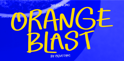 Experience the vibrant energy of Orange Blast, a playful handwritten display font that can make your designs pop! With its bold and dynamic strokes, this font is perfect for adding a playful yet professional touch to any project. Whether you’re designing logos, posters, or social media graphics, Orange Blast delivers a burst of creativity that captivates and engages your audience. Orange Blast features : Standard Latin Numbers, symbols, and punctuations Multilingual Support. Fully accessible without additional design software Simple Installations Works on PC & Mac Thank You.
 - Siren Song by Ana's Fonts,
$15.00 Siren Song is a textured marker font with rough edges and dozens of ligatures that give it a true handwritten feel. It includes both regular and slanted versions of the font, with bonus swashes that complement it nicely to achieve eye-catching designs. This handwritten font includes: A-Z, a-z, 0-9, accents, punctuation and symbols Tons of ligatures, for a more natural handwritten feel Contextual Alternates (for b, f, k and s) An extra set of 26 swashes (a-z) and 10 symbols (0-9)
 - Offenders Club by Maulana Creative,
$14.00 Offenders Club is a signature script and sans serif font. With thin felt tip stroke condensed sans serif Display, fun character with a bit of ligatures. To give you an extra creative work. Offenders Club font support multilingual more than 100+ language. This font is good for logo design, Social media, Movie Titles, Books Titles, a short text even a long text letter and good for your secondary text font with sans or serif. Make a stunning work with Offenders Club font. Cheers, MaulanaCreative
 - Bollolo by YuliusParyadi,
$11.00 Bollolo (Handwritten) is a fun and playful font. Bollolo name is made from bolo-bolo which is mean lets be friend. This font is readable, catchy, and easy to use. This font is suitable for quotes, logo designs, kids toys, story book, and many other design projects. Bollolo is includes: - full set uppercase and lowercase letter; - numerals; - multilingual support; - large number of punctuations; - ligatures. Please add this font as your favorite, hit like button, or follow me. I'll very happy for that and appreciated it.
 - Tendencies by HIRO.std,
$22.00 Tendencies – Graffiti Font This font describes culture, hip-hop, gravity, style, spray, road, travel, is easy to use and will bring good harmony when the letters are connected with alternate styles and paired with each other Tendencies has more than 489 Glyphs FEATURES - Ligatures - Stylistic Alternates - Uppercase - Lowercase - Numbering and Punctuations - Multilingual Support - Works on PC or Mac - Simple Installation USE Tendencies works great in any branding, board, logos, apparel, produk pagaking, magazines, label, films, stationary, poster, etc. and any projects that need street art taste.
 - P22 Platten Neu by IHOF,
$39.95 The P22 Platten font family has been revisited and expanded by designer Colin Kahn. Platten is based on lettering found in German fountain pen practice books from the 1920s (you may have seen the similar Speedball books in the US). This round tip pen lettering is comparable to the basic forms used in grammar school teaching alphabets, but with a few original characteristics. The Italic version has even more of these unusual features. Geometric and simple yet casual and timeless. Perfect for many uses.
 - Reflex by Sudtipos,
$29.00 Reflex update: Now in 18 styles and variable version. Reflex was designed as an alternative to many overused types found on the packaging of pop culture products. Taking its inspiration from Bauhaus design roots, even in its heavy weights it maintains a soft aesthetic that can transparently convey a message of newness and understanding, as well as clarity and evenness. The Reflex set comes with a wide range of linguistic support, at no extra charge, including characters for Central European, Cyrillic, Greek, Turkish and Baltic regions.
 - Kreak Display by Tebaltipis Studio,
$10.00 KREAK is a bold display font with 6 various styles for your needs. KREAK has uppercase, lowercase, alternative, and ligature letters. It’s fun, pop, vintage, and playful! WHAT'S YOU GET ? Unique Letterforms Works on PC & Mac Simple Installations Accessible in the Adobe Illustrator, Adobe Photoshop, Microsoft Word Fully accessible without additional design software. I really hope you'll get pleasure using Pagers font and it will be perfect addition to your font collection! Contact me with an inbox message If you have any question. Thank you! Happy Creating
 - Aeronaut by FaceType,
$39.00 A Neogothic typeface that radiates trendy ease and allows bicolor compositions. The decorative elements of Aeronaut, the swashes we call parachutes and the squiggly arrows of the upper-case characters soften the font’s Gothic appearance. It’s the reason why we labeled it a “Neogothic typeface that radiates trendy ease.” Make it as modern as you like it to be. · Aeronaut-Base combined with Aeronaut-Parachute allows bicolor compositions. Simply place them on top of each other to create playful, two-colored headlines. Aeronaut-Balloon is similar to Aeronaut-Parachute but offers even longer swashes. AeronautPlain is similar to Aeronaut-Base but works as a complete font on its own (as it contains all punctuation). We abandoned the swashes of the upper-case characters to keep the font pure and straight. · The glyphs of Aeronaut are derived from Textualis also known as Textura or Gothic Bookhand. Textualis represented the most calligraphic form of blackletter types and is today regarded as quintessentially Gothic. Aeronaut has been inspired by Kirchengotische Schrift, a font that can be found in a German font book from 1879 entitled Vorlegeblätter für Firmenschreiber. As its name suggests, it was designed for religious publications. · View other fonts from Georg Herold-Wildfellner: Sofa Serif | Sofa Sans | Mila Script Pro | Pinto | Supernett | Mr Moustache | Aeronaut | Ivory | Weingut · Language Report for Aeronaut / 175 languages supported: Abenaki, Afaan Oromo, Afar, Afrikaans, Albanian, Alsatian, Amis, Anuta, Aragonese, Aranese, Aromanian, Arrernte, Arvanitic, Asturian, Aymara, Basque, Bikol, Bislama, Bosnian, Breton, Cape Verdean, Catalan, Cebuano, Chamorro, Chavacano, Chickasaw, Cimbrian, Cofan, Corsican, Croatian, Czech, Danish, Dawan, Delaware, Dholuo, Drehu, Dutch, English, Estonian, Faroese, Fijian, Filipino, Finnish, Folkspraak, French, Frisian, Friulian, Galician, Genoese, German, Gooniyandi, Greenlandic, Guadeloupean, Gwichin, Haitian Creole, Han, Hiligaynon, Hopi, Hungarian, Icelandic, Ido, Ilocano, Indonesian, Interglossa, Interlingua, Irish, Istroromanian, Italian, Jamaican, Javanese, Jerriais, Kala Lagaw Ya, Kapampangan, Kaqchikel, Karelian, Kashubian, Kikongo, Kinyarwanda, Kiribati, Kirundi, Klingon, Ladin, Latin, Latino Sine, Lojban, Lombard, Low Saxon, Luxembourgish, Makhuwa, Malay, Manx, Marquesan, Meglenoromanian, Meriam Mir, Mohawk, Moldovan, Montagnais, Montenegrin, Murrinhpatha, Nagamese Creole, Ndebele, Neapolitan, Ngiyambaa, Norwegian, Novial, Occidental, Occitan, Oshiwambo, Ossetian, Palauan, Papiamento, Piedmontese, Polish, Portuguese, Potawatomi, Qeqchi, Quechua, Rarotongan, Romanian, Romansh, Rotokas, Sami Lule, Sami Southern, Samoan, Sango, Saramaccan, Sardinian, Scottish Gaelic, Serbian, Seri, Seychellois, Shawnee, Shona, Sicilian, Silesian, Slovak, Slovenian, Slovio, Somali, Sorbian Lower, Sorbian Upper, Sotho Northern, Sotho Southern, Spanish, Sranan, Sundanese, Swahili, Swazi, Swedish, Tagalog, Tetum, Tok Pisin, Tokelauan, Tshiluba, Tsonga, Tswana, Tumbuka, Tzotzil, Uzbek, Venetian, Vepsian, Volapuk, Voro, Walloon, Waraywaray, Warlpiri, Wayuu, Wikmungkan, Wiradjuri, Xhosa, Yapese, Yindjibarndi, Zapotec, Zulu, Zuni
 - Avaline Script by Kimmy Design,
$20.00 Avaline is a super smart script font that was 100% handmade. Inspired by hand lettering doodles, the font family combines a mischievous spirit and cheerful style. Its playful letterforms come in Light, Regular, Bold and Sketch, and it comes with tons of language support and fun alternatives. Packed with OpenType features, Avaline comes together to make a truly authentic hand script family package. Its imperfect hand-drawn style is utilized by contextual alternatives – giving each character 3 subtle variations as well as special styles that appear automatically based on where they appear in a line of text. Stylistic alternatives offer completely different styles for all capital and some lowercase letters. Swashes provide numerous flourish options for ascending & descending letters as well as characters that start or end text lines. Small caps and titling alternatives provide great secondary text options, converting the script letterforms to more proportional small cap ones. Avaline also comes with a massive set of extras, including catchwords, swashes & flourishes, arrows, borders, line breaks, laurels and frames. Together they make for a truly organic script font bundle. Avaline seriously comes with hundreds of alternative options, to see everything you can do with the family and to learn how to access them, please visit http://tinyurl.com/htwhetr
 - Sassoon Joined NORDIC by Sassoon-Williams,
$66.00 These fonts will join-as-you-type in your OpenType application as shown in the posters above. Choose Use Contextual Alternates option in your app to get basic recommended baseline joins for teaching. Additionally, use can choose from 7 Stylistic Sets of alternative letterforms that are so important for Teachers. Create ‘pen lifts’ anytime too! Fonts display unjoined by default on this website and are delivered that way - joining is controlled by your application. Designed for teaching children, these fonts enable progressive pupil exercises for a smooth transition between separate letters and the teaching of joined handwriting. Purchase a single font or the complete package contains the typeface ‘Sassoon Joined’ in a Regular weight only, for the 5 Nordic languages; Finnish (Suomi), Danish (Dansk), Icelandic (íslenska), Norwegian (Norsk), Swedish (Svenska), with English as the default language in all fonts. These fonts are for use with a compatible OpenType applications such as Word to get joined text. Or, enter " | " between letters for unjoined text. Free to download resources Stylistic Sets and how to access the alternative letters feature in these OpenType fonts Purchasers of this font package may use their Order Number to receive a free Copybook PDF by Rosemary Sassoon recommended for effective teaching
 - Strawberry Swirl by Krafted,
$10.00 Imagine a world filled with swirls of strawberry, pops of pink, and pure joy to go around for everyone... Are you trying to make an elegant, sweet, and stylish statement with your invitations, social media, website, or printed materials? Then grab some cotton candy, crack a smile, and get ready for a swirly day of wonders! Introducing Strawberry Swirl - A Modern Script Font. This gorgeous & stylish font can be used for a host of different content needs and projects. Use it for your headings, logos, business cards, printed quotes, invitations (wedding, birthday, engagement, etc.), packaging, resumes, and even your website or social media branding. Enchant & delight your audience, clients, or guests with this versatile, stylish, and elegant font. What you’ll get: - Multilingual & Ligature Support - Full sets of Punctuation and Numerals Compatible with: - Adobe Suite - Microsoft Office - KeyNote - Pages Software Requirements: The fonts that you’ll receive in the pack are widely supported by most software. In order to get the full functionality of the selection of standard ligatures (custom created letters) in the script font, any software that can read OpenType fonts will work. We hope you enjoy this font and that it makes your branding sparkle! Feel free to reach out to us if you’d like more information or if you have any concerns.
 - Idealista by Suitcase Type Foundry,
$39.00 Idealista directly responds to its other members, Nudista and Kulturista. It shares the same proportions and the same set of weights, yet it enriches the expression means of the two typefaces with new themes — the character set is smooth, even round, and it boasts a number of special details and perky moves. Most of all, Idealista relishes juicy magazine titles, typographic logotypes and propagandist posters. Unlike cold, technicist typefaces, it has great zest for life, so there's no wonder that in each of the letters, intuition wins over intellect. Owing to this, the text set in Idealista has a special voluptuous quality and unmistakable temperament — in a single typeface Idealista combines the best of sans-serif, slab-serif, as well as geometric and calligraphic construction principles, coming down to one impressive, expressive cocktail. Some letters have serifs, some do not, some are sharp, some are smooth, and all this results in the nice hip-hop beat of the line of text. The typeface has five weights and ten styles in total, so it can easily accommodate to the needs of complex texts, unlike many of its display counterparts. Idealista is valuable partner for the more text-suited Nudista and, if need for tiny sizes arises, to Kulturista as well.
 - Funtrude by Colllab Studio,
$9.00 "Hi there, thank you for passing by. Colllab Studio is here. We crafted best collection of typefaces in a variety of styles to keep you covered for any project that comes your way! When you have a project that needs a fun, unique font to make it pop, you can’t go wrong with Funtrude. Funtrude comes in three styles: Basic, Extrude, and Hole. Each style has more than 350 of the most beautiful glyphs you could ever dream of seeing. The Extrude style is great for titles, headings, and any other text where you want to use a bold font but don’t want it to be overly bold; the Basic style will work great for things like product names or subheadings; and the Hole style is perfect for anything else! Each individual style comes with its own swashes—so your fonts can look just as beautiful when they’re all capitalized as they do when they’re in normal text. What makes us so excited about this product is how much we love to use it ourselves. When we saw Funtrude for the first time, we couldn’t believe our eyes—it was everything we had ever wanted in a font, plus it was super affordable. GET IT NOW....!!! A Million Thanks Colllab Studio www.colllabstudio.com
 - Nautilus Text by Linotype,
$29.99Hellmut G. Bomm first released his Linotype Nautilus typeface in 1999. Ten years later, he updated and expanded the design. Now users have two additional families at their disposal: Nautilus Text and Nautilus Monoline. Nautilus Text bears more similarities to the original Linotype Nautilus. The letters shows a high degree of contrast in their stroke modulation. Bomm's intention was to create a clear, highly legible face. While the even strokes of most sans serif types eventually tire the eyes in long texts, the marked stroke contrast of Nautilus Text lends the face its legibility. The characters were drawn with a broad tipped pen. Like serif typefaces, the forms of Nautilus Text display a variety of elements. Its characters are narrow, with relatively large spaces between them. This helps create an overall open appearance, and allows a large quantity of text to fit into a small space. Nautilus Monoline's letters share the same overall proportions as Nautilus Text's. But as their name implies, they are monolinear. Their strokes do not have the calligraphic modulation that Nautilus Text features. This allows them to set another sort of headline, making Nautilus Monoline a refreshing display type choice to pair with body text set in Nautilus Text. - Nautilus Monoline by Linotype,
$29.99Hellmut G. Bomm first released his Linotype Nautilus typeface in 1999. Ten years later, he updated and expanded the design. Now users have two additional families at their disposal: Nautilus Text and Nautilus Monoline. Nautilus Text bears more similarities to the original Linotype Nautilus. The letters shows a high degree of contrast in their stroke modulation. Bomm's intention was to create a clear, highly legible face. While the even strokes of most sans serif types eventually tire the eyes in long texts, the marked stroke contrast of Nautilus Text lends the face its legibility. The characters were drawn with a broad tipped pen. Like serif typefaces, the forms of Nautilus Text display a variety of elements. Its characters are narrow, with relatively large spaces between them. This helps create an overall open appearance, and allows a large quantity of text to fit into a small space. Nautilus Monoline's letters share the same overall proportions as Nautilus Text's. But as their name implies, they are monolinear. Their strokes do not have the calligraphic modulation that Nautilus Text features. This allows them to set another sort of headline, making Nautilus Monoline a refreshing display type choice to pair with body text set in Nautilus Text. - Klainy by Identity Letters,
$29.00 An unadorned Grotesque with a refreshingly personal touch. If “Grotesque” mainly means “industrial, mechanical, anonymous typeface” to you, Klainy might redefine your image of the genre. Yes, it’s a Grotesque—but with a contemporary look and a lot of personality. Klainy’s apertures are more closed at the top and more open at the bottom, creating an informal rhythm that sets Klainy apart: a confident, optimistic voice with a clean appearance. Terminals are subtly back-bent: these quaint “hooks” make Klainy a bit more personal, a bit friendlier. (You can find them in the a, c, f, and r.) Just like its old-style Grotesque ancestors, Klainy is optimized for display sizes and short texts. There, its unobtrusive quirks can be wholly appreciated. However, the familiar Grotesque appearance makes sure that the typeface is comfortable to read in smaller sizes, as well. Use Klainy whenever a basically classic sans-serif typeface with a modern and individual twist is called for. This font family comes in eight weights ranging from Thin to Black, each with a matching italic style. More than 500 glyphs and a bunch of Open Type Features make it a reliable companion for all of your projects. You can fine-tune the flavor of Klainy with Stylistic Alternates such as a one-story a and a two-story g. Their simple construction blends perfectly with the design concept of this typeface. Klainy is a seasoned blue-collar worker that surprises you with wit and team spirit. It’ll be a great addition to your font library.
 - Corleone by FontMesa,
$- Corleone was originally designed as a two font family in 2001 and offered for free. This year we've expanded the font family to twelve fonts including small caps and italics. While the new Corleone has been greatly refined and is a much more professional quality font we've decided to still offer the original two fonts for free. Corleone is the perfect font for t-shirts and other merch, the new small caps make this font stand out and bring attention to whatever you use it on. Corleone is the font you can't refuse. Tech notes: Corleone was designed after a famous movie logo in the 1970's with a title name that sounds a lot like The Grandfather if you know what I mean. The movies had three installments, my original font was patterned after the logo for the third movie, the new Corleone Primo and Secondo versions are patterned after the logos of the first two movies. The differences are noticed mostly in the lowercase letters. One thing you will not find in this font family is the puppeteer or puppet master hand because it's been registered as a separate trademark of Paramount Pictures. If you're using an application that works in layers then you'll be interested in the four extra over score glyphs included in some of the versions of this font. Sorry, MS Word does not work in layers so this feature will not work in MS Word. When you open up the glyph map in Adobe Creative Suite you should see the over score glyphs when you scroll down to the bottom. These extra over score glyphs allow you to extend the top line of a single capital letter, with four different lengths you should be able to mix and match to achieve the length that you desire. When using the over score glyphs it's best to divide your word or headline into separate text objects, the cap being one object and the remaining letters being the second. If you try using the over score glyphs on a single text object then with each over score that you add the text after it will get pushed down the line.
 - VTC-FreehandTattooOne - Personal use only

- VTC-BadEnglischOne - Personal use only

- Lil' Diddles One by Patricia Lillie,
$25.00Aliens, toys, lawn ornaments and more. - Germs - Unknown license

- 112 Hours by Device,
$9.00 Rian Hughes’ 15th collection of fonts, “112 Hours”, is entirely dedicated to numbers. Culled from a myriad of sources – clock faces, tickets, watches house numbers – it is an eclectic and wide-ranging set. Each font contains only numerals and related punctuation – no letters. A new book has been designed by Hughes to show the collection, and includes sample settings, complete character sets, source material and an introduction. This is available print-to-order on Blurb in paperback and hardback: http://www.blurb.com/b/5539073-112-hours-hardback http://www.blurb.com/b/5539045-112-hours-paperback From the introduction: The idea for this, the fifteenth Device Fonts collection, began when I came across an online auction site dedicated to antique clocks. I was mesmerized by the inventive and bizarre numerals on their faces. Shorn of the need to extend the internal logic of a typeface through the entire alphabet, the designers of these treasures were free to explore interesting forms and shapes that would otherwise be denied them. Given this horological starting point, I decided to produce 12 fonts, each featuring just the numbers from 1 to 12 and, where appropriate, a small set of supporting characters — in most cases, the international currency symbols, a colon, full stop, hyphen, slash and the number sign. 10, 11 and 12 I opted to place in the capital A, B and C slots. Each font is shown in its entirety here. I soon passed 12, so the next logical finish line was 24. Like a typographic Jack Bauer, I soon passed that too -— the more I researched, the more I came across interesting and unique examples that insisted on digitization, or that inspired me to explore some new design direction. The sources broadened to include tickets, numbering machines, ecclesiastical brass plates and more. Though not derived from clock faces, I opted to keep the 1-12 conceit for consistency, which allowed me to design what are effectively numerical ligatures. I finally concluded one hundred fonts over my original estimate at 112. Even though it’s not strictly divisible by 12, the number has a certain symmetry, I reasoned, and was as good a place as any to round off the project. An overview reveals a broad range that nonetheless fall into several loose categories. There are fairly faithful revivals, only diverging from their source material to even out inconsistencies and regularize weighting or shape to make them more functional in a modern context; designs taken directly from the source material, preserving all the inky grit and character of the original; designs that are loosely based on a couple of numbers from the source material but diverge dramatically for reasons of improved aesthetics or mere whim; and entirely new designs with no historical precedent. As projects like this evolve (and, to be frank, get out of hand), they can take you in directions and to places you didn’t envisage when you first set out. Along the way, I corresponded with experts in railway livery, and now know about the history of cab side and smokebox plates; I travelled to the Musée de l’imprimerie in Nantes, France, to examine their numbering machines; I photographed house numbers in Paris, Florence, Venice, Amsterdam and here in the UK; I delved into my collection of tickets, passes and printed ephemera; I visited the Science Museum in London, the Royal Signals Museum in Dorset, and the Museum of London to source early adding machines, war-time telegraphs and post-war ration books. I photographed watches at Worthing Museum, weighing scales large enough to stand on in a Brick Lane pub, and digital station clocks at Baker Street tube station. I went to the London Under-ground archive at Acton Depot, where you can see all manner of vintage enamel signs and woodblock type; I photographed grocer’s stalls in East End street markets; I dug out old clocks I recalled from childhood at my parents’ place, examined old manual typewriters and cash tills, and crouched down with a torch to look at my electricity meter. I found out that Jane Fonda kicked a policeman, and unusually for someone with a lifelong aversion to sport, picked up some horse-racing jargon. I share some of that research here. In many cases I have not been slavish about staying close to the source material if I didn’t think it warranted it, so a close comparison will reveal differences. These changes could be made for aesthetic reasons, functional reasons (the originals didn’t need to be set in any combination, for example), or just reasons of personal taste. Where reference for the additional characters were not available — which was always the case with fonts derived from clock faces — I have endeavored to design them in a sympathetic style. I may even extend some of these to the full alphabet in the future. If I do, these number-only fonts could be considered as experimental design exercises: forays into form to probe interesting new graphic possibilities.
 - New Yorker Type Pro by Wiescher Design,
$45.00 New-Yorker-Type was one of the first typefaces I tried my hand at in 1985. I meant it as a revival of the typeface used by the New Yorker magazine. I did not scan it. I just looked at the type and redrew it completely by hand. Only much later did I come to know, that there is a bundle of similar typefaces of that period. Rea Irvin's design for New-Yorker magazine was just one of them, maybe the best. In the next step I repaired some of the mistakes that I made more than thirty years ago. Now on the eve of 2020 I gave the font a complete overhaul and added a set of Swash Initials, Cyrillic and Greek glyphs and many ligatures. The font now has 1075 glyphs and is all set for most latin writing systems. On top of that I made two versions, a Classic one with rounded corners and a pointed Pro version for a more up-to-date look. Take your pick. Yours sincerely, honoring Rea Irvin a great type- and magazine-designer, Gert Wiescher
 - Nimbus Sans Novus by URW Type Foundry,
$89.99 The first versions of Nimbus Sans have been designed and digitized in the 1980s for the URW SIGNUS sign-making system. Highest precision of all characters (1/100 mm accuracy) as well as spacing and kerning were required because the fonts should be cut in any size in vinyl or other material used for sign-making. During this period three size ranges were created for text (T), the display (D) and poster (P) for small, medium and very large font sizes. In addition, we produced a so-called L-version that was compatible to Adobe’s PostScript version of Helvetica. Nimbus was also the product name of a URW-proprietary renderer for high quality and fast rasterization of outline fonts, a software provided to the developers of PostScript clone RIPs (Hyphen, Harlequin, etc.) back then. Also in the 80s, a new, improved version of the Nimbus Sans, namely Nimbus Sans Novus was designed. Nimbus Sans Novus was conceptually developed entirely with URW’s IKARUS system, i.e. all styles harmonize perfectly with each other in terms of line width, weight, proportions, etc. On top of that, Nimbus Sans Novus contains more styles than Nimbus Sans.
 - Tertius by Scholtz Fonts,
$21.00 Tertius, with its high ascenders and clubbed serifs, is a modern interpretation of the classic Carolingian style (7th - 9th centuries AD). There was no capital form in the Carolinian hand and Roman square capitals were originally used with it. The Carolingian hand began, after a while, to develop more cursive tendencies as people looked for a way to speed up the writing process. I have “capitalized” on this trend and have devised an appropriate and dramatic set of flowing capitals for this family. With its elegant swashes and bold letter shapes, Tertius embodies the romance of medieval life, of knights, castles, and chivalry. Tertius comes in four styles:- -- Regular: with elegant, smoothly penned characters; -- Crenellated: written with a scratchy pen over rough parchment -- many drops of ink and blotches have been left on the parchment (“Crenellated” means battlements -- the rough protrusions on the top of castle walls); and -- Romantic: the capitals have been loosely overwritten generating a contemporary version of illuminated capitals. -- Illuminated: richly decorated illuminated capitals for use with Tertius Regular (28 characters) All fonts have been carefully crafted, letterspaced and kerned and contain full character sets of 237 characters.
 - Mr Foodie by Hipopotam Studio,
$30.00 Mr Foodie is a set of 825 icons divided into 7 groups – 109 fruit icons, 157 kitchen icons, 120 animal products icons, 100 veggie icons, 107 desserts icons, 127 beverages icons, and 105 other food related icons. You can find a full, multi-color list of every icon with its name and corresponding character on a dedicated website or in a pdf manual. It’s a multilayer font so every group consists of 4 fonts – Regular, Back, Front, and 3rd Color. The Regular style is for single color use only and the Back, Front, and 3rd Color styles are necessary if you want to achieve a multicolor effect. Position three identical text boxes exactly on top of each other, apply layer font styles, and choose whatever colors you like. You’ll quickly discover that some icons don’t have 3rd Color style. This is not a mistake – a lot of things look good with just two colors. Use it to make logos, illustrations, games, app icons, t-shirts, mugs, cooking books, restaurant menus, interior decorations, invitations, balloons, and any other project where fine crafted food drawing is needed.
 - Whimsies by Typephases,
$25.00The Whimsies series goes further in our fixation with invented little people: the three dingbats of this series contain mostly imaginary situations, drawn first with ink on paper. All but a tiny fraction of the illustrations (a total of 114) have been drawn from one's imagination, with no previous models. The themes depicted here are varied and often humorous, though the humour is on the darker side, you are warned. The themes have a definite retro - victorian feel, with top hats, moustaches, long coats, walking canes and the like. Together with their close relatives, our Illustries, Bizarries, Ombres, Absurdies and Genteta dingbats (we give this bizarre collective the common name of Whimbats) you can use the Whimsies in an endless variety of projects, ranging from small spot illustration to whole pages, page spreads or posters applications. You can use them as they come in the digital font, or customize them easily in your favourite graphics program. A touch of texture or color will give them a completely new look. The vectorial nature of digital fonts means you can enlarge them to any size, with no loss of crispness in their outlines. - Eigerdals Slab by insigne,
$30.00 Introducing Eigerdals Slab - the ultimate font for creating a cozy and inviting atmosphere in your designs. This slab-serif font family captures the essence of the mountains of Norway and the streets of Stockholm, making it the perfect choice for design projects that need a touch of Hygge. With its top-heavy characters, Eigerdals Slab has a more approachable and warm feel that sets it apart from other font choices. Plus, its tall x-height, brushed and smooth look makes it both readable and stylish. But that's not all, Eigerdals Slab comes loaded with practical OpenType features like ligatures, unicase alternates, and a set of upright italic swash alternates, that can be fully utilized in software like Quark and Adobe suite. Not only that, it also includes support for a wide range of languages. Eigerdals Slab is an extension of the Eigerdals family, and its distinctive look pairs perfectly with other text faces. Whether you're using it for display work or longer blocks of text, Eigerdals Slab is the perfect font for adding warmth and friendliness to your designs. Don't wait any longer, try Eigerdals Slab today and elevate your work to the next level!
 - New Yorker Type Classic by Wiescher Design,
$45.00 New-Yorker-Type was one of the first typefaces I tried my hand at in 1985. I meant it as a revival of the typeface used by the New Yorker magazine. I did not scan it. I just looked at the type and redrew it completely by hand. Only much later did I come to know, that there is a bundle of similar typefaces of that period. Rea Irvin's design for New-Yorker magazine was just one of them, maybe the best. In the next step I repaired some of the mistakes that I made more than thirty years ago. Now on the eve of 2020 I gave the font a complete overhaul and added a set of Swash Initials, Cyrillic and Greek glyphs and many ligatures. The font now has 1075 glyphs and is all set for most latin writing systems. On top of that I made two versions, a Classic one with rounded corners and a pointed Pro version for a more up-to-date look. Take your pick. Yours sincerely, honoring Rea Irvin a great type- and magazine-designer, Gert Wiescher
 - Galleds Stars by Yukita Creative,
$14.00 Galleds Stars Display Typeface is a single font with a minimalistic but standout style for any work from movie titles, music album covers, magazines, beauty ads, and even wedding invitations. --- Minimalist type design has been a success for professional designers worldwide. - Galleds Stars Display Typeface is legible from much larger distances than typical fonts - Elegant letterforms give the feeling of luxury - Smooth curves for elegant typography This font has several alternative characters as in ( A,N,O,R,S,a,c,e,o,t,y ) Tips for using fonts in projects. Use this font with a simple background, not too busy so that you can highlight your branding This font file OTF


