10,000 search results
(0.023 seconds)
- Amoresa by Andrey Sharonov,
$22.00 Amoresa script was handwritten under inspiration of traditional calligraphy and the wonderful mystic soundtrack of Wojciech Kilar. This font comes with a clean and aged version, beautiful uppercase and lowercase alternates, ligatures and end-swashes. You can easy get alternate characters just by adding number 2, 3, or 4 after any uppercase. Each of them has from one to four stylistic alternates. Lowercase has alternates too. Aurora has eight lengths of end-swashes. Just add underscore and a number from 1 to 8 after any letter at the end of the word ( _1 _2 _3 ... _8). Amoresa has multi-lingual support (Western European characters) for the following languages: English, Danish, Dutch, Estonian, Faroese, Filipino, Finnish, French, German, Hungarian, Icelandic, Irish, Italian, Norwegian, Polish, Portuguese, Spanish, Swedish. In my examples I show how this script can be used. It's very well suited for logotypes, wedding invitations, alcohol labels, romantic cards and others. Recommended to use in Adobe Illustrator or Photoshop. The special features don't work in Microsoft Word.
 - Davison Spencerian by House Industries,
$33.00 As one of the most distinguished lettering artists of the 20th century, Meyer “Dave” Davison’s greatest contribution to the American visual landscape is arguably Davison Spencerian. The alphabet made its first appearance in Photo-Lettering’s 1946 catalog and remains a benchmark of the ornamental script genre. Thanks to the skillful hands of Mitja Miklavčič and the tireless eyes of House Industries designers Ben Barber and Ken Kiel, we have preserved the poise and precision of Davison’s masterwork in this faithfully-rendered digital incarnation. From automotive exhaust accessories and pirate-themed wedding invites to New Orleans sissy bounce hip-hop CD covers and upmarket bivalve ambrosia packaging, Davison Spencerian offers sober sophistication and unparalleled flexibility. DAVISON SPENCERIAN CREDITS: Typeface Design: Meyer “Dave” Davison Typeface Digitization: Mitja Miklavčič Typeface Direction: Ben Kiel and Ken Barber Like all good subversives, House Industries hides in plain sight while amplifying the look, feel and style of the world’s most interesting brands, products and people. Based in Delaware, visually influencing the world.
 - Proper by Scholtz Fonts,
$17.00Proper was based on handwritten characters (of my own) that I scanned and then digitally touched up. I kept the digital editing to a minimum so as to preserve the freshness of the original. I did, however, want to convey a sense of propriety and regularity and so my original handwriting was done with quite a lot of control. I kept the size of the lower case characters quite large and this makes the font very readable, even at quite small point sizes. Proper may be used when you need clean, legible text, with a natural look, e.g.: -- magazines aimed at the natural health market -- "natural look" fashion pages -- "natural look" decor pages -- natural food products -- natural beauty products -- children's books -- packaging for children's toys, games etc. -- educational material -- comics Proper contains a full character set with all upper and lower case characters, numerals, symbols, accented characters and it has been carefully spaced and kerned. - Jabberwub by Sentinel Type,
$30.00A fresh new decorative display face bubbling with life & spontaneity, Jabberwub belongs to a rare genus of creature fonts that time forgotócasual animated. A fun & bouncy eye-catcher that crosses into the land of the zany, dancing a whacky line between discord & rhyme, Jabberwub packs tons of fun into a state-of-the-art OpenType font loaded with 270 extra glyphs, including stylistic alternates, discretionary ligatures, word ligatures and capitalized ligatures, allowing creative typographers to achieve a custom hand-lettered look without all the mess & spilt glue of a manual paste-up job. Just like using rub-down type but it never cracks or splits, and it never runs out. The moment you start using Jabberwub you'll be laffing! Jabberwub is ideal for whatever zany stuff springs to mind. It takes an outline with no problem-o, and you can squish & squoosh it as the occasion takes your fancy. Optimal results are achieved by hand setting each individual glyph. Available in OpenType only. - Halogen Slab by Positype,
$29.00 When I released Halogen, I asked ‘Who doesn't want or need an expansive contemporary extended sans that has a sense of style and swagger… what if it had a lowercase, small caps and various numeral options… how could you say no?’ Go, click on the Halogen link and read on, if you're interested. Halogen was well-received, so I decided to take it further with Halogen Slab (the name kinda tips you off as to what kind of typeface it is, don't ya think?). As always, I prefer not to take short cuts and provide an anemic offering of glyphs — a modern typeface offered today must provide more than just the basics and this one does — lowercase, smallcaps, old style numerals, tabular forms, stylistic and titling alternates, fractions, case-sensitive features, and even an alternate uppercase ordinal set is included. Now go make cool print and digital things with it, and share them with me.
 - Nemocón by Andinistas,
$59.67 Nemocon is a display font family designed by Carlos Fabian Camargo G. Nemocon It is ideal for making attractive messages. Nemocon has over 2200 glyphs distributed in 6 files OT designed from handmade lettering and usability testing. • Nemocon Script (1382 glyphs): based on the rotation of a flat tip brush. Its letters correspond to the uninterrupted calligraphic logic, as well as similar ingredients as the ones used in font Brush Script by Robert E. Smith, created for the American Type Founders in 1942. • Nemocon Tuscan (375 glyphs): Inspired by representative types of wood from the 19th century, specifically speedball brawny Tuscan capitals with serifs fishtail shaped. • Nemocon Catchwords (115 glyphs) + Nemocon Catchwords Shadow (115 glyphs): categorically inflated words with and without shadows, to accompany, highlight and prioritize. • Nemocon Dingbats (114 glyphs) + Nemocon Containers(150 glyphs): unconventional pictograms consisting warm and comforting thoughts designed to highlight words or phrases which needed multicolored illustrations or drawings in black and white.
 - Gaitera Ball - Personal use only

- Dizzy Edge by PizzaDude.dk,
$15.00 My Dizzy Edge font is really not that dizzy! Actually it's quite steady and legible - super good for packaging, greeting cards and perhaps even commercials for toys, candy, t-shirts, movieposters...yep, that list is long! What's more interesting is that the font as got 6 different versions of each letter - at first glance, the letters don't vary that much, but a closer look reveals the sometimes grungy outline of a pen! But theres more!!! Dizzy Edges comes with multi-language accents!!! What's not to like!!!
 - Carputins by Maulana Creative,
$14.00 Carputins is a casual script font. With bold felt tip stroke, fun character with a bit of ligatures and has a two files lowercase alternates extra swashes. To give you an extra creative work. Carputins font support multilingual more than 100+ language. This font is good for logo design, Social media, Movie Titles, Books Titles, a short text even a long text letter and good for your secondary text font with sans or serif. Make a stunning work with Carputins font. Cheers, Maulana Creative
 - Fanchy by ArimaType,
$19.00 Fanchy Created from our explorations inspired by retro 70s style and pop culture visual designs such as comics, cartoons, and old posters. Strong bold character with groovy style makes us feel the retro vibe and brings us to the 70s. Fanchy Comes with beautiful characters and curves consisting of 6 sets of styles. Contains 2 regular and italic styles, 2 shadow styles and 2 outline styles. This font is best used for headings, logotypes, quotes, apparel designs, posters, flyers, packaging, book covers, and much more.
 - Valsity by Ingrimayne Type,
$9.00 Valsity is a squarish slab-serif family with five weights and two widths, each with an italics for a total of twenty members. With negligible contrast, it is almost monoline. It is for decorative uses; it is too square and lacks the contrast to make it a good choice for extensive text. Valsity began with a blending of two other squarish slab-serifs, Valgal and Kwersity, and its name reflects that ancestry. From there it took on a life of its own, often diverging from its parents.
 - SS Vortax by Sharkshock,
$100.00 SS Vortax is a space-age themed display sans featuring broad strokes and tight spacing. This close relative of Galaxus features imposing Capitals with some sharp slants in the Italic version. It’s designed to cover horizontal blocks effortlessly. Most characters have curves on the exterior with right angles on the interior. This dynamic contrast makes it a great choice for a video game/app, toy packaging, or sports logo. SS Vortax is equipped with European accents for international support. Please check glyph maps for all supported characters.
 - Zelmud Script by Maulana Creative,
$14.00 Zelmud Authentic Script Font is an expressive signature script font. With regular felt-tip stroke, fun character with some of ligatures and extra swash. To give you an extra creative work. Zelmud Authentic Script Font support multilingual more than 100+ language. This font is good for logo design, Social media, Movie Titles, Books Titles, a short text even a long text letter and good for your secondary text font with sans or serif. Make a stunning work with Zelmud Authentic Script Font. Cheers, MaulanaCreative
 - Pen Elegant JNL by Jeff Levine,
$29.00 A 1918 lettering instruction book by William Hugh Gordon presented a number of lettering styles that were geared toward sign and show card painters along with tips and tricks regarding the correct construction of such signs for maximum effect. One pen lettered Roman alphabet with a beautiful set of numerals has been recreated digitally as Pen Elegant JNL, which is available in both regular and oblique versions. To note, Gordon was the co-inventor of the Speedball lettering pen with Ross F. George in 1915.
 - Vonique 43 by Sharkshock,
$125.00 Vonique 43 is a stylish display font designed to stop passerby in their tracks. Curvaceous lowercase members define this font along with a consistently thin line weight throughout. Most are elegantly styled after circles featuring very short descenders and matching the cap height of capital letters. Vonique 43, like its predecessors, was not designed for everyday text, but eye catching logos. It's equipped with support for many different languages including Russian and Greek. Use it for a luxury brand, clothing line, or a company logo.
 - Nearland by Uncurve,
$20.00 Nearland is an aesthetic vintage Script font. Inspired from the past, elegant signage, gold leaf art, sign painting, lettering, logo and old label product. Nearland Script comes with tons of alternates characters and special alternate (i) lowercase is a ending swash thats to make more eye cacthy. Finally BOOM..!! you get a great design for your project. Nearland It's suitable for authentic logos, headings, sign painting, posters, letterhead, branding, magazines, album covers, book covers, movies, apparel design, flyers, greeting cards, product packaging, badge and more.
 - Arca by PintassilgoPrints,
$20.00 A charming font inspired by the Brazilian beloved album for children by Vinicius de Moraes, author of the bossa nova classic 'Garota de Ipanema' (Girl from Ipanema) with his partner Tom Jobim. The font has a cheerful cutout look, as does the original album cover designed by Elifas Andreato in 1980. Arca font is loaded with alternates for a nice natural look and has yet quite cool interlocks. Its complementary font brings handsome graphic elements to add some bossa here and there. Now let's dance!
 - South Route by Nicky Laatz,
$15.00 Introducing South Route Font Duo and Extras - a handsome new font duo with tons of versatility.South Route consists of two fonts , A textured casual script and a bold & hearty sans-script titling font.To make your designs more authentic, South Route Script font has a set of lowercase alternate letters and ligatures included.South Route also has a handy set of 26 extra dry marker swashes and grit dingbats . Fantastically versatile, South Route lends itself to both retro hipster style designs and fresh bold modern designs.
 - Kanona JNL by Jeff Levine,
$29.00Kanona JNL is modeled from one of the numerous alphabets created by the late Alf R. Becker for Signs of the Times magazine from the 1930s through the 1950s. Thanks to a wealth of source material provided by Tod Swormstedt of ST Media (and who is also the curator of the American Sign Museum in Cincinnati, Ohio), Jeff Levine has been redrawing many of these alphabets and presenting them in digital form. The original variations in letter widths from Becker’s hand-painted alphabet have been left intact. - Orange Blast by Olivetype,
$18.00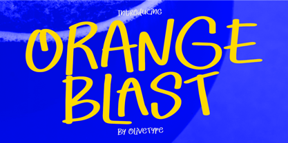 Experience the vibrant energy of Orange Blast, a playful handwritten display font that can make your designs pop! With its bold and dynamic strokes, this font is perfect for adding a playful yet professional touch to any project. Whether you’re designing logos, posters, or social media graphics, Orange Blast delivers a burst of creativity that captivates and engages your audience. Orange Blast features : Standard Latin Numbers, symbols, and punctuations Multilingual Support. Fully accessible without additional design software Simple Installations Works on PC & Mac Thank You.
 - Siren Song by Ana's Fonts,
$15.00 Siren Song is a textured marker font with rough edges and dozens of ligatures that give it a true handwritten feel. It includes both regular and slanted versions of the font, with bonus swashes that complement it nicely to achieve eye-catching designs. This handwritten font includes: A-Z, a-z, 0-9, accents, punctuation and symbols Tons of ligatures, for a more natural handwritten feel Contextual Alternates (for b, f, k and s) An extra set of 26 swashes (a-z) and 10 symbols (0-9)
 - Offenders Club by Maulana Creative,
$14.00 Offenders Club is a signature script and sans serif font. With thin felt tip stroke condensed sans serif Display, fun character with a bit of ligatures. To give you an extra creative work. Offenders Club font support multilingual more than 100+ language. This font is good for logo design, Social media, Movie Titles, Books Titles, a short text even a long text letter and good for your secondary text font with sans or serif. Make a stunning work with Offenders Club font. Cheers, MaulanaCreative
 - Bollolo by YuliusParyadi,
$11.00 Bollolo (Handwritten) is a fun and playful font. Bollolo name is made from bolo-bolo which is mean lets be friend. This font is readable, catchy, and easy to use. This font is suitable for quotes, logo designs, kids toys, story book, and many other design projects. Bollolo is includes: - full set uppercase and lowercase letter; - numerals; - multilingual support; - large number of punctuations; - ligatures. Please add this font as your favorite, hit like button, or follow me. I'll very happy for that and appreciated it.
 - Tendencies by HIRO.std,
$22.00 Tendencies – Graffiti Font This font describes culture, hip-hop, gravity, style, spray, road, travel, is easy to use and will bring good harmony when the letters are connected with alternate styles and paired with each other Tendencies has more than 489 Glyphs FEATURES - Ligatures - Stylistic Alternates - Uppercase - Lowercase - Numbering and Punctuations - Multilingual Support - Works on PC or Mac - Simple Installation USE Tendencies works great in any branding, board, logos, apparel, produk pagaking, magazines, label, films, stationary, poster, etc. and any projects that need street art taste.
 - P22 Platten Neu by IHOF,
$39.95 The P22 Platten font family has been revisited and expanded by designer Colin Kahn. Platten is based on lettering found in German fountain pen practice books from the 1920s (you may have seen the similar Speedball books in the US). This round tip pen lettering is comparable to the basic forms used in grammar school teaching alphabets, but with a few original characteristics. The Italic version has even more of these unusual features. Geometric and simple yet casual and timeless. Perfect for many uses.
 - Reflex by Sudtipos,
$29.00 Reflex update: Now in 18 styles and variable version. Reflex was designed as an alternative to many overused types found on the packaging of pop culture products. Taking its inspiration from Bauhaus design roots, even in its heavy weights it maintains a soft aesthetic that can transparently convey a message of newness and understanding, as well as clarity and evenness. The Reflex set comes with a wide range of linguistic support, at no extra charge, including characters for Central European, Cyrillic, Greek, Turkish and Baltic regions.
 - Kreak Display by Tebaltipis Studio,
$10.00 KREAK is a bold display font with 6 various styles for your needs. KREAK has uppercase, lowercase, alternative, and ligature letters. It’s fun, pop, vintage, and playful! WHAT'S YOU GET ? Unique Letterforms Works on PC & Mac Simple Installations Accessible in the Adobe Illustrator, Adobe Photoshop, Microsoft Word Fully accessible without additional design software. I really hope you'll get pleasure using Pagers font and it will be perfect addition to your font collection! Contact me with an inbox message If you have any question. Thank you! Happy Creating
 - Aeronaut by FaceType,
$39.00 A Neogothic typeface that radiates trendy ease and allows bicolor compositions. The decorative elements of Aeronaut, the swashes we call parachutes and the squiggly arrows of the upper-case characters soften the font’s Gothic appearance. It’s the reason why we labeled it a “Neogothic typeface that radiates trendy ease.” Make it as modern as you like it to be. · Aeronaut-Base combined with Aeronaut-Parachute allows bicolor compositions. Simply place them on top of each other to create playful, two-colored headlines. Aeronaut-Balloon is similar to Aeronaut-Parachute but offers even longer swashes. AeronautPlain is similar to Aeronaut-Base but works as a complete font on its own (as it contains all punctuation). We abandoned the swashes of the upper-case characters to keep the font pure and straight. · The glyphs of Aeronaut are derived from Textualis also known as Textura or Gothic Bookhand. Textualis represented the most calligraphic form of blackletter types and is today regarded as quintessentially Gothic. Aeronaut has been inspired by Kirchengotische Schrift, a font that can be found in a German font book from 1879 entitled Vorlegeblätter für Firmenschreiber. As its name suggests, it was designed for religious publications. · View other fonts from Georg Herold-Wildfellner: Sofa Serif | Sofa Sans | Mila Script Pro | Pinto | Supernett | Mr Moustache | Aeronaut | Ivory | Weingut · Language Report for Aeronaut / 175 languages supported: Abenaki, Afaan Oromo, Afar, Afrikaans, Albanian, Alsatian, Amis, Anuta, Aragonese, Aranese, Aromanian, Arrernte, Arvanitic, Asturian, Aymara, Basque, Bikol, Bislama, Bosnian, Breton, Cape Verdean, Catalan, Cebuano, Chamorro, Chavacano, Chickasaw, Cimbrian, Cofan, Corsican, Croatian, Czech, Danish, Dawan, Delaware, Dholuo, Drehu, Dutch, English, Estonian, Faroese, Fijian, Filipino, Finnish, Folkspraak, French, Frisian, Friulian, Galician, Genoese, German, Gooniyandi, Greenlandic, Guadeloupean, Gwichin, Haitian Creole, Han, Hiligaynon, Hopi, Hungarian, Icelandic, Ido, Ilocano, Indonesian, Interglossa, Interlingua, Irish, Istroromanian, Italian, Jamaican, Javanese, Jerriais, Kala Lagaw Ya, Kapampangan, Kaqchikel, Karelian, Kashubian, Kikongo, Kinyarwanda, Kiribati, Kirundi, Klingon, Ladin, Latin, Latino Sine, Lojban, Lombard, Low Saxon, Luxembourgish, Makhuwa, Malay, Manx, Marquesan, Meglenoromanian, Meriam Mir, Mohawk, Moldovan, Montagnais, Montenegrin, Murrinhpatha, Nagamese Creole, Ndebele, Neapolitan, Ngiyambaa, Norwegian, Novial, Occidental, Occitan, Oshiwambo, Ossetian, Palauan, Papiamento, Piedmontese, Polish, Portuguese, Potawatomi, Qeqchi, Quechua, Rarotongan, Romanian, Romansh, Rotokas, Sami Lule, Sami Southern, Samoan, Sango, Saramaccan, Sardinian, Scottish Gaelic, Serbian, Seri, Seychellois, Shawnee, Shona, Sicilian, Silesian, Slovak, Slovenian, Slovio, Somali, Sorbian Lower, Sorbian Upper, Sotho Northern, Sotho Southern, Spanish, Sranan, Sundanese, Swahili, Swazi, Swedish, Tagalog, Tetum, Tok Pisin, Tokelauan, Tshiluba, Tsonga, Tswana, Tumbuka, Tzotzil, Uzbek, Venetian, Vepsian, Volapuk, Voro, Walloon, Waraywaray, Warlpiri, Wayuu, Wikmungkan, Wiradjuri, Xhosa, Yapese, Yindjibarndi, Zapotec, Zulu, Zuni
 - Avaline Script by Kimmy Design,
$20.00 Avaline is a super smart script font that was 100% handmade. Inspired by hand lettering doodles, the font family combines a mischievous spirit and cheerful style. Its playful letterforms come in Light, Regular, Bold and Sketch, and it comes with tons of language support and fun alternatives. Packed with OpenType features, Avaline comes together to make a truly authentic hand script family package. Its imperfect hand-drawn style is utilized by contextual alternatives – giving each character 3 subtle variations as well as special styles that appear automatically based on where they appear in a line of text. Stylistic alternatives offer completely different styles for all capital and some lowercase letters. Swashes provide numerous flourish options for ascending & descending letters as well as characters that start or end text lines. Small caps and titling alternatives provide great secondary text options, converting the script letterforms to more proportional small cap ones. Avaline also comes with a massive set of extras, including catchwords, swashes & flourishes, arrows, borders, line breaks, laurels and frames. Together they make for a truly organic script font bundle. Avaline seriously comes with hundreds of alternative options, to see everything you can do with the family and to learn how to access them, please visit http://tinyurl.com/htwhetr
 - Sassoon Joined NORDIC by Sassoon-Williams,
$66.00 These fonts will join-as-you-type in your OpenType application as shown in the posters above. Choose Use Contextual Alternates option in your app to get basic recommended baseline joins for teaching. Additionally, use can choose from 7 Stylistic Sets of alternative letterforms that are so important for Teachers. Create ‘pen lifts’ anytime too! Fonts display unjoined by default on this website and are delivered that way - joining is controlled by your application. Designed for teaching children, these fonts enable progressive pupil exercises for a smooth transition between separate letters and the teaching of joined handwriting. Purchase a single font or the complete package contains the typeface ‘Sassoon Joined’ in a Regular weight only, for the 5 Nordic languages; Finnish (Suomi), Danish (Dansk), Icelandic (íslenska), Norwegian (Norsk), Swedish (Svenska), with English as the default language in all fonts. These fonts are for use with a compatible OpenType applications such as Word to get joined text. Or, enter " | " between letters for unjoined text. Free to download resources Stylistic Sets and how to access the alternative letters feature in these OpenType fonts Purchasers of this font package may use their Order Number to receive a free Copybook PDF by Rosemary Sassoon recommended for effective teaching
 - Strawberry Swirl by Krafted,
$10.00 Imagine a world filled with swirls of strawberry, pops of pink, and pure joy to go around for everyone... Are you trying to make an elegant, sweet, and stylish statement with your invitations, social media, website, or printed materials? Then grab some cotton candy, crack a smile, and get ready for a swirly day of wonders! Introducing Strawberry Swirl - A Modern Script Font. This gorgeous & stylish font can be used for a host of different content needs and projects. Use it for your headings, logos, business cards, printed quotes, invitations (wedding, birthday, engagement, etc.), packaging, resumes, and even your website or social media branding. Enchant & delight your audience, clients, or guests with this versatile, stylish, and elegant font. What you’ll get: - Multilingual & Ligature Support - Full sets of Punctuation and Numerals Compatible with: - Adobe Suite - Microsoft Office - KeyNote - Pages Software Requirements: The fonts that you’ll receive in the pack are widely supported by most software. In order to get the full functionality of the selection of standard ligatures (custom created letters) in the script font, any software that can read OpenType fonts will work. We hope you enjoy this font and that it makes your branding sparkle! Feel free to reach out to us if you’d like more information or if you have any concerns.
 - Idealista by Suitcase Type Foundry,
$39.00 Idealista directly responds to its other members, Nudista and Kulturista. It shares the same proportions and the same set of weights, yet it enriches the expression means of the two typefaces with new themes — the character set is smooth, even round, and it boasts a number of special details and perky moves. Most of all, Idealista relishes juicy magazine titles, typographic logotypes and propagandist posters. Unlike cold, technicist typefaces, it has great zest for life, so there's no wonder that in each of the letters, intuition wins over intellect. Owing to this, the text set in Idealista has a special voluptuous quality and unmistakable temperament — in a single typeface Idealista combines the best of sans-serif, slab-serif, as well as geometric and calligraphic construction principles, coming down to one impressive, expressive cocktail. Some letters have serifs, some do not, some are sharp, some are smooth, and all this results in the nice hip-hop beat of the line of text. The typeface has five weights and ten styles in total, so it can easily accommodate to the needs of complex texts, unlike many of its display counterparts. Idealista is valuable partner for the more text-suited Nudista and, if need for tiny sizes arises, to Kulturista as well.
 - Funtrude by Colllab Studio,
$9.00 "Hi there, thank you for passing by. Colllab Studio is here. We crafted best collection of typefaces in a variety of styles to keep you covered for any project that comes your way! When you have a project that needs a fun, unique font to make it pop, you can’t go wrong with Funtrude. Funtrude comes in three styles: Basic, Extrude, and Hole. Each style has more than 350 of the most beautiful glyphs you could ever dream of seeing. The Extrude style is great for titles, headings, and any other text where you want to use a bold font but don’t want it to be overly bold; the Basic style will work great for things like product names or subheadings; and the Hole style is perfect for anything else! Each individual style comes with its own swashes—so your fonts can look just as beautiful when they’re all capitalized as they do when they’re in normal text. What makes us so excited about this product is how much we love to use it ourselves. When we saw Funtrude for the first time, we couldn’t believe our eyes—it was everything we had ever wanted in a font, plus it was super affordable. GET IT NOW....!!! A Million Thanks Colllab Studio www.colllabstudio.com
 - Nautilus Text by Linotype,
$29.99Hellmut G. Bomm first released his Linotype Nautilus typeface in 1999. Ten years later, he updated and expanded the design. Now users have two additional families at their disposal: Nautilus Text and Nautilus Monoline. Nautilus Text bears more similarities to the original Linotype Nautilus. The letters shows a high degree of contrast in their stroke modulation. Bomm's intention was to create a clear, highly legible face. While the even strokes of most sans serif types eventually tire the eyes in long texts, the marked stroke contrast of Nautilus Text lends the face its legibility. The characters were drawn with a broad tipped pen. Like serif typefaces, the forms of Nautilus Text display a variety of elements. Its characters are narrow, with relatively large spaces between them. This helps create an overall open appearance, and allows a large quantity of text to fit into a small space. Nautilus Monoline's letters share the same overall proportions as Nautilus Text's. But as their name implies, they are monolinear. Their strokes do not have the calligraphic modulation that Nautilus Text features. This allows them to set another sort of headline, making Nautilus Monoline a refreshing display type choice to pair with body text set in Nautilus Text. - Nautilus Monoline by Linotype,
$29.99Hellmut G. Bomm first released his Linotype Nautilus typeface in 1999. Ten years later, he updated and expanded the design. Now users have two additional families at their disposal: Nautilus Text and Nautilus Monoline. Nautilus Text bears more similarities to the original Linotype Nautilus. The letters shows a high degree of contrast in their stroke modulation. Bomm's intention was to create a clear, highly legible face. While the even strokes of most sans serif types eventually tire the eyes in long texts, the marked stroke contrast of Nautilus Text lends the face its legibility. The characters were drawn with a broad tipped pen. Like serif typefaces, the forms of Nautilus Text display a variety of elements. Its characters are narrow, with relatively large spaces between them. This helps create an overall open appearance, and allows a large quantity of text to fit into a small space. Nautilus Monoline's letters share the same overall proportions as Nautilus Text's. But as their name implies, they are monolinear. Their strokes do not have the calligraphic modulation that Nautilus Text features. This allows them to set another sort of headline, making Nautilus Monoline a refreshing display type choice to pair with body text set in Nautilus Text. - Erotica by Lián Types,
$49.00 “A picture is worth a thousand words” and here, that’s more than true. Take a look at Erotica’s Booklet; Erotica’s Poster Design and Erotica’s User’s Guide before reading below. THE STYLES The difference between Pro and Std styles is the quantity of glyphs. Therefore, Pro styles include all the decorative alternates and ligatures while Std styles are a reduced version of Pro ones. Big and Small styles were thought for better printing results. While Big is recommended to be printed in big sizes, Small may be printed in tiny sizes and will still show its hairlines well. INTRODUCTION I have always wondered if the circle could ever be considered as an imperfect shape. Thousands of years have passed and we still consider circles as synonyms of infinite beauty. Some believe that there is something intrinsically “divine” that could be found in them. Sensuality is many times related to perfectly shaped strong curves, exuberant forms and a big contrasts. Erotica is a font created with this in mind. THE PROCESS This story begins one fine day of March in 2012. I was looking for something new. Something which would express the deep love I feel regarding calligraphy in a new way. At that time, I was practicing a lot of roundhand, testing and feeling different kinds of nibs; hearing the sometimes sharp, sometimes soft, sound of them sliding on the paper. This kind of calligraphy has some really strict rules: An even pattern of repetition is required, so you have to be absolutely aware of the pressure of the flexible pen; and of the distance between characters. Also, learning copperplate can be really useful to understand about proportion in letters and how a minimum change of it can drastically affect the look of the word and text. Many times I would forget about type-design and I would let myself go(1): Nothing like making the pen dance when adding some accolades above and below the written word. Once something is mastered, you are able to break some rules. At least, that’s my philosophy. (2) After some research, I found that the world was in need of a really sexy yet formal copperplate. (3) I started Erotica with the idea of taking some rules of this style to the extreme. Some characters were drawn with a pencil first because what I had in mind was impossible to be made with a pen. (4) Finding a graceful way to combine really thick thicks with really thin hairlines with satisfactory results demanded months of tough work: The embryo of Erotica was a lot more bolder than now and had a shorter x-height. Changing proportions of Erotica was crucial for its final look. The taller it became the sexier it looked. Like women again? The result is a font filled with tons of alternates which can make the user think he/she is the actual designer of the word/phrase due to the huge amount of possibilities when choosing glyphs. To make Erotica work well in small sizes too, I designed Erotica Small which can be printed in tiny sizes without any problems. For a more elegant purpose, I designed Erotica Inline, with exactly the same features you can find in the other styles. After finishing these styles, I needed a partner for Erotica. Inspired again in some old calligraphic books I found that Bickham used to accompany his wonderful scripts with some ornated roman caps. Erotica Capitals follows the essentials of those capitals and can be used with or without its alternates to accompany Erotica. In 2013, Erotica received a Certificate of Excellence in Type Design in the 59th TDC Type Directors Club Typeface Design Competition. Meet Erotica, beauty and elegance guaranteed. Notes (1) It is supossed that I'm a typographer rather than a calligrapher, but the truth is that I'm in the middle. Being a graphic designer makes me a little stubborn sometimes. But, I found that the more you don't think of type rules, the more graceful and lively pieces of calligraphy can be done. (2) “Know the forms well before you attempt to make them” used to say E. A. Lupfer, a master of this kind of script a century ago. And I would add “And once you know them, it’s time to fly...” (3) Some script fonts by my compatriots Sabrina Lopez, Ramiro Espinoza and Alejandro Paul deserve a mention here because of their undeniable beauty. The fact that many great copperplate fonts come from Argentina makes me feel really proud. Take a look at: Parfumerie, Medusa, Burgues, Poem and Bellisima. (4) Some calligraphers, graphic and type designer experimented in this field in the mid-to-late 20th century and made a really playful style out of it: Letters show a lot of personality and sometimes they seem drawn rather than written. I want to express my sincere admiration to the fantastic Herb Lubalin, and his friends Tony DiSpigna, Tom Carnase, and of course my fellow countryman Ricardo Rousselot. All of them, amazing.
 - Klainy by Identity Letters,
$29.00 An unadorned Grotesque with a refreshingly personal touch. If “Grotesque” mainly means “industrial, mechanical, anonymous typeface” to you, Klainy might redefine your image of the genre. Yes, it’s a Grotesque—but with a contemporary look and a lot of personality. Klainy’s apertures are more closed at the top and more open at the bottom, creating an informal rhythm that sets Klainy apart: a confident, optimistic voice with a clean appearance. Terminals are subtly back-bent: these quaint “hooks” make Klainy a bit more personal, a bit friendlier. (You can find them in the a, c, f, and r.) Just like its old-style Grotesque ancestors, Klainy is optimized for display sizes and short texts. There, its unobtrusive quirks can be wholly appreciated. However, the familiar Grotesque appearance makes sure that the typeface is comfortable to read in smaller sizes, as well. Use Klainy whenever a basically classic sans-serif typeface with a modern and individual twist is called for. This font family comes in eight weights ranging from Thin to Black, each with a matching italic style. More than 500 glyphs and a bunch of Open Type Features make it a reliable companion for all of your projects. You can fine-tune the flavor of Klainy with Stylistic Alternates such as a one-story a and a two-story g. Their simple construction blends perfectly with the design concept of this typeface. Klainy is a seasoned blue-collar worker that surprises you with wit and team spirit. It’ll be a great addition to your font library.
 - Corleone by FontMesa,
$- Corleone was originally designed as a two font family in 2001 and offered for free. This year we've expanded the font family to twelve fonts including small caps and italics. While the new Corleone has been greatly refined and is a much more professional quality font we've decided to still offer the original two fonts for free. Corleone is the perfect font for t-shirts and other merch, the new small caps make this font stand out and bring attention to whatever you use it on. Corleone is the font you can't refuse. Tech notes: Corleone was designed after a famous movie logo in the 1970's with a title name that sounds a lot like The Grandfather if you know what I mean. The movies had three installments, my original font was patterned after the logo for the third movie, the new Corleone Primo and Secondo versions are patterned after the logos of the first two movies. The differences are noticed mostly in the lowercase letters. One thing you will not find in this font family is the puppeteer or puppet master hand because it's been registered as a separate trademark of Paramount Pictures. If you're using an application that works in layers then you'll be interested in the four extra over score glyphs included in some of the versions of this font. Sorry, MS Word does not work in layers so this feature will not work in MS Word. When you open up the glyph map in Adobe Creative Suite you should see the over score glyphs when you scroll down to the bottom. These extra over score glyphs allow you to extend the top line of a single capital letter, with four different lengths you should be able to mix and match to achieve the length that you desire. When using the over score glyphs it's best to divide your word or headline into separate text objects, the cap being one object and the remaining letters being the second. If you try using the over score glyphs on a single text object then with each over score that you add the text after it will get pushed down the line.
 - VTC-FreehandTattooOne - Personal use only

- VTC-BadEnglischOne - Personal use only


