10,000 search results
(0.029 seconds)
- Zigas Signature by Aminmario Studio,
$20.00 Zigas Signature is a stylish typeface that has natural hand write looks. It gives a vintage and sophisticated vibe to your design project. Zigas Signature is perfect for branding projects, logo, wedding designs, social media posts, advertisements, product packaging, product designs, label, photography, watermark, invitation, stationery and any projects that need handwriting taste.
 - Nouveau Spurred JNL by Jeff Levine,
$29.00 The hand lettered title on the 1915 sheet music for “On the Banks of the Amazon” was the design model for Nouveau Spurred JNL, which is available in both regular and oblique versions. This gently spurred Art Nouveau Roman is a beautiful choice for headlines, book titles and other retro-influenced projects.
 - True Message by Attractype,
$15.00 True Message is a handwritten brush font that created by skilled hands to make this font look stylish and elegant. This font is suitable for branding projects, logo, wedding designs, visiting cards, social media posts, advertisements, product packaging, product designs, label, photography, watermark, invitation, stationery and any projects that need unique handwriting taste.
 - Broughtes by Sulthan Studio,
$10.00 Broughtes is a beautiful, hand-drawn font duo. Script and sans that create a casual, yet stylish combination. This font would be suitable for logos, branding projects, homeware designs, product packaging, mugs, quotes, posters, shopping bags, logos, t-shirts, book covers, business cards, invitation cards, congratulations. cards, and all your other beautiful projects. Contains a full two set of lowercase and uppercase letters, punctuation, numbers, and multilingual support. This font also includes Ligatures and Swashes
 - OYReem arabic by Omartype,
$14.00 Introducing a brand new typeface, meticulously crafted by your hands. Inspired by the rich culture and heritage of the Arabic language, this typeface embodies your unique vision and artistic expression. It combines modern techniques with a deep understanding of the language's aesthetics. This typeface has been developed using advanced techniques to ensure excellent clarity and readability. Every shape, line, and detail has been carefully studied to strike a perfect balance between elegance and legibility
 - Garden Song by Ana's Fonts,
$15.00 Garden Song is a quirky handmade serif font family with ornaments. Garden Song includes a serif font, with handmade italics and ornaments. Use Garden Song in designs such as postcards and notes, posters, logotypes, social media posts, branding and packaging. Garden Song includes: Garden Song: a serif font with a cute hand lettering feel and swashes for the caps, with matching Garden Song Italic, and Garden Song Ornaments: a set of 26 ornaments
 - Cheddar Gothic by Adam Ladd,
$25.00 Cheddar Gothic is a hand drawn, 8 style typeface family including Sans, Serif, Slab, and Stencil with Italics that all include 92 matching catchwords and icons to add variety and interest. Great for a variety of uses: packaging, posters, t-shirts, stamps, branding, headlines, etc. An all caps family, simply switch between upper and lowercase for alternates. Lowercase offers a classic, condensed look; uppercase adds a little more character, including extended crossbars and sliced terminals.
 - Affair by Sudtipos,
$99.00 Type designers are crazy people. Not crazy in the sense that they think we are Napoleon, but in the sense that the sky can be falling, wars tearing the world apart, disasters splitting the very ground we walk on, plagues circling continents to pick victims randomly, yet we will still perform our ever optimistic task of making some little spot of the world more appealing to the human eye. We ought to be proud of ourselves, I believe. Optimism is hard to come by these days. Regardless of our own personal reasons for doing what we do, the very thing we do is in itself an act of optimism and belief in the inherent beauty that exists within humanity. As recently as ten years ago, I wouldn't have been able to choose the amazing obscure profession I now have, wouldn't have been able to be humbled by the history that falls into my hands and slides in front of my eyes every day, wouldn't have been able to live and work across previously impenetrable cultural lines as I do now, and wouldn't have been able to raise my glass of Malbeck wine to toast every type designer who was before me, is with me, and will be after me. As recently as ten years ago, I wouldn't have been able to mean these words as I wrote them: It’s a small world. Yes, it is a small world, and a wonderfully complex one too. With so much information drowning our senses by the minute, it has become difficult to find clear meaning in almost anything. Something throughout the day is bound to make us feel even smaller in this small world. Most of us find comfort in a routine. Some of us find extended families. But in the end we are all Eleanor Rigbys, lonely on the inside and waiting for a miracle to come. If a miracle can make the world small, another one can perhaps give us meaning. And sometimes a miracle happens for a split second, then gets buried until a crazy type designer finds it. I was on my honeymoon in New York City when I first stumbled upon the letters that eventually started this Affair. A simple, content tourist walking down the streets formerly unknown to me except through pop music and film references. Browsing the shops of the city that made Bob Dylan, Lou Reed, and a thousand other artists. Trying to chase away the tourist mentality, wondering what it would be like to actually live in the city of a billion tiny lights. Tourists don't go to libraries in foreign cities. So I walked into one. Two hours later I wasn't in New York anymore. I wasn't anywhere substantial. I was the crazy type designer at the apex of insanity. La La Land, alphabet heaven, curves and twirls and loops and swashes, ribbons and bows and naked letters. I'm probably not the very first person on this planet to be seduced into starting an Affair while on his honeymoon, but it is something to tease my better half about once in a while. To this day I can't decide if I actually found the worn book, or if the book itself called for me. Its spine was nothing special, sitting on a shelf, tightly flanked by similar spines on either side. Yet it was the only one I picked off that shelf. And I looked at only one page in it before walking to the photocopier and cheating it with an Argentine coin, since I didn't have the American quarter it wanted. That was the beginning. I am now writing this after the Affair is over. And it was an Affair to remember, to pull a phrase. Right now, long after I have drawn and digitized and tested this alphabet, and long after I saw what some of this generation’s type designers saw in it, I have the luxury to speculate on what Affair really is, what made me begin and finish it, what cultural expressions it has, and so on. But in all honesty it wasn't like that. Much like in my Ministry Script experience, I was a driven man, a lover walking the ledge, an infatuated student following the instructions of his teacher while seeing her as a perfect angel. I am not exaggerating when I say that the letters themselves told me how to extend them. I was exploited by an alphabet, and it felt great. Unlike my experience with Ministry Script, where the objective was to push the technology to its limits, this Affair felt like the most natural and casual sequence of processions in the world – my hand following the grid, the grid following what my hand had already done – a circle of creation contained in one square computer cell, then doing it all over again. By contrast, it was the lousiest feeling in the world when I finally reached the conclusion that the Affair was done. What would I do now? Would any commitment I make from now on constitute a betrayal of these past precious months? I'm largely over all that now, of course. I like to think I'm a better man now because of the experience. Affair is an enormous, intricately calligraphic OpenType font based on a 9x9 photocopy of a page from a 1950s lettering book. In any calligraphic font, the global parameters for developing the characters are usually quite volatile and hard to pin down, but in this case it was particularly difficult because the photocopy was too gray and the letters were of different sizes, very intertwined and scan-impossible. So finishing the first few characters in order to establish the global rhythm was quite a long process, after which the work became a unique soothing, numbing routine by which I will always remember this Affair. The result of all the work, at least to the eyes of this crazy designer, is 1950s American lettering with a very Argentine wrapper. My Affair is infused with the spirit of filete, dulce de leche, yerba mate, and Carlos Gardel. Upon finishing the font I was fortunate enough that a few of my colleagues, great type designers and probably much saner than I am, agreed to show me how they envision my Affair in action. The beauty they showed me makes me feel small and yearn for the world to be even smaller now – at least small enough so that my international colleagues and I can meet and exchange stories over a good parrilla. These people, whose kindness is very deserving of my gratitude, and whose beautiful art is very deserving of your appreciation, are in no particular order: Corey Holms, Mariano Lopez Hiriart, Xavier Dupré, Alejandro Ros, Rebecca Alaccari, Laura Meseguer, Neil Summerour, Eduardo Manso, and the Doma group. You can see how they envisioned using Affair in the section of this booklet entitled A Foreign Affair. The rest of this booklet contains all the obligatory technical details that should come with a font this massive. I hope this Affair can bring you as much peace and satisfaction as it brought me, and I hope it can help your imagination soar like mine did when I was doing my duty for beauty.
 - Kochay by Grontype,
$14.00 Kochay is an unique bold and blurred hand lettering monoline font. this font is outstanding with its sharp and bold style that makes kochay font is more tough and aesthetic. This font equipped with extra ligatures and alternates. Kochay is perfect for branding, text header, t-shirt design, logotype and other stunning graphic design. Features: Basic Latin Glyphs Multilingual Numeral and Punctuation Standard Ligatures Stylistic Alternates Thankyou for picking up this font, hope you enjoy it. Regard. Grontype
 - Kumo Sans by EchadType,
$10.00 Kumo Sans is a clear and comprehensible font stylized to mimic marker pen handwriting. The idea was to interpret swift and negligent hand movement in a distinct and easy to read familiar glyph silhouette. Family comes in three weights and italic slant option. Shadow version with outline and shadow effect is perfect for short catchy phrases, brand names and headlines use. Font contains Latin diacritics, Hebrew cursive writing, Bitcoin, Indian Rupee, New Israeli Shekel symbols, fractions etc.
 - Baby Algutta by IM Studio,
$19.00 Baby Algutta is a modern, handwritten and modern calligraphy font. The shape is modern and unique and the writing style is very natural. The Baby Algutta features a varied baseline, smooth lines, beautiful glyphs, and amazing alternatives. Hand-drawn design elements allow you to create many beautiful typographic designs in an instant such as branding, web and editorial design, prints, crafts, quotes, It's great for logos, wedding invitations, romantic cards, labels, packaging, name spelling, and more. Thank you.
 - High Billion by Haksen,
$15.00 Introduce Excellent combination modern font duo in High Billion the stylish modern and natural fonts combination with casual chic flair. These are perfect for branding, wedding invites and cards, and more option for your requirement.High Billion include two font styles with full set of natural hand draw for script and elegant with all uppercase letters for sans serif. Numerals, a large range of punctuation and ligatures giving realistic hand-lettered style. In order to use the beautiful ligatures for script also all uppercase for sans serif, you need a program that supports OpenType features such as Adobe Illustrator CS, Adobe Photoshop CC, Adobe Indesign and Corel Draw. Thanks and have a great day :) Haksen
 - HiH Firmin Didot by HiH,
$10.00 Before Bodoni, there was Didot. With the publication by Francois Ambroise Didot of Paris in 1784 of his prospectus for Tasso’s La Gerusalemme Liberata, the rococo typographical style of Fournier de Jeune was replaced with a spartan, neo-classical style that John Baskerville pioneered. The typeface Didot used for this work was of Didot’s own creation and is considered by both G. Dowding and P. Meggs to be the first modern face. Three years later, Bodoni of Parma is using a very similar face. Just as Bodoni’s typeface evolved over time, so did that of the Didot family. The eldest son of Francois Ambroise Didot, Pierre, ran the printing office; and Firmin ran the typefoundry. Pierre used the flattened, wove paper, again pioneered by Baskerville, to permit a more accurate impression and allow the use of more delicate letterforms. Firmin took full advantage of the improved paper by further refining the typeface introduced by his father. The printing of Racine’s Oeuvres in 1801 (seen in our gallery image #2) shows the symbiotic results of their efforts, especially in the marked increase in the sharpness of the serifs when compared to their owns works of only six years earlier. It has been suggested that one reason Bodoni achieved greater popularity than Didot is the thinner hairlines of Didot were more fragile when cast in metal type and thus more expensive for printers to use than Bodoni. This ceased to be a problem with the advent of phototypesetting, opening the door for a renewed interest in the work of the Didot family and especially that of Firmin Didot. Although further refinements in the Didot typeface were to come (notably the lower case ‘g’ shown in 1819), we have chosen 1801 as the nominal basis for our presentation of HiH Firmin Didot. We like the thick-thin circumflex that replaced the evenly-stroked version of 1795, possible only with the flatter wove paper. We like the unusual coat-hanger cedilla. We like the organic, leaf-like tail of the ‘Q.’ We like the strange, little number ‘2’ and the wonderfully assertive ‘4.’ And we like the distinctive and delightful awkwardness of the double-v (w). Please note that we have provided alternative versions of the upper and lower case w that are slightly more conventional than the original designs. Personally, I find the moderns (often called Didones) hard on the eyes in extended blocks of text. That does not stop me from enjoying their cold, crisp clarity. They represent the Age of Reason and the power of man’s intellect, while reflecting also its limitations. In the title pages set by Bodoni, Bulmer and Didot, I see the spare beauty of a winter landscape. That appeals to a New Englander like myself. Another aspect that appeals to me is setting a page in HiH Firmin Didot and watching people try to figure out what typeface it is. It looks a lot like Bodoni, but it isn't!
 - Mr Eaves Modern by Emigre,
$59.00 Mr Eaves is the often requested and finally finished sans-serif companion to Mrs Eaves, one of Emigre’s classic typeface designs. Created by Zuzana Licko, this 2009 addition to the Emigre Type Library expands the versatility of the original Mrs Eaves with two complimentary families: Mr Eaves Sans and Mr Eaves Modern. Mr Eaves was based on the proportions of Mrs Eaves, but Licko took some liberty with its design. One of the main concerns was to avoid creating a typeface that looked like it simply had its serifs cut off. And while it matches Mrs Eaves in weight, color, and armature, Mr Eaves stands as its own typeface with many unique characteristics. The Sans version relates most directly to the original serif version, noticeably in the roman lower case letters a, e, and g, as well as in subtle details such as the angled lead in strokes, the counter forms of the b, d, p, and q, and the flared leg of the capital R, the tail of the Q. The distinctly loose-fitting letter spacing of Mrs Eaves was applied also to the Sans version. This, together with generous built-in line spacing due to a small x-height and extended ascenders and descenders, renders the same kind of lightness and airiness when setting text that is so characteristic of Mrs Eaves. Deviations from the original Mrs Eaves are evident in the overall decrease of contrast, as well as in details such as the flag and tail of the f and j, and the finial of the t, which were shortened to maintain a cleaner, sans serif look. And the lower case c had to be balanced out differently after it lost its top ball terminal. And with the loss of serifs, Mr Eaves set width is slightly narrower. Mr Eaves Italic also carries over many forms from its Mrs Eaves model, most notably the v, w, and z, which are unusually flamboyant for a sans italic design. It also utilizes lead in and terminal tails that are reminiscent of the serif italic. The biggest departure here is the width of the characters. The extra narrow gauge and delicate features seemed more appropriate for the Serif than the Sans. To allow for a comfortable fit, Mr Eaves Italic has a more robust design and wider character width. Meanwhile, the Modern family provides an overall less humanistic look, with simpler and more geometric-looking shapes, most noticeably in the squared-off terminals and symmetric lower case counters. This family has moved furthest from its roots, yet still contains some of Mrs Eaves’ DNA. The Modern Italic is free of tails, and overall the Modern exhibits more repetition of forms, projecting a cleaner look. This provides stronger differentiation from the serif version whenever a more contrasting look is desired. Each version (Sans and Modern) contains its own set of alternates providing unique options for applications such as headlines, word logos, letterheads, pull quotes, and other short text settings. Both the Sans and Modern come in six weights. The simpler forms of a sans-serif provide the opportunity of more weights than do serif letter forms, which are more complex in structure, making it difficult to accommodate additional weight without distortions. Regular and Bold match the original Mrs Eaves weights, while the Heavy provides an additional weight for extra emphasis.
 - Casual Crew by Learning Kiddos,
$18.99 A fresh friendly font with upper and lower cases inspired by the Casual Style of Sign Painters. It features well-designed curves, four versatile styles (including Regular, Bold, Halftones and Outlines), latin language support and sexy built-in signs and catchwords. Suitable for titles, Branding, package design & more. If you are looking for a fine Hand-drawn font Family with great curves, Casual Crew is what you want.
 - Avangard by Larin Type Co,
$12.00 Avangard - a new hand drawn script font in 2 styles. These fonts are ideal for branding and will decorate any of your projects. You can also use them to create a logo or use for small businesses, t-shirts, book covers, stationery, marketing, blogs, magazines, and more. Also I made alternates, ligatures and swash, with their help you can make your project more beautiful and unique. Enjoy using!
 - Kembara Cinta Outline by Fargun Studio,
$12.00 Kembara Cinta Outline is a new, fresh, and modern hand lettered font, decorative characters and a dancing baseline! So beautiful on handicrafts, greeting cards, branding materials, business cards, quotes, posters, and more. Features: Unique ligatures Stylistic sets Basic Latin A-Z and a-z Numbers International Symbols included Punctuation Need help? If you need help or advice, please contact me by e-mail "fargunstudio@gmail.com" Thank you for your purchase
 - Rosewind by Hanifarifinsyah,
$15.00 Rosewind is an elegant, full-featured script font with tons of alternate characters and OpenType features. The name Rosewind is inspired by the rose behind the house that is often blown off. It is a hand-lettered style and is particularly well-suited to invitations, branding, and editorial design. The OpenType features can be very easily accessed by using OpenType-savvy programs such as Adobe Illustrator and Adobe InDesign.
 - Hello Smile by Gatype,
$14.00 You can get the latest Hello Smile original handwritten simple font model now! With an updated hand calligraphy model with special glyphs that have been given a combination of fantasy and handwritten ink. This font will look beautiful on any design, Wedding designs, branding materials, blog titles, quotes and invitations, and business cards. OpenType includes: Alternative Style Set style Ligature SWASH Thank you so much for viewing and Enjoying it.
 - Navila Mandres by madeDeduk,
$16.00 Navila Mandres is a realistic hand drawn font come with alternative and ligature and will be perfect for book, title branding, product packaging, invitation, quotes, label, poster, logo etc. Feature Uppercase & Lowercase Number & Symbol International Glyphs Multilingual support Alternative Ligature Thanks so much for checking out my shop and feel free to drop us a message any time and follow my shop for upcoming updates Hope you enjoy it.
 - Rough Stone by Epiclinez,
$18.00 Rough Stone is a lovely and trendy hand brush font. It is a good choice for creating eye-catching logos, brandings, and quotes. This Font is supporting more than 66 languages, which include: Afrikaans Albanian Catalan Danish Dutch English Estonian Finnish French German Italian Norwegian Portuguese Spanish Swedish Zulu, and more. You will get : Basic Latin A-Z & a-z. Numbers, symbols, and punctuations Multilingual Support. Accented Characters : ÀÁÂÃÄÅÆÇÈÉÊËÌÍÎÏÑÒÓÔÕÖØŒŠÙÚÛÜŸÝŽàáâãäåæçèéêëìíîïñòóôõöøœšùúûüýÿžß Thank you
 - Letteris by Hanzel Space,
$25.00 Introducing of our new product the name is Letteris, the bold script font inspired by Bold hand lettering style, Letteris font is good for branding logotype, headline, book cover, Flyer, Packaging, poster, t-shirt design and any more. Letteris have many alternative character and have opentype features like a stylistic alternatice, stylistic set, ligature and swash so you can mix and match like a you want. MULTiLINGUAL ACCENT šŸÀÁÂÃÄÅÆÇÈÉÊËÌÍÎÏÐÑÒÓÔÕÖØÙÚÛÜÝßàáâãäåæçèéêëìíîïðñòóôõöøùúûüýÿ
 - Backrush by Garisman Studio,
$20.00 Backrush combines attractive curves with a fresh urban edge; delivering a stylish hand-brushed look which is guaranteed to add an eye-catching appeal to your logo designs, brand imagery, handwritten quotes, product packaging, merchandise and social media posts.
 - Mr Eaves Sans by Emigre,
$59.00 Mr Eaves is the sans-serif companion to Mrs Eaves, one of Emigre’s classic typeface designs. Created by Zuzana Licko, this 2009 addition to the Emigre Type Library expands the versatility of the original Mrs Eaves with two complementary families: Mr Eaves Sans and Mr Eaves Modern. Mr Eaves was based on the proportions of Mrs Eaves, but Licko took some liberty with its design. One of the main concerns was to avoid creating a typeface that looked like it simply had its serifs cut off. And while it matches Mrs Eaves in weight, color, and armature, Mr Eaves stands as its own typeface with many unique characteristics. The Sans version relates most directly to the original serif version, noticeably in the roman lower case letters a, e, and g, as well as in subtle details such as the angled lead in strokes, the counter forms of the b, d, p, and q, and the flared leg of the capital R, the tail of the Q. The distinctly loose-fitting letter spacing of Mrs Eaves was applied also to the Sans version. This, together with generous built-in line spacing due to a small x-height and extended ascenders and descenders, renders the same kind of lightness and airiness when setting text that is so characteristic of Mrs Eaves. Deviations from the original Mrs Eaves are evident in the overall decrease of contrast, as well as in details such as the flag and tail of the f and j, and the finial of the t, which were shortened to maintain a cleaner, sans serif look. And the lower case c had to be balanced out differently after it lost its top ball terminal. And with the loss of serifs, Mr Eaves set width is slightly narrower. Mr Eaves Italic also carries over many forms from its Mrs Eaves model, most notably the v, w, and z, which are unusually flamboyant for a sans italic design. It also utilizes lead in and terminal tails that are reminiscent of the serif italic. The biggest departure here is the width of the characters. The extra narrow gauge and delicate features seemed more appropriate for the Serif than the Sans. To allow for a comfortable fit, Mr Eaves Italic has a more robust design and wider character width. Meanwhile, the Modern family provides an overall less humanistic look, with simpler and more geometric-looking shapes, most noticeably in the squared-off terminals and symmetric lower case counters. This family has moved furthest from its roots, yet still contains some of Mrs Eaves' DNA. The Modern Italic is free of tails, and overall the Modern exhibits more repetition of forms, projecting a cleaner look. This provides stronger differentiation from the serif version whenever a more contrasting look is desired. Each version (Sans and Modern) contains its own set of alternates providing unique options for applications such as headlines, word logos, letterheads, pull quotes, and other short text settings. Both the Sans and Modern come in three weights. The simpler forms of a sans-serif provide the opportunity of more weights than do serif letter forms, which are more complex in structure, making it difficult to accommodate additional weight without distortions. Regular and Bold match the original Mrs Eaves weights, while the Heavy provides an additional weight for extra emphasis.
 - Playing Fake by Gassstype,
$23.00 Hello Everyone, Introduce our new collection,Playing Fake is Bad Display Font.this is a Strong Style and classy style, inspired by famous logos of Technology and brands that have very strong characteristics, this font is great for your creative projects such as watermark on photography, and perfect for logos & branding, invitation,advertisements,product designs, stationery, wedding designs,label ,product packaging, special events or anything that need handwritting taste. Playing Fake has charming, authentic and relaxed characteristic more natural look to your text with a more natural look to your text.
 - Sandglow by Burntilldead,
$14.00 Sandglow is a fancy hand lettered script typeface with a clear style, good mood, and dramatic movement. It allows you to create beautiful hand-made typography in an instant. It’s suitable for headlines, logotype, editorial design, branding, letterhead, poster, apparel design, product packaging, label or anything that need handlettering style. Comes with many variations on each character, including uppercase, lowercase, numerals & punctuation, stylistic styles, ligatures, discretionary ligatures, and titling. You will also discover extras swash added to give that finishing touch to your texts. Available in OTF and TTF format, Support Opentype features, Multilingual languages and PUA unencoded.
 - Magehand by Typia Nesia,
$28.00 Magehand an excellent font for modern hand lettering logo or headline/display designs. Suitable for any design needs : logo, branding, modern advertising design, logos, poster quote, book / cover Title, editorial design, card, custom mug, pillow, t-shirts, and any hand-lettered needs. WHAT YOU GET - Magehand (.ttf + .otf) comes with upper and lowercase Standard Characters, Punctuation, Numerals. And other Glyphs variation of the OpenType features such as Standard Ligature, Discretionary Ligatures, Stylistic Alternate and Stylistic Set (ss01 - ss18). - PUA Encode Characters, fully accessible without additional design software. - Includes a range of multilingual characters. Typia Nesia Std
 - You Blockhead by Comicraft,
$29.00 Why you little Numbskull! Nitwit! Visigoth! Dimwitted Jackass! Interplanetary Goat! Highwayman! Sea-gherkin! Jellyfish! KnowNothing! Filibuster! Cachinnating cockatoo! Artichoke! Two-timing Troglodyte! Bald-headed budgerigar! Odd-toed Ungulate! Autocrat! Carpetseller! Duck-billed platypus! Dunderheaded coconut! Ectoplasm! Steamroller! Iconoclast! Kleptomaniac! Raggle taggle ruminant! Orangutang! Rapscallion! Ten thousand thundering typhoons! Whippersnapper! Billions of billious barbecued blue blistering barnacles -- you-you... YOU BLOCKHEAD! With its sturdy stance and over 100 friendly interlocking letter pairs, this font was made famous in the logo and branding for the video game CLASH OF CLANS, and infamous in the logo and branding for the Image comic THE BEEF.
 - Ardiland by Dora Typefoundry,
$17.00 Introducing, Ardiland - a stylish serif with beautiful binders and substitutes! Ardiland is a modern serif font to apply to many graphic or editorial design projects. A classy, unique high contrast, and light binding style for your upcoming projects. for feminine logo signs, fashion & editorial design heads, branding projects, Apparel Branding, packaging, magazine titles, advertisements, T-shirts, postcards and other special occasions. Here's what's included: Alternatives & Ligatures Numbers & punctuation Character with accent Support Multiple Languages PUA encoded This type of family has become the work of true love, making it as easy and fun as possible. I really hope you enjoy it! Thank you
 - SK Fushimi by Shriftovik,
$32.00 SK Fushimi is an accidental experimental font inspired by modern Japanese culture and aesthetics. Its futuristic geometric shapes, on the one hand, follow the spirit of the time of the land of the rising sun, and on the other hand, they make homage to technology. Like Japanese culture, the SK Fushimi font plastic fits perfectly into many areas of graphic design, supporting and complementing any graphic solutions. In addition, this font supports a multilingual set of more than fifty characters, including Cyrillic and Latin alphabets. Unusual in all respects, the font is perfect for the same unusual design or will make it so!
 - Billie Olivia by Youngtype,
$18.00 Billie Olivia - Handwritten Typefaces is a hand brushed font created with a brush and ink, bold and irregular baseline. Contains a complete set of lowercase, uppercase, Alternates, ligatures, punctuation, numbers, and multilingual support. This font ideal for use in watercolor design or lettering style bold hand, such as blog header, posters, wedding elements, t-shirt, apparel, cover books, business cards, greeting cards, branding, merchandise, invitations and handmade quotes and more. How to access all alternative characters, using Windows Character Map with Photoshop: https://www.youtube.com/watch?v=Go9vacoYmBw How to access all alternative characters using Adobe Illustrator: https://www.youtube.com/watch?v=XzwjMkbB-wQ Thank you!
 - Dabu by Gunjan,
$42.00 Dabu is a hand paint inspired high contrast decorative display typeface. With unique five ornamental layers which makes Dabu very presentable and eye catchy. Dabu has identical styles that very well goes with logo design, headline, creative sign boards, poster design, social media, fashion brand, beauty product branding, large print and screen. How to use Dabu ? - Select Dabu-Regular. - Copy the same one more time. - Select and choose any one Dabu Depth, Dabu Heart, Dabu Flower, Dabu Diamond, Dabu Square. - Select both and Aline. - Bingo!! :) No animals harmed in the making of this typeface Dabu is supportive to Adobe illustrator, Adobe Photoshop, Adobe In-design and All Adobe.
 - Luisina by Keristyper Studio,
$14.00 Luisina Script is a handwritten font reflecting calligraphy lettering. This font is inspired by hand-written, pop culture and urban culture. It includes numbers, punctuation, alternates, ligatures, and supports other languages. It is perfect for adding a hand-lettered style to your stationery, headlines, branding, and wedding invitation. Luisina Font multilingual support: Afrikaans, Albanian, Catalan, Danish, Dutch, English, Estonian, French, Finnish, German, Icelandic, Indonesian, Italian, Malay, Norwegian, Portuguese, Spanish, Swedish, Zulu, and many more. What’s Included : Standard & Multilingual glyphs Ligature Works on PC & Mac Simple installations Accessible in Adobe Illustrator, Adobe Photoshop, Adobe InDesign, and even work on Microsoft Word. Hope you enjoy our font!
 - Beehive by Matt Grey Design,
$29.00 Beehive is an Art Deco inspired display typeface with a unique slant, each word fits below one another neatly, which is perfect for creating stylised titling and logos. Beehive is made to look like a vintage, art deco styled typeface, the font is ideal for branding, posters, band artwork or album covers and endless other uses. Great for titling or medium sized text, made to be as big as possible because of the thin lines.
 - Solar Power by Surplus Type Co,
$16.00 Solar Power is an organic handwritten brush font that's perfect for your brand content. This font features two sets of uppercase characters so you can achieve a natural hand drawn feel with your design. Solar Power is ideal for marketing & advertising content for brands, creating quotes & content for social media, web designs and lots more. Multilingual characters included!
 - Analogue Pro by Ingo,
$42.00 very traditional forms strongly slanted italic consistant proportions extraordinary ligatures swashes alternate letters alternate figures lower case l with a hooked “foot” Believe it or not, there are hardly any sans serif fonts in which the lower case letter l also has the hooked form of an l. Instead, we readers have to constantly distinguish whether we are seeing an uppercase I or a lower case l — just take a look at the word “Illinois”... The ingoFont Analogue was developed for exactly this reason. The intent: To create a pretty much »ordinary«, even classical font with its most striking characteristic being the inclusion of the “crooked l.” As a model, I used the »mother of all sans serifs«, Akzidenz Grotesk from Berthold, with its beginnings going back to the 19th century. Analogue is so to say a new interpretation of Akzidenz Grotesk from ingoFonts. All characters — following the model — have been newly designed. And if you want to emphasize the shape of the hooked foot even more, you can also activate the alternate styles for d, h, m, n (Style Set 1). Conversely, the alternate a somewhat softens the “hooked” impression (Style Set 2). The slanted versions — it isn’t truly a real cursive font — are noticeably stronger with 13° than the italics in comparable fonts, and were given a round e with a mind of its own which distinguishes itself considerably compared to the upright characters in the overall appearance of the font. More modern and formal solutions in detail were chosen for some of the characters, for example the M was given lightly slanted sides; the a reflects the curves of the s; the “feet” of a, l and t match; the flared legs of K and R became a “foot”, too. General proportions were carried over almost completely with no changes from Akzidenz Grotesk as well as the slanted trimming on the open forms of a, c, e, s; in comparison, C, G and S were given straight endings. Analogue contains many ligatures, even discretional ligatures, plus proportional, old style as well as tabular figures. All in all, at first sight Analogue brings back memories of the charm of its well-known predecessor; and yet, many small differences give Analogue an unmistakable certain something...
 - Yolanda Love Script by Letterara,
$12.00 Yolanda Love Script is a stylish script font that features a varying baseline, smooth line, modern and with a depth love. For those of you who are need a touch of love and modernity for your designs or branding, it can be used for various purposes such as headings, wedding, invitation, signature, logos, branding, t-shirt, letterhead, signage, lable, news, posters, badges etc. A wide range of swashes (a-z), alternates (A-Z), and ligature are included so that you can give your logo or name a custom, hand-calligraphy look.
 - Altarimoon by Keristyper Studio,
$14.00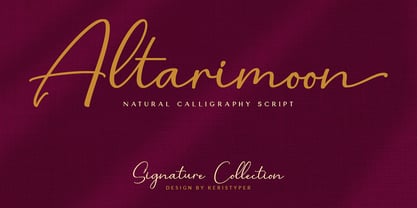 Introducing Altarimoon, a free-flowing, modern hand-drawn script. With a spontaneous feel and lots of alternates, it's a perfect typeface for your branding projects or anywhere you need a fresh hand-drawn look. Altarimoon Font multilingual support: Afrikaans, Albanian, Catalan, Danish, Dutch, English, Estonian, French, Finnish, German, Icelandic, Indonesian, Italian, Malay, Norwegian, Portuguese, Spanish, Swedish, Zulu, and many more. What’s Included : Standard & Multilingual glyphs Ligature Works on PC & Mac Simple installations Accessible in Adobe Illustrator, Adobe Photoshop, Adobe InDesign, and even work on Microsoft Word. Hope you enjoy our font!
 - Ghania Roses by Akrtype Studio,
$19.00 Ghania Roses Script is a lovely script that brings a luxury feel. Ghania Roses comes with 460+ glyphs, The natural handwritten script is suitable for you who needs a typeface for headlines, logotypes, apparel, wedding invitations, Valentines day, branding, packaging, advertising, watermark, and more. Ghania Roses was created to look as close to authentic hand-lettering as possible. Not only will you find a range of stylized ligatures/alternates, but you’ll have much fun mixing and matching the upper and lowercase letters to give each word a truly personalized, hand-lettered vibe.
 - Milton Keynes by Dumadi,
$20.00 Milton Keynes is a modern thick font that comes from hand scratches so it is great for branding logos, t-shirt designs, posters, business cards, typography, newspapers, other design projects and many other media that can be manipulated with this font.