10,000 search results
(0.033 seconds)
- Yanyont by Jipatype,
$27.00 Yanyont แบบอักษรซานเซอริฟอเนกประสงค์และแห่งอนาคตที่สมบูรณ์แบบสำหรับอุตสาหกรรมยานยนต์ ด้วยฐานและ x-height ที่แบนราบ Yanyont มีรูปลักษณ์แห่งเทคโนโลยีอันโฉบเฉี่ยวที่ช่วยดึงดูดสายตาได้อย่างแน่นอน แบบอักษรได้รับการออกแบบด้วยรูปลักษณ์แห่งอนาคตแบบไซไฟที่เพิ่มความไฮเทคให้กับทุกโปรเจ็คของคุณ Yanyont มีน้ำหนักให้เลือกถึง 9 น้ำหนัก ทั้งแบบตัวตรงและแบบตัวเอียง รวมเป็น 18 ลักษณะให้ได้เลือกใช้ ซึ่งการมีตัวเลือกที่หลากหลายช่วยสร้างความเป็นอันหนึ่งอันเดียวกันในการสื่อทั้งหมดของคุณ ตั้งแต่โบรชัวร์และโปสเตอร์ไปจนถึงเว็บไซต์และแคมเปญโฆษณา นอกจากนี้ Yanyont ยังรองรับหลายภาษาและมาพร้อมกับคุณสมบัติ opentype เช่น Small cap หรือ tabular แบบอักษรนี้เหมาะสำหรับบริษัทที่มีการเข้าถึงระหว่างประเทศ ให้แบรนด์ยานยนต์ของคุณดูล้ำสมัยกับ Yanyont Introducing Yanyont, a versatile and futuristic sans-serif typeface that is perfect for the automotive industry. With its flat baseline and x-height, Yanyont has a sleek and technical look that is sure to catch the eye. The typeface is designed with a sci-fi futuristic look that adds a high-tech edge to any project. Yanyont offers 9 weight options in both upright and italic styles, for a total of 18 unique styles to choose from. This provides a wide range of options for creating a cohesive look across all your branding materials, from brochures and posters to websites and advertising campaigns. Additionally, Yanyont supports multiple languages and come with opentype features such as small cap or tabular. This typeface is perfect for companies with international reach. Give your automotive brand a cutting-edge look with Yanyont.
 - Million Boomer by Colllab Studio,
$15.00 Presenting Million Boomer! A Smooth Handwritten Font. This font made with the perfect combination of each character. You can combine with Extra to get a unique combination. It looks original and can be used for all your project needs. Each glyph has its own uniqueness and when meeting with others will provide dynamic and pleasing proximity. This font can be used at any time and in any project. You can see in the presentation picture above, Million Boomer looks stylish and unique on design projects. So, Million Boomer can't wait to give its touch to all your design projects such as quotes, poster design, personal branding, promotional materials, website, logotype, product packaging, etc. WHAT'S INCLUDED? 1. Million Boomer • It comes with uppercase, lowercase, ligatures, numeral, punctuation, symbols, alternate, and Standard Latin Multilingual Support (Afrikaans, Albanian, Catalan, Danish, Dutch, English, French, German, Icelandic, Indonesian, Italian, Malay, Norwegian, Portuguese, Spanisch, Swedish, Zulu, and More). 2. Extra Dingbat • Included 17 Dingbats. You can feature all with typing c_1 until c_17 A Million Thanks Colllab Studio
 - Just Moving by Colllab Studio,
$15.00 Presenting Just Moving! A Chic Handwritten Font with natural strokes. This font made with the perfect combination of each character. You can combine with Extra to get a unique combination. It looks original and can be used for all your project needs. Each glyph has its own uniqueness and when meeting with others will provide dynamic and pleasing proximity. This font can be used at any time and in any project. You can see in the presentation picture above, Just Moving looks unique and so flow style on design projects. So, Just Moving can't wait to give its touch to all your design projects such as quotes, poster design, personal branding, promotional materials, website, logotype, product packaging, etc. WHAT'S INCLUDED? Just Moving • It comes with uppercase, lowercase, ligatures, numeral, punctuation, symbols, Many Ligatures, Alternates, and Standard Latin Multilingual Support (Afrikaans, Albanian, Catalan, Danish, Dutch, English, French, German, Icelandic, Indonesian, Italian, Malay, Norwegian, Portuguese, Spanisch, Swedish, Zulu, and More). Extra Swashes • Included 10 Underline Swashes. You can feature all with typing c_1 until c_10 A Million Thanks Colllab Studio
 - Magus by Artisticandunique,
$30.00 Magus - Serif font family - 6 Styles - Multilingual supports. Magus is a stylistic and powerful serif font family with different alternative character designs. You will have the opportunity to enrich the content of your projects with alternative characters.This font comes with Multilingual options, 6 styles and rich glyph options. It has a stylist structure that can be effective in the development of your projects. While you can easily use standard characters in plain texts, you can also create aesthetic styles with alternative characters. According to the purpose of use in the typographic compositions you will create; you can also create stylish looks for your titles in books or magazines in creating a brand identity. This font provides flexibility in all your projects with the alternatives it offers. Especially for editorials, magazines, books, branding, identity, packaging, logo design, web design, headlines, movie titles etc. If you're looking for a font with stylistic alternatives, Magus serif font might meet your needs. With this font you can create your unique designs. Have a good time.
 - Goodrich by Hendra Pratama,
$15.00 WARNING! Roughed version is quite heavy to open. Highly recommended to install the font without previewing it first. GOODRICH come in 2 different styles, with same character; Bold & Strong, and can evoke a different emotions. It comes in both clean and rough styles in only Uppercase Latin characters. When choosing a font, it’s important to consider the visual theme of your design. A clean bold fonts can lend a more stronger tone to your design, making it a great choice for Logo or Title. On the other hand, a textured fonts can lend a more natural printed-looks, making them perfect for designing 70s-80s themed parties. It can be used for various design purposes ; Posters, Logos, Packaging, Books or Movie Titles. In summary, these fonts are versatile and can add a unique look to any design project. If you want to add a touch of nostalgia and elegance to your designs, these fonts were timeless asset. With plenty of vintage and retro design resources available, it’s easy to find the perfect ideas for your next project.
 - Caslon #540 by ITC,
$29.00The Englishman William Caslon punchcut many roman, italic, and non-Latin typefaces from 1720 until his death in 1766. At that time most types were being imported to England from Dutch sources, so Caslon was influenced by the characteristics of Dutch types. He did, however, achieve a level of craft that enabled his recognition as the first great English punchcutter. Caslon's roman became so popular that it was known as the script of kings, although on the other side of the political spectrum (and the ocean), the Americans used it for their Declaration of Independence in 1776. The original Caslon specimen sheets and punches have long provided a fertile source for the range of types bearing his name. Identifying characteristics of most Caslons include a cap A with a scooped-out apex; a cap C with two full serifs; and in the italic, a swashed lowercase v and w. Caslon's types have achieved legendary status among printers and typographers, and are considered safe, solid, and dependable. A few of the many interpretations from the early twentieth century were true to the source, as well as strong enough to last into the digital era. These include two from the American Type Founders Company, Caslon 540 and the slightly heavier Caslon #3. Both fonts are relatively wide, and come complete with small caps, Old style Figures, and italics. Caslon Open Face first appeared in 1915 from the Barnhart Bros & Spindler Foundry, and is not anything like the true Caslon types despite the name. It is intended exclusively for titles, headlines and initials, and looks elegant whether used with the more authentic Caslon types or by itself. - LiebeDoni by LiebeFonts,
$29.90 LiebeDoni is pure Italian art. A contemporary nod to Italian typographic heritage, LiebeDoni’s warm and friendly style is perfect for—literally—bold headlines and impressive invitations. Take a seat on LiebeDoni’s Vespa and enjoy the sweet curves of dolce far niente. But don’t let the relaxed hand-crafted appearance fool you: You’re dealing with a solid quality typeface that has received painstaking attention to detail. Round like the Colosseum, some lines are as colloquial as the Tower of Pisa—but all this with almost Teutonic obsession for technical perfection. Feature-wise, we went the full quattro stagioni: Variations and alternatives for many letters, swashy initials and swirly ligatures—plus language support that goes way beyond English and Italiano. Double-o ligature, anyone? Two different www ligatures? Check. (Please make sure your software supports OpenType if you wish to use the advanced features.) Get both the outline and the filled version and go crazy on creative layering and endless possibilities. Each font contains over 600 glyphs and both contain the full character set. Make a bold move to italy—treat yourself with this font. If you like LiebeDoni, you may also like its perfectly matching sisters LiebeErika and LiebeOrnaments—or any of our other 100% compatible LiebeFonts.
 - Neuarc by CozyFonts,
$25.00 Neuarc Font Family This is the 20th font family of CozyFonts Foundry, established 10 years ago in 2012 with the release of Aladdin Bold. Neuarc is based loosely on arcs and curves, hence it’s naming. As shown in one of the font posters that serves to showcase this font, a collage of rough sketches is displayed as the poster’s background. These hand drawn pencil drawings were worked and reworked and The final drawings were scanned and built in Adobe Illustrator and transferred to glyph windows, glyph by glyph, in Fontlab 8. The 5 styles, so far, are reminisscent of The Art Deco Era of Design between the 1030s and 1950s. Neuarc also has it’s own footprint with several characters that stand out, eg. A, 8, &, B, ?, $, 5, w, x, a, c, e, etc. giving the reason for the ’Neu’ in the naming. These letterforms & Numbers work extremely well in monograms. Each styles has it’s own personality. From the ultra chic Light style to the dominant cool Bold style, this family maintains a uniform legibility at small to large sizes. Meant primarily for display uses, Neuarc works well for posters, logos, headlines, packaging, branding, signage for a myriad of applications. The Neuarc Deco style font will work well in titles and numbers of any application.
 - Guadalupe by Rodrigo Navarro Bolado,
$32.00 Article to appear on the font family page: According to the Catholic faith, a well known náhuatl story called "Nican Mopohua" (translated as "Here it's narrate") about the Marianas apparitions on the Tepeyac's hill, to the north of the actual Mexico City. After four apparitions, La Virgen de Guadalupe (LVG) told Juan Diego (JD) that he must introduce himself to the first Bishop of Mexico. JD took in his "ayate" some roses (that aren't natives to Mexico's barren territories) and when he dropped them in front of the bishop, the image of LVG appeared in front of him with indigenous features. I’ve worked a lot in this font that appears to came out of nowhere, just like the image of LVG itself, the fact is that I started first sketching some flowers, because I wanted to do something related to this mexican story, so, taking some features from this flowers I started sketching some letters, for example “r” and “i” and the counter forms for some letters like “a” and “o” (that I didn’t use by the way) and the punctuation marks, all inspired by this leaf forms. Lighter weight coming soon! Hope you like it. Any comments: rodrigonabo@gmail.com
 - Frescito by Mans Greback,
$49.00 Frescito is a modern sans-serif typeface that embodies a fresh, cool, and street-smart aesthetic. Designed to be both balanced and versatile, its clear and legible monoline style is designed for branding and advertising in editorial and digital design. The Frescito font family comes in the five classic weights: Thin, Light, Medium, Bold, and Black, along with a Variable font for ultimate flexibility and customization, as well as Italics. Inspired by the energetic spirit of the city and its vibration, Mans Greback set out to create a typeface that would stand out against vivid moment; a type that would work in a traditional café just as well as for contemporary merchandise. The result is a font that combines the best of both worlds: an air of freshness and modernity with an unpretentious, timeless and classy appeal. The font is built with advanced OpenType functionality and has a guaranteed top-notch quality, containing stylistic and contextual alternates, ligatures, and more features; all to give you full control and customizability. It has extensive lingual support, covering all Latin-based languages, from Northern Europe to South Africa, from America to South-East Asia. It contains all characters and symbols you'll ever need, including all punctuation and numbers.
 - Christmas Cypher by Mans Greback,
$79.00 Christmas Cypher is a street Xmas font. It merges the rebellious spirit of street art with the nostalgic cheer of the holiday season. This graffiti-inspired font embodies a dash of urban flair, perfect for designs that aim to stand out. Its bold strokes and sharp attitude, infused with a whimsical twist of Christmas elements, make it ideal for youthful and energetic designs. The font dances between traditional cheer and contemporary cool, bringing a fresh perspective to the visual language of Christmas. Use the included Icon font to make Christmas symbols. Use parenthesis symbols () [] {} to make stars around any word. Example: {Hiphop}[Style] The font is built with advanced OpenType functionality and guaranteed top-notch quality, containing stylistic and contextual alternates, ligatures and more automatic and manual features; all to give you full control and customizability. It has extensive lingual support, covering all Latin-based languages, from North Europa to South Africa, from America to South-East Asia. It contains all characters and symbols you'll ever need, including all punctuation and numbers. Designed by Mans Greback, a typographer known for his attention to detail and passion for blending tradition with modern design trends, Christmas Cypher is more than a font – it's a declaration of celebration and creativity.
 - Dream Within A Dream by Storm Type Foundry,
$55.00 Dream Within a Dream was the title of exhibition of Czech art inspired by the work of Edgar Allan Poe curated by Otto M Urban and Veronika Hulíková. Three dozens of artists exhibited their works in the Czech National Gallery in 2020. The cataloguje was printed with the use of the present typeface. Artists took significant interest in Poe's literary oeuvre only after the writer's untimely death. This was mainly thanks to the poet Charles Baudelaire who translated Poe's works to French. As early as in the second half of the 19th century, prominent artists such as Edouard Manet, Odilon Redon, James Ensor and Gustave Doré created remarkable artworks inspired by Poe. Although the first Czech translations of Poe's woks date to the 1850s, artworks inspired by them only appeared several decades later, at the turn on the 20th century. Poe's poems and short stories inspired František Kupka and soon after him, Josef Váchal, Jan Konůpek and František Kobliha. Alfred Kubin, a German artist born in Bohemia, made illustrations for the German translation of Poe's collected stories. Later on, Alén Diviš and František Tichý created further Poe-inspired artworks. Poe was a source of inspiration for Jan Švankmajer and more recently, František Štorm and Jaroslav Róna.
 - La Coffee by Creativetacos,
$12.00 Introducing La Coffee Font, a sleek, cool and professional handmade font that is perfect for adding a unique touch to your branding, logos, or your instagram quotes. It includes uppercase, lowercase, numbers, symbols and with Latin extended character support, it is versatile for a variety of creative endeavors, while exuding a rustic charm. La Coffee will look great on invitations, packaging, slideshows, logos, headlines, lettering, posters, branding, inspirational quotes, headlines, magazine layouts, website designs, advertising, invitations, packaging designs, book covers and any other creative endeavour. What's Inside the Product? - Weight of the Font: Regular The Font Kit comes packed with: - Big Letters (Uppercase) - Small Letters (Lowercase) - Numbers & Symbols - Multilingual Support Here's a sneak peek at the characters supported: - All the letters from A-Z (uppercase and lowercase) - All the numbers from 0-9 - All these special characters - !"#$%&'()*+,-./:;=?@[]^_`{|}~ ¡¢£¤¥§¨©ª«®°±²³´¶¸¹º»¿ˆˇ˜–—‘’‚‛“”„†‡•…‰‹›⁄€™− - And a range of international characters like á â à ä å ã æ ç é ê è ë í î ì ï ı ñ ó ô ò ö õ ø œ š ß ú û ù ü ý ÿ ž  À Ä Å Ã Æ Ç É Ê È Ë Í Î Ì Ï Ñ Ó Ô Ò Ö Õ Ø Œ Š Û Ù Ü Ý Ÿ
 - KG Two Is Better Than One by Kimberly Geswein,
$5.00 This font was created in honor of my husband for our 12th wedding anniversary. 14 years ago, I met this tall, skinny guy from Indiana in the lobby of a hotel in Hong Kong. We talked. The next day, we had lunch together. And that night we had dinner together. And the next day. And the next. We met just before my 19th birthday, and on my birthday he took me to the top of Victoria Peak, where we looked out over the city of Hong Kong- such a beautiful place to begin a lifetime of love! We spent 4 months together in Hong Kong, falling in love with each other and with the beautiful city we were privileged to call home for that short time. We married the next year. We've lived in Indiana, Texas, China, Kentucky, and Florida over those 12 years of marriage and have welcomed 2 daughters into our lives. I know beyond a shadow of a doubt that he completes my life in a way I didn't know was possible. And I know that I'm blessed beyond words to have a supportive, wonderful, encouraging husband who is also a loving, involved, caring dad to our daughters. This font is for you, Keith!
 - Ideal Gothic by Storm Type Foundry,
$44.00At the turn of the 20th century monolinear alphabets were often despised for their dullness. Typographers, therefore, took great pains to breathe some kind of individuality into the monotonous sans-serif scheme. They started with subtle differentiation in the thickness of vertical and horizontal strokes and finished by improving details. By this they arrived at a more decorative appearance of the type face which thus became more regardful of the eye of the bourgeoisie. Ideal Gothic is no exception. It is characterized by a correct stiffness which will improve the morals of every idea printed by this type face. The awkward curves of the italics are a little suggestive of openwork iron products or the bent iron of the decorative little railings in a Prague park. The so-called "hidden" and, furthermore, curved serifs complete the inconspicuous "charm" of this type face. All its above-mentioned features, however, suddenly turn into advantages when we need to design a magazine, a brochure or an annual report, in short whenever illustrations dominate. It is not by accident that the basic design of "Ideal Gothic" has such a light tonal value - it competes neither with fine pencil sketches, nor with sentimental landscapes. It is very suitable for business cards and corporate identity graphics. - Go To Town JNL by Jeff Levine,
$29.00 Vintage sheet music for a song from the 1941 animated feature "Mr. Bug Goes to Town" featured a casual, hand-lettered inline type style on its cover page. Recreated as the digital font Go to Town JNL, this design is presented in all the imperfect glory of pen and ink lettering. Go to Town JNL is available in the regular inline version as well as a solid version. A bit about the cartoon: The project was created by the legendary Fleischer Studios in Miami, Florida (they had relocated from New York City), after they could not obtain the rights to adapt Maurice Maeterlinck's "The Life of the Bee". Beset by the expenses of relocating to Florida, growing production costs on the full-length feature cartoon and other problems; mid-way through the making of "Mr. Bug Goes to Town" the Fleischer brothers were forced to sell their studio to their distributor (Paramount Pictures) in order to continue in operation. It was released on Dec. 5, 1941 - just two days before the Japanese attack on Pearl Harbor. The release [and subsequent re-release by Paramount as "Hoppity Goes to Town"] was a disappointing failure, earning [as late as 1946] only $241,000 of the initial cost of $713,511 it took to make the film.
 - Costa Std by Typofonderie,
$59.00 A mediterranean style sanserif in 4 styles The original idea of Costa was to create a contemporary mediterranean typeface style. Costa is a synthesis of the purity, as found on Greek capitals, and softness, found in Renaissance scripts. First thing was the design concept that take its roots on the Chancery script. Such writing style appeared during Italian Renaissance. Later few typefaces have been developed from such cursive models. Today most serifed typeface italic take their roots on such triangular structure we can find on gylphs like the n, p, or d. The Costa capitals remains close to pure sanserif models when the lowercases features an ending serif on many letters like the a, n, d, etc. This ending serif being more like a minimal brush effect, creating a visual contrast and referencing the exoticness of the typeface. Knowing that the Costa typeface family began life in the 90s as a bespoke typeface for Costa Crociere, an Italian cruise company — it suddenly makes sense and explains well why Jean François Porchez focused so much on Italian Chancery mixed to a certain exotism. The curvy-pointed terminals of the Costa n can obviously get find on other glyphs, such as the ending of the e, c and some capitals. So, the sanserif looks more soft and appealing, without to be to pudgy or spineless. The general effect, when set for text, remains a sanserif, even not like Rotis Semiserif. Costa is definitly not a classical typeface, or serif typeface which convey past, tradition, historicism as Garamond does beautifully. Because of the Costa crocieres original needs, Costa typeface was designed to be appropriate for any uses. Anytime you’re looking for good mood, qualitative effects, informal tone, cool atmosphere without to be unconvential or blowzy, Costa will convey to your design the required chic and nice atmosphere, from large headlines sizes, brands, to small text sizes. It’s a legible typeface, never boring. A style without neutrality which doesn’t fit comfortably into any typeface classification! Does it proves the novelty of its design and guarantees as well as its originality? Its up to you to be convinced. Barcelona trip Originally not planned, this need appeared because of a trip to Barcelona at the time of the project, where Jean François was giving a lecture. He wanted to pay an homage to that invitation to create something special. So, he designed during his flight some variations of the Spanish Ch, following ideas developed by the Argentinian type designer Rubén Fontana for his typeface called Fontana ND (published by the Barcelona foundry Bauer). Then, he presented during his lecture variations and asked to the audience which design fit the best to their language. They selected the design you can find in the fonts today. Read more about pairing Costa Type Directors Club 2000 Typographica: Our Favourite Typefaces 2004
 - Frinkle Brush by Letteralle,
$19.00 Introducing Frinkle Brush! Frinkle Brush is a readable and finely balanced handwritten font. With consistent and natural detail, Frinkle Brush also come with underline swash (You can access it by typing s1-s3). Frinkle Brush can be placed in many design needs such as, merch, branding, packaging, social media, events, and many more. Thank You!
 - Chickenz by Typogama,
$19.00 The Chickenz dingbat font is a series of symbols based inspired by the wild west, from cowboy silhouettes and playing cards to a series of office shapes that can be used in any corporate layout. These designs were conceived as part of the Jackazz family but can also be mixed with any other typefaces.
 - Antiquettes by Fantasy Inspirations,
$8.00With my dingbats and your favorite software, you can create elegant web graphics in minutes! All these fonts were created with the web designer in mind. Each font consists on 26 original shapes with endless possibilities: virtual jewelry, buttons, framing, interfaces, etc. For examples of what you can do with these fonts: Click Now! - Magic by Misprinted Type,
$15.00 Magic is a vintage wide serif distressed stamp-like font with 4 styles to choose from. Ideal for a project that need that rough look and you can always combine styles to customize your type. With 3 styles (+lowercases) all combined into a single font. Styles can be accessed in opentype features “stylistic alternates & Swashes".
 - Hypherin by ahweproject,
$9.00 Hypherin is a gorgeous and bold handwritten font, crafted to give your headlines and logotype projects a stylish touch. This font reads as strong, confident, and dynamic and can add tons of nostalgic character to your designs. Hypherin is PUA encoded which means you can access all of the beautiful glyphs and swashes with ease!
 - Smilena by Melvastype,
$32.00 Smilena is a stunning brush script font that has a modern touch. It can be used in various design projects, including package design. Smilena offers alternate characters, such as initial and final forms for lowercase letters, as well as swash characters. These features can be conveniently utilized in design software that supports Opentype capabilities.
 - Boredom by Invasi Studio,
$17.00 You want to add more raw for your design. Introduction our new Handwritten Font. A Boredom Font with realistic scribbles pen styles. This set can make your design more realistic. Includes 2 set alternate variations for each A-Z letter (both uppercase and lowercase). So you can create a combination of whatever you want!
 - Hudsson Romano by Letterafandi Studio,
$16.00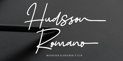 Hudsson Romano is a simple and quirky looking Signature handwritten font. It has a classy, elegant, and modern look that you can use for logos, branding, invitations, stationery, wedding designs, social media posts, and much more! This font is PUA encoded, which means you can access all of the glyphs and swashes with ease!
 - Balburdia by Matosrs,
$19.00 Balburdia is a font based in the street art letters of Brazil. Inspired by "pixação" from the brazilian cities of Rio de Janeiro and São Paulo, Balburdia can translate the street culture and add a little extra to your designs. Balburdia can be used for art, branding or fashion itens that contain this theme.
 - Dubidam by NamelaType,
$19.00 Dubidam is A Cherfull semi-slab Typeface. Has a playful but firm style in each stem. Come with many feature; Stylistic alternate, Standard & Discretionary ligatures, multilingual characters, that can be accessed with opentype feature. Dubidam can be use for branding project, product packaging, advertising, quotes and where ever you need fun and playful design.
 - Britonix by Owl king project,
$47.00 Inspired by monospaced letters, Britonix is designed with normal spacing but seems mono. Uppercase Britonix can be used for headlines or displays giving it a minimalist, professional yet modern look. Britonix also carries 20 weights including italic style, minimalistic lowercase letters can also work well for long sentences or paragraphs. happy exploring with Britonix.
 - Algeron by Jolicia Type,
$19.00 Algeron is a thin serif font with an ethnic feel and a modern twist, many alternates choices so that you can combine according to your style. Give your text some elegance and personality and also you can use discretionary ligatures curves add a unique style Algeron include file : - Full uppercase, lowercase, numbers, punctuation + multilingual letters.
 - The Marmars by Eotype,
$14.00 The Marmars is display typeface that has bold characteristics. This font can give your designs a playful and friendly impression. You can use this font for retro, vintage and urban designs. This font comes with alternative style and ligature features which are suitable for various projects such as logos, product labels, posters and many more.
 - Antiques by Fantasy Inspirations,
$9.75With my dingbats and your favorite software, you can create elegant web graphics in minutes! All these fonts were created with the web designer in mind. Each font consists on 26 original shapes with endless possibilities: virtual jewelry, buttons, framing, interfaces, etc. For examples of what you can do with these fonts: Click Now! - Jewelry by Fantasy Inspirations,
$8.00With my dingbats and your favorite software, you can create elegant web graphics in minutes! All these fonts were created with the web designer in mind. Each font consists on 26 original shapes with endless possibilities: virtual jewelry, buttons, framing, interfaces, etc. For examples of what you can do with these fonts: Click Now! - Warilah by Letterafandi Studio,
$16.00 Warilah is a modern handwritten with characters that dance along the baseline. It can be used for various purposes such as logos, wedding invitations, headings, t-shirts, letterhead, signage, labels, news, posters, badges and so much more. This font is PUA encoded which means you can access all of the glyphs and swashes with ease!
 - Brolink by Sarid Ezra,
$13.00 Brolink is a wide bold sans based font with unique lowercase that will make your design looks sci-fi and modern. You can use this font for any purpose, especially to make logotype. You can mix and match the uppercase and lowercase to make your logo more readable. This font also comes with outline style!
 - Lintang Serif by Rillatype,
$17.00 Introducing, Lintang. Lintang is a display serif font that is firm yet elegant and unique because of its character and swash alternatives. Lintang is furnished with many character and swash alternatives that you can choose from making this font feel special and stand out. by using this font you can create elegant designs very easily.
 - TOCinRings by Ingrimayne Type,
$14.95 TOCinRings has letters in circles. The letters are from a typewriter font called TiredOfCourier. The typeface contains characters that can add color to letters. There are two ways to do this. One uses layers and the other a combination of characters, some with zero width. This pdf file explains the how this can be done.
 - Mechaniclove by ahweproject,
$14.00 Mechaniclove is a gorgeous and bold handwritten font, crafted to give your headlines and logotype projects a retro touch. This font reads as strong, confident, and dynamic and can add tons of nostalgic character to your designs. This font is PUA encoded which means you can access all of the glyphs and swashes with ease!
 - DF Ko by Dutchfonts,
$33.00 The Ko family was developed for the text posters at the Holland Festival in 1997, based on the filling of a lettering stencil with different pen thicknesses. Ko Heavy and the Ko KAP were the first weights; the family was completed in 2002 with a Ko Light, a second Ko KAP and two italics.
 - Creamer by Creativework Studio,
$14.00 Creamer is a gorgeous and bold handwritten font, crafted to give your headlines and logotype projects a stylish touch. This font reads as strong, confident, and dynamic and can add tons of nostalgic character to your designs. Creamer is PUA encoded which means you can access all of the glyphs and swashes with ease.
 - John Sans by Storm Type Foundry,
$49.00 The idea of a brand-new grotesk is certainly rather foolish – there are already lots of these typefaces in the world and, quite simply, nothing is more beautiful than the original Gill. The sans-serif chapter of typography is now closed by hundreds of technically perfect imitations of Syntax and Frutiger, which are, however, for the most part based on the cool din-aesthetics. The only chance, when looking for inspiration, is to go very far... A grotesk does not afford such a variety as a serif typeface, it is dull and can soon tire the eye. This is why books are not set in sans serif faces. A grotesk is, however, always welcome for expressing different degrees of emphasis, for headings, marginal notes, captions, registers, in short for any service accompaniment of a book, including its titlings. We also often come across a text in which we want to distinguish the individual speaking or writing persons by the use of different typefaces. The condition is that such grotesk should blend in perfectly with the proportions, colour and above all with the expression of the basic, serif typeface. In the area of non-fiction typography, what we appreciate in sans-serif typefaces is that they are clamorous in inscriptions and economic in the setting. John Sans is to be a modest servant and at the same time an original loudspeaker; it wishes to inhabit libraries of educated persons and to shout from billboards. A year ago we completed the transcription of the typefaces of John Baskerville, whose heritage still stands out vividly in our memory. Baskerville cleverly incorporated certain constructional elements in the design of the individual letters of his typeface. These elements include above all the alternation of softand sharp stroke endings. The frequency of these endings in the text and their rhythm produce a balanced impression. The anchoring of the letters on the surface varies and they do not look monotonous when they are read. We attempted to use these tricks also in the creation of a sans-serif typeface. Except that, if we wished to create a genuine “Baroque grotesk”, all the decorativeness of the original would have to be repeated, which would result in a parody. On the contrary, to achieve a mere contrast with the soft Baskerville it is sufficient to choose any other hard grotesk and not to take a great deal of time over designing a new one. Between these two extremes, we chose a path starting with the construction of an almost monolinear skeleton, to which the elements of Baskerville were carefully attached. After many tests of the text, however, some of the flourishes had to be removed again. Anything that is superfluous or ornamental is against the substance of a grotesk typeface. The monolinear character can be impinged upon in those places where any consistency would become a burden. The fine shading and softening is for the benefit of both legibility and aesthetics. The more marked incisions of all crotches are a characteristic feature of this typeface, especially in the bold designs. The colour of the Text, Medium and Bold designs is commensurate with their serif counterparts. The White and X-Black designs already exceed the framework of book graphics and are suitable for use in advertisements and magazines. The original concept of the italics copying faithfully Baskerville’s morphology turned out to be a blind alley. This design would restrict the independent use of the grotesk typeface. We, therefore, began to model the new italics only after the completion of the upright designs. The features which these new italics and Baskerville have in common are the angle of the slope and the softened sloped strokes of the lower case letters. There are also certain reminiscences in the details (K, k). More complicated are the signs & and @, in the case of which regard is paid to distinguishing, in the design, the upright, sloped @ small caps forms. The one-storey lower-case g and the absence of a descender in the lower-case f contributes to the open and simple expression of the design. Also the inclusion of non-aligning figures in the basic designs and of aligning figures in small caps serves the purpose of harmonization of the sans-serif families with the serif families. Non-aligning figures link up better with lower-case letters in the text. If John Sans looks like many other modern typefaces, it is just as well. It certainly is not to the detriment of a Latin typeface as a means of communication, if different typographers in different places of the world arrive in different ways at a similar result.