10,000 search results
(0.048 seconds)
- College Game JNL by Jeff Levine,
$29.00 The hand lettered credits for the 1940 horror film “The Invisible Woman” look more like they would show up in a movie about a college football game. A bold, condensed slab serif type design, it’s perfect for many sports-themed graphics projects. The digital version has been aptly named College Game JNL, and is available in both regular and oblique versions.
 - Suomi Sans by Suomi,
$25.00 There are many sans serif typefaces with calligraphic tendencies, but Suomi Sans is different: the outside forms are fairly basic, fairly narrow sans serif style, but the counter forms have a strong calligraphic flair with accented upper left and lower right hand corners. With six weights in Roman and italic, Suomi Sans works well for both headline and text use.
 - Bandera Display Cyrillic by AndrijType,
$21.00 This contrast serif typeface is good for display use. Bandera Display Cyrillic has six weights with original italics. It catches attention in headlines of posters and magazines. It works well with Bandera Cyrillic (slab serif), Osnova Cyrillic (sans serif) and Bandera Text Cyrillic (serif) fonts. Bandera is Spanish for 'flag'. And Bandera is a symbol of Ukrainian fighting for freedom for many years.
 - The Milade by TM Type,
$12.00 The Milade is inspired by the retro style in combination with the hand lettering style.The Milade has many alternative swash & ligatures characters and has opentype features like a stylistic alternatice, stylistic set, ligature, and swash so you can mix and match as you want. This font is PUA encoded which means you can access all of the amazing glyphs and ligatures with ease!
 - Margoline by Letterhend,
$19.00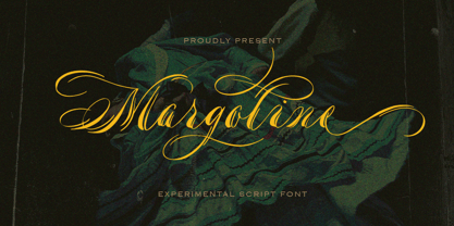 Introducing, Margoline script font. Margoline is a swash handwritten font that is perfect for branding, packaging, wedding invitation, card, etc. Features : uppercase & lowercase numbers and punctuation multilingual alternates and ligatures swash PUA encoded We highly recommend using a program that supports OpenType features and Glyphs panels like many of Adobe apps and Corel Draw, so you can see and access all Glyph variations.
 - Freedam Theory by Stringlabs Creative Studio,
$25.00 Fredam Theory is a Retro bold script with Groovy style, unique design taste and combine with classic retro style of the 80s, trendy, vintage, and sporty. The Fredam Theory is perfect for retro lovers, besides this font is also perfect if used for brands such as: barbershop, motorcycle club, clothing, logo brand, coffee shop, shoe brands, hipster and many more.
 - Hybi15 Ronja by Hybi-Types,
$9.00 The Hybi15-Ronja is a characterful 4-style font family. It’s high recognition factor makes it appropriate for all oportunities of headlines, slogans and advertising. Though, it’s straight-line and well-balanced look makes it friendly and charming. The fonts are offering a huge character set for usage in many languages. Also thousands of kerning pairs within each style are obligatory.
 - Franken Jr AOE Pro by Astigmatic,
$24.95 Franken Jr. Pro was inspired by the title screen from the 1966 Hanna Barbera cartoon titled, "Frankenstein Jr." The original titling had a unique presence to it, overflowing with charm and offbeat personality. The addition of a Small Caps set, Unlimited Fractionals, Superiors & Inferiors, and Ordinals gave the a bit more serious, but not too serious) titling stance to the Franken Jr. Pro typestyle. Franken Jr. Pro truly embodies the comic lettering of its time, and gives designs a lively retro spark.
 - NTF Fragma by Noble Type Foundry,
$20.00 A futurist headline typeface exploring the concept of sub-baseline interconnectivity and flow. Boasting over 450 glyphs, this typeface comes with an enormous amount of ligatures to achieve optimum flow between letterforms. Its sources of inspiration are endless (old science fiction, Arabic letterforms and 90s UK garage/rap album artwork featuring futurist custom type.) The typeface is best suited to headlines and larger type. Currently available in Bold with an Italic version coming in the not too distant future. Enjoy!
 - Moressans by IKIIKOWRK,
$17.00 Introducing Moressans - Luxurious Type, created by ikiiko. Moressans is a sans serif type with a thin and rounded shape. A simple font, with a thin size, adds to the impression of elegance and also fashionable too. This typeface is perfect for an elegant logo, branding, fashion brand, luxury brand, layout magazine, beauty product, packaging product, quotes, or simply as a stylish text overlay to any background image. What's included? Uppercase & Lowercase Number & Punctuation Alternates Multilingual Support Works on PC & Mac
 - vastra by AdultHumanMale,
$6.00 vastra is a slim, futuristic, bauhaus inspired typeface. It has plenty of those pesky foreign glyphs and various alternates of the standard alphabet. It’s available in 5 different weights from light to Heavy and is complimented by 5 italicized versions of the 5 different weights too. I wanted this font to look like background set typography in a 70’s sci-fi movie. D A N G E R You can buy it in singles, pairs or the whole damn brood.
 - TE Warsh Tharwat Emara by Tharwat Emara,
$49.00 Introducing "TE Warsh Tharwat Emara," an exquisite Naskh font designed to elevate your typography to the next level. Our font features intricate calligraphic strokes, elegant curves, and graceful flourishes that bring a touch of sophistication and elegance to your text. Designed with the utmost attention to detail, every character in "TE Warsh Tharwat Emara" is beautifully crafted and easy to read. "TE Warsh Tharwat Emara" is perfect for typesetting the Holy Quran, with its beautifully crafted curves and strokes. The Naskh script is one of the most popular calligraphic styles used in Arabic typography and is known for its clarity, making it perfect for Quranic typesetting. With "TE Warsh Tharwat Emara," you can create stunning, high-quality typography that is perfect for publishing the Quran, as well as other religious texts. In addition to its suitability for Quranic typesetting, "TE Warsh Tharwat Emara" is versatile and can be used in a variety of contexts. Its elegant and sophisticated design makes it perfect for book covers, posters, branding, and web design. "TE Warsh Tharwat Emara" supports a wide range of languages, including Arabic, Persian, Urdu, and many others, making it ideal for multi-lingual projects. "TE Warsh Tharwat Emara" includes a range of special features that take your typography to the next level. The font includes ligatures and alternate characters, which allow you to create more natural and fluid connections between characters. The alternate characters provide a variety of stylistic choices, giving you even more control over the typography. "TE Warsh Tharwat Emara" is compatible with a wide range of platforms and software, including Adobe Creative Suite, Microsoft Office, and many others. This means that you can use "TE Warsh Tharwat Emara" in your favorite design software, without worrying about compatibility issues. "TE Warsh Tharwat Emara" comes with a multi-user perpetual license, which allows you to use it for commercial and personal projects. The perpetual license means that you can use the font indefinitely, without having to worry about renewing your license. We also offer a range of licensing options, including a single-user license, to suit your needs. In conclusion, "TE Warsh Tharwat Emara" is a must-have for designers and typographers who are looking to create stunning, high-quality typography that is perfect for publishing the Holy Quran, as well as other religious texts. With its intricate calligraphic strokes, elegant curves, and graceful flourishes, "TE Warsh Tharwat Emara" will elevate your typography to the next level. It's versatile, easy to use, and comes with a range of special features that make it perfect for all kinds of projects. So, whether you're designing book covers, posters, or websites, don't miss out on "TE Warsh Tharwat Emara." Purchase now and experience the beauty of our Naskh font for yourself.
 - Gojacky Bold Script Font by IbeyDesign,
$17.00 Gojacky Bold Script Font is a gorgeous and bold handwritten font, crafted to give your headlines and logotype projects a stylish touch. This font reads strong, confident, and dynamic and can add tons of nostalgic character to your designs.
 - Agustaf Bold Script Font by IbeyDesign,
$17.00 Agustaf Bold Script Font is a gorgeous and bold handwritten font, crafted to give your headlines and logotype projects a stylish touch. This font reads strong, confident, and dynamic and can add tons of nostalgic character to your designs.
 - BD Megatoya by Balibilly Design,
$25.00 Overview of BD Megatoya Consists of 41 fonts, including nine upright, nine italics, nine extended, nine extended italics, all in nine weights from thin to black. 4 outline version in black weight. 1 variable with three axes (weight, width, slant). 1,470 glyphs in each font. Opentype features include small caps, stylistic alternates, ligatures, complete numeral figures, ordinal, case-sensitive forms. language support: Western European, Central European, and Southeastern European. About BD Megatoya Taking a geometric sans serif approach, we designed the letterform with details on round characters to pursue harmony and leave a slightly boxy feel to the extended style. The stylistic alternate is one of our concentrations to make them versatile yet still preserve consistency in stem and metrics to provide good readability in small text. Overall, the various treatments for each character will encourage each other to dynamic colours, flexible, and functional impressions in their application. Slicing edges The edge of the letter slice in 45 degrees will give the impression of a sparkle of light when you look at them for the first 2 seconds (our experience). This is what we did a few years ago when working on automotive branding. The word-mark logotype with slicing form gives an exclusive and different impression from its crowds. If you agree with us, does BD Megatoya deserve to be called a problem solver in branding projects? Jump over to .ss07, .ss08, .ss09, and .ss10 to find them! The Features BD Megatoya font family includes 41 great fonts in nine weights, an extended character set of over 1400 glyphs, multilingual support such as Southeastern Europe, Central Europe, Western Europe. Also advanced & useful open-type features: case-sensitive forms, small caps, standard and discretionary ligatures, stylistic alternates, ordinals, fractions, numerator, denominator, superscript, subscript, circled number, slashed zero, old-style figure, tabular and lining figure. Use BD Megatoya BD Megatoya is very suitable for branding projects and many designs purpose like advertising, posters, invitations, branding, logos, magazines, merchandise, presentations, etc. It's a FREE Get one weight from the BD Megayoya family for Free! Apply to your amazing projects and enlarge your creative tools by adding the complete BD Megatoya family to your font library.
 - Kadupul Flowers by Gatype,
$12.00 Kadupul Flowers is an incredibly unique handwritten,The shape is modern and style is very natural.modern calligraphy font. Masterfully designed to become a true favorite, the name of this font is also inspired by the name of a flower that is popular in the world this font has the potential to bring each of your creative ideas to the highest level! Kadupul Flowers features a varied baseline, gorgeous glyphs, and stunning alternatives. Hand-drawn design elements allow you to create many beautiful typographic designs in an instant like branding, web design and editorial, prints, crafts, quotes, It's great for logotypes, wedding invitations, romantic cards, labels, packaging, spelling of names and others. Kadupul Flowers includes OpenType stylistic alternates, ligatures and International support for most Western Languages. To enable the OpenType Stylistic alternates, you need a program that supports as Adobe Illustrator CS, Adobe Indesign & CorelDraw X6-X7, Microsoft Word 2010 or later versions. How to access all alternative characters using Adobe Illustrator: https://www.youtube.com/watch?v=XzwjMkbB-wQ Kadupul Flowers is coded with PUA Unicode, which allows full access to all the extra characters without having special designing software. Mac users can use Font Book , and Windows users can use Character Map to view and copy any of the extra characters to paste into your favorite text editor/app. How to access all alternative characters, using Windows Character Map with Photoshop: https://www.youtube.com/watch?v=Go9vacoYmBw
 - Koomerang by Type Associates,
$21.95 I arrived this concept as a means to fulfil a need for a simple yet radical semi-sans with rounded terminals. My concept called for a modular approach so a single weight font family resulted, the monoline stroke weights being one-eighth of the cap height and the x-height five-eights, the descent two units. Within these constraints I found it was simple to devise an alphabet which met my need for quirkiness whilst retaining its legibility. As for the outline, shadow and contour variants - well they just seem to work. If you are wondering - and you don't hail from the "Land Downunder" - Canberra is our nation's capital; Bondi - "water breaking over rocks" a beautiful beach in Sydney; Uluru is the name given to the world's largest pebble, (formerly known as Ayers Rock); Kakadu is a national park in the "Top End" and Koomerang means "hill of clouds" - all place names in their respective Australian indigenous languages. Come on down - the natives are friendly.
 - Very Frank by Up Up Creative,
$16.00 Meet Very Frank, a font that won’t feed you any lines or tell you any lies. Straight and tall and lacking in all but the subtlest softening details (look at the leg on that uppercase K, though…). Very Frank is a condensed sans serif display font (in regular and italic) with tall, straightforward lines and subtle curves to soften things up. It includes a ton of standard and discretionary ligatures and two stylistic sets to spice things up and add some fun. It's perfect for headlines, editorial design, monograms, branding, logos, poster design, and more. Very Frank includes approximately 540 glyphs and more than 75 standard and discretionary ligatures. Additional OpenType features include character variants, stylistic sets, and multilingual support (including multiple currency symbols). The OpenType features can be very easily accessed by using OpenType-savvy programs such as Adobe Illustrator and Adobe InDesign. (To access these awesome features in Microsoft Word, you'll need to get comfortable with the advanced tab of Word's font menu.)
 - Interlaken by ROHH,
$20.00 Interlaken™ is a modern display & branding typeface allowing to design creative logotypes, posters and headlines with ease. It is an uppercase family of six OpenType fonts and one 2-axis variable font, packed with features such as stylistic alternates and tons of original ligatures. The family’s purpose is to make the creative process of designing logotype a blast. It has a wide set of OpenType features crafted especially to make your life easier, allowing you to accomplish your projects in less time. Interlaken has a powerful and very modern character, it comes in three width variants, making it a good fit in various design scenarios. Its cutout details make it look unique and create an impression of inner shadows when set on a dark background. Interlaken is a great typographic tool for such industries as sports, fitness, modern technology, fashion and gaming. It works perfect as a pairing typeface with Rothorn, Conthey and Conthey Inline and Axalp Grotesk.
 - Silver Streak by Swell Type,
$20.00 Inspired by the streamlined lettering of trains, cars and advertisements from the 1930s and 1940s, Silver Streak is a font family that combines Art Deco elegance with refined craftsmanship and modern features. Silver Streak's contrasting strokes and tastefully rounded corners conjure an era of refined, vintage elegance. An extravagant palette of 25 weights — from gracefully tall and thin to commandingly wide and heavy, along with a variable font for unlimited options between — provide unforgettable branding possibilities for luxury items ranging from jewelry, clothing and perfume to the sleek badges of high performance sports cars. Features: Five widths from Compressed to Extended Each with five weights from Light to Heavy Complete family includes a Variable font for precise control of weight and width Support for 223 languages, including Western & Central Europe, Russian Cyrillic, Serbian/Macedonian, Ukranian and Vietnamese Alternate hook-cornered capitals (accessible as Opentype Discretionary Ligatures) Alternate round-topped A in two versions, each with international accents (accessible as Stylistic Alternates)
 - Extra Old by Mans Greback,
$59.00 Extra Old is a vintage serif typeface. With heavy strokes and miniscule serifs, this classic font family is the perfect lettering for a headline to emit genuine quality. Why not use Extra Old for a traditional logo or balanced product label. Created with pride and care, this type has the optimal appearance of a classic vintage logo but for a modern setting. The font family consists of Regular and Italic, as well as Bold and Bold Italic. Also included are the font styles Coaster and Floria Corner, two typefaces for beautiful decorative elements, combining with the lettering. The font is built with advanced OpenType functionality and has a guaranteed top-notch quality, containing stylistic and contextual alternates, ligatures and more features; all to give you full control and customizability. It has extensive lingual support, covering all Latin-based languages, from Northern Europe to South Africa, from America to South-East Asia. It contains all characters and symbols you'll ever need, including all punctuation and numbers.
 - XXII CoolScript by Doubletwo Studios,
$25.99 XXII CoolScript - The vibrant typeface with a ton of alternates MAJOR UPDATE This is a big update of XXII CoolScript. First of all, from now it’s a whole family with 7 new weights from ExtraThin to Black. It comes with more than hundred additional glyphs, some more alternates, ligatures, numerals and fitting opentype features for fractions and two extra ampersands. This lovely script font by Lecter Johnson is another, more soft and round one in the series of Doubletwo Studios’ script fonts (XXII YeahScript, XXII AwesomeScript). Its wonderfully designed letters, ligatures and alternates may bring a charming and individual handwritten look to your creation. This fonts are designed to easily create logos, headlines and text phrases within a blink of an eye. Just open your glyphs-palette* and simply chose, from up to 27 different alternates and variations per glyph, the one that fits best for your needs. *For further information visit the Behance Project.
 - Zetwih by Twinletter,
$17.00 Zetwih, is a stunning display font with an alluring Japanese feel. With the beauty and charm of faux Japanese, Zetwih is the perfect solution for projects that require a distinctly Japanese and Southeast Asian touch. With Zetwih, you can create designs that are themed by Japanese and Southeast Asian culture in an authentic and captivating style. Each letter is carefully designed, combining elements of a distinctly Japanese aesthetic with a modern twist. Zetwih’s top features give you flexibility and creativity in your typography designs. With the available ligatures and alternates, you can combine beautiful characters and create interesting variations in letter composition. Zetwih also supports multilingualism, allowing you to express your message in multiple languages and reach an international audience. That way, you can adapt this font to the needs and preferences of your target market. Let Zetwih immerse you in the beauty and elegance of Japanese and Southeast Asian culture. Get this font now and create inspiring and stunning designs with an unforgettable Japanese touch. What’s Included : File font All glyphs Iso Latin 1 Alternate, Ligature Simple installations We highly recommend using a program that supports OpenType features and Glyphs panels like many Adobe apps and Corel Draw so that you can see and access all Glyph variations. PUA Encoded Characters – Fully accessible without additional design software. Fonts include Multilingual support
 - VLNL Bonen by VetteLetters,
$30.00 While sketching for a music project logo, Donald DBXL Beekman looked at several wood type alphabets as a starting poing. One of these was No.120, patented in 1880 by William Hamilton Page. With its distinct diagonally cut serifs and round shapes cut off at top and bottom, it bore just the right feel for the project. DBXL digitized the alphabet, adding all characters needed for a full set. During this process all shapes were widened, tweaked and streamlined to enhance consistency and rhythm along the whole font. VLNL Bonen is an all-caps display font with a very specific western cowboy or circus look. For instance burger or barbecue grill restaurants would do well with this one. We can easily see it shine on a festival flyer or poster as well, and not just country & western festivals. VLNL Bonen is suitable for any ‘big’ use that needs to stand out of the crowd. Bonen is the Dutch word for beans, a world wide source of nutrition and proteins it comes in a multitude of shapes, colours and sizes. Beans are also the most eaten foods in a cowboy’s diet along the trail. Available in abundance and easily preserved and transported, many recipes on the cattle drives in the American Wild West used beans. Think of chili, mashed beans with biscuits and bean soups. “Keep them doggies movin’, cowboy!”
 - Rotis Sans Serif Paneuropean by Monotype,
$98.99Rotis is a comprehensive family group with Sans Serif, Semi Sans, Serif, and Semi Serif styles. The four families have similar weights, heights and proportions; though the Sans is primarily monotone, the Semi Sans has swelling strokes, the Semi Serif has just a few serifs, and the Serif has serifs and strokes with mostly vertical axes. Designed by Otl Aicher for Agfa in 1989, Rotis has become something of a European zeitgeist. This highly rationalized yet intriguing type is seen everywhere, from book text to billboards. The blending of sans with serif was almost revolutionary when Aicher first started working on the idea. Traditionalists felt that discarding serifs from some forms and giving unusual curves and edges to others might be something new, but not something better. But Rotis was based on those principles, and has proven itself not only highly legible, but also remarkably successful on a wide scale. Rotis is easily identifiable in all its styles by the cap C and lowercase c and e: note the hooked tops, serifless bottoms, and underslung body curves. Aicher was a long-time teacher of design with many years of practical experience as a graphic designer. He named Rotis after the small village in southern Germany where he lived. Rotis is suitable for just about any use: book text, documentation, business reports, business correspondence, magazines, newspapers, posters, advertisements, multimedia, and corporate design. - ALS SyysScript by Art. Lebedev Studio,
$63.00 Handwriting of a strong Carelian personality revived: It’s autumn time once again, harvesting season, mushroom & berry time – the favourite season of my Karelian aunt Katri. A postcard she sent me more than twenty years ago had inspired me to SyysScript, “Script of Autumn” in Finnish. Katri had a very kind but also energetic personality, and I always thought her handwriting was a mirror of it. By making SyysScript I felt I could revive some of her unforgettable character. My Finnish autumn font has by now become a favourite for many and is branding fine food in both the Eastern and the Western hemisphere – even far beyond the arctic circle. “SyysScript“ is actually a growing family. For enhanced functionality in small sizes I added “SyysScript Eco” a year ago, a style with shortened extensions and simplified letterforms especially suited for packaging. And this autumn, a special one for Finland which is celebrating its 99th birthday, SyysScript grew again: Two long awaited newcomers, “SyysScript FeltTip” and “SyysScript FeltTip Eco” joined the family. They are bolder and softer than the previous styles but keep their positive, lighthearted feel. Use them to make a powerful individual mark on any background. – They are equally well suited for paper, packaging, a screen or even a concrete wall! Language support: Western and Central European, Extended Cyrillic.
 - LC Trinidad by Compañía Tipográfica de Chile,
$34.00 Lc Trinidad is the result of a series of wonderings regarding geometric Sans Serif typography design, in particular; Futura of Paul Renner. A “conversation” arose between me and the designer – actually there was no conversation, it is an euphemism for “I saw his designs, I draw them and discussed with myself some of his decisions – that ended up being the origin of this font firsts glyphs: A, H, N, O, R and S. I started with uppercase letters, and here is when Rudolf Koch with Kabel and his “Das schreibbuchlein” joined the conversation. This is how I could develop some alternative lowercase letters so as to illustrate this imaginary discussion. The result is a sans serif, geometric, modern typeface with classical Roman proportion in the uppercase letters; two stylistic sets for lowercase letters (setKoch and setRenner), rational, open and sharp ends. It is ideal to form titles, medium length texts, branding, exhibitions and animations. The family consists of 9 weight variants and their corresponding oblique versions and small caps. With more than 900 glyphs, it covers more than 190 Latin languages and together with its Opentype functions it creates a modern and versatile family. Besides, it has powerful OpenType features for each style, including stylistic sets, extended language support, ligatures, contextual alternates, lining figures, oldstyle figures, small caps numbers, arrows, fractions, superscripts, subscripts and many more.
 - FF Hertz by FontFont,
$68.99 Low stroke contrast, generous spacing, and fine-grained weights from Light to Extra Bold make FF Hertz a workhorse text typeface which holds up well under today’s widely varying output conditions from print to screen. The quite dark Book style works well on e-ink displays which usually tend to thin out letters, as well as in print when you want to evoke the solid letter image of the hot-metal type era. Two sizes of Small Caps are included: A larger size for abbreviations and acronyms, and a smaller size matching the height of the lowercase letters. FF Hertz is a uniwidth design, that means each letter occupies the same space in all weights. This feature allows the user to switch between weights (but not between Roman and Italic styles) without text reflow. Jens Kutilek began work on FF Hertz in 2012. From a drawing exercise on a low-resolution grid (a technique proposed by Tim Ahrens to avoid fiddling with details too early), it soon evolved into a bigger project combining a multitude of influences which up until that point had only been floating around in his head, including his mother’s 1970s typewriter with its wonderful numbers, Hermann Zapf’s Melior as well as his forgotten Mergenthaler Antiqua (an interpretation of the Modern genre), and old German cartographic lettering styles. Jens likes to imagine FF Hertz used in scientific books or for an edition of Lovecraftian horror stories.
 - Albion Signature by TofinoType,
$90.00 Albion Signature is a value packed font of exceptional character, with lots of old world charm to make your next project personal and special. Containing over 2,200 glyphs, it’s large enough to handle any demanding project, big or small. It also contains over 400 flourishes in three sections (dingbats, geometric shapes, and misc. geometric shapes) in numerous styles, that can be used in endless combinations. It’s like several fonts in one. Everything you need to do a stellar project is included. A script font that lines up perfectly with a few extra endings and hidden treasures spread throughout. It also contains a complete easy to use PDF index, so you will be able to find exactly the glyph you are looking for fast. This font can only enhance the fonts that you already own, making them more versatile and useful. On its own, it is a very elegant calligraphy script, that will make every project you create look great. The capital letters overlap and intertwine just like in days gone by, for a unique style. Also included are tools that can give you very precise spacing, right inside a word processor. Usage: Photoshop styles, InDesign, personal promotion logos, monograms & signatures.... That’s where it shines, yet it’s still great for art, cards, fancy documents, really fancy labels & even notes to Mom. Imagine, most people used to write letters like these at one time. Now you too can have documents that look like the work of a studied penman.
 - Capitolium 2 by TypeTogether,
$58.00 Capitolium was designed in 1998 at the request of the Agenzia romana per la preparatione del Giubileo for the Jubilee of the Roman Catholic Church in 2000. This type design was the central part of the project for a wayfinding and information system to guide pilgrims and tourists through Rome. Capitolium also continues Rome’s almost uninterrupted two-thousand-year-old tradition of public lettering . It is a modern typeface for the twenty-first century and strongly related to the traditions of Rome. Soon after the completion of this project Unger began contemplating the possibility of bringing the atmosphere of this design to newspapers. Though Capitolium works well in most modern production processes and also on screens, it is too fragile for newsprint. For newspapers sturdier shapes were required as well as more characters to a line of text, and Capitolium News has a bigger x-height than Capitolium. Capitolium News is a thoroughly modern newsface, with classic letterforms linked to a strong tradition. Capitolium News for running text comes in the variations regular, italic, semibold, semibold italic, bold and bold italic. As is possible with most of Unger’s type designs, Capitolium News can be condensed and expanded without any harm to the letterforms. The update to this beautiful font family, Capitolium News, includes the addition of over 250 glyphs featuring full Latin A language support, new ligatures, 4 sets of numerals, arbitrary fractions and superiors/inferiors. Furthermore, kerning was added and fine tuned for better performance.
 - Ivory by FaceType,
$24.00 Ivory is inspired by a beautiful typeface used in an illustrated compendium about pomology from 1882. We separated the elegant “Swashes” from the letters – use it together with “NoSwashes” to get two-colored initials. Please note that the kerning of NoSwashes works only together with Swashes. To achieve the two tone effect shown in the samples, you need to use an application that supports layers. For example, Adobe Illustrator, Adobe InDesign, Adobe PhotoShop, CorelDRAW, and Quark. Some of the preview images were made by Arina Karen Renata Palilingan.
 - Bright Ideas by Ingrimayne Type,
$9.00 The BrightIdeas family contains two novelty fonts that have letters on light bulbs. The fonts have some characters on standing bulbs and some on hanging bulbs and these two sets are made to alternate with the OpenType contextual alternatives (calt) feature. To use only one set of bulbs, this feature must be turned off and character spacing adjusted. The family contains a style with clear bulbs and one with filled bulbs. They can be used in layers to add color. Both are monospaced. The characters on the bulbs are derived from the font Myhota-Bold.
 - Empirelines by Haksen,
$19.00 Empirelines are the family of blackletter style with Uppercase and Lowercase feel nice balanced. Provide alternates font in lowercase variant style make the design letter looks incredible. Honestly it works perfectly for headlines, logos, posters, packaging, T-shirts and much more. Recommended to use in Adobe Illustrator or Adobe Photoshop with opentype feature. How to access Alternates Character? Open glyphs panel : In Adobe Photoshop choose tool Window >> glyphs In Adobe Illustrator choose toolType >> glyphs If you have questions, just send me a message and I’m glad to help. Have a great day, Haksen
 - Bron Shadline by Jeremia Adatte,
$49.00 Bron Shadline is the semi-outline and lighter variation of the original Bron typeface. The outline adds an extra vibrancy, more contrast and bring a special shading effect out. The Shadline version has also two separate layered fonts to make your own multi-color compositions. Possibilities of editing the font are infinite : even use Bron Black Two Color One to add an extra third layer. These can be used separately to create even more subtle effects. Bron Shadline is packed with an extended character set, supporting Central, Western and Eastern European languages.
 - Elen Sans by Hurufatfont,
$19.00 The first design of Elensans consisted of 4 styles that are including two weights and their italics which I designed in my student years in 2002. It was designed with a little Art Nouveau style touch with inspired by classical geometric based fonts such as Friz Quadrata and Eras. It was updated with according to the orientations of the day in 2012 and eventually it took its final form with actual touches in 2020. The family has 18 weights, ranging from Thin to Black in normal styles and including their italics. It is ideally suited for advertising and packaging, editorial and publishing, logo, branding and creative industries, poster and billboards, small text, wayfinding and signage as well as web and screen design.
 - Rhino by Canada Type,
$24.95This is Canada Type's second Helmut Matheis revival. Rhino is what Matheis did under the name Mobil for the Ludwig & Mayer foundry in 1960. It's an informal text face with some attractive irregularities relating to the traits of handwriting. The influence of the human hand can be clearly seen in letters like the A, J, Q, R, T and pretty much all of the lowercase. Though obviously inspired by and tooled after the human touch, Rhino's functionality extends to even a page or two of text setting. Aside from its functionality, Rhino gives short paragraphs what the classic immersive-reading fonts are not built for: immediate friendliness and natural humility. A few alternates and ligatures are included within the font. - Wordmark by W Type Foundry,
$28.00 Wordmark is our new fully equipped branding tool. Designed with a refreshed humanist style, much loved by brands that need to deliver their message in a serious way, with a current look. Drawn by the cool eye of Gaspar Muñoz, expect this font to be as good or even better than its predecessor "Herokid". "Wordmark" is super complete; it includes condensed, thin, expanded, and heavy weights plus italics with two complementary systems that work together in a powerful way. "Wordmark Normal" offers great readability for text and signage, big or small. And "Wordmark Display", designed with a noticeably taller X height specifically made for headlines, big windows, and big screens. With 48 different styles keep it simple and make reliable designs with "Wordmark".
 - ITC Avant Garde Gothic Paneuropean by ITC,
$49.00ITC Avant Garde Gothic¿ was designed by Herb Lubalin and Tom Carnase in 1970. They based it on Lubalin¿s logo for Avant Garde Magazine - an exciting construction of overlapping and tightly-set geometric capitals. ITC Avant Garde is a geometric sans serif; meaning the basic shapes are constructed from circles and straight lines, much like the work from the 1920s German Bauhaus movement. The early versions of ITC Avant Garde became well-known for their many unique alternates and ligatures that still conjure up the typographic aura of the 1970s. These fonts contain the basic alphabets (without the old unusual ligatures). Still strong and modern looking, ITC Avant Garde has become a solid staple in the repertoire of today's graphic designer. The large, open counters and tall x-heights seem friendly, and help to make this family work well for short texts and headlines. The condensed weights were drawn by Ed Benguiat in 1974, and the obliques were designed by Andr¿ G¿rtler, Erich Gschwind and Christian Mengelt in 1977. ITC Avant Garde¿ Mono is a monospaced version done by Ned Bunnel in 1983. - Tokoloshe by Scholtz Fonts,
$17.95Tokoloshe is a name in African mythology for a mischievous leprechaun-like figure that loves practical jokes and tricking people. There are many books of such African stories, for example Tales of the Tokoloshe by Pieter Scholtz. The letter shapes that I used in the Tokoloshe font have inspiration from two sources: -- the spiky character of the font was derived from the wonderfully imaginative, wooden carvings of the Makonde people of beings called "shetani". The word "tokoloshe" is used by other tribes, but from his behaviour, he is certainly a type of shetani. -- some of the letter shapes were informed by Art Deco styles of fonts, for example: Kunjani, Black Tie SF, Selznick Normal, Zaire SF, Binner Gothic and ITC Anna. But the Tokoloshe font, like its namesake, is much more freespirited. Use this font whenever you want to suggest the rich artistic, cultural and spiritual heritage of Africa. The font is fully professional in terms of its character set. It contains over 235 characters - (upper and lower case characters, punctuation, numerals, symbols and accented characters are present). In fact, it has all the accented characters used in the major European languages. - Sunetta by Linotype,
$29.99An inkstone, a brush, ink, and paper. In China, one speaks of “wenfang sibao” — the four treasures of the scholar’s study. With these centuries-old hand tools, Werner Schneider created a calligraphic type trilogy of the highest aesthetic order; he named this typeface family after Buddha’s stepbrother, Sunetta. Sunetta is an outstanding choice for contemporary display type purposes. Its combination of lively forms overcome sterile text passages, lending them a more personal note and feeling. But Sunetta is not only recommended for documents bestowing distinction and accolades; the fonts are superb for shorter text passages as well. Sunetta’s spirited flow raises it above the fray that so many generic letterforms find themselves mired in, creating an unforgettable impression. Sunetta’s three complementary styles, Sunetta Flair, Sunetta Charme, and Sunetta Magic, offer three varying degrees of calligraphic verve. The family’s base font, Sunetta Flair, harkens back to the showcard lettering styles of the 1950s, while remaining distinctly European in taste. Sunetta Charme has a more swash-type appearance, while Sunetta Magic is joyfully decorative — its brush-written strokes dance across the line. Together, they may help you reach typographic nirvana.