10,000 search results
(0.031 seconds)
- FF Franklinstein by FontFont,
$30.99 German type designer Fabian Rottke created this display FontFont in 1996. The font is ideally suited for music and nightlife, poster and billboards as well as software and gaming. FF Franklinstein provides advanced typographical support with features such as ligatures. It comes with proportional lining figures.
 - Halloween Day by Goodigital13,
$20.00 These font can be used in web design and apps as well as in booklet, posters, or any other printed matter. Halloween, is a display spooky feel font. It’s suitable for dark and Halloween theme. Such as a Poster, Logotype, Social Media Promotion, Merchandise or Crafter.
 - Toykids by Sakha Design,
$10.00 Toykids is a playful and stylish font with a youthful spirit. Is suitable for both professional-looking projects such as branding designs, labels, websites, and business cards as well as casual designs like packaging, posters, flyers, quotes, social media posts, invitations, and special occasions cards, etc
 - Fountaine by Unicode Studio,
$15.00 Fountaine script is a fresh new font script that comes in both clean and rough styles, so this font can provide an alternative, new sensation and vintage feel for the designer or craftsperson working on various projects. This font is perfect for all your projects such as wedding invitations, greeting cards, branding materials, business cards, quotes, posters, insignia, badges, greeting cards, vintage logos, or you can use this font for logo projects (logotypes) and more! Fountaine script comes with a total of 325 glyphs. The alternative characters are divided into several Open Type features such as Swash, Stylistic Sets, Stylistic Alternates, Contextual Alternates, and Ligatures. The Open Type features can be accessed by using Open Type savvy programs such as Adobe Illustrator, Adobe InDesign, Adobe Photoshop, Corel Draw X version or Microsoft Word. And this Font includes PUA Unicode (specially coded fonts) so that all the alternate characters can easily be fully accessed by a craftsperson or designer on either Windows or Mac computers without the requirement for fancy design software. Mail support: If you have any question, please contact me Via e-mail "unicodestudio@gmail.com" Thank You!
 - Fixture by Sudtipos,
$39.00 Fixture is our massive 72-font take on plentiful offerings of the late 19th century’s typefaces, posters and wood letterpress sundry done in the Grotesk genre. Four widths ranging from Ultra Compressed to Expanded each come in nine weights and accompanying italics. Some common sans-serif alternates, such as the a and g, are included in all the fonts. The idea with this design was to put together a workhorse font family with enough functional flexibility to work in multiple environments, from the subtlety of magazine layout or film credits to the visual drama of billboards or packaging. Aesthetically speaking, it is quite interesting — though in retrospect quite unintentional — that each different width and/or weight of this face ended up pulling a different dominant trait from the melting-pot origins of the entire family. It’s almost like a tribute album to some famous band’s covers of older songs. It may also be a good conversation piece on our tools shaping the very things for which they’re used. Can’t really get any more post-Grotesk than this. In the 21st century, this is the one genre to rule them all.
 - Quiller by Canada Type,
$24.95Quiller is another catch from the hot metal days, another one that managed to slip through the fingers of both the photo-typers and digitizers of last 4 decades. JJ Sierke’s Privat design from 1966 is now resurrected and heavily extended to be used by computer users everywhere. The original design was revived, and two whole new fonts were added to it - one with very unique swash caps and alternates, and one with many many ligatures and letter-combination ornaments. Quiller is a cross between brush calligraphy and very casual fast handwriting. It even has a slight Arabic simulation to it. Given such traits, the addition of a swash font and a multitude of ligatures comes in very handy to keep the natural flow of the font and maintain the elegance of its spirit. Those who like the auto-magic of OpenType’s intelligent substitution should like the fact that the OTF version is a single font with all the bells and whistles ready to go in the swash and discretionary ligatures features. If you use the latest versions of Adobe programs, the OTF version of Quiller is highly recommended. - Glittera by Natural Ink,
$12.00 Glittera Script is a modern calligraphy design, including Regular. This font is casual and beautiful with swash. Can be used for various purposes. such as logos, product packaging, wedding invitations, branding, headlines, signage, labels, signatures, book covers, posters, quotes, and more. Glittera Script includes a change of the OpenType language style, binding and international support for most Western languages. To activate the OpenType Stylistic alternative, you need a program that supports OpenType features such as Adobe Illustrator CS, Adobe Indesign & CorelDraw X6-X7, Microsoft Word 2010 or newer versions. How to access all alternative characters using Adobe Illustrator: https://www.youtube.com/watch?v=XzwjMkbB-wQ Glittera Script is coded with PUA Unicode, which allows full access to all additional characters without having to design special software. Mac users can use the Font Book, and Windows users can use Character Map to view and copy one of the additional characters to insert into your favorite text editor / application. How to access all alternative characters, using Windows Character Map with Photoshop: https://www.youtube.com/watch?v=Go9vacoYmBw If you need help or have questions, please let me know. I am happy to help :) Thank you & Congratulations on Designing! Script is coded with PUA Unicode, which allows full access to all additional characters without having to design special software. Mac users can use the Font Book, and Windows users can use Character Map to view and copy one of the additional characters to insert into your favorite text editor / application. How to access all alternative characters, using Windows Character Map with Photoshop: https://www.youtube.com/watch?v=Go9vacoYmBw If you need help or have questions, please let me know. I am happy to help :) Thank you & Congratulations on Designing!
 - Bradley Texting by Monotype,
$57.99Bradley Texting: a clear, friendly and easily legible calligraphy font, also suited to electronic devices With Bradley Texting, Richard Bradley has published another calligraphic typeface that recalls the style of Bradley Hand and Bradley Type. In this case, however, Bradley has advanced the style with clearer forms for display on electronic instruments and on other formats. Two other font families paved the way to the newly introduced Bradley Texting. In the mid-1990s, Bradley published Bradley Hand, with its rough contours. Since these coarse forms do not cut a good figure in the larger font sizes, Bradley Type followed, with smooth letters. During the development of Bradley Type, the idea for a further font came about ? one in the style of the two other calligraphic typefaces, but with simpler, easily legible forms and suited to electronic devices like mobile phones or tablets. The letters for Bradley Texting began with a marker on paper. Looking back, Bradley describes one of the biggest challenges as having the calm required to draw the relaxed-looking letters repeatedly while still making them fit the general style.The somewhat narrow and dynamically designed letters have round line ends, like those left by a felt-tipped pen. As a hand-written print font, the individual letters are not connected to one another. Nonetheless, they demonstrate the influence of a written font, such as the extended ends and the flowing transitions. Clear forms with open counters and a large x-height guarantee Bradley Texting good legibility in the smaller font sizes. Bradley Texting is also effective under more challenging conditions, such as on mobile phones, e-book readers or tablets; the fonts friendly and lively character comes through. With Regular, Semibold and Bold, Bradley Texting is adequately equipped for use as a headline or text font in various sizes. The selection of characters covers the Western European languages and German typographers will be happy to note the presence of the upper-case ß. Use the dynamic and clear forms of Bradley Texting anywhere you need a friendly character with a personal accent. Bradley Texting is persuasive in the print realm, in advertisements or on posters, as well as on electronic devices. - Nathaniel by Mevstory Studio,
$25.00 Nathaniel The "Nathaniel " font family epitomizes beauty and elegance in every character. With two distinct styles, Regular and Italic, this font is the perfect choice to infuse sophistication into your design projects. Key Features: Elegance and Beauty: Nathaniel has been meticulously crafted to ensure each letter is visually captivating. It's an ideal choice for creating stunning quotes and long paragraphs in your designs. Feminine Appeal: This font is perfectly suited for designs with a feminine touch, such as fashion, magazines, and logos with a simple yet enchanting design. Artistic Pairings: Nathaniel seamlessly complements script fonts, enhancing the artistic appeal of your projects. Combine these two font styles to create unique and attention-grabbing designs. Recommended Uses: Inspirational Quote Designs: Use Nathaniel to create motivational and inspirational quotes for social media, posters, or merchandise. Fashion and Magazine Design: Nathaniel is the perfect choice to create a luxurious and feminine look in magazine layouts and fashion promotions. Simple and Classy Logos: Craft simple yet character-filled logos using Nathaniel to represent your brand with unmatched style. Nathaniel is the perfect fusion of beauty and functionality, elevating your design projects to the next level. With this font, you'll be able to create impressive and captivating works. Get Nathaniel today and start making your design projects stand out. Don't miss out on this opportunity! Get Nathaniel now and start inspiring the world with your captivating designs.
 - Thaun by Scholtz Fonts,
$19.00 I can best describe the Thaun family as a general purpose display family, inspired by Scholtz Fonts' " "Delikat". I wanted to produce a display font that was more robust than Delikat, without losing the delicacy of the original. In order to do this I thinned solid, curved strokes toward the baseline, and let them dwindle to gently rounded points. As a graphic designer I became aware that designs that used a number of styles from the same family seemed to work well. This was easily done using a standard sans serif font such as Arial or Helvetica. However, when a different look is needed, display fonts do not always have a the variety of different styles that are necessary to produce a coherent design. Thus with Thaun, the challenge was to create a coherent family based on a display font. The archetype of this family is Thaun Regular with six different widths forming closely related styles. There are also two variants of the archetype i.e. Thaun Black & Thaun Rough to add variety to the primary style. An additional sub-family, Thaun Accord, appears in two widths. Thaun Jazz is a wide three dimensional variation. Thaun has all the features usually included in a fully professional font. Language support includes all European character sets, Greek symbols and all punctuation. Opentype features include automatic replacement of some characters and discretionary replacement of stylistic alternatives.
 - Meastro by Ferry Ardana Putra,
$39.00 It's been a while... more than three months we developed our brand new font. We call them "Meastro". Fun fact though, we want to call it "Maestro", but you know... we were afraid of the copyright thing. Meastro Script is a fun, bold, luscious, retro display script font. We crafted this font very carefully and make them very smoothly attach to each other. Especially, on the script version. You can see every character's tail beautifully connected one to another without using ligatures' help. This font takes full advantage of the Open Type format with several automatic ligatures that occur as you type for your preferred design. Moreover, the manual stylistic alternates allow you to choose the letters you prefer. Alternates occur automatically as you type in supported programs when you have "Ligatures" or "Stylistic Alternates" turned on. Meastro is Created with a ton of stylistic alternates, swashes, and ligatures, and also comes with layerable fonts to recreate the effect without uncomfortable overlaps of the extruded shadow effect. On this pro pack, you will also get the Meastro Display font! On this font you will meet the unique blocky and squared design, making your design feel classic and retro-like. Combine them and “boom”, you will be the “Maestro” of the vintage design! This retro typeface is perfect for logotypes, t-shirts, vintage badges, retro quotes, branding, packaging, posters, signboards, social media needs, etc. ——— Meastro features: A full set of uppercase and lowercase characters Layered Style Numbers and punctuation Multilingual language support PUA Encoded Characters OpenType Features +553 Total Glyphs (Script) +235 Total Glyphs (Display) +238 Stylistic Alternates +30 Ligatures +69 Swashes and more (Shiny and Graffiti Spray Effect Included!) ——— ⚠️To enable the OpenType Stylistic alternates, you need a program that supports OpenType features such as Adobe Illustrator CS, Adobe InDesign & CorelDraw X6-X7, Microsoft Word 2010, or later versions. There are additional ways to access alternates/swashes, using Character Map (Windows), Nexus Font (Windows), Font Book (Mac), or a software program such as Pop Char (for Windows and Mac).
 - Prosaic Std by Typofonderie,
$59.00 A Postmodern vernacular sanserif in 8 fonts Prosaic designed by Aurélien Vret is a Postmodern typographic tribute to the french vernacular signs created by local producers in order to directly market their products visible along the roads. These signs drawn with a brush on artisanal billboards do not respect any typographic rules. The construction of these letterforms is hybrid and does not respect any ductus. Nevertheless the use of certain tools provokes a certain mechanism in the development of letter shapes. It’s after many experiments with a flat brush, that’s these letterforms have been reconstructed and perfected by Aurélien Vret. This is the starting point for the development of an easily reproducible sanserif with different contemporary writing tools. From non-typographical references of Prosaic towards readability innovation The influence of the tool is revealed in the letterforms: angular counterforms contrasting to the smoothed external shapes. This formal contrast gives to Prosaic a good legibility in small sizes. These internal angles indirectly influenced by the tool, open the counterforms. In the past, to deal with phototype limitations in typeface production, some foundries modified the final design by adding ink traps. In our high resolution digital world, these ink traps — now fashionable among some designers — have little or no effect when literally added to any design. Should one see in it a tribute to the previous limitations? Difficult to say. Meanwhile, there are typeface designers such as Ladislas Mandel, Roger Excoffon, and Gerard Unger who have long tried to push the limits of readability by opening the counters of their typefaces. Whatever the technology, such design research for a large counters have a positive impact on visual perception of typefaces in a small body text. The innovative design of counter-forms of the Prosaic appears in this second approach. Itself reinforced by an exaggerated x-height as if attempting to go beyond the formal limits of the Latin typography. It is interesting to note how the analysis of a non-typographical letters process has led to the development of a new typographic concept by improving legibility in small sizes. Disconnected to typical typographic roots in its elaboration, Prosaic is somewhat unclassifiable. The formal result could easily be described as a sturdy Postmodern humanistic sanserif! Humanistic sanserif because of its open endings. Sturdy because of its monumental x-height, featuring a “finish” mixing structured endings details. The visual interplay of angles and roundness produces a design without concessions. Finally, Prosaic is Postmodern in the sense it is a skeptical interpretation of vernacular sign paintings. Starting from a reconstruction of them in order to re-structure new forms with the objective of designing a new typeface. Referring to typographic analogy, the Prosaic Black is comparable to the Antique Olive Nord, while the thinner versions can refer to Frutiger or some versions of the Ladislas Mandel typefaces intended for telephone directories. Prosaic, a Postmodern vernacular sanserif Prosaic is radical, because it comes from a long artistic reflection of its designer, Aurélien Vret, as well a multidisciplinary artist. The Prosaic is also a dual tone typeface because it helps to serve the readability in very small sizes and brings a sturdy typographic power to large sizes. Prosaic, a Postmodern vernacular sanserif
 - Glamona by Gold Type,
$16.00 Glamona Script is one of the Elegant script fonts that comes with a very beautiful character change, a kind of classic copper decorative script with a modern touch, designed with high detail to present an elegant style. You will get: Glamona Font Files Glamona Script is interesting because the typeface is pleasing to the eye, clean, feminine, sensual, glamorous, simple and very easy to read, because of the many luxurious letter connections. I also offer a number of decent stylistic alternatives for some of the letters. Classic style is very suitable to be applied in various formal forms such as invitations, labels, restaurant menus, logos, fashion, make up, stationery, novels, magazines, books, greeting/wedding cards, packaging, labels or all kinds of advertisements. destination. . .. Glamona has 428+ glyphs and 401 alternate characters, including multiple language support. With OpenType features with alternative styles and elegant ligatures. The OpenType features don't work automatically, but you can access them manually and for best results your creativity will be required in combining variations of these Glyphs. I highly recommend using a program that supports OpenType features and the Glyphs panel such as Adobe Illustrator, Adobe Photoshop CC, Adobe InDesign, or CorelDraw, so that you can view and access all variations of Glyphs. How to access all alternative characters using Adobe Illustrator: https://www.youtube.com/watch?v=XzwjMkbB-wQ How to access all alternative characters, using the Windows Character Map with Photoshop: https://www.youtube.com/watch?v=Go9vacoYmBw If you need help or have any questions, let me know. I'm happy to help. Thanks & Happy Designing
 - Garden Hidaleya by Kartiny Type,
$12.00 Garden Hidaleya Script is one of the Elegant script fonts that comes with a very beautiful character change, a kind of classic copper decorative script with a modern touch, designed with high detail to present an elegant style. You will get: Garden Hidaleya Garden Hidaleya Bold Garden Hidaleya Script is interesting because the typeface is pleasing to the eye, clean, feminine, sensual, glamorous, simple and very easy to read, because of the many luxurious letter connections. I also offer a number of decent stylistic alternatives for some of the letters. The classic style is very suitable to be applied in various formal forms such as invitations, labels, restaurant menus, logos, fashion, make up, stationery, novels, magazines, books, greeting / wedding cards, packaging, labels or all kinds of advertising purposes. . . Garden Hidaleya has alternate characters, including multiple language support. With OpenType features with alternative styles and elegant ligatures. The OpenType features don't work automatically, but you can access them manually and for best results your creativity will be required in combining variations of these Glyphs. I highly recommend using a program that supports OpenType features and the Glyphs panel such as Adobe Illustrator, Adobe Photoshop CC, Adobe InDesign, or CorelDraw, so that you can view and access all variations of Glyphs. How to access all alternative characters using Adobe Illustrator: https://www.youtube.com/watch?v=XzwjMkbB-wQ How to access all alternative characters, using the Windows Character Map with Photoshop: https://www.youtube.com/watch?v=Go9vacoYmBw If you need help or have any questions, let me know. I'm happy to help. Thanks & Happy Designing.
 - Mono Spec by Halbfett,
$30.00 Mono-Spec is a monospaced family of sans-serif type. At least in default settings, all characters across the typeface share a common width. That fixed setting is condensed, and the aesthetic style of Mono-Spec’s letterforms is very industrial. A sister family, called Mono-Spec Stencil, is also available. Its design strays away from the mechanical nature of Mono-Spec, and it channels the spirit of resistance and street culture. Mono-Spec ships in two different formats. Depending on your preference, you can install the typeface as a single Variable Font or use the family’s five static OpenType font files instead. Those weights run from Light through Bold. While the static-format fonts offer a good intermediary-step selection, users who install the Variable Font have vastly greater control over their text’s stroke width. The Mono-Spec Variable Font’s weight axis allows users to differentiate between almost 1,000 possible font weights. That enables you to fine-tune your text’s exact appearance on-screen or in print. Whatever format you choose, the Mono-Spec fonts are equipped with several OpenType features. The most striking of these can be activated via a Stylistic Set. That will replace several letters – like “B”, “E”, “F”, “H”, and “I” with double-width alternates. Those alternates take up as much space as two characters placed next to each other otherwise word. The effect of Mono-Spec’s double-width alternates is striking, and their use strikes a strong chord in any display typography applying them.
 - Lady Boss Cyrillic by Ira Dvilyuk,
$18.00 Just a few days ago, it was cold, but today it feels like spring is almost here. With these tender feelings, I want to present you Lady Boss Cyrillic script a delicate, feminine thin modern handwritten font. Lady Boss script font contains the Cyrillic glyphs too. Its hand look style makes it perfect for use in all your design projects be it logos, signatures, labels, packaging design, blog headlines. Also, it will look great in mugs, cards, gorgeous typographic designs, wedding stationery and much more. Lady Boss script contains a full set of uppercase and lowercase letters, - which can be used to create a handwritten look. The Cyrillic part of the font contains the uppercase and lowercase letters and 9 letters with long tails. Also Cyrillic part of the font contains 10 Cyrillic ligatures. Lady Boss _symbols is a font with over 50 unique, hand-drawn illustrations and elements that can help you to make your design unique and matchless. Combine and merge swashes and illustrations to create your own designs and make borders, frames, dividers, logos, and more (just use A-Z and a-z keys in the included Lady Boss symbols font). A different symbol is assigned to each uppercase or lowercase standard character, so you do not need graphics software, just type the letter you need. Multilingual Support for 31 languages: Latin glyphs for Afrikaans, Albanian, Basque, Bosnian, Catalan, Danish, Dutch, English, Estonian, Faroese, Filipino, Finnish, French, Galician, Indonesian, Irish, Italian, Malay, Norwegian Bokmål, Portuguese, Slovenian, Spanish, Swahili, Swedish, Turkish, Welsh, Zulu. And Cyrillic glyphs support for Russian, Belorussian, Bulgarian, and Ukrainian languages.
 - Let's Jazz by Unio Creative Solutions,
$9.00 Introducing “Let’s Jazz” - a playful typeface which is inspired by iconic mid-century American advertising and lettering. With this project we wanted to homage the dazzling graphics of those booming years and the result is a jazzy typeface that provides a condensed aspect with a bouncy rhythm. As previously said, Let’s Jazz gives the spontaneous vibe of this sensational music genre but it has been also designed with a strong focus to the very distinct look of Saul Bass graphics, which are honestly still fresh and convincing, even nowadays. Let’s Jazz offers two versions, Regular and Stamp. Each version contains more than 450 glyphs and covers several languages based on the Latin alphabet; the jazzy experience is enhanced with OpenType (OTF) support for small caps and includes some neat ligatures and alternates plus the oldstyle bouncy numerals*. This package is a powerful tool in a wide variety of design purposes: headlines, packaging, logotypes, badges, posters and much more. *Let’s Jazz has built-in OpenType features enabled for Adobe® Creative Suite® and any other opentype capable software. All the extra characters has been additionally coded with “PUA Unicode”, which basically means that this font duo is totally accessible without any additional design software. All the extra characters can now be copied straight out the FontBook (Mac) or CharacterMap (Win) and pasted into your favorite text editor. Official mini-tutorials available here: - How to access alternates, ligatures and swashes in Font Book®: https://youtu.be/mGKlvKr0ReI - How to use alternates, ligatures and swashes in Photoshop®: https://youtu.be/46ZtDbHwUAc Specifications: - Multi-language Support (Central, Eastern, Western European languages) - OpenType features (Standard and Discretionary Ligatures, Alternates, Small Caps, OldStyle Numerals) - PUA Coded Extra Characters Thanks for viewing, Unio.
 - Rosanthie by Anomali Creative,
$19.99 Greeting the new day! Start with a new handwriting, it will make your work more creative! Introducing Rosanthie - Signature Script Font by Anomali Creative! Rosanthie is Signature script is handmade signature style font with stunning characters. Ideal for logos, name tag, handwritten quotes, product packaging, merchandise, social media & greeting cards. It contains a full set of lower & uppercase letters, a large range of punctuation, numerals, and multilingual support. This font can be used with all software that can read standard fonts. ------------------------------------------------------ Check out my instagram: www.instagram.com/anomali_studio Thanks so much for checking out my shop! All the best, Krisna Teja
 - Cosmic Sans by Zachary Mazur,
$15.00 Cosmic Sans was my first font ever created for a school project. The class I made this font for was my Advanced Typography and was a semester project. I really couldn't think of a title for this font, until one of my good friends said, "Why don't you name it Cosmic Sans?" I searched the internet for any other fonts with that name, and sure enough there wasn't. Thus the name stuck. This font is more or less a display font, thus every secondary character was not created. I hope you enjoy this font and much as I have while creating it!
 - Pronave by Almarkha Type,
$23.00 Introducing Pronave – Display with strong and challenging nuances. very suitable for the title, logo, typography, clothes, magazines, brochures, packaging and much more for your design needs, making your designs more modern and professional. Caps Only Fonts. What’s Included : Standard glyphs Web Font Works on PC & Mac Simple installations Accessible in the Adobe Illustrator, Adobe Photoshop, Adobe InDesign, even work on Microsoft Word. PUA Encoded Characters – Fully accessible without additional design software. Fonts include multilingual support Image used : All photographs/pictures/vector used in the preview are not included, they are intended for illustration purpose only. Cheers! Thank You
 - Clasifa by Keristyper Studio,
$14.00 Introducing Clasifa font a retro bold script style typeface. Inspired by retro typography and lettering in the '70s and '80s combined with bold typography style. This Font is perfect for vintage and retro design, badges, logos, posters, branding, packaging, signage, book cover and so much more! Multilingual support: Afrikaans, Albanian, Catalan, Danish, Dutch, English, Estonian, French, Finnish, German, Icelandic, Indonesian, Italian, Malay, Norwegian, Portuguese, Spanish, Swedish, Zulu, and many more. What’s Included : Standard & Multilingual glyphs Ligature Works on PC & Mac Simple installations Accessible in Adobe Illustrator, Adobe Photoshop, Adobe InDesign, and even work on Microsoft Word. Hope you enjoy our font!
 - Taranto by Antitype,
$11.90 Taranto was inspired by the typeface Domino by J. C. & M. Demarchi (published by Mecanorma in 1973). At its core, it follows the design language of Domino, but goes much further than its source of inspiration. (see fontsinuse.com for more info on Domino). The Taranto font family consists of 4 individual fonts (Thin, Regular, Black and Fill). Each font contains a glyph set of about 240 glyphs (Western European character set) and also contains alternates for some characters. Taranto Fill is designed as an underlay for the regular and thin cut. but also works fantastic as a very bold standalone.
 - Delliger by Twinletter,
$15.00 Delliger, a stunning, energetic display typeface with eye-catching forms, is now available. This font is ideal for graffiti-themed projects, outdoor projects, special events, penning lovely quotes, and much more. With this font, you can make your project gorgeous and memorable for everyone. This graffiti font is great for product logos, poster titles, headlines, packaging, film titles, logotypes, gorgeous writing, and trendy graffiti designs, among other things. Of course, if you utilize this font in your numerous creative projects, they will be perfect and outstanding. Use this typeface right away for your one-of-a-kind and remarkable projects.
 - Human Sans by Ian Farnam,
$20.00 Human Sans is a humanist sans serif font created as an experiment. The goal, how much a simple substitution of a small set of characters could change a font's nature. In its base form, Human Sans is a humanist sans serif geared toward text. However, through stylistic sets, it can adopt a myriad of different visual styles. This includes geometric alternates, uncials alternates, contextual swash caps, and the high and low midlines, typically seen in Art Deco lettering. These features are combinable for whatever look you may need. Human Sans comes with a full set of diacritics, in 9 weights and corresponding Italics.
 - Okaluera by Hishand Studio,
$15.00 Okaluera Sans Serif font seamlessly blends elegance and luxury with a touch of minimalism, creating a sophisticated visual experience. Its sleek and graceful letterforms exude opulence, making it ideal for projects that demand a touch of class. The font's minimalist design adds a sense of modernity, ensuring it remains versatile for various applications. Whether used in print or digital media, Okaluera effortlessly captures attention, making a bold statement with its refined aesthetics. Good for logos, branding, invitations, stationery, wedding designs, social media posts, and much more. Complete with ligatures alternates regular italic icon kerning multilingual support
 - Sour Crunch by DM Studio,
$15.00 Introducing Sour Crunch! It's a 'crunchy' comical Display Font, inspired by pop art style comic fonts. It's a good choice for both personal and commercial project purpose, for creating logos, packaging, posters, headers, wall arts, cafe banners, t-shirt designs, advertisements, kids stuff, social media posts and much more! Sour Crunch feature : - All in CAPS with standard character set, including numeric and symbols. - Multilingual Supports ( Afrikaans, Albanian, Catalan, Danish, Dutch, English, Estonian, Finnish, French, German, Italian, Norwegian, Portugese, Spanish, Swedish, Zulu ) If you have any question please kindly send us a message. Hope you enjoy this font. Thanks and Stay Creative!
 - Sugarless Coffee by Gassstype,
$23.00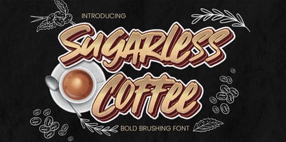 Hello Everyone, introduce our new product Sugarless Coffee - Bold Brushing Font Crafted Display, inspired by the title of the sports poster and We make it very energetically. Sugarless Coffee font with strong and challenging nuances. very suitable for the title, typography, Poster, magazines, brochures, packaging,Websites and much more for your design needs, making your designs more modern and professional. Inspired by Logo style and combination with Cute Craft style. that will fulfill your design needs for quotes,sporty theme, logotype, wordmark, etc. This has many opentype features and support multi language. You can activate Ligature OpenType panel design more interesting.
 - Boldy by Larin Type Co,
$18.00 BOLDY This is a stunning display serif font, it includes alternates for lowercase, as well as ligatures for lowercase. This multi-purpose font captures a huge range for the design and creation of your project. Laro will perfectly cope with a variety of tasks and will always look stylish and modern. With it, you can create logos, labels, advertising, packaging, branding, book covers and magazines, cosmetics, banners, posters, headings, descriptions, stationery, advertising and much more. Full alphabet with Uppercase and Lowercase A-z Numbers, fractions Punctuation and symbols Alternates for Lowercase Ligatures for Lowercase Multilingual support
 - Theadzan by Almarkha Type,
$29.00 Hello everyone, we introduce our new product, Thadzan - Super Bold Condensed inspired by the title of the sports poster, We make it very energetically, so it has very strong characteristics, taking into account the thickness and density of each gliph, along with a ligature that makes this font look unique. Thadzan font with strong and challenging nuances. It is also equipped with 10 glyph ligatures, which make the characteristics of this font even more extraordinary. very suitable for the title, typography, clothes, Poster, magazines, brochures, packaging,Websites and much more for your design needs, making your designs more modern and professional.
 - Bomanda Signature by Febri Creative,
$12.00 Bomanda Signature is a handwritten signature font. This font has 2 stylistic forms, namely regular and italic. Also added is a bonus 1 font, a floral element font that can be used for: logos, writing ornaments, making frames, and much more. You can create the perfect signature or logo with this font. What's Included? - Bomanda Signature Regular OTF - Bomanda Signature Italic OTF - Bomanda Floral Elements OTF - More than 598 of glyphs - Works on PC & Mac Simple Installations Accessible in the Adobe Illustrator, Adobe Photoshop, Adobe InDesign, CorelDraw, even work on Microsoft Word. Multilingual Support Thanks and have a wonderful day.
 - Happy Twigs by Yumna Type,
$25.00 Fonts are sometimes so limited and boring that it is hard to stand out your designs. What is worse is that you want unique, visually interesting designs, but you still have to use common fonts people have already used. Therefore, Happy Twigs can be your interesting alternatives. Happy Twigs is a twig branch-inspiring display font of which letters are made in a lot of lines forming complex, attractive displays. Its unique character is due to the complex, detailed displays with which you can apply for any artistic, creative designs. Such a display font is applicable for any nature related products. Its complex, attractive letters will help you emphasize the messages you deliver and express different nuances depending on the design and color choices. In addition, it shows crowded and detailed, yet artistic and attractive nuances. Happy Twigs provides a clipart in accordance with the font theme as a bonus and features you can enjoy. Features: Multilingual Supports PUA Encoded Numerals and Punctuations Happy Twigs fits best for various design projects, such as brandings, headings, magazine covers, quotes, printed products, merchandise, social media, etc. Find out more ways to use this font by taking a look at the font preview. Thanks for purchasing our fonts. Hopefully, you have a great time using our font. Feel free to contact us anytime for further information or when you have trouble with the font. Thanks a lot and happy designing.
 - Tempting by RGB Studio,
$19.00 Tempting Script is one of the Elegant script fonts that comes with a very beautiful character change, a kind of classic copper decorative script with a modern touch, designed with high detail to present an elegant style. Files Include : Basic Latin A-Z and a-z Numbers Symbols PUA Encode Multilanguage Support Tempting Script is interesting because the typeface is pleasing to the eye, clean, feminine, sensual, glamorous, simple and very easy to read, because of the many luxurious letter connections. I also offer a number of decent stylistic alternatives for some of the letters. This font perfectly made to be applied especially in logo, and the other various formal forms such as invitations, labels, logos, magazines, books, greeting / wedding cards, packaging, fashion, make up, stationery, novels, labels or any type of advertising purpose. Tempting has 349+ , including multiple language support. With OpenType features with alternative styles and elegant. The OpenType features don't work automatically, but you can access them manually and for best results your creativity will be required in combining variations of these Glyphs. I highly recommend using a program that supports OpenType features and the Glyphs panel such as Adobe Illustrator, Adobe Photoshop CC, Adobe InDesign, or CorelDraw, so that you can view and access all variations of Glyphs. Thanks and have a wonderful day, If you have any questions, please get in touch with us Don't forget to check out our other products.
 - Aviano Contrast by insigne,
$22.00 The Aviano series returns, refined and sophisticated with an extended, high-contrast sans-serif family. Aviano Contrast is a contemporary typeface radiating with luxury. It's classic elegance makes it perfect for high-end applications such as cosmetic, jewelry or fashion brands. Aviano Contrast's extended forms give the face a smart look, and the curves are carefully honed to be sinuous and seductive. This high-contrast face is in a class of its own, composed in the style of a classic Didone but lacking the typical serifs. Aviano Contrast comes in six different weights and is packed with OpenType features. Need swash forms? Ball terminals? Art Deco alternates inspired by the inscriptions and signage of the '20s and '30s? Aviano Contrast includes 230 alternate characters. Twelve style sets are available, including four complete sets of art deco-inspired alternates, small forms, swash, titling and a wide array of other alternates to make your designs unique. As a complement to these characters, Aviano Contrast also includes 40 discretionary ligatures for artistic typographic compositions. Please see the informative .pdf brochure to see these features in action. OpenType capable applications such as Quark or the Adobe Creative suite can take full advantage of the automatically replacing ligatures and alternates. This family also includes the glyphs to support a wide range of languages. The rest of the Aviano series pairs very well with this face. These include Aviano, Aviano Serif, Aviano Sans, Aviano Didone, Aviano Flare, Aviano Future and Aviano Slab.
 - Raigatta Script by Colllab Studio,
$17.00 Presenting Raigatta Script! An authentic script font with Alternates and Extra. This font made with the perfect combination of each character. You can combine with aLternates and extra to get a unique combination. It looks original and can be used for all your project needs. Each glyph has its own uniqueness and when meeting with others will provide dynamic and pleasing proximity. This font can be used at any time and in any project. You can see in the presentation picture above, Raigatta Script looks unique and so flow style on design projects. So, Raigatta Script Font can't wait to give its touch to all your design projects such as quotes, weddings, Japanese theme design, poster design, personal branding, promotional materials, website, logotype, product packaging, etc. WHAT'S INCLUDED? Raigatta Regular • It comes with uppercase, lowercase, ligatures, numeral, punctuation, symbols, Many Ligatures, Alternates, and Standard Latin Multilingual Support (Afrikaans, Albanian, Catalan, Danish, Dutch, English, French, German, Icelandic, Indonesian, Italian, Malay, Norwegian, Portuguese, Spanisch, Swedish, Zulu, and More). Raigatta Stylish Alternate • It comes with uppercase and lowercase. Just access using Opentype Feature or Characters Map Tool. Raigatta Alternate Ending Swash • It comes with lowercase only. Just access using Opentype Feature or Characters Map Tool. Extra Swashes • Included 12 Underline Swashes. You can feature all with typing c_1 until c_12. Just access using Opentype Feature or Characters Map Tool. A Million Thanks Colllab Studio
 - Preta by Lián Types,
$39.00 Preta, portuguese for a very pure kind of black, has its name very related to its concept: I wanted to make the fattest/darkest script ever. People who follow my work may notice its forms are very related to works of my past (1) but this time the challenge was to be very cautious with the white spaces between letters. Not only I followed some rules and ductus of the copperplate style of calligraphy but also I took a lot of inspiration in posters of the early Art Nouveau (specially in Alfred Roller of the Vienna Secession) where letters forms looked like black squares if not looked from a close distance. With Preta, I wanted to achieve that same idea of “darkness” and thanks to the always welcomed question -what if?- the font grew a lot. The result is a very fat font, that looks delicious. Due to possible customer needs, I designed Preta Small, so it can be used in smaller sizes. Preta Ao Sol (which literally means under the sun!) is a style with those lovely tiny details to give the sensation of bright. Preta Ao Sol Solo was made to be used as a layered font with Preta. Finally, Preta Capitals serves as a company for Preta. Hope you enjoy the font as much as I did when designing it: The fact that it’s full of alternates, swashes, ligatures and swirls makes it really pleasurable at the moment of using it. Give it a try and dance with Preta! TIPS For better results, use Preta with the ‘standard ligatures’ feature activated. NOTES (1) Beatle in 2014. Seventies in 2015.
 - Sassoon Write by Sassoon-Williams,
$66.00 These fonts will join-as-you-type in your OpenType application as shown in the posters above. Choose Use Contextual Alternates option in your app to get basic recommended baseline joins for teaching. Additionally, use can choose from 7 Stylistic Sets of alternative letterforms that are so important for Teachers. Create 'pen-lifts' too! Fonts display unjoined by default on this website and are delivered that way - joining is controlled by you. A mature ‘joined-up’ hand is the result of correct instruction from an early age. Sassoon Write typefaces are a direct progression from the separate letters of Sassoon Infant or Sassoon Primary and were specially created for teaching cursive handwriting in a flexible way. Designed for older pupils and adults, rather than children. A family of 4 fonts than join, or enter " | " between letters for unjoined text. For use with OpenType compatible applications such as Word. Enables progressive pupil exercises for a smooth transition between separate letters and teaching joined handwriting. Free to download resources Stylistic Sets and how to access the alternative letters feature in these OpenType fonts Purchasers of this font package may use their Order Number to receive a free Copybook PDF by Rosemary Sassoon recommended for effective teaching
 - FS Truman by Fontsmith,
$80.00 Beyond broadcast Like Truman Burbank, the star of The Truman Show, FS Truman was born for TV. You’ll know it from Sky One’s on-screen trails and announcements, but it’s just as at home in other media. Its starting point was the skeleton of a highly legible, space-saving, corporate font with some of FS Dillon’s geometric discipline built in. Its distinctive tone of voice and “ownability” are in its boxy but friendly shapes, and characters with hybrid features. FS Truman’s weights and widths were honed to work at TV screen resolutions. A face for TV it may have been, but this is a font that works on every level, on screen, in print, in headlines, in listings, in longer text, in tight corners and open spaces. The space-saver Compact, condensed but crystal clear, FS Truman comes into its own where a lot needs to be said in not a lot of space. Its letter spacing allows the type room to breathe, even at small sizes, while its fulsome x-height and diminutive descenders pave the way for tighter leading. A natural for headlines and titles over three or four lines. “Hybrid” features With every font, Fontsmith look for crafty new ways to imbue letterforms with a consistent character. The idea with FS Truman was to introduce “hybrid” features. In open letters such as “c” and “s”, for example, the top terminals have straight, vertical cuts while their lower terminals have a more angular, cursive finish. Boxy, spacious forms with unusual curves and angles create not just highly legible and efficient letters but strongly distinctive ones, too.
 - Areplos by Storm Type Foundry,
$53.00To design a text typeface "at the top with, at the bottom without" serifs was an idea which crossed my mind at the end of the sixties. I started from the fact that what one reads in the Latin alphabet is mainly the upper half of the letters, where good distinguishableness of the individual signs, and therefore, also good legibility, is aided by serifs. The first tests of the design, by which I checked up whether the basic principle could be used also for the then current technology of setting - for double-sign matrices -, were carried out in 1970. During the first half of the seventies I created first the basic design, then also the slanted Roman and the medium types. These drawings were not very successful. My greatest concern during this initial phase was the upper case A. I had to design it in such a way that the basic principle should be adhered to and the new alphabet, at the same time, should not look too complicated. The necessary prerequisite for a design of a new alphabet for double-sign matrices, i.e. to draw each letter of all the three fonts to the same width, did not agree with this typeface. What came to the greatest harm were the two styles used for emphasis: the italics even more than the medium type. That is why I fundamentally remodelled the basic design in 1980. In the course of this work I tried to forget about the previous technological limitations and to respect only the requirements then placed on typefaces intended for photosetting. As a matter of fact, this was not very difficult; this typeface was from the very beginning conceived in such a way as to have a large x-height of lower-case letters and upper serifs that could be joined without any problems in condensed setting. I gave much more thought to the proportional relations of the individual letters, the continuity of their outer and inner silhouettes, than to the requirements of their production. The greatest number of problems arose in the colour balancing of the individual signs, as it was necessary to achieve that the upper half of each letter should have a visual counterbalance in its lower, simpler half. Specifically, this meant to find the correct shape and degree of thickening of the lower parts of the letters. These had to counterbalance the upper parts of the letters emphasized by serifs, yet they should not look too romantic or decorative, for otherwise the typeface might lose its sober character. Also the shape, length and thickness of the upper serifs had to be resolved differently than in the previous design. In the seventies and at the beginning of the eighties a typeface conceived in this way, let alone one intended for setting of common texts in magazines and books, was to all intents and purposes an experiment with an uncertain end. At this time, before typographic postmodernism, it was not the custom to abandon in such typefaces the clear-cut formal categories, let alone to attempt to combine the serif and sans serif principles in a single design. I had already designed the basic, starting, alphabets of lower case and upper case letters with the intention to derive further styles from them, differing in colour and proportions. These fonts were not to serve merely for emphasis in the context of the basic design, but were to function, especially the bold versions, also as independent display alphabets. At this stage of my work it was, for a change, the upper case L that presented the greatest problem. Its lower left part had to counterbalance the symmetrical two-sided serif in the upper half of the letter. The ITC Company submitted this design to text tests, which, in their view, were successful. The director of this company Aaron Burns then invited me to add further styles, in order to create an entire, extensive typeface family. At that time, without the possibility to use a computer and given my other considerable workload, this was a task I could not manage. I tried to come back to this, by then already very large project, several times, but every time some other, at the moment very urgent, work diverted me from it. At the beginning of the nineties several alphabets appeared which were based on the same principle. It seemed to me that to continue working on my semi-finished designs was pointless. They were, therefore, abandoned until the spring of 2005, when František Štorm digitalized the basic design. František gave the typeface the working title Areplos and this name stuck. Then he made me add small capitals and the entire bold type, inducing me at the same time to consider what to do with the italics in order that they might be at least a little italic in character, and not merely slanted Roman alphabets, as was my original intention. In the course of the subsequent summer holidays, when the weather was bad, we met in his little cottage in South Bohemia, between two ponds, and resuscitated this more than twenty-five-years-old typeface. It was like this: We were drinking good tea, František worked on the computer, added accents and some remaining signs, inclined and interpolated, while I was looking over his shoulder. There is hardly any typeface that originated in a more harmonious setting. Solpera, summer 2005 I first encountered this typeface at the exhibition of Contemporary Czech Type Design in 1982. It was there, in the Portheim Summer Palace in Prague, that I, at the age of sixteen, decided to become a typographer. Having no knowledge about the technologies, the rules of construction of an alphabet or about cultural connections, I perceived Jan Solpera's typeface as the acme of excellence. Now, many years after, replete with experience of revitalization of typefaces of both living and deceased Czech type designers, I am able to compare their differing approaches. Jan Solpera put up a fight against the digital technology and exerted creative pressure to counteract my rather loose approach. Jan prepared dozens of fresh pencil drawings on thin sketching paper in which he elaborated in detail all the style-creating elements of the alphabet. I can say with full responsibility that I have never worked on anything as meticulous as the design of the Areplos typeface. I did not invent this name; it is the name of Jan Solpera's miniature publishing house, in which he issued for example an enchanting series of memoirs of a certain shopkeeper of Jindrichuv Hradec. The idea that the publishing house and the typeface might have the same name crossed my mind instinctively as a symbol of the original designation of Areplos - to serve for text setting. What you can see here originated in Trebon and in a cottage outside the village of Domanín - I even wanted to rename my firm to The Trebon Type Foundry. When mists enfold the pond and gloom pervades one's soul, the so-called typographic weather sets in - the time to sit, peer at the monitor and click the mouse, as also our students who were present would attest. Areplos is reminiscent of the essential inspirational period of a whole generation of Czech type designers - of the seventies and eighties, which were, however, at the same time the incubation period of my generation. I believe that this typeface will be received favourably, for it represents the better aspect of the eighties. Today, at the time when the infection by ITC typefaces has not been quite cured yet, it does absolutely no harm to remind ourselves of the high quality and timeless typefaces designed then in this country.In technical terms, this family consists of two times four OpenType designs, with five types of figures, ligatures and small capitals as well as an extensive assortment of both eastern and western diacritics. I can see as a basic text typeface of smaller periodicals and informative job-prints, a typeface usable for posters and programmes of various events, but also for corporate identity. Štorm, summer 2005 - Ekaliptus by Yinon Ezra,
$9.90 Ekaliptus, Display Condensed and Humane Typeface, Containing 4 Weights + 4 Matched Italics, Can be used for Headlines and Logos. Two Styles that work well together to form a better tool for you.
 - Breathy Signature by Nathatype,
$29.00 Reveal your very best design result that makes everyone brainstorming easily with Breathy Signature. It's a versatile monoline signature font. The brushstrokes and curves style applied to the characters that resemblance to actual handwriting gives this font natural yet elegant feels. This font also easy to read and will look great in a variety of sizes. Features: Stylistic Sets Ligatures Swashes Numerals and Punctuations PUA Encoded It can be used for many design projects, such as poster, logo, book cover, branding, heading, printed product, merchandise, quotes, social media campaign, etc. Get more inspiration about how to use it by seeing the font preview. Thank you for purchasing our fonts. Please don’t hesitate to contact us, if you have any further question or issues. We’re happy to help. Happy Designing.