10,000 search results
(0.036 seconds)
- Bright Melody by Zeenesia Studio,
$17.00 Bulgaria Script is a beautiful and light handwritten font with a unique feel and a stunning impact. It will add a luxury spark to any design project that you wish to create! This font is PUA encoded which means you can access all of the amazing glyphs and ligatures with ease!
 - Eye Monsta by Illushvara,
$15.00 Eye Monsta is a bold and fun display font, carefully handcrafted to become a true favorite. Its casual charm makes it appear wonderfully down-to-earth, readable and, ultimately, incredibly versatile. This font will look outstanding in any context, whether it’s being used on busy backgrounds or as a standalone headline!
 - Oyscake by Allouse Studio,
$16.00 Proudly Present, Oyscake a Handwritten Font. Oyscake is perfect for any titles, logo, product packaging, branding project, megazine, social media, wedding, or just used to express words above the background. Oyscake also come with Multi-Lingual Support. Enjoy the font, feel free to comment or feedback, send me PM or email.
 - Kush by Our House Graphics,
$17.00 Kush is what happens when you let your fonts sit around watching cartoons and eating cake and ice-cream all day�When their vectors are freed from all constraints and allowed to follow their bliss. Kush has filled its insides to just the other side of contentment and comes to you on a sugar high and with a head full of Looney Tunes. And... It�s two ply! A two-layered display face from Our House Graphics with a plush, organic feel, Kush has 370 glyphs, over two dozen standard and discretionary ligatures, stylistic alternates and a few surprises. Kush Fat and Kush Shade work well independently but together they become a two colour, two layer font. Simply type some text in Kush Shade, copy it and paste it back on top of your original text. Then change the top layer to Kush Fat and adjust the colours to your liking. For best results, use default settings for kerning and tracking (letter spacing).
 - Combine by Andinistas,
$49.00 Combine, designed by Carlos Fabian Camargo G, is powerful and attractive, multi-layered chromatic type family that consists of 12 fonts, typographically grouped in two logics: “Script and Caps”, so that they could be colored separately or in group. Both designed with contrasting optical techniques and combinable at the same time. The unforgettable central idea of Combine was inspired by unique types of speedball letters designed by ancient artists in Canadian posters of shows and fairs in 1930. This is why its Typographical tools work independently or in group, resulting in highly polished designs that need fonts with coupled effusiveness. Their combined resources offer guaranteed distinguishing letters with shadow effects and worn, in order to help enhance their expressiveness. Combine is excellent in any project on paper or screen as it has more than 2100 glyphs and features of OpenType distributed strategically in fonts easy to use. SEE BELOW THE MAIN ADVANTAGES: • Combine Script & Shadow: It offers incredible case sensitive fluency and eloquence drawn with vertical cursive letters with ornamental non-stop excitement and complementation. It also has a variety of significant upward and downward, alternative strokes combined with its vintage ties that also give authenticity to their designs. • Combine Caps 1,2,3 & Shadow1,2: Guarantees you a colorful horizontal area of narrow case with 2 types of shadows, sound and other shade with diagonal stripes. Its geometric uniformity gives a friendly, open and subtle character by Typographic and special resources and visual properties coloring layers separately or in groups. In addition, its 2 layers of skeletal illuminations, adding internal lines and simultaneously contributing to play perfect confrontation and contrast with their geometric ideas and aesthetics for special attention. • Combine Words & Shadow: It can be used to design a perfect tone in each one of the 50 slogans written diagonally, making a brilliant feeling suggestive seductive style. Compatibility and flexibility works by monoline thin cursive strokes ideal for featured items with and without shade. Combine was selected at the Bienal Tipos Latinos 2016
 - Amira Madison Script by Jamalodin,
$17.00 Introducing Amira Madison Script! Amira Madison Script is modern calligraphy script font, every single letters has been carefully crafted to make your text looks beautiful. With modern script style this font will perfect for many different project, example: invitations, greeting cards, posters, name card, quotes, blog header, branding, logo, fashion, apparel, letter, stationery and more! Amira Madison Script come with 780+ glyphs. The alternative characters were divided into several Open Type features such as Swash, Stylistic Sets, Stylistic Alternates, Contextual Alternates. The Open Type features can be accessed by using Open Type savvy programs such as Adobe Illustrator, Adobe InDesign, Adobe Photoshop Corel Draw X version, And Microsoft Word. And this Font has given PUA unicode (specially coded fonts). so that all the alternate characters can easily be accessed in full by a craftsman or designer. Amira Madison Script Contains: - Uppercase & Lowercase - International Language & Symbols - Punctuation & Numbers - PUA Unicode - Standard Stylistic Alternates - Stylistic Set 1-23 - Character Variant Contextual. The ZIP file are include the following : Amira Madison Script.otf If you don't have a program that supports OpenType features such as Adobe Illustrator and CorelDraw X Versions, you can access all the alternate glyphs using Font Book (Mac) or Character Map (Windows). If you have any question, don't hesitate to contact me by email: jamalodin11@gmail.com
 - Edcosmic by Colllab Studio,
$14.00 "Hi there, thank you for passing by. Colllab Studio is here. We crafted best collection of typefaces in a variety of styles to keep you covered for any project that comes your way! CALLING ALL CREATIVE PEOPLE and any other creator who wants their work to stand out. Edcosmic is an urban glyphic font that pours unique character into your creation. The traditional way of having graffiti style is to draw every letter manually. For every styles that you want to create, you’ll have to draw each letter by hand. This will take you days and most likely months to finish your project. With technical development, it limits the use of graffiti style in real life because it is so time consuming. Edcosmic is a graffiti font with an elaborate character set that makes creating the new styles easier than ever before. You don’t have to draw every single letter by hand anymore. What took months can now be done within hours if not minutes! You are still limited by your own creativity instead of time consumption. Edcosmic is a font with a new graffiti character set that gives creative freedom to your world. The font has very detailed characters, this will make your design different from all the others. By having a special font you can create a new style and make the world your own! A Million Thanks www.colllabstudio.com
 - Piscis by Susana Simplício,
$35.00 Piscis Dingbats are inspired by aquaculture and fishkeeping, and its main feature is the detailed drawings enabling a real representation of the fishes. Each Dingbat can be used individually or in the construction of illustrations through the combination of drawings, the limit is the imagination to create a variety of creative possibilities.
 - Antique Borders & Corners 2 by Aerotype,
$29.00 Hand selected from multiple sources, the 60+ glyphs of Antique Borders & Corners 2 can be mixed and matched to make authentic 18th and 19th century borders of any length. Flip the orientation for 'bottom' borders with the shift key.
 - Ivan by Hot Russian Pancakes,
$- Monospaced black slab-serif without any philosophy or idea, it doesn't pretend to be anything sophisticated, it is as simple as chewing gum or a can of soda. Simple and angry typeface Ivan has a lively friend — Juan typeface.
 - Sekek by Gholib Tammami,
$14.00 Sekek is a cute display font. It embodies playfulness and authenticity and is the perfect choice for any children’s activity or school project. Add this chunky lettered font to your designs and notice how it makes them come alive.
 - Juan by Hot Russian Pancakes,
$- Monospaced black slab-serif without any philosophy or idea, it doesn't pretend to be anything sophisticated, it is as simple as chewing gum or a can of soda. Simple and lively typeface Juan has a ascetic friend — Ivan typeface.
 - Miranda by Tim Rolands,
$19.00A mysterious beauty hidden away on a secret island by her eccentric wizard father? No: An elegant display face influenced by Aldine old-style letterforms, Miranda brings classic sophistication to any project. The family includes regular and bold weights. - Terazza Tiling by Greater Albion Typefounders,
$8.95 Terazza Tiling was brought to mind by old-fashioned tiled fireplace surrounds. It's a system of geometric tiles intended for constructing page borders and rules. Their geometric nature makes them adaptable for any sort of period or modern look.
 - Antique Borders & Corners 1 by Aerotype,
$29.00 Hand selected from multiple sources, the 60+ glyphs of Antique Borders & Corners 1 can be mixed and matched to make authentic 18th and 19th century borders of any length. Flip the orientation for 'bottom' borders with the shift key.
 - Simple Home by Goodigital13,
$20.00 This font perfectly made to be applied especially in logo, and the other various formal forms such as invitations, labels, logos, magazines, books, greeting / wedding cards, packaging, fashion, make up, stationery, novels, labels or any type of advertising purpose.
 - Typesetter Treasures JNL by Jeff Levine,
$29.00 Cartoon cuts, sales builders, catchwords, mortised cuts, decorative embellishments and stock art are what comprise the images found within Typesetter Treasures JNL. Redrawn from vintage sources, these nostalgic illustrations add warmth and charm to any print or web project.
 - Magules by HansCo,
$15.00 Magules is a serif typeface with vintage and retro look!. Equipped with all complete characters ranging from uppercase letters, lowercase letters, numbers, punctuation marks and multi-lingual support, this font is ready to be used in any project. Enjoy!
 - Sugar Candy by madeDeduk,
$14.00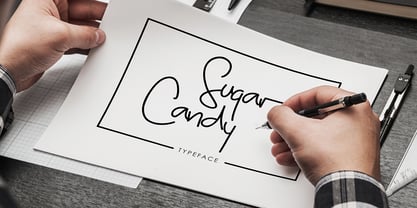 Sugar Candy is a signature typeface font inspired from classic handwriting style. Suitable to create any branding, product packaging, invitations, quotes, t-shirts, labels, posters and more. Feature UPPERCASE lowercase Number & Symbol International Glyphs Alternative Uppercase Alternative lowercase Ligatures
 - Chocco by Oliveira 37,
$26.00 Chocco is a chunky and a fun display typeface. With an extra heavy but friendly personality, Chocco works well for posters, food packaging, children’s products and books, or any communications which needs to be friendly, fun, casual or loud.
 - Hip Slop by Ampercamp,
$9.95 Inspired by field research of marker graffiti in the Pearl District of Portland, Oregon, Hip Slop is an urban all-caps typeface with a serendipitous edge. Includes over 60 unique characters to accomodate any message worth defacing property for.
 - Beast Maker by Remedy667,
$18.00 Unleash the beast with Beast Maker, the ultimate gritty horror font from Remedy667. Inspired by 1970s Giallo films and perfect for creating a powerful and sinister vibe, Beast Maker is an essential tool for any horror designer. Beast Maker is perfect for spooky posters and flyers, horror-themed video games and movies, or any project that needs an eerie touch. Beast Maker - because fear is always in fashion. Doubles Elimination for letters and numbers gives you a more natural look. All caps font design. Includes a Remedy667 Font Catalog PDF, all your favorite fonts in one handy catalog. Unleash the Beast Maker!
 - Spiraltwists by Aah Yes,
$0.75Spiraltwists is a family of 2 fonts giving assorted spiral shapes. In each font they're grouped in fours - the same basic spiral in 4 different orientations (N S E W almost), and Spiraltwists has solid lines making up the spirals, Spiraltwists Antique has dotted lines making up the spirals, giving them an antique or rustic appearance. Spiraltwists has heavier spirals on Upper Case, lighter spirals on lower case; plus a group of spirals with a straightened outer end and connecting lines so you get two spiral scrolls joined together by a long line at the top or bottom. (inputting UVWXYZ into the text-box on this webpage will show it). The big example on the webpage shows it all more clearly than any explanation. A fuller description, plus the above example, are included in the zipfile. Please note: for the avoidance of doubt, the font does not contain any letters, the text in these 2 examples is not Spiraltwists but Luzaine. - Allrounder Antiqua by Identity Letters,
$40.00 Timeless Renaissance looks, gently updated. For novels and billboards alike. Allrounder Antiqua is an old-style serif member of the Allrounder superfamily. A timeless typeface based on classical proportions, Allrounder Antiqua is perfectly suitable for advanced book and editorial design well as packaging and branding. True: its main purpose is to set flawless body copy and to generate an evenly textured page—but its refined shapes work fantastically in display applications, too. Some details, such as the small and sharp bowl of the lowercase a, are fully appreciated in large sizes only. If you need a sophisticated serif typeface for packaging, food, fashion, consumer goods, or lifestyle branding, Allrounder Antiqua is up for it. It's also apt as an outstanding corporate typeface, be it for a more conservative venture or the latest hipster start-up. This classy serif typeface comes in four weights with corresponding true italics. Just like its sans-serif counterpart, Allrounder Grotesk, Allrounder Antiqua is equipped with plenty of Opentype Features like small caps, six sets of figures, case-sensitive forms, superiors, fractions and many ligatures. You will find alternate letters with swashes within this extended character set, as well as all the accented glyphs necessary to support more than 200 Latin-based languages. Historical Background The (French) Renaissance-influenced typeface started as Moritz Kleinsorge's graduation project within the "Expert Class Type design" course of the Plantin Institute for Typography, located in the famous Museum Plantin-Moretus in Antwerp, Belgium. There, Moritz Kleinsorge decided to create a revival of Robert Granjon's "Ascendonica Romain", described as "a beautiful face; typical of Granjon's mature style" in the inventory list of available material. "To touch punches and matrices cut by Robert Granjon back in 1567 was an invaluable inspiration", Moritz explains. Over time, the typeface moved away from being a true revival. Rather, it evolved into a Granjon-inspired typeface. That typeface is now available as Allrounder Antiqua. Perfect Pairing: Allrounder Antiqua + Allrounder Grotesk Allrounder Grotesk is the ideal complement to Allrounder Antiqua. They both share common vertical metrics and a common color. This allows you to pair both typefaces within the same layout—even within the same paragraph—without creating visual disruption. Head over to the Family Page of Allrounder Grotesk to get more information about this typeface. Design Trick: Bilingual Design With the Allrounder Superfamily Combining Allrounder Grotesk with Allrounder Antiqua is an ideal approach for bilingual designs, wherein both languages get the same emphasis yet are distinguished with two different typefaces. It's also best practice to set headlines in a different typeface than the body text if they harmonize with each other. Allrounder Grotesk and Allrounder Antiqua provide you with the perfect pair for this purpose.
 - Brown Hunter Vic by Alit Design,
$15.00 Brown Hunter Inspired by the design style of the 1830s, the elegant Victorian style design is full of charming sharp curves. Designs with a classic Victorian style from the cruel era, people always use it for redesigning needs or creating new designs. The Brown Hunter typeface is designed in an elegant Victorian style which contains many font characters which when combined will make an attractive design and of course very cool. Included in the download package are: Brown Hunter Vic, which is a classic Victorian serif style and contains swash and alternatives, there are two types of Brown Hunter Vic, the standard one and the hold one, which contains ornaments on the inside of the body. Brown Hunter Script is an elegant street writing style made with spontaneous and sharp brush strokes giving a bold impression. Brown Hunter Dis is a Serif display style font that is intended for subtitles in designs, besides this font has 13 families from thin to heavy. Brown Hunter Black is a font with a charming black letter style and is still comfortable to read when used for body text in a classic Victorian style. This font also has 13 families from thin to heavy so it can be used for headers or body text. Brown Hunter Ornament is a font made with a unique orament shape in the classic Victorian style, besides that there are also border frames, animal vectors, silhouette logos, flowers and many more. With 4 styles and 30 different fonts, the Brown Hunter typeface when combined will create a cool design and a Victorian concept. By collecting Brown Hunter Typeface you can easily create classic, Victorian and elegant themed designs. Brown Hunter is perfect for designing vodka labels, beer, pomade, logo tattoos, book covers, t-shirts and so on.
 - River City Sandwriting by River City,
$24.98 I searched all over the internet looking for a realistic sand writing font and came away empty handed. Undaunted by this, I grabbed my business partner, Mary and trekked down to our local river, the Arkansas (pronounced ar-KAN-sas around here). Using sticks, we scratched out the entire alphabet in the sand, including upper & lowercase, and punctuation marks! I photographed the characters, converted them to line art on my computer and used font creating software to turn it into a true type font! This font was designed for adding dates, places and messages to your beach photos that looked as if you wrote it in the sand before you took the picture! It is a decorative font best used in large, headline sizes. To make it appear more realistic, select a darker color from the sand in the photo to use for the type instead of black!
 - Ongunkan Arkaic Greek by Runic World Tamgacı,
$45.00 Many local variants of the Greek alphabet were employed in ancient Greece during the archaic and early classical periods, until around 400 BC, when they were replaced by the classical 24-letter alphabet that is the standard today. All forms of the Greek alphabet were originally based on the shared inventory of the 22 symbols of the Phoenician alphabet, with the exception of the letter Samekh, whose Greek counterpart Xi (Ξ) was used only in a sub-group of Greek alphabets, and with the common addition of Upsilon (Υ) for the vowel /u, ū/.[1][2] The local, so-called epichoric, alphabets differed in many ways: in the use of the consonant symbols Χ, Φ and Ψ; in the use of the innovative long vowel letters (Ω and Η), in the absence or presence of Η in its original consonant function (/h/); in the use or non-use of certain archaic letters (Ϝ = /w/, Ϙ = /k/, Ϻ = /s/); and in many details of the individual shapes of each letter. The system now familiar as the standard 24-letter Greek alphabet was originally the regional variant of the Ionian cities in Anatolia. It was officially adopted in Athens in 403 BC and in most of the rest of the Greek world by the middle of the 4th century BC.
 - Matwin by Eyad Al-Samman,
$10.00 The idea behind designing ‘Matwin’ font was related to the youngest children of the designer namely the M-A fraternal twin. The name of the typeface (i.e., Matwin or M-A-Twin) was composed by merging three linguistic small syllables. The ‘-Twin’ syllable refers to the non-identical twin of the designer. The ‘M-’ and ‘A-’ syllables refer to the initial letters of the twin’s first names (i.e., Muhammad and Abdul-Wli) respectively. The typeface ‘Matwin’ has a personal trait which makes it as one of the most favorite fonts for the designer among his humble collection of fonts. Modestly, it is the designer’s handwriting and it has been designed to be added to the script font family known as brush un-joined. The brief process for having this typeface alive was done by firstly scanning the real script for each Latin letter, digit, symbol which were handwritten earlier by the designer himself. Then, the combination of these many scanned characters was manipulated using digital programs to produce at the end the complete typeface. The typeface has the essential glyphs comprising the character set required for most of the Latin, Western, and Eastern European languages including the Irish language. It combines +605 characters and this makes it as a pro font. It also entitles it to be applicable for usage in many languages of different communities and nations worldwide. ‘Matwin’ is dedicated for those who search for a genuine handwriting typeface with a natural touch and informal style to be added on their different published and produced products and services. It is more preferable when it is used in artistic, typographic, and other works using the lowercase letters or by mixing both upper- and lower-case letters. Moreover, the typeface is appropriate for any type of typographic and graphic designs in web, print, and other media such as boards and walls. It is also preferable to be used in the wide fields related to publications especially children-related ones, comics, printed or handwritten menus of cafeterias and restaurants at universities and public places, as well as other prints related to services and production industries. It also can create a very personal and friendly impact when used in headlines, books and novels’ covers, posters, titles, messages, envelopes addresses, grocery lists, postcards, ads, fliers, journals, paper arts, public notices, invitations, scrapbooks, notations, products’ surfaces for organic foods and juices, logos, medical packages related to children, Android applications, as well as products and corporates branding and the like. In a nutshell, ‘Matwin’ typeface fits without a glitch those (i.e., designers, typographers, publishers, artists, packagers, service providers, and so on) who have drastic and strong tendency towards imprinting their works with spontaneous and outlandish touches made by this typeface. Please, enjoy it extremely.
 - Anuschka by Anomali Creative,
$10.00 Introducing **ANUSCHKA** - Faux Cyrillic Display Font Faux Cyrillic, pseudo-Cyrillic, pseudo-Russian or faux Russian typography is the use of Cyrillic letters in Latin text, usually to evoke the Soviet Union or Russia, though it may be used in other contexts as well. It is a common Western trope used in book covers, film titles, comic book lettering, artwork for computer games, or product packaging which are set in or wish to evoke Eastern Europe, the Soviet Union, or Russia. A typeface designed to emulate Cyrillic is classed as an ethnic typeface. **ANUSCHKA** came with that protest and propaganda vibe. It's contain a complete Simple Latin Glyphs, with extra ligatures, D-Ligature, Stylistic set for the main character to make it stencil look and distressed look. --- This font can be used with all software that can read standard fonts. Check out my instagram: https://www.instagram.com/anomalicreatype/ Thanks so much for checking out my shop! All the best, **Krisna Teja** Anomali Creatype #typeface #Stencil #FauxCyrillic #Cyrillic #Military #Protest #Poster #vintage #Extreme #design #Vintage #graphic #calligraphy #Retro #typography #propaganda #Poster #blackletter #retrostyle #illustration #Russian #socialist #character #set #uppercase #decorative #black #classic #Uppercase #handmade #capital #bold #number #modern #tattoo #english #art #label #logo #middle #typographic #antique #sign #letterhead #fashion #filmtitles #russia #comicbooklettering #videogames #computergames
 - Dead Plants - Unknown license

- Eclectic One by Altered Ego,
$45.00STF Eclectic One is a visual cornucopia of symbols, like the junk drawer in your kitchen. Stuff you'll need someday for a graphic element, bullet or dingbat application. Perfect for website icons! The Eclectic family is legendary, with a cult-like following among the inititated. As one of the first dingbat fonts available on the web, it gain popularity after its design in the early 1990s. With over 150 characters in the complete set, you'll find yourself using Eclectic One almost daily to add spice to your otherwise san-serif typographic existence. This font is essentially a soap opera of typographic image elements, created for projects when I couldn't find the "thingbat" I needed. Almost more of a collection of illustrations, there are many characters which connect to form patterns, and of course it's like a "small neutral European country" army knife for the creative community. EcOne features complete hour, quarter, and half-hour notations in an analog clock design glyph, recycled/recyclable symbols, a registration mark, a toaster, globes, sideways diamond arrows, spaceships, stoplights, the "running man," several atomic references, da buzz saw, target icons, the unusual smiley face floating in a ball (with a drop shadow, no less!), and the fish skeleton which complements the fallout shelter symbol, and more. Make your own juxtapositions! One reviewer proclaims "for whatever you do, Eclectic One is an excellent dingbat source." Available in Mac and PC formats. License it today! - Resting by Nathatype,
$29.00 Font is the most important design element to increase your branding. However, it may be tricky and take quite a while to figure out the perfect font for your design. Resting is a perfect display serif font for any of your design projects. Serif font is a font type with sticky small lines on the letters’ edges expressing formal, classic nuances and more aesthetic, creative touches due to the display font combinations. This display font has thick, high contrast lines perfect for catching attention and creating firm impressions. In addition, use this font for big text sizes for a legibility reason and make use of the other interesting features to beautify your designs. Features: Stylistic Sets Ligatures Multilingual Supports PUA Encoded Numerals and Punctuations Resting fits best for various design projects, such as brandings, posters, banners, logos, magazine covers, quotes, headings, printed products, invitations, name cards, merchandise, social media, etc. Find out more ways to use this font by taking a look at the font preview. Thanks for purchasing our fonts. Hopefully, you have a great time using our font. Feel free to contact us anytime for further information or when you have trouble with the font. Thanks a lot and happy designing.
 - Slantblaze Pro by Campotype,
$25.00 We Redesigned this Slantblaze-Pro. Slantblaze Pro is an exteme slanted display script with characteristics: Simple, Thick, Contrast, and Dynamic. First launched in 2011, and now we present it again in a new version to provide the best user experience. As italics (default), Slantblaze Pro has aloof challenge as a display font. It was designed as an alternative for headline, title in any purpose such as header, brands, packaging, identity, automotive logo, etc. What’s new and changed: This version 2.02 comes in a True Type OT-flavor version. The outline were designed to be smoother than before. Redesign of ‘C’, ‘E’, ‘F’, ‘G’, ‘T’, and some changes to all other smallcases Removed: question.sc, questiondown.sc, exclam.sc and exclamdown.sc assuming they will never be used Rewrite the features structure and adding some new related to all changes New swashed glyphs: A-Z The writing system of numbers is completed with the old-style version and each tabular and proportional method New contextual (calt) to an alternative look of “A" when combined with all lowercase. Also in this feature we have another way to access Ornaments is more interactive by combining dlig and calt features. Another new glyph may be access only in feature (salt)
 - KD Hachure by Kassymkulov Design,
$9.95 KD Hachure is a display, geometric font with layering possibilities. Combine the two layers to achieve different color combinations or use them separately to achieve a completely different look. Kerning is optimized so that all latin letters are connected. With the default leading 120%, descenders connect with the top of accents. Set the leading to 100% manually if you want to connect descenders with the top of uppercase or ascender letters.
 - Garamond #3 by Linotype,
$40.99Opinion varies regarding the role of Claude Garamond (ca. 1480–1561) in the development of the Old Face font Garamond. What is accepted is the influence this font had on other typeface developments from the time of its creation to the present. Garamond, or Garamont, is related to the alphabet of Claude Garamond (1480-1561) as well as to the work of Jean Jannon (1580–1635 or 1658), much of which was attributed to Garamond. In comparison to the earlier Italian font forms, Garamond has finer serifs and a generally more elegant image. The Garamond of Jean Jannon was introduced at the Paris World’s Fair in 1900 as Original Garamond, whereafter many font foundries began to cast similar types. Morris F. Benton’s Garamond appeared in 1936 and is based on the forms of Jean Jannon, which already displayed characteristics of the Transitional style. - Glanlen by Bungletter,
$10.00 Glanlen Outline is a very Beautiful, elegant and unique Script font. Expertly designed to become a true favorite, this font has the potential to take your creative ideas to the highest level! Glanlen Outline is appealing because it's sleek, clean, feminine, sensual, glamorous, simple and highly readable, thanks to its many luxurious letter connections. I also offer a number of viable alternative styles for all letters. Classic style is very suitable to be applied in various formal forms such as invitations, labels, restaurant menus, logos, fashion, make up, stationery, novels, magazines, books, greeting cards/weddings, packaging, labels or all kinds of advertisements. for your purposes. . . . . . . Contains full set: -4 Type Font -Uppercase -Lowercase -Alternative -Ligature -Punctuation -Number -Multilingual support. Need help or have questions let me know. I'm happy to help. Thank you & Congratulations on the Design.
 - Garamond Classico by Linotype,
$29.99Opinion varies regarding the role of Claude Garamond (ca. 1480–1561) in the development of the Old Face font Garamond. What is accepted is the influence this font had on other typeface developments from the time of its creation to the present. Garamond, or Garamont, is related to the alphabet of Claude Garamond (1480–1561) as well as to the work of Jean Jannon (1580–1635 or 1658), much of which was attributed to Garamond. In comparison to the earlier Italian font forms, Garamond has finer serifs and a generally more elegant image. The Garamond of Jean Jannon was introduced at the Paris World’s Fair in 1900 as Original Garamond, whereafter many font foundries began to cast similar types. Garamond Classico is based on the forms of Jean Jannon, which already displayed characteristics of the Transitional style. - Parisi by Eurotypo,
$34.00 The Parisii was a small Gallic people settled in the current Paris region, which gave its name to the city of Paris. According to Caesar (53 BC.), their main town (oppidum) was Lutetia (Paris). Parisii was born of inspiration to be leafing through some old magazines on the terrace of a cafe in the beautiful city that is Paris. Parisi is like the city: casual, youth, romantic, free spirited and, at the same time, sophisticated, elegant and classic. The Parisi family font is a lovely and casual handlettering script, which is based on gestual calligraphy. Parisi has a slight bounce and intentional irregularity giving your words a wonderful flow. Fat and thin stroke in this font impresses the harmony. Parisi consists of 3 subfamilies: Regular, Italic and Condensed. This font includes Parisi font has OpenType features such as Stylistics and Contextual alternates, swashes, Standard and Discretional Ligatures, stylistic sets and ornaments that allow you to mix and match pairs of letters to fit your design. This will help your creativity and make it easier to make the impressive and elegant typographic work. This OpenType features may only be accessible via OpenType-aware applications, a Central European language support. Parisi looks lovely on wedding invitations, greeting cards, logos, business-cards and is perfect for using in ink or watercolour based designs, fashion, magazines, food packaging and menus, book covers and more!
 - Didgeree Doodle NF by Nick's Fonts,
$10.00The pattern for this delightful little font was originally released as Bernhard Heavy Antique Cursive by the Bauersche Geißerei of Frankfurt am Main and designed, of course, by Lucien Bernhard. Dippy, trippy, under the radar and over the top. The Postscript and Truetype versions contain a complete Latin language character set (Unicode 1252); in addition, the Opentype version supports Unicode 1250 (Central European) languages as well. - Neudoerffer Fraktur by Linotype,
$29.99Johann Neudörffer the Elder's 1538 writing manual fascinated the German designer Helmut Bomm for years. Together with Albrecht Dürer and Hieronymus Andreä, Neudörffer helped create Fraktur, perhaps the most Germanic of all the blackletter styles. As a tribute to this master, and bringing its letterforms to a 21st century public, Boom released the Neudoerffer Fraktur family through Linotype in 2009. Neudoerffer Fraktur's appearance is based very much in handwriting, and Bomm had already begun using letters from prototype versions of this typeface as early as the 1990s. For years, Neudoerffer Fraktur'sletters would appear secretly and seductively in design projects like historical sign restorations or heraldry pieces. The sources that Bomm used while drawing the typeface were images from Jan Tschichold's Treasures of Calligraphy" and Albert Kapr's "Schriftkunst." The Neudoerffer Fraktur family has four separate fonts. Any user of Adobe CS applications should consider licensing Neudoerffer Fraktur Regular (the font without any numeral suffixes). This font contains three different OpenType stylistic sets. Users can pick and choose which versions of the letters that they would like to set. Anyone using Quark XPress, Microsoft Word, or other applications without support for Stylistic Sets should license Neudoeffer Fraktur Regular 1, Neudoeffer Fraktur Regular 2, and Neudoeffer Fraktur Regular 3. Each of these three fonts has letters with slightly different style of flourish, and all three may be combined with each other. Neudoerffer Fraktur Regular 1 is optimal for longer texts; Neudoerffer Fraktur Regular 2 contains alternate letters, and well as more ornamented capitals; Neudoerffer Fraktur Regular 3's letters have a stronger calligraphic accent."
