10,000 search results
(0.087 seconds)
- Alameda Script by Mans Greback,
$59.00 Alameda Script is a sporty script typeface. A sharp calligraphy lettering that brings your mind to a distinguished championship, Alameda Script is a professional quality formal font family. Drawn and created by Mans Greback in 2022, it is perfect for a classic sport headline or a fresh and modern logotype design. Use underscore _ to make a swash. Example: Breakers_ Use multiple underscores to make swashes of different lengths. Example: Baseball______ (Download required.) Alameda Script is provided in three styles: Regular, Bold and Black, in order to compliment each other and maximise your options and design experience. The font is built with advanced OpenType functionality and has a guaranteed top-notch quality, containing stylistic and contextual alternates, ligatures and more features; all to give you full control and customizability. It has extensive lingual support, covering all Latin-based languages, from Northern Europe to South Africa, from America to South-East Asia. It contains all characters and symbols you'll ever need, including all punctuation and numbers.
 - Letterature by Kaer,
$21.00 Letterature is an elegant serif. I designed old-fashioned letters with playful ligatures. The font may be used for creating classical printing, logo design, clothing embroidery, product packaging, vintage header, luxury identity, etc. What you will get: * Uppercase and lowercase * Ligatures * Multilingual support * Numbers * Symbols * Punctuation To have a look at all the ligatures in the font you may open the glyphs panel: In Photoshop go to Window - glyphs In Illustrator go to Type - glyphs Please feel free to request to add characters you need: kaer.pro@gmail.com
 - Roberto by Letterara,
$12.00 Roberto is a charming and magical hand-lettered script font. The playful rounded characters make it the perfect font for creating stunning calligraphy results. Roberto comes packed with beautiful swashes, that will allow you to add a decorative touch within seconds. Get inspired by its authentic feel and use it to create greeting cards, branding materials, business cards, quotes, posters, and more! What’s included: • Works both on Mac & PC • Simple installations • Alternate, Swash & Ligature • Accessible in the Adobe Illustrator, Adobe Photoshop, Adobe InDesign, CorelDraw, even works on Microsoft Word. • Multi-lingual Support: ä ö ü Ä Ö Ü ß ¿ ¡ • To access the alternate glyphs, you need a program that supports OpenType features such as Adobe Illustrator CS, Adobe Photoshop CC, Adobe Indesign, and CorelDraw. More information about how to access alternate glyphs, check out this link (http://goo.gl/ZT7PqK) To stay up to date for my latest job, follow me and let’s be friends because there will be many promos.
 - Fragtude by Letterhend,
$20.00 "Old is Gold".. Perhaps that's the best words to represent this typeface called Fragtude - a pair of vintage display typeface consist of bold script and serif. One of our finest typeface, crafted carefully to make sure its quality. Inspired by 40s 50s lettering and signage, the nostalgic feels will bring you back to the good ol' days. This typeface is perfectly made to be applied especially in logo, and the other various formal forms such as invitations, labels, logos, magazines, books, greeting / wedding cards, packaging, fashion, make up, stationery, novels, labels or any type of advertising purpose. Features : uppercase & lowercase numbers and punctuation multilingual swash and ligatures alternates PUA encoded We highly recommend using a program that supports OpenType features and Glyphs panels like many of Adobe apps and Corel Draw, so you can see and access all Glyph variations. How to access opentype feature : letterhend.com/tutorials/using-opentype-feature-in-any-software/ Email us to letterhend@gmail.com if you need something! Happy Designing!
 - Falkosta by Mans Greback,
$59.00 Falkosta is a decorative retro script typeface. Drawn and created by Mans Greback in 2022, this cursive lettering has a distinct style and a strong personality. Use it for a vintage logotype, a print for your business or as a headline for an article. Use underscore _ anywhere in a word to make a swash under the word. Example: Love_ Write # or ¤ after any letter to make a swash version. Example: Me# & You¤ Use multiple underscores for longer swashes. Example: Superman_______ (Download required.) The font is built with advanced OpenType functionality and has a guaranteed top-notch quality, containing stylistic and contextual alternates, ligatures and more features; all to give you full control and customizability. It has extensive lingual support, covering all Latin-based languages, from Northern Europe to South Africa, from America to South-East Asia. It contains all characters and symbols you'll ever need, including all punctuation and numbers.
 - Hanstoc Script by Mans Greback,
$69.00 Hanstoc Script is a formal calligraphy typeface. A sporty cursive, this retro lettering works as a cool team logotype or a vintage headline. Drawn and created by Mans Greback in 2022, it has a fresh style and a bold personality. Use underscore _ to make a swash. Example: Baseball_ Use multiple underscores to make different lengths. Example: Beauty____ The Hanstoc Script family consists of four professional styles: Regular, Bold, Italic, Italic Bold; complimenting each other for greater design opportunities. The font is built with advanced OpenType functionality and has a guaranteed top-notch quality, containing stylistic and contextual alternates, ligatures and more features; all to give you full control and customizability. It has extensive lingual support, covering all Latin-based languages, from Northern Europe to South Africa, from America to South-East Asia. It contains all characters and symbols you'll ever need, including all punctuation and numbers.
 - Aanaar by Letterjuice,
$66.00 This typeface comes from a self initiated project called Sápmi, which aims to contribute to keep a group of minority languages alive through solving issues in the education environment. This re-thought edition takes the name of Aanaar and joins our library with a bigger character set and two new weights which complete the typeface providing a big typographic palette as well as adding stylistic two-story a and g for more advanced readers as well as to enable the typeface to be used in other environments. The typeface was originally designed for children’s text books. Analysing kid’s typeface design, we identified some important problems and solved them within the boundaries we had. The main concern in a typeface which will be used by children is letter recognition, as they have not yet fully develop their reading skills. For example, letters like “a” and “g” share a very similar structure in this particular kind of typefaces, where the only distinctive part is the descender of the “g”. It is known that the lower part of the letter is the less important feature when reading, therefore we decided to make a clear distinction between them by having an “a” with a spur on the top right. This also helped distinguishing “a” and “o”. Children typefaces usually have one story “a”, making “a” usually too close to “o”. Additionally we moved the joint in “a” upwards and narrowed very slightly the “a” to make sure they cannot be mistaken. More generally, the x-height is fairly tall and the typeface has a bit of movement which give it a good rhythm helping moving along nicely when reading. Aanaar consists of 5 weights (Light, Regular, Medium, Bold and Black) plus two Italics (Light Italic and Italic).
 - P22 Glaser Houdini by P22 Type Foundry,
$24.95 Milton Glaser commented about this type family: “The typeface is called Houdini after the famous American magician. I wanted to produce a letterform that would gradually disappear as one line after another was removed.” The various versions of Houdini presented by P22 include those originally offered as phototypesetting fonts, plus a solid and an outline version—a variation of which was used for Sesame Place children’s park in 1980. These Houdini variations can all be layered on top of each other for a range of chromatic effects. Each of the Houdini fonts contains over 375 characters for full European language coverage. The family is taken to its logical conclusion with the bonus font “P22 Glaser Houdini Vanished.” This font shares the same spacing and kerning as all of the Houdini font but lacks all visible outlines. Over the years there have been many typefaces that borrowed heavily from the Glaser designs, but these are the only official fonts approved by Milton Glaser Studio and the Estate of Milton Glaser.
 - Kompakt by Linotype,
$29.99 Kompakt is one of the early typefaces of type designer Hermann Zapf, whose Palatino has long been a standard in almost every area of application. Kompakt consists of a single weight and was designed in 1952, two years after Palatino. It was produced by the foundry D. Stempel AG in Frankfurt am Main, Germany, where Zapf was at the time in the artistic department. The figures of this extremely strong and heavy typeface are decidedly those of a broad tipped pen. When enlarged, the sharp outlines of the characters can be clearly seen. The unique dynamic of the alphabet is a result of its strong serifs, which on the lower case letters almost connect the letters in a line. Together with the slight slant to the right, this gives Kompakt the character of handwriting, making it look like it is always striving to go forward. Kompakt is an excellent choice for advertisements, especially for posters which should display a hint of nostalgia, and should be used only in headlines.
 - Broadside by Device,
$39.00 Broadside is a versatile, authoritative and functional family inspired by the sans serifs seen on ’40s and ’50s patriotic posters and period advertising. It is available in seven weights across condensed, normal and extended widths, each with reweighed italics. The type from this period was very often hand-drawn, and so differs considerably from poster to poster. Many American examples of this period use a Photo-Lettering style called Murray Hill and its derivatives, although their UK counterparts, designed by such luminaries as Abram Games or Tom Eckersley, are more stylistically diverse. Even though no single model is available to base a digitisation on, there are certain recurring stylistic quirks that give the type its unique flavour, and so the most interesting examples from several sources were be combined for the final family. Alternate short descenders, allowing for tighter line spacing, can be toggled on or off in the Opentype panel of Indesign or Illustrator. Tabular and lining numerals and a single-story ‘a’ are also available in all weights and styles.
 - Sincerely by Canada Type,
$24.95Whether with pen on paper, or in digital, realistically connecting vertical handwriting is never an easy task to accomplish. After working with many handwriting fonts, and after intently dissecting so many different handwritings, one tends to expect such things to be quirky, disconnected, and almost never upright. In fact, in spite of vertical handwriting’s academically-sung virtues of rationality, efficiency, clarity and logic, very few people manage to deviate from the natural slant when writing. Even fewer manage to make the vertical handwriting connect and keep its natural flow. Calligraphy and upright cursive aside, it is almost impossible to make a vertical letters connect and maintain a real handwriting appearance. This is where the genius of this design comes in to bridge the gap between upright handwriting and calligraphy. Sincerely is based on one of the most fascinating handwriting designs to ever come out of Germany: Karlgeorg Hoefer’s 1968 Elegance for the Ludwig & Mayer foundry. It is a handwriting with the full meaning of the word, yet it possesses the rare, very commanding and appealing trait of being both vertical and connected while managing to remain realistic. It is the ultimate branding iron of handwriting fonts. When set and printed, Sincerely simply cannot be ignored. Ideal for humanity-asserting poster designs, lettering of short wording with plenty of space, poetry, notes, greeting cards, craft literature, book covers, history-related designs, and a whole range of other applications. - Open Book ING by Ingrimayne Type,
$9.00 OpenBookING is a gimmick or novelty font that has letters on pages of a book. It is caps only and monospaced. The letters on the upper-case keys are on the left-handed pages of an open book and the letters on the lower-case keys are the same letters but on the right-handed pages of an open book. One could alternate upper and lower case keys to get letters on complete books, but the Opentype feature of contextual alternatives (calt) does this automatically. Several previous typefaces from IngrimayneType used the calt feature to alternate shapes that fit together in an interlocking pattern, such as alternating concave and convex shapes. OpenBookING uses the calt feature in a different way, to alternate two halves of a symmetrical shape. To provide two copies of numbers and common symbols, some non-alphabetical characters are unavailable because their slots were taken by the second form of the number or common symbol. If stylistic set one (ss01) is turned on, spaces are replaced with empty pages. This may leave you with unwanted spaces at the end of lines, and to eliminate them, turn off the feature (or change the font) for these spaces. The empty pages can be used in a layer to add color to the text. There is also a second set of empty pages with a filled page that can also be used in layers. (See poster for examples.) These pages are on the (logicalnot multiply) and (register divide) characters for the first set and on the (ordmasculine ellipsis) and (macron trademark) keys for the second set. Finally, OpenBookING has a large set of accented characters if anyone should need them. The letters used on the books were derived from the font Myhota-Bold. For a related typeface of letters on book covers, see NewLibrary. OpenBookING has limited uses and is priced accordingly.
 - Civane Serif by insigne,
$35.00 Civane Serif maintains the epic grandeur of Civane with a text-friendly typeface. Inspired by the great tales of old, the grandeur of Civane is refined into a serif font with sharp serifs. Civane Serif is a contemporary sans-serif typeface with a robust character set. The Civane Serif family of typefaces supports 48 Latin-based Western, Central, and Eastern European languages, as well as the Baltic States and Turkey. Ligatures, small caps, embellishments, and a wide range of numerals are all accessible in OpenType, including proportional and tabular-width numbers, old style figures, fractions, inferiors, and superiors. Civane Serif is one of the finest choices for serif text setting. The italic or bold weights, as well as the roman set in titling caps, will impart a feeling of serene dignity on posters and webpages. Civane Serif's craftsmanship shines through with its higher contrast modern design, perfect for high-end premium goods and services.
 - TT Fors by TypeType,
$39.00 TT Fors useful links: Specimen | Graphic presentation | Customization options TT Fors is a modern geometric sans serif with characters and shapes contrasting in width, as close as possible to the basic geometric shapes (circle, square, triangle). TT Fors is a great addition to TypeType's line of functional sans serifs, which already includes such fonts as TT Norms Pro, TT Commons, TT Hoves and TT Interphases. The main inspiration for the creation of TT Fors was the study of geometric grotesques of the early to mid-20th century (Futura, Neuzeit Grotesk, Twentieth Century, Avantgarde Gothic, etc.), and the analysis of the contribution they made to the visual environment of that time. We gave ourselves the task to create the most versatile functional typeface that draws inspiration from the visual environment of the early to mid-20th century, but at the same time is aimed at uninterrupted use in all modern media, from branding and packaging design to work in interfaces and applications. This versatility is reflected in the title TT Fors (for), a typeface for a wide range of uses. The rounded characters in the font family tend to be shaped as the correct circle as much as possible, while the rest of the characters have narrower proportions. For more functionality, the typeface has rather high lowercase characters. Thanks to the correct and precisely selected geometric shapes and uniform construction rules, TT Fors works great both in the format of large headings and in very small text sizes used in book printing and in web design. In addition, the TT Fors family has a display subfamily TT Fors Display, which is a trendy pair for the text fonts. The main feature of the display subfamily is high contrast in horizontal or vertical strokes. When choosing a contrasting stroke, we paid attention that the shape of the letter would not go into reverse contrast and become a stressed sans serif. The subtle strokes in TT Fors Display have added sufficient display vibe to give the font a vibrant character, while remaining intelligent and serious. In total, TT Fors family includes 34 fonts: 9 weights and 9 italic styles in the text subfamily, 6 weights and 6 italic styles in the display subfamily, 2 outline styles and 2 variable fonts for both subfamilies. TT Fors has stylistic alternatives, ligatures, small caps (text family only), numbers in circles, arrows and a set of alternative round full stops and punctuation marks (text family only), slashed zero, and other useful features. More details about all OpenType features can be found in the font specimen. And, by good tradition, TT Fors has two variable fonts, for each of the subfamilies. Each variable font supports two axes of variability—thickness and slant. An important clarification—not all programs support variable technologies yet, you can check the support status here: https://v-fonts.com/support/. To use the variable font with two variable axes on Mac you will need MacOS 10.14 or higher. TT Fors supports more than 180+ languages, such as: Acehnese, Afar, Albanian+, Aleut (lat), Alsatian, Aragonese, Arumanian+, Asu, Aymara, Azerbaijani+, Banjar, Basque+, Belarusian (lat), Bemba, Bena, Betawi, Bislama+, Boholano+, Bosnian (lat), Breton+, Catalan+, Cebuano+, Chamorro+, Chichewa, Chiga, Colognian+, Cornish, Corsican+, Cree, Croatian, Czech+, Danish, Dutch+, Embu, English+, Esperanto, Estonian+, Faroese+, Fijian, Filipino+, Finnish, French, Frisian, Friulian+, Gaelic, Gagauz (lat), Galician+, Ganda, German+, Gusii, Haitian Creole, Hawaiian, Hiri Motu, Hungarian+, Icelandic+, Ilocano, Indonesian+, Innu-aimun, Interlingua, Irish, Italian+, Javanese, Jola-Fonyi, Judaeo-Spanish, Kabuverdianu, Kalenjin, Karachay-Balkar (lat), Karaim (lat), Karakalpak (lat), Karelian, Kashubian, Kazakh (lat), Khasi, Kinyarwanda, Kirundi, Kongo, Kurdish (lat), Ladin, Latvian, Leonese, Lithuanian, Livvi-Karelian, Luba-Kasai, Ludic, Luganda+, Luo, Luxembourgish+, Luyia, Machame, Makhuwa-Meetto, Makonde, Malagasy, Malay+, Maltese, Manx, Maori, Marshallese, Mauritian Creole, Minangkabau+, Moldavian (lat), Montenegrin (lat), Morisyen, Nahuatl, Nauruan, Ndebele, Nias, Norwegian, Nyankole, Occitan, Oromo, Palauan, Polish+, Portuguese+, Quechua+, Rheto-Romance, Rohingya, Romanian +, Romansh+, Rombo, Rundi, Rwa, Salar, Samburu, Samoan, Sango, Sangu, Sasak, Scots, Sena, Serbian (lat)+, Seychellois Creole, Shambala, Shona, Silesian, Slovak+, Slovenian+, Soga, Somali, Sorbian, Sotho+, Spanish+, Sundanese, Swahili, Swazi, Swedish+, Swiss German+, Tagalog+, Tahitian, Taita, Talysh (lat), Tatar+, Teso, Tetum, Tok Pisin, Tongan+, Tsakhur (Azerbaijan), Tsonga, Tswana+, Turkish+, Turkmen (lat), Uyghur, Valencian+, Vastese, Vepsian, Volapük, Võro, Vunjo, Walloon, Welsh+, Wolof, Xhosa, Zaza, Zulu+, Belarusian (cyr), Bosnian (cyr), Bulgarian (not localization), Erzya, Karachay-Balkar (cyr), Khvarshi, Kumyk, Macedonian, Montenegrin (cyr), Mordvin-moksha, Nogai, Russian+, Rusyn, Serbian (cyr)+, Ukrainian
 - Lightyears by Match & Kerosene,
$25.00 Lightyears is a geometric typeface that features a highly stylized lowercase and variations of alternates to create titling results on the fly. You can set the typeface to all-caps for a simple look, or you can alternate uppercase and lowercase letters for a highly stylized title. Uppercase stylistic alternates have a “stereo” look as the crossbars and some stems are doubled in a non-traditional way.
 - PR Sprucewood 01 by PR Fonts,
$5.00 This font is a collection of sketched spruce trees. Some are filled outlines, some are bare trunks and branches, and some are rough squiggles. Each can be used individually to suggest a tree, and the different shapes can be layered in different colors, to suggest texture, or snow cover. There is also a glyph of a mountain range, for a horizon behind your forest.
 - AMA by Nantia.co,
$16.00 AMA Greek and Latin Font is a hand-made display font. Of course, the font supports a full set of Greek chars and an extended Latin character set with diacritics. Τhis typeface can be a mighty companion to your next graphic design project. From “hand-written” quotes to product packaging, merchandise, and branding projects, this font is so versatile that it can cover them all.
 - Alander by Letteralle,
$23.00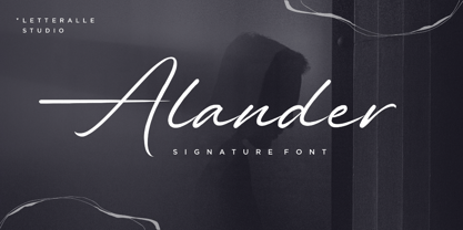 I'd like to introduce you Alander! a wonderful signature font. Alander comes with a stylish style and a masculine impression. A little chic and classy, Alander is a worthy addition to your collection of handwritten script fonts. Alander is perfect for many design needs such as merch, T-shirts, titles, book covers, social media posts, websites, events, and many more. Enjoy the font, Thanks!
 - Prossimo by Studio Sun,
$16.00 This font is strongly inspired by the Futurism (Futurismo) movement in the early 20th century; with its simple shapes and strong structure, this font can be used to give a contemporary look to any design. Available in 3 styles (Display, Stencil, Text), this font is great for logos, headlines, posters, and UI/UX design. It can be used in various design applications such as print or web.
 - F2F Allineato by Linotype,
$29.99Allineato was part of the Face2Face project, a fontlabel created with a couple of friend in order to stimulate new ideas and forms in the typographical landscape. Most of the Typefaces were used by Alexander Branczyk in his famous techno magazine "Frontpage". About Allineato: "Al" means "Alessio Leonardi" and Lineato "lined", but if you read it as an italian world means "conformed to a given line". - Molabrista by Jehansyah,
$15.00 Molabrista Display this is a very beautiful serif font, you can enjoy it as an extraordinary work, make this font design your choice as your favorite font, with several alternates that you can combine into the shape you want, to add an elegant and luxurious impression to your design. show, very suitable for any project Include : Numeric Punctuation Latin Alternate Thank you very much
 - Kinderz by MaxnorType,
$15.00 Kinderz is a fun display font with lots of styles and multilingual support. The design has a relaxed feel and is intended for purposes related to kids and teenagers, but can also be used for all modern informal themed designs. It can be used for various purposes, especially those related to kids and teenagers, such as for logo design, branding, posters, banners, stationery, and so on.
 - Blackpast by Sarid Ezra,
$15.00 Introducing, Blackpast, a futuristic logo font with alternates! Blackpast is a sans based font with unique lowercase that will make your design looks futuristic and modern. You can use this font for any purpose, especially to make logotype. You can mix and match the uppercase and lowercase to make your logo more readable. This font also have special alternates that will make your design more stand-out!
 - Bigestar by Mevstory Studio,
$25.00 Bigestar is a sans based font with unique lowercase & uppercase that will make your design looks futuristic and modern. You can use this font for any purpose, especially to make hi-tech logotype. This font is also suitable for science-fiction movie poster. You can mix and match the uppercase and lowercase to make your logo more unique and stand-out. This font also support multi language.
 - Funny Nature by URW Type Foundry,
$39.99 Funny Nature is not a typeface but a collection of small, comic-like symbols. Lüdicke used to work often for a supplier of gardening equipment etc. He had to come up with new, original and vivid ideas for the design of catalogues and ads. He designed Funny Nature, a wonderful collection of illustrations. Can you hear the humming and buzzuing, can you smell the flowers?
 - 99 Names of ALLAH Kids by Islamic Calligraphy75,
$12.00 We have transformed the “99 names of ALLAH” into a font. That means each key on your keyboard represents 1 of the 99 names of ALLAH Aaza Wajal. The fonts work with both the English and Arabic Keyboards. We call this Calligraphy "Kids" because it looks as if a child is writing the names. The first "Alef" has a "hamzit wasel", this indicates that the name can be pronounced both as "AR-RAHMAAN" or "R-RAHMAN" (in the zip file you will find a pdf file explaining the differences in the "harakat", pronunciation and spelling according to the Holy Quran). Some of the letters in the calligraphy are unusually big, they look as a child is writing them. No decorative letters are used in this calligraphy. Purpose & use: - Writers: Highlight the names in your texts in beautiful Islamic calligraphy. - Editors: Use with kinetic typography templates (AE) & editing software. - Designers: The very small details in the names does not affect the quality. Rest assured it is flawless. The MOST IMPORTANT THING about this list is that all the names are 100% ERROR FREE, and you can USE THEM WITH YOUR EYES CLOSED. All the “Tachkilat” are 100% ERROR FREE, all the "Spelling" is 100% ERROR FREE, and they all have been written in accordance with the Holy Quran. No names are missing and no names are duplicated. The list is complete "99 names +1". The +1 is the name “ALLAH” 'Aza wajal. Another important thing is how we use the decorative letters. In every font you will see small decorative letters, these letters are used only in accordance with their respective letters to indicate pronunciation & we don't include them randomly. That means "mim" on top or below the letter "mim", "sin" on top or below the letter "sin", and so on and so forth. Included: Pdf file telling you which key is associated with which name. In that same file we have included the transliteration and explication of all 99 names. Pdf file explaining the differences in the harakat and pronunciation according to the Holy Quran.
 - Umbero by NaumType,
$25.00 Umbero is an experimental geometric blackletter. Umbero was inspired by modern street art (by artists like Pokras Lampas, RETNA, etc.), gothic script and constructivism. It has an ornate and twitchy structure: you can not find two similar letters. Capital letters have even more complex structure, then lowercase, to the extent that you can even use them as initial letters with a different, more calm font if you want to achieve a medieval stylization in a contemporary way. Get Umbero if you need something extra for your design. Or vice versa use it as a starting point of your work. It’s a perfect choice for the mystic or contemporary logos, headlines, oversize typography, branding, identity, website design, album art, covers, posters, advertising, etc.
 - Feverish by Veil of Perception,
$66.00 “Feverish” was a font borne out of perceived need in the marketplace. Hallmark retired font designer and master letter designer Myron McVay first approached Bill LaFever to collaborate on a project to design a semiformal calligraphic script that could be set as text copy with a large variety of swash and alternative characters and small caps. Bill penned the initial forms and Myron did the digital conversions and initial technical work. After Myron passed away, Terry Lee, a protégé of Myron’s at Hallmark, also retired, took over and the project was completed. “Feverish” is a semi-formal italic which can be used in a wide variety of commercial and advertising applications. The font family is large which can accommodate a variety of unique applications.
 - MFC Patisserie Monogram by Monogram Fonts Co.,
$19.95 The source of inspiration for MFC Patisserie Monogram is a letter set from the book, "Letters and Lettering" by Paul Carlyle & Guy Oring, published in 1938. This elegant decorative style was shown as Capitals & Numerals only, but we've expanded it out to include Capitals, Smallcaps, Numerals, an Ampersand, and ornamental parenthesis, brackets, and braces. MFC Patisserie Monogram can create one, two, or three letter monograms as well as basic headline and titling settings. It is a refined look that is as darling as it is delicate. The numeral set and bullet dividers allow for more detailed and personalized monograms. If you want an even more customized look, you can add any of a handful of brackets, braces, or parenthesis to surround your monograms in a complimenting style.
 - Basilio by Canada Type,
$29.95 In the late 1930s, old Egyptiennes (or Italiennes) returned to the collective consciousness of European printers and type houses — perhaps because political news were front a centre, especially in France where Le Figaro newspaper was seeing record circulation numbers. In 1939 both Monotype and Lettergieterij Amsterdam thought of the same idea: Make a new typeface similar to the reverse stress slab shapes that make up the titles of newspapers like Le Figaro and Le Frondeur. Both foundries intended to call their new type Figaro. Monotype finished theirs first, so they ended up with the name, and their type was already published when Stefan Schlesinger finished his take for the Amsterdam foundry. Schlesinger’s type was renamed Hidalgo (Spanish for a lower nobleman, ‘son of something’) and published in 1940 as ‘a very happy variation on an old motif’. Although it wasn’t a commercial success at the time, it was well received and considered subtler and more refined than the similar types available, Figaro and Playbill. In the Second World War, the Germans banned the use of the type, and Hidalgo never really recovered. Upon closer inspection, Schlesinger’s work on Hidalgo was much more Euro-sophisticated and ahead of its time than the too-wooden cut of Figaro and the thick tightness of Playbill. It has a modern high contrast, a squarer skeleton, contour cuts that work similarly outside and inside, and airy and minimal solutions to the more complicated shapes like G, K, M, N, Q and W. It is also much more aware of, and more accommodating to, the picket-fence effect the thick top slabs create in setting. Basilio (named after the signing teacher in Mozart’s Figaro) is the digital revival and major expansion of Hidalgo. With nearly 600 glyphs, it boasts Pan-European language support (most Latin languages, as well as Cyrillic and Greek), and a few OpenType tricks that gel it all together to make a very useful design tool. Stefan Schlesigner was born in Vienna in 1896. He moved to the Netherlands in 1925, where he worked for Van Houten’s chocolate, Metz department store, printing firm Trio and many other clients. He died in the gas chambers of Auschwitz in 1944. Digital revivals and expansions of two of his other designs, Minuet and Serena, have also been published by Canada Type.
 - Alpha One by Wiescher Design,
$18.00 »AlphaOne« is my newest addition to the experimental Alpha-font-collection. I just had to do this one! It is based on Paul Renners fonts, but has got nothing to do with them, I just took the widths and some basic forms. No – or hardly no – optical corrections were made to the glyphs. I wanted the pure geometric forms to come to life. This was a lot of fun to design, I especially like the »Q« with the negative tail. I did make four weights, but nothing is normal with this font, so weight doesn’t really mean anything. Have fun!
 - Matterdi by Creativemedialab,
$20.00 Introducing Matterdi, an elegant High-Fashion serif family with tons of unique and fashionable ligatures. This versatile serif family contains 100+ unique, elegant ligatures and alternates. 9 weights available from Thin to Black which gives you many possibilities to layout your next projects. Perfect for word-marks, monograms, logos, branding projects, or to use as web font. Try Matterdi Bold for display titles or Matterdi Thin for a fashionable and elegant look. It is also perfect to pair with a hand-drawn script! How to access alternate? Adobe Photoshop go to Window - glyphs Adobe Illustrator go to Type - glyphs
 - Rosseville by Typehand Studio,
$16.00 A faboulus script font for you with tons of love. Rosseville can make text stand out - perfect for logos, printed quotes, invitations, cards, product packaging, headers and whatever your imagination holds.
 - Shaking by La Boîte Graphique,
$17.00 Designed by Ewen Prigent, Shaking is a set of four expressive hand-crafted titling typefaces ideal for packaging, posters, children's books… and many other media! Shaking one, two, three and four!
 - Dutch Mediaeval Book by Canada Type,
$29.95This is the elaborately expanded version of what is arguably the most classic and popular of all historic Dutch faces: Sjoerd Hendrik de Roos's Hollandse Mediaeval from 1912. Over the decades, many pressmen and typography connoisseurs have gushed loving prose about this typeface. An extended family of two weights, corresponding italics, small caps, four condensed fonts, four book fonts, a set of initials and some very Dutch ornaments, Dutch Mediaeval is a versatile workhorse that flows comfortably and artistically, with the elegance of the main weights nicely complemented by the sturdiness of the bolds. Very few text faces are this clean and inviting while being crafty as well. The Dutch Mediaeval family comes with quite a few OpenType features and extended Latin language support. - Dutch Mediaeval by Canada Type,
$29.95This is the elaborately expanded version of what is arguably the most classic and popular of all historic Dutch faces: Sjoerd Hendrik de Roos's Hollandse Mediaeval from 1912. Over the decades, many pressmen and typography connoisseurs have gushed loving prose about this typeface. An extended family of two weights, corresponding italics, small caps, four condensed fonts, four book fonts, a set of initials and some very Dutch ornaments, Dutch Mediaeval is a versatile workhorse that flows comfortably and artistically, with the elegance of the main weights nicely complemented by the sturdiness of the bolds. Very few text faces are this clean and inviting while being crafty as well. The Dutch Mediaeval family comes with quite a few OpenType features and extended Latin language support. - Noam Text by TypeTogether,
$69.00 Adi Stern’s Noam Text shows that typographic progress is often in the small things — in the perfecting of familiar traditions and in staying loyal to the spirit of what came before. It can’t really be called progress unless it honours its history. In this way, TypeTogether is happy to introduce Noam Text: A Hebrew and Latin serif font that builds on its heritage with the twin tools of honour and progress. Since 1908, the Frank-Rühl fonts have dominated the Hebrew book and newspaper market. Noam Text’s design goal was to create a coherent family with both Latin and Hebrew serif text typefaces, each authentic to its own script, and which would serve as an alternative to last century’s predecessor. In short order, users will recognise Noam Text as a source of progress in its bilingual abilities. Hebrew and Latin have opposite reading directions, creating many issues: opposing directionality of the open counters; vertical stress in Latin, but horizontal in Hebrew; fewer extenders in Hebrew; and no Hebrew capital letters. All these have been taken into account in Noam Text’s modern design. Of unique importance — all punctuation marks have a Hebrew version, which makes each script complete and uncompromising. Among other technologically advanced details, Noam Text was programmed for all expected scenarios of mixing Hebrew, Latin, figures, and punctuation. Noam Text is intended mostly for setting long texts, so it strives to achieve maximum legibility in minimum space with its large x-height, short and fairly condensed Latin capitals, large and open counters, and low contrast. Originally derived from the Hebrew, the shallow horizontal curves and strong baseline serifs provide dynamism and enhance the reading flow. Noam Text Latin’s italic is rounded and reading friendly, is condensed to generate a lighter texture than the roman, and has a flowing stance. These virtues help it endure harsh printing conditions and subpar inks and paper. Noam Text’s three total weights provide a proper solution for integrating texts in both scripts, as well as a contemporary alternative for use in books, newspapers, and magazine design. Aligned with TypeTogether’s commitment to produce high-quality type for the global market, the complete Noam Text family displays an impressive amount of discretion, applying to wide use-cases by not edging too close to religious motifs or imbibing in secular indulgence. This means Noam Text can be the go-to family across the board and capitalise on the desire for clear typographic progress in this modern age.
 - Clothe by Mans Greback,
$59.00 Clothe is a vintage handwriting typeface. The genuine calligraphic style gives any project a handmade feeling.. Drawn and put together by Måns Grebäck, this font supports hundreds of languages. Use [ ] { } for swashes. Example: Clothe[
 - Autographer by Letteralle,
$23.00 I'd like to introduce you Autographer! a wonderful signature font. Autographer is an eye-catching, sexy, fashionable, and chill handwritten script font. Autographer is very valuable to additional you handwritten and signature font. Autographer comes with multilingual support, extra ligature, and swashes. To access swashes you only need to type _1 until _5. Autographer is perfect for many design needs such as merch, T-shirts, titles, book covers, social media posts, websites, events, and many more. Enjoy the font, Thanks!
 - Boldina by DSType,
$19.00Boldina consists of 18 fonts with a lot of personality. This is a font to be mixed. That’s its purpose and that’s why it's designed as one single weight in so many different styles. My intent was to give designers a chance to use the same typeface in many different ways, putting together sans and serif, lots of italics and even Greek, Cyrillic and CE characters. The Ligatures and the Script versions give a more poetic and more accurate feeling to the text.