10,000 search results
(0.027 seconds)
- Essence by kloeg architecture,
$29.00 This font is especially designed by architects for architect, urban planners, landscape architects, industrial and product designers. It is ideal for the use with line drawings. Because of it's geometric shape it blends in with your drawings. It's adjusted to fit most of the common line width types. It also contains many icons, especially for use in these professions. On top of that you can find many glyphs and icons to create legends and title blocks. More information about kloeg design.
 - 1456 Gutenberg by GLC,
$38.00 Font designed from that used by Gutenberg in Mayence to print the 42-line bible in 1456. The original font has too many characters for a true type font. Many of them have - in 2008 - no more utility. This font include "long s", naturally, as typicaly medieval, but also a lot of ligatures and abbreviations as "...us", "...rum" "...s" "...r...". A render sheet, added, help to identify them on keyboard. Uses include web-site titles, posters and flier designs, editing ancient texts or greeting cards as a very decorative font... This font support easily as enlargement as small size, remaining clear and easy to read.
 - Brontoburger by Sharkshock,
$115.00 Brontoburger is defined by its loose, laidback appearance but stops short of being too rough around the edges. Its softened corners produce a warm, friendly look suitable for many applications. This display font is playful enough to be featured on toy packaging but suitable for business cards as well. Try the 3D Extrude version for a book cover or poster. This 3 member family is equipped with Basic Latin, extended Latin, diacritics, Cyrillic, symbols, punctuation, and kerning.
 - MFC Pantomime Monogram by Monogram Fonts Co.,
$19.95 The inspiration source for Pantomime Monogram is an unusual Art Deco design from a vintage embroidery publication which combines both sans-serif and flare serif styles to create a diamond monogram format. This monogram, which evokes visions of it etched into bakelite, was originally intended to adorn handkerchiefs and towels, but it has so many other possibilities. It is one of many monogram designs from the early 1900’s which fall into a two letter format that is either adorned or interwoven with framing styles. Pantomime Monogram is only capable to two letter monograms due to its unique design. Download and view the MFC Pantomime Monogram Guidebook if you would like to learn a little more.
 - English Engravers Roman by Smith Hands,
$38.00 English Engravers Roman is inspired by the beauty and eccentric detailing of British stone carved lettering. After observing many beautiful inscriptions around London and southern England, Robbie Smith decided to create a font family in homage to this rich heritage. English Engravers Roman features a set of beautifully balanced uppercase Roman, and a characterful lowercase alphabet with some endearing quirks. Included in the each font are two forms of lowercase 'q', one very similar to an uppercase 'Q' with a tail, and a traditional 'q'. Each font in the family features a comprehensive character set with many ligatures, added to enhance letter spacing. The fonts all feature an additional set of old style numerals. Many extra characters and ligatures can be accessed via the 'insert glyph' functions in graphic design software.
 - Showboat by Canada Type,
$25.00You are looking at the friendliest, happiest and most faithful of puppies. It comes to greet you as soon as your eyes see it, radiates its joy, wags its tail, jumps in circles, and begs to be played with. Showboat is a very unique bragger of a font. Its bouncy metrics and whimsical shapes are a sure formula for attention. People will soak it in and feel happy while they do. How can anyone greet such happy letters with anything other than a smile? No matter how many fonts your design box has, you can be sure that none of them is this radiant, lively or cute. This happy camper comes in four fonts: two weights and a large number of corresponding ligatures and alternates. Showboat can be used in a vast number of design applications; flyers and webs for parties, pre-teen and teen events, scrapbooking, candy branding, posters, children's publications and web sites, pet stores and products, toys, and many many other things. - Just Fall Holidays by Outside the Line,
$19.00 Lots of Fall fun, many Halloween icons... black cat, haunted house, witch hat, ghost, scary masks, pumpkins, bat, BOO! and more. Plus back to school icons... bus, pencil, flashcards, paste, leaves and an apple for the teacher.
 - Cellofy by Owl king project,
$27.00 Cellofy This serif-type Cellofy font is made with several types of families ranging from regular to expanded. This is to make it easier for designers to get many choices in a font family, aiming to make it easier to explore with many choices. happy exploring various projects, hopefully, Cellofy can collaborate on your design.
 - Salish by Saja TypeWorks,
$29.00 Salish is a sans-serif typeface inspired by the art of the Salishan tribes in the Northwest Americas. It draws heavily on the concept of the ‘ovoid’, a wide ovular shape that is flat on the bottom and top heavy, that is central to the art style known as ‘Formline’. Designed by Aaron Bell of Saja Typeworks, Salish comes in 5 weights, from Thin to UltraBold. Language support includes some 200 Latin-based languages as well as the necessary orthographies for all Salishan languages, including: Comox, Sliammon, Klahoose, Pentlach, Sechelt, Squamish, Halkomelem, Nooksack, Straights Salish (Saanich), Lushootseed, S'Klallam, Quinault, Upper Chehalis, Lower Chehalis, Cowlitz, Bella Coola, Ditidaht, Tseshaht, Nuu-chah-nulth, Ehattesaht-Nuchatlaht, Kwak'wala, Shuswap, Lillooet, Thompson River Salish, Coeur d'Alene, Columbia-Moses, Colville, Okanagan, and Montana Salish. Haida (a non-Salishan language) is also supported.
 - Marcheile by Arterfak Project,
$15.00 Marcheile is a display font, inspired by Gatsby & Vintage looks. The All-Caps font which comes from a combination of art deco and retro style. Luxury shapes, clean & solid that very possible to apply in many design project. Marcheile also has some OpenType features to gives you many alternatives in your creative process. There's some ligatures, many alternates, and 18 accents. Great choice for your headline, editorial, logotype, quotes, typography and more!
 - Marsheila by Arterfak Project,
$15.00 Marsheila is a display font, inspired by Gatsby & Vintage looks. The All-Caps font which comes from a combination of art deco and retro style. Luxury shapes, clean & solid that very possible to apply in many design project. Marsheila also has some OpenType features to gives you many alternatives in your creative process. There's some ligatures, many alternates, and 18 accents. A great choice for your headline, editorial, logotype, quotes, typography and more!
 - Theyriad Script by FallenGraphic,
$20.00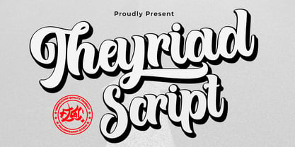 Theyriad Script is the great choice for watermarks on photography, logo designs, quotes, album covers, business cards, and many other design projects. Theyriad Script is here to elevate your work to the highest level. Features: -Accents (Multilingual Characters) -PUA encoded -Numerals and Punctuations (OpenType Standard) -Many alternates
 - Selfie Neue Rounded by Lián Types,
$29.00 INTRODUCTION When I started the first Selfie back in 2014 I was aware that I was designing something innovative at some point, because at that time there were not too many, (if any) fonts which rescued so many calligraphy features being at the same time a monolinear sans. I took inspiration from the galerías’ neon signs of my home city, Buenos Aires, and incorporated the logic and ductus of the spencerian style. The result was a very versatile font with many ligatures, swashes and a friendly look. But… I wasn’t cognizant of how successful the font would become! Selfie is maybe the font of my library that I see the most when I finally go out, (type-designers tend to be their entire lives glued to a screen), when I travel, and also the font that I mostly get emails about, asking for little tweaks, new capitals, new swashes. Selfie was used by several renowned clients, became part of many ‘top fonts of the year’ lists and was published in many magazines and books about type-design. These recognitions were, at the same time, cuddles for me and my Selfie and functioned as a driving force in 2020 to start this project which I called Selfie Neue. THE FONT "Selfie for everything" Selfie Neue, because it’s totally new: All its glyphs were re-drawn, all the proportions changed for better, and the old and somehow naive forms of the first Selfie were redesigned. Selfie Neue is now a family of many members (you can choose between a Rounded or a Sharp look), from Thin to Black, and from Short to Tall (because I noticed the feel of the font changed notoriously when altering its proportions). It also includes swashy Caps, which will serve as a perfect match for the lowercase and some incredibly cute icons/dingbats (designed by the talented Melissa Cronenbold) which, as you see in the posters, make the font even more attractive and easy to use. You'll find tons of alternates per glyph. It's impossible to get tired with Selfie! Like it happened with the old Selfie, Selfie Neue Rounded was thought for a really wide range of uses. Magazines, Book-covers, digital media, restaurants, logos, clothing, etc. Hey! The font is also a VF (Variable Font)! So you can have fun with its two axes: x-height and weight, in applications that support them. Let me take a New Selfie! TECHNICAL If you plan to print Selfie Neue VF (Rounded or Sharp), please remember to convert it to outlines first. The majority of the posters above have the "contextual" alternates activated, and this makes the capitals a little smaller. I'd recommend deactivating it if you plan to use Selfie for just one word. Use the font always with the "fi" feature activated so everything ligatures properly. The slant of the font is 24,7 degrees, so if you plan to have its stems vertical, you may use Selfie with that rotation in mind. THANKS FOR READING
 - Mido by Design Eva Wilsson,
$30.00 Mido is designed with the aim to recreate all the power of the early 19h century slab serifs, but without their geometric monotony. The ambition was to make a humanist slab serif that would function both in smaller sizes, as headlines, and poster size. Careful attention has been payed to the spaces within and inbetween letters – they show slight irregularities to create dynamic negative spaces, which in turn makes the letters sit solidly together as words and sentences. Mido is suitable for packaging, posters, book covers, identities and headlines, as well as type set in smaller sizes. It comes with both upper- and lower case figures. The typeface Mido is an ongoing design project of which the first font is now released.
 - MFC Semicirculus Monogram by Monogram Fonts Co.,
$19.95 The inspiration source for Semicirculus Monogram is a stylish sans serif letterset from a vintage embroidery publication which combines to create a semi-circular form monogram. Originally intended to adorn handkerchiefs, it has so many other possibilities. Ornaments from numerous antique specimen books were combined with the letter set to accent and complete its form. This is one of many monogram designs for the early 1900s which fall into a two letter format that is either adorned or interwoven with ornamentation. Download and view the MFC Semicirculus Monogram Guidebook if you would like to learn a little more.
 - Lubaline by Lián Types,
$39.00 Who haven't heard the phrase that ‘any past time was better’?. Although I sometimes find this phrase a little too pessimistic (because I try to think that the best is yet to come), it may be true regarding my passion, typography. I'm too young (29) unfortunately, and this means I did not have the pleasure of being contemporary with maybe the man who has influenced my work the most (1). The man that showed that letters are more than just letters to be read. Herb Lubalin (1918-1981), also called sometimes as ‘the rule basher’ (2), smashed the taboos and sacred rules of type design and gave it personality. He rejected the functionalist philosophy of europeans in favor of an eclectic and exuberant style. To him, letters were not merely vessels of form, they were objects of meaning. (3). Nowadays, when looking at his portfolio, who dares to deny that the term ‘typography’ and ‘beauty’ may go hand-in-hand without any problem? Ed Benguiat, one of Herb’s partners, still likes making jokes with the phrase “screw legibility, type should be beautiful” and what I understand of this is not to forget the rules, but to know and break them carefully. In an era of pure eclecticism, we, the lovers of flourishes and swashes, can't do nothing but admire all the legacy that Lubalin, this wonderful type-guru, left. My font Lubaline read as “the line of Lubalin” is my humble tribute to him. Those who know his work, may see the influences easily like in his ‘Beards’ (1976) and ‘The Sound of Music’ (1965) posters; the art-deco forms in many of his amazing logos and practically in all his creations where letters seem to be alive just like you and me. I really hope that the future finds me still learning more and more about type-design and letterforms, and like him, always willing to make innovations in my field: Because letters are not just letters to be read. NOTES (1) These are some of my fonts in which some of Lubalin’s influences can be seen (in order of creation): Reina, Aire, Erotica, String, Beatle, Heroe, Selfie, Model, Seventies, and many others that are still in progress. (2) (3) Steven Heller. Herb Lubalin: Rule Basher. U&lc (1998) http://www.printmag.com/imprint/my-favorite-lubalin/
 - Lando by Illunatic,
$13.99 Introducing Lando - a handmade uppercase type family with a natural character. Lando comes in two styles with two weights each. Its characters have been drawn by hand to give them a warm and authentic look. Lando's appearance is enhanced by two contextual alternates for each Latin character and all numbers. In addition, all fonts contain several open type functions such as swashes and initials, a selection of ligatures and support of open type fractions. It is rounded up by many handy extras, such as shapes and icons, catch words, bullets and much more. Lando is intended to work best in logos, posters, magazine headlines and on packaging and apparel. But it also feels comfortable with short texts, due to its support of many latin languages.
 - Postale by Dear Alison,
$24.00 I recently came across an old travel journal I’d misplaced, and in it was a really rough sketch of an Italian post office. The sign lettering caught my eye while flipping through the pages, and while not my forte, I thought I’d take my stab at recreating sans-serif lettering as a font. The Postale family recaptures that old post signage and the vintage flair that appeals to me. A little reminiscing is always a good thing. You’ll find the Stylistic Alternates feature changes up the retro styled letters to a more modern sans serif styling for a handful of letterforms, if the vintage style of certain letters isn’t your cup of tea.
 - Printers Drawer JNL by Jeff Levine,
$29.00 Printers Drawer JNL continues building on a library of letterpress illustrations, cartoons, ad builders, Art Deco ad panels, ornaments, embellishments, and general miscellany. The images are re-drawn from vintage source material, and this font is jam-packed with 89 images spread throughout most all of the standard keyboard positions. This is officially the 1000th release from Jeff Levine Fonts since its inception in January of 2006. Jeff Levine Fonts aims to preserve the almost-lost artwork and lettering styles of the past within a digital type format, and often recreates the designs complete with their evident flaws, idiosyncrasies and eccentricities; allowing for a “real world” and nostalgic look to the computer generated art projects of today.
 - FS Joey Paneuropean by Fontsmith,
$90.00Kangaroo FS Joey was the offspring of a project with Rudd Studio to develop a logotype for an online streaming TV service, in 2008. While under wraps, the secret project was code-named Kangaroo. The logotype led to a second project, to design a corporate typeface for the service. It was the first big project Fernando Mello had worked on with Jason Smith. “Like any designer who just joined a team, I was very excited about it, drawing and sketching lots of ideas. I remember Jason and I experimenting with lots of possibilities, for both the logo and the typeface.” Online As the font for a Spotify-style, internet-based service, FS Joey needed to be highly legible on-screen, including at very small sizes. There had to be a range of weights, and they’d have to work well in print, too. It was also important that it felt corporate, not too quirky, while still having a strong character of its own. Quirkiest “We designed three weights specifically for use on the Web,” says Jason Smith. “There was the usual fight between me and my team. I wanted at least one identifiable letter that was a quirk. As always I went straight for the lowercase ‘g’, and it was drawn numerous times with lots of variation. I got the quirkiest one accepted by the client.” But, later in 2009, the Competition Commission blocked Project Kangaroo, and Fontsmith were left with a couple of weights of an as yet unused font. From Kangaroo, Joey was born. A favourite “Straight away, people started to notice the typeface,” says Jason. “I can take the credit for pushing the art direction and standing up for the quirks. But it was Fernando who was the key to pulling it all together and adding his own distinct flavour. Now it’s one of my favourite designs in our library.” Fresh and friendly, geometric and energetic, Joey is available in five weights, all with italics, all finely-tuned for both screen and print. - FS Joey by Fontsmith,
$80.00 Kangaroo FS Joey was the offspring of a project with Rudd Studio to develop a logotype for an online streaming TV service, in 2008. While under wraps, the secret project was code-named Kangaroo. The logotype led to a second project, to design a corporate typeface for the service. It was the first big project Fernando Mello had worked on with Jason Smith. “Like any designer who just joined a team, I was very excited about it, drawing and sketching lots of ideas. I remember Jason and I experimenting with lots of possibilities, for both the logo and the typeface.” Online As the font for a Spotify-style, internet-based service, FS Joey needed to be highly legible on-screen, including at very small sizes. There had to be a range of weights, and they’d have to work well in print, too. It was also important that it felt corporate, not too quirky, while still having a strong character of its own. Quirkiest “We designed three weights specifically for use on the Web,” says Jason Smith. “There was the usual fight between me and my team. I wanted at least one identifiable letter that was a quirk. As always I went straight for the lowercase ‘g’, and it was drawn numerous times with lots of variation. I got the quirkiest one accepted by the client.” But, later in 2009, the Competition Commission blocked Project Kangaroo, and Fontsmith were left with a couple of weights of an as yet unused font. From Kangaroo, Joey was born. A favourite “Straight away, people started to notice the typeface,” says Jason. “I can take the credit for pushing the art direction and standing up for the quirks. But it was Fernando who was the key to pulling it all together and adding his own distinct flavour. Now it’s one of my favourite designs in our library.” Fresh and friendly, geometric and energetic, Joey is available in five weights, all with italics, all finely-tuned for both screen and print.
 - 57-nao by ILOTT-TYPE,
$49.00 Designed in 1950s Japan by Okanao & Kushiro, the perfect partnership until artistic temperaments drove them apart. The duo spent years crafting the font with the working title “Messenjā”, Okanao bringing technical expertise to craft letterforms, while Kushiro made it his life, obsessively working late into the night to check pages for errors. For him the project was never about making money, it was an artistic endeavor to reprint the great Western works of literature. When he found out Okanao had secretly sold the rights to the font for use as a logo for a major Japanese manufacturer, Kushiro burned all evidence of the designs in a fit of passionate fury. The two reportedly never spoke again. “Messenjā” was thought lost forever until a type specimen was discovered in a vintage typewriter box bought on eBay. Now redrawn and available as 57-nao, a faithful and beautifully crafted monospace characterized by what is considered Okanao’s defining moment, the angular loop on the lowercase ‘a’.
 - Girona by Narrow Type,
$35.00 Girona is a contrasting sans serif typeface which comes in 5 weights from light to bold. Large inktraps and many playful details create a modern typeface with a distinctive look. Girona offers many discretionary and standard ligatures. With different stylistic sets you can change the feel of your design from more delicate to more bold. It’s a perfect typeface for branding, editorial design, logo design and many others. Girona works best in larger sizes or headlines.
 - Sofia Rough by Mostardesign,
$22.00 Based on the popular Sofia Pro typeface, Sofia Rough is a multifaceted font family with differents eroded variations. Sofia Rough contains sixteen fonts and two eroded sub families. With Sofia Rough Black for uppercase and Sofia Rough Script for lowercase you can create many variations. It has also several layers like shadows, inline or outline to create unique design. Sofia Rough contains also more than 80 extra graphics such as catchwords, ornaments, emblems, decorative lines, stars and many more.
 - Lady Cleo by Solotype,
$19.95This started out to be a font with an Egyptian hieroglyphic look, but took a detour just beyond the first pyramid. A young lady we know said many of the letters reminded her of the hooks on a bra strap. Whatever. - Paladise by Lettersiro,
$18.00 Paladise font is great for logo, poster, clothing, branding, party invitation, and many many other cool design projects. Paladise Font Inside: Add more style to each font with OpenType Features - stylistic alternates, lowercase initial form and final form, ligatures, stylistic sets.
 - MBF Quadria by Moonbandit,
$17.00 Quadria, is an experimental square font. With many alternative and ligature, this typeface is more than capable to fulfill all the square variant you need in a font. Use this font for title, headline, logo, poster and many other design projects.
 - Rosa by Pelavin Fonts,
$25.00 Inspired by Art Deco packaging, Rosa fits comfortably into that classic genre. It’s namesake in the collection of La Sociéte Parisienne de Savons is described thusly: In mythological legend, Chloris, the goddess of Spring flowers transformed the body of a nymph into the first Rose. Aphrodite gave her beauty. Dionysus, the god of wine gave her a sweet fragrance and the Three Graces, charm, joy and radiance. Equally compatible with Machine Age, Streamline, Moderne and even Memphis design motifs, it presents the unique option of serving as both the typographic and decorative components of a design. Use Rosa to evoke a sense of elegance, high style and historical context.
 - Foda Display by Fo Da,
$25.00 Foda Display typeface for Latin and Arabic is a modern calligraphy and one of FoDa foundry new creations, that is suited for branding, logos, packaging, advertising, social media designs, posters, wedding invitations and more... Foda Display comes in two weights : Regular and italic with a basic character set of more than 750 glyphs that cover many OTF features like: -multilingual support for many Latin-based scripts and Arabic. -Alternates -Ligatures -Kerning -currency support and many other OpenType features.
 - Martin Crantz by Proportional Lime,
$9.99 Martin Crantz (or sometimes Krantz) of the three, including Ulrich Gering and Michael Friburger, that set up a press at the Sorbonne in 1470 was likely the fellow who had the technical know how how to cast the type itself, hence the name of this new face that is based on his work. This font has been expanded to meet the demands of modern day use but it also contains a number of specialized glyphs that allow for the recreation of text in the manner of his day with such characters as the -rum abbreviation and other handy Renaissance oddities. Since this face was designed prior to 1501 there is no italic variant in keeping with the spirit of historical accuracy.
 - ReRun Stencil by Wing's Art Studio,
$10.00 A hand-drawn stencil font for video games and film titles with a grungy urban design. This all-caps display font offers a simple way to replicate the look of hand-drawn or sprayed on stencil lettering. An industrial style that's used for it's quick real-world applications found on everything from roadworks, storage containers and military vehicles; with an urban visual language uniquely suited to video games, film titles and album covers. See above for more usage ideas. This font family includes uppercase-only characters, plus all punctuation, numerals and language support. Contents: ReRun includes 4 styles: - Rough - Clean - Outline - Light Recreate the textured look in these visuals using our infinite textures for Adobe Illustrator. Available to download from our website.
 - Ornate Blackboards by Intellecta Design,
$16.90Ornate Blackboards is a beautiful collection of ornaments from Intellecta Design, excellent for use in works of art and editorial publications, like book covers, headpieces to sections of books, magazines, packaging works, and many other solutions. Good to use with roman versals, chiseled fonts and many other different kinds of typefaces. - Cow Palace JNL by Jeff Levine,
$29.00 During the 1960s Hippie movement, a large amount of the rock and roll poster art was strongly influenced by the Art Nouveau period of the early 1900s. A poster for an appearance by The Doors at San Francisco’s Cow Palace Exposition Center (presented by Fillmore East and West owner Bill Graham) featured some wonderfully eclectic Nouveau-styled serif hand lettering. Now recreated as a digital type face called Cow Palace JNL (and named for the performance venue), the font is available in both regular and oblique versions.
 - Cabrito Semi by insigne,
$24.00 Relax. Deep breath. And step away to font nirvana with Cabrito Semi. Like its Cabrito relatives, Semi’s handwriting-inspired feel is mellow and care-free. But don’t misunderstand us. Even with its fun-loving peculiarities, this free spirit will command whatever party you invite it to. It’s a perfect blend of unique and functional. So what’s the secret of this little one’s strength? It’s pure balance. Cabrito Semi’s energy surges from deep within the relaxed, balanced tones of its humanist structure and calligraphic crafting. The 36 fonts of this well-crafted semi serif originate from the popular Cabrito, an insigne design slab serif developed for the kid’s book, The Clothes Letters Wear. Along with its other amigos, Inverto and Sans, Cabrito Semi rounds out this easy-going household of fonts. The four fonts play well together on anything from meals and candy to toys and cars. With the support of the other three, Semi makes a great choice for titles and moderately long text like you would use for websites, flyers, and packaging. Semi’s complete pack of alternates is accessible in any OpenType-enabled system. This kiddo has loads of alternates, swashes, and alternate titling caps to add a bit of sweetener to the balance. Also bundled are swash alternates, old style figures, and compact caps. Preview any and all of these features in the interactive PDF brochure. This font members of the family also consists of your glyphs for 72 languages. So who says you can’t love quirky? Take a look at Cabrito Semi--and any of the other members of the Cabrito family. You’re bound to find yourself loving fun all over again.
 - Ultra System by Set Sail Studios,
$14.00 Introducing Ultra System; A modern exploration of 8 fonts, each carefully designed to naturally compliment one another. With 6 clean sans fonts and 2 textured script fonts, Ultra System gives you a variety of ways to combine and arrange each font, allowing you to create striking & modern typographic designs. This typeface collection consists of 8 fonts; Ultra System Script • A textured, bouncy & flowing marker script font containing upper & lowercase characters, numerals, and a large range of punctuation. Ultra System Script Alt • This is a second version of Ultra System Script, with a completely new set of both upper and lowercase characters. If you wanted to avoid letters looking the same each time to recreate a custom-made style, or try a different word shape, simply switch to this font for an additional layout option. Ultra System Sans • A wide, bold sans font containing uppercase only characters, numerals, and a large range of punctuation. Ultra System Sans Line One • A thick outlined version of Ultra System Sans, pair this with other Ultra System Sans fonts to add emphasis to words or phrases. Ultra System Sans Line Two • A thin outlined version of Ultra System Sans, pair this with other Ultra System Sans fonts to add emphasis to words or phrases. Ultra System Sans Italic • Italic variations are included for all 3 Ultra System Sans fonts. FAQs; Accessing Ligatures • Ligatures are supported by most desktop graphics & text software (not just the fancy ones!), including Photoshop, Illustrator, InDesign, Word, Pages & Keynote. Many programs will automatically have this feature switched on for you, but if you need any help accessing then please feel free to drop me a message. Language Support • All Ultra System fonts support the following languages; English, French, Italian, Spanish, Portuguese, German, Swedish, Norwegian, Danish, Dutch, Finnish, Indonesian, Malay, Hungarian, Polish, Croatian, Turkish, Romanian, Czech, Latvian, Lithuanian, Slovak, Slovenian
 - Amaranthine by SemutHitam,
$16.00 Introducing Amaranthine Script. Amaranthine Script is smooth and vintage font script. Comes with many opentype feature, upper and lower case standard character set, punctuation and numerals, multilingual characters, ligatures, stylistic alternates and many more glyph. Recommended for personal and commercial use your company logo, branding, poster, flyers, greetings, invitation, book cover, quotes, and many more. We hope you enjoy with Amaranthine Script. Feel free to comment and give any feedback to build more good font. Thanks for your purchasing, and Happy creating... :)
 - Decalled script by SemutHitam,
$12.00 Introducing Decalled Script. Decalled Script is sharp and elegant font script. Comes with many opentype feature, upper and lower case standard character, punctuation and numerals, multilingual characters, ligatures, stylistic alternates, swash, and many more glyph. Perfect for personal and commercial use your company logo, branding, poster, flyers, greetings, invitation, book cover, quotes, and many more. We hope you enjoy with Decalled Script. Feel free to comment and give any feedback to build more good font. Thanks for your purchasing, and Happy creating... :)
 - JesusLovesYouAll by LucasFonts,
$19.00 Almost every type designer feels the need, from time to time, to interrupt his or her serious work on complex text type systems for something more playful. In Luc(as)'s case this has often meant designing more typefaces. In the early 1990s, while working on Thesis, Luc(as) drew several display faces which were based on the shapes of TheSans but were either de(con)structive versions or experimental variations. Jesus Loves You All is a heretic thorny typeface vaguely based on the outlines of TheSans. Jesus Loves You was given a remarkable three-dimensional treatment in Abbott Miller's Dimensional Type project.
 - Rileyson by Club Type,
$36.99 Crisp contemporary Sans-serif family useful for clear, clean corporates, stylish branding letterforms or friendly, casual messaging too, with use of its capital and lower case ligatures, swash capitals, old style numerals and many ornaments.
 - Dopamine by Luke Thompson,
$30.00 Dopamine is a friendly, flowing sans serif typeface. It works best for large headlines, particularly in packaging or editorial projects. Its most interesting feature is the flowing line across the top of many of the characters, creating smooth waves from one to another.