10,000 search results
(0.052 seconds)
- Zin Slab by CarnokyType,
$46.00 Zin Slab is a contemporary slab-serif typeface designed for various situations of typographic usage. Characteristic feature is a large x-height and balans between neutral construction of letters (strictly vertical axis) and dynamic open forms (opened terminals). Another typical feature is a visually narrower connection between stems and strokes. The complete font family consist of three width proportions (Normal, Condensed and Extended). Every sub-family has 5 weights, ranging from Light to Black with matching Italics. Each font includes small capitals, old-style and tabular figures, standard and discretionary ligatures, alternate glyphs and a many of typographic options applied by the Opentype features. Zin Slab can be effectively used for both text and display typesetting. It can be used especialy in magazine layouts and editorial design, as well in advertising typography, orientation systems, corporate identities and many other situations. Zin Slab is a member of the Zin super family, which also includes Zin Sans, Zin Serif and Zin Display fonts. You can try Demo styles in Medium weight fully for free.
 - Zin Sans by CarnokyType,
$46.00 Zin Sans is a contemporary sans-serif typeface designed for various situations of typographic usage. Characteristic feature is a large x-height and balance between neutral construction of letters (strictly vertical axis) and dynamic open forms (opened terminals). Another typical feature is a visually narrower connection between stems and strokes. The complete font family consist of three width proportions (Normal, Condensed and Extended). Every sub-family has 5 weights, ranging from Light to Black with matching Italics. Each font includes small capitals, old-style and tabular figures, standard and discretionary ligatures, alternate glyphs and a many of typographic options applied by the Opentype features. Zin Sans can be effectively used for both text and display typesetting. It can be used especially in magazine layouts and editorial design, as well in advertising typography, orientation systems, corporate identities and many other situations. Zin Sans is a member of the Zin type system, which also includes Zin Slab, Zin Serif and Zin Display fonts. You can try Demo styles in Medium weight fully for free.
 - Street Tag Vol 2 by Tomatstudio,
$19.00 Street Tag vol 2 is the second version of Street Tag fonts. Inspired from realistic caligraphy tagging style in many big cities. This style is more bold and readable, perfect for your “street art” designs style. I combined the real graffiti experiences into computer fonts, I think it will be different with other fonts if you can feel it, cause I draw graffiti, tagging and throw ups since I was high school. The real tagging style is never be tidy, but don’t worry, I already adjust the kerning and spacing in the best possible way. You’ll find the better result when you adjust the kerning, and edit baseline manually, especially for the alternates font, if you unfamiliar with these one, you can find many tutorials in youtube, for the example https://www.youtube.com/watch?v=251cTL029M4. what will you get You’ll get some alternates in several alphabet, see that in the font preview, some sample fonts I change the dot in “I” to stars, and I add ‘ into “O”, sometimes we do that in the real walls! You can explore more with this font!
 - Whitenights by Linotype,
$29.99Whitenights is a contemporary text family, which was developed by the prolific Swedish typographer Lars Bergquist in 2002. Containing five weights (11 different fonts total), this family contains every tool you need to set splendid text. The base font of the family is Whitenights Regular, a reliable face designed in the old style manner. It ships in OpenType format, with old style figures. Whitenights Ligatures Regular is a supplementary font, which contains many extra ligatures (e.g., ffb, ffk, tt, and fj) whose use will improve the color" of a page of text set in Whitenights Regular. Whitenights Regular may be accented by combination with Whitenights Small Caps, Whitenights Italic, Whitenights Bold, and/or Whitenights Bold Italic. The Whitenights Italic, Bold and Bold Italic styles all have supplementary Ligature fonts available for purchase, similar to the Whitenights Ligatures Regular face described above. For larger, headline text, the specially designed Whitenights Titling is quite useful. This titling font has been optically redrawn and respaced for use in large sizes. Naturally, it has its own supplementary Ligature font as well. In books, magazines, and newsletters this font is a great display companion to the rest of the Whitenights family. Its use in conjunction with the text faces will make your typographical compositions more sophisticated. Last but not least in the Whitenights family is Whitenights Math, which contains many additional mathematical and logical glyphs not found in a standard font's character set. Used together, the above 12 styles can set almost any text or math-based document. The entire family is included in the Take Type 5 collection from Linotype GmbH." - Poipoi by Dharma Type,
$14.99 Extraordinary impact and visual conspicuousness. Poipoi is a super 3D sans family for posters, logos and all display. The basic idea is not a brand new. The Stacking type system has been used since before wood type age. As you imagined, colored wood type(woodcut), many other engravings and contemporary printer machine print many colors separately with different printing plates for each color. Poipoi uses the same system for 3d effect. Please use Photoshop or Illustrator, or your favorite graphic design apps that can handle layers. Layers are the printing plates of wood type. You should be able to change text color for each layer. Poipoi "Standard" style is the base of this font family. You can add effects by stacking Highlight and shadow layers. Stacked layers in different color make the text in 3D. Instruction 1. Type your text as you like. 2. Set font-name "Poipoi" and font-style "Standard" 3. Set color of "Standard" layer. 4. Duplicate the "Standard" layer twice (One for Highlight, one for Shadow). 4'. The layer order should be Highlight, Standard, and Shadow from top to bottom. 5. Set font-style and color of "Highlight" and "Shadow" layers. 6. Adjust tracking if you need. (Please use same tracking value for all 3 layers.) For further detail, https://www.dropbox.com/s/xymis7dh5hwxn9q/Poipoi.pdf Poipoi Standard, Highlighted, and shadowed style can be used solely. Rounded terminals add soft, cute, and casual impressions to your design. Spec: Over 400 glyphs! Basic Latin ✓ Western Europe ✓ Central Europe ✓ South Eastern Europe ✓ Mac Roman ✓ Windows 1252 ✓ Adobe Latin 1 ✓ Adobe Latin 2 ✓ Adobe Latin 3 ✓ Almost all Latins are covered.
 - Elsain by Maculinc,
$15.00 Elsain is a serif family font that is very unique on the edges with different angular styles, the spacing between these fonts is made very tight to deepen the character of this font. This font is great in layout design for quotes or body copy, best used as a display for headings, logos, branding, magazines, product packaging, invitations or anything else. Elsain Serif Family has many features such as Multilingual support, has 14 font families from thin to thick and also 2 variables. This font is also available in Cyrillic to complement many other languages. Not to forget it is also available in Greek form, and some other accessories. This completeness can be used in various letters from various countries such as English, Indonesian, Afrikaans, Basque, Breton, Catalan, Danish, Dutch, Finnish, French, Gaelic, German, Icelandic, Irish, Italian, Norwegian, Portuguese, Saami, Spanish, Swahili , SwedenCroatia, Czech, Estonian, Hungarian, Latvian, Lithuanian, Polish, Romanian, Serbian, Slovak, Slovenian, Turkish, Avar, Balkar, Belarusian, Bulgarian, Chechen, Erzya, Ingush, Lezgian, Macedonian, Moldavian, Ossetian, Russian, Serbian, Ukrainian, Greek and others. What do you get: Elsain Serif Regular and Italic Elsain Variable Regular and Variable Italic TTF. Accessible in Adobe Illustrator, Adobe Photoshop, and Adobe InDesign, it even works in Microsoft Word. Fully Encoded Characters are accessible without additional design software. Images used: All photos/images/vectors used in the preview are excluded, for illustration purposes only. Feel free to follow, like and share. thank you very much for checking my store!
 - Aerle by Hackberry Font Foundry,
$24.95 My first font for 2009 was Aerle. It is a new dark sans serif font in my continuing objective of designing book fonts that I can really use. It made a little ripple in the industry, but more than that I found that I loved it with Aramus and Artimas — my latest book font family with the same proportions. In many ways, Aerle is a very different direction for me built on what I have learned on Aramus and other recent developments in my style. The concept came to me while using Bitstream's Mister Earl on a site online—though there is no direct reference. I wanted a more playful heavy sans with a much smaller x-height than I have been using lately, plus taller ascenders. As I was using Aerle, I constantly needed a light and bold version. The new direction I am taking is a result of a decision that my fonts, though I loved the character shapes, produced an even type color that is too dark or a little dense. Aerle was an attempt to get away from that look even though the letterspacing is quite tight. For Aerle Thin I pushed a little further in that direction and increased the letterspacing. The hand-drawn shapes vary a lot, many pushing the boundaries of the normal character. This gives a little looseness and helps the lightness in feel I am looking for. It will be interesting to see where this all goes. Most new type around the world is far too perfect for my taste. While the shapes are exquisite, the feel is not human but digital mechanical. I find myself wanting to draw fonts that feel human — as if a person crafted them. In most ways this is a normal font for me in that it has caps, lowercase, small caps with the appropriate figures for each case. These small caps were very small (x-height as is proper). So Aerle's small caps are a little oversize because they plugged up too bad at x-height size. The bold is halfway between. These size variations seem important and work well in the text. This font has all the OpenType features in the set for 2009. There are several ligatures for your fun and enjoyment: bb gg sh sp st ch ck ff fi fl ffi ffl ffy fj ft tt ty Wh Th and more. Like all of my fonts, there are: caps, lowercase, & small caps; proportional lining figures, proportional oldstyle figures, & small cap figures; plus numerators, denominators, superiors, inferiors, and a complete set of ordinals 1st through infinity. Enjoy!
 - SK Fillout by Shriftovik,
$32.00 SK Fillout is a display typeface inspired by the problem of information noise. Noise is embedded in the basis of characters structure, which gives it a unique form. The typeface is built on combining several thicknesses into a single symbol form with an offset at different distances. For better expressiveness, each letter has two variations of the character it included into the uppercase and lowercase sets. This typeface supports many languages included in the Extended Latin and Cyrillic type sets. The SK Fillout font is perfect for bold design, for working with printed and web products.
 - Ambient by IHOF,
$24.95 “When you push the stage props of the life aside, there will remain the truth ...” Ambient is a deconstructed sans-serif font, which captures the essence of basic Roman letterforms... with a few twists. Gabor Kothay was born July 19th, 1962. He works as a graphic designer and teaches second-form art students. Typeface design was a hobby for many years but it has become an everyday routine with Fontmunkasok and Fontana Type Foundry. He lives with his wife and two daughters in a suburb of Szeged, a sunny southern Hungary town that lies on the banks of the Tisza river.
 - Regia Sans Pro by Latinotype,
$49.00 Regia Sans is a typeface that was designed in 2008 in Concepción, Chile, and was first released for sale by Latinotype. It is a very thin and condensed font with a modular design, well-suited for short texts, logos, magazines, posters, etc. This new version includes more than 1,300 characters in Opentype format, many ligatures (including diacritical marks and numbers), two groups of alternate characters, and some swash characters. Languages include: Basic Latin, Western European, Euro, Catalan, Baltic, Turkish, Central European, Romanian and Pan Africa Latin. Photos by Sergio Recabarren. Designed in 2010 by Luciano Vergara.
 - Gautters Mickey by Creative17studio,
$18.00 Introducing : "Gautters Mickey" is a unique modern serif font. comes with a large selection of alternative characters and ligatures. The distinctive shape of each character makes this font even better for any design, both personal and corporate. Create your own unique design by using this font. very suitable for formal and informal use. Available in two types of styles: regular & italic. Features : 1. standard character set 2. multilingual support 3. numbers and punctuation marks 4. many ligatures and alternatives What are you waiting for, get this premium font right away. Free updates. Any questions? just ask. Thank you
 - Bandera by AndrijType,
$21.00 This square serif typeface is a real workhorse. It is a modern tool for text design: extremely legible and well shaped. Bandera has six weights with original italics. It catches attention in headlines of posters and magazines or makes reading comfortable in plain texts. Bandera shares main proportions with sans serif Osnova Pro typefamily so ideally can pair it. It has Bandera Text and Bandera Display sister families as well. Please check also Pro version for pan-european support (full Latin-Greek-Cyrillic). Bandera is Spanish for ‘flag’. And Bandera is a symbol of Ukrainian fighting for freedom for many years.
 - Good Love Song by Ocha Puyaber,
$10.00 Good Love Song is a cursive font family. It is inspired by love, hearts, and USA’s script. It can be written in Carolinian, Sioux, O'odham, Southern Athabaskan, Hawaiian, Samoan, Dutch, Maltese, Aymara, Mapuche, Rapa Nui, and other Latin alphabet languages. This font family is cute and fun. It has many heart decorations. The strokes are drawn with a round cap tool, with no contrast. The form is upright. Parts H have capitals with High starts. Parts L have capitals with Low starts. Parts U are love line Unions. It can be used with the font Good Song.
 - FS Sinclair by Fontsmith,
$80.00 ZX Spectrum In 1982, a home computer came on the market that would launch the UK IT industry. The ZX Spectrum sold five million units and spawned thousands of software titles. It was the must-have gadget for every teen. FS Sinclair is inspired by the memory of Sir Clive Sinclair’s greatest creation: the experience of entering its clunky command codes and reading its simple, grid-placed type. Smart, switched-on, great in text and display, FS Sinclair is a modern grid-based font, drawn with the Spectrum in mind and brought to life by well thought-out design. Formula Having completed the font for Channel 4’s brand update, the Fontsmith team defined the formula for its next font: the creative essence of the C4 work but with more structural discipline, more rigid form and a little more seriousness. The new font wouldn’t look self-consciously retro but it would reference the past and, it was hoped, influence the future. Readability Like the ZX Spectrum, it took a while for the new font to do exactly what it was meant to do. Many of the early concepts by Phil Garnham and Jason Smith were too jagged – the result of an awareness of getting too close to existing fonts of the same ilk, such as Wim Crouwel’s Gridnik. Eventually, FS Sinclair evolved into a more readable, functional grid-based type design that answered Phil and Jason’s original, self-set brief. Idiosyncratic There’s a technological, systems feel to FS Sinclair but ultimately, humans are in charge. The lowercase “a”, “n”, “m” and “r” have clean-cut “ears”, and the square-ish design is softened by round joins on the inside of the letterforms. The idiosyncratic design of letters such as “g”, “j”, “k”, “v”, “w” and “y” bring the design up to date. This is a modular font with character, and a range of weights that allow varied application.
 - Martin Luther by Harald Geisler,
$59.00 ❧ Useful links: Luther’s Manuscripts at the UNESCO Memory of the World at Google Arts and Culture Martin Luther font on Kickstarter (with Film about the creation) Each letter of the Martin Luther font is strictly based on original samples found in Martin Luther’s 500 year old handwritten manuscripts. Letters that occur more often for example vowels have two or more different versions stored in the font. (➶ Figure 4) These alternative forms are exchanged automatically by the font as you type, and create a vivid look that comes close to actual handwriting. The font avoids that two identical letters are placed next to each other like, for example the two “o” in the word “look”. ➸ What Historic Sources is the Font based on? Two historic documents were used to base the font on. The notes Luther took before giving his speech in Worms in 1521 and a 6 page letter he wrote immediately after to Emperor Charles V., summarising his speech (➶ Figure 2). Both documents have been added to the UNESCO “Memory of the World” and can be seen at the Google Arts and Culture website. ➸ The Creation of a Handwriting Font The creation of a handwriting font is very different from the creation of a regular font. Harald Geisler has specialised in recreating handwriting in preceding projects with Albert Einstein’s, Sigmund Freud’s and his own handwriting. His experience working with Archives and Museums has gone into this project. First Geisler analyses the movement in the writing to understand how each letter is drawn. This involves partially learning how to write like a person. In this process not the outlines of the sample are reproduced but the original movement path of the handwriting (➶ Figure 3). In a second step width and contrast is added to reproduce Martin Luther’s characteristic impetus and the writing tools used at the time. (Link: Youtube Playlist showcasing the creation of individual letters) How about signs that can’t be found in archives? Some Glyphs can not be found in 500 year old manuscripts, for example the @-sign. Towards the end of the creation one collects a profund amount of details about how a writer moves on paper and addresses certain tasks moving the pen. Keeping this knowledge in mind an improvisation can be based on similar letter forms. For example the @ sign is based on of the movement of a lowercase a and parenthesis. ➸ Features of the Martin Luther font ❶ Extensive Documentation of the creation of the font, including high quality reproduction of the used manuscripts. ❷ Additional texts from Historian Dr. Henning Jürgens and Palaeographer (and Luther handwriting expert) Prof. Ulrich Bubenheimer ❸ Alternating Letters - in handwriting every word looks a bit different. To avoid that two identical letterforms are placed next to each other (for example in the word look) the font actively changes between different versions of letters as you type. ❹ Ligatures - characteristic writing forms when two letters are combined (for example “ct”) (➶ Figure 5) ❺ Terminal Letterforms - renders a special letterform when letter is at the end of a word. (➶ Figure 8) ❻ ‘’’Initial and Medial Letterforms''' - some letterforms are different when placed in the beginning or middle of a word, for example the lowercase s. ❼ Luther Rose - is a seal Luther used to authorise his correspondence. Today it is a widely recognized symbol for Luther. When you enter the numbers of Luthers year of birth and death 14831546 using the Martin Luther PRO font, it will render a stylised version of the Luther Rose. (➶ Figure 7) ❽ Historic letter-forms - letter-forms that are specific to medieval writing around 1500. For example the long-s or h with a loop at the bottom. (➶ Figure 6) ⚑ Multi language support - see the technical information tab for a full list of supported languages. (➶ Figure 11) ➸ The different Styles explained ❋ Martin Luther PRO - this includes all features listed above and is geared towards writing texts that are more readable today. It features alternating letters to create a natural handwriting look as well as two stylistic sets accessible through the OpenType menu. Historic forms are available through the glyph picker. ❋ Martin Luther Historic - this font creates a historically correct reproduction (i.e. with long-s) of Luther’s medieval latin handwriting. It features alternating letters to create a natural handwriting look as well as two stylistic sets accessible through the OpenType menu. ❋ Martin Luther Expert-1 - Dedicated access to the first set of letters only. ❋ Martin Luther Expert-2 - Dedicated access to the second set of letters only. ❈❈❈ Family Pack - recieve all fonts at a discounted price. ❈❈❈ ➸ Kickstarter The creation and development of the Martin Luther font was financed by 500 supporters on ➸Kickstarter.
 - Norberto by CastleType,
$59.00 Norberto, a CastleType original, is based on a Russian design from the late 19th century that in turn appears to be based on Bodoni. However, Norberto is a much warmer design than most Bodonis, with many soft touches such as very gentle curves from the serif at the top of B, D, P, and R; a jaunty cap on the ‘A’ (and Cyrillic ‘El’, ‘De’, etc); charmingly quaint numerals; hairline accents, and other subtleties that make it a wonderful addition to the Modern typefaces. In addition to several useful OpenType features, Norberto also offers extensive language support, including modern Greek and most languages that use the Cyrillic alphabet, as well as built-in keyboard support for Esperanto and Yoruba. Norberto now has a stencil version which combines the elegance of the original with the informality of a stencil cut. As one enthusiast says, "As a die-cut companion to his compact Norberto, Jason Castle's Norberto Stencil hits us right where we live with its svelte stature and sexy, Bodoni-esque bones." — Typedia
 - Annyeong by Ditatype,
$29.00 Annyeong welcomes you with a display font that captures the essence of Korean vibes. This display is a celebration of the dynamic and inviting nature of Korean design. It's a versatile tool that allows you to infuse your projects with a sense of cultural richness and visual impact. The characters in Annyeong are generously sized, ensuring a powerful and visually striking impact. The bold weight adds a sense of solidity, embodying the strength and confidence found in Korean aesthetics. Infused with Korean vibes, Annyeong brings a touch of cultural richness to every letter. In addition, enjoy the features here. Features: Stylistic Sets Multilingual Supports PUA Encoded Numerals and Punctuations Annyeong fits in headlines, logos, posters, flyers, branding materials, greeting cards, print media, editorial layouts, and many more designs. Find out more ways to use this font by taking a look at the font preview. Thanks for purchasing our fonts. Hopefully, you have a great time using our font. Feel free to contact us anytime for further information or when you have trouble with the font. Thanks a lot and happy designing.
 - Sam Suliman by K-Type,
$20.00 Sam Suliman is a condensed display face supplied in three weights – Regular, Medium and Bold – plus a set of handy italics (obliques). All six fonts are included in the value family pack. The fonts are inspired by lowercase lettering on a Sarah Vaughan album cover designed by Sam Suliman in 1962, a style which contrasts sharp tight outer corners with soft rounded counters. The letters were perhaps influenced by a Solotype font called Herald Square, but without that font’s aversion to diagonals, and adding distinctive perky ascenders/descenders on the lowercase r, a, u, g and n. The Sam Suliman fonts also add the nubs to d, m, p, and q. Suliman was born in Manchester, England in 1927. After working for McCann Erikson in London, he moved to New York where he took on freelance work designing album covers, particularly celebrated are his striking minimalist designs for jazz records. He moved back to England in the early 1960s, designing many book jackets, film titles and fabrics, also working in Spain and India before settling in Oxford in the 1980s.
 - Bronto by W Type Foundry,
$29.00 Bronto is a typeface that mutated many times: it went from being morphologically conventional, to have soft features, to finally have some inverted contrasts that made it more dynamical; but all this without losing sight of the meaning of a typefamily, and the aim pursued by this work: Bronto doesn’t behave as a piece of art, but as a tool. In some weights, this typeface possesses fluffy characteristics and is boldly bighead, while in other versions is slightly contrasted and controlled; this in order to maintain the essential features of the typefamily along the versatility and usability of the 20 variations that composed it. Bronto it’s inspired in neo humanists typographies of the 20th century, and in Chilean lettering. This kind of work was made by the spontaneity of the paintbrush, which gave an inverted contrast to some characters. This typeface has plenty of OpenType features, specially an extensive set of ligatures in all weights. Bronto is well suited for motion graphics, letterings, web, advertisings, magazines and books.
 - Resist Mono by Groteskly Yours,
$25.00 Resist Mono is a highly functional monospaced type family designed for optimal performance both in print and on the web. Inspired by the distinctive features of the original Resist Sans family, it showcases deep inktraps, angled terminals, and exceptional legibility. With its bold personality and style, Resist Mono remains highly readable even at small sizes. Suitable for coding, UX, web, and graphic design, Resist Mono offers versatility and visual impact for a wide range of applications. Resist Mono comes in 16 styles (14 static fonts) and two variable fonts. Each font contains over 1300 glyphs, including letters, small capitals, numbers, punctuation, symbols, etc. Resist Mono supports more than 200 Latin-based languages and has extensive Cyrillic support for languages like Russian, Bulgarian, Ukrainian, Serbian, and many more. In addition to this, Resist Mono also includes special Powerline symbols for coding. OpenType features in Resist Mono include Small Capitals, Case Sensitive Punctuation, Stylistic Alternates, Fractions, Subscript, Superscript, Ligatures and many more. Resist Mono Type Family Features: - 1300+ characters per font - 14 static fonts - 2 variable fonts - True Italics - Small Capitals - Extensive OpenType features - Supports 200+ Languages (Latin & Cyrillic) - Special Symbols and Features - Free Trial Fonts Available Resist Mono has been meticulously developed to prioritize functionality and legibility, making it an ideal choice for coding. It offers true italics with a calligraphic influence, adding a unique touch to the font. Additionally, users can access the regular slanted letterforms through OpenType by selecting the corresponding stylistic set. With its versatility, Resist Mono can be applied beyond coding, finding relevance in various contexts like product and graphic design, web design, publishing, and more, thanks to its visually appealing features and bold stylistic choices. Explore Resist Mono Dynamic Specimen for more features, type testers, etc.
 - Aspira by Durotype,
$49.00 Aspira: the legible geometric typeface. Aspira is a multi-purpose typeface. It is suitable for both text and display use — for graphic design, corporate identity design, magazines, newspapers, books, reports, advertising, signage, etc. Aspira is a versatile typeface. It offers 112 styles consisting of 8 weights and 7 widths. It offers 56 upright fonts and 56 italic fonts. It offers lining and oldstyle figures (proportional and tabular). It offers small caps, ligatures, arbitrary fractions, and extensive language support. Aspira is a geometric typeface. It offers a fresh geometric personality which is pleasant and not too conspicuous. Aspira is a multi-width typeface. It offers 7 widths — much more than what is currently usual. Aspira is a legible typeface. Many of its details, like its open apertures and subtle variations in stroke width, are designed to enhance its legibility. Free demo font available. Aspira in use: 1 2 3 4 5 6 7 8 9 10. For more information about Aspira, download the PDF Specimen Manual.
 - Woodmark JNL by Jeff Levine,
$29.00 Woodmark JNL is a rough and somewhat irregular in letter form wood type based on some examples of William H. Page's "New Process No. 507". The eccentricity of the letters is reminiscent of many of the 1800's wood type designs, and is perfect for a rustic look within any retro project.
 - New Hotinok 2D by 2D Typo,
$36.00 The type family New Hotinok 2D continues Ukrainian tradition and in the same time connects it with Art Deco style. It is good for presentation, literary, arts and foods, especially sweets and coffee. Connection of geometry and ornamental effect can help in logo design. Includes four styles, Latin diacritics for many languages.
 - Losta Riecha by Variatype,
$22.00 Losta Riecha is a stylish and luxurious serif font inspired by fashion trends and includes discretionary ligatures and stylistic alternates. Perfectly match the contemporary design theme for many projects such as logotypes, corporate branding, poster design, business cards, headline cover, and more. FONT FEATURES 301 Glyphs Additional Accents 68 Languages Kerning Ligatures Alternates
 - Frelline Script by Soft Creative,
$14.00 Frelline looks beautiful on wedding invitations, thank you cards, quotes, greeting cards, logos, business cards and more. Perfect for use in ink or watercolors. Including beginning and end letters, alternative support and many languages. I made this font very carefully so that each letter looked very unique and had various beautiful alternatives.
 - Ventralie by Din Studio,
$29.00 Ventralie is authentic and modern blackletter font. The font is suitable for any branding project like logo, t-shirt printing and many more. Outstanding in a wide range of contexts. Featured : Alternates Accents (Multilingual characters) PUA encoded Numerals and Punctuation (OpenType Standard) Extra Ornaments Thanks for downloading premium font from Din Studio
 - And So Forth JNL by Jeff Levine,
$29.00 Barbara D. Berney (a graphic artist and friend of Jeff Levine) had suggested making a font featuring many of the ampersands from Jeff's large library of type, noting their popularity as decorative embellishments. And So Forth JNL is the finished font - loaded with hundreds of ampersands in a wide variety of styles.
 - Rankensteen by Ingrimayne Type,
$9.00 Many blackletter and calligraphic typefaces are elegant and can be used for items like invitations and liturgical or religious texts. Rankensteen is probably not one of them. It is crude and bizarre and with a somewhat menacing appearance. It seems more appropriate for a letter from a pirate than for a formal invitation.
 - Roklin by Sign Studio,
$20.00 Roklin is an elegant serif family for use as both formal text and headers. Has quite a lot of character alternatives and also enhanced ligatures. It's perfect for casual typography as well as official documents, really. All characters are PUA Encoded, you can use this font easily in many common editor software easily.
 - Gothiks Condensed by Blackletra,
$50.00 This is the condensed version of Gothiks , a 6-weight display sanserif influenced by Texturas. It is ideal for everything big, compact and powerful. This family has an extensive character set — with extensive language support — and many OpenType features like fractions, small capitals and different figure sets. Default figures align with lowercase.
 - Brush Off JNL by Jeff Levine,
$29.00 Brush Off JNL is based on the hand-lettered title from the cover of the 1955 sheet music of "Love is A Many Splendored Thing". The unique, artistic and somewhat eccentric letter shapes are both reminiscent of show card lettering and calligraphy. The design is available in both regular and oblique versions.
 - Breaze by PizzaDude.dk,
$19.00 You may think cartoon or kids product, when you take a look at Breaze - and you may be right…but I did have retro grafitti in mind, when I drew the letters. Well, actually I may have mixed both cartoon and grafitti! Anyway, it’s a playful font and is suitable for many things!
 - Outr by Outerend,
$20.00 The fonts "Outr" were created with the concept of typography in motion. These display fonts look unique as movie titles, TV show logos, game titles, and many other products, especially with edgy and tech designs on screens. These are more suitable for and work very well in 2D and 3D motion graphics.
 - Geodot by Okaycat,
$24.50 Geodot is subtly faded with a bold graphic appearance. Inspired by atomic structure, it is defined by a harmonious arrangement of tiny spheres. Since the appearance varies widely depending on scale, this font has many possible applications. Geodot is extended, containing West European diacritics & ligatures, making it suitable for multilingual environments and publications.
 - Oishigo by GlyphStyle,
$16.00 Oishigo is a freeform handwritten font, it has a tail that goes up and down randomly which makes this font look different and beautiful. This font has many different ligatures, more than 50 ligatures and additional alternates and swashes Font feature Uppercase, Lowercase, Numerals & Punctuations, Stylistic alternate, Ss01, Ss02 50+ igature, Swashes, Multilanguage
 - Brillany by Solidtype,
$14.00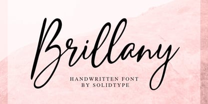 Brillany is a simple handwritten script font, modern and fashionable. This elegant font is legible and looks great as a headline or in body text. This font will perfect for many different project for blogging, social media, branding, wedding invites, cards etc. Including ligatures, uppercase and lowercase, punctuation and multiple languages support.
 - Sweet Sunday by Slex Studio,
$12.00 Sweet Sunday is a modern handwritten font with a full set of decorative doodles! Tthis is a unique font that fits in many ways - with ligatures for ss, tt, ai, an + ee. This font is perfect for quotes, shirt designs, websites, branding, children's designs, svg designs, blogs, logos, invitations and more! Thank you!
 - Studio Five by Lafonts,
$29.00 Designed after the sixties neon sign of an arthouse cinema in downtown Zurich, Studio 5 is now a typeface for many applications. The three different styles include old style numbers and alternate characters for titling. All styles have the same metrics. Bold and open styles can be layered for neon sign effects.
 - Arco Star by Okaycat,
$29.50 Arco Star is a beautiful font made entirely of tiny stars, arriving with a family of styles so many different effects are possible. Arco Star is extended, containing European accents and ligatures so it is perfect for international publications. Arco Star pairs well with Arco Web and Arco Crayon from Okaycat fonts.
 - Team Deco JNL by Jeff Levine,
$29.00 In an online edition of Modern Screen Magazine for March of 1936, many of the article headlines were set in a bold, slab serif inline font which (although possessing some Art Deco traits) could double as a sports font. This is now available as Team Deco JNL in both regular and oblique versions.