10,000 search results
(0.036 seconds)
- Arlon by Marc Lohner,
$28.00 Arlon makes it easy to give any brand or advertising a cool & futuristic look. Thanks to its spurless letterforms and some uncommonly shaped letters, this typeface creates a strong visual impact even in small sizes. Having generously rounded angles and terminals, Arlon also spreads warmth and friendliness. To sum up, Arlon communicates an affinity for technology – in a friendly way. The family contains a really wide span from thin to black and has many Opentype features as well as many numerical variations to offer, making it a versatile font. From Afrikaans via romanized Chinese through to Zulu: Arlon comes with 631 glyphs per font, covering more than 200 languages. Designed by Marc Lohner in 2018.
 - Botterill Signature by Aqeela Studio,
$15.00 Botterill Signature is a beautiful signature font. It was made to meet your needs in creating elegant designs. This natural font is perfect for branding, wedding invitations, magazines, mugs, business cards, quotes, posters, and more! To enable OpenType Stylistic changes, you need a program that supports OpenType features such as Adobe Illustrator CS, Adobe Indesign & CorelDraw X6-X7, Microsoft Word 2010 or newer versions. Botterill Signature is coded with Unicode PUA, which allows full access to all additional characters without having to design special software. Mac users can use the Font Book, and Windows users can use the Character Map to view and copy one of the additional characters to paste into your favorite text editor / application. Thank you
 - Vintage Bridge by Nathatype,
$29.00 Get ready to transcend to a world of magic, laughter, and butterflies. Your projects will spark delight and engage everyone who sees it! Wait no more, we will give you the best choice. Vintage Bridge-A Monoline Script Font Vintage Bridge is a handcrafted font, made to bring out a slice of retro vibes. Every hand-drawn stroke and curve will delight and add brightness and fun to wherever it’s placed. Ideal to create amazing headings, logos, menus, and social media graphics. Vintage Bridges includes Multilingual Support to make your branding reach a global audience. Features: Alternates Ligatures Stylistic Set Bonus Ornament PUA Encoded Numerals and Punctuation Thank you for downloading premium fonts from Nathatype
 - Groovy Orange by Tebaltipis Studio,
$10.00 Groovy Orange feels playfully nostalgic and delivers an incredible vintage retro aesthetic. Use this display font to add that special retro touch to any design idea you can think of!. Masterfully designed to become a true favorite, this font has the potential to bring each of your creative ideas to the highest level! WHAT'S YOU GET ? Unique Letterforms Works on PC & Mac Simple Installations Accessible in the Adobe Illustrator, Adobe Photoshop, Microsoft Word Fully accessible without additional design software. I really hope you'll get pleasure using Groovy Orange and it will be perfect addition to your font collection! Contact me with an inbox message If you have any question. Thank you! Happy Creating.
 - TT Mussels by TypeType,
$35.00 TT Mussels useful links: Specimen | Graphic presentation | Customization options About TT Mussels: The TT Mussels font family is the successor of such popular fonts as Bender and TT Squares. At the same time, TT Mussels has a number of fundamental differences that make it a unique font family that stands out from other octagonal typefaces. When designing TT Mussels, we paid great attention to the possibility of imposing large arrays of text, and we can responsibly state that TT Mussels is a rare type of technological text fonts. To go along with the rest, we've created a stencil version of the typeface, in which the location of the incisions changes according to their thickness. In total, the TT Mussels font family consists of 36 faces, which include among other things stylistic alternatives, ligatures, and also implements a broad support for OpenType features: case, frac, ordn, sups, sinf, numr, dnom, onum, tnum, pnum, liga, dlig, salt, ss01. Dynamic contrast is widely implemented in TT Mussels. It is most noticeable in the Black typeface, where the ratio of the thickness of the vertical strokes to the horizontal strokes is approximately two to one. For the Thin typeface, the thickness of the vertical strokes is already consistent with the thickness of the horizontal strokes. You can also find other signs of respect for traditional text fonts in the TT Mussels design, such as the trace of pen movement which is historically typical for antiquas. For example, in the letter M from the Black face, we can first see a thin stroke, then a thick diagonal stroke followed by a thin diagonal stroke, and a finishing bold vertical stroke. As in the case of dynamic contrast, this effect gradually disappears when approaching thin faces. In thick faces, in places such as the “armpits” of the letters MN? or the junctions of the diagonals of WVvw, there are visual compensators that brighten the bold typefaces. As the thickness of typefaces moves from thick to thin, the dimensions and conceptual values of compensators change, and in thin typefaces they completely disappear. TT Mussels language support: Acehnese, Afar, Albanian, Alsatian, Aragonese, Arumanian, Asu, Aymara, Banjar, Basque, Belarusian (cyr), Bemba, Bena, Betawi, Bislama, Boholano, Bosnian (cyr), Bosnian (lat), Breton, Bulgarian (cyr), Cebuano, Chamorro, Chiga, Colognian, Cornish, Corsican, Cree, Croatian, Czech, Danish, Embu, English, Erzya, Estonian, Faroese, Fijian, Filipino, Finnish, French, Friulian, Gaelic, Gagauz (lat), Galician, German, Gusii, Haitian Creole, Hawaiian, Hiri Motu, Hungarian, Icelandic, Ilocano, Indonesian, Innu-aimun, Interlingua, Irish, Italian, Javanese, Judaeo-Spanish, Judaeo-Spanish, Kalenjin, Karachay-Balkar (lat), Karaim (lat), Karakalpak (lat), Kashubian, Khasi, Khvarshi, Kinyarwanda, Kirundi, Kongo, Kumyk, Kurdish (lat), Ladin, Latvian, Laz, Leonese, Lithuanian, Luganda, Luo, Luxembourgish, Luyia, Macedonian, Machame, Makhuwa-Meetto, Makonde, Malay, Manx, Maori, Mauritian Creole, Minangkabau, Moldavian (lat), Montenegrin (lat), Mordvin-moksha, Morisyen, Nahuatl, Nauruan, Ndebele, Nias, Nogai, Norwegian, Nyankole, Occitan, Oromo, Palauan, Polish, Portuguese, Quechua, Rheto-Romance, Rohingya, Romanian, Romansh, Rombo, Rundi, Russian, Rusyn, Rwa, Salar, Samburu, Samoan, Sango, Sangu, Scots, Sena, Serbian (cyr), Serbian (lat), Seychellois Creole, Shambala, Shona, Slovak, Slovenian, Soga, Somali, Sorbian, Sotho, Spanish, Sundanese, Swahili, Swazi, Swedish, Swiss German, Swiss German, Tagalog, Tahitian, Taita, Tatar, Tetum, Tok Pisin, Tongan, Tsonga, Tswana, Turkish, Turkmen (lat), Ukrainian, Uyghur, Vepsian, Volapük, Võro, Vunjo, Xhosa, Zaza, Zulu.
 - TT Ricordi Greto by TypeType,
$29.00TT Ricordi Greto useful links: Specimen | Graphic presentation | Customization options TT Ricordi Greto is the 5th project from the TT Ricordi collection of fonts, the main task of which is to find gems in old tablets and on stones and bring these inscriptions back to life in the form of contemporary fonts under the general name TT Ricordi. TT Ricordi Greto is Kseniya Karataeva’s original experimental project, inspired by a floor plaque dating from 1423 found in the Basilica di Santa Croce, Florence. When working on the typeface, we wanted to do something new and modern, but at the same time find details or artifacts in the source that could be exaggerated to the maximum. TT Ricordi Greto is a non-contrasting Florentine sans-serif with dynamic proportions and a hint on what would be serifs. The main features of the typeface are the closed aperture, dynamic proportions, and the combination of historical forms with modern visual solutions, flowing terminals with curling dash ends and flared ends, and subtle serifs that hint at the historical material. Another feature of the typeface is a large set of graphic icons (characters and objects), margin markers (flowers, stars and drops) and thirteen catchwords. All icons and spacing have been carefully selected and rendered in order to best match the visual plasticity of the font and interact well with it. The TT Ricordi Greto font family consists of 4 styles: Regular, Medium, Demibold + the Variable font. Each style includes 678 glyphs and 14 OpenType features. In addition to wide language support (extended Latin and basic Cyrillic), each style has two sets of figures and currencies (proportional and tabular), a set of arrows alternative versions of the letter M (flared and straight versions) and the letter Ф (round and oval) and the same a set of icons, margin markers and catchwords. TT Ricordi Greto OpenType features list: aalt, ccmp, locl, numr, ordn, tnum, pnum, case, ss01, ss02, ss03, ss04, ss05, calt. TT Ricordi Greto language support: Acehnese, Afar, Albanian+, Aleut (lat), Alsatian, Aragonese, Arumanian+, Asu, Aymara, Azerbaijani +, Banjar, Basque +, Belarusian (lat), Bemba, Bena, Betawi, Bislama+, Boholano+, Bosnian (lat), Breton +, Catalan+, Cebuano+, Chamorro+, Chichewa, Chiga, Colognian+, Cornish, Corsican +, Cree, Croatian, Czech+, Danish, Dutch+, Embu, English+, Esperanto, Estonian+, Faroese+, Fijian, Filipino+, Finnish, French, Frisian, Friulian+, Gaelic, Gagauz (lat), Galician+, Ganda, German+, Gikuyu, Guarani, Gusii, Haitian Creole, Hawaiian, Hiri Motu, Hungarian+, Icelandic+, Ilocano, Indonesian+, Innu-aimun, Interlingua, Irish, Italian+, Javanese, Jola-Fonyi, Judaeo-Spanish, Kabuverdianu, Kalenjin, Kamba, Karachay-Balkar (lat), Karaim (lat), Karakalpak (lat), Karelian, Kashubian, Kazakh (lat), Khasi, Kikuyu, Kinyarwanda, Kirundi, Kongo, Kurdish (lat), Ladin, Latvian, Leonese, Lithuanian+, Livvi-Karelian, Luba-Kasai, Ludic, Luganda+, Luo, Luxembourgish+, Luyia, Machame, Makhuwa-Meetto, Makonde, Malagasy, Malay+, Maltese, Manx, Maori, Marshallese, Mauritian Creole, Meru, Minangkabau+, Moldavian (lat), Montenegrin (lat), Morisyen, Nahuatl, Nauruan, Ndebele, Nias, Norwegian, Nyankole, Occitan, Oromo, Palauan, Polish+, Portuguese+, Quechua+, Rheto-Romance, Rohingya, Romanian +, Romansh+, Rombo, Rundi, Rwa, Salar, Samburu, Samoan, Sango, Sangu, Sasak, Scots, Sena, Serbian (lat)+, Seychellois Creole, Shambala, Shona, Silesian, Slovak+, Slovenian+, Soga, Somali, Sorbian, Sotho+, Spanish+, Sundanese, Swahili, Swazi, Swedish+, Swiss, German +, Tagalog+, Tahitian, Taita, Talysh (lat), Tatar+, Teso, Tetum, Tok Pisin, Tongan+, Tsakhur (Azerbaijan), Tsonga, Tswana +, Turkish+, Turkmen (lat), Uyghur, Valencian+, Vastese, Vepsian, Volapük, Võro, Vunjo, Walloon, Walser+, Welsh+, Wolof, Xhosa, Zaza, Zulu+, Belarusian (cyr), Bosnian (cyr), Bulgarian (cyr), Erzya, Karachay-Balkar (cyr), Khvarshi, Kumyk, Macedonian+, Montenegrin (cyr), Mordvin-moksha, Nogai, Russian+, Rusyn, Serbian (cyr)+, Ukrainian. - Credit Crunch by Comicraft,
$29.00 Here in the heart of Santa Monica, in the disused 1940s aircraft hangar we like to call the Comicraft Studios, we know that times are tough. As we were driving to “work” in the back of our chauffeur driven Humvee limo, sipping martinis out of the navels of Playboy bunnies and wondering what font we should release next, we decided it was time to reach out to the poor people. Yes, we felt it was time to create a font for the huddled masses yearning to breathe free, for the wretched refuse of our teeming shores. A font, if you will, for the tempest-tossed. It’s a little skinny and might be described as pinched and starved, but it’s guaranteed to see you through this current economic crisis as only the 26 letters of the alphabet can. It was a tall order, but Jazzy JG Roshell created this one while he was in line at the bank, waiting for his personal bailout. Meticulously crafted using one of those ballpoint pens attached to the cashier’s station by elastic, Credit Crunch is the Hamburger Helper of comic book fonts. It’s kind of a hybrid -- just like the Priuses our trophy wives drive to their personal plastic surgeons -- and it’s solar powered and also comes with a tank full of good old fashioned Biro ink. The Recession, Climate Change AND Global Hunger will probably end mere minutes after you crack open your life’s savings to buy this font. How can you afford NOT to...? See the families related to Credit Crunch: Credit Extension.
 - Kontext H by Elster Fonts,
$20.00 Imagine a font that is easier to read the smaller it is – or the further away the text is. There are already many line screen fonts, I wanted to take it to the extreme and use as few lines as possible, while keeping the grid of the fonts metrics. The result is a typeface that lives up to its name. Each individual line makes no sense on its own; individual letters are only recognisable in the context of all associated lines, individual letters are most likely to be recognised in the context of whole words. Attached to a building wall, text would be readable from a great distance and become increasingly difficult to decipher the closer you get to the building. Placed on the ground or on a large flat roof, text would only be readable from an aeroplane or - depending on the size - in Google Earth. Kontext has old style figures, superscript numerals, case-sensitive questiondown and exclamdown and an alternative ampersand, 390 glyphs at all. Use the same value for font size and line spacing to keep the lines in the grid, or change the line spacing in 10% steps. Change the spacing in 100-unit or 25-percent increments increments to keep the grid. The »H« in the font name stands for horizontal (lines). The numbers in the font name refer to the brightness of the background and letters themselves, with the first number describing the background and the second the letters. Starting with »00« (white) to »200« (dark) See also my Family Kontext Dot
 - Night Light Neon by Wing's Art Studio,
$24.00 Night Light is a specially created collection of seven neon inspired fonts giving designers the power to replicate traditionally hand-made lettering from the comfort of their own computer. Choose from the selection of script, sans serif and outline fonts to set your text. Then apply our custom graphic styles for a life giving jolt of electricity! The appeal of neon lettering lives in its power to display a message in a functional, eye-catching and timelessly cool way. How many times have you stopped in the street to admire a bar sign or shop front blazing with neon colors? It's aesthetic works equally well for a Hot Dog stand or high-end fashion brand, providing a tried and tested technique for grabbing customer attention. I've designed these fonts to make the power of neon accessible to all, investing time to research real neon signs and how they are made, paying attention to their human imperfections and inherent limitations (all of which makes them). This research has been distilled into these essential styles; Script, Outline, Inline, Square and Compressed. These seven core fonts give designers a new opportunity to take advantage of realistic neon lettering in their print and online projects, perfect for music promotion, film titles, YouTube tutorials and gig posters. Ready to be moulded to any requirement, the power of neon is in your hands. Neon Graphic Style Presets Available Here The link above provides access to the graphic styles seen in the visuals with support for Adobe Photoshop, Adobe Illustrator, Adobe After Effects. Simply download and follow the instructions provided.
 - Kontext V by Elster Fonts,
$20.00 Imagine a font that is easier to read the smaller it is – or the further away the text is. There are already many line screen fonts, I wanted to take it to the extreme and use as few lines as possible, while keeping the grid of the fonts metrics. The result is a typeface that lives up to its name. Each individual line makes no sense on its own; individual letters are only recognisable in the context of all associated lines, individual letters are most likely to be recognised in the context of whole words. Attached to a building wall, text would be readable from a great distance and become increasingly difficult to decipher the closer you get to the building. Placed on the ground or on a large flat roof, text would only be readable from an aeroplane or - depending on the size - in Google Earth. Kontext has old style figures, superscript numerals, case-sensitive questiondown and exclamdown and an alternative ampersand, 390 glyphs at all. Use the same value for font size and line spacing to keep the lines in the grid, or change the line spacing in 10% steps. Change the spacing in 50-unit or 25-percent increments to keep the grid. The »V« in the font name stands for vertical (lines). The numbers in the font name refer to the brightness of the background and letters themselves, with the first number describing the background and the second the letters. Starting with »00« (white) to »200« (dark) See also my family Kontext Dot
 - ITC Handel Gothic by ITC,
$40.99 The Handel Gothic? typeface has been a mainstay of graphic communication for over 40 years - all the while looking as current as tomorrow. Designed by Don Handel in the mid-1960s, and used in the 1973 United Airlines logo developed by Saul Bass, Handel Gothic was an instant success when released to the graphic design community. Its generous lowercase x-height, full-bodied counters and square proportions make the design highly readable at a wide range of sizes. Handel Gothic's slightly idiosyncratic character shapes gave the face a futuristic look 40 years ago that retains its power today. In addition, its Uncial-like lowercase is instantly identifiable - and unique among sans serif typestyles. Award-winning type designer Rod McDonald was attracted to the simple, decisive forms of the original, but he felt the design needed to be refined and updated. ?One of my goals was to bring a modern typographic discipline to what was really an old phototypesetting font.? To achieve his goal, McDonald re-proportioned every character and balanced the delicate relationship between the curves and the straight strokes. He also added a number of alternate characters to extend the range of the design. ?I wanted to give designers a large enough character set so they wouldn't feel constrained in what they could do. I want them to be able to play with the fonts, not just set words.? McDonald enlarged the family from the single-weight original to five weights, each with a full suite of alternate characters.In 2015 Nadine Chahine designed matching arabic weights to this family.
 - Resist Mono by Groteskly Yours,
$25.00 Resist Mono is a highly functional monospaced type family designed for optimal performance both in print and on the web. Inspired by the distinctive features of the original Resist Sans family, it showcases deep inktraps, angled terminals, and exceptional legibility. With its bold personality and style, Resist Mono remains highly readable even at small sizes. Suitable for coding, UX, web, and graphic design, Resist Mono offers versatility and visual impact for a wide range of applications. Resist Mono comes in 16 styles (14 static fonts) and two variable fonts. Each font contains over 1300 glyphs, including letters, small capitals, numbers, punctuation, symbols, etc. Resist Mono supports more than 200 Latin-based languages and has extensive Cyrillic support for languages like Russian, Bulgarian, Ukrainian, Serbian, and many more. In addition to this, Resist Mono also includes special Powerline symbols for coding. OpenType features in Resist Mono include Small Capitals, Case Sensitive Punctuation, Stylistic Alternates, Fractions, Subscript, Superscript, Ligatures and many more. Resist Mono Type Family Features: - 1300+ characters per font - 14 static fonts - 2 variable fonts - True Italics - Small Capitals - Extensive OpenType features - Supports 200+ Languages (Latin & Cyrillic) - Special Symbols and Features - Free Trial Fonts Available Resist Mono has been meticulously developed to prioritize functionality and legibility, making it an ideal choice for coding. It offers true italics with a calligraphic influence, adding a unique touch to the font. Additionally, users can access the regular slanted letterforms through OpenType by selecting the corresponding stylistic set. With its versatility, Resist Mono can be applied beyond coding, finding relevance in various contexts like product and graphic design, web design, publishing, and more, thanks to its visually appealing features and bold stylistic choices. Explore Resist Mono Dynamic Specimen for more features, type testers, etc.
 - ITC Jambalaya by ITC,
$29.99The talented designer of the well-known Formata typeface, Bernd Möllenstädt was born on February 22, 1943 in Germany. He has lived in Westfalia, Berlin and Munich, Germany, and now permanently resides in Munich. From his earliest years he was interested in typography, first studying as a typesetter (1961-64) and then a student of graphic design (1964-1967). In 1967 Möllenstädt joined the Berthold typefoundry and his career as one of the leading type personalities began. One year after joining Berthold, he became the head of the type design department. For 22 years he worked as the head of that department, under the leadership of Günter Gerhard Lange. Upon Lange’s retirement in 1990, Möllenstädt ascended to the type directorship of Berthold where he was responsible for type design and font mastering. Möllenstädt designed two typeface for the Berthold Exklusiv Collection, Formata (1988) and Signata (1994). Under license from Berthold, Adobe marketed Formata as part of the Adobe Type Library. Formata is now one of the most successful sans serifs in the world, used both in American and European magazines, as well as newsletters in the Far East (Gulf New Kuwait). Formata also was chosen as the corporate typeface of Postbank, Allianz, VW Skoda, Infratest Burke, etc. In addition to his work for Berthold, Möllenstädt has lectured at local Munich schools on typography and graphic design, and designed corporate type identities and diverse logos for major corporations, including Allianz, Commerzbank, Mauser Officer and Hoepfner. Möllenstädt continues his association with Berthold as a designer. He most recently completed small caps and fractions for Formata. He also has substantially contributed to Berthold's Euro symbol program (e.g. adding the Euro symbol design-specific to the most popular families). Möllenstädt currently is working on a new Berthold Exklusiv design. - Helo xmas by Gilar Studio,
$16.00 Hello xmas is a Christmas Script font and an extra font containing doodle illustration. Hello xmas looks stunning on wedding invitations, thank you cards, quotes, greeting cards, logos, business cards and every other design which needs a handwritten touch. This font is PUA encoded which means you can access all of the glyphs and swashes with ease! It features a varying baseline, smooth lines, gorgeous glyphs and stunning alternates. Please check all lowercase, uppercase and numerals to access all Doodle in font format. The best tool if you want to create t-shirt designs, mug designs, logos or just play around. Features : Uppercase & Lowercase Numerals & Punctuations (OpenType Standard) Accents/Multilingual characters beginning and ending swash (ss01-ss07) beautyful ligature PUA Encoded To access all OpenType Stylistic alternates, you need a program that supports OpenType features such as Adobe Illustrator, Adobe Photoshop, CorelDraw and Microsoft word. The font has PUA Unicode (Private Use Areas - font specific code), so that all the alternative characters (with flourishes and swirly lines) can be easily accessed in full through Windows and Mac and you can load them into applications such as Cricut Design Space and Silhouette Studio. If you don't have a program that supports OpenType features such as Adobe Illustrator and CorelDraw X Versions, you can access all the alternate glyphs using Font Book (Mac) or Character Map (Windows). To Access Alternate Characters Click The Link Below: Adobe illustrator CS https://www.youtube.com/watch?v=geL0Ye02Ryk Adobe illustrator CC https://www.youtube.com/watch?v=V25yiUh8BcE Ms Word https://www.youtube.com/watch?v=HxkhZiCuwEw Coreldraw X7 https://www.youtube.com/watch?v=UBVsufJjons Adobe Photoshop CC https://www.youtube.com/watch?v=BYKXl58AdNY Indesign CS https://www.youtube.com/watch?v=HgZTCxKG14Q Check my other Font here : https://gilarstudio.com/ Thanks and happy designing :-)
 - Getty Dubay by Handwriting Success,
$9.00 The Getty-Dubay® family of fonts has been 500 years in the making — so that you can make your handwriting worksheets in seconds. These fonts are modern descendants of the chancery handwriting style (now called “Italic”) from the Italian Renaissance, when master scribes designed a fluid and graceful hand, inspired by the proportions of the golden rectangle and Roman capitals. The Italic style has been in constant use since then. In modern times, it has been celebrated by Alfred Fairbank, Lloyd Reynolds and many others including authors Barbara Getty and Inga Dubay in their Getty-Dubay® Italic method. The Getty-Dubay® monoline handwriting fonts provide a replete resource to effectively model the highly-legible and beautiful Italic handwriting style. These are the official fonts of Getty-Dubay® Italic. Download the Getty-Dubay® Font Guide for everything you need to know about the Getty-Dubay® fonts. The Getty-Dubay® Joined fonts produce a clean cursive handwriting with join-as-you-type ease. Four join options are included: Standard, Pointed (altered joins into m, n and r), e k (utilizing the two-stroke e and one-stroke k), and Beginning (easiest joins only). The Getty-Dubay® Basic fonts provide sans-sarif clarity suitable for young writers. The Getty-Dubay® Precursive fonts add serifs to the lowercase letters, while retaining the pure Roman capitals of Basic Italic. The Getty-Dubay® Smallcaps fonts make mixed capitals easy to use. All Getty-Dubay® fonts come with scaffolds such as dashed contours, ruled lines, directional arrow and starting dots (for Basic and Smallcaps). They support multiple Latin-based languages from around the world. Getty-Dubay® is a registered trademark in the United States.
 - Rose Garden Deluxe by Fenotype,
$25.00 Rose Garden Deluxe is an elegant type collection including a luscious high contrast serif in three weights and an ethereal pen script also in three weights. Together the fonts form an effective all-around set for sophisticated display purposes. The fonts are best used for imposing headlines, as a logotype, in packaging and posters. Rose Garden Serif has an extra high contrast giving it a sophisticated look, suitable for fashion or luxurious high-end products, magazines and anything such. Rose Garden Pen has no contrast, as if it was written with a steady and precise inking pen. Rose Garden Pen is equipped with plenty of useful OpenType features: it has Contextual Alternates and Standard Ligatures to enliven the flow of “writing” and to keep the connections between letters smooth. In addition it has Stylistic and Swash Alternates for every standard uppercase and lowercase characters, as well as for ampersand and few ligatures. On top of that it has initial and terminal swashes - a feature that is set in Titling Alternates. The feature works following: click it on and write normally. Type a space before a word and after it to get a special swash character in the beginning and in the end of the word. If that isn’t enough seek for even more alternates in the Glyphs Palette. Each weight has over 650 glyphs in total. Rose Garden Ornaments is an extension to Rose Garden Pen. It’s a set of Ornaments with the same weight and handwriting style as the font. The swooshes can be combined with the font for even more ornamental looks and the swashes set in lowercase letters can be used as additional terminal swashes, combined with any lowercase character.
 - Winner by sportsfonts,
$19.00 Winner™ and Winner Sans™—Classic athletic aesthetics, finally as a versatile contemporary super family. Just when you thought there was nothing left to add to the classic sports design, we lifted it to a whole new level. Whatever you want to set in whatever space, with seven weights in seven widths both with or without serifs, you’ll definitely find the right proportions for it! Winner supports not only most Latin-based languages but also Greek. Its extensive character set also contains currency signs, arrows, as well as a wide range of numerals from small figures to Roman numerals. Furthermore, its sophisticated OpenType layout features give you access to alternative letter shapes, fractions, tabular figures, and contextual alternates. With more than 24,000 glyphs in 49 fonts, Winner leaves nothing to be desired. Grab Condensed Regular for free and give it a spin!
 - Robson by TypeUnion,
$20.00 Robson is a fluid, condensed, uppercase font made up of eight weights, as well as a variable, that will provide instant visual impact to your projects. The font is made up of 486 glyphs which features extensive language support & stylistic alternates to give your designs the versatility they require. The font has a retro edge to it by using rounded structures on the A, M, N, W and Y glyphs that are reminiscent of posters and promos from the 70s and 80s. The ultra tight thin weight is made to be used at super sizes to bring a focal point to your designs. Robson is meant to be seen big (well, he's a bit of a show-off) Robson is perfect for your digital, print or branding projects. Or, for a poster on your fridge that says "You rock".
 - Dorset by Positype,
$49.00 Dorset marks Léon Hugues first script typeface and first release with the Positype Flourish label. Built crosscurrent to a strict revival or calligraphic digitization, Dorset’s aim was to understand how a font could interact with various calligraphic influences in a single execution and how that interpretation by Léon would lead to new, exclusive design choices. The design purposely chose to connect various gestures from Spencerian handwriting and copperplate calligraphy and meld that with his initial experiments with fine, flat nibs. The result is wholly unique and useful when clear, open, and legible script typography is desired. OpenType features included in this typeface allow the user to seamlessly move from an italic to connected script, while the various stylistic sets can lead you to variations of texture and rhythm, allowing for a more personal and exact expression.
 - Thimble Village by Shakira Studio,
$11.30 Thimble Village – Modern Serif Font Is a modern serif font it's a cool modern take on a retro classic, and it's ready to make a lasting impression on your merchandise, quote designs, header text, logos & branding, advertisements and much more. It's packed with plenty of alternates and ligatures to really bring it to life, and give you a wide range of customisation options. Features: · 2 Weights font (Regular,Italic) · Lowercase and Uppercase · Beautiful Alternates & Ligatures · Numerals & Punctuation · Accented characters · Multilingual HOW TO ACCESS ALTERNATE CHARACTERS Open glyphs panel: In Adobe Photoshop go to Window - glyphs In Adobe Illustrator go to Window - Type – glyphs I really hope you'll get pleasure using Thimble Village font and it will be perfect addition to your font collection! Contact me with an inbox message If you have any question. Thank you and enjoy!
 - Monolog by Polytype,
$20.00 Monolog is an especially monolinear rounded display typeface, designed to work great alongside monoline illustrations, logos and icons, while still performing well in some text settings. A number of contemporary quirks in its construction establish visual interest, while Monolog’s clean, geometric forms allow it to remain extremely versatile, great for a wide range of applications and themes. Some good uses would include branding and identity work, signage, packaging, web and app design; anywhere from a hip coffee shop to a contemporary arts gallery, a music festival or a craft microbrewery. Stand-out features include double-stacked capital ligatures, abbreviation and catchwords ligatures, interesting capital forms, and alternates – including a stylistic set to swap the default circular forms for ovals to give Monolog a more condensed and pragmatic style. Big thanks to Ilya Ruderman, who kindly helped me to improve my cyrillic alphabet.
 - Le Rock by URW Type Foundry,
$39.99 Le rock is the newborn sister of my first typeface Jazmo and a relative of my music-inspired font family. Le Rock seems to wiggle and jiggle a little as if it invites you to dance. This is caused by the gaps in the individual characters. The typeface can also be seen as eroded, carved and sculpted by mother nature. But besides, the design of Le Rock can also be associated with the characteristics of stones: Solid and since ever, here, there and everywhere. To walk on, lean against, to be surrounded by, to build with and to shelter in. It cannot be denied, that there are also some comic art influences. The font is outspoken enough to be used in any form of graphic design, like poster and flyers, but at the same time it remains readable enough for longer texts.
 - Sidestroke by Ramen,
$9.00 The typeface is inspired by our love of old hand-painted signs in butchers, and based on some very quick sketches using a brush pen to find what shapes worked. There is quite a quirky element to the type, as we tried to create the original sketches by rotating the brush pen to reflect the strokes of a paint brush. This lead to a horizontal stressing, which is most noticeable in letters like C, G, S and J. Sidestroke comes in 2 styles, both a standard solid version, and a pre-shadowed outline version. This can be outlined and divided in Illustrator to quickly create an alternate coloured fill for your letters. The lowercase letters have been designed to automatically horizontally align with any uppercase letters, which is a great shortcut when creating logos or other unique type layouts.
 - The Sunmora by Ardyanatypes,
$15.00 THE SUNMORA DECORATIVE SERIF Classic Decorative Serif Font from the eighties to present. It’s an elaborate curve and unique tail shape with a special 12 weight, thin to black. Make you freely set any design for headings, logos, fashion, website, floral, tagging, magazine cover, posters, and many more Completely bloom with the compatibility in multi-language, make it easy to use for any country. Come up with an alternative to bloom up your design and discretionary ligature to use it as decorative font THE SUNMORA has bloomed and it’s all class so if you want a stylish font that is guaranteed to draw the eye, then this is it! A guide to accessing all alternatives can be read at: http://adobe.ly/1m1fn4Y Features: A-Z Character Set a-z Characters set Numerals & Punctuations (OpenType Standard) Multilingual Thank you and have a nice day
 - Thurof by Twinletter,
$17.00 Welcome to the world of Thurof, a bubble typeface that will provide a strong, bold, and whimsical touch to your projects. Do you want to make your messages more colorful and entertaining? Thurof is the ideal candidate. Thurof is available in three different styles: Regular, Outline, and Shadow. This means you can produce an effect that is appropriate for your project, from bright to lighter with an outline or shadow effect. Thurof's plethora of variant ligatures and characters distinguishes it from other languages. This allows you to use your imagination to create unique and inspiring designs. Thurof's multilingual support will also assist you in spreading your message over the world. Thurof is an excellent choice for projects that demand a fun, playful appearance. Allow Thurof to transform your message into something vibrant and inspiring, and leave an indelible impact.
 - Kavala by Sohel Studio,
$12.00 Kavala – Modern Serif Font Is a modern serif font it's a cool modern take on a retro classic, and it's ready to make a lasting impression on your merchandise, quote designs, header text, logos & branding, advertisements and much more. It's packed with plenty of alternates and ligatures to really bring it to life, and give you a wide range of customisation options. Features: · 4 Weights font (Regular,Italic,Bold,Outline) · Lowercase and Uppercase · Beautiful Alternates & Ligatures · Numerals & Punctuation · Accented characters · Multilingual HOW TO ACCESS ALTERNATE CHARACTERS Open glyphs panel: In Adobe Photoshop go to Window - glyphs In Adobe Illustrator go to Window - Type – glyphs I really hope you'll get pleasure using Kavala font and it will be perfect addition to your font collection! Contact me with an inbox message If you have any question. Thank you and enjoy!
 - SAV PT by Puckertype,
$29.00SAV Display PT is directly inspired from hand-painted commercial signage found around Savannah, Georgia. There is a strong tradition of hand-painted signs adorning small car wash stations, to beauty salons, to mechanics and restaurants. Currently a collection of about four to five painters account for the majority of the signs. This font was derived from 10 uppercase letters that seemed to represent the aesthetic thread found throughout the signs. There are no lowercase letters found in these signs, so the lowercase of the font had to be designed from scratch. I felt this added versatility to the font and its possibilities for usage. This font is strictly a display font. However, because of the apparent roots (intended or unintended) of the lettering to transitional/modern modulated fonts, it does read surprising well at smaller sizes. - 1715 Jonathan Swift by GLC,
$42.00 The famous Irish poet and novelist Jonathan Swift (Dublin 1667-1745) has a large personal library of which he noticed carefully the book list by himself. We have used a facsimile from this catalogue to reconstruct this present font, as one example of the poet’s personal hands but also as a typical example of the British quill pen handwriting from about mid 1600’s to the beginning of 1700’s . It is a “Pro” font containing Western (including Celtic) and Northern European, Icelandic, Baltic, Eastern, Central European and Turquish diacritics. The numerous alternates and ligatures allow to made the font looking as closely as possible to the real hand. Using an OTF software, the features allow to vary automatically almost each character of a word without anything to do but to select contextual alternates and standard ligatures and/or stylistic alternates options.
 - Sugela by Sealoung,
$25.00 Sugela is a Classy New Beautiful Serif Font The serifs that we made specifically for the needs of elegant branding, with additional ligatures and alternates in a more feminine and unique form will be ready to add value to your brand. It's great to take advantage of designers or product owners who need a solution to make their designs look more classy and modern. This font is specially designed for fashion-themed projects, perfectly suitable for creating elegant, chic, lifestyle designs such as logos, titles, magazines, and more. Sugela serif font is ready with: - Any option to get creative variations with unique letters - Preview as inspiration what you can do with Sugela font - Ready with Lowercase and Uppercase characters Hope you enjoy our fonts and if you have any questions feel free to message me & I'm happy to help :)
 - Belleson by Haksen,
$14.00 Hello Font Lovers! Introducing my script font called Belleson! Belleson is a luxury script that contains many characters and ligatures that will show elegant taste when you use this font. Belleson has many functions - logos, blogs, websites, and all everything that related to letters! How to use this font if I can’t operation of many software like as Photoshop, illustrator and anything? Please don’t worry about it :) You can use this font in all of software in your computer! With more than 40 glyphs of ligatures in this font, you will fall in love with this font. Belleson provides a handwritten look - natural but elegant in taste. Ligatures contain of : al ah at att ett ott itt ff ll tt il it am an ul th ch nt nl oi ct cl ot ol rr om on oo or ck gh of el ell et st sl ss sh op ee nn ant all ull oll
 - Tea Dance by Studio K,
$45.00 If you think nostalgia isn't what it used to be, this will change your mind. A ritzy new font family from Studio K that will transport you back to the era of afternoon tea dances performed to the strains of the Palm Court Orchestra or the Bath Pump Room Quartet: a celebration of the golden age of dance from Busby Berkeley to Fred Astaire and Ginger Rogers. Enjoy!
 - Hoffers by Konstantine Studio,
$17.00 Say hello to Hoffers. A bold and casual script typeface with implementation of markers handwriting vibes. Some are connected and the others aren't. Perfectly fit for casual logotype, food and beverage branding, book covers, anytime you need to tell fun stories, Hoffers is the answer. Packed up with 30 ligatures to make it look seamlessly handwritten. Carefully crafted click by click to keep it clean in every strokes.
 - Christmas Valentine by Mvmet,
$16.00 Christmas Valentine is a lovely comic display font. You can use it for anything ranging from t-shirts, book designs, and greeting cards to stickers and posters, or anything that needs a casual touch. If you want to use it for Christmas or Valentine themed designs, it will be your perfect font to pick. Fall in love with its incredibly versatile style, and use it to create lovely designs!
 - Soothing Along by Mvmet,
$18.00 Soothing Along is a fun and playful grunge handmade font. You can use it for anything ranging from t-shirts, book designs, and greeting cards to stickers and posters, or anything that needs a casual touch. If you want to use it for Christmas or Valentine themed designs, it will be your perfect font to pick. Fall in love with its incredibly versatile style, and use it to create lovely designs!
 - F2F HogRoach by Linotype,
$29.99The Techno sound of the 1990s, a personal computer, a font creation software and some inspiration had been the sources to the F2F (Face2Face) font series. Thomas Nagel and his friends had the demand to create new unusual faces that should be used in the leading german techno magazine Frontpage". Even typeset in 6 point to nearly unreadability it was a pleasure for the kids to read and decrypt the messages." - Groovy Christmas by Mvmet,
$16.00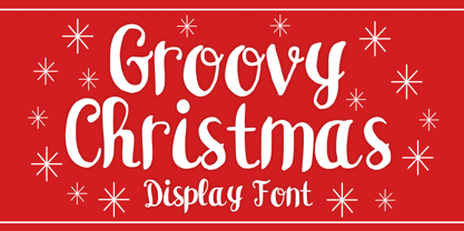 Groovy Christmas is a playful script display font. You can use it for anything ranging from t-shirts, book designs, and greeting cards to stickers and posters, or anything that needs a casual touch. If you want to use it for Christmas or Valentine themed designs, it will be your perfect font to pick. Fall in love with its incredibly versatile style, and use it to create lovely designs!
 - Prozac by Barnbrook Fonts,
$30.00 Throughout the history of typography there have been countless attempts to simplify the alphabet. In the early 20th century, modernist designers experimented with reducing the alphabet to basic geometric shapes. Prozac pushes this utopian experiment further by reducing the roman alphabet to just six shapes. These shapes are then flipped or rotated to make up the 26 letters of the alphabet. Prozac is available without prescription in lite and max versions.
 - Lucky Fellas by Nicky Laatz,
$10.00 A rough-and-ready hand-brushed script, with edgy lines and awesome character! It includes opentype features - stylistic alternates for the lowercase letters, and a comprehensive set of natural looking Ligatures to add to the realistic nature of the typeface. Lucky Fellas font family includes a complimentary textured titling sans serif font, and some super sexy swashes and splatters font to add some finishing touches to your designs.
 - Gyro by Alandya TypeFoundry,
$18.00 Introducing " Gyro Serif Display ", Gyro Serif Display is designed with a conical stem to create a unique style and easy to read. Which are all equipped with plenty of language support and open type features. Gyro Serif Display was made to function especially well at large sizes. Gyro Serif Display is a very versatile font, covering a wide variety of projects, from bold magazine imagery, to branding, poster design, and more.
 - Asian Scroll by Okaycat,
$29.50 Asian Scroll contains many kanji symbols laid out in the regular English keyboard layout for easy access to these special characters. In your capitals, you'll see each symbol here is subtitled with a small English translation indicating the meaning of the symbol. Asian Scroll brings these symbols to you in dry brush and wet. Please see the gallery picture to see which keys are used to access the kanji symbols.