10,000 search results
(0.039 seconds)
- Binter Script by Romie Creative,
$10.00 Introducing Binter. A bold retro script that will take you back to the 60s. This typeface has an extrude version so you can create a retro effect font easily. This font is very suitable for application, especially on logos, and various other formal forms such as invitations, labels, logos, magazines, books, greeting/wedding cards, packaging, fashion, make up, stationery, novels, labels or all kinds of things. advertising purposes. Feature : uppercase & lowercase numbers and alternating PUA coded swash multilingual ligature punctuation We strongly recommend using programs that support OpenType features and Glyphs panels such as many Adobe and Corel Draw applications, so that you can view and access all variations of Glyphs.
 - Morchain by Letterhend,
$17.00 Morchain is a classy script. This typeface has nostalgic feel because of its style, so the font is really match for your project with classic/vintage theme. T This font perfectly made to be applied especially in logo, and the other various formal forms such as invitations, labels, logos, magazines, books, greeting / wedding cards, packaging, fashion, make up, stationery, novels, labels or any type of advertising purpose. Features : Uppercase & lowercase Numbers and punctuation ALternates & Ligatures Multilingual PUA encoded We highly recommend using a program that supports OpenType features and Glyphs panels like many of Adobe apps and Corel Draw, so you can see and access all Glyph variations.
 - Mogaster by Letterhend,
$17.00 Introducing, The Mogaster - a bold monoline script with a touch of vintage look and feel. You will get 3 styles of font. This type of font perfectly made to be applied especially in logo, headline, signage and the other various formal forms such as invitations, labels, logos, magazines, books, greeting / wedding cards, packaging, fashion, make up, stationery, novels, labels or any type of advertising purpose. Features : uppercase & lowercase numbers and punctuation multilingual alternates / swashes and ligatures PUA encoded We highly recommend using a program that supports OpenType features and Glyphs panels like many of Adobe apps and Corel Draw, so you can see and access all Glyph variations.
 - Calfine by Letterhend,
$17.00 Introducing, Calfine, a Bold and strong serif with high contrast weight. This font very suitable to be used as a title or display, make it looks great and stands from the crowd. This font perfectly made to be applied especially in logo, and the other various formal forms such as invitations, labels, logos, magazines, books, greeting / wedding cards, packaging, fashion, make up, stationery, novels, labels or any type of advertising purpose. Features : uppercase & lowercase numbers and punctuation multilingual PUA encoded We highly recommend using a program that supports OpenType features and Glyphs panels like many of Adobe apps and Corel Draw, so you can see and access all Glyph variations.
 - Nofela by DYSA Studio,
$18.00 Nofela is a Handwritten Brush Script font. This another collection of script is perfect for your next personal branding project, excellent for your business. Nofela have a smooth edges, so this font gives an authentic handcrafted feel style. Nofela is perfect choice for people looking for clean, modern, minimalist, elegant, beauty design styles. Suitable for almost any graphic designs such as logo, branding materials, business cards, gift cards, t-shirt, cover, thumbnail, print, poster, photography, quotes .etc sans-serif, legible, geometric, clean, sans, modern, display, grotesque, corporate, branding, magazine, contemporary, text, headline, elegant, sans serif, grotesk, advertising, classic, swiss, poster, logo, editorial, technical, logotype
 - Bohemian Initials by Kaer,
$24.00 I’m happy to present you the Bohemian initials font family. Regular and Colored styles (Uppercase & Numbers) based on Codex Gigas originated in medieval Bohemia. The manuscript has been dated 1230. The elaborate initials are at the beginning of the main texts and their principal divisions. The painter was aiming to achieve a plastic depiction of the trailing vines of the initials, and he painted with solid colours. He used only four of the primary colours cinnabar red, blue, green and yellow, brightly toned, as well as white accents and contours. The trailing vines of the initial letters are painted in a decorative, advanced Romanesque style, already bordering on naturalism. The plant taken as the starting point is the acanthus, a thistle-like plant which grows wild in the Mediterranean countries. The decoration of the Devil’s Bible is not the work of an amateur. Scholars have concurred: it is book illuminations created in Northeast France and Southern England in the so-called Channel style which provided the starting point for the coiled trailing-vine shapes in the initials of the Devil’s Bible. --- You can use color fonts in PS CC 2017+, AI CC 2018+, ID CC 2019+, macOS 10.14 Mojave+ Please note that the Canva & Corel & Affinity doesn't support color fonts! --- Please feel free to request any help you need: kaer.pro@gmail.com Thank you!
 - Slowglass by Adam Jagosz,
$29.00 Slowglass is a geometric semi-serif accompanied by geohumanist italics. Softly rounded edges lend it a friendly tone. The typeface includes two categories of stylistic alternates, available as font features as well as complementary font subfamilies. Text forms for increased legibility (Slowglass Text) and uncial-inspired unicase variants (Slowglass Alt). At over 1500 glyphs per weight, the fonts support 80+ Latin-based languages (incl. Vietnamese), 14 Cyrillic-based languages and polytonic Greek. OpenType features: Six sets of figures: proportional / tabular × oldstyle / lining / petite (ss20) Superscript and subscript figures Fractions, numerators, denominators Optional slashed zero Case-sensitive forms Glyph composition/decomposition (support for Navajo and Greek) Localization (Dutch, Marshallese, Bulgarian) Stylistic Sets: ss01 Roman: Two-story a, loopy α / Italic: Loopy α ss02 Roman: Simple g / Italic: Simple k ss03 Unicase r ss04 Alt f t г п т γ ss05 Descending η χ ss06 Unicase β ζ θ ξ ss07 Alt в г д ж з к п т ю ss08 Latinized ς, cursive и й ss09 Round Δ Λ Д д Л л Љ љ ss10 Full-stem a q ss11 Seriffed I ss12 Unicase A ss13 Unicase E Ω ss14 Descending F T Г П ss15 Descending G P Q Y ss16 Unicase M N И H Y ss17 Extending Φ Ψ ss20 Petite figures
 - Ahganirya by Hishand Studio,
$15.00 Ahganirya is display font that boasts a modern, minimalist design, making it perfect for businesses looking for a clean and sophisticated look. The font's elegant curves and sharp edges make it a stunning choice for logos, business cards, and other design projects. Ahganirya font offers versatility and flexibility to designers looking to create a cohesive and professional brand identity. Whether you're working on a print or digital project, Ahganirya font's legibility and unique design will surely make your work stand out. Complete with - ligatures - alternates - regular - italic - icon - kerning - multilingual support
 - Doris by Fontsphere,
$16.00 Introducing DORIS: A Sweet Handwritten Font Family. DORIS is a stunning new font designed to add a touch of sweetness and charm to your designs. It was originally created for a series of children's books, then it was expanded with additional glyphs and additional thicknesses were added.. --- Key Features:. Handwritten Charm: DORIS captures the beauty and warmth of handwritten lettering, bringing a personal and intimate feel to your designs. Its imperfect lines and organic shapes radiate authenticity and evoke a sense of genuine connection. . Versatile Usage: Whether you're designing coloring books, creating beautiful illustrations, making invitations, or crafting nicely-made quotes, DORIS adapts beautifully to various applications, providing endless creative possibilities. . Feminine and Playful: With its soft curves and whimsical strokes, DORIS exudes a feminine and playful essence. It is a font that effortlessly brings a touch of joy to any design, making it perfect for creating illustrations, invitations, and other projects aimed at capturing a sense of happiness. . Multiple Thickness Options: The availability of five different thicknesses in the DORIS font family allows you to choose the perfect stroke weight for each project. Whether you need a delicate touch or a bold statement, DORIS has you covered. . --- Usage Recommendations:. Children's Books and Illustrations: DORIS is an excellent choice for children's books, illustrations, or any other project targeting a young audience. Its playful and friendly aesthetics will capture the hearts of kids and adults alike. . Invitations and Greeting Cards: Create stunning invitations and charming greeting cards with DORIS. Its sweet and friendly style sets the right tone for special events, celebrations, or heartfelt messages. . Nicely-Made Quotes: Give your quotes a personal and endearing touch with DORIS. Whether it's motivational quotes, lovely sayings, or inspiring messages, DORIS will add warmth and authenticity to every word. . Personal Branding: Incorporate DORIS into your personal branding materials, such as business cards, logos, or website headers, to showcase your unique personality and create a lasting impression. . --- Let DORIS bring a touch of sweetness and handwritten charm to your designs. With its delightful handwritten style, multiple thickness options, and endless usage possibilities, DORIS is the perfect companion for creating projects that are full of happiness and joy.
 - Sign Panels JNL by Jeff Levine,
$29.00Alf R. Becker was a noted sign painter, designer and the creator of hundreds of unique alphabets which were published in the trade magazine Signs of the Times during the 1930s through the 1950s. Thanks to Tod Swormstedt of ST Media [and who is also the curator of the American Sign Museum in Cincinnati], Jeff Levine received some reference material on Becker's work. Becker displayed many of his type styles within decorative panels—a popular trend in the days when signs were hand-lettered. Using the reference material as a guide, Jeff has re-drawn twenty-six sign panels for adaptation to digital print work. While the designs in themselves are not thoroughly unique to Alf Becker, he has left behind some tangible examples of how sign painters embellished their lettering work. With the use of complementary colors and tones, these panels—joined with vintage lettering - classically recreate the warm and attractive advertising of years ago. - Gloria Monoline by IM Studio,
$15.00 Gloria Monoline is a text serif with an editorial focus designed by Ikhsan Maulana. The idea for a typography job came from a design school letter-making exercise: Get a pair of scissors and some large sheets of paper, and start cutting. The resulting letters and the act of cutting them from paper inform the type design process, resulting in strong, simple shapes and open, inviting textures. The tone is crisp and straightforward. The classic letterforms, with a playful touch, give the design a personality that is both practical and spontaneous. The text weight is capable of adjusting copies at various sizes to print and render clearly on screen. Its lightest and heaviest weights work best at display sizes. Great care has been taken to save typists time with OpenType features including contextual punctuation and symbols to match case-sensitive, lower-case, and all-caps settings, as well as set images set for each use.
 - MVB Dovetail by MVB,
$79.00 MVB Dovetail is an editorially focused text serif designed by David Sudweeks. The working idea for the typeface came from a design school letter-making exercise: Take a pair of scissors and a few large sheets of paper, and start cutting. The resulting letters and the action itself of cutting them out of paper informed the type design process, producing strong, simple shapes and an open, inviting texture. Dovetail’s tone is crisp and straightforward. Its classic letterforms, set off with a touch of playfulness, give the design both a practical and spontaneous personality. The text weights capably set copy at a variety of sizes for print and render crisply on screen. Its lightest and heaviest weights perform best at display sizes. Care has been taken to save the typographer’s time with OpenType features including contextual punctuation and symbols to fit mixed-case, small-caps, and all-caps settings, as well as figure sets tuned to each use.
 - Multi by Type-Ø-Tones,
$60.00 Multi is an extensive sans serif typeface family that consists of two subfamilies: Multi Text that comprises three weights (roman & italic) and Multi Display (seven weights, roman & italic). Vitality bursts forth from Multi. It has a distinctive ‘phrasing’ (in the musical sense), neither humanist nor glyphic, somewhere in between, exploring uncharted territory. Its design is pragmatic, yet not rigid, slightly tinged with tiny incised touches. This is clearly noticeable in Multi Display: the roman lowercase’s asymmetric stems are very softly tapered, with bevelled, sharp upstrokes. Furthermore, all weights consistently share these idiosyncrasies from Thin to Poster. With its lower contrast, wider proportions, shorter ascenders and descenders, Multi Text was purposely adjusted to meet all the requirements of a legible typeface for newspapers in paper and screen, as they were manually hinted. It also has a few new features, such as the outstrokes of the roman ‘l’ and the italic ‘a’, which bring a subtle calligraphic feel to the text flow.
 - Grand Slam SG by Spiece Graphics,
$39.00 Grand Slam is based on an old cardwriting style known as Poster Gothic. This dynamic letterstyle was used in the heyday of the Hollywood movie poster because of its powerful and snappy appeal. The face is of uniform thickness and made as wide as possible without interfering with legibility. Its vertical strokes seem to be thickened slightly where normal serifs would be. It is interesting to note that another group of tiny little serifs populate the entire design. Grand Slam comes with a complete set of alternates including small caps and small figures. A lowercase has been added for greater versatility. Grand Slam is now available in the OpenType format. In addition to small caps, lining figures, oldstyle figures, petite lining figures, and swashes, this expanded OpenType version contains some new stylistic alternates. These advanced features work in current versions of Adobe Creative Suite InDesign, Creative Suite Illustrator, and Quark XPress. Check for OpenType advanced feature support in other applications as it gradually becomes available with upgrades.
 - Buslingthorpe by Shinntype,
$39.00 What intrigued me about Buslingthorpe was the virtuoso challenge it presented, of designing a typeface that would, despite a ridiculously tiny x-height, still possess a coherent harmony betwen upper and lower case, and read confortably. At the same time, beyond pure plastic formality, I was aware that there are strong connotations of historicism in this noble style, with overtones of regal magnificence, on account of the extravagant leading and generous point size required for adequate visibility—in traditional letterpress printing such proportions, with so few characters per square inch, were pricey and devoured resources. There are two iconic early 20th century designs in the genre: Koch Antiqua (Rudolf Koch, Klingspor Foundry, 1922) and Lucian (Lucian Bernhard, Bauer Foundry, 1925). Both these have x-heights smaller than fifty percent of ascender height, which nominally defines the category. So I made these my benchmarks, and determined to outdo them in dramatic fashion. —Nick Shinn, Orangeville, March 2021
 - Alaturka by Bülent Yüksel,
$19.00 ABOUT FAMILY: What makes "Alaturka" elegant, friendly and contemporary is its very rounded curves with very open terminals. "Alaturka" has been designed with a higher "x-height" than other fonts in its class to make tiny readability more obvious in any use situation. It will be ideal for use in small sizes such as business cards or mobile applications. This typeface is also equipped with powerful OpenType features to satisfy the most demanding professionals. It has solid features like case sensitivity, small, true capitals, full ligatures, tabular figures for tables, old-style figures to elegantly insert numbers into your sentences, and more alternative characters to give personality to your projects. FEATURE SUMMARY: - 2 style: 1From 1923 To 2023 - 8 weights: Thin, Extra Light, Light, Regular, Medium, Bold, Extra Bold, and Black. - 3widths: Normal, Narrow, and Condensed. - Matching italics (12º) for all weights and widths. - Matching small caps for all weights and widths. - Lining and old-style figures (proportional and tabular). - Some alternate characters - Unlimited fractions. - Automatic ordinals (1st, 2nd, 3rd, etc.). - Extended language support: Most Latin-based scripts - Extended currency support. You can enjoy using it.
 - Elicit Script by Monotype,
$40.99 Elicit Script is a hybrid script family, that can be as casual or formal as the occasion demands. Created by Laura Worthington and Jim Wasco, the design is based on pointed pen Spencerian Script handwriting. “It’s like one of those German italics from the early 20th century, that have beautiful shapes that hold their own,” says Wasco. Elicit Script spans five weights, from Extra Light to Bold, and three styles – Formal, Normal and Casual. This makes it an incredibly versatile script design, easily paired with other typefaces and able to be dressed up or down, depending on what it’s used for. The monoline Casual style offers a more relaxed tone of voice, while Formal sits at the more decorative end of the spectrum. Designers can keep things straightforward, tidy and practical with the typeface’s simple caps, or add in swash caps if they need more exuberance and expression. Generous spacing means Elicit Script works well at smaller sizes as well. Elicit Script Variable Set is a single font file that features two axes: Weight and Contrast. The Weight axis has instances from Extra Light to Bold. The Contrast axis has instances from Casual (low contrast) to Formal (high contrast).
 - Rocher by Harbor Type,
$29.00 🏆 Selected for Tipos Latinos 8. 🏆 Hiii Typography 2018 Merit Award. Rocher was designed while looking for an answer to a simple question: what would a typeface look like if it was made of stone? It certainly would look solid, but did we have to add cracks and rubble so it would resemble rocks? We didn’t think so. We decided to tackle the problem a different way. We added corners where there usually aren’t any and threw some unusual letterforms into the mix. The result is a typeface that feels like stone, but if you look closely there is nothing inherently stony about it. Unexpected corners provide just the right amount of roughness, while unusual letterforms give the text an informal aesthetic, traces of something naive and handmade. A family was born when the sturdy letterforms were turned into a series of playful layers. With 9 fonts in total, Rocher can be mixed and matched to create unique layered compositions that add depth to the layout. We designed Rocher to be used in logotypes, packaging, mobile apps and headlines. We are confident you will find another handful of scenarios where it can shine.
 - Letterboard by Sunday Creative Co.,
$12.00 Creatives understand the compulsion to make something of worth. And each creative person has a toolbox they grab from often. Letterboard Lite is the narrow geometric sans that can headline or support whatever project is next on your list — the one unfussy tool you’ll use time and again. With its geometric shapes, Letterboard is a ground-floor sans that stabilizes the foundation upon which everything else will be built. It cements the context unobtrusively without begging to be acknowledged. Pair Letterboard with any script typeface and it will highlight that script’s qualities, whether capricious or elegant. Pair it with a serif or slab serif for an obvious change of tone: With a modern slab, trends will be respected, but it will act more coy with an old-school chunky slab. Letterboard’s geometry is easily subsumed as a partner to a range of serifs, from classics to the latest releases. These qualities and its narrowness make it easy for Letterboard to be used as a large display font in headlines or branding applications. Letterboard comes with 270 characters necessary for setting over 150 Latin-based languages: A–Z with diacritics, lining numerals, and the most common punctuation and symbols.
 - Peridot PE by Foundry5,
$9.00 Peridot is not just another typeface – it's a multifaceted sans serif type system crafted with passion and precision by Foundry5. Painstakingly developed through long hours and a keen focus on every minute detail, this typeface boasts a high-quality 10 weight family with matching italics in 6 widths, and the highly versatile variable format. Brimming with character, Peridot invites you to experiment with its various stylistic variants, allowing you to tailor the typographic tone to fit your creative vision perfectly. The diverse range of widths and styles in Peridot offers a dynamic typographic toolbox, ready to inspire and captivate even the most innovative designers. Peridot PE supports Cyrillic, Greek, and Latin and covers over 370 languages. It includes all required localised variants, tabular numerals and currencies, fractions, clever discretionary ligatures and many more features. Peridot performs in varied environments – from branding, display, corporate use, editorial, advertising, poster, web, screen usage etc. Think of any other use case as well, and Peridot will perform. Peridot comprises 120 static fonts, family packages, and variable support. It is the gem you ought to have in your collection.
 - VAG Rounded Next by Monotype,
$57.99 VAG Rounded Next brings a classic 1970s typeface up to date, keeping all of its easy going, approachable personality but adding some much-needed versatility and language support. Originally commissioned by Volkswagen, VAG Rounded remained in use by the company until the early 90s and has also been used by Apple, Skype and Myspace. Its enduring appeal lies in its appealingly rounded terminals, and its immediate, informal tone of voice. “When you look at the Volkswagen Beetle it has these curves that are timeless and legendary,” says Steve Matteson, who led the creation of VAG Rounded Next. “I think that's what stands out in this design – that friendly aesthetic, and the simple line and circle.” This new version offers 700 glyphs with pan European language support (including Greek and Cyrllic), as well as 10 weights of upright and italic styles. New display weights Shine and Rough – which create “chocolate popsicle” and “rust” effects – are begging to be used in branding, packaging and editorial projects, while the lighter weights are well suited for text. VAG Rounded Next Variables are font files which are featuring one axis and have a preset instance from Thin to Black.
 - Fontella by Canada Type,
$24.95 Italian type design master Aldo Novarese was not famous for making calligraphic designs, nor had he any interest in them. He is much better known for his text faces, and quite innovative sans serif and decorative designs which became the definition of what we now know as techno and modern. But in 1968, Novarese surprised everyone with a fantastic flowing deco script entitled Elite. Novarese's formula of simple soft curves and toned-down swashes makes for one of the most unique alphabets ever seen, not to mention one of the best flowing and most legible scripts. This is now its digital incarnation, named Fontella. Fontella's applications are virtually limitless. This is the sort of script that can feel at home pretty much anywhere; a sign, a fridge magnet, a bumper sticker, a greeting card, a movie poster, a book cover, music artwork, magazine ads, newsletter headlines, etc. Digitized from original specimen and expanded with a few built-in alternates and ligatures by Rebecca Alaccari, the font was named after the famed jazz singer Fontella Bass. These letters are just so sweet they had to be called Fontella.
 - Canilari by W Type Foundry,
$35.00 Canilari is a post-modern type family inspired by Diaguita pottery and contemporary serif typefaces. The Diaguita culture—developed from 10th century A.D. until 16th century A.D.—settled in the area of the present-day north Chile and northwest Argentina. Surviving cultural expressions of the Diaguita people are reduced to just a few pieces of beautifully decorated pottery of high technical quality. Canilari itself is a scream of identity with an incomparable tone that borrows elements from native America and proudly show them to the world. The intense and consistent personality of Canilari makes it a functional font for a wide range of uses: from continuous text in the most challenging environments to pithy, high-impact headlines. Canilari is well-suited for publishing: newspapers, magazines, books, etc. Its flashy look and angular shapes also make it an excellent choice for posters, logotypes, and advertising. The family consists of 2 sets: one standard and one pro, each in 4 weights plus italics. Canilari also includes a set of ornaments and illuminated caps. Together, the Std set (369 characters) and Pro (710 characters) support 219 different languages. This typeface was selected at the Bienal Tipos Latinos 2014.
 - Neue Frutiger Tamil by Linotype,
$99.00 Neue Frutiger Tamil was created by Pria Ravichandran and a team of designers and font engineers from the Monotype Studio, under the direction of Monotype type director Akira Kobayashi. The family is available in 5 weights from Light to Bold to support the Tamil script. The typographic forms of Neue Frutiger Tamil are familiar and friendly. The Tamil shows traces of elements that is reminiscent of the calligraphic influences found in the 20th-century designs. Reflecting the modern typographic needs of the Tamil script, this type family is in the upright style. These two factors ensure that the two scripts, Tamil, and Latin pair elegantly. The result, Neue Frutiger Tamil, is an eclectic contemporary type family that bridges the past and the present. Neue Frutiger Tamil embodies the same warmth and clarity as Adrian Frutiger's original design, but allows brands to maintain their visual identity, and communicate with a consistent tone of voice, regardless of the language. It is part of the Neue Frutiger World collection, offering linguistic versatility across environments – suited to branding and corporate identity, advertising, signage, wayfinding, print, and digital environments.
 - Halcyon by Studio Buchanan,
$12.00 Halcyon is a post-geometric typeface made up of 16 fonts across 8 weights. Each weight contains an upright with a corresponding true italic. Halcyon's design builds on the foundations of classic typefaces such as Futura, Gill Sans and ITC Avant Garde Gothic, by mixing their geometric structure with more modern humanist qualities and attributes. The result is a friendly and approachable personality with a sophisticated and serious edge. Halcyon feels familiar, but unique, playful but not asinine. The versatility of its character makes Halcyon a reliable choice for any design decision. With a large variety of weights, and a whole host of Open Type features, Halcyon can adapt to fit the tone of your communications. The lighter weights present a more refined and formal voice, while the heavier, oversized weights grow more exuberant. It's large x-height and open apertures increase it's legibility, making it perfect for setting large display headlines or small sized, long form text. Halcyon is a multilingual family with hundreds of accented characters, and allows for customisable characters through diacritic combinations. All European languages are already covered, alongside many more within the Latin alphabet.
 - MyCRFT by DM Founts,
$28.00 MyCRFT was designed as a custom heading typeface for Drew Maughan's IhNohMinecraft project. ABOUT THE PROJECT Beginning life in 2015 under the name Mascoteers, the project was an ensemble of small-scale characters built from LEGO elements. The challenge was in creating the different figures with the restrictions of existing LEGO elements, while being recognisable as individual characters. The project was initially well received within the LEGO community and with the general public, but was eventually ignored and even ridiculed in favour of LEGO's own BrickHeadz theme, launched in late 2016. It was rebranded IhNohMinecraft as a response to the deliberate cries of "Ih dih Minecraft?" since BrickHeadz' launch. The project has no relation to the popular game. ABOUT THE TYPEFACE The motivation to create MyCRFT was as part of establishing IhNohMinecraft as its own project, by giving it a new visual identity. The typeface could be described as a cross between the ones used for Gears Of War and Overwatch. I liked the boldness of the former, and the italicized straight edges of the latter. MyCRFT was intended to be used in its Black Italic form from the beginning, and was designed around the letters from the word MINECRAFT. Where I couldn't decide on specific characters, I've included the designs as alternative glyphs. I've also included the old "square" Mascoteers logo and the newer "head" IhNohMinecraft logo. MyCRFT is paired with Kanit on the official IhNohMinecraft web site. Let me know if you discover a better pairing! PROJECT LINKS View the IhNohMinecraft "reveal" playlist on YouTube. The official Mascoteers/IhNohMinecraft web site.
 - Fioritura by Michael Rafailyk,
$11.00 Fioritura is a floral display typeface inspired by Sandro Botticelli's "Primavera" ("Spring") and Guiseppe Arcimboldo's "The Four Seasons" paintings. Fioritura means flowering in Italian, and the character composition consists of stems, leaves, flowers, and flying pollen. Scripts: Latin, Greek, Cyrillic. Language count: 480+. Glyph count: 1103. Kerning: 936 class pairs. Hinting: Not applied. Contextual Alternates: AA BB CC DD EE FF GG LL MM NN OO PP RR SS TT ZZ aa bb cc dd ee ff gg ll mm nn oo pp rr ss tt zz. To keep the writing natural, every second of two frequently repeated letters is automatically replaced by its alternative version. Turned on by default. Contextual Alternates: ΆΈΉΊΌΎΏ. Greek uppercase accented characters lose their tonos accent and retain only dieresis in All Caps mode. Turned on by default. If you need tonos accents in All Caps then turn off Contextual Alternates (calt) feature. Stylistic Alternates: ABCDEFGLMNOPRSTZ abcdefglmnoprstz. Supported languages: Abenaki, Abron, Acheron, Achinese, Achuar-Shiwiar, Adamawa Fulfulde, Adangme, Afar, Afrikaans (Latin), Aghem, Aguaruna, Aja, Akan, Albanian, Alsatian, Amahuaca, Amarakaeri, Amis, Andaandi (Dongolawi), Anuta, Ao Naga, Apinayé, Arabela, Aragonese, Aranese, Aromanian, Arrernte, Arvanitic (Latin), Asháninka, Asturian, Asu, Atayal, Awa-Cuaiquer, Awetí, Aymara, Azerbaijani (Latin, Cyrillic), Baatonum, Bafia, Bagirmi Fulfulde, Balinese, Balkan Romani, Bambara (Latin), Baoulé, Bari, Basaa, Bashkir (Latin), Basque, Batak (Latin), Belarusian (Latin, Cyrillic), Bemba, Bena, Biali, Bikol, Bini, Bislama, Boko, Bora, Borgu Fulfulde, Bouna Kulango, Bosnian, Breton, Buginese (Latin), Bulgarian, Buryat, Bushi, Candoshi-Shapra, Cape Verdean Creole, Caquinte, Caribbean Hindustani, Cashibo-Cacataibo, Cashinahua, Catalan, Cebuano, Chachi, Chamorro, Chavacano, Chayahuita, Chechen, Chewa (Latin), Chickasaw, Chiga, Chiltepec Chinantec, Chokwe, Chuukese, Cimbrian, Cofán, Colognian, Cornish, Corsican, Creek (Muscogee), Croatian, Czech, Dagaare, Dagbani, Danish, Dawan, Dehu, Delaware, Dendi, Dholuo, Dimli, Dinka, Ditammari, Drehu, Duala, Dutch, Dungan, Dyula, Embu, English, Erzya, Ese Ejja, Esperanto, Estonian, Ewe, Ewondo, Falam Chin, Fanti, Faroese, Fijian, Filipino, Finnish, Folkspraak, Fon, French, Friulian, Frisian, Fula, Gagauz (Latin), Galician, Ga’anda, Garifuna, Gen, Genoese, German, Gikuyu, Gilbertese, Gonja, Gooniyandi, Greek, Greenlandic (Kalaallisut), Guadeloupean Creole, Guarani, Gusii (Latin), Gwich’in, Haitian, Hakha Chin (Latin), Hän, Hani, Hausa (Latin), Hawaiian, Hiligaynon, Ho-Chunk, Hopi, Hotcąk (Latin), Huastec, Hungarian, Icelandic, Ido, Igbo (Latin), Ilocano, Indonesian, Interglossa, Interlingua, Irish, Istro-Romanian, Italian, Ixcatlán Mazatec, Jamaican, Javanese (Latin), Jèrriais, Jola, Kabuverdianu, Kabiyè, Kabuverdianu, Kabyle (Latin), Kaingang, Kako, Kala Lagaw Ya, Kalaallisut, Kalenjin, Kalmyk (Cyrillic), Kamba, Kanuri, Kaonde, Kapampangan (Latin), Kaqchikel, Karachay (Cyrillic), Karakalpak (Latin), Karelian, Kashubian, Kazakh, Kekchí, Kenzi, Khalkha (Cyrillic), Khasi, Khoekhoe, K’iche’, Kikuyu, Kimbundu, Kinyarwanda (Ruanda), Kiribati, Kirmanjki, Kirundi (Rundi), Kissi, Kituba, Klingon, Kölsch, Kongo, Konzo, Koyra Chiini, Koyraboro Senni, Kpelle, Krio, Kuanyama, Kumyk, Kurdish, Kven Finnish, Kwasio, Kyrgyz (Cyrillic), Ladin, Ladino, Lakota, Lamnso’, Langi, Latgalian, Latin, Latino sine Flexione, Latvian, Ligurian, Limba, Lingala, Lithuanian, Lobi, Lojban, Lombard, Low German, Lozi, Luba-Katanga, Luba-Lulua, Luo, Luxembourgish, Luyia, Maasai, Maasina Fulfulde, Macedonian, Machame, Madurese (Latin), Makhuwa, Makonde, Makwe, Malagasy (Latin), Malaysian Malay (Latin), Maltese, Mam, Maninkakan, Manx, Maore Comorian, Māori, Mapudungun, Marquesan, Marshallese, Masai, Matsés, Mauritian Creole, Mbelime, Megleno-Romanian, Mende, Meriam Mir, Meru, Meta’ (Latin), Metlatónoc Mixtec, Mezquital Otomi, Mi’kmaq, Minangkabau, Mirandese, Mískito, Miyobe, Mizo, Mohawk, Moksha, Moldovan, Mongolian (Cyrillic), Montagnais, Montenegrin (Latin, Cyrillic), Mossi, Mundang, Munsee, Murrinh-Patha, Murui Huitoto, Mwani, Naga Pidgin, Nagamese Creole, Nahuatl, Nama, Nateni, Navajo, Ndebele, Ndonga, Neapolitan, Ngazidja Comorian, Ngiemboon, Ngiyambaa, Ngomba, Nigerian Fulfulde, Niuean, Nobiin, Nomatsiguenga, Noongar, Norwegian (Bokmål, Nynorsk), Novial, Nuer, Nyamwezi, Nyanja, Nyankole, Nyemba, Nzima, Occidental (Interlingue), Occitan, Ojitlán Chinantec, Old Icelandic, Old Norse, Onĕipŏt, Oromo, Oroqen, Oshiwambo (Ovambo), Ossetian (Latin, Cyrillic), Otuho, Páez, Palauan, Paluan, Pampanga, Papantla Totonac, Papiamentu, Pedi, Picard, Pichis Ashéninka, Piedmontese, Pijin, Pintupi-Luritja, Pipil, Pohnpeian, Polish, Portuguese, Potawatomi, Prussian, Pulaar, Pular, Purepecha, Qiandong Miao, Quechua, Rarotongan, Romani, Romanian, Romansh, Rombo, Rotokas, Russian, Rusyn, Rwa, Sakha, Samburu, Sami (Inari, Lule, Northern, Southern, Pite, Skolt, Ume), Samoan, Sango, Sangu, Saramaccan, Sardinian, Scottish Gaelic, Secoya, Sena, Serbian, Seri, Seychellois Creole, Shambala, Sharanahua, Shawnee, Shilluk, Shipibo-Conibo, Shona, Shuar, Sicilian, Silesian, Siona, Slovak, Slovene (Slovenian), Slovio (Latin), Soga, Somali, Soninke, Sorbian (Lower, Upper), Sotho (Nothern, Southern), Spanish, Sranan, Sukuma, Sundanese (Latin), Susu, Swahili, Swazi, Swedish, Swiss German, Tachelhit (Latin), Tagalog, Tahitian, Taita, Tajik (Cyrillic), Talysh, Tasawaq, Tatar (Cyrillic, Latin), Tedim Chin, Teso, Tetum, Ticuna, Timne, Tiv, Toba, Tojolabal, Tok Pisin, Tokelauan, Tonga, Tongan, Tosk, Totontepec Mixe, Tsafiki, Tshiluba, Tsonga, Tswana, Tumbuka, Turkish, Turkmen (Latin, Cyrillic), Tuvaluan, Tuvan, Twi, Tzeltal, Tzotzil, Uab Meto, Ukrainian, Ulithian, Umbundu, Urarina, Uyghur (Cyrillic), Uzbek (Latin, Cyrillic), Vai, Venda, Venetian, Veps, Vietnamese, Volapük, Võro, Vunjo, Waama, Waci Gbe, Wallisian, Walloon, Walser, Wangaaybuwan-Ngiyambaa, Waorani, Waray, Warlpiri, Wasa, Wayuu, Welsh, Wik-Mungkan, Wiradjuri, Wolof (Latin), Xavante, Xhosa, Xwela Gbe, Yagua, Yanesha’, Yangben, Yanomamö, Yao, Yapese, Yindjibarndi, Yoruba (Latin), Yucateco, Záparo, Zapotec, Zarma, Zazaki, Zulu, Zuni. The promo images used photos of Cottonbro, Maria Lindsey from Pexels, and Andreea Popa, Wyron A from Unsplash.
 - Balune by Authentype,
$12.00 Balune Family Font created by Authen Type. This font features a classic and elegant style, perfect for: Balune Family Font designs are very beautiful to use in branding designs for brochures, logos, and invitations with a neat and varied font concept. Script font features a gorgeous handwritten style that infuses this beautiful script with authenticity and charm! Standard glyphs uppercase and lowercase letters Numerals, a large range of punctuation and ligatures. Lowercase letters include ending swashes. Works on PC & Mac. Simple installations, accessible in Adobe Illustrator, Adobe Photoshop, Adobe InDesign, even work on Microsoft Word. PUA Encoded Characters – Fully accessible without additional design software. Fonts include multilingual support for; ä ö ü Ä Ö Ü ß ¿ ¡ Image used: All photographs/pictures/logo/vectors used in the preview are not included, they are intended for illustration purposes only. Thank you for your purchase! Hope you enjoy our font! Designers: Ekayasa.
 - Maldini Script by Max.co Studio,
$12.00 Maldini Script is a classic calligraphy font. This is a classic thin font with an italic style. Here you will get a beautiful classic font. This font is available in several modern swirls that can make your work look elegant, sweet and perfect. With this style, this font will be suitable for logos, branding projects, design of household appliances, product packaging, mugs, quotes, posters, shopping bags, logos, t-shirts, book covers, business cards, invitation cards, greeting cards, and all your other beautiful projects. You can use this font for your work very easily. Because there are many features in it. Contains a complete set of upper and lowercase letters, punctuation, numbers and multilingual support. This font also includes several ligatures and alternative styles Set Stylistic For those of you who have software that is able to work OpenType (Corel Draw / Photoshop / Illustrator / InDesign). Thanks & Happy Designing!
 - Blaze Stanley by Ditatype,
$29.00 Blaze Stanley is a casual, fun handwritten font, created by using a brush pen. Clean and a little bit quirky, this font is the perfect fit for all of your logos, branding, social media, and crafty DIY projects. Featured : Accents (Multilingual characters) PUA encoded Numerals and Punctuation (OpenType Standard) Full Support Dita Type
 - Lalonde by The Thrill of Design,
$29.00 Lalonde Font Family has great readability and can be used for: logos, call outs and headlines for advertising, wedding invitations, t-shirts, signage, scrapbooking, posters, badges, etc. Lalonde is a modern hand-drawn script font and is available with two formats OTF and TTF and with (Latin-1 Supplement) ÀÁÂÃÄÅÆÇÈÉÊËÌÍÎÏÝ ÑÒÓÔÕÖØŒÙÚÛÜ àáâãäåæçèéêëìíîïñòóôõöðøœùúûüýÿ.
 - Curly Millie by Typesthetic Studio,
$12.00 Curly Millie is modern & fresh signature style script font. This font looks natural, classy and perfect for any awesome projects that needs a handwriting taste. With exaggerated strokes and a bouncy baseline, Curly Millie has an unmistakable charm; perfect for logos, wedding stationery, cards, gift designs, photography, watermark, product packaging and handwritten quotes.
 - Stonefloral by Allouse Studio,
$16.00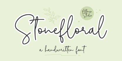 Proudly Presenting, Stonefloral A Handwritten Font. Stonefloral is perfect for any titles, logo, product packaging, branding project, megazine, social media, wedding, or just used to express words above the background. Stonefloral also come with Multi-Lingual Support. Enjoy the font, feel free to comment or feedback, send me PM or email. Thank You!
 - Bankai by Allouse Studio,
$16.00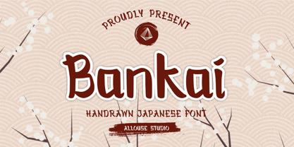 Bankai a Handdrawn Japanese Font. Bankai is perfect for any tittles, logo, product packaging, branding project, megazine, social media, wedding, or just used to express words above the background. Bankai also come with Multi-Lingual Support. Enjoy the font, feel free to comment or feedback, send me PM or email. Thank You!
 - Kaithryn by Din Studio,
$29.00 Kaithryn is a modern calligraphy font. It brings a beautiful and attractive typeface. Made for any professional project branding. It is the best for logos, branding, wedding and quotes. Includes: Kaithryn (OTF) Features: Stylistic Set Beautiful Ligatures Multilingual Support PUA Encoded Numerals and Punctuation Thank you for downloading premium fonts from Din Studio
 - Canyonlands by The Styled Script,
$27.00 Say hello to chic with the beautiful, modern Canyonlands Script font! This casual, hand-lettered script font is perfect for styling logos, stationery, social media, websites and so much more! Canyonlands was created with multilingual support and over 45 ligatures, allowing you to create a real hand-written look to your projects.
 - Kidszones by Krakenbox Studio,
$15.00 Kidszones is a cute and fun display and decorative font. Its cool, playful & childish look makes it a fantastic choice for fashion, signature, album covers logos, branding, magazines, social media posts, advertisement, and many more. Use this display font to add that special cool touch to any design idea you can think of!
 - Anzura by Mightyfire,
$10.00 Anzura is a decorative font that can be used for book title, logo brand, poster and many more. The looks is vintage classic yet clean, with a little decoration on each letter. We have two styles, Anzura Regular and Anzura Shadow. Both are beautiful! Enjoy in cooking something creative with Anzura font! :)
 - Bakrie by 160 Std,
$20.00 Bakrie is a bold and incredibly unique display font. Masterfully designed to become a true favorite, this font has the potential to bring each of your creative ideas to the highest level! suitable for use in many design forms, for example Headline, Magazines, Postcards, Logos, DIY Projects, Brand, Apparel, Quotes, and much more.
 - Rockmore by Almarkha Type,
$29.00 Rockmore is a bold script font with a clear style and dramatic movements. This font is great for logos, printed quotes, invitations, cards, product packaging, headers, Logotype, Letterhead, Poster, Apparel Design, and much more! Rockmore comes with uppercase, lowercase, numerals, accents (Multilingual characters), punctuations and a lot of gorgeous variations on each character!