10,000 search results
(0.018 seconds)
- Coconut Leaves by Omotu,
$16.00 COCONUT LEAVES! A handwritten display brush font, all caps. Coconut Leaves font is suitable for branding, logotype, apparel, T-shirt, Hoodie, product packaging, quotes, flyer, poster, book cover, advertising, etc. Whats Include? Opentype support Multilingual support PUA encoded Features: All uppercase, numerals, punctuations, and ligatures Accessible in the Adobe Illustrator Glyphs panel, or under Stylistic Alternates in the Adobe Photoshop OpenType menu, Adobe InDesign, Corel Draw, even work on Microsoft Word Please message me if you're unsure of any language support. Thanks for looking, and I hope you enjoy it! Please don't hesitate to drop me a message if you have any issues or queries.
 - Punkaholic by Sharkshock,
$115.00 Punkaholic started out as a loopy, all caps display font with a semi condensed feel. Before completion some of the letters such as A and W were given a more traditional look and were penciled in for alternates. In the end, however, they were added as uppercase characters instead. For this reason most words in lowercase vary in appearance from their uppercase counterparts. This dichotomy between straight lined capitals and rounded ones makes for some interesting contrasts. Punkaholic works best in less formal settings such as café menus, t-shirts, or children’s publications. It comes in 3 styles and contains Latin, extended Latin, punctuation, and kerning.
 - Laca by Nova Type Foundry,
$30.00 Laca is a semi-sans serif inspired by retro Portuguese packaging of soaps. Laca is the Portuguese word for hairspray. The starting point was to design a typeface that would bring a familiar feeling of closeness and warmth but giving it a modern look ensuring it works well on modern platforms. It’s a lively typeface that brings texture and personality to the text. Perfect for branding and for all communications. There is an upright italic version available through the stylistic set that brings even more friendliness to the font. The result is a versatile typeface that has many OpenType features that brings stylistic alternates to the designer.
 - Chips Snack by Omotu,
$16.00 Chips Snack! A hand-written font with 2 styles, regular (brush texture) and solid. Chips Snack is perfect for short typography, logotype, apparel, T-shirt, Hoodie, product packaging, quotes, flyer, poster. Whats Include? 1. Uppercase and lowercase characters 2. Supports international languages 3. Numerals, punctuations 4. Accessible in the Adobe Illustrator Glyphs panel, or under Stylistic Alternates in the Adobe Photoshop OpenType menu, Adobe InDesign, Corel Draw, even work on Microsoft Word 5. Multilingual support Please message me if you're unsure of any language support. Thanks for looking, and I hope you enjoy it! Please don't hesitate to drop me a message if you have any issues or queries.
 - Pink Lemonade by Nicky Laatz,
$22.00 A new fresh, bold brush font from Nicky Laatz. Pink Lemonade is Sweet, Casual and curvy...with subtle brush texture left in- perfect for head-turning statements and eye-catching branding. Pink Lemonade includes 45 natural-looking Opentype ligatures - perfect for making your words look freshly lettered, and like less of a font. Try alternating between having the ligatures active and not active for an even more natural look. Pink Lemonade will work wonderfully for beauty, posters, music brands, magazines, cosmetics, cook books, culinary art, book covers, sporting brands, bold headliners, and websites. Enjoy more inspiration using all Nicky Laatz's fonts on Instagram - @nickylaatz.
 - Streeters by Fontsphere,
$16.00 Streeters is a hand brush typeface, created for a specific project, where one of the assumptions in creating it was to combine the appearance of a manual brush, liquid paint but also a spatial effect. Uppercase and lowercase letters create a slightly different effect with the same character height. They are created in such a way that, in addition to writing with one letter case, it is also possible to mix and create many different combinations of uppercase and lowercase characters, for example, a unique look for the same repetitive words. The font is best for works where a non-standard, strong and distinctive form of communication is needed.
 - Manees by Omotu,
$16.00 DETAILS Manees! A modern calligraphy font with two styles, regular and slant. Manees font is suitable for branding, logotype, apparel, T-shirt, Hoodie, product packaging, quotes, flyer, poster, advertising, etc. Whats Include? 1. Uppercase and lowercase characters 2. Multilingual support. 3. Numerals, punctuations, and alternates 4. Accessible in the Adobe Illustrator Glyphs panel, or under Stylistic Alternates in the Adobe Photoshop OpenType menu, Adobe InDesign, Corel Draw, even work on Microsoft Word. Please message me if you're unsure of any language support. Thanks for looking, and I hope you enjoy it! Please don't hesitate to drop me a message if you have any issues or queries. Omotu Studio
 - FS Pimlico by Fontsmith,
$80.00 Born in the 70s Personal influences are unavoidable in type design and usually find their way through into finished fonts. At Fontsmith, one period in particular provides inspiration, according to FS Pimlico designer, Fernando Mello. “Jason and Phil have always known that I’m very into the visual language of the 70s. I know that Jason shares my love of the 70s and Phil will sometimes admit to being a fan, too. I think that’s the reason they were both so supportive in the development of this font. “And, of course, we all share an interest in good-humoured and intelligent design. We like to think it’s a Fontsmith characteristic.” Back from black FS Pimlico started in an unusual place: with a tubby, penguin-like lowercase “a” that Fernando Mello had been sketching. From “a” grew the rest of the alphabet – a bubbly, fat, friendly family with a brush-written quality that became FS Pimlico Black. The black weight certainly isn’t the normal starting point for creating a regular and bold weight, but Fernando pressed on, driven by a glut of influences: brush-writing; Letraset and early digital systems catalogues; the type of Herb Lubalin and Tony di Spigna; 70s clothes and vinyl; and 70s revival disco nights in London’s Pimlico and Vauxhall. Natural or flourished Not often do fonts come along that seem to span the ages. FS Pimlico is at home in an office environment providing a fresh clear identity in communications or providing text that’s clear and easy to read. But it likes to party, too, 70s style. With the OpenType features switched on, a designer can totally change the look of their work, and create point-of-sale, headlines and titles that stand out and get noticed.
 - FS Pimlico Variable by Fontsmith,
$249.99Born in the 70s Personal influences are unavoidable in type design and usually find their way through into finished fonts. At Fontsmith, one period in particular provides inspiration, according to FS Pimlico designer, Fernando Mello. “Jason and Phil have always known that I’m very into the visual language of the 70s. I know that Jason shares my love of the 70s and Phil will sometimes admit to being a fan, too. I think that’s the reason they were both so supportive in the development of this font. “And, of course, we all share an interest in good-humoured and intelligent design. We like to think it’s a Fontsmith characteristic.” Back from black FS Pimlico started in an unusual place: with a tubby, penguin-like lowercase “a” that Fernando Mello had been sketching. From “a” grew the rest of the alphabet – a bubbly, fat, friendly family with a brush-written quality that became FS Pimlico Black. The black weight certainly isn’t the normal starting point for creating a regular and bold weight, but Fernando pressed on, driven by a glut of influences: brush-writing; Letraset and early digital systems catalogues; the type of Herb Lubalin and Tony di Spigna; 70s clothes and vinyl; and 70s revival disco nights in London’s Pimlico and Vauxhall. Natural or flourished Not often do fonts come along that seem to span the ages. FS Pimlico is at home in an office environment providing a fresh clear identity in communications or providing text that’s clear and easy to read. But it likes to party, too, 70s style. With the OpenType features switched on, a designer can totally change the look of their work, and create point-of-sale, headlines and titles that stand out and get noticed. - Preta by Lián Types,
$39.00 Preta, portuguese for a very pure kind of black, has its name very related to its concept: I wanted to make the fattest/darkest script ever. People who follow my work may notice its forms are very related to works of my past (1) but this time the challenge was to be very cautious with the white spaces between letters. Not only I followed some rules and ductus of the copperplate style of calligraphy but also I took a lot of inspiration in posters of the early Art Nouveau (specially in Alfred Roller of the Vienna Secession) where letters forms looked like black squares if not looked from a close distance. With Preta, I wanted to achieve that same idea of “darkness” and thanks to the always welcomed question -what if?- the font grew a lot. The result is a very fat font, that looks delicious. Due to possible customer needs, I designed Preta Small, so it can be used in smaller sizes. Preta Ao Sol (which literally means under the sun!) is a style with those lovely tiny details to give the sensation of bright. Preta Ao Sol Solo was made to be used as a layered font with Preta. Finally, Preta Capitals serves as a company for Preta. Hope you enjoy the font as much as I did when designing it: The fact that it’s full of alternates, swashes, ligatures and swirls makes it really pleasurable at the moment of using it. Give it a try and dance with Preta! TIPS For better results, use Preta with the ‘standard ligatures’ feature activated. NOTES (1) Beatle in 2014. Seventies in 2015.
 - Fadista by Alex Beck,
$19.99 Fadista is an eccentric experimental typeface, inspired by the Portuguese fado music and letterings by the artist Stuart Carvalhais (1887–1961), created throughout the 1920ies and 1930ies. A strong and clean presence with a touch of quirky gives the typeface its overall character. Fadista includes various OpenType features that allow tailoring the type to custom needs, encouraging graphical exploration. Fadista is the result of meticulous research, graphic reinterpretation and systematization of the glyph palette, taking into account modern font standards. Balancing between a historic heritage and „hipster“ contemporary looks, Fadista represents a discourse about aesthetics, trends and currentness in graphic design. The stylistic variations of the glyphs in fadista work in an additive fashion, rather than completely altering the look of the typeface. This means that a basic framework of glyphs remains unaltered, while certain subgroups of characters are affected by the style choices. Through this behavior, stylesets in fadista work as a switch for the type of contrast you’d like entwined in the overall look of the typeface. Other unique features include stylistic alternates for specific glyph combinations, ligatures that allow internal character spacing and tiny diacritics that flow within cap height along normal height glyphs. Please note the lowercase characters within Fadista are uppercase alternates. Math operators are fully supported, as well as a wide range of symbols and punctuation. Supported Languages: Albanian, Danish, Dutch, English, Finnish, French, German, Icelandic, Italian, Malagasy, Norwegian, Portuguese, Romansh, Spanish, Swedish and Turkish. For further language support don‘t hesitate to get in touch. Fadista was awarded the Art Directors Club Bronze in the junior competition 2014 and the DDC Award 2014 in the category "Future“.
 - FS Truman by Fontsmith,
$80.00 Beyond broadcast Like Truman Burbank, the star of The Truman Show, FS Truman was born for TV. You’ll know it from Sky One’s on-screen trails and announcements, but it’s just as at home in other media. Its starting point was the skeleton of a highly legible, space-saving, corporate font with some of FS Dillon’s geometric discipline built in. Its distinctive tone of voice and “ownability” are in its boxy but friendly shapes, and characters with hybrid features. FS Truman’s weights and widths were honed to work at TV screen resolutions. A face for TV it may have been, but this is a font that works on every level, on screen, in print, in headlines, in listings, in longer text, in tight corners and open spaces. The space-saver Compact, condensed but crystal clear, FS Truman comes into its own where a lot needs to be said in not a lot of space. Its letter spacing allows the type room to breathe, even at small sizes, while its fulsome x-height and diminutive descenders pave the way for tighter leading. A natural for headlines and titles over three or four lines. “Hybrid” features With every font, Fontsmith look for crafty new ways to imbue letterforms with a consistent character. The idea with FS Truman was to introduce “hybrid” features. In open letters such as “c” and “s”, for example, the top terminals have straight, vertical cuts while their lower terminals have a more angular, cursive finish. Boxy, spacious forms with unusual curves and angles create not just highly legible and efficient letters but strongly distinctive ones, too.
 - KG Flavor And Frames Three by Kimberly Geswein,
$5.00 Frames and borders of various types. Also includes a series of words perfect for accenting Instagram photos.
 - DB Circles - Christmas by Illustration Ink,
$3.00DoodleBat Circles - Christmas is a collection of Christmas themed words and clipart thrown together in classic circles. - Demetria by Andinistas,
$39.95 Demetria is a font created in 2012 by Carlos Fabián Camargo and works to form words and headlines with medieval expressiveness. Thus his concept mix uncial, Roman and italic letters resulting serifs some here and there, extended width and high amount of contrast between thick and thin strokes. That way its vigorous ups and downs are higher than its “x” height, highlighting it as a font with regular caliber,outstanding to design headlines with strong proportions and texture. Consequently, typographic and aesthetic possibilities of Demetria are visually appealing by its chaotic forms that are embedded and remain fixed in the minds of its viewers; also, “Demetria Pro” has OpenType features such as “Swash”, “Titling”, “Discretionary Ligatures”, “Standard Ligatures”, Ordinals, Fractions and Superscript that make shine what is written by their abstract shapes resembling elongated paths of black ink diluted in water. This font also works in software without opentype features, so it is recommended to use the remaining files NON-PRO. In short, the expressiveness and mysticism of Demetria is reaffirmed with some capital letters with lower height designed to be interchangeable with similar metrics to lowercase but aesthetically different.Thus the font mimics strong imperfections and splashes that get slim or grow depending on their degree of spontaneity. In that sense Demetria is recommended to compose words, phrases and typographic textures in graphic design projects related to epic, historical or legendary matters.
 - Luckywish by Jafar07,
$12.00 Welcome to the world of Luckywish Sans-Serif Handmade Font, a special offering born from hands full of creativity and love. Combining the art of handwriting with the simplicity of a sans-serif, Luckywish font offers a magical script that fulfills all your wishes. Luckywish is a symbol of hope that shines through every stroke found in each character. Crafted with heartfelt dedication, this font showcases the natural beauty of handwriting, bringing warmth and joy to every design composition. Armed with a pen and imagination, Luckywish exudes a unique charm. Its relaxed and delicately intertwined style brings a friendly and inviting ambiance to every formed sentence. When used, this font will infuse happiness and a fresh spirit into every project you undertake. Luckywish is more than just a font; it's a loyal partner to designers, writers, and creators alike. With its sans-serif characteristics, this font is easy to use and suitable for a variety of creative projects, from logo designs to posters, from wedding invitations to company branding. In the palm of your hand, Luckywish offers a perfect balance between boldness and delightful gentleness. Each character is meticulously crafted to provide unparalleled harmony in every usage. It's time to let your hopes and imagination flourish with Luckywish. Let this font bring joy and inspiration into your design world. Get ready to witness your words and messages transform into mesmerizing works of art that capture hearts. Be part of this magical journey with Luckywish. Get the font now and enjoy limitless creativity with an unmatched personal touch.
 - Alfie by Monotype,
$29.99 Alfie™ is lively, friendly, inviting and easy on the eyes. What more could you want in a script? How about four flavors of the same design? Alfie Script is a delightful connecting script with a touch of comfortable elegance. Use it for everything from social announcements to headlines and packaging. Alfie Casual is a little more laid-back with letters standing on their own. It works great in short blocks of text copy, subheads and navigational links. Alfie Informal has spirited serifs and its own demeanor, while Alfie Small Caps does a fine job of supporting its other siblings. There’s an immediacy to words and messages set in these lighthearted confections. Jim Ford was practicing drawing with a new brush pen when the inspiration for Alfie came to him. He had filled several pages in a notebook with letters and, at one point, realized that there might be a typeface among them. As it turned out, there were four. The process, however, wasn’t choosing one design and modifying it. The makings of all the designs were on the pages. It was just a matter of culling out the right collection of characters to build the foundations for the four flavors of Alfie. Because they share the same family roots, each design in the Alfie family can be paired and intermixed. Ford admits that there’s a hint of Emil Klumpp’s 1950s Murray Hill typeface (https://www.myfonts.com/fonts/bitstream/murray-hill/) in the Alfie family. Just enough to give the design a 50s vibe. (Some fashions never go out of style.)
 - Deportivo by 8AV,
$15.00 Welcome Deportivo - Spanish for sporty. Deportivo is a simple and powerful typeface based on the lettering on vintage sports equipment. I saw it as a brand on a pair of old skis and fell in love with it because it is so bold and it can be easily read while moving at high speed, making it perfect in a sports and dynamic environment. Due to its high legibility, it gets great results with sports teams, league names and t-shirt numbers and race indications. The high x-height gives the typeface a unique look and a strong tone of voice - that will echo in each arena and outside making it perfect also for headlines in newspapers and magazines and product names. Keep scoring!
 - Forked Tongue by Comicraft,
$19.00 Are you Troubled by Ghostly Voices in the night? Do you hear the Terrifying Tones of Demons and Ghouls in your Attic or Cellar? Have you or any of your family spoken with "Forked Tongue? Well, talk of the devil, Forked Tongue happens to be the latest offering brought to you buy our courteous and efficient staff this month (now on call twenty-four hours a day to serve all your supernatural lettering needs). If it Sounds Spooky, it most probably speaks with Forked Tongue. Oh, but if you really have got ghosts or poltergeists, well, um, we don't know who you gonna call. Features: Four weights (Regular, Italic, Bold & Bold Italic) with upper and lower case alphabets. Includes Western and Central European international characters.
 - Cynapse OT by Positype,
$29.00 Several years ago I was faced with a project that required very small type to be used in a directory. In general, there was a need for a lot of 'fine print'. Faced with this, all of the tests I was making with existing faces were producing too much bleed of the individual glyphs...Cynapse was born. It evolved into this pseduo-techy looking type that standardized and glorified the ink trap (the small, tiny allowances of white space that reduces the amount of ink hitting the page, and in effect, reducing the appearance of bleed). The results was promising. The new OT version contains additional OpenType features that include expanded ligature sets, fractions, 5 sets of numerals as well as small caps and Central European diacritics.
 - Cahuenga by LuxTypo,
$50.00 Cahuenga embodies clarity in text and distinction in display. Throughout the development process, references were sought out only as moments for consideration presented themselves. Thus, the development was long and complex with Cahuenga not prescribing to a single distinctive model as a foundation. Exploration around formal traits was influenced as much by aesthetics as they were by desired functional outcomes. Cahuenga organically holds a tone and pitch that is sincere. The name is emblematic of many who drive through the Hollywood area of Los Angeles. As in many parts, the driving route is convoluted from point A to point B. However, it seems more often than not, that when in the Hollywood area, one usually ends up on Cahuenga Boulevard at some point.
 - Artifex CF by Connary Fagen,
$35.00 Designed for easy reading of long passages, Artifex CF's smoothed-off serifs help the flow of text without unnecessary visual noise. Artifex's even rhythm and mellow tone make it an excellent option for books, magazines, articles, blogs, captions, and longform texts. A near-upright italic adds emphasis and urgency with elegance. Artifex also doubles as a handsome display typeface, scaling gracefully with charming details revealing themselves at large sizes. Artifex CF pairs nicely with bold, clean sans-serifs, such as Greycliff CF and Visby CF. Artifex also has a sibling typeface, Artifex Hand CF, cut from the same cloth, but with subtle flares in place of the serifs. All typefaces from Connary Fagen include free updates, including new features, and free technical support.
 - CAL iWasLike Pro by California Type Foundry,
$47.00 CAL iWasLike™ Pro is totally for sure the amazing friendly font you need for, like, everything! Its conversational tone makes reading fun and enjoyable! Designed for friendly, paragraph reading ease on screen or medium res print, with the full set of OpenType features. It's design gives it the most even text shade for digital fonts, and has less holes in the text for easier reading. iWasLike™ is a large x-height, informal text and caption font designed to render well for Apple Quartz and Microsoft devices, low res to high res printing, with full Western Central European, and Turkish support, small caps, superiors, inferiors, fractions, as well as some special additions like music symbols, pricing feature, arrows, and two sets of circled numbers.
 - Possible by K-Type,
$20.00 POSSIBLE is both sans and serif, either is possible. The typeface is a sans-serif impersonating a spur serif, or it’s a glyphic with the look and feel of a sans. This clean, contemporary family is inspired by Percy J Smith’s ’Petit Serif’ from 1928, and similarly takes inspiration from Johnston’s Underground, though more recent influences provide geometric and humanist elements that, together with the tiny micro-serifs, improve clarity and legibility. Spur serifs such as Petit Serif, Copperplate and Liberty are often caps-only fonts, but Possible contains a lowercase, as well as a full Latin Extended-A character set. Possible is available in five weights – Thin, Light, Regular, Medium and Bold – each supplied with a corresponding, optically-corrected italic.
 - Depicto by Michael Rafailyk,
$12.00 A pixelated typeface with asymmetrical serifs intended to depict emojis in coarse mosaic shapes and represented in two styles that perfectly complement each other – Mono (casual font) and Mosaic (color font). The main font feature is a large set of pictograms, which are activated using the Stylistic Set and typed right in a text with a keywords like :smile: :happy: :sad: :pear: :rose: :horse: :bike: :house: and so on. Read more about Depicto font family concept, features, pictograms, color font, emoji skin tone, how to use it, and the applications support: https://michaelrafailyk.com/depicto See the complete list of 600+ pictograms: https://michaelrafailyk.com/typeface/specimen/Depicto.pdf Scripts: Latin, Greek, Cyrillic, Hebrew Languages: 480+ The promo image “Serpant Mosaics” used a photo of Nick Verlice from Pexels
 - 19-PRA by ILOTT-TYPE,
$29.00 Inspired by the elegance of Herman Zapf’s designs crossed with the readability of early 20th century Gothic fonts by Morris Fuller Benton, 19-PRA is a sans-serif with a visible stroke contrast and a humanist tone of voice. The large x-height seen in fonts like News Gothic and Palatino increases legibility and condensed proportions give excellent readability making it perfect for newspaper and magazine publishing. A typeface that can serve for both body text and titling the uppercase excels for headlines and renders beautiful brand names when tracked out. It sets well with both a serif or sans serif and has various open type features including: 12 standard ligatures, 3 discretionary ligatures, tabular figures, old stye figures as well as European accents.
 - Fedorro by Leeza Chepugova,
$13.00 We are proud to present to you our new Latin+Cyrillic font Fedorro! Fedorro typeface is a classy example of a modern Ukrainian style of type design. It is inspired by traditional fonts of the past, but with a strong modern twist to its appearance. The main feature of this font are round and playful letters combined with a relatively tiny negative space, making it unique like no other: many typeface elements were borrowed from historical exemplars of Ukrainian handwritten letters and redesigned with modern trends in mind. Fedorro is perfect for all the situations when you need the text to pop and catch the viewer's eye: posters, books and magazine covers, headlines, banners and ads, logotypes, corporate branding, lables, ads etc.
 - Sinkin Sans Narrow by K-Type,
$20.00 Sinkin Sans Narrow is a simple, pleasantly proportioned and easy to read sans-serif, available in all 9 standard web weights, 100 to 900, plus italics, so the face is a comprehensive illustration of the CSS web font numerical scale. Sinkin Sans fonts are designed with tiny, inconspicuous notches that sink into verticals at the intersections of strokes, adding highlights to congested corners. The incisions make right angles appear sharper and improve definition in more intricate characters. Sinkin Sans Narrow inherits the enviable clarity and readability of the luxuriously wide original family. The Narrow typeface, however, is designed to economise on space within busy web pages and has been sensitively condensed for maximum legibility. Each weight of Sinkin Sans Narrow is supplied with a free Italic.
 - Counter Attack by Ronny Studio,
$19.00 Counter Attack Font is a typeface that emphasizes a more informal and expressive style. It is often used in designs that require a sense of spontaneity or creativity, such as logos, posters or album covers. Freestyle fonts may feature irregular, hand-drawn letters, often with excessive embellishments or decorative elements. This font is designed to convey a sense of energy and movement, and can be used to evoke a certain mood or tone in a design. There are many freestyle font styles available, ranging from more readable and structured designs to more abstract and experimental ones. Features : - All Caps - numbers and punctuation - Alternate & Ligature - Swash Ornament - multilingual - PUA encoded Please contact us if you have any questions. Enjoy Crafting and thanks for supporting us! :) Thank you
 - Ingram BT by Bitstream,
$50.99Ingram BT might be described as Deco, or Arts & Crafts, in style. Created by Alex Marshall, it is a very condensed design with high-waisted uppercase glyphs that feature dots rather than straight lines for the middle hairlines. There are two sets of alternate glyphs accessible via stylistic and contextual OpenType features. The contextual alternates offer the most interesting glyph substitutions. There are also oldstyle and tabular figures, superiors and inferiors, as well as unlimited fractions. Ingram is a very handsome, casual typeface, with a slightly rough finish. The compact lowercase remains very readable at text sizes and it is a pleasure to turn on the earth tone colors and typeset left and right justified paragraphs! The extended character set supports Baltic and Central European languages. - Althera - Personal use only

- Somn by Mix Fonts,
$13.00 Mix Somn is the perfect font for adding charm to your children’s products. Its thin, tall, and dainty style is both stylish and legible, making it perfect for labeling baby clothes, toys, and other items. The digitally handwritten sans serif font was created with an iPad Pro and Apple Pencil, using the Poppy Brush from my Procreate Brush Bundle. Its delicate strokes and sweet, soft appearance make it the perfect choice for any project you might find in your little bundle of joy’s nursery. Mix Somn includes the following characters: ABCDEFGHIJKLMNOPQRSTUVWXYZ abcdefghijklmnopqrstuvwxyz 0123456789 !@$#%^&*() `~♥M• ÷+=[]:;’”,.\|/?{}<>“”‘’-–—_…©®™«»°¡¿₱¢€£¥ ÁÀÂÄÃÅĂĄÆĆČÇÐÉÈÊËĘÍÌÎÏŁŃÑÓÒÔÖÕØŐŒŚŠȘȚÚÙÛÜŰÝŸŹŽŻÞ áàâäãåăąæćčçðéèêëęíìîïłńñóòôöõøőœśšșțúùûüűýÿźžżþ
 - Carolyna by Emily Lime,
$59.00 Carolyna is an elegant, yet whimsically handwritten calligraphy font that was created with readability in mind. It uses open-type features to assist with letter flow and to give each creation that modern, hand-lettered touch. With over 1000 characters, there are many stylistic alternates to choose from, tons of foreign characters so you can write in other languages, and fun swashes to give headings a little something extra. Note: The Pro version contains ALL characters - but if you can't use open-type, I highly recommend opting for one of the other options where what you see is exactly what you get!
 - LS Altia by Letterhend,
$14.00 Introducing Altia Hand Lettering Tool Kit, Yes it is a Tool Kit. The reason why we named it as a Tool Kit is because you will get tons of item in one product! This product will contain 7 fonts. This product will provide anything you need to create a lovely quotes and logo. Just mix and match the fonts and then you can get a beautiful lettering that you can use in any media you want! Very suitable for wedding invitation, greeting cards, merchandise, apparel, poster / print design, etc. All the fonts is also support multilingual.
 - Kathak by Ekahermawan,
$14.00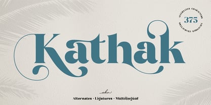 Please welcome Kathak. Kathak is a display serif font. Kathak is specially designed to make your typography design result looks more beautiful with tons of alternates and ligatures characters. Kathak is versatile font for many different projects such as logo, branding, poster, magazines, labels, merchandise, invitation, presentation, advertising, quotes and so much more! FEATURES: OpenType support Playfull to use (with ligatures and alternates options) Multilingual support PUA Encoded If you need support or more information about this item, please kindly contact me : ekahermawanputu@gmail.com Thank you so much.. I really hope you enjoy when using it!
 - Liam by Laura Worthington,
$29.00 Liam is a quirky hand-drawn serif font that bounces playfully around the baseline. Named after my young nephew, Liam’s cute cowlick curls and varying slants add childlike charm while retaining legibility, making it ideal for use in storybooks, toys, and other kids stuff. It includes 130 alternates and 52 adorable illustrations. See what’s included! http://bit.ly/2ci2MN0 *NOTE* Basic versions DO NOT include swashes, alternates or ornaments This font has been specially coded for access of all the swashes, alternates and ornaments without the need for professional design software! Info and instructions here: http://lauraworthingtontype.com/faqs/
 - Art Maria by Letterara,
$14.00 Art Maria is a playful and strikingly beautiful handwritten font with a bold twist in the style of Modern Calligraphy. Art Maria is fully-featured with tons of alternate characters and OpenType features. It will add a sophisticated charm to any design project! Art Maria handletter is particularly well suited to invitations, branding, editorial design, elegant logos, upscale packaging, wedding stationery, posters, quotes, short text, branding, web, graphic design, and any other projects requiring a handwritten and luxurious touch. The OpenType features can be very easily accessed by using OpenType-savvy programs such as Adobe Illustrator and Adobe InDesign.
 - Govia Sans by Marc Lohner,
$25.00 Let’s have some fun! Govia Sans adds plenty of joy to any logo, layout or UI. Geometric shapes and a funny look come together in this font family – thus, Govia Sans might be the perfect choice for toys, books, packaging designs, movieposters and many more. Although the fonts’ comic character shines through in every glyph, it keeps a surprising degree of legibility even in small sizes. Choose between a Medium and a Bold weight. Designed by Marc Lohner, Govia Sans speaks more than 200 languages. Funny ligatures, arrows, oldstyle figures and many more features will fulfill all your typographic needs.
 - Jollin Family by Creativemedialab,
$14.00 Jollin Family is a pretty, attractive and fashionable sans serif, has ton of alternates that you can use to create a simple but pretty letters. Jollin has 8 weights and 3 Widths and also available in Variable version Jollin Family Variable contain three configurable axes: weights, width, and slant, you can adjust the font axis setting to get the desire size. Jollin Perfect for Heading, logo creation, Advertisements, Christmas, Label, business card, branding and more! Get inspired by its fashionable appeal! to access alternate Adobe Photoshop go to Window - glyphs Adobe Illustrator go to Type - glyphs
 - Uncia Black by Greater Albion Typefounders,
$12.00 Greater Albion Has been toying with thoughts of a “unicase” typeface for a while. On the other hand we’ve always wondered just what practical use they are. It is also a while since we’ve introduced a ‘handwritten’ design. Therefore, It struck us that one answer was something ‘hand-lettered’. These days many people do write in a sort of informal unicase don’t they? But, at the same time, we wanted it to have a little character. So here it is, a bit calligraphic, with a touch of black-letter and a cunning mix of upper- and lower-case forms Uncia Black!
