10,000 search results
(0.076 seconds)
- Disforia Inersia by Skinny Type,
$15.00 Introducing Disforia Inersia! Your purchase includes Disforia Inersia Script, conjunctive handwritten script, and Print, handwritten, printed script typeface. Disforia Inersia created side by side to work together. All lowercase letters are placed to receive a connecting tail from Disforia Inersia. You can mix and match in the same word to your heart's content! Disforia Inersia was also created with the crafter in mind: there are no closed counters in either type, meaning they can easily be used for stencils and electronic cutters such as the Cricut line and the Silhouette. Disforia Inersia Package includes: - Nearly 300+ glyphs in Inertia Dysphoria font, designed to work together! - No closed counters - useful for stencils and vinyls! - More than 200 accented characters in each font. - Double letter staggered ligatures for a hand-drawn look! - PUA-encoded for easy character map access! Enjoy and thank you. Skinny Type
 - Hokaplay by Afkari Studio,
$13.00 Hokaplay - Playful Display Font Hokaplay is a playful display font that creates with a very good concept and adjusted well to keep the legibility. Hokaplay Playful Display Font Comes with upper and lowercase Standard Characters, Punctuation, Numerals And other Glyphs variation of the OpenType features/ Ligatures. Hokaplay Playful Display Font is suitable for logos, posters, school flyers, university banners, modern advertising design, product labels, cartoons, kid books, custom mugs, pillows, t-shirts, youtube thumbnail/cover, poster quote, editorial design, book/cover Title, website/blog, social media post, packaging designs,, and other designs. Features; - 2 Styles; Regular and Rounded - Standart and special ligatures - Uppercase, Lowercase, Number, and Punctuation - Works on PC & Mac - Simple installations - Accessible in Adobe Illustrator, Adobe Photoshop, Adobe InDesign, even work on Microsoft Word - Fully accessible without additional design software. - Mültîlíñgúãl Sùppört for; ä ö ü Ä Ö Ü ß ¿ ¡
 - DST Helfita by Designsation,
$16.00 This first font was made as an experimental work for us. learn a alot of typeform from other typeface in the past, bring us to this grace position. We learn about Variable font and all the thing to do some improvement in our work. such a nice time to present this new font to the world as the ground breaking of our mission to scale up our skill and to step up into the next vision as a font designer. We create this font with variable and Open Type features. Some instances including, from thin to black. and on the variable font has and oblique style.
 - Flavery by Invasi Studio,
$19.00 Flavery is a vintage slab serif font that is perfect for creating a rustic and rugged aesthetic with its hand-drawn slab serif style. This font is ideal for evoking the old-fashioned cowboy era or the classic vintage vibes era and is great for display purposes. Flavery features alternate glyphs and supports multilingual Latin characters to enhance your designs with a touch of old-world charm. Its bold and distinctive style will make your designs stand out and give them a unique character. Whether you're working on a poster, packaging, or branding project, Flavery will add a touch of vintage authenticity to your work.
 - Worthing by Greater Albion Typefounders,
$14.00 Worthing aims to combine Victorian charm with modern-day requirements for legibility and clarity, and we hope, demonstrates that traditional elegance still has its place in the modern world. Meanwhile, for those who are curious about the naming of our fonts, Mr Lloyd our designer was reading Mr Wells (H. G.) War of the Worlds recently. No doubt some of you will remember the part that Worthing in Sussex played in that story. Worthing is offered in three styles: regular, alternate and shaded. It's ideal for Victorian and Edwardian era inspired design work, posters and signage, as well as for book covers, chapter headings and so forth.
 - Bad Marker by Haiku Monkey,
$10.00 The marker has been sitting in your pen drawer for years. You can't bring yourself to throw it out, because it's the best marker in the world; but it has become worn and frayed, and you can't bring yourself to use it, either. But today you have just the project for the best bad marker in the world, and you take it from the drawer, remove the cap, and notice with glee that time has accumulated a perfect supply of ink in the frayed tip. You bring it down on the pristine white paper in front of you, and magic begins to trace itself on the page...
 - Jotia by Hashtag Type,
$32.00 Creating a combination between serif and sans serif typefaces, Jotia utilises the best of both worlds, resulting in a unique and modern neo-humanist font family. Taking its inspiration from lapidary inscriptions rather than pen drawn text, Jotia uses triangular serif shape details to create a strong uniformed personality with clear legibility. This original quality enables characters to be expressive in headlines, as well as in printed and onscreen text situations. Jotia also works beautifully alongside both serif and sans serif typefaces giving complex editorial work a more powerful and visually stimulating dynamic. Details include six weights, manual kerning and spacing, ligatures and alternatives.
 - Eyadish by Eyad Al-Samman,
$7.00 Eyadish is an entertaining, comic, and childish font. The name of this font is originally derived from two main syllables. The first one is "Eyad-" which refers to my first name and the second syllables is "-ish" which means characteristics of or relating to. Hence, "Eyadish" refers to the characteristics that "Eyad", the typographer, himself has and had during his childhood. I do like this font for its childish and comic shapes. I have decided to design this font trying to leave a humble and personal imprint regarding the magic and innocent world of all children. Frankly, it is my most favorable designed font. This font comes in two different weights with facilities for writing and publishing in different alphabets included in various Latin and Cyrillic texts and scripts. "Eyadish" is primarily designed to be fit with all prints of kids, children, and juveniles' products. It is major usage is in advertisements and publications. It is suitable for T-shirts, books' covers of children such as fairy tales and comic stories, advertisement light boards in malls, and titles in parental, childish, comic, and other related magazines. "Eyadish" also can be printed in many children's products such as garments, towels, shoes, socks, toys, pacifiers, diapers, exhibitions, festivals, books titles and contents, medicines' packages, kindergartens' signs, buses, comic and TV series, kids and children organizations and charities names, images, software, foods including milk cans, candies, chocolates, and other related products. The font is extremely and distinguishably attractive when it is used with various, and vivid colorful letters and words in posters, cards, and placards. "Eyadish" is specifically designed for commercial, educational, cultural, and social purposes related to infants, babies, kids, and children. The main characteristic of "Eyadish" Typeface is in its childish look that remains when anyone reads or types or even deals visually with its characters.
 - Breaking Bread by Missy Meyer,
$12.00 This font came to be when I was creating a cake topper mockup (see the promo images) and didn't have a thick script font that I liked for it. So I got to work writing out some fun chunky cursive letters that could top a cake! The concept of breaking bread is an old one, often meaning two parties working together. In the Breaking Bread font, I've combined that heavy connecting script with a hand-lettered sans-serif uppercase set. It works in all lowercase, all uppercase, and title case with equal ease! I've also included a number of alternates and ligatures, so you can have a truly hand-written look when double-letter words show up, plus a few extra characters and swashes to add some pizzazz to your work. It's great for crafting a mug or t-shirt, creating a logo, or making product packaging! And all of those alternates are PUA-encoded, so they're easy to access in any character map. Breaking Bread also comes with over 300 extended Latin characters for language support, including but not limited to: Catalan, Czech, Danish, Esperanto, Estonian, Finnish, French, Gaelic, German, Icelandic, Irish, Italian, Latvian, Lithuanian, Norwegian, Polish, Portuguese, Romanian, Serbian (Latin), Slovak, Slovenian, Spanish, Swedish, Turkish, Welsh, and more!
 - Tiki Tangle by Shakira Studio,
$19.00 Introducing Tiki Tangle - A Decorative and Classic Font Full of Retro Fun! Tiki Tangle is the answer for designers looking for a retro touch and uniqueness in their designs. This decorative font captures the retro fun that's all the rage right now, creating a balance between nostalgic memories of the past and timeless uniqueness. Each letter in Tiki Tangle is a work of art in itself, embracing a cute and unconventional retro aesthetic. Suitable for designers who want to add a touch of uniqueness to their projects, in line with contemporary design trends. With Tiki Tangle, you have the creative freedom to turn your designs into eye-catching works of art. Whether you're designing a classic poster, eye-catching product labels, or unique social media graphics. Here's what you get: Regular and Italic Version All Multilingual symbol Opentype features ( ligature, alternate ) Accessible in the Adobe Illustrator, Adobe Photoshop, Adobe InDesign, even work on Microsoft Word. PUA Encoded Characters - Fully accessible without additional design software. Multilingual character supports : (Afrikaans, Albanian, Catalan, Croatian, Czech, Danish, Dutch, English, Estonian, Finnish, French, German, Hungarian, Icelandic, Italian, Lithuanian, Maltese, Norwegian, Polish, Portuguese, Slovenian, Spanish, Swedish, Turkish, Zulu) Follow my shop for upcoming updates, and for more of my work, Thank you!
 - Erstwhile by Hanoded,
$15.00 I like posh English words - the ones you read in books, but actually never use. Erstwhile is such a word; it means ‘former’, but if you use it while talking to someone, it sounds quite odd. Erstwhile is a classy font family - crafted in Holland (with love!).
 - ITC Astro by ITC,
$29.99ITC Astro is the typeface that proves you can get your work done while watching cartoons. “It all started as a series of doodles while I was watching The Jetsons,” recalls Sasa Petricic. “The show's impossibly simplistic vision of the twenty-first century cried out for a font that fit into that world -- a world where everyday objects can carry far more fun and personality than they should.” ITC Astro is the first commercial typeface design from Petricic, whose “day job” is working as a reporter for the Canadian Broadcasting Corporation. Petricic has filed stories from across Canada and around the world for CBC's flagship evening newscast, The National. His reports have also appeared on CNN and BBC Television. Petricic's work as a correspondent and video journalist have taken him to six continents, covering everything from famine and genocide in Africa to the war in Iraq. With such serious matters filling the hours of Petricic's day as a journalist, it's not hard to see why he conceived Astro as a welcome blast of whimsy. “As I began to draw the design,” he says, “I decided that every part of Astro should be a cartoon character unto itself.” Each character has its own baseline shadow (or coaster, or circular antigravity generator, depending on how you look at things). The angular caps dance jauntily, rocking from left to right, while a suite of companion small caps provide backup. The end result is a design quite unlike any other, with surprising charm and versatility. ITC Astro comes in a two-weight family of White and Black. - ITC Garamond Handtooled by ITC,
$34.99Claude Garamond (ca. 1480-1561) cut types for the Parisian scholar-printer Robert Estienne in the first part of the sixteenth century, basing his romans on the types cut by Francesco Griffo for Venetian printer Aldus Manutius in 1495. Garamond refined his romans in later versions, adding his own concepts as he developed his skills as a punchcutter. After his death in 1561, the Garamond punches made their way to the printing office of Christoph Plantin in Antwerp, where they were used by Plantin for many decades, and still exist in the Plantin-Moretus museum. Other Garamond punches went to the Frankfurt foundry of Egenolff-Berner, who issued a specimen in 1592 that became an important source of information about the Garamond types for later scholars and designers. In 1621, sixty years after Garamond's death, the French printer Jean Jannon (1580-1635) issued a specimen of typefaces that had some characteristics similar to the Garamond designs, though his letters were more asymmetrical and irregular in slope and axis. Jannon's types disappeared from use for about two hundred years, but were re-discovered in the French national printing office in 1825, when they were wrongly attributed to Claude Garamond. Their true origin was not to be revealed until the 1927 research of Beatrice Warde. In the early 1900s, Jannon's types were used to print a history of printing in France, which brought new attention to French typography and the Garamond" types. This sparked the beginning of modern revivals; some based on the mistaken model from Jannon's types, and others on the original Garamond types. Italics for Garamond fonts have sometimes been based on those cut by Robert Granjon (1513-1589), who worked for Plantin and whose types are also on the Egenolff-Berner specimen. Linotype has several versions of the Garamond typefaces. Though they vary in design and model of origin, they are all considered to be distinctive representations of French Renaissance style; easily recognizable by their elegance and readability. ITC Garamond? was designed in 1977 by Tony Stan. Loosely based on the forms of the original sixteenth-century Garamond, this version has a taller x-height and tighter letterspacing. These modern characteristics make it very suitable for advertising or packaging, and it also works well for manuals and handbooks. Legible and versatile, ITC Garamond? has eight regular weights from light to ultra, plus eight condensed weights. Ed Benguiat designed the four stylish handtooled weights in 1992." In 1993 Ed Benguiat has designed Handtooled versions. - LC Tejuela by Compañía Tipográfica de Chile,
$29.00 Tejuela (Spanish for “Wood Shingle”) is a neoclassical type inspired by the wooden architecture of the ancient churches of Chiloé, an archipelago in southern Chile; which are World Heritage Sites. This typeface has rough and broken forms but with soft strokes. The neoclassical characteristic of Tejuela is due to the architecture of these temples, which belong to this style but adapted to wood with excellent quality and ingenuity by Chiloé builders using a material available in the area. Therefore, this typeface reflects the tradition of the fonts of that period, but adapted to the coarseness and warmth of the southern wood of the world. Tejuela is useful for extensive texts in literature, history, art and heritage; as also for short and large phrases in headlines according to the occasion. Tejuela has eight variants in Roman and Italic versions, with small caps, Old Style and Lining numbers, ligatures, alternative glyphs, fractions, among other OpenType features; special mention to the capital letters Swash of the italic versions, which serve to generate delicate compositions. In addition, it has two stylistic sets to compose border ornaments inspired by the Chilota Architecture: colonnades and corners, only using the numbers on the keyboard; it is important that the line spacing has the same value as the font.
 - Avenir Next Georgian by Linotype,
$49.00 The original Avenir typeface was designed by Adrian Frutiger in 1988, after years of having an interest in sans serif typefaces. The word Avenir means “future” in French and hints that the typeface owes some of its interpretation to Futura. But unlike Futura , Avenir is not purely geometric; it has vertical strokes that are thicker than the horizontals, an “o” that is not a perfect circle, and shortened ascenders. These nuances aid in legibility and give Avenir a harmonious and sensible appearance for both texts and headlines. In 2012, Akira Kobayashi worked alongside Avenir’s esteemed creator Adrian Frutiger to bring Avenir Next to life, as a new take on the classic Avenir. The goal of the project was to take a beautifully designed sans and update it so that its technical standards surpass the status quo, leaving us with a truly superior sans family. Since then, Monotype expanded the typeface to accommodate more languages. Akira’s deep familiarity with existing iterations of the Frutiger designs, along with his understanding of the design philosophy of the man himself, made him uniquely suited to lead the creation of different language fonts. Avenir Next World family, the most recent release from Monotype, is an expansive family of fonts that offers support for more than 150 languages and scripts that include Latin, Cyrillic, Greek, Hebrew, Arabic, Georgian, Armenian and Thai. Avenir Next World contains 10 weights, from UltraLight to ExtraBlack.
 - Village Hall JNL by Jeff Levine,
$29.00 A 1918 poster issued during World War I from the YWCA encouraged women to pitch in to the war effort by joining the “United War Work Campaign”. The Art Nouveau hand lettering of that poster was a slight throwback to the “Western” or “Victorian” style of typography because of the characters having split serifs. This is now available as Village Hall JNL, in both regular and oblique versions
 - Ultra Pro by Stiggy & Sands,
$29.00 Our Ultra Pro is an ultra bold slab typeface with nods to wood type styles like Clarendon and Egyptian. Its powerful and dramatic letterforms are both serious in form but friendly in appearance yet it is still easily legible. Perfect for power headlines and titling for impact, the SmallCaps and extensive figure sets only work to further expand the usefulness of the typeface across a wider gamut of design options.
 - Fadegent by Rvandtype,
$12.00 Discover the Allure of Fadegent Font: A Signature of Elegance Step into a world of refined design with Fadegent Font, an embodiment of timeless elegance. Crafted with meticulous attention to detail, this signature-style font is a work of art in itself, with its graceful strokes and sophisticated curves that infuse every character with a touch of opulence. Features: Alternate Characters Numbers and punctuation Multilingual PUA encoded Thank You
 - Mondial Plus by Wiescher Design,
$49.50 MondialPlus is, as the name implies, a font meant for the whole world. MondialPlus is the newer and better version of Mondial. MondialPlus is designed to work in small sizes for bodytext. Only in bigger sizes does the font show its hidden character, it has a curved design to it, that makes it very special. Mondial is a very elegant and versatile font in the tradition of french sans typefaces.
 - Ongunkan Tolkien Cirth Runic by Runic World Tamgacı,
$55.00 Cirth was invented by John Ronald Reuel Tolkien for use in his novels. It is modelled on the Anglo-Saxon Runic alphabet, and is used to write the language of the Dwarves (Khuzdul) in The Hobbit and The Lord of the Rings in inscriptions in wood and stone. It is also used as a alternative alphabet for English. The fonts here are both the hobbit version and the version for English.
 - Rennie Mackintosh Scotland St by CRMFontCo,
$20.00Derived from the world famous Rennie Mackintosh Font, the Scotland St. version gives an outline form of the genius of Charles Rennie Mackintosh. The "Scotland St." name comes from one of Mackintosh's most famous architectural works - the Scotland St. School in Glasgow, Scotland. This wonderful legacy of Mackintosh's genius can be visited daily FREE OF CHARGE, as it has been classed as a museum by Glasgow City Council. - I am online with u by Pisto Casero,
$19.00 The "Line" style of "I am online with u" font family was inspired by the idea of the digital connection of two people living in different parts of the world. Later on this idea was expanded, including different styles such as "Dashed" or "Dotted", which built the font family taking the initial idea to another level and keeping the connectivity concept alive. This typeface works best when used in big sizes.
 - Tarweed by Matteson Typographics,
$19.99 Tarweed is based on a Gothic Tuscan style wood type. Its floral decorative stem endings are similar to the buds of the pungent Tarweed flower found at elevation in the Rockies. Useful for any 19th century-looking typographic design Tarweed’s style can be useful for flower shops, billiard halls, music venues, restaurants and more. Expertly crafted to be used at large sizes these fonts also work well in digital applications.
 - Child Island by HIRO.std,
$14.00 Child Island a Playful Font This font describes about funny, childish, happy, excitement, easy going, and very easy to use. Child Island inspired from Children's World. FEATURES - Uppercase and Lowercase letters - Numbering and Punctuations - PUA Encoded Characters - Multilingual Support - Works on PC or Mac - Simple Installation USE Child Island perfect for headings, flyer, body text, product packaging, book or magazine cover, logotype, apparel design, album covers, etc. Enjoy using! Thanks. HIRO.std
 - Headliner No. 45 by KC Fonts,
$34.00 Headliner No. 45 is an ode to the 1940’s-era news headline. The Headliner No. 45 Family is simply two fonts: Regular & Italic. Headliner No. 45 has a very classic look to its features; worn out by a touch of grunge. This font will work with any of your design needs! For a customized look, switch between uppercase and lowercase for a change of erosion on the letters.
 - Mignon by Supfonts,
$10.00 My new font is beautiful and smooth modern calligraphic script with a straight baseline. And I also added a separate font with cute swashes at the beginning and at the end. You do not need special software, everything works simply and clearly :) Mignon will look beautiful on Christmas and holiday invitations, wedding invites and stationery, logos, and more. I love using it for emphasis words and pairing it with serifs. Test it out below to see how it could look for your next project! Includes: Uppercase and lowercase Numbers and punctuation Foreign language support Check out my blog: https://www.instagram.com/zloillev pinterest.com/dmitriychirkov7
 - Arigola by Hashtag Type,
$27.97 Arigola is a beautiful slab serif defined by its Art Nouveau spirit that gives it a particular charm; one that is eye pleasing and helps distinguish products against its competitors. Naturally highlighting words to give a striking title and create an extra visual weight, Arigola embraces natural forms inspired by the living world with great rhythm. Arigola offers an excellent range of alternative characters to add personality to projects and stand out from the crowd with its own voice. Full details include 4 weights with over 500 characters, manually edited kerning and a range of OpenType features.
 - Anti by Type Firm,
$39.99 If we look up the definition of the word "grotesque", we find the following: "Odd or unnatural in shape, appearance, or character; fantastically ugly or absurd; bizarre." Following this definition, the design for Anti aims to create an un-compromised version of a grotesque sans-serif – where decorative details live in balance with brutalist shapes. The result is an alphabet with a slightly modernist feeling and an eccentric touch, that work wonders at small sizes. The typeface comes with four weights – light to bold – and features a character set supporting Central and Eastern European as well as Western European languages.
 - Hijrah by Omotu,
$17.00 Hijrah! A blackletter display font with 2 styles, regular (clean) and textured (stamped). Hijrah is perfect for logos, apparel, T-shirt, Hoodie, product packaging, or anything else. What's Included? 1. Uppercase and lowercase characters 2. Supports international languages 3. Numerals, punctuations, stylistic alternates, stylistic sets 4. Accessible in the Adobe Illustrator Glyphs panel, or under Stylistic Alternates in the Adobe Photoshop OpenType menu, Adobe InDesign, Corel Draw, even work on Microsoft Word. Thanks for looking, and I hope you enjoy it! Please don't hesitate to drop me a message if you have any issues or queries. (ibnu.blawong2@gmail.com)
 - Krifon Regular by Tebaltipis Studio,
$15.00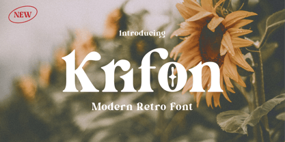 Krifon - Modern Bold Serif Font is a stylish font It has both modern and retro look. Comes with alternatives and ligatures, helps to create stunning logos, quotes, posts, blog posts. branding projects, magazine imagery, wedding invitations, and much more. WHAT'S YOU GET ? Unique Letterforms Works on PC & Mac Simple Installations Accessible in the Adobe Illustrator, Adobe Photoshop, Microsoft Word Fully accessible without additional design software. I really hope you'll get pleasure using Krifon Font and it will be perfect addition to your font collection! Contact me with an inbox message If you have any question. Thank you! Happy Creating.
 - Mountriel by Typetemp Studio,
$18.00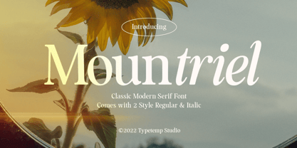 Mountriel - Classic Modern Serif Font is a stylish font It has both Classic modern and 80s 90s look. Comes with alternatives and ligatures, helps to create stunning logos, quotes, posts, blog posts. branding projects, magazine imagery, wedding invitations, and much more. WHAT'S YOU GET ? Unique Letterforms Works on PC & Mac Simple Installations Accessible in the Adobe Illustrator, Adobe Photoshop, Microsoft Word Fully accessible without additional design software. I really hope you'll get pleasure using Allenoire font and it will be perfect addition to your font collection! Contact me with an inbox message If you have any question. Thank you! Happy Creating.
 - Youngblood Antique by insigne,
$21.99 Youngblood Antique is a distressed non-connected formal script with tall, sweeping ascenders. Three variants are available, including an inked regular font, a font drawn with a dry brush and a distressed, grungy version. Sixty-four OpenType ligatures add a realistic, natural effect and ensure that no two letters in a word repeat. Youngblood Antique also includes OpenType ending swashes, and old style figures and 30 alternate characters that allow designers to customize the ascender and descender swashes. Be sure to check out the non-distressed original Youngblood. Youngblood Antique works great in conjunction with insigne Splats!.
 - Salim by Omotu,
$18.00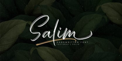 Salim is a handwritten brush font with 2 styles, regular (brush texture) and solid. Salim is perfect for branding, logotype, apparel, T-shirt, Hoodie, product packaging, quotes, flyer, poster. Comes with Uppercase and lowercase characters, Supports international languages, Numerals, punctuations, ligatures, stylistic alternates, and stylistic sets. Accessible in the Adobe Illustrator Glyphs panel, or under Stylistic Alternates in the Adobe Photoshop OpenType menu, Adobe InDesign, Corel Draw, even work on Microsoft Word. Thanks for looking, and I hope you enjoy it! Please don't hesitate to drop me a message if you have any issues or queries.
 - Aparo by DSType,
$40.00 Typography or Calligraphy. Unconnected or Connected. For us, at DSType Foundry, that was the main question. With Aparo, we tried to bring the best of the two worlds into a single, yet complex, typeface. Aparo appears to be a very simple bold italic roman typeface, but it has plenty of calligraphic flair, including swashes that make your words stand out, collision detectors so that you don't get weird combinations, alternate characters activated by default for improved calligraphic effect and a very extended character set in a total of 897 glyphs. Download our detailed type specimen for complete information on Aparo.
 - Westbourne Serif by Typetemp Studio,
$20.00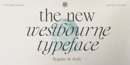 Westbourne Modern Serif Typeface is a stylish font It has both modern look. Comes with alternatives and ligatures, helps to create stunning logos, quotes, posts, blog posts. branding projects, magazine imagery, wedding invitations, and much more. WHAT'S YOU GET ? Westbourne Regular and Italic Unique Letterforms Works on PC & Mac Simple Installations Accessible in the Adobe Illustrator, Adobe Photoshop, Microsoft Word Fully accessible without additional design software. I really hope you'll get pleasure using Westbourne font and it will be perfect addition to your font collection! Contact me with an inbox message If you have any question. Thank you! Happy Creating.
 - EmBauhaus by Emboss,
$25.00 EmBauhaus is a display typeface, geometric in style, inspired by the face named after the world changing Bauhaus School. To aid readability I rethought the original typeface and closed all of the voids cut out of the strokes. We also modified the upper case to make it a more traditional design. An example of this is the upper case L, where a 90 degree angle was added. This typeface was designed to be used judiciously in a layout, to draw focus to words and headlines, using stark angles, radii and geometry to create visual rhythm and gestalt.
 - Godger by Craft Supply Co,
$20.00 Godger Condensed Sans Serif: Boldness Redefined Step into the bold world of Godger, where strength and simplicity converge. This bold, masculine font is a powerhouse, built for strong, memorable branding. Its condensed form is not only space-efficient but also packs a punch, perfect for headlines that demand attention. Masculine and Commanding Godger’s bold, condensed letters exude a sense of command, making it a go-to for titles needing a masculine touch. Each letter is crafted for high impact, ensuring your words aren’t just read, but felt. This font doesn’t whisper; it shouts with a clear, authoritative voice.
 - Mariott by Omotu,
$22.00 GRINDS! A handwritten display brush font, all caps. GRINDS font is suitable for branding, logotype, apparel, T-shirt, Hoodie, product packaging, quotes, flyer, poster, book cover, advertising, etc. Whats Include? Opentype support Multilingual support PUA encoded Features: All uppercase, numerals, punctuations, and ligatures Accessible in the Adobe Illustrator Glyphs panel, or under Stylistic Alternates in the Adobe Photoshop OpenType menu, Adobe InDesign, Corel Draw, even work on Microsoft Word Please message me if you're unsure of any language support. Thanks for looking, and I hope you enjoy it! Please don't hesitate to drop me a message if you have any issues or queries.
 - Speed Line by Raditya Type,
$15.00 If you are looking for a neat vintage font, Speed Line is a very appropriate choice. It can be applied for various purposes. This font is perfect for logotype, headline, apparels, quotes, posters, labels with vintage and exclusive feels. What's included? 1. Uppercase and lowercase characters 2. Supports international languages 3. Features: Uppercase, Lowercase, numeral & punctuation, multilanguage, initials, ligatures, and trails 4. Accessible in the Adobe Illustrator Glyphs panel, or under Stylistic Alternates in the Adobe Photoshop OpenType menu, Adobe InDesign, Corel Draw, even work on Microsoft Word. 5. PUA Encoded Characters - Fully accessible without additional design software. Thanks You
 - Rock Forest by Mightyfire,
$15.00 Introducing Rock Forest, a captivating decorative display font that transforms your words into a visual masterpiece. Crafted with precision and artistic flair, this typeface is a symphony of intricate details, offering a sophisticated and ornate aesthetic that commands attention. Each letter of Rock Forest is a work of art in itself, adorned with decorative elements that exude opulence and refinement. The intricate flourishes, delicate serifs, and graceful curves come together to create a harmonious balance between extravagance and legibility. The font's design is a celebration of decorative elegance, making it the perfect choice for projects that demand a touch of grandeur.