10,000 search results
(0.034 seconds)
- Carte Blanche by Hanoded,
$20.00 Carte Blanche literally means 'Blank Ticket'. Yeah, yeah, it is also a very 007-ish catchphrase, but I wanted to give this elegant font a 'stylish' name and Carte Blanche popped up. All glyphs were hand drawn on a rather expensive piece of heavy-weight paper and were put into the font in between changing nappies, bouts of the flu and the subsequent wiping of snotty noses. Carte Blanche speaks most Roman-based languages - albeit nasally…
 - Sarabande by Three Islands Press,
$24.00Sarabande is a painstaking reproduction of Jean Jannon's famous "Garamond" of 1621 -- also known as "Caracteres de l'universite." Whereas the original was intended for setting French and Latin text only, Sarabande has all standard international characters and diacritics, along with a Euro symbol. (There are however no characters for higher mathematics or logic, and the number of other unhistorical characters has also been kept to a practical minimum.) Sarabande comes with two styles: a roman and a true italic. - Mexican Pattern by Kaer,
$24.00 Mexican Pattern is my vision of classic Mexican style with colorful and ornate pattern. Mexican patterns appeared as a result of the fusion of two cultures. Aztec and Mayan heritage mingled with Spanish traditions in bright colors. You can use color fonts in PS CC 2017+, AI CC 2018+, ID CC 2019+, macOS 10.14 Mojave+ Please note that the Canva & Corel & Affinity doesn't support color fonts! Please feel free to request any help you need: kaer.pro@gmail.com Best, Roman.
 - Origamet Hamida by Gatype,
$14.00 Hi Everyone, we are proud to present our new font. The new natural Hamida origami with a classy and modern style makes this font look elegant, natural, stylish. Origamet Hamida is perfect for invitations, logos & branding, photography, advertising, watermarks, social media posts, product packaging, product designs, labels, wedding designs, stationery, special events or anything else needed to create a theme.
 - Only You Sexy Icons by LeType,
$19.90 The Icons developed to the font Only You Sexy make reference to hipsters concept a recurring nostalgia and a recovery of an almost forgotten romanticism. Bring all that romance back. Bring the sensuality in your works and projects. The font has more than 300 icons. Also available Only You Sexy.
 - Lovely Summer by Sakha Design,
$12.00 Lovely Summer is a romantic and sweet calligraphy typeface with characters that dance along the baseline. It will add a luxury spark to any design project that you wish to create! This font is PUA encoded which means you can access all of the amazing glyphs and ligatures with ease!
 - Betty Finty by Stringlabs Creative Studio,
$29.00 Betty Finty is a friendly and modern script font with a unique style. It will add a romantic touch to any crafting project! Fall in love with its authentic feel and use it to create gorgeous wedding invitations, beautiful stationary art, eye-catching social media posts, and cute greeting cards.
 - Amanilla by AEN Creative Studio,
$15.00 Amanilla is a romantic and sweet serif display font. No matter the topic, this font will be an incredible asset to your fonts’ library, as it has the potential to elevate any creation. This font is PUA encoded, which means you can access all of the glyphs and swashes with ease!
 - Delmonte Belarina by Letterena Studios,
$9.00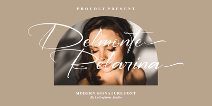 Delmonte Belarina is a romantic and sweet calligraphy typeface with characters that dance along the baseline. It will add a luxury spark to any design project that you wish to create! This font is PUA encoded which means you can access all of the amazing glyphs and ligatures with ease!
 - Stayling Quarters by TM Type,
$12.00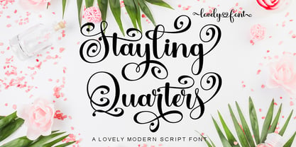 Stayling Quarters is a romantic and sweet calligraphy typeface with characters that dance along the baseline. It will add a luxury spark to any design project that you wish to create! This font is PUA encoded which means you can access all of the amazing glyphs and ligatures with ease!
 - Justin Honey by Romie Creative,
$13.00 Justin Honey is a beautiful modern calligraphy font with a special heart character. It will add a romantic touch to any craft project! Fall in love with its authentic feel and use it to create gorgeous wedding invitations, beautiful stationery art, eye-catching social media posts, and cute greeting cards
 - Reimbrandt by IKIIKOWRK,
$19.00 Proudly Present Reimbrandt - Art Nouveau Type, created by ikiiko. Reimbrandt is a classic typeface that is a perfect representation of the timelessness and romance of the past, inspired by the beautiful Art Nouveau era. This alluring typeface transports you back to a time when elegance and grace were the norm. This font exudes beauty and romance with its simple, decorative shapes reminiscent of the painstaking craftsmanship of the Art Nouveau era. This typeface is perfect for an vintage vibes, classic & vintage poster layout, fashion look book, book cover, packaging, food & beverages and also good for quotes, or simply as a stylish text overlay to any background image. What's included? Uppercase & Lowercase Number & Punctuation Multilingual Support Works on PC & Mac
 - Wood Bonnet Antique No.7 by astype,
$41.00 Wood Bonnet Antique No.7 is based on real vintage wood type blocks from Switzerland. The very distressed letters give a warm analogue vintage charm on printing. These kind of wood type letters were very common and often named by generic names like Roman, French or Antique followed by a catalog number. But these letters have some very quirky details hard to find else were. » pdf specimen « The font offers up to five glyph variations of all the Latin base letters, figures and some additional letters. An OpenType glyph-rotator is programmed to emulate the randomness of old school printing on live typing. All dingbats of the specimen file are included in the font data too.
 - Rodia by Monotype,
$25.00 Rodia is an Oddball Geometric Sans Typeface consisting of nine weights in both roman and oblique. It’s a geometric sans with a twist that’s perfect for branding and identity projects – it will also give your body text a unique voice. Inspiration came from the iconic “RADIO” signage that was once in place at 5041, Pico Boulevard, Los Angeles in 1985 (documented at https://tinyurl.com/y2krt2ox). With its distinctive leg, the /R/ provides a personality trait to define the style of the character set. You can clearly see how this characteristic separates Rodia from other geometric sans families – the /k/v/w/x/y/K/R/V/W/X/Y/ glyphs all display the distinctive ‘feet’ and ‘hands’ as terminals to legs and arms. Then there is the /A/ with its triangular crossbar – this triangular motif has been used to embellish alternates in Stylistic Set 1 for /A/E/F/G/H/Q/S/ glyphs. These will add another layer of versatility for your typographic projects. Rodia features an extensive character set covering all Latin European languages. Key features: 9 weights in Roman and Oblique Full European character set (Latin only) 400+ glyphs per font.
 - Cinque by Adrianna Bilas,
$18.99 CINQUE is a new Slab Serif Display Font inspired by Avant-Garde, Art Deco & the aesthetics of ‘The Grand Budapest Hotel’. It gives a new meaning to slab serif with a fresh and authentic touch. This playful and contemporary font incorporates various character alternates allowing flexibility and more creative possibilities. Geometric, fun & fancy!
 - Clock Bird by Stripes Studio,
$20.00 Clock Bird is a new font that is brushed and very attractive with a natural, detailed and perfect texture. It also includes a weight with underline swashes. Clock Bird is perfect for brand projects, logos, product packaging, posters, invitations, greeting cards, news, blogs, and everything where you wish to add a personal charm.
 - Garuda by Campotype,
$49.00 Garuda typeface, featuring the shape and style based on "Garuda Pancasila", the state symbol of the Republic of Indonesia. Garuda is a mythical bird in the Javanese puppet stories, is very similar to the eagle. At the typeface we can find more ligatures beside than the standard. Within Garuda at least encoded 792 glyphs per weight onto major codepage: win 1252, 1250, 1254, 1257 including Mac OS Roman. It is containing more OpenType features such as swash, contextual alternate, stylistic, figures/number, and a few bit ornaments. The typeface has a pretty good readability and legibility even in small sizes. So it is useful for short texts (text length? Whom fear) for print and screen material. Usage on headlines, posters, titles, or something like that, can utilize ornament lines as a sweetener. Please find more information about the OpenType Manual of this typeface on the gallery page (pdf).
 - Ardalista by Mercurial,
$17.00 Ardalista is lovely script calligraphy made with a touch of sweet, lovely and charming attraction that adds to the impression of a beautiful and elegant. a charming typeface and So beautiful on invitation like greeting cards, sublimation, wedding invitation, branding materials, business cards, quotes, posters, headings, signature, logos, t-shirt, letterhead, signage, lable, news, posters, badges and more What is interesting? Imagine you get a beautiful and very charming font in the design you make. that would be the answer you wanted right now. Ardalista has a script typeface and extra letters that allows you to be more free in designing. What's new? Hey..look at this. besides you get a font with over 150 alternates, ligatures and swashes. let's imagine what you can do with all that. yeah that's awesome. For those with Opentype capable software ( Photoshop CC or any version of Illustrator/ Indesign), Ardalista also comes with Opentype features such as access to all the alternate letters and double letter ligatures. And this Font has given PUA unicode (specially coded fonts). so that all the alternate characters can easily be accessed in full by a craftsman or designer. Don't forget to check out other cool fonts on our store and wait for new fonts. Follow our shop for upcoming updates including additional glyphs and language support. feel free to send me a message, comment, like and share.
 - Fiasco by ChibaChiba,
$24.95 Extremely influenced by the new rave trend, Fiasco is a reflex of it's excesses. Way too many elements, bright neon colors, and that not-knowing-when-to-stop sort of behavior. Acid House aesthetic remixed by the nu school DJs. Neon Flamboyant.
 - Amster by PampaType,
$60.00 Amster is an energetic & refined type created by Francisco Gálvez, with a sharp idea on how elegance & legibility can meet harmoniously. Amster can build a text that is highly readable as well as friendly. It has five weights of roman & cursive both with smallcaps and fully-equipped with all OT sorts and even a wonderful set of illuminated initials. Amster is a very versatile typeface, allowing for a wide range of uses: screen to print, small text to display, science to poetry. Amster speaks more than 200 languages.
 - Nerone by The Ampersand Forest,
$20.00 Nerone is a quasi-unicase display type family in four weights, from light to black. In its lighter versions, it's reminiscent of dignified flared serifs like Albertus. In its black version, it's comparable to display faces like Serif Gothic, with a hint of Mostra-like despotism... Inspired by ancient Roman capitals, Nerone takes a whimsical look at how they might turn into a black fatface, and how a matching lowercase might give the whole affair a whimsical feel — specifically when applied to fun branding and marketing uses. Part of The Ampersand Forest's Sondheim Series.
 - Nvma Titling by Stone Type Foundry,
$49.00 Nvma is based on Roman letterforms which appeared during the period from the earliest extant examples in the sixth or seventh century BC until the end of the third century BC. For Nvma the J, U and W had to be fantasies as they did not exist until much later, similar to the G, numerals and other non-alphabetic signs in the font. Thus not all of the archaic forms are represented in Nvma. Nvma was designed to work with Magma, as it matches the weights and heights for Magma Thin and Magma Titling Thin.
 - Initials Bergling A by Alter Littera,
$15.00 A comprehensive set of initials (usually referred to as Uncials, Lombardic Initials, or Lombards) of the French variety, adapted from Bergling, J.M. (1918), Art Alphabets and Lettering (Second Edition), Chicago: Blakely-Oswald Printing Company. The font contains over one hundred glyphs, including character outlines for two-color layering. Suitable to accompany most Gothic (especially Textura and Rotunda) and many Roman typefaces, or to be displayed as drop caps or in full titles and headings. Specimen, detailed character map, OpenType features, and font samples available at Alter Littera’s The Initials “Bergling A” Font Page.
 - Engravers by Linotype,
$39.00In 1899, Robert Wiebking (who worked for a number of foundries in his time) designed an all-caps typeface named Engravers Roman (see Engravers #2). American Type Founders, Inc. (ATF) released a heavier variant in 1902, Engravers Bold, designed by Morris Fuller Benton. Engravers Bold was also released by the Barnhart Brothes & Spinder foundry. Today, Linotype's Engravers brings turn-of-the-century elegance directly to your keyboard. Use the Engravers typeface on any formal piece -- from table cards, to menus, invitations, or advertising work. Engravers is similar to Copperplate Gothic, Sackers Gothic and Nicolas Cochin. - Gramers by Dora Typefoundry,
$15.00 Gramers is an elegant and modern minimalist font family, a new roman sans serif font carefully crafted, These font ideas come from various references, from vintage, classic, art deco, to the modern era. Carefully drawn with high contrast between the strokes bold and thin with the aim of making even the simplest sans serif letters look sensual, elegant, and warm. The feeling of versatility and luxury you get in Gramers. As you can see in the display of our creations such as Branding, Header, Logotype, Posters, Magazines, Packaging, Art deco wedding invitations, and others. This shows that Gramers can accommodate various design styles. The flat lines cover five styles (each light, regular, medium, semi thick, Thick), each of which includes nearly 293 glyphs. OpenType features include 103 standard ligatures and a small number of character variants, and multilingual support (including multiple currency symbols). Features: • 5 Font weight • uppercase • Alternative & Ligature Styles • Numbers & Punctuation • Characters with accents • Supports Multiple Languages This type of family has become the work of real love, making it as easy and enjoyable as possible. I really hope you enjoy it! I can't wait to see what you make with Gramers! Feel free to use the #Dora Typefoundry and #Gramersfont tags to show what you've done!
 - FF Meta by FontFont,
$108.99 German type designer Erik Spiekermann, created this sans FontFont between 1991 and 2010. The family has 28 weights, ranging from Hairline to Black in Condensed and Normal (including italics) and is ideally suited for advertising and packaging, book text, editorial and publishing, logo, branding and creative industries, small text as well as web and screen design. FF Meta provides advanced typographical support with features such as ligatures, small capitals, alternate characters, case-sensitive forms, fractions, and super- and subscript characters. It comes with a complete range of figure set options—oldstyle and lining figures, each in tabular and proportional widths. As well as Latin-based languages, the typeface family also supports the Cyrillic, Greek, and Hebrew writing systems. FF Meta Variable are font files which are featuring two axis and have a preset instance from Hairline to Black and Condensed to Roman In 2011, FF Meta was added to the MoMA Architecture and Design Collection in New York. This FontFont is a member of the FF Meta super family, which also includes FF Meta Correspondence , FF Meta Headline , and FF Meta Serif . FF Meta® font field guide including best practices, font pairings and alternatives. Featured in: Best Fonts for Resumes
 - Hecate by Océane Moutot,
$32.90 Hécate is a contemporary serif typeface designed with sharp serifs, smooth and dynamic lines and high contrast. Inspired by the Garalde style with its tilted axis, Hécate brings uniqueness and modernity to this more traditional style. Its large variety of glyphs, including accents, old-style numbers and ligatures will give you freedom for all of your projects. It offers a large choice of uses such as magazine, branding, edition and so on. Hécate is available in 16 styles from thin to black, in roman and italic.
 - Decennie Express JY Pro by JY&A,
$45.00 JY Décennie Express was developed as a sans serif workhorse complement to JY Décennie. The basic roman design shares characteristics, and in some cases, characters (e, o, and others) with the serif version, making JY Décennie Express work particularly well with its progenitor. The design is friendly and approachable, as opposed to stark (the effect one usually has with Helvetica and other over-used typefaces). On closer inspection, straight lines blend into curves on the outlines: the characters are in fact complex but appear simple.
 - Chinese Prodigy by Attype Studio,
$19.00 Chinese Prodigy is a Chinese style serif font, with a modern twist. It has 2 styles: regular and slant. Chinese Prodigy is perfect for branding and promotional material for Asian-themed designs The fonts works best as display typefaces or as beautiful headline fonts, but can also be used in other ways to create stunning designs. Features : - Chinese Prodigy Font Family - Multilingual, US Roman, Latin 1 Support If you have any question, don’t hesitate to contact us. --- Hope you enjoy with our font! Attype Studio
 - Marcellus Pro by Stiggy & Sands,
$29.00 Our Marcellus Pro was inspired by classic Roman inscription letterforms. Clarity and beauty are embodied in the standard lowercase, while this historically influenced typeface also nods to the powerful presence of the Trajan titling style with its SmallCaps set. When combined together, Marcellus is a gorgeous flare-serif typeface, rich with presence and usability. Opentype features include: - SmallCaps. - Full set of Inferiors and Superiors for limitless fractions. - Tabular, Proportional, and Oldstyle figure sets (along with SmallCaps versions of the figures). - Stylistic Alternates for Caps to SmallCaps conversion.
 - Amerika Pro by CheapProFonts,
$- This is the 200th font released by CheapProFonts, and again I wanted to make something special - so I have chosen to upgrade another well-known font by the infamous Fredrick "Apostrophe" Nader: Amerika! The whole character set for this stylish font has been polished for consistent baseline placement and serif thickness, and proper overshoots has been implemented. All the alternate letterforms (and some new ones) have been included as OpenType alternates AND they have now been made available with accents, too! The Greek and Cyrillic letterforms are properly encoded and kerned. I hope many will enjoy the improvements - and naturally: it is still free! ALL fonts from CheapProFonts have very extensive language support: They contain some unusual diacritic letters (some of which are contained in the Latin Extended-B Unicode block) supporting: Cornish, Filipino (Tagalog), Guarani, Luxembourgian, Malagasy, Romanian, Ulithian and Welsh. They also contain all glyphs in the Latin Extended-A Unicode block (which among others cover the Central European and Baltic areas) supporting: Afrikaans, Belarusian (Lacinka), Bosnian, Catalan, Chichewa, Croatian, Czech, Dutch, Esperanto, Greenlandic, Hungarian, Kashubian, Kurdish (Kurmanji), Latvian, Lithuanian, Maltese, Maori, Polish, Saami (Inari), Saami (North), Serbian (latin), Slovak(ian), Slovene, Sorbian (Lower), Sorbian (Upper), Turkish and Turkmen. And they of course contain all the usual "western" glyphs supporting: Albanian, Basque, Breton, Chamorro, Danish, Estonian, Faroese, Finnish, French, Frisian, Galican, German, Icelandic, Indonesian, Irish (Gaelic), Italian, Northern Sotho, Norwegian, Occitan, Portuguese, Rhaeto-Romance, Sami (Lule), Sami (South), Scots (Gaelic), Spanish, Swedish, Tswana, Walloon and Yapese.
 - Crown Jewels by TofinoType,
$120.00 Crown Jewels is a massive Super Pro font like no other. This must be one of the most complex font ideas ever imagined. Based on an original font by George Williams, Crown Jewels takes that original idea to a whole new level. Containing thousands of glyphs, it has the size and complexity for any fancy job. This font is like hundreds of fonts in one. Many OpenType features and sub-styles to give you hundreds of different looks. Every single capital letter has been hand-sculpted into a unique complex shape like no other. Multi-language support for numerous countries including Greece and Russia. It also has advanced Open Type features like converting numbers to Roman Numerals automatically for your art projects. Numbers from 1 to 3,999,999,999 can be converted automatically to two different Roman Numeral styles. This font also comes with a nice large pdf manual explaining every function so please read it in its entirety so you can use this font successfully. There is a optional add-on font of Flourishes containing over 800 complex glyphs that can be used with this font or any font you already own. It will bring your fonts and art projects to life. It also has numerous OpenType features programmed so that each feature simply outputs 94 flourishes at a time to your keyboard. There is also a complete color-coded pdf directory of each and every one so you can find the shape you want fast. Every single one is available in recent versions of Photoshop and InDesign by simply turning on a OpenType feature and hitting a key on the keyboard. There is also a separately programmed ligature feature in case that is the only OpenType feature you have and just with that feature every single glyph can be placed into your documents easily. Crown Jewels is priced so you don't have to lay siege to the tower to afford it. It has a very low cost per glyph and is actually one of the best values here. This font took over nine years to make and it’s still just pennies a glyph. Usage: Photoshop styles, InDesign, Promotion Logos, Monograms & Signatures....That’s where it shines and it’s made for art, cards, fancy documents, really super fancy labels & even notes to Mom. If you have a fancy art project that needs doing this is the font to use.
 - Viable Logic by Twinletter,
$12.00 Viable Logic font, has a neat and clean character new face sans serif fonts, in response to the need for innovative and new designs, for that this sans serif font family has different characters namely bold, thin and regular. This font is simple yet neat and elegant, the design of this typeface gives it a clean, modern look and a unique style to help give it a captivating look when you use it. This font is perfect for strong text with displays for a wide variety of branding, advertising, posters, banners, packaging, news headlines, magazines, websites, logo design, and more.
 - Distinction by Great Lakes Lettering,
$12.00 Distinction Is a brand new font from Great Lakes Lettering. A high contrast brush script with a ton of usefulness. Make you mark with Distinction.
 - Tory by Matteson Typographics,
$19.95 Frederic Goudy designed Tory in the spirit of the ‘lettres batarde’ found Geoffry Tory’s Champ Fleury. He was looking to create a romantic type for which to typeset the book Auccasin et Nicolette. It was one of Goudy’s favorite typefaces of his own creation and it is digitized by Steve Matteson to preserve that legacy.
 - Bakiya by Qaratype,
$14.00 Bakiya is an enchanting handwritten font. This versatile script font has a wide spectrum of applications ranging from greeting cards to headlines and is guaranteed to add a romantic feel to your next project. This font is PUA encoded which means you can access all of the beautiful glyphs and beginning & ending swashes. with ease!
 - Syntax Next Paneuropean by Linotype,
$103.99Syntax was designed by Swiss typographer Hans Eduard Meier, and issued in 1968 by the D. Stempel AG type foundry as their last hot metal type family. Meier used an unusual rationale in the design of this sans serif typeface; it has the shapes of humanist letters or oldstyle types (such as Sabon), but with a modified monoline treatment. The original drawings were done in 1954; first by writing the letters with a brush, then redrawing their essential linear forms, and finally adding balanced amounts of weight to the skeletons to produce optically monoline letterforms. Meier wanted to subtly express the rhythmical dynamism of written letters and at the same time produce a legible sans serif typeface. This theme was supported by using a very slight slope in the roman, tall ascenders, terminals at right angles to stroke direction, caps with classical proportions, and the humanist style a and g. The original foundry metal type was digitized in 1989 to make this family of four romans and one italic. Meier completely reworked Syntax in 2000, completing an expanded and improved font family that is available exclusively from Linotype GmbH as Linotype Syntax. In 2009 the typeface family was renamed into a more logical naming of "Syntax Next" to fit better in the Platinum Collection naming." - Shamilove by Yoga Letter,
$12.00 Shamilove is a very beautiful and romantic font. This font is very easy to use with a heart-shaped swash, so it will add to the beauty of this font. This font is perfect for Valentine's, to express your feelings to your partner, weddings, birthdays, quotes, product promotions, social media updates, your business promotions, and more.
 - Eskapade by TypeTogether,
$53.50 The Eskapade font family is the result of Alisa Nowak’s research into Roman and German blackletter forms, mainly Fraktur letters. The idea was to adapt these broken forms into a contemporary family instead of creating a faithful revival of a historical typeface. On one hand, the ten normal Eskapade styles are conceived for continuous text in books and magazines with good legibility in smaller sizes. On the other hand, the six angled Eskapade Fraktur styles capture the reader’s attention in headlines with its mixture of round and straight forms as seen in ‘e’, ‘g’, and ‘o’. Eskapade works exceptionally well for branding, logotypes, and visual identities, for editorials like magazines, fanzines, or posters, and for packaging. Eskapade roman adopts a humanist structure, but is more condensed than other oldstyle serifs. The reason behind this stems from the goal of closely resembling the Fraktur style to create harmony in mixed text settings. Legibility is enhanced by its low contrast between thick and thin strokes and its tall x-height. Eskapade offers an airy and light typographic colour with its smooth design. Eskapade italic is based on the Cancellaresca script and shows some particularities in its condensed and round forms. This structure also provided the base for Eskapade Fraktur italic. Eskapade Fraktur is more contrasted and slightly bolder than the usual darkness of a regular weight. The innovative Eskapade Fraktur italic, equally based on the Cancellaresca script previously mentioned, is secondarily influenced by the Sütterlin forms — an unique script practiced in Germany in the vanishingly short period between 1915 and 1941. The new ornaments are also hybrid Sütterlin forms to fit with the smooth roman styles. Although there are many Fraktur-style typefaces available today, they usually lack italics, and their italics are usually slanted uprights rather than proper italics. This motivated extensive experimentation with the italic Fraktur shapes and resulted in Eskapade Fraktur’s unusual and interesting solutions. In addition to standard capitals, it offers a second set of more decorative capitals with double-stroke lines to intensify creative application and encourage experimental use. The Thin and Black Fraktur styles are meant for display sizes (headlines, posters, branding, and signage). A typeface with this much tension needs to keep a good harmony between strokes and counters, so Eskapade Black has amplified inktraps and a more dynamic structure seen in the contrast between straight and round forms. These qualities make the family bolder and more enticing, especially with the included uppercase alternates. The Fraktur’s black weights are strident, refusing to let the white of the paper win the tug-of-war. It also won’t give away its secrets: Is it modern or historic, edgy or amicable, beguiling ornamentation or brutish presentation? That all depends on how the radically expanded Eskapade family is used, but its 16 fonts certainly aren’t tame.
 - Verbatim by Monotype,
$25.99 This extensive 60-font type family was inspired by the best (and worst) of 1970s science fiction TV shows and movies. Verbatim aims to extract the essence of futuristic type from that era, add a dash of modern style and conjure a cinematic typeface for the 21st century. From the extremes of the thin condensed, all the way through to the black extended, Verbatim has the scope to add drama to your titles and headings, and finesse to your logo and branding projects. Distinguishing features include a large x-height and open counters that aid legibility. This typeface crosses a few boundaries of type specification in that it is both rounded and square, it is part geometric in construction with a touch of humanistic flair and stroke contrast – giving Verbatim a distinctive and confident air. Key features: • 6 weights in Roman and Oblique • 5 Styles – Condensed, Narrow, Regular, Wide, Extended • Small Caps and 7 Alternates • European Language Support (Latin) • 600 glyphs per font. See more detailed examples at the Verbatim microsite.