10,000 search results
(0.034 seconds)
- Octoville - Unknown license

- Pirulen - Unknown license

- Lunasol - Unknown license

- Snidely - Unknown license

- Screengem - Unknown license

- 1980 Portable - Unknown license

- Skeletor Stance - Unknown license

- Vibrocentric - Unknown license

- Zodillin - Unknown license

- Flora by Sensatype Studio,
$15.00 A new Sans serif that we created special for branding needs, with extra ligature in unique shape add value of your brand. It so nice to leverage designer or product owner that need solutions to make their design look more stylish and modern. And specially for Flora font, We prepared any ligatures, and any alternate characters to help you create unlimited variations for your creative needs. Flora - Modern Branding Stylish Font ready with: Any options to get creative variations (combination of Alternate and Ligatures) Preview as a inspirations that you can do with Satisfy font Ready with Lowercase and Uppercase characters Wish you enjoy our font!
 - Fleabitten by Hanoded,
$15.00 I love going to flea markets and second-hand stores; in fact a lot of the furniture in our home is second hand (or pre-loved, a euphemism I find rather peculiar). I personally believe that buying used products is a good way to help this planet, as no new stuff needs to be made and the old stuff gets a second life. Fleabitten is a ‘western style’ serif font. You could use it to pimp the posters for your line dance festival, but hey, be creative! I am sure you’ll find some good use for this very nice pre-loved font. Yes, pre-loved: I loved it first!
 - F2F Madame Butterfly by Linotype,
$29.99The techno sound of the 1990s, a personal computer, font creation software, and some inspiration all came together to inspire the F2F (Face2Face) font series. Alessio Leonardi and his friends had the demand to create new unusual typefaces, which would be used in the leading German techno magazine of the day, Frontpage. Even typeset as small as 6-points, in nearly undecipherable layouts, it was a pleasure for the kids to read and try to decrypt the messages. F2F Madame Butterfly is a font with a heavy, or dark, appearance. The darkness is brought about by the overlapping bits of glyph forms that make up each letter in the typeface. - Olivany by Sensatype Studio,
$15.00 A new Sans serif that we created special for branding needs, with extra ligature in unique shape add value of your brand. It so nice to leverage designer or product owner that need solutions to make their design look more stylish and modern. And specially for Young font, We prepared any ligatures, and any alternate characters to help you create unlimited variations for your creative needs. Olivany Modern Beauty sans serif font ready with: Any options to get creative variations (combination of Alternate and Ligatures) Preview as a inspirations that you can do with Olivany font Ready with Lowercase and Uppercase characters Wish you enjoy our font!
 - Carves by Sensatype Studio,
$15.00 CARVES is a Modern Display Font A new Display Serif that we created special for logo and branding needs, with extra unique shape that will add your brand value. It so nice to leverage designer or product owner that need solutions to make their design look more Unique and modern. And specially for Sugar font, We prepared any alternate characters to help you create unlimited variations for your creative needs specially for logotype or wordmark. CARVES Modern Display font ready with: Any options to get creative variations (combination of Alternates) Preview as a inspirations that you can do with Carves font Ready with All Uppercase characters Wish you enjoy our font :)
 - Souljah by 38-lineart,
$17.00 Let us introduce you our new font Souljah, a natural script font. This font has a very contrast stroke, very wide down stroke and very tiny up stroke. Every glyphs shaped very flowy and smooth as if it is written by a dancing hand. All glyphs are connected nicely, this font also included ligature to add more natural touch. "Natural and Soulful Calligraphy" is a perfect tagline to describe Souljah Included Opentype font with ligature, swash alternate and multilingual support. Souljah swash Uppercase for beginning swash and lowercase for ending swash, this file was made to the user who is not common to opentype stylistic feature.
 - Original SS by Sensatype Studio,
$15.00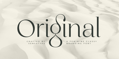 Original is a Feminine Classy Branding Font A new font that we created special for branding needs, with extra ligature in unique characters add value of your brand. It so nice to leverage designer or product owner that need solutions to make their design look more stylish and modern. And specially for satisfy font, We prepared any ligatures, and any alternate characters to help you create unlimited variations for your creative needs. Original Branding font ready with: Any options to get creative variations (combination of Alternate and Ligatures) Preview as a inspirations that you can do with Original font Ready with Lowercase and Uppercase characters Wish you enjoy our font. :)
 - F2F Tagliatelle Sugo by Linotype,
$29.99The techno sound of the 1990s, a personal computer, font creation software, and some inspiration all came together to inspire the F2F (Face2Face) font series. Alessio Leonardi and his friends had the demand to create new unusual typefaces, which would be used in the leading German techno magazine of the day, Frontpage. Even typeset as small as 6-points, in nearly undecipherable layouts, it was a pleasure for the kids to read and try to decrypt the messages. Bubbly black letterforms dancing across the line: this is F2F Tagliatelle Sugo, a funky font from Alessio Leonardi. Try it out in a big headline today! - Mazaeni by Kereatype,
$14.00 Mazaeni is a bold serif font family that includes 5 Weight regular to Extra Black which is inspired by something simple, elegant, usable, and versatile. Mazaeni is a daring and playful display typeface perfect for logotypes, posters, and editorial use. Includes wide language support, optional ligatures, OpenType alternates, and more. One thing to note about Mazaeni is the letter spacing. It was intentionally for clean reading if you wanted to use it for the body type, so I recommended setting the spacing a little tighter for display use (around -5 to -25 should do!). All typefaces from Kereatype include free updates, new features, and free technical support.
 - F2F Prototipa Multipla by Linotype,
$29.99The techno sound of the 1990s, a personal computer, font creation software, and some inspiration all came together to inspire the F2F (Face2Face) font series. Alessio Leonardi and his friends had the demand to create new unusual typefaces, which would be used in the leading German techno magazine of the day, Frontpage. Even typeset as small as 6-points, in nearly undecipherable layouts, it was a pleasure for the kids to read and try to decrypt the messages. The glyphs in F2F Prototypia Multipla have been turned into mini letter collages. Text set in this font will take on a quilt-pattern-like appearance. - 1672 Isaac Newton by GLC,
$42.00 Isaac Newton, father of the theory of gravity, used several forms of handwriting in his life, in numerous texts about numerous scientific subjects. Here, we propose a handwritten font, using a particularly legible script form, coming from texts written in 1672, the year he presented a new reflecting telescope to the Royal Society. It is a Pro font containing Western, Eastern, Central and Northern European, Icelandic, Baltic, and Turkish diacritics. The alternates and ligatures allow the font to look as closely as possible to the real thing. The features allow OTF software to vary the characters of a word automatically, with no more work than selecting contextual alternates and standard ligatures.
 - Overseas by Hanoded,
$15.00 I traveled a lot: in the beginning on my own, later as a tour guide. I always used the English word ‘abroad’ to describe a trip to a foreign country, but I noticed that the English, Australians and New Zealanders preferred the word ‘overseas’. I then realised that they all lived on an island, so most of the foreign countries for them were across the sea. I had to think of that when I made this font! Overseas is a brush font with a certain rough elegance to it. I made it using poster paint and a brush. Use if for posters, product packaging and book covers.
 - Wigwams by Struvictory.art,
$14.00 We would like to introduce our new product Wigwams - Handwritten Geometric Font. Wigwams is a linear font in a hand-drawn minimalistic style, the lowercase is decorated with geometric elements. The typeface includes Regular and Symbol versions. Combine the font with symbols to get a unique design. The font is easy to use in various design programs or without any program. Wigwams is suitable for lettering posters, camping products, photo overlays in hipster style and music albums. The font works great both for printing clothes and craft products, branding and packaging (herbal tea, handmade soap, organic food). Also use individual letters and symbols to create logos and monograms.
 - Mostaza by Eurotypo,
$30.00 Mostaza is a new lettering font designed by Carine de Wandeleer. The Open Type features include 164 alternates, also in capital letters, and 100 ligatures. All this makes the text lively and bouncy, without the monotony of obviously repeated letterforms. In addition, we have included some ornaments designed to support the font, some were specially designed to be combined with the letters for a "more calligraphic" effect (access to them through the glyphs palette). Mostaza is doing very well to create titles, logos and posters for brand and packaging, invitations, greeting cards, magazines and book covers, children's material, fashion and wherever you want. Enjoy it!
 - Le Monde Journal Std by Typofonderie,
$59.00 A highly legible typeface in 4 series Le Monde Journal by definition is intended for newspaper use & at small sizes. It’s an economical and workshorse typeface adapted to any extrem condition of uses. Even though it has the same colour as Times, it appears more open. The reading flow has been made more fluent & less abrupt. The glyphs counters are bigger, as if they were “alluminating the interior.” The form, characterized by its serifs, remains embedded in our visual memory. Intermediate weights like Book can be considered as a grade supplement of the Regular. Italics accompany Le Monde Journal. With a more delicate design & a distinctive rhythm, they remain noticeable when used with the romans. Its companion, Le Monde Sans can extend your typographic palette. For beautiful page layout, use it in conjunction with Le Monde Livre for titling sizes. The verticals metrics and proportions of Le Monde Journal are calibrated to match perfectly others Typofonderie families. This family was designed in 1994 as bespoke typeface family for the French newspaper Le Monde. The family is not used any more by this newspaper from November 2005. Bukva:raz 2001 Type Directors Club .44 1998 European Design Awards 1998
 - The Blowar by Alit Design,
$15.00 Presenting ⚔️The Blowar Typeface⚔️ by alitdesign. The Blowar font is inspired by action movie posters with the theme of war or knights in the Roman era. The bold and bold character of The Blowar font is perfect for making hero movie titles, game titles, logotypes, t-shirt designs and so on with heroic themes. Apart from the regular font, the Blowar also has an italic style which makes the design more dynamic and cool. The Blowar font has alternatives that you can combine between swashes and symbols that have the theme of heroes and war. Besides that this font is very easy to use both in design and non-design programs because everything changes and glyphs are supported by Unicode (PUA). The Blowar Typeface has a total of 706 glyphs including symbol, multilingual. Language Support : Latin, Basic, Western European, Central European, South European,Vietnamese. In order to use the beautiful swashes, you need a program that supports OpenType features such as Adobe Illustrator CS, Adobe Photoshop CC, Adobe Indesign and Corel Draw. but if your software doesn't have Glyphs panel, you can install additional swashes font files.
 - Metroblack #2 by Linotype,
$29.00American graphic designer William Addison Dwiggins' (W.A.D. for short) first typefaces were the Metro family, designed from 1927 onward. The project grew out of Dwiggins' dissatisfaction with the new European sans serif typefaces of the day, such as Futura, Erbar, and Kabel, a feeling he expressed in his seminal book Layout in Advertising. Urged by Mergenthaler Linotype to create a solution for the problem, Dwiggins began a professional relationship that would span over the next few decades. The first Metro family typeface to be released was Metroblack, brought to market by Linotype in 1929 (Metroblack #2™ the only one of the two versions that Mergenthaler Linotype eventually put into production which is available in digital form). With more of a humanist quality than the geometric styles popular in Europe at the time, Dwiggins drew what he believed to be the ideal sans serif for headlines and advertising copy. Metroblack has a warmer character than the Modernists' achievements, and the type is full of mannered curves and angled terminals (Metroblack also has an astoundingly beautiful Q). The weights of the Metro family, Metromedium #2™ and Metrolite #2™, were each designed by Mergenthaler Linotype's design office under Dwiggins' supervision. In 2012 Toshi Omagari reworked the Metro family as "Metro Nova" with many weights into a modern type family that even contains the alternate characters from the origin Metro family from Dwiggins. Despite having been created more than three-quarters of a century ago, the Metro family types have aged well, and remain a popular sans serif family. Although spec'd less often than other bestsellers, like Futura, Metro continues to find many diverse uses. The typeface has appeared throughout Europe and the North America for decades in newspapers and magazines, and can even help create a great brand image when used in logos and corporate identity. Dwiggins ranks among the most influential graphic designers and typeface designers of the 20th Century. He has several other quality fonts in the Linotype portfolio, including the serif text faces Electra™ and New Caledonia™, as well as Caravan™, a font of typographic ornaments. - Aramis - Unknown license

- Identity Check by Hanoded,
$15.00 Every time I bring my youngest son to his swimming lessons, I need to show my Covid Vaccination Pass; a QR code on my phone. I thought that I would be off the hook after I showed it the first time, but no, not at the swimming pool! It feels a bit like a bad comic book, so I decided to name this comic book style font Identity Check. Of course, I should have called it Covid Vaccination Check, but that is just too much and it probably won’t sell. Who wants a font called Covid?? ;-) Identity Check is a comic book style font. The glyphs are wider than I am used to (it seems I AM capable of learning new tricks), but the effect is rather nice. Identity Check comes with extensive language support, including Cyrillic and Vietnamese. Plus two sets of alternate glyphs, that cycle as you type.
 - Acorde by Willerstorfer,
$95.00 Please note: Acorde webfonts are exclusively available at willerstorfer.com Acorde is a reliable workhorse for large, demanding design projects. It was designed to be perfectly suited to all different sizes, from small continuous text to large headlines and big signage. The typeface’s name is derived from ‘a’ ‘cor’porate ‘de’sign typeface, however Acorde is not only suitable for corporate design programmes but for information design and editorial design purposes as well. Acorde’s inception was in early 2005 as Stefan Willerstorfer’s final project in the Type and Media course at the Royal Academy of Art in The Hague (NL). It is a humanist sans serif with noticeable diagonal contrast and shows clear influences of the broad nib pen, especially in the Italics. Acorde’s characterful details give it a distinctive appearance in large sizes and contribute to its high legibility in small sizes. It comes in 14 styles – seven weights in Roman and Italic each. While the proportions of the Regular style were chosen to guarantee optimal legibility without being too space consuming, the heavier the weight gets the more suitable it is for headline purposes. The heavy weights are relatively narrower than the lighter ones, which gives them a strong appearance. The huge character set contains 925 glyphs per font and covers a vast range of latin-based languages. Various accented letters, small caps, eleven figure-sets, superscript and subscript are all included. OpenType features allow for a comfortable use of the large set. Acorde was honored with the 2010 Joseph Binder Bronze award for type design by DesignAustria.
 - Arabetics Harfi by Arabetics,
$59.00 Arabetics Harfi is a Latin Serif typeface with a comprehensive support for the Arabetic scripts, including Quranic texts. Careful spacing and kerning was used to enhance resulting text legibility both scripts. Arabetics Harfi fully supports MS 1252 Western and 1256 Arabic code pages, in addition to all transliteration characters required by the ALA-LC Romanization tables. Users can either select an accented character directly or form it by keying the desired combining diacritic mark following an unaccented character. For Arabic, it fully supports Unicode 6.1, and the latest Arabic Supplement and Extended-A Unicode blocks. The Arabic design of this font family follows the Mutamathil Taqlidi type style with connected glyphs, but it emphasizes a horizontal look and feel rather than verticalone, utilizing slightly varying x-heights. The Mutamathil Taqlidi type style uses one glyph per every basic Arabic Unicode character or letter, as defined by the Unicode Standards, and one additional final form glyph, for each freely-connecting letter of the Arabic cursive text. Arabetics Harfi includes the required Lam-Alif ligatures in addition to all vowel diacritic ligatures. Soft-vowel diacritic marks (harakat) are selectively positioned with most of them appearing on similar high and low levels—top left corner—, to clearly distinguish them from the letters. Tatweel is a zero-width glyph. Arabetics Harfi includes both Arabic and Arabic-Indic numerals, in addition to generous number of punctuation and mathematical symbols. It includes two weights, regular and bold, each of which has normal, right slanted Italic, and left-slanted styles.
 - Gallaecia, a font named evocatively to conjure images of historical depth and cultural richness, is one that manages to bridge the gap between the ancient and contemporary with its design. Named afte...
- Orb by Superfried,
$32.50 Orb by Superfried has been re-released. Now re-drawn and improved the elegant, geometric uppercase display typeface now also includes a secondary character set activated via the shift key. The glyphs are constructed from two concentric paths featuring intricate interactions and angled incisions, which lead to a very distinct look and feel. Orb includes 266 glyphs in two character and is available in two weights: display and outline.
 - Novel Sans Hair Pro by Atlas Font Foundry,
$50.00 Novel Sans Hair is the new package of 24 ultra light weights of Novel Sans Pro, the humanist grotesque typeface family within the largely extended award winning Novel Collection, containing Novel Pro, Novel Sans Pro, Novel Sans Hair Pro, Novel Sans Condensed Pro, Novel Mono Pro, Novel Sans Rounded Pro and Novel Sans Office Pro. Novel Sans Hair has a carefully attuned character design and a well balanced weight contrast. Classic proportions and the almost upright italic makes Novel Sans Pro being a modern humanist with the calligraphic warmth of a real italic. Many similarities with the other typeface families within the Novel Collection enable designers to combine the families and reach highest quality in typography. Novel Sans Hair [1020 glyphs] comes in 24 styles and contains small caps, an extra set of alternate glyphs, many ligatures, lining figures [proportionally spaced and monospaced], hanging figures [proportionally spaced and monospaced], small caps figures [proportionally spaced and monospaced], positive and negative circled figures for upper and lower case, superior and inferior figures, fractions, extensive language support, arrows for uppercase and lowercase and many more OpenType™ features.
 - Breathe Neue by Lián Types,
$37.00 Breathe Neue is not just an update of my renowned Breathe of 2010, this is something else... Many times I find myself looking for inspiration in my previous creations. The original Breathe has something on its essence: Something that almost 10 years later still caught my attention. Like its name suggests, letters seem to be breathing, moving, alive. Many years passed so I asked myself if there was still something I could do for it, something to get the most of that beautiful essence... Suddenly, I was already working on its curves: Many new loops, more polished, more refined. Also the proportion and spacing were altered to embellish the font. Breathe Neue’s swashes are addictive. I couldn't find another word. Irresistible? Maybe. Once you see some of its loops you want to see more. I believe this might be due to its very geometrical feel, which match well with the bodonian curves of the font. See also how well it works with Breathe Caps. And what if you combine them with Breathe Special? wow. I'm still young (yeah, sure) and I believe there're still many years ahead to enjoy this great profession, and to make many new (and astonishing, I hope) fonts. But I also think, it’s time to pamper my first creations. They deserve the best treatment, after all, they were once a success! This is what I did with my lovely Breathe. I hope you like it.
 - Gineso by insigne,
$- Michaelangelo. da Vinci. Bellini. Rafael. Masters of Italian art whose names have dwarfed those of many other great Italian artists. Yet relics from these other artists remain, though often unnoticed because of their practical nature. These unknowns are the Italian Masters of vernacular sign painting, and insigne now gives a nod to their work with its new sans serif, Gineso. Based on its inspiration, Gineso was created for posters, headlines and logotypes. (It does well in apps, too, though the sign painters probably weren’t thinking about that at the time.) Aesthetically remedied, yet still with an uncut charm, Gineso’s condensed qualities make it especially nice for signs and titling where horizontal space is at a premium. The tight, narrow forms of its geometric design leave you with a robust flavor that will remind you of mamma’s spaghetti. But don’t worry; the font’s ample counters ensure your audience won’t be reading through a bowl of pasta. These condensed forms look great on their own or when their seven different weights and matching italics are utilized together. With the included OpenType features, fractions and superior/inferior positions are also available to broaden your palette. Even more, this font is ready for complex, professional typography with OpenType features like alternate letters and a large character set including Central and Eastern European Languages. So when you find yourself (or your project) in a tight space, stir in Gineso to get the right taste for your copy. It may just make all the difference.
 - Palatino Arabic by Linotype,
$187.99 Palatino Arabic is a collaboration between Lebanese designer Nadine Chahine and Prof. Hermann Zapf. The design is based on the Al-Ahram typeface designed by Zapf in 1956 but reworked and modified to fit the Palatino nova family. The design is Naskh in style but with a strong influence of the Thuluth style as well. This is evident in the swash-like finials and the wide proportions of the letterforms. It is designed for use in print in both large and small sizes. The counters are wide open to allow for better readability in small sizes as well as to maintain an open and friendly appearance. The font has 1091 glyphs and includes a large number of extra ligatures and stylistic alternates as well as the basic Latin part of Palatino nova and support for Arabic, Persian, and Urdu. It also includes proportional and tabular numerals for the supported languages. Palatino Arabic wins Type Directors Club award. Each year, the New York-based Type Directors Club judges typeface designs from all over the world in their TDC2 contest. Linotype is pleased to announce that a very new typeface of its own is among 2008’s winners: Palatino Arabic. A collaboration between Nadine Chahine and Prof. Hermann Zapf, this face is an extension of Zapf’s Al-Ahram Arabic type from 1956 recreated to join the Palatino nova family.
 - Telepath by Coniglio Type,
$19.95 TELEPATH Telepath by Coniglio Type, first appeared in 1998. It is now in opentype .otf as of 2021. Telepath is a master sampling of a Royal office typewriter of industrial strength provided by the Miller Furniture store, of Dunkirk, New York. It had a baseline set of numbers to make accounting practices easy and line up nicely on the statements. (No gentile old fashioned numerical ascenders and descenders.) Yet, for a a rather old and stolid machine, it was very luxurious and built to definitely take the test of time. Cudo's for Royal Typewriter Company, is all I can say. The set of images were very carefully gathered and has fallen into the preferred category for a typewriter font that has it all. The font has exceptional value as a text font -and- a display font. It contains a great deal of graphic information and doesn't spike at higher sizes. Telepath presents a strikingly handsome typewriter font with a uniquely intuitive difference. Unlike the original source material—scans of monospaced typewriter copy, every font is painstakingly hand kerned for your most demanding copy fitting work in justified or casually ragged settings for print or the web. All Coniglio Type fonts are 100% embeddable. It will get you there.
 - KG Grace For Today by Kimberly Geswein,
$5.00 A neat, feminine handwriting with a few unique notes- the lowercase e and g, for example. This is both legible but has enough flavor to be a believable handwriting font.
 - Gyllene Elgen by Mans Greback,
$69.00 Gyllene Elgen, created by Mans Greback, is a delicate and captivating handwriting font that exudes romance and charm. With its thin, beautiful lines, and loopy, decorative swirls, this typeface brings a touch of elegance and sophistication to your design projects. Perfect for invitations, personal notes, and other heartfelt communications, Gyllene Elgen captures the essence of delicate, handcrafted beauty. The font was inspired by the golden hues of the Swedish landscape during autumn, as well as the mythical golden elk that roams the forests. Mans Greback sought to bring this enchanting story to life through the graceful curves and fine details of Gyllene Elgen. The font is built with advanced OpenType functionality and has a guaranteed top-notch quality, containing stylistic and contextual alternates, ligatures, and more features; all to give you full control and customizability. It has extensive lingual support, covering all Latin-based languages, from Northern Europe to South Africa, from America to South-East Asia. It contains all characters and symbols you'll ever need, including all punctuation and numbers. Mans Greback is a Swedish typeface designer, celebrated for his innovative and diverse portfolio. With a keen eye for detail and innovative designs, Mans has earned a reputation for creating fonts that resonate with people across the globe, inspiring creativity and capturing the imagination.
 - Le Mores Collection by Great Studio,
$16.00 Hi everyone, I want to introduce Le Mores Collection Font Duo, a classy pair of contemporary serif fonts and scripts. With its unique serif ligature font, it is perfect for combining with signature script fonts. This font is perfect for your various design projects , elegant branding, wedding stationery, romantic book cover designs, classy packaging, album covers, handwritten quotes, greeting cards, unique social media posts, and so much more. Le Mores Collection Script A modern and elegant signature script font containing upper and lowercase characters, and a variety of alternative letters, all punctuation and numbers. Also contains 64 automatic ligatures to help text flow naturally like the original handwriting. Le Mores Collection Serif is all Caps stylish & modern containing uppercase characters, all punctuation and numbers. It is also equipped with 32 automatic ligatures and has several alternative letters to enhance your beautiful design. Cheers, Great Studio


