10,000 search results
(0.036 seconds)
- Bonsai by Three Islands Press,
$29.00 Years ago, I developed an interest in the Japanese art of dwarfed potted trees, bonsai. I bought some books on the subject from Brooklyn Botanic Garden. In one -- Handbook on Bonsai: Special Techniques (seventh printing, February 1976) -- the type was bad. Old worn lead type, I suspect, spread wide in the tops of characters and disappearing on the bottoms. Two decades later, I came across my Brooklyn Botanic Garden collection and was struck again by this interesting type. Inspired, I made a typeface. Didn't take me long to decide on a name for it, either: a name with a double-meaning, based both on its look and its inspiration. Bonsai, the typeface, has two styles, a roman and a true italic.
 - Arcus by CarnokyType,
$- Arcus OpenType is a geometrically constructed font. The grounding principle is the round curve. The homogeneous character of this font is guaranteed by using this principle not only in drawings of particular letters but in the shaping of diacritical signs, too. The scope of the typeface weight is from Extra Light to Extra Bold while the complete font family includes 6 weights and their respective, well turned italics. This font contains a wide range of alternative signs, small capitals, lining and oldstyle numerals, fractions, superiors, inferiors, ligatures and discretionary ligatures; all this is within the frame of OpenType functions. This font type is not made for the typography of extensive texts. Best it can be used for headline display typeface or in creating logotypes and corporate identities.
 - Linotype Sangue by Linotype,
$29.99Linotype Sangue is part of the Take Type Library, selected from the contestants of Linotype’s International Digital Type Design Contests of 1994 and 1997. This prize-winning font was designed by the German artist Gabriele Laubinger. The most distinguishing characteristic of Linotype Sangue is the contrast between the wide, rounded capital letters and the tall, narrow and pointed lower case. Another factor which makes this font so unique is the way Laubinger worked with stroke contrasts, using heavy strokes in the top third of the characters and diminishing to extremely light strokes at the bottom. Linotype Sangue makes a mysterious, secretive impression. It is best used for headlines and displays and shorters texts with point sizes of 12 and larger. - Catholic Girls by Scholtz Fonts,
$21.00Catholic Girls is a timeless, handwriting-based, semi-calligraphic font that is highly readable yet has an informality combined with a quiet elegance. Above all else, Catholic Girls is well-behaved, ladylike, and can be expected to behave correctly and make the right impression in a wide range of situations. This "hand" is based on the style of handwriting taught at many Catholic Girls' Schools. It is feminine, elegant and readable. Use "Catholic Girls" for a great variety of applications, including: ? party invitations, wedding stationery, social event media, ? marketing material for seminars, property developments, leisure & lifestyle promotions, fashion, interior design, restaurants, florists, cosmetics ? publishing: magazines, books, children's books, greeting cards, ? packaging: girls' clothing, girls' toys, household consumables, cosmetics, fashion items, interior decor products - Qualion Text by ROHH,
$39.00 Qualion Text™ is a modern geometric sans serif typeface with humanist and calligraphic inspirations. It is a text family designed for excellent legibility. Qualion Text™ is a sibling of Qualion™ & Qualion Round™, geometric family with lots of swashes and ornaments. Letter shapes and proportions has been adjusted to fit paragraph text and small sizes: - typeface is narrower now in order to fit more text in the design space - larger stroke contrast - pronounced ink traps and tapering - elegant true italics made even more calligraphic - adjusted spacing and kerning - adjusted font weights The main purpose of the family is clean and legible paragraph text, however it is very attractive choice for branding, headlines and display use, too. The italic styles as well as thin, bold and black upright styles have very strong character and look great in display sizes. Italics are very fluent, calligraphic, subtle and elegant, from the other side bold and black uprigths are very modern, powerful and unique thanks to the pronounced ink traps. Qualion Text™ family consists of 20 styles - 10 weights with corresponding true italics. Both have extended language support, as well as broad number of OpenType features, such as small caps, case sensitive forms, standard and discretionary ligatures, swashes, stylistic sets, contextual alternates, lining, oldstyle, tabular and small cap figures, slashed zero, fractions, superscript and subscript, ordinals, currencies and symbols.
 - Spaghetti Cyrillic by Ira Dvilyuk,
$17.00 The Spaghetti playful cute font includes the main & alternative uppercase, and main & alternative lowercase, and the full set of double letters in an upper and lowercase, and a large range of numerals and punctuation. The Spaghetti font will be perfect for use in all your fun design projects be it logos, labels, packaging design, blog headlines. Also, it will look great on mugs, cards, kids books headlines, or other typographic projects. Spaghetti cute playful font contains the Cyrillic glyphs too. The Cyrillic part of the font contains a full set of uppercase lowercase, and the Spaghetti Symbols is an additional font with 52 hand-drawn doodles, catchwords, arrows, and swashes and can help to make your design more original. Combine and arrange swashes and illustrations to create your own designs and make borders, frames, dividers, logos, and more (just use A-Z and a-z keys in the included Spaghetti Symbols font). A different symbol is assigned to every uppercase or lowercase standard character so you do not need graphics software just simply type the letter you need. Multilingual Support for 31 languages: Latin glyphs for Afrikaans, Albanian, Basque, Bosnian, Catalan, Danish, Dutch, English, Estonian, Faroese, Filipino, Finnish, French, Galician, Indonesian, Irish, Italian, Malay, Norwegian Bokmål, Portuguese, Slovenian, Spanish, Swahili, Swedish, Turkish, Welsh, Zulu. And Cyrillic glyphs support for Russian, Belorussian, Bulgarian and Ukrainian languages. Thanks!
 - Petite Annagri Cyrillic by Ira Dvilyuk,
$19.00 The font pair Petite Annagri Cyrillic will look gorgeous on wedding stationery, love stories, branding materials, monoline logos, business cards, Insta quotes, elegant fashion sketches, and much more. Petite Annagri script font contains the Cyrillic and Greek glyphs too. Petite Annagri is a pretty monoline cursive font, plus a Symbols font with 36 lovely monoline swirls, flourishes, and illustrations. Petite Annagri script font contains a full set of uppercase and lowercase letters. Petite Annagri Symbols is a font with over 36 hand-drawn monoline elements, illustrations, and swashes that can help you to make your design unique and matchless. Combine and merge swashes, flourishes, and illustrations to create your own designs and make borders, frames, dividers, logos, and more. To make the swirl or flourishes in the beginning or in the end of the word just type the letter (A-Z or a-z and 0-9 keys) and choose the included Petite Annagri Symbols font. See preview images. Multilingual Support for 33 languages: Latin glyphs for Afrikaans, Albanian, Basque, Bosnian, Catalan, Danish, Dutch, English, Estonian, Faroese, Filipino, Finnish, French, Galician, Indonesian, Irish, Italian, Malay, Norwegian Bokmål, Portuguese, Slovenian, Spanish, Swahili, Swedish, Turkish, Welsh, Zulu. Also, the Greek language is supported. And Cyrillic glyphs support for Russian, Belorussian, Bulgarian and Ukrainian languages Kazakh. Works perfectly on the Canva platform. For Cricut & Silhouette recommended.
 - Bfrika by Holland Fonts,
$30.00Bfrika is an 'Africa inspired' typeface and a contribution for the typographic issue 'National Typographica' of I-Juici Magazine, in South Africa. This geometrical decorative design represents bold simplicity, directness and rythm. The name evolved from text for the spread in the magazine. The B replaces the A. Africa be free. Bfrika. The concept behind Bfrika is to generate an unpredictable visual rhythm in an attractive decorative presentation. Filling up the white space around the letters accentuates form over function, thus creating an interference of visual impressions with its legibility. This visual rhythm is amplified by its redundancy in a text, only pausing at a break or a word space. Based on the concept of separate printing forms in letterpress, Bfrika Two Tone and Bfribat Two Tone separate the letter from the outside form in two fonts. Placing two text frames exactly on top of each other and assigning each part of these font to a frame in a different color, offers a quick way to add color. Originally Bfrika was designed for I-Jusi magazine #17, National Typografika, South Afrika 2001. Bfribat and both two tone fonts were created for Building Letters, a fund raiser for orphanages in Kenya and Uganda (www.buildingletters.org) and are also available for Mac and PC at www.hollandfonts.com and will be distributed in 2004 through associated foundries. - X Ruffian by ThoroughBR&,
$9.00 X RUFFIAN Ruffian was a champion thoroughbred horse who won 10 consecutive races. A feat worth mentioning & repeating. Her tenacity & steadfast approach established the basis for this variable based font. The X represents both the Roman numeral 10, but also the X-factor for creating bespoke works of art. It is quite befitting that this font be named after a legendary champion. Which begs the question...Do you champion variety? X Ruffian's design motif uses a broad tipped chiseled marker that was set at an angle for that extra bit of vigor. Identical letter forms defeat that truly "hand rendered" look that we ultimately strive for. Each uppercase letter offers 10 (X) or more stylistic alternatives, the lowercase and number sets have 3+ options and an over under for those special characters that yield a long bottom or top (see images). Ligatures & bonus characters can add that unique offering to your already individual style & can easily be found via the glyphs panel in any open type program. With a gigantic glyph count of 688, you'll never run out of options. As a right of passage, we felt obliged to include a roman numeral set as the name beckons, which differs from the standard letter form in which you would use to create. This is a variable winner. See you at the races!
 - Mirava by Din Studio,
$25.00 Hi, Everyone! Ready to make your branding spark? If you need to create a big, bold logo for your business, work on a poster for an event, or whatever your project may be-then this is the perfect font for you. Mirava Sans-A Sans Serif Font Family If we can give you many options then why not? Mirava San is a package that will delight you. With this family you will get many options to maximize your designs with stylish fonts. This font designed to bring your branding to life and add a touch of modernity, fun and style. Mirava paves the way for you to write the information you need to send out to your audience. Perfect to create amazing headings, logos, menus, social media graphics, and many more. Our font always includes Multilingual Support to make your branding reach a global audience. Features: Multilingual Support PUA Encoded Numerals and Punctuation Thank you for downloading premium fonts from Din Studio
 - Airates Script by Maculinc,
$20.00 Airates, this is my first font, as the name suggests and because this is my first font that I introduced to the world. Inspired by a film where someone who loses all and returns to struggle to find meaning in life that actually clings to the edge of the world and that's where the beginning of a story seems to be reborn. Airates Script Fonts is a typeface thick and easy to read so comfortable to wear .You can use it as a logo, badge, insignia, packaging, headline, poster, t-shirt/apparel, greeting card, business card, and wedding invitation and more. The flowing characters are ideal to make an attractive messages to your taste. mix and match with a bunch of alternative characters to fit your project.It will be more interesting if you add swash / alternative swash. The alternative characters in this font were divided into several OpenType features such as Stylistic Alternates, Ligature and Ligature Alternates. Mail support : maculinc@gmail.com Thank you! Maculinc
 - Fathuk by Twinletter,
$13.00 Introducing “FATHUK Font” – Where Playfulness Meets Creativity! Unleash your inner creativity with FATHUK Font, a playful display font designed to ignite your imagination. FATHUK Font adds a whimsical touch to your projects, making it perfect for playful and imaginative designs. Whether you’re working on children’s books, fun posters, or quirky branding, this font brings an element of joy and creativity to your work. Crafted with precision, FATHUK Font’s unique style is sure to capture attention. Its playful and charming appearance invites readers to engage with your content and sparks curiosity. With FATHUK Font, the possibilities are endless. Use it to infuse a sense of fun into your designs, and watch as your projects come to life with personality and flair. No matter the creative endeavor, FATHUK Font is your go-to choice for adding a playful twist to your work. Embrace the spirit of creativity, and let FATHUK Font elevate your designs to new heights. – PUA Encoded Characters – Fully accessible without additional design software.
 - Boemia by Pedro Teixeira,
$14.00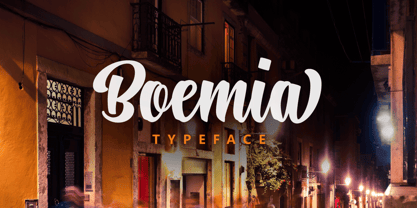 Boemia, with alternate lowercase and swashes to add value to your projects.
 - Bagarozz - 100% free

- Aierbazzi - 100% free

- Garash by Dharma Type,
$14.99 Very decorative script inspired by old lettering in Eastern Europe. Eye-catching for picture books, toys for children. There is another font which called Garash Script.
 - Tenner by Suomi,
$35.00 All-caps script with swashes in upper case, and ligatures. And outline with same metrics, so the oulines fit snuggly on top of the book-variant.
 - Thumper by Kern Club,
$10.00 Nostalgia styled font designed by Samborghini Uppercase Character Set A-Z Lowercase Character Set a-z Tons of alternate characters Numerals & Simple punctuation OTF file format
 - Texarkana JNL by Jeff Levine,
$29.00 Texarkana JNL is based on classic condensed wood type from the 1800s, and is embellished with stars on the top and bottom for a decorative look.
 - Fango by Typo5,
$16.95A heavy one. For major impact use it only in caps, however typing randomly upper and lower case has interesting results too. Play with it please. - TT Polls by TypeType,
$29.00 TT Polls useful links: Specimen | Graphic presentation | Customization options About TT Polls family: TT Polls emerges as a modern modular slab serif inspired by American sports graphics. As we wanted to create a really special and remarkable project, we've decided to broaden the character palette and implement the OT features support, and also to add a traditional handwritten script in several weights to the slab serif. Although TT Polls and TT Polls Script subfamilies are stylistically contrasting each other, they perfectly match thanks to the appropriate proportions both in the thickness of vertical strokes and the general width of characters. TT Polls subfamily consists of 5 weights and 5 italics. In it, we've implemented a ligatures set and broad support of OpenType features: calt, salt, liga, dlig, case, frac, sinf, sups, dnom, numr, tnum. Thanks to stylistic alternates it is possible to significantly change the nature of the font, making it more technological. TT Polls Script subfamily is a handwritten script in 5 weights. Geometric swashes created for all characters of basic Latin and Cyrillic alphabets contribute to its authenticity. A lot of OpenType features (swsh, liga, calt, case, frac, ordn, sinf, sups, dnom, numr, tnum, onum, pnum) are also integrated into the TT Polls Script. Although we've been considering the use of TT Polls in sports-related design—be that inscriptions on baseball players' shirts or numbers on a race car’s side—while creating the font family, we have to admit that the final version of TT Polls is also a great fit to a more casual design and application spheres. TT Polls language support: Acehnese, Afar, Albanian, Alsatian, Aragonese, Arumanian, Asu, Aymara, Banjar, Basque, Belarusian (cyr), Bemba, Bena, Betawi, Bislama, Boholano, Bosnian (cyr), Bosnian (lat), Breton, Bulgarian (cyr), Cebuano, Chamorro, Chiga, Colognian, Cornish, Corsican, Cree, Croatian, Czech, Danish, Embu, English, Erzya, Estonian, Faroese, Fijian, Filipino, Finnish, French, Friulian, Gaelic, Gagauz (lat), Galician, German, Gusii, Haitian Creole, Hawaiian, Hiri Motu, Hungarian, Icelandic, Ilocano, Indonesian, Innu-aimun, Interlingua, Irish, Italian, Javanese, Judaeo-Spanish, Judaeo-Spanish, Kalenjin, Karachay-Balkar (lat), Karaim (lat), Karakalpak (lat), Kashubian, Khasi, Khvarshi, Kinyarwanda, Kirundi, Kongo, Kumyk, Kurdish (lat), Ladin, Latvian, Laz, Leonese, Lithuanian, Luganda, Luo, Luxembourgish, Luyia, Macedonian, Machame, Makhuwa-Meetto, Makonde, Malay, Manx, Maori, Mauritian Creole, Minangkabau, Moldavian (lat), Montenegrin (lat), Mordvin-moksha, Morisyen, Nahuatl, Nauruan, Ndebele, Nias, Nogai, Norwegian, Nyankole, Occitan, Oromo, Palauan, Polish, Portuguese, Quechua, Rheto-Romance, Rohingya, Romanian, Romansh, Rombo, Rundi, Russian, Rusyn, Rwa, Salar, Samburu, Samoan, Sango, Sangu, Scots, Sena, Serbian (cyr), Serbian (lat), Seychellois Creole, Shambala, Shona, Slovak, Slovenian, Soga, Somali, Sorbian, Sotho, Spanish, Sundanese, Swahili, Swazi, Swedish, Swiss German, Swiss German, Tagalog, Tahitian, Taita, Tatar, Tetum, Tok Pisin, Tongan, Tsonga, Tswana, Turkish, Turkmen (lat), Ukrainian, Uyghur, Vepsian, Volapük, Võro, Vunjo, Xhosa, Zaza, Zulu.
 - Contribute by Fontscafe,
$39.00 The Contribute font is one that takes you back to the days of the fountain pen. To those who are old enough to remember, fountain pens were tiresome to fill and use – but also a pleasure to own, something to cherish that became so much a part of your daily life, a symbol of etiquette and sometimes even a style statement! Our Contribute fonts will definitely remind you of that, and everything else to do with a touch of vintage class. This 30s-like font is sure to become one of your favorite cursive fonts, be it for use on a poster or a web page. This font is ideal for those situations where you need your viewer to connect on a more personal level than formal. Think ‘writing a letter rather than typing it out’, and you will know what we mean!
 - Sparkling Sunday by Prestige Artsy Studio,
$19.99 Introducing the newest addition to your font collection — Sparkling Sunday! This font is the perfect combination of vintage and modern, with bold and chunky letters that are sure to make a statement. The font is inspired by the 80s and 90s era, with a touch of modern typography. Each letter is carefully crafted with attention to detail, giving it a unique and eye-catching look. The font is perfect for posters, flyers, logos, and any design that needs a retro touch. It comes in a regular style and an extra including 26 retro graphics to allow versatility in your designs. Simply install the file as a separate and you will get to type them using the alphabets A-to-Z to access them. Get ready to take your designs to the next level with this cute Sparkling Sunday Duo.
 - Retro Voice by BlessedPrint,
$20.00 Retro Voice is variable serif font meticulously crafted by BlessedPrint to evoke the nostalgic charm of the 80's. Drawing inspiration from trendy vintage magazine headlines, this font family boasts regular and italic versions. Retro Voice's variable font format provides you with boundless opportunities to fine-tune your typography. With the ability to adjust width, weight, and contrast, you can create a wide range of visual styles that cater to various design projects. No need to fumble with glyph panels; simply type a "+" after the letter to access alternate characters. This feature extends to all characters, thanks to our PUA encoding. Each character within Retro Voice has undergone a meticulous design process. Every curve, line, and thickness was refined to perfection through a precise and rigorous mathematical verification, resulting in a font that radiates luxury and elegance.
 - Creepy Night by Seemly Fonts,
$12.00 Creepy Night is an incomparable display font. Masterfully designed to become a true favorite, this font has the potential to bring each of your creative ideas to the highest level!
 - Party Noid by PizzaDude.dk,
$20.00Party Noids goes all the way - from cartoonish to romantic, from funny to serious. Write in all caps, all lowercase or mix upper and lowercase to create ounces of fun! - KG A Little Swag by Kimberly Geswein,
$5.00 Cute bunting style lettering. Best when used with multiple layers to create a stacked, dimensional look. Use the parentheses to create end pieces and _ (underscore) to connect the end pieces.
 - Pratfall by Jeff Levine,
$29.00 For 138 years, the Milton Bradley Company (of Springfield, Massachusetts) has been the leading producer of board games, toys and educational/instructional materials. The company was acquired by Hasbro in 1984. It was merged with the also-acquired Parker Brothers in 1991 and became Hasbro Games until both brand ID's were dropped in 2009. “The Moving Picture Game” was a 1920s-era board game created by Howard R. Garis (credited as ‘the author of the Uncle Wiggily game’) and capitalized on the still-new motion picture industry. On top of the storage box is the game’s name – hand lettered in a free-flowing Art Nouveau sans serif that more closely resembles the titles found within animated cartoons or in the ‘bubble letters’ a school child doodles on notebook paper. Recreated as a digital typeface, Pratfall JNL (named after the slips, trips and falls taken by silent era film comedians) is available in both regular and oblique versions.
 - Brushed by d[esign],
$4.62 Let this free-flowing brush script add a little hand painted goodness to your works. Cheaper than a bucket of paint, use Brushed to add brush painted letters to your works or manipulate the many glyphs in this font using image editing software to create art as shown above.
 - Mix Stitch by Mix Fonts,
$13.00 Mix Stitch, is an embroidery lesson disguised as a font, fit for handmade and DIY themed projects. Can be used to emulate embroidery in images, or as a guide to teach kids how to write. So many uses for this fun font, I don't even know where to begin.
 - Helion by Fonthead Design,
$19.00Helion is a font designed by Ethan Dunham that has a sleek sci-fi feel to it. While it appears to be monocase, many of the lower case letters are different, though the x-height equals the cap height. You can use this to add variation to your headlines. - RAN by URW Type Foundry,
$35.99 RAN Reformed Typeface for Beginners by Georg Salden - a headstrong and courageous approach to an improved handling of handwriting. Diverse and sometimes irreconcilable theories exist about how beginners are supposed to learn writing and reading. This has led to fierce discussions among experts already. We don’t want to pour more oil on the fire, but hope to create a new awareness for this topic, which is important to everyone of us. For beginners the combination of single characters (sounds) to whole words is essential during the acquirement of reading and writing. In this process they develop the skill to recall entire terms from memory. Therefore, after current practice, every word shall be written in a single stroke without lifting the pen in between. Georg Salden contradicts this postulate and warns, that coercively holding the pen down within a word can easily lead to exaggerated loop formations and a general meandering of the written text. The intellectual process in connecting single sounds to words while writing would happen anyway and the prohibition to lift the pen would often lead to tensions. To still support the necessary connections in general and to simplify the connecting, he teaches to write all round letters like a, e, g, o with inclusion of the connecting stroke, so that the spacing and combining with the next character arise by themselves. By settling the stroke at certain points and with a clear and logical writing method, a conscious and careful contact with the various strokes arises. All this automatically leads, together with a certain deceleration, to an increase of beauty and readability in the handwriting. The repeatedly discussed topic »connected or unconnected« appears to be solved in the most comfortable way as, depending on the particular character combination, both solutions are possible.
 - Salvador by Homelessfonts,
$49.00 Homelessfonts is an initiative by the Arrels foundation to support, raise awareness and bring some dignity to the life of homeless people in Barcelona Spain. Each of the fonts was carefully digitized from the handwriting of different homeless people who agreed to participate in this initiative. A biography/story of each homeless person captures their story, to help raise awareness and bring some dignity to the life of homeless people. Monotype is pleased to donate all revenue from the sales of Homelessfonts to the Arrels foundation in support of their mission to provide the homeless people in Barcelona with a path to independence with accommodations, food, social and health care. Salvador was born in a small village in the province of Seville, Spain where he lived until 2002. During many years he worked in restaurants, construction, and in the fields, until he decided to go try his luck in Palma de Mallorca. There he worked in hotels and in construction, until the economic crisis erupted and he was left without work or benefits of any kind and he began to live in the street: “The street has few good things, but it teaches you to be more selfless, to share with others what you have, even if it isn’t much.” In 2006, a friend encouraged him to come along to Barcelona and bought his plane ticket. Once there, things did not go much better and he had to continue living in the street. A year ago he left behind that life and now he explains his experience in guided tours to school groups: “I like it because I see that many of them are interested and they ask questions. It is good that they learn.”
 - Glis by BXS Type,
$10.00 The Glis font is a unique expression of authenticity, meticulously hand-drawn to bring a touch of charming personality to your designs. With rounded and slightly irregular strokes, Glis is more than just typography; It's a visual experience that adds artisanal charm and a sense of warmth to your creations. Each character is carefully designed to convey a relaxed and welcoming aesthetic, providing a visually captivating approach to your typographic compositions. Try Glis to infuse a dose of originality and softness into your designs. **Uppercase
 - Brume by Creativemedialab,
$16.00 Brume font is a bold, attractive and beautiful font. "Easy to read, modern and elegant look but stylist", this will be the first words that your client says to your design using this font. Comes with uppercase and lowercase. It has many alternates character with nice curve that you can arrange to create a nice logo lettering, or use it as a display face on a poster and add a few alterations to it to make a beautiful eye catching words. Brume font is best for logo lettering, headlines, product packaging, t-shirt design, wedding theme, poster, book cover, wedding invitation, Christmas and more To access alternate: In Adobe Photoshop go to Window - glyphs In Adobe Illustrator go to Type - glyphs
 - Billie Sight by Din Studio,
$29.00 Looking for the perfect font to use on invitations or branding? Hoping to travel your audience to a world of gorgeous, elegant, versatile, yet modern? Then, you go to the right path. Introducing Billie Sight- A Signature Font Billie Sight is a modern and elegant handcrafted signature font to embrace your audiences or guests. Every stroke and curve was created to capture the essence of elegance and style. Perfect for social media posts and ads, printed quotes, t-shirt designs, packaging, or even as a modern text overlay to any background image. Billie Sight includes Multilingual Options to make your branding globally acceptable. Features: Standard Ligatures Stylistic Sets Multilingual Support (84 language) PUA Encoded Numerals and Punctuation Thank you for downloading premium fonts from Din Studio
 - Zany Route by Putracetol,
$22.00 Zany Route is a delightful and rounded typeface designed to rev up the fun in transportation-themed projects. With its playful and engaging style, it's the perfect addition to any creative project. Whether used on its own or combined with any of its eleven thematic variations, Zany Route is sure to transport your designs to a world of joy and adventure. This font offers eleven distinct variations inspired by transportation, including planes, cars, gears, motorcycles, trucks, and more. It's the ideal choice for designs related to transportation, catering to children and crafters alike. Zany Route is your ticket to logos, children's themes, crafting, invitations, packaging, posters, titles, businesses, greeting cards, stickers, children's books, magazines, and any designs connected to the world of transportation.
 - Egal by Koral Creative,
$30.00 Introducing EGAL, the highly sophisticated and premium font inspired by the symbol of equality, the equals sign (=). Meticulously crafted with the utmost attention to detail, EGAL is the epitome of luxury typography, perfect for elevating your brand's image. Egal is a contemporary display font inspired by old sans fonts, designed to provide a premium feel to any project. It is designed to fit any logo or branding project and supports over 70 languages, including Cyrillic. With 395 glyphs, Egal is the perfect choice for anyone looking to add a stylish and sophisticated touch to their project. The word "egal" itself is derived from the French word for "equal", emphasizing the font's intent to provide a sense of balance and harmony to any project.
 - ITC Avant Garde Gothic Paneuropean by ITC,
$49.00ITC Avant Garde Gothic¿ was designed by Herb Lubalin and Tom Carnase in 1970. They based it on Lubalin¿s logo for Avant Garde Magazine - an exciting construction of overlapping and tightly-set geometric capitals. ITC Avant Garde is a geometric sans serif; meaning the basic shapes are constructed from circles and straight lines, much like the work from the 1920s German Bauhaus movement. The early versions of ITC Avant Garde became well-known for their many unique alternates and ligatures that still conjure up the typographic aura of the 1970s. These fonts contain the basic alphabets (without the old unusual ligatures). Still strong and modern looking, ITC Avant Garde has become a solid staple in the repertoire of today's graphic designer. The large, open counters and tall x-heights seem friendly, and help to make this family work well for short texts and headlines. The condensed weights were drawn by Ed Benguiat in 1974, and the obliques were designed by Andr¿ G¿rtler, Erich Gschwind and Christian Mengelt in 1977. ITC Avant Garde¿ Mono is a monospaced version done by Ned Bunnel in 1983. - Tetris - Unknown license


