10,000 search results
(0.047 seconds)
- Fango by Typo5,
$16.95A heavy one. For major impact use it only in caps, however typing randomly upper and lower case has interesting results too. Play with it please. - Creepy Night by Seemly Fonts,
$12.00 Creepy Night is an incomparable display font. Masterfully designed to become a true favorite, this font has the potential to bring each of your creative ideas to the highest level!
 - Party Noid by PizzaDude.dk,
$20.00Party Noids goes all the way - from cartoonish to romantic, from funny to serious. Write in all caps, all lowercase or mix upper and lowercase to create ounces of fun! - KG A Little Swag by Kimberly Geswein,
$5.00 Cute bunting style lettering. Best when used with multiple layers to create a stacked, dimensional look. Use the parentheses to create end pieces and _ (underscore) to connect the end pieces.
 - Contribute by Fontscafe,
$39.00 The Contribute font is one that takes you back to the days of the fountain pen. To those who are old enough to remember, fountain pens were tiresome to fill and use – but also a pleasure to own, something to cherish that became so much a part of your daily life, a symbol of etiquette and sometimes even a style statement! Our Contribute fonts will definitely remind you of that, and everything else to do with a touch of vintage class. This 30s-like font is sure to become one of your favorite cursive fonts, be it for use on a poster or a web page. This font is ideal for those situations where you need your viewer to connect on a more personal level than formal. Think ‘writing a letter rather than typing it out’, and you will know what we mean!
 - Sparkling Sunday by Prestige Artsy Studio,
$19.99 Introducing the newest addition to your font collection — Sparkling Sunday! This font is the perfect combination of vintage and modern, with bold and chunky letters that are sure to make a statement. The font is inspired by the 80s and 90s era, with a touch of modern typography. Each letter is carefully crafted with attention to detail, giving it a unique and eye-catching look. The font is perfect for posters, flyers, logos, and any design that needs a retro touch. It comes in a regular style and an extra including 26 retro graphics to allow versatility in your designs. Simply install the file as a separate and you will get to type them using the alphabets A-to-Z to access them. Get ready to take your designs to the next level with this cute Sparkling Sunday Duo.
 - Retro Voice by BlessedPrint,
$20.00 Retro Voice is variable serif font meticulously crafted by BlessedPrint to evoke the nostalgic charm of the 80's. Drawing inspiration from trendy vintage magazine headlines, this font family boasts regular and italic versions. Retro Voice's variable font format provides you with boundless opportunities to fine-tune your typography. With the ability to adjust width, weight, and contrast, you can create a wide range of visual styles that cater to various design projects. No need to fumble with glyph panels; simply type a "+" after the letter to access alternate characters. This feature extends to all characters, thanks to our PUA encoding. Each character within Retro Voice has undergone a meticulous design process. Every curve, line, and thickness was refined to perfection through a precise and rigorous mathematical verification, resulting in a font that radiates luxury and elegance.
 - TT Polls by TypeType,
$29.00 TT Polls useful links: Specimen | Graphic presentation | Customization options About TT Polls family: TT Polls emerges as a modern modular slab serif inspired by American sports graphics. As we wanted to create a really special and remarkable project, we've decided to broaden the character palette and implement the OT features support, and also to add a traditional handwritten script in several weights to the slab serif. Although TT Polls and TT Polls Script subfamilies are stylistically contrasting each other, they perfectly match thanks to the appropriate proportions both in the thickness of vertical strokes and the general width of characters. TT Polls subfamily consists of 5 weights and 5 italics. In it, we've implemented a ligatures set and broad support of OpenType features: calt, salt, liga, dlig, case, frac, sinf, sups, dnom, numr, tnum. Thanks to stylistic alternates it is possible to significantly change the nature of the font, making it more technological. TT Polls Script subfamily is a handwritten script in 5 weights. Geometric swashes created for all characters of basic Latin and Cyrillic alphabets contribute to its authenticity. A lot of OpenType features (swsh, liga, calt, case, frac, ordn, sinf, sups, dnom, numr, tnum, onum, pnum) are also integrated into the TT Polls Script. Although we've been considering the use of TT Polls in sports-related design—be that inscriptions on baseball players' shirts or numbers on a race car’s side—while creating the font family, we have to admit that the final version of TT Polls is also a great fit to a more casual design and application spheres. TT Polls language support: Acehnese, Afar, Albanian, Alsatian, Aragonese, Arumanian, Asu, Aymara, Banjar, Basque, Belarusian (cyr), Bemba, Bena, Betawi, Bislama, Boholano, Bosnian (cyr), Bosnian (lat), Breton, Bulgarian (cyr), Cebuano, Chamorro, Chiga, Colognian, Cornish, Corsican, Cree, Croatian, Czech, Danish, Embu, English, Erzya, Estonian, Faroese, Fijian, Filipino, Finnish, French, Friulian, Gaelic, Gagauz (lat), Galician, German, Gusii, Haitian Creole, Hawaiian, Hiri Motu, Hungarian, Icelandic, Ilocano, Indonesian, Innu-aimun, Interlingua, Irish, Italian, Javanese, Judaeo-Spanish, Judaeo-Spanish, Kalenjin, Karachay-Balkar (lat), Karaim (lat), Karakalpak (lat), Kashubian, Khasi, Khvarshi, Kinyarwanda, Kirundi, Kongo, Kumyk, Kurdish (lat), Ladin, Latvian, Laz, Leonese, Lithuanian, Luganda, Luo, Luxembourgish, Luyia, Macedonian, Machame, Makhuwa-Meetto, Makonde, Malay, Manx, Maori, Mauritian Creole, Minangkabau, Moldavian (lat), Montenegrin (lat), Mordvin-moksha, Morisyen, Nahuatl, Nauruan, Ndebele, Nias, Nogai, Norwegian, Nyankole, Occitan, Oromo, Palauan, Polish, Portuguese, Quechua, Rheto-Romance, Rohingya, Romanian, Romansh, Rombo, Rundi, Russian, Rusyn, Rwa, Salar, Samburu, Samoan, Sango, Sangu, Scots, Sena, Serbian (cyr), Serbian (lat), Seychellois Creole, Shambala, Shona, Slovak, Slovenian, Soga, Somali, Sorbian, Sotho, Spanish, Sundanese, Swahili, Swazi, Swedish, Swiss German, Swiss German, Tagalog, Tahitian, Taita, Tatar, Tetum, Tok Pisin, Tongan, Tsonga, Tswana, Turkish, Turkmen (lat), Ukrainian, Uyghur, Vepsian, Volapük, Võro, Vunjo, Xhosa, Zaza, Zulu.
 - Allrounder Antiqua by Identity Letters,
$40.00 Timeless Renaissance looks, gently updated. For novels and billboards alike. Allrounder Antiqua is an old-style serif member of the Allrounder superfamily. A timeless typeface based on classical proportions, Allrounder Antiqua is perfectly suitable for advanced book and editorial design well as packaging and branding. True: its main purpose is to set flawless body copy and to generate an evenly textured page—but its refined shapes work fantastically in display applications, too. Some details, such as the small and sharp bowl of the lowercase a, are fully appreciated in large sizes only. If you need a sophisticated serif typeface for packaging, food, fashion, consumer goods, or lifestyle branding, Allrounder Antiqua is up for it. It's also apt as an outstanding corporate typeface, be it for a more conservative venture or the latest hipster start-up. This classy serif typeface comes in four weights with corresponding true italics. Just like its sans-serif counterpart, Allrounder Grotesk, Allrounder Antiqua is equipped with plenty of Opentype Features like small caps, six sets of figures, case-sensitive forms, superiors, fractions and many ligatures. You will find alternate letters with swashes within this extended character set, as well as all the accented glyphs necessary to support more than 200 Latin-based languages. Historical Background The (French) Renaissance-influenced typeface started as Moritz Kleinsorge's graduation project within the "Expert Class Type design" course of the Plantin Institute for Typography, located in the famous Museum Plantin-Moretus in Antwerp, Belgium. There, Moritz Kleinsorge decided to create a revival of Robert Granjon's "Ascendonica Romain", described as "a beautiful face; typical of Granjon's mature style" in the inventory list of available material. "To touch punches and matrices cut by Robert Granjon back in 1567 was an invaluable inspiration", Moritz explains. Over time, the typeface moved away from being a true revival. Rather, it evolved into a Granjon-inspired typeface. That typeface is now available as Allrounder Antiqua. Perfect Pairing: Allrounder Antiqua + Allrounder Grotesk Allrounder Grotesk is the ideal complement to Allrounder Antiqua. They both share common vertical metrics and a common color. This allows you to pair both typefaces within the same layout—even within the same paragraph—without creating visual disruption. Head over to the Family Page of Allrounder Grotesk to get more information about this typeface. Design Trick: Bilingual Design With the Allrounder Superfamily Combining Allrounder Grotesk with Allrounder Antiqua is an ideal approach for bilingual designs, wherein both languages get the same emphasis yet are distinguished with two different typefaces. It's also best practice to set headlines in a different typeface than the body text if they harmonize with each other. Allrounder Grotesk and Allrounder Antiqua provide you with the perfect pair for this purpose.
 - Brushed by d[esign],
$4.62 Let this free-flowing brush script add a little hand painted goodness to your works. Cheaper than a bucket of paint, use Brushed to add brush painted letters to your works or manipulate the many glyphs in this font using image editing software to create art as shown above.
 - Mix Stitch by Mix Fonts,
$13.00 Mix Stitch, is an embroidery lesson disguised as a font, fit for handmade and DIY themed projects. Can be used to emulate embroidery in images, or as a guide to teach kids how to write. So many uses for this fun font, I don't even know where to begin.
 - Helion by Fonthead Design,
$19.00Helion is a font designed by Ethan Dunham that has a sleek sci-fi feel to it. While it appears to be monocase, many of the lower case letters are different, though the x-height equals the cap height. You can use this to add variation to your headlines. - Pratfall by Jeff Levine,
$29.00 For 138 years, the Milton Bradley Company (of Springfield, Massachusetts) has been the leading producer of board games, toys and educational/instructional materials. The company was acquired by Hasbro in 1984. It was merged with the also-acquired Parker Brothers in 1991 and became Hasbro Games until both brand ID's were dropped in 2009. “The Moving Picture Game” was a 1920s-era board game created by Howard R. Garis (credited as ‘the author of the Uncle Wiggily game’) and capitalized on the still-new motion picture industry. On top of the storage box is the game’s name – hand lettered in a free-flowing Art Nouveau sans serif that more closely resembles the titles found within animated cartoons or in the ‘bubble letters’ a school child doodles on notebook paper. Recreated as a digital typeface, Pratfall JNL (named after the slips, trips and falls taken by silent era film comedians) is available in both regular and oblique versions.
 - RAN by URW Type Foundry,
$35.99 RAN Reformed Typeface for Beginners by Georg Salden - a headstrong and courageous approach to an improved handling of handwriting. Diverse and sometimes irreconcilable theories exist about how beginners are supposed to learn writing and reading. This has led to fierce discussions among experts already. We don’t want to pour more oil on the fire, but hope to create a new awareness for this topic, which is important to everyone of us. For beginners the combination of single characters (sounds) to whole words is essential during the acquirement of reading and writing. In this process they develop the skill to recall entire terms from memory. Therefore, after current practice, every word shall be written in a single stroke without lifting the pen in between. Georg Salden contradicts this postulate and warns, that coercively holding the pen down within a word can easily lead to exaggerated loop formations and a general meandering of the written text. The intellectual process in connecting single sounds to words while writing would happen anyway and the prohibition to lift the pen would often lead to tensions. To still support the necessary connections in general and to simplify the connecting, he teaches to write all round letters like a, e, g, o with inclusion of the connecting stroke, so that the spacing and combining with the next character arise by themselves. By settling the stroke at certain points and with a clear and logical writing method, a conscious and careful contact with the various strokes arises. All this automatically leads, together with a certain deceleration, to an increase of beauty and readability in the handwriting. The repeatedly discussed topic »connected or unconnected« appears to be solved in the most comfortable way as, depending on the particular character combination, both solutions are possible.
 - Salvador by Homelessfonts,
$49.00 Homelessfonts is an initiative by the Arrels foundation to support, raise awareness and bring some dignity to the life of homeless people in Barcelona Spain. Each of the fonts was carefully digitized from the handwriting of different homeless people who agreed to participate in this initiative. A biography/story of each homeless person captures their story, to help raise awareness and bring some dignity to the life of homeless people. Monotype is pleased to donate all revenue from the sales of Homelessfonts to the Arrels foundation in support of their mission to provide the homeless people in Barcelona with a path to independence with accommodations, food, social and health care. Salvador was born in a small village in the province of Seville, Spain where he lived until 2002. During many years he worked in restaurants, construction, and in the fields, until he decided to go try his luck in Palma de Mallorca. There he worked in hotels and in construction, until the economic crisis erupted and he was left without work or benefits of any kind and he began to live in the street: “The street has few good things, but it teaches you to be more selfless, to share with others what you have, even if it isn’t much.” In 2006, a friend encouraged him to come along to Barcelona and bought his plane ticket. Once there, things did not go much better and he had to continue living in the street. A year ago he left behind that life and now he explains his experience in guided tours to school groups: “I like it because I see that many of them are interested and they ask questions. It is good that they learn.”
 - Glis by BXS Type,
$10.00 The Glis font is a unique expression of authenticity, meticulously hand-drawn to bring a touch of charming personality to your designs. With rounded and slightly irregular strokes, Glis is more than just typography; It's a visual experience that adds artisanal charm and a sense of warmth to your creations. Each character is carefully designed to convey a relaxed and welcoming aesthetic, providing a visually captivating approach to your typographic compositions. Try Glis to infuse a dose of originality and softness into your designs. **Uppercase
 - Brume by Creativemedialab,
$16.00 Brume font is a bold, attractive and beautiful font. "Easy to read, modern and elegant look but stylist", this will be the first words that your client says to your design using this font. Comes with uppercase and lowercase. It has many alternates character with nice curve that you can arrange to create a nice logo lettering, or use it as a display face on a poster and add a few alterations to it to make a beautiful eye catching words. Brume font is best for logo lettering, headlines, product packaging, t-shirt design, wedding theme, poster, book cover, wedding invitation, Christmas and more To access alternate: In Adobe Photoshop go to Window - glyphs In Adobe Illustrator go to Type - glyphs
 - Billie Sight by Din Studio,
$29.00 Looking for the perfect font to use on invitations or branding? Hoping to travel your audience to a world of gorgeous, elegant, versatile, yet modern? Then, you go to the right path. Introducing Billie Sight- A Signature Font Billie Sight is a modern and elegant handcrafted signature font to embrace your audiences or guests. Every stroke and curve was created to capture the essence of elegance and style. Perfect for social media posts and ads, printed quotes, t-shirt designs, packaging, or even as a modern text overlay to any background image. Billie Sight includes Multilingual Options to make your branding globally acceptable. Features: Standard Ligatures Stylistic Sets Multilingual Support (84 language) PUA Encoded Numerals and Punctuation Thank you for downloading premium fonts from Din Studio
 - Zany Route by Putracetol,
$22.00 Zany Route is a delightful and rounded typeface designed to rev up the fun in transportation-themed projects. With its playful and engaging style, it's the perfect addition to any creative project. Whether used on its own or combined with any of its eleven thematic variations, Zany Route is sure to transport your designs to a world of joy and adventure. This font offers eleven distinct variations inspired by transportation, including planes, cars, gears, motorcycles, trucks, and more. It's the ideal choice for designs related to transportation, catering to children and crafters alike. Zany Route is your ticket to logos, children's themes, crafting, invitations, packaging, posters, titles, businesses, greeting cards, stickers, children's books, magazines, and any designs connected to the world of transportation.
 - Egal by Koral Creative,
$30.00 Introducing EGAL, the highly sophisticated and premium font inspired by the symbol of equality, the equals sign (=). Meticulously crafted with the utmost attention to detail, EGAL is the epitome of luxury typography, perfect for elevating your brand's image. Egal is a contemporary display font inspired by old sans fonts, designed to provide a premium feel to any project. It is designed to fit any logo or branding project and supports over 70 languages, including Cyrillic. With 395 glyphs, Egal is the perfect choice for anyone looking to add a stylish and sophisticated touch to their project. The word "egal" itself is derived from the French word for "equal", emphasizing the font's intent to provide a sense of balance and harmony to any project.
 - ITC Avant Garde Gothic Paneuropean by ITC,
$49.00ITC Avant Garde Gothic¿ was designed by Herb Lubalin and Tom Carnase in 1970. They based it on Lubalin¿s logo for Avant Garde Magazine - an exciting construction of overlapping and tightly-set geometric capitals. ITC Avant Garde is a geometric sans serif; meaning the basic shapes are constructed from circles and straight lines, much like the work from the 1920s German Bauhaus movement. The early versions of ITC Avant Garde became well-known for their many unique alternates and ligatures that still conjure up the typographic aura of the 1970s. These fonts contain the basic alphabets (without the old unusual ligatures). Still strong and modern looking, ITC Avant Garde has become a solid staple in the repertoire of today's graphic designer. The large, open counters and tall x-heights seem friendly, and help to make this family work well for short texts and headlines. The condensed weights were drawn by Ed Benguiat in 1974, and the obliques were designed by Andr¿ G¿rtler, Erich Gschwind and Christian Mengelt in 1977. ITC Avant Garde¿ Mono is a monospaced version done by Ned Bunnel in 1983. - Tetris - Unknown license

- Janda Spring Doodles by Kimberly Geswein,
$5.00 Doodles ranging from cute animals to Easter eggs to flowers of various types.
 - Vibration by Funk King,
$5.00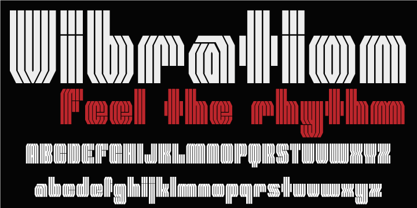 Vibration is a modular font. Use it to give energy to your designs.
 - Liam by Intellecta Design,
$19.95Liam, an oldstyle easy to use typeface, excelent to emulate old printed books... - Shmulik Yael MF by Masterfont,
$59.00 Tender and elegant hand writing font, expanded to add air to your text.
 - Plenti by MADType,
$19.00 Plenti is the fat font to add to your visual communication toolbox. Friendly, square, and quirky all at the same time. It is itching to get used on posters and websites.
 - Pace by Ratzlaff Type,
$9.00 Pace is a geometric minimalist typeface with a large range of weight options to suit multiple scenarios, from videogames to sports magazines. To inspire movement and speed, try the Slanted styles.
 - Sangeki by Anomieka,
$12.00 Sangki is a cool and bold serif font. Masterfully designed to become a true favorite, this font has the potential to bring each of your creative ideas to the highest level!
 - BE BOlD by WAP Type,
$15.00 Be Bold is an incredibly unique display font. Masterfully designed to become a true favorite, this font has the potential to bring each of your creative ideas to the highest level!
 - DB Dainty Swirl by Illustration Ink,
$3.00DB Dainty Swirl is great for embellishments, adorning a scrapbook page or adding a nice to touch to a card or invitation. Adds a classy, finished look to any project. Enjoy! - Miny Fellas by Stringlabs Creative Studio,
$25.00 Miny Fellas is inspired by classic typography and brings its own unique style to any design project. Use this gorgeous and unique handwritten font to bring any DIY project to life!
 - Mleyoth by Griyotype,
$10.00 Mleyoth is a bold and detailed blackletter font. Masterfully designed to become a true favorite, this font has the potential to bring each of your creative ideas to the highest level!
 - Prismatic Spirals Pro by MMC-TypEngine,
$182.00 PRISMATIC SPIRALS PRO FONT! The Prismatic Spirals PRO is a Decorative Type-System and ‘Assembling Game’, itself. Settled in squared pieces modules or tiles, embedded by unprecedented Intertwined Prismatic Structures Design, or intricate interlaced bars that may seem quite “impossible” to shape. Although it originated from the ‘Penrose Square’, it may not look totally as an Impossible Figures Type of Optical Illusions. More an “improbable” Effect in its intertwined Design, that even static can seem like a source of Kinetical Sculptures, or drive eyes into a kind of hypnosis. Prismatic Spirals Pro has two related Typefaces both more basic or easier to use versions, the Default Family plus its “bold” braided version Prismatic Interlaces… PRO provides a more advanced, complex, and twisted Design, plus requires to be typed alternating caps. Instructions: Use the Map Font Reference PDF as a guide to learn the 'tiles' position on the keyboard, then easily type and compose puzzle designs with this font! All alphanumeric keys are intuitive or easy to induce, you may easily memorize it all! Plus, often also need to consult it! *Find the Prismatic Spirals Pro Font Map Reference PDF Here! (!) Is recommended Print it to have the Reference or open the PDF to also copy and paste, when consulting is required or when it may be difficult to access, depending on the keyboard script or language. The 2 glyphs sets are separated in colors for facilitating. Also use the Map Font with key captions or switch to it for ensure that the characters are alternating between both uppercase and lowercase letters as other Keys as numbers, marks, and punctuation along the strings, holding Shift one by one or actually two by two. As a Tiles Type-System, the line gap space value is 0, this means that tiles line gaps are invisibly grouted, so the user can compose designs, row by row, descending to each following row by clicking Enter, same as line break, while advances on assembling characters. Background History: The first sketches of my Prismatic Knots or Spirals Designs dates back then from 2010, while started developing hand-drawn Celtic Knots and Geometric Drawings in grid paper, while engage to Typography, Sacred Geometry and the “Impossible Figures” genre… I started doing modulation tests from 2013, until around 2018, I got to unravel it in square modules or tiles from the grid, then idealized it as fonts, along with other Type projects. This took 13 years to come out since the first sketches and 6 months in edition. During the production process some additional tiles or missing pieces were thought of and added to the basic set, which firstly had only the borders, corners, crossings, nets, Trivets connectors or T parts and ends, then added with nets and borders integrations. Usage Suggestions: This type-system enables the user to ornate and generate endless decorative patterns, borders, labyrinthine designs, Mosaics, motifs, etc. It can seem just like a puzzle, but a much greater tool instead for higher purposes as to compose Enigmas and use seriously. As like also to write Real Text by assembling the key characters or pieces, this way you can literarily reproduce any Pixel Design or font to its Prismatic Spirals correspondent form, as Kufic Arabic script and further languages and compose messages easily… This Typeface was made to be contemplated, applied, and manufactured on Infinite Decorative Designs as Pavements, Tapestry, Frames, Prints, Fabrics, Bookplates, Coloring Books, Cards, covers or architectonic frontispieces, storefronts, and Jewelry, for example. Usage Tips: Notice that the line-height must be fixed to 100% or 1,0. In some cases, as on Microsoft Word for example, the line-height default is set to 1,15. So you’ll need to change to 1,0 plus remove space after paragraph, in the same dropdown menu on Paragraph section. Considering Word files too, since the text used for mapping the Designs, won't make any literal orthographical sense, the user must select to ignore the Spellcheck underlined in red, by clicking over each misspelled error or in revision, so it can be better appreciated. Also unfolding environments as Adobe Software’s, the Designer will use the character menu to set body size and line gap to same value, as a calculator to fit a layout for example of 1,000 pts high with 9 tiles high, both body size and line gap will be 111.1111 pts. Further Tips: Whenever an architect picks this decorative system to design pavements floor or walls, a printed instruction version of the layout using the ‘map’ font may be helpful and required to the masons that will lay the tiles, to place the pieces and its directions in the right way. Regarding to export PNGs images in Software’s for layered Typesetting as Adobe Illustrator a final procedure may be required, once the designs are done and can be backup it, expanding and applying merge filter, will remove a few possible line glitches and be perfected. Technical Specifications: With 8 styles and 4 subfamilies with 2 complementary weights each (Regular and Bold) therefore, Original Contour, Filled, Decor, with reticle’s decorations and 2 Map fonts with key captions. *All fonts match perfectly when central pasted for layered typesetting. All fonts have 106 glyphs, in which 96 are different keys with 2 versions of each of both caps and shift keys, plus a few repeated for facilitating. It was settled this way in order for exchanging with its Prismatic relative fonts which has only 48 different keys repeated twice. Concerning tiles manufacturing and Printed Products as stickers or Stencils, any of its repeated pieces was measured and just rotated in different directions in each key, so when sided by other pieces in any direction will fit perfectly without mispatching errors. Copyright Disclaimer: The Font Software’s are protected by Copyright and its licenses grant the user the right to design, apply contours, plus print and manufacture in flat 2D planes only. In case of the advent of the same structures and set of pieces built in 3D Solid form, Font licenses will not be valid or authorized for casting it. © 2023 André T. A. Corrêa “Dr. Andréground” & MMC-TypEngine.
 - Bella Copia by Vincenzo Crisafulli,
$29.00 Bella Copia is a font dedicated to the world of childhood, to the writing of primary school children, but can also be used to compose texts or express essential concepts. It can be used for food, fashion, logos and much more. The clarity in the sign wants to express simplicity and immediacy. As far as possible, what is "not needed" has been taken away from individual glyphs. In the illustrations an attempt has been made, by combining images with fonts, to express the concept of cleanliness, simplicity and clarity. It is composed of 314 glyphs to try to embrace as many languages as possible.
 - DST Helfita by Designsation,
$16.00 This first font was made as an experimental work for us. learn a alot of typeform from other typeface in the past, bring us to this grace position. We learn about Variable font and all the thing to do some improvement in our work. such a nice time to present this new font to the world as the ground breaking of our mission to scale up our skill and to step up into the next vision as a font designer. We create this font with variable and Open Type features. Some instances including, from thin to black. and on the variable font has and oblique style.
 - LHF Centennial Panels 1 by Letterhead Fonts,
$46.00 One of four fonts consisting of the best old fashioned panels from Golden Era Studios. Each font contains 36 expertly drawn panels. Each letter generates a different design. Special Note: Due to the large file size of these fonts, they will not convert for use in Gerber Omega. Instead, Omega users may wish to use an alternate program to type the characters and import them into Omega as .eps files. CorelDraw users should use the "Weld" command rather than "Convert to Curves" command to convert these fonts to vector outlines. Otherwise, the program may crash due to the sheer number of points in each panel.
 - Street Stronger by Sipanji21,
$13.00 "Street Stronger" is a graffiti font with three layers that can be used to create a three-dimensional (3D) effect on your text. By using these three layers in your design, you can add depth and dimension to your typography. Fonts with these layers are often used in street art, posters, or other designs that aim to create a prominent 3D effect. With "Street Stronger," you have the ability to create text that looks different and adds a strong 3D impression by using the various layers. This allows you to customize the text's appearance to fit your design vision and add a powerful three-dimensional touch to your project.
 - Sausage by Eclectotype,
$40.00 Sausage is unapologetically bold and bulbous. Influenced by magnetic fridge letters, hot dogs and 70s phototype fonts, it is retro, but not cloyingly so. It was a deliberate plan to make Sausage only a single style typeface. The freedom that not having to think about how the font should relate to other weights allowed me to push the glyphs to places they might not otherwise have been able to go. There isn't a single corner in the entire font, and you'd be hard pushed to find a straight line. This is as soft and friendly as they come, and still equipped with numerous ligatures, alternates and arrows for sophisticated typography.
 - Flinscher by Greater Albion Typefounders,
$16.00 The Flinscher family contains twenty display typefaces, in weights that vary from light to black, and widths that extend from condensed to expanded. The family’s design inspiration traces its roots to the early portion of the twentieth century. In essence, it is a calligraphic script typeface family with blackletter influences. The letter forms are decorative and distinctive, yet clear and easy to read, and in use set up a regular rhythm that leads the eye from character to character. The Flinscher typefaces are well suited to design work that needs to combine formality with fun. Just the thing for a certificate or a book cover!
