10,000 search results
(0.035 seconds)
- Cusp by Typeco,
$29.00 Cusp is a display font that was initially inspired by austere Art Deco lettering. After the capitals were refined, then the lowercase was designed with a bit of techno flair. From these basic letterforms a variety of styles were created, ranging from the rigid DeStijl to the whimsical Loose. The result is a versatile display font family that allows the user to mix, match, and overlay the letters for a dynamic effect. In-fact 2 overlay fonts were designed specifically so that one can create graffiti-like multi-layered effects. Cusp is a super-kawaii display family of 16 fonts plus 2 overlay fonts.
 - Android by Type Innovations,
$39.00 Android is an experimental 3D shadow outline font developed by the American type designer Alex Kaczun. The unique lighting created by the beveled edge in combination with an outline font was particularly difficult to create. But the result was worth the effort. Android makes for a powerful headline display that virtually pops off the page. There is a true three dimensional quality to this innovative new typeface. Use the regular Android when setting tight leading for smaller point sizes, and use Android Tall which has taller capitals for larger headlines. By experimenting with Type Effects in Illustrator or PhotoShop you can achieve some spectacular additional 3D effects.
 - Wavespired by Invasi Studio,
$19.00 Wavespired is a unique font that combines the playful and jazzy lettering of the 1950s cartoon modern style with a modern and sleek design. This font is perfect for creating eye-catching logos and headings that will stand out in any design project. The font is influenced by the retro vibes of the fifties, but with a fresh and modern twist that makes it ideal for today's design needs. The font is legible and easy to read, making it perfect for headlines, titles, and other design elements that need to be easily understood. The font is perfect for any project that requires a fun, retro-inspired design with a modern twist.
 - Dequindre by Alex Jacque,
$30.00 Dequindre is a monolinear blackletter typeface, and was drawn as if grade school handwriting practice sheets came in a blackletter variety. Dropping the thin/thick calligraphic contrast of traditional blackletter glyph construction and instead sticking to the bare skeleton of the typeface, Dequindre manages to bring forth a delicate, contemporary aesthetic that plays off of a core blackletter form. Overall portrayed with a softer, more friendly take on the angular, severe forms of 16th century blackletter style, and through pulling some of the curvier, smoother stroke qualities of Antiqua while still maintaining the overall construction and flourish of Fraktur, Dequindre sits in a unique space in the pantheon of blackletter typefaces.
 - Getty Dubay by Handwriting Success,
$9.00 The Getty-Dubay® family of fonts has been 500 years in the making — so that you can make your handwriting worksheets in seconds. These fonts are modern descendants of the chancery handwriting style (now called “Italic”) from the Italian Renaissance, when master scribes designed a fluid and graceful hand, inspired by the proportions of the golden rectangle and Roman capitals. The Italic style has been in constant use since then. In modern times, it has been celebrated by Alfred Fairbank, Lloyd Reynolds and many others including authors Barbara Getty and Inga Dubay in their Getty-Dubay® Italic method. The Getty-Dubay® monoline handwriting fonts provide a replete resource to effectively model the highly-legible and beautiful Italic handwriting style. These are the official fonts of Getty-Dubay® Italic. Download the Getty-Dubay® Font Guide for everything you need to know about the Getty-Dubay® fonts. The Getty-Dubay® Joined fonts produce a clean cursive handwriting with join-as-you-type ease. Four join options are included: Standard, Pointed (altered joins into m, n and r), e k (utilizing the two-stroke e and one-stroke k), and Beginning (easiest joins only). The Getty-Dubay® Basic fonts provide sans-sarif clarity suitable for young writers. The Getty-Dubay® Precursive fonts add serifs to the lowercase letters, while retaining the pure Roman capitals of Basic Italic. The Getty-Dubay® Smallcaps fonts make mixed capitals easy to use. All Getty-Dubay® fonts come with scaffolds such as dashed contours, ruled lines, directional arrow and starting dots (for Basic and Smallcaps). They support multiple Latin-based languages from around the world. Getty-Dubay® is a registered trademark in the United States.
 - Thrusters by Typodermic,
$11.95 Welcome to the world of Thrusters—the angular, twin-line display typeface inspired by the timeless classic, Space Duel. Thrusters is the perfect way to bring the retro, arcade vibes to your designs! This bold and futuristic typeface is the ultimate tribute to the iconic arcade legacy, and it’s available in four different forms that can be used as layers to create stunning multicolor effects. Whether you’re creating a high-energy video game title screen, a promotional poster for a local arcade, or even a custom t-shirt design, Thrusters has got you covered. With its sharp angles and sleek curves, Thrusters is sure to turn heads and capture attention. It’s the perfect way to add some excitement and nostalgia to any design project. So what are you waiting for? Blast off into the world of retro gaming with Thrusters today! Most Latin-based European writing systems are supported, including the following languages. Afaan Oromo, Afar, Afrikaans, Albanian, Alsatian, Aromanian, Aymara, Bashkir (Latin), Basque, Belarusian (Latin), Bemba, Bikol, Bosnian, Breton, Cape Verdean, Creole, Catalan, Cebuano, Chamorro, Chavacano, Chichewa, Crimean Tatar (Latin), Croatian, Czech, Danish, Dawan, Dholuo, Dutch, English, Estonian, Faroese, Fijian, Filipino, Finnish, French, Frisian, Friulian, Gagauz (Latin), Galician, Ganda, Genoese, German, Greenlandic, Guadeloupean Creole, Haitian Creole, Hawaiian, Hiligaynon, Hungarian, Icelandic, Ilocano, Indonesian, Irish, Italian, Jamaican, Kaqchikel, Karakalpak (Latin), Kashubian, Kikongo, Kinyarwanda, Kirundi, Kurdish (Latin), Latvian, Lithuanian, Lombard, Low Saxon, Luxembourgish, Maasai, Makhuwa, Malay, Maltese, Māori, Moldovan, Montenegrin, Ndebele, Neapolitan, Norwegian, Novial, Occitan, Ossetian (Latin), Papiamento, Piedmontese, Polish, Portuguese, Quechua, Rarotongan, Romanian, Romansh, Sami, Sango, Saramaccan, Sardinian, Scottish Gaelic, Serbian (Latin), Shona, Sicilian, Silesian, Slovak, Slovenian, Somali, Sorbian, Sotho, Spanish, Swahili, Swazi, Swedish, Tagalog, Tahitian, Tetum, Tongan, Tshiluba, Tsonga, Tswana, Tumbuka, Turkish, Turkmen (Latin), Tuvaluan, Uzbek (Latin), Venetian, Vepsian, Võro, Walloon, Waray-Waray, Wayuu, Welsh, Wolof, Xhosa, Yapese, Zapotec Zulu and Zuni.
 - Wasleyton by Uncurve,
$30.00 Introducing "Wasleyton," a vintage ephemera font that weaves the elegance of a bygone era into your modern design projects. Drawing inspiration from the timeless charm of elegant signage, gold leaf craftsmanship, and the artistry of old label products, Wasleyton is more than just a font—it's a journey into the aesthetics of the past. Unleash the power of nostalgia as Wasleyton offers a plethora of alternate characters, ensuring your designs are not just eye-catching but also uniquely authentic. The versatility of this font makes it a perfect choice for a range of applications, from authentic logos and elegant headings to the artistry of sign painting and captivating posters. Infuse your projects with a touch of vintage sophistication as Wasleyton lends its charm to letterheads, branding materials, magazines, album covers, and book covers. Watch as your designs come alive in movies, apparel, flyers, and label designs, each one telling a story of craftsmanship and timeless style. Combine Wasleyton with other fonts, be it a script for a touch of fluid elegance, a serif for classic appeal, or a sans serif for a modern twist. Add a few effects, and suddenly, your project transforms into a masterpiece—classic yet contemporary, elegant yet bold. Elevate your design game with Wasleyton's ability to transport your audience to a different era. Whether you're working on product packaging that demands attention or creating an atmosphere on a movie poster, Wasleyton brings that touch of vintage authenticity that turns your project from ordinary to extraordinary. In summary, Wasleyton isn't just a font; it's a time machine to the aesthetics of yesteryears. Perfect for logos, signage, posters, branding, magazines, album covers, and much more, Wasleyton is your key to infusing a timeless vintage charm into the modern design landscape. Add it to your toolkit, and let your creativity unfold in a tapestry of nostalgia and elegance.
 - Leroy by Andinistas,
$39.95 Leroy is a font family of 5 members designed from geometrizing Roman and Gothic skeletons. Its purpose is to provide optimal reading of titles and paragraphs with strong mechanical flavor. Because of this, its variables are designed to sort information in media such as labels, signs and industrial atmosphere packaging related with the Soviet Union’s fonts in 1920. This idea matured white horizontal lines superimposed on alphabets drawn with an ancient architectural team known as “Leroy K & E Controlled Lettering System”. Then that evolved into a family concept unifying its proportion to the same X height for its members, resulting in a versatile type system. Therefore, Regular and Bold variables have low contrast between thick and thin strokes. Its upstream and downstream are extremely short, generating a suitable interline that clogs the vertical area. Its overall width equal to its X height, supports its tight spacing that compacts the horizontal area. Therefore, the variant with black caliber has plenty of contrast between thick and thin strokes. The light variable has a “blind” effect radiating light halos, ideal to propose hierarchies and combinations with orthogonal projection. In that sense, Leroy’s modular character reminds constructivist ideology merged with typographical variants suitable for graphic design with geometric look. To achieve this, I studied the softening of forms and counter blocks into a typographical system specially designed for composing useful information to attract attention. In that sense, the dingbats were obtained through a careful process of research and testings done with drawings that provided full and empty visual strategies that with the passage of time helped to forge the major decisions of a metamorphosis from industrial tools, birds and humans from pictogram mixing various genres.
 - Toughton by 99TyppeFoundry,
$12.00 Introducing Toughton Handwritten Font Unveil the beauty of handwritten elegance with Toughton, a font that breathes life into your creative projects. Designed to capture the essence of human touch, Toughton transforms words into a poetic dance of strokes and curves. The Art of Personalization Toughton isn't just a font; it's a journey through the art of personalization. Whether you're crafting wedding invitations, designing branding materials, or adding a human touch to your digital creations, Toughton's unique character will infuse your work with warmth and authenticity. Timeless Appeal With a timeless appeal that transcends trends, Toughton embraces the charm of handwritten script. Its fluid strokes and carefully crafted ligatures ensure that every word flows effortlessly, making it the perfect choice for projects that demand elegance and readability. Versatile Application From logos to social media graphics, packaging to editorial designs, Toughton adapts seamlessly to a variety of design contexts. Let your imagination run wild as you explore the versatility of this handwritten gem. Features and Functionality OpenType Features: Toughton comes with a set of OpenType features, including ligatures and alternates, to add depth and character to your text. Multilingual Support: Express yourself in various languages with Toughton's extensive multilingual support. Web and Print Ready: Whether it's for web design or print publications, Toughton is optimized for both digital and physical mediums. Elevate Your Creations Elevate your design game with Toughton Handwritten Font. It's not just a font; it's an artistic tool that allows you to tell your story with flair, grace, and a touch of humanity. Unlock the potential of your creative projects and make your message resonate with the world. Experience the magic of handwritten authenticity. Get Toughton today and let your words dance with elegance.
 - Horizona by TypeThis!Studio,
$54.00 Each iteration of Horizona is carefully designed to maintain consistency and the aesthetic integrity of this font. Users can be sure that any symbol they use, and in whatever language, the typeface's whimsical nature will shine through to provide a polished and stylized finish to their product. From branding to signage, editorial to advertising, or even for personal use, Horizona makes a statement in a huge variety of languages, letters, symbols, and numbers. www.typethis.studio
 - Koorkin by Monotype,
$29.99 “I originally drew the primary characters with a felt tip marker, scanned them and then proceeded to noodle on the computer,” says George Ryan of his new typeface, Koorkin. “Over the years, I’ve designed many original typefaces, but Koorkin has become one of my favorites. I’ve worked on hundreds of highly structured text faces. For the most part, the roots of all of them can be found in the handwritten letterforms we learn as children. I enjoy going back to these shapes whenever the opportunity presents itself. ”The happy result of Ryan‘s felt tip marker sketches and his love of simple letterforms is a new family of upright and italic scripts in medium and bold weights.
 - Straight Line by K-Type,
$20.00 Straight Line is essentially an outline Modern, but drawn without any curves whatsoever. Thin horizontals and thick verticals provide the classic look of a Didone, updated and enhanced by clean, minimalist geometry. In addition to the Straight Line font itself, the package includes Straight Line Solid with matching spacing and kerning. The Solid font can be used solo, or layered with the outline font to provide a colour background. Straight Line is an excellent display face for contemporary, eye-catching headings and sub-headings, and the fonts contain a full complement of Latin Extended-A characters. The typeface was inspired by a 1930s experimental alphabet by the British artist, Percy J Smith.
 - Gill Sans by Monotype,
$45.99The successful Gill Sans® was designed by the English artist and type designer Eric Gill and issued by Monotype in 1928 to 1930. The roots of Gill Sans can be traced to the typeface that Gill's teacher, Edward Johnston, designed for the signage of the London Underground Railway in 1918. Gill´s alphabet is more classical in proportion and contains what have become known as his signature flared capital R and eyeglass lowercase g. Gill Sans is a humanist sans serif with some geometric touches in its structures. It also has a distinctly British feel. Legible and modern though sometimes cheerfully idiosyncratic, the lighter weights work for text, and the bolder weights make for compelling display typography. - 1525 Durer Initials by GLC,
$28.00 In 1525, Albrecht Dürer, the well known German great artist, was publishing the so-called “Underweysung der Messung mit dem Zirckel und Richtscheyt”, printed in Nuremberg. This handbook explained with numeral figures how to draw with a compass and ruler. A large part is devoted to the drawing of Roman characters, which can be used as decorative initials. We are offering two complete historical initial sets and also have entirely redrawn the missing letters: J, U and W, Eth, Lslash, Thorn and Oslash in the two forms, using the Dürer style. The font may be used with all our Humane and Garalde fonts, like 1543 Humane Jenson or 1592 GLC Garamond and others from the GLC foundry catalog.
 - Epoque by Rafaeiro Typeiro,
$15.50 Époque initially came from composing a fashion catalogue with some materials from the Brazilian Amazon. The pieces of the collection used natural caoutchouc as raw material and the design of capital letters use forms that refer to the typography of the historical period 1890 - 1910 in which caoutchouc was the main driving force of the Amazonian economy. This typeface has a complete set of numerals, a set of standard ligatures, in addition to alternates in specific glyphs and a large set of discretionary ligatures composed mainly for UPPERCASE. Époque family is comprised of four weights without italics(with an alternate set in place). It’s a typeface recommended for titles, logos, and posters.
 - 1968 GLC Graffiti by GLC,
$38.00 This font was inspired by the paint brushed letters in use in the 60 - 70s for protest slogans tagged on the cities walls. In those days, we didn't commonly use aerosols like today, so we used paint brushes, with paint or tar cans, drew the letters, and ran away quickly ! Capitals and lower case have the same size, and a lot of alternates characters or ligatures allows the user to vary each letter (until tree alternates for single letters) in each word of a text . Likewise, the words may be easily underscored or intersected by a few stains looking like paint spots, substituted to the following standards characters: [greater], [less], [dagger], [backslash], [bullet], and [underscore].
 - News Crew JNL by Jeff Levine,
$29.00 It seems that after the 1960s, very few display typefaces were being produced that had the desirability to transcend generations, as did many type designs of the past. In 1970, a local television station embraced a lettering style for its logo that was a cross between round point pen nib lettering and the modular, techno look complete with squared characters in a futuristic "space age" style. News Crew JNL was inspired by the few examples found of this particular font [in use by the station at the time] and was pretty much created from scratch in order to capture the 1970s era of experimental typography. It is available in both regular and oblique versions.
 - American Uncial by Linotype,
$40.99American Uncial™ was designed by Victor Hammer in 1943. Uncial typefaces consist of letter forms of the Capitalis Monumentalis and the majescule cursive. The origins of Uncial faces date back to the 5th century. In 1953, American Uncial was expanded to include some new figures, also designed by Hammer, and was rereleased by Klingspor with the name Neue Hammer Unziale. The forms are based on old scripts in books of antiquity and the early Middle Ages and the font is a new variation of a classic. Neue Hammer Unziale font has been a favorite for certificates and diplomas and is recommended for headlines and shorter texts in a point size of 12 or larger. - Josephine by Scholtz Fonts,
$25.00Josephine, named for Josephine Baker, the legendary dancer of the 1930s, is a twenty first century sans serif typeface that harks back to the earlier part of last century. Although very modern, it has been greatly influenced by the many art deco fonts produced during the twenties and thirties of the twentieth century.In it I have tried to capture the art deco spirit in a modern humanist font. Josephine is exceptionally readable and yet completely characteristic of the Art Deco period. It can be used for text passages as well as display in posters, advertising, labels and packaging. It is professionally finished and contains all upper and lower case characters as well as all special characters, punctuation and symbols. - Arista Pro by Zetafonts,
$39.00 Arista Pro is the definitive version of the successful Arista typeface, designed by Francesco Canovaro, first released in 2007 as Arista Z and then reissued as Arista 2.0 in 2010. The pro version of Arista features the geometric and soft approach of the original typeface but comes in a full range of weights and two alternate versions (Arista Pro Regular and Arista Pro alternate version). The typeface has been expanded with the inclusion of Greek and Cyrillic alphabets as well as an extended range of latin characters. A companion icon typeface, Arista Pro Icon, has been developed, allowing for variable-width monoline icons that can be used to faultlessly match the typeface line width, up to semibold weight.
 - Last Bastion by Joe Hewitt Design,
$10.99 Last Bastion is a strong, resolute serif typeface. The original inspiration came from the idea of an impenetrable medieval fortress that has stood the test of time and defended generations of hardened soldiers. Large stone towers and fortifications are reflected in the font's bold stems. The sans serif font offers a more modern and clean look, while the Gothic font shows the typeface's darker side. All three fonts include alternates for all letters and numbers in both caps and small caps. Last Bastion lends itself to branding, billboards, signage and industry to name a few. The glyph set includes all languages covered in Basic Latin, Latin-1 Supplement and Latin Extended-A scripts.
 - Beurre by Wilton Foundry,
$29.00 In thinking about a way to express the character of this script, it occurred to me that the splitting of the main downstrokes in the caps is almost like when knife cuts into butter. Picture a butter knife that slices into butter, slowly wedging the cut wider so that when it is pulled back, the remaining shape would resemble the main downstroke of any capital letter. The lowercase characters have an almost roundhand-like character but with a slightly more formal presence. Available in Postscript, Truetype and Opentype for both Mac and Windows, Beurre is ideal for Menu's, Invitations and pretty much anywhere you need a reasonably strong, but friendly legible script. Enjoy!
 - László by Just My Type,
$20.00 We count three inspirations for the László font family. The upper case was inspired by Yomar Augusto’s amazing font Unity, used on last year’s German World Cup Team jerseys; the lower case from a few letters a poster for a Bauhaus show. The name László is an homage to László Moholy-Nagy, peerless Bauhaus designer and teacher. The László type family is stripped down to the typographic core, lean, clean and definitely machined, at home in either a formal or casual setting, i.e. you can take László anywhere. Inspired by watching the World Cup and the German Team’s jerseys. Very clean, simple, Bauhaus-style design, European and highly legible. Usage recommendations Automobile ads, anywhere a European feel is desired.
 - Zebrawood by Adobe,
$29.00Zebrawood font is a joint work of the typeface designers K.B. Chansler, C. Crossgrove and C. Twombly, who also designed Rosewood, Ponderose and Pepperwood together. Like its relatives, Zebrawood also displays a kind of Wild West character. Its style can be traced back to the Toscanienne typefaces which appeared in advertisements and on signs at the end of the 19th century. Typical of this capital alphabet are the split serifs and robust base forms, which emphasize the typeface's decorative character. Zebrawood is, like Rosewood and Schwennel, meant as a bicolor font, meaning that the weight Zebrawood fill complements the inner spaces of Zebrawood regular. When used carefully in headlines, Zebrawood font will be sure to attract attention. - Art Project JNL by Jeff Levine,
$29.00 A 1930s WPA (Works Projects Administration) poster advertising a play entitled “Abraham Lincoln, The Great Commoner” had the play’s name done in a hand-lettered Art Deco sans. This is the basis for Art Project JNL. According to Wikipedia, “the Works Progress Administration (renamed in 1939 as the Work Projects Administration; WPA) was the largest and most ambitious American New Deal agency, employing millions of unemployed people (mostly unskilled men) to carry out public works projects, including the construction of public buildings and roads. In a much smaller but more famous project, Federal Project Number One, the WPA employed musicians, artists, writers, actors and directors in large arts, drama, media, and literacy projects.”
 - Armchair Modern by PSY/OPS,
$36.00 “Growing up in Iceland, I was exposed to Scandinavian modernism from an early age. My parents had Arne Jacobsen furniture around the house and I was always enticed by the fun shapes and colors...."—SK Armchair Modern is derived from the logo created for Armchair Media Group by Stefan Kjartansson. The design is unabashedly ultra-modern, reminiscent of work by Mark Newson and the aforementioned Jacobsen. Armchair Media is a consulting company, working with clients from the Web and interactive TV, so the super-elliptical letterforms are also intended to evoke a traditional TV screen or CRT display. The complete family of five weights was co-produced by PSY/OPS in 2001.
 - Fatimurgeno by Greentrik6789,
$21.00 Sans serif fonts, hundreds, or maybe thousands. There have been a lot of sans serif fonts that have been created and circulated on the internet. This font is here to increase the number of sans serif fonts circulating on the internet to be even more. Fatimurgeno comes with variable font. You can adjust the size of the weight which is suitable for the needs you want. Fatimurgeno is a various sized, clean and modern looking sans serif font. Whether you’re using it for crafting, digital designing, presentations or greeting cards making, it’s perfect! The Thick version will be perfect for a clean and strong look, and the slim version will be perfect for a soft and seductive look.
 - Bestiario by Intellecta Design,
$27.50 John Seddon (1644-1700), was a famous english writing master, the leading calligrapher of his time, and master of Sir John Johnson’s Free Writing School in Priest’s Court, Foster Lane. His portrait was drawn by William Faithorne and was engraved by John Sturt as the frontispiece for his copy-books, such as ‘The Ingenious youth’s companion’ of c.1690 and 'The pen-man’s paradise' of c.1695. These were engraved after his work by others. Your extra-rare book - "The Pen-mans Paradise Both pleasent & Profitable OR Examples of all ye usuall hands of this Kingdome. Adorn'd with variety of ffigures an Flourishes done by Command of hand. Each ffigure being one continued & entire Track of the pen most where of may be struck as well Reverse (or to answer bothwayes) as Forward", London (1965). - YES (that is the title of the book) was the starting point to these new extra accurated works of Iza W, a series of revivals of the penmanship Seddon’s artworks, animal and human kingdon inspired penmanship forms in the Bestiario font. On the other hand, his highly ornamented animal kingdon inspired capitals and alphabets in the Seddon Penmans Paradise Capitals typeface. The “SeddonsFleurons” completes the collection. Fantastic choice to elaborated barocque/renaissance inspired and historical accurated layouts.
 - Squab by Tadas,
$10.00 The Squab typeface was designed to be simple, big and bubbly for projects from poster to t-shirt design or animation.
 - 57 Rodeo by Baseline Fonts,
$24.00A practical yet unique display face designed to offer attention-getting headlines and an alternative to the normal wild west faces. - Indian Feather by Balpirick,
$15.00 Indian Feather is a Beautiful Handdrawn Font. Indian Feather is a romantic and sweet calligraphy typeface with characters that dance along the baseline. It will add a luxury spark to any design project that you wish to create! Indian Feather also multilingual support. Enjoy the font, feel free to comment or feedback, send me PM or email. Thank you!
 - Hayles by ahweproject,
$10.00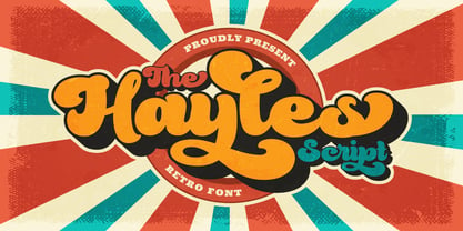 Hayles is a fun, retro-style script display font that is ready to take your designs to the next level. Add it to your vintage-inspired posters, stickers, apparel, or social media posts and you will definitely impress your audience. This font is PUA encoded, which means you can access all of the glyphs and swashes with ease!
 - Tudeprins by Bogstav,
$17.00 Tudeprins is not a really positive word - the font probably did deserve another name, but I was inspired after reading a children's novel, starring a "Tudeprins" The font is dedicated to children's books, adventures, comics or something related to that - but feel free to use "Tudeprins" for anything you like! Comes with multilingual support as well as contextual alternates!
 - Melodicstar by Balpirick,
$15.00 Melodicstar is a Modern Calligraphy Font. Melodicstar is a lovely script font featuring charming, playful characters that seem to dance along the baseline. Add this font to your most creative ideas, and notice how it makes them stand out! Melodicstar also multilingual support. Enjoy the font, feel free to comment or feedback, send me PM or email. Thank you!
 - FX Neofara by Differentialtype,
$10.00 FX Neofara is a sans serif font family that comes with 9 weights, 9 italics, and an outline. It’s perfect for documents, font logos, blogs, social media, marketing campaigns, and many other projects! FX Neofara masterfully designed to become a true favorite, this font has the potential to bring each of your creative ideas to the highest level!
 - Monchila by ahweproject,
$10.00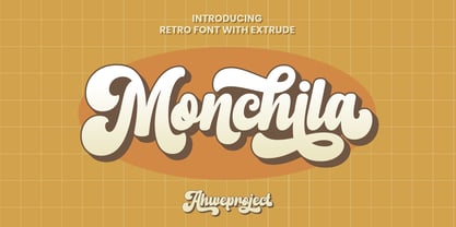 Monchila is a fun, retro-style script display font that is ready to take your designs to the next level. Add it to your vintage-inspired posters, stickers, apparel, or social media posts and you will definitely impress your audience. This font is PUA encoded, which means you can access all of the glyphs and swashes with ease!
 - Raydhen by ahweproject,
$10.00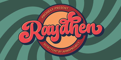 Raydhen is a fun, retro-style script display font that is ready to take your designs to the next level. Add it to your vintage-inspired posters, stickers, apparel, or social media posts and you will definitely impress your audience. This font is PUA encoded, which means you can access all of the glyphs and swashes with ease!
 - Berlin Caligram by Genesislab,
$15.00 Berlin Caligram is a fancy yet elegant display font. characters that are suitable for today's style will be very interesting for you to create any design work with a classy model that maintains a calm and classy style to look at. you must already have the inspiration to be combined with the creativity you have! Multilingual Support.
 - RM Elegance by Ray Meadows,
$19.00 With an obvious nod to Art Deco, this font offers a stylish design with distinctively elongated ascenders and descenders. Includes: Western European, Central European, Baltic & Turkish sets. Due to the modular nature of this design there may be a slight lack of smoothness to the curves at very large point sizes (around 100 pt and above).
 - TF Bombass by Teenage Foundry,
$19.00 TF Bombass – Groovy Display Font By Teenage Foundry Introducing our latest font creation – a groovy typeface that’s sure to transport you back to the funky, psychedelic era of the 60s and 70s! With its bold, playful style and unique character, this font is perfect for adding a retro feel to your design projects. Features: Uppercase, Lowercase, Numeral, Punctuation & Multilingual.