10,000 search results (0.019 seconds)
  1. Knives - Personal use only
  2. X360 by Redge - Unknown license
  3. Sofachrome - Unknown license
  4. star_font - Unknown license
  5. Scythe - Unknown license
  6. Futured - Unknown license
  7. Sonic Empire - Unknown license
  8. push - Unknown license
  9. Zamolxis I - Unknown license
  10. OregonDry - Unknown license
  11. GearBox - Unknown license
  12. Blazing - Unknown license
  13. Lastman - Unknown license
  14. Gears - Unknown license
  15. Shoplifter - Unknown license
  16. Alpha Sentry - Unknown license
  17. Chemical Reaction B BRK - Unknown license
  18. Gumtuckey - Unknown license
  19. Walkway UltraBold - Unknown license
  20. UNITED BRK - Unknown license
  21. Touchdown - Unknown license
  22. Fat Legs - Unknown license
  23. U.S.A. Condensed - Personal use only
  24. Rogue Hero Expanded Italic - Unknown license
  25. Chow Fun - Unknown license
  26. Juan Miro - Unknown license
  27. Only Fools and Horses - Unknown license
  28. Tork - Unknown license
  29. Headache - Unknown license
  30. Geared Up - Unknown license
  31. Twin Marker - Unknown license
  32. Electrik Hollow - Unknown license
  33. GALLAECIA - Unknown license
  34. Binary X BRK - Unknown license
  35. 26WOMAN - Unknown license
  36. Danube - Unknown license
  37. HOUSEPIPES - Unknown license
  38. STAR+STAR (sRB) - Unknown license
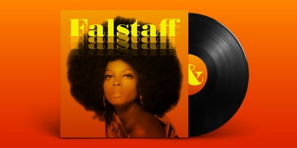
  39. Falstaff MT by Monotype, $29.99
    Falstaff first appeared with Monotype in 1931, an alphabet in the style of a wide, bold antiqua that was especially popular in the first third of the 19th century. Such typefaces distinguished themselves through their consistent basis in the transitional antiqua style. They are characterized by their extremely fine unflexed serifs with no curve connecting them to the thick strokes. The numerals with their generous curves and ball-like stroke endings and beginnings are particularly decorative. The vertical strokes are dominant and give lines of this typeface a column-like and therefore static look. Falstaff is today often used for book titling, especially for mystery novels. It is best used sparingly in middle and larger point sizes.
  40. Chet by East end, $22.00
    Chet was inspired by the lettering on the signs of American diners and gas stations in the 1950s and 60s. It is not a mere reprint of nostalgic signage letters, however. This typeface retains the boldness, uniqueness, and strength of this era, while adding a modern touch that makes it feel comfortable to use today. It is highly readable even from a distance, making it perfect for signs, posters, and website headers. Chet can also be used as a base for creating logotypes because of the unique forms of the a, n, and r. The typeface is named after Chet Baker, the jazz trumpeter who was active between the 1950s and 1970s.
Looking for more fonts? Check out our New, Sans, Script, Handwriting fonts or Categories
abstract fontscontact usprivacy policyweb font generator
Processing