10,000 search results
(0.031 seconds)
- Journal Sans New by ParaType,
$40.00 The Journal Sans typeface was developed in the Type Design Department of SPA of Printing Machinery in Moscow in 1940–1956 by the group of designers under Anatoly Schukin. It was based on Erbar Grotesk by Jacob Erbar and Metro Sans by William A. Dwiggins, the geometric sans-serifs of the 1920s with the pronounced industrial spirit. Journal Sans, Rublenaya (Sans-Serif), and Textbook typefaces were the main Soviet sans-serifs. So no wonder that it was digitized quite early, in the first half of 1990s. Until recently, Journal Sans consisted of three faces and retained all the problems of early digitization, such as inaccurate curves or side-bearings copied straight from metal-type version. The years of 2013 and 2014 made «irregular» geometric sans-serifs trendy, and that fact affected Journal Sans. In the old version curves were corrected and the character set was expanded by Olexa Volochay. In the new release, besides minor improvements, a substantial work has been carried out to make the old typeface work better in digital typography and contemporary design practice. Maria Selezeneva significantly worked over the design of some glyphs, expanded the character set, added some alternatives, completely changed the side-bearings and kerning. Also, the Journal Sans New has several new faces, such as true italic (the older font had slanted version for the italic), an Inline face based on the Bold, and the Display face with proportions close to the original Erbar Grotesk. The new version of Journal Sans, while keeping all peculiarities and the industrial spirit of 1920s-1950s, is indeed fully adapted to the modern digital reality. It can be useful either for bringing historical spirit into design or for modern and trendy typography, both in print and on screen. Designed by Maria Selezeneva with the participation of Alexandra Korolkova. Released by ParaType in 2014.
 - Didot Headline by Canada Type,
$24.95 In spite of its name, this font family embodies the ultimate classic modern advertising typeface, rather than concern itself with revivalism or Didone authenticity. Naturally the spirit of the original Didot faces still exists in this family, but over twelve years of work on it have made it more fitting to the luxurious expression of our day and age, rather than nineteenth century Europe. Upscale and stylish, Didot Headline is an essential tool for any designer involved in magazines, books, tasteful music, or overall luxury packaging that requires clean and large classic typography with an unmistakable modern spin. We recommend the use of Didot Headline between 12 and 48 points. For larger display use, check out its sister family, Didot Display.
 - Didot Display by Canada Type,
$24.95 In spite of its name, this font family embodies the ultimate classic modern advertising typeface, rather than concern itself with revivalism or Didone authenticity. Naturally the spirit of the original Didot faces still exists in this family, but over twelve years of work on it have made it more fitting to the luxurious expression of our day and age, rather than nineteenth century Europe. Upscale and stylish, Didot Display is an essential tool for any designer involved in magazines, books, tasteful music, or overall luxury packaging that requires clean and large classic typography with an unmistakable modern spin. We recommend the use of Didot Display at 48 points and over. For 12-48 pt. use, check out its sister family, Didot Headline.
 - GreenCherry by Vishwakarma Studio,
$10.00 GreenCherry typeface is for regular texts. I have designed every glyph with kept perfection in mind. I also retained symmetry throughout all glyphs. They look very premium when placed together. The typeface has 3 fonts - Thin, Normal & Bold. Every font has 210 glyphs and supports Western European languages. It has essential OpenType features like Kerning and Hinting. Hence you can use it wherever you want. It works very well with print media and web media as well. This typeface is suitable for Websites, Apps, Blogs, Book Publication, Stationery, Signage, and other Printing media. I am sure you will enjoy this typeface.
 - Bankstory by Krafted,
$10.00 Ready to enchant your audience and enhance your branding? Introducing Bankstory - An Elegant Handwritten Font. This font is all about Elegance, Style, Luxury, Professionalism, and Authority. With elegance and passion edged into every curve and twist of this handwritten font - you’ll be sure to reign in sales and make lasting impressions. Bankstory can be used for a variety of different content needs such as headings, logos, business cards, printed quotes, cards, packaging, resumes, and even your website or social media branding. Let the world see your ideas with Bankstory - An Elegant Handwritten Font. What you’ll get: Multilingual & Ligature Support Contextual Alternatives Full sets of Punctuation and Numerals Compatible with: Adobe Suite Microsoft Office KeyNote Pages Software Requirements: The fonts that you’ll receive in the pack are widely supported by most software. In order to get the full functionality of the selection of standard ligatures (custom-created letters) in the script font, any software that can read OpenType fonts will work. We hope you enjoy this font and that it makes your branding sparkle! Feel free to reach out to us if you’d like more information or if you have any concerns.
 - Type Tile by Konst.ru,
$19.00 The fastest and easiest way to create original images. It is necessary to take any text and use it with Type Tile. Create pictures, patterns and backgrounds from real texts. Font can be used in various encodings and you can type texts in many languages. Type Tile supports Central European languages that use Latin script, (Polish, Czech, Slovak, Hungarian, Slovene, Serbian, Croatian, Romanian and Albanian), Cyrillic alphabets, Western languages, Greek, Turkish, Hebrew, Arabic, Baltic languages, Vietnamese, Thai and Japanese. You can make the background from the original text for the page on which can print the translated text. This symbiosis can create a feeling of presence in the original text. Decorate the packaging in which the text is written in the form of ornament. Several layers of the texts with Type Tile shows an incredible pictures. Use a pair of letters can give a regular pattern. Type Tile provides endless and fantastic opportunities for design on any surfaces and for different purposes in publish, fashion, textiles, industry, animation, Internet and so on.
 - Precious Sans Two by G-Type,
$60.00 Precious Sans Two is a complete reworking of the 2002 design which was only ever available in PostScript format. Over a decade later G-Type’s Nick Cooke decided to re-appraise the typeface, scrutinise the old letterforms and overhaul the family. Make no mistake though, Precious Sans Two is no rudimentary re-release; nearly every character has been redrawn, re-proportioned, respaced and improved. Precious Sans Two is now in cross-platform compatible OpenType format with extended Latin language support for Western & Central Europe, the Baltics & Turkey. The original quirkier glyphs (f, g, I) have been retained as an OT style set feature and the typeface now contains small caps and an extensive set of discretionary ligatures as well as both proportional & tabular figures. The character set is further enhanced with the addition of 20 directional single and double arrows in each of the six weights which range from Thin through to Black, all with accompanying italics. Precious Sans Two is a distinctively modern typeface, well equipped for advanced typographic use in print, web and digital publishing environments.
 - FF Kaytek Headline by FontFont,
$50.99 Kaytek™ Headline completes the Kaytek typeface family with seven weights optimized for display purposes. Like the Kaytek Sans it is a fresh take on the correspondence typefaces of the 90s - which were originally designed for the demands of office environments. Just like its predecessors, this text typeface is robust and hard-working - meaning it works well in challenging design or printing environments - but it’s not without personality. Look closer at the lowercase g and a, especially in the italic, and you can see some unexpected elements of subversiveness within the design Every style of the typeface takes up exactly the same amount of space, thanks to the careful creation by Radek Lukasiewicz. This means designers can switch between styles without the text being reflowed, making it particularly useful in magazines, where space might be limited, and also on the internet, where hover links appear in a different style Kaytek Headline comes in seven weights, from Thin to ExtraBlack. Kaytek Sans, Kaytek Slab, and Kaytek Rounded, are also available.
 - Gloss by Typodermic,
$11.95 Are you ready to unleash your inner punk fashionista? Look no further than Gloss, the ultimate typeface for anyone who wants to make a statement. With its roots in Champion, a classic metal script from the ’50s, Gloss combines vintage vibes with a modern twist. But don’t be fooled by its retro origins—this font is anything but ordinary. Thanks to OpenType ligatures, each paint drip in Gloss is unique and unpredictable, adding a touch of spontaneity to your designs. And when set on an incline, the slightly skewed letters make a bold and dramatic statement. But what really sets Gloss apart is its trashy fashion edge. With a twice-recycled look that blends the best of the ’50s and ’80s, Gloss is the perfect choice for anyone who wants to embrace their inner rebel. So why settle for ordinary when you can make a splash with Gloss? Whether you’re designing a poster, creating a logo, or just looking to add some edge to your typography, Gloss is the ultimate choice for anyone who wants to stand out from the crowd. Most Latin-based European writing systems are supported, including the following languages. Afaan Oromo, Afar, Afrikaans, Albanian, Alsatian, Aromanian, Aymara, Bashkir (Latin), Basque, Belarusian (Latin), Bemba, Bikol, Bosnian, Breton, Cape Verdean, Creole, Catalan, Cebuano, Chamorro, Chavacano, Chichewa, Crimean Tatar (Latin), Croatian, Czech, Danish, Dawan, Dholuo, Dutch, English, Estonian, Faroese, Fijian, Filipino, Finnish, French, Frisian, Friulian, Gagauz (Latin), Galician, Ganda, Genoese, German, Greenlandic, Guadeloupean Creole, Haitian Creole, Hawaiian, Hiligaynon, Hungarian, Icelandic, Ilocano, Indonesian, Irish, Italian, Jamaican, Kaqchikel, Karakalpak (Latin), Kashubian, Kikongo, Kinyarwanda, Kirundi, Kurdish (Latin), Latvian, Lithuanian, Lombard, Low Saxon, Luxembourgish, Maasai, Makhuwa, Malay, Maltese, Māori, Moldovan, Montenegrin, Ndebele, Neapolitan, Norwegian, Novial, Occitan, Ossetian (Latin), Papiamento, Piedmontese, Polish, Portuguese, Quechua, Rarotongan, Romanian, Romansh, Sami, Sango, Saramaccan, Sardinian, Scottish Gaelic, Serbian (Latin), Shona, Sicilian, Silesian, Slovak, Slovenian, Somali, Sorbian, Sotho, Spanish, Swahili, Swazi, Swedish, Tagalog, Tahitian, Tetum, Tongan, Tshiluba, Tsonga, Tswana, Tumbuka, Turkish, Turkmen (Latin), Tuvaluan, Uzbek (Latin), Venetian, Vepsian, Võro, Walloon, Waray-Waray, Wayuu, Welsh, Wolof, Xhosa, Yapese, Zapotec Zulu and Zuni.
 - Acrylic Brush by Typodermic,
$11.95 Introducing Acrylic Brush, the perfect script font to add a touch of artistic flair to your designs! With its small-caps and unconnected style, this font brings a unique and sophisticated look to any project. But what really sets Acrylic Brush apart is its faded paint effect, giving your text a handcrafted, vintage vibe. And that’s not all! Thanks to its OpenType features, Acrylic Brush automatically substitutes double letter combinations with ligatures, creating a more natural and seamless appearance. So not only does this font look beautiful, it’s also incredibly easy to use and versatile. Whether you’re designing a logo, creating a poster, or adding text to a photo, Acrylic Brush is the perfect choice for anyone looking to add a touch of creativity and originality to their work. So why settle for ordinary fonts when you can elevate your designs with Acrylic Brush? Give it a try and see for yourself! Most Latin-based European, Greek, and some Cyrillic-based writing systems are supported, including the following languages. Afaan Oromo, Afar, Afrikaans, Albanian, Alsatian, Aromanian, Aymara, Bashkir (Latin), Basque, Belarusian (Latin), Bemba, Bikol, Bosnian, Breton, Bulgarian, Cape Verdean, Creole, Catalan, Cebuano, Chamorro, Chavacano, Chichewa, Crimean Tatar (Latin), Croatian, Czech, Danish, Dawan, Dholuo, Dutch, English, Estonian, Faroese, Fijian, Filipino, Finnish, French, Frisian, Friulian, Gagauz (Latin), Galician, Ganda, Genoese, German, Greek, Greenlandic, Guadeloupean Creole, Haitian Creole, Hawaiian, Hiligaynon, Hungarian, Icelandic, Ilocano, Indonesian, Irish, Italian, Jamaican, Kaqchikel, Karakalpak (Latin), Kashubian, Kikongo, Kinyarwanda, Kirundi, Komi-Permyak, Kurdish (Latin), Latvian, Lithuanian, Lombard, Low Saxon, Luxembourgish, Maasai, Macedonian, Makhuwa, Malay, Maltese, Māori, Moldovan, Montenegrin, Ndebele, Neapolitan, Norwegian, Novial, Occitan, Ossetian, Ossetian (Latin), Papiamento, Piedmontese, Polish, Portuguese, Quechua, Rarotongan, Romanian, Romansh, Russian, Sami, Sango, Saramaccan, Sardinian, Scottish Gaelic, Serbian, Serbian (Latin), Shona, Sicilian, Silesian, Slovak, Slovenian, Somali, Sorbian, Sotho, Spanish, Swahili, Swazi, Swedish, Tagalog, Tahitian, Tetum, Tongan, Tshiluba, Tsonga, Tswana, Tumbuka, Turkish, Turkmen (Latin), Tuvaluan, Uzbek (Latin), Ukrainian, Venetian, Vepsian, Võro, Walloon, Waray-Waray, Wayuu, Welsh, Wolof, Xhosa, Yapese, Zapotec Zulu and Zuni.
 - Kake by Eclectotype,
$30.00 Kake’s upper case letters are inspired by a hand-painted sign outside a temple in Ubud, Bali. The rest of the font is made to fit the style. The hand-made aesthetic is increased by the implementation of contextual alternates, which automatically swap glyphs to alternate forms to avoid the monotony of repeating letters. The amount of variations for each glyph is dependent on letter frequency in English; there are more a’s and e’s than q’s and j’s. Even with only two variations of some glyphs, the programming makes sure that no two matching glyphs are ever next to eachother, and for the most part they will rarely be even two letters apart. This all makes for type that looks like it isn't type. The glyphs bounce and subtly change weight with willful abandon. Some of the letters on that original sign are somewhat quirky. If you're not a fan you can engage stylistic alternates or stylistic sets to change the C, G, S, Y, c, s and y glyphs to a less idiosyncratic form. These variations still have variations themselves, so with contextual alternates on, they will look as random as all the rest. Case sensitive forms and automatic fractions are included, as are 98 ornaments, ranging from the useful to the (let’s just say) esoteric. These can be accessed from the glyph palette. I know you've probably never realized you need an anchor, a fuel pump, skull and crossbones and chess symbols in the same font before, but that doesn't mean you don't! Kake is full on display typography. It’s legible for small blocks of copy but don't go setting essays in it. Unless you really want to... in which case, go for it.
 - Secret Memories by Flawlessandco,
$9.00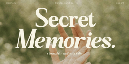 Secret Memories is a Serif Italic Font with a classy and elegant style in each character, so it's fitted for some wedding invitation display. There's some connected letters and some alternates that suitable for any graphic designs such as branding materials, t-shirt, print, business cards, logo, poster, t-shirt, photography, quotes .etc This font support for some multilingual. Also contains uppercase A-Z and lowercase a-z, alternate character, numbers 0-9, and some punctuation. If you need help, just write me! Thanks so much for checking out my shop!
 - Momentic Yesterday by Flawlessandco,
$9.00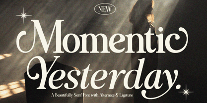 Momentic Yesterday is a Modern Font Duo that contains Serif and Italic Typeface also gives a feel of Elegant font type. There's some connected letters and some alternates that suitable for any graphic designs such as branding materials, t-shirt, print, business cards, logo, poster, t-shirt, photography, quotes .etc This font support for some multilingual. Also contains uppercase A-Z and lowercase a-z, alternate character, numbers 0-9, and some punctuation. If you need help, just write me! Thanks so much for checking out my shop!
 - Random Notes by Gassstype,
$23.00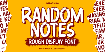 Hello Everyone,introduce our new product Random Notes is a Rough Display Font Handmade Font is a Strong Style and classy style, This font is great for your next creative project such as logos, printed quotes, invitations, cards, product packaging, headers, Logotype, Letterhead, Poster, Label, cartoon, and comic etc. This font is great for your creative projects such as watermark on photography, and perfect for logos & branding, photography, invitation. Random Notes a natural handwritten feel. This handmade font will make your design has a beautiful natural touch for each details.
 - Visia Pro by Designova,
$12.00 VISIA Pro - Our flagship Geometric Sans-Serif typeface, a perfect blend of elegant, minimal and premium design aesthetics at it's level best. A perfect typeface for logotypes, headlines, branding, marketing graphics, corporate identities, all web & print purposes. This pack comes with a total of 14 fonts: 7 Weights (Extra Light / Light / Regular / Semi Bold / Bold / Extra Bold / Heavy) 7 Weights of Italic versions (Extra Light / Light / Regular / Semi Bold / Bold / Extra Bold / Heavy) Each weight includes extended language support including Western European & Central European sets. A total of 258 glyphs are included.
 - Flossy by Gassstype,
$23.00 Here comes our new font Flossy is a Handwritten Brush font with a Rough style and dramatic movement. This font is great for your next creative project such as logos, printed quotes, invitations, cards, product packaging, headers, Logotype, Letterhead, Poster, Label, and etc. This font are handmade with brushes on Procreate. Then crafted carefully drawn into vector format. Flossy a natural handwritten feel. This handmade font will make your design has a beautiful natural touch for each details. It is perfect for any design project as Invitation,logo, book cover, craft or any design purposes.
 - Golden Cosmic by Flawlessandco,
$9.00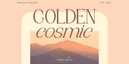 Golden Cosmic is a Serif Italic Font with a classy and elegant style in each character, so it's fitted for some wedding invitation display. There's some connected letters and some alternates that suitable for any graphic designs such as branding materials, t-shirt, print, business cards, logo, poster, t-shirt, photography, quotes .etc This font support for some multilingual. Also contains uppercase A-Z and lowercase a-z, alternate character, numbers 0-9, and some punctuation. If you need help, just write me! Thanks so much for checking out my shop!
 - Mondrake by Flawlessandco,
$9.00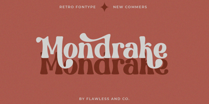 Mondrake is a modern retro with a fun and bold style that perfect for your retro-themed projects. Try out some alternate characters for another visual result! There's some connected letters and some alternates that suitable for any graphic designs such as branding materials, t-shirt, print, business cards, logo, poster, t-shirt, photography, quotes .etc This font support for some multilingual. Also contains uppercase A-Z and lowercase a-z, alternate character, numbers 0-9, and some punctuation. If you need help, just write me! Thanks so much for checking out my shop!
 - Recording Artist JNL by Jeff Levine,
$29.00 When 45 RPM records were the norm for a teenager’s music collection in the 1950s and 1960s, many discs had their labels printed by letterpress. Some record companies utilized a bold, condensed typeface set in all caps for the song’s title and other pertinent information. The digital version of this font is called Recording Artist JNL, and is available in both regular and oblique versions. A companion font loosely based on this type design [but with more original characters and a slightly lighter weight] is Promotional Copy JNL.
 - Dominic by Flawlessandco,
$9.00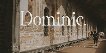 Dominic is a Serif Italic Font with a classy and elegant style in each character, so it's fitted for some wedding invitation display. There's some connected letters and some alternates that suitable for any graphic designs such as branding materials, t-shirt, print, business cards, logo, poster, t-shirt, photography, quotes .etc This font support for some multilingual. Also contains uppercase A-Z and lowercase a-z, alternate character, numbers 0-9, and some punctuation. If you need help, just write me! Thanks so much for checking out my shop!
 - Mothern by Flawlessandco,
$9.00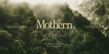 Mothern is a Serif Italic Font with a classy and elegant style in each character, so it's fitted for some wedding invitation display. There's some connected letters and some alternates that suitable for any graphic designs such as branding materials, t-shirt, print, business cards, logo, poster, t-shirt, photography, quotes .etc This font support for some multilingual. Also contains uppercase A-Z and lowercase a-z, alternate character, numbers 0-9, and some punctuation. If you need help, just write me! Thanks so much for checking out my shop!
 - Benogi by Flawlessandco,
$9.00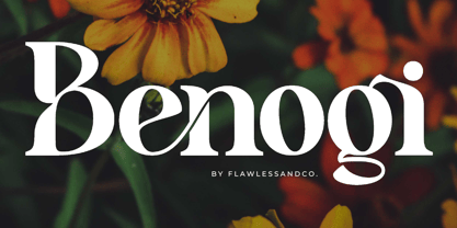 Benogi is a Modern Retro Font with a classy and unique style in each character, so it's fitted for some wedding invitation display. There's some connected letters and some alternates that suitable for any graphic designs such as branding materials, t-shirt, print, business cards, logo, poster, t-shirt, photography, quotes .etc This font support for some multilingual. Also contains uppercase A-Z and lowercase a-z, alternate character, numbers 0-9, and some punctuation. If you need help, just write me! Thanks so much for checking out my shop!
 - Croist by Flawlessandco,
$9.00 Croist is a modern retro with a fun and bold style that perfect for your retro-themed projects. Try out some alternate characters for another visual result! There's some connected letters and some alternates that suitable for any graphic designs such as branding materials, t-shirt, print, business cards, logo, poster, t-shirt, photography, quotes .etc This font support for some multilingual. Also contains uppercase A-Z and lowercase a-z, alternate character, numbers 0-9, and some punctuation. If you need help, just write me! Thanks so much for checking out my shop!
 - Helios Retro by Flawlessandco,
$9.00 Helios Retro is a modern retro with a fun and bold style that perfect for your boho-themed projects. Try out some alternate characters for another visual result! There's some connected letters and some alternates that suitable for any graphic designs such as branding materials, t-shirt, print, business cards, logo, poster, t-shirt, photography, quotes .etc This font support for some multilingual. Also contains uppercase A-Z and lowercase a-z, alternate character, numbers 0-9, and some punctuation. If you need help, just write me! Thanks so much for checking out my shop!
 - Mocassa by Flawlessandco,
$9.00 Introducing "Mocassa" - a captivating handwritten sans serif font that combines the charm of handcrafted letterforms with the versatility of a modern sans serif typeface. There's some connected letters and some alternates that suitable for any graphic designs such as branding materials, t-shirt, print, business cards, logo, poster, t-shirt, photography, quotes .etc This font support for some multilingual. Also contains uppercase A-Z and lowercase a-z, alternate character, numbers 0-9, and some punctuation. If you need help, just write me! Thanks so much for checking out my shop!
 - Brahmasta by Flawlessandco,
$9.00 Brahmasta is a modern serif with a classic retro style that perfect for your retro-themed projects. Try out some alternate characters for another visual result! There's some connected letters and some alternates that suitable for any graphic designs such as branding materials, t-shirt, print, business cards, logo, poster, t-shirt, photography, quotes .etc This font support for some multilingual. Also contains uppercase A-Z and lowercase a-z, alternate character, numbers 0-9, and some punctuation. If you need help, just write me! Thanks so much for checking out my shop!
 - Nadier by Flawlessandco,
$9.00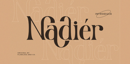 Nadier is a Modern Serif Font that made with a classic style in each character, so it's fitted for some wedding invitation display. There's some connected letters and some alternates that suitable for any graphic designs such as branding materials, t-shirt, print, business cards, logo, poster, t-shirt, photography, quotes .etc This font support for some multilingual. Also contains uppercase A-Z and lowercase a-z, alternate character, numbers 0-9, and some punctuation. If you need help, just write me! Thanks so much for checking out my shop!
 - Morris by HiH,
$10.00 Morris is a four-font family produced by HiH Retrofonts and based on the work of the very English William Morris. William Morris wanted a gothic type drawn from the 14th century blackletter tradition that he admired both stylistically and philosophically. He drew from several sources. His principal inspiration for his lower case was the 1462 Bible by Peter Schoeffer of Mainz; particularly notable for the first appearance of the ‘ear’ on the g. The upper case was Morris’s amalgam of the Italian cursive closed caps popular throughout the 12th through 15th centuries, a modern example of which is Goudy’s Lombardic Capitals. The gothic that Morris designed was first used by his Kelmscott Press for the publication of the Historyes Of Troye in 1892. It was called “Troy Type” and was cut at 18 points by Edward Prince. It was also used for The Tale of Beowulf. The typeface was re-cut in at 12 points and called “Chaucer Type” for use in The Order of Chivalry and The Works of Geoffrey Chaucer. Morris' objective is designing his gothic was not only to preserve the color and presence of his sources, but to create letters that were more readable to the English eye. ATF copied Troy and called it Satanick. Not only was the ATF version popular in the United States; but, interestingly, sold very well in Germany. There was great interest in that country in finding a middle ground between blackletter and roman styles -- one that was comfortable for a wider readership. The Morris design was considered one of the more successful solutions. Our interpretation, which we call Morris Gothic, substantially follows the Petzendorfer model used by other versions we have seen, with the following exceptions: 1) a larger fillet radius on the upper arm of the H, 2) a more typically broadpen stroke in place of the foxtail on the Q, which I do not like, 3) inclusion of the aforementioned ear on the g and 4) a slightly shorter descender on the y. We have included five ornaments, at positions 0135, 0137, 0167, 0172 and 0177. The German ligatures ‘ch’ & ‘ck’ can be accessed using the left and right brace keys (0123 & 0125). Morris Initials One and Morris Initials Two are two of several different styles of decorative initial letters that Morris designed for use with his type. He drew from a variety of 15th century sources, among which were Peter Schoeffer’s 1462 Mainz Bible and the lily-of-the-valley alphabet by Gunther Zainer of Augsburg. Each of the two initial fonts is paired with the Morris Gothic lower case. Morris Ornaments is a collection of both text ornaments and forms from the surrounding page-border decorations.
 - Fontenay Fancy - Personal use only

- Geometry Soft Pro by CheapProFonts,
$10.00 The Geometry Pro family has been designed to be the final word in purely geometric fonts, and this rounded “Soft” sub-family is the ultimate web 2.0 style font collection. Even though it is strictly geometric (as drawn with a compass and a ruler fixed to 90 and 45 degree angles) it is not slavishly modular: letters have differing widths, and the sidebearings, spacing and kerning has been finely adjusted to create smooth text. The Soft family contains three weights each with 6 variants: A is the basic form and the starting point B has more dynamic and modern shapes C has open and swirly shapes X is the serious text version Y has a very horizontal look Z is a collection of all the remaining more funky shapes Mix and match to your heart’s desire! Please enjoy the free “Bold N” version - this “notched” variant lets you test out the quality of the outlines and the language support. ALL fonts from CheapProFonts have very extensive language support: They contain some unusual diacritic letters (some of which are contained in the Latin Extended-B Unicode block) supporting: Cornish, Filipino (Tagalog), Guarani, Luxembourgian, Malagasy, Romanian, Ulithian and Welsh. They also contain all glyphs in the Latin Extended-A Unicode block (which among others cover the Central European and Baltic areas) supporting: Afrikaans, Belarusian (Lacinka), Bosnian, Catalan, Chichewa, Croatian, Czech, Dutch, Esperanto, Greenlandic, Hungarian, Kashubian, Kurdish (Kurmanji), Latvian, Lithuanian, Maltese, Maori, Polish, Saami (Inari), Saami (North), Serbian (latin), Slovak(ian), Slovene, Sorbian (Lower), Sorbian (Upper), Turkish and Turkmen. And they of course contain all the usual “western” glyphs supporting: Albanian, Basque, Breton, Chamorro, Danish, Estonian, Faroese, Finnish, French, Frisian, Galican, German, Icelandic, Indonesian, Irish (Gaelic), Italian, Northern Sotho, Norwegian, Occitan, Portuguese, Rhaeto-Romance, Sami (Lule), Sami (South), Scots (Gaelic), Spanish, Swedish, Tswana, Walloon and Yapese.
 - Abril by TypeTogether,
$39.00 Conceived specifically for intensive editorial use, whether it is in newspapers, magazines or digital media, Abril is a font family of two worlds. The titling weights, based on a contemporary revamp of classic Didone styles, display both neutrality and strong presence on the page, attracting the reader’s attention with measured tension in its curves, good color and high contrast. It also features typographic niceties such as ornaments, borders, special dingbats and alternate letters and numbers that propose a broad palette of tools to the designer. The text weights are more closely inspired by both, 19th century slab serifs and scotch roman types. They maintain consistency with the headline styles, and at first glance may appear to have the same shapes only with lower contrast. However, in reality the letter forms of Abril Text were engineered from scratch to achieve a color, texture and overall width that allow using the font comfortably in the most challenging environments for continuous reading, such as newspapers. This also makes it a great font family for pocketbooks and magazines. Abril competes, in terms of economy of space, head to head with some newspaper classics such as Utopia or Nimrod, but featuring a more contemporary look and feel; and unlike them, includes a full set of small caps with numbers and punctuation. The four main text weights of Abril Text were also manually hinted which grants the possibility of a smooth transition from printed media to web platform. Abril consists of 8 text styles and 12 display styles, all of them containing the standard TypeTogether character set that supports over 50 languages including those from Central and Northern Europe.
 - Swissa Piccola by Jeremia Adatte,
$30.00 The Swiss typewriters were famous for their unique precision. As complex digitalizations and macro shots were a start for the inspiration and studies, each character has been carefully re-crafted from the ultra high def scans of the printouts made on a special bleed-proof paper. Today’s characters such as @, euro sign and most of accents have been crafted according the original alphabet design. The idea was to digitize and keep a saving of the original typewriter including all its functions (e.g. underlining key) . It’s surprisingly very legible at small sizes. Thanks to an x-height tighter and more spaced, a glyph design less detailed and more neutral/simple than other fonts found on american or italian typewriters. The final artwork can be set at very large sizes due to the highly detailed glyph design. Swissa Piccola Regular is loaded with more than 150 glyphs created with the typewriter to avoid letter repetition in a word. This OpenType feature can be accessed through the 'discretionary ligatures' option. Plus it comes with two stylistic sets : one with an original underlining feature, another with a slashed-x feature. In which all characters are unique and also have been originally typed with the typewriter. It contains more 600 glyphs in total. The two features are separated in another two fonts (Swissa Piccola Slashed x and Underlined) in case a non OT-savvy app is used. If you wish to obtain exactly the same prints as the original Swissa Piccola typewriter, you should set your font at 11.3 pt and 19.5 pt of line spacing. The Swissa Piccola font was originally offered in a dedicated limited edition packaging.
 - Sancoale Slab Soft by insigne,
$24.75 Ready for the designs of today, the Sancoale superfamily takes a softer turn with a rounded slab serif. Crafted from Sancoale’s simple geometry, new softened slab serifs provide a lively typeface that conveniently enhances its cousins: Sancoale Softened--a sans with blunted terminals; Sancoale Slab; and, certainly, the first Sancoale. The weights of each and every member are balanced diligently to be compatible with one another. When used alongside one another, the combination makes for robust and tight design. With weights starting with the slender thin ranging to the juicy black, Slab Soft opens the doorway to the vary of uses. Its design is legible and neutral enough for bodies of copy--both in print and on your website. The web font also stands out perfectly as a headline or a display face. Slab Soft carefully places a foot ahead, and doesn't overpower like many slabs. This font’s the choice to seize the day and get the job done. All insigne™ fonts are absolutely loaded with OpenType options. Sancoale Slab is geared up for pro typography, together with alternates with stems, compact caps and lots of alts, together with “normalized” capitals and lowercase letters. The font features many numeral sets, with fractions, old-style and lining figures with superiors and inferiors. OpenType-capable programs like Quark or the Adobe suite allow you to quickly change ligatures and alternates. You can see these options shown in the .pdf brochure. Bundled are compact caps, fractions, old-style and lining quantities, scientific superior/inferior figures, entire ordinal and inferior alphabet. The Sancoale superfamily also features the glyphs to aid a variety of languages, together with Central, Eastern and Western European languages. In all, Sancoale Slab supports around forty languages that utilize the Latin script, earning Sancoale the pick for for multi-lingual publications and packaging.
 - Urbax by Eko Bimantara,
$16.00 Urbax; Bold expressive script for urban people and urban projects. Fit for Logo, Brand, Titling, Shirt, Hoodie, Products, Signage, Prints and Various Creative Projects. Contain 5 stylistic sets with lot of alternates. Contain basic latin multilanguage support.
 - Catalyst by Ryan Williamson,
$- Catalyst is an attempt at increasing the economy of print while retaining optimal legibility through type design. This type family does so through subtle and intentional OpenType features, as well as referencing successful past attempts throughout history.
 - Shirin by Ahmet Altun,
$- With this nice, rounded-corner handwriting font that is like comic, slab style; sweet and radiant logos, texts and every kind of graphics, editions and printings like magazines, brochures can be created. Text printouts look pretty smart.
 - MEGA SLANT LINE by TypoGraphicDesign,
$19.00 CONCEPT/CHARACTERISTICS This strikingly bold, black and extended 3D font reminiscent of sci-fi films and experimental typeface design. The font acts as a chain of ligatures and thus receives a unique aesthetic. The unique letter forms are in sharp contrast to other fonts and thus stand out as a unique selling point. APPLICATION AREA Posters, music cover, book cover, logos, as a headline font for magazines or websites … TECHNICAL SPECIFICATIONS Headline Font | Display Font | Sci-Fi Font »Mega Slant Line« OpenType Font with 303 glyphs – alternative letters and ligatures (with accents & €) & 2 styles (regular & 3d) KONZEPT/BESONDERHEITEN Diese auffällig plakative, fette und breitlaufende 3D Schrift erinnert an Sci-Fi Filme und ist experimentelle Schriftgestaltung. Die Schrift wirkt wie eine Kette aus Ligaturen (Buchstabenverbindungen) und erhält somit eine ganz eigene Ästhetik. Die sehr eigenen Buchstabenformen werden sich deutlich von anderen Schriften abheben und somit als Alleinstellungsmerkmal herausstechen. Der Fluss ergiebt sich aus den EINSATZGEBIETE Plakate aller Art, Musik Cover, Buchcover, für Logos und Wortmarken, als Displayschrift für Zeitschriften oder Websites… TECHNISCHE INFORMATIONEN Headline Font | Display Font | Sci-Fi Font »Mega Slant Line« OpenType Font with 303 glyphs – alternative letters and ligatures (with accents & €) & 2 styles (regular & 3d)
 - Spitzkant Variable by Julien Fincker,
$185.00 About the design Spitzkant is a serif typeface family that is characterized by strong contrasts. Pointed, sharp serifs and edges contrast with round and fine forms, making it very individual and expressive. This makes it particularly suitable for branding, editorial, packaging and advertising. The high-contrast display version has been complemented by a lower-contrast text version, making Spitzkant in combination suitable for both strong headlines and extensive body text. An allrounder that can be used for many purposes. Variable Font The Variable Font contains 3 axes: weight, oblique and optical size – all in just one file. Features With over 850 characters, it covers over 200 Latin-based languages. It also has an extended set of currency symbols and a whole range of open type features. For example, there are alternative characters as Stylistic Sets, Small Caps, automatic fractions and many other features. Ligatures Especially the extensive selection of ligatures (standard and optional) is a special feature which was an important part during the design process. With over 95 different ligatures there are many possibilities to give headlines and logos an individual touch. Get the usual version of the Spitzkant family here: https://www.myfonts.com/fonts/julien-fincker/spitzkant/
 - Milk Drops by Duck Soup Design,
$12.00 Milk Drops is a semi-casual-feeling cross between a didone and slab serif display font. Elegant, flourishy, whimsical and bold, as much as one font can be any or all of those things! It has highly contrasting weights, but not so much to take itself too seriously or risk legibility. Playfully, it entertains the teardrop motif wherever it can – in expected areas like the descender of a "y" and the ascender of an "f", but also in some whimsical flourishes. Many of the uses of the teardrop motif are implemented on the terminals and ears where many old prints may have suffered from bleed of ink – answering a "what if" question like "what if those accidental bleeds were designed on purpose?" or "what if a font were designed as though it was already seen through blurry eyes?" Milk Drops also features stencil-like open counters and lots of ligatures (32). Note also, it has some super-nerdy additions like symbols for Bitcoin, Pilcrow, Interrobang and Irony Mark. Language Support Milk Drops is highly versatile – with an impressive count of 470 glyphs, it can accommodate up to 78 latin-based languages.
 - Gold Rush by FontMesa,
$25.00This old classic font has an interesting history, it was originally cut with lowercase by the Bruce Type Foundry in 1865 and listed as Ornamented No. 1514. Around 1903 the Bruce foundry was bought by ATF, in 1933 this font was revived by ATF as Caps only and was given the Gold Rush name but was sometimes called Klondike. A similar version of this font with lowercase and radiused serifs was produced by the James Conner's Sons Type Foundry around 1888. In the past other foundries such as the Carroll foundry, Type Founders of Phoenix and the Los Angeles Type Foundry have produced an all caps version of this font. After examining several printed sources of this font from more recent books I found that the original from Bruce's 1882 book was by far the best in design quality, it was also the only printed source that included the lowercase. New open faced, ornamented and distressed versions have been added to this old classic font, there are also many extended characters for Western, Central and Eastern European countries. The Gold Rush Trail OpenType version has alternate double letter pairs included in the font and will automatically be substituted when used in Adobe CS products or other software that takes advantage of OpenType features. Also available is a spurred version of this font listed under the name Gold Spur.
