10,000 search results
(0.028 seconds)
- Hiragino Sans Rounded by SCREEN Graphic Solutions,
$210.00 Hiragino Sans Rounded (Maru Gothic) is derived from the basic design of the Hiragino Sans (Kaku Gothic) with its wide counters and comfortable appearance. It features gentle typeface that provides graceful roundedness to the tips of all the strokes of a character. On the flip side of this gentle impression is the fact that every single element in the Hiragino Sans upon which this typeface is based has been carefully polished down in every respect in pursuit of an elegant roundness that makes it possible to handle carefully executed typesetting. That approach is clearly different from the general rounded typeface that makes full use of the body, and makes it possible to respond the requirement of professional typesetting. It is never-uninteresting design whose letterform is rooted in the traditions of traditional printing type. It is a font that of course can be used on its own and easily formatted just like Hiragino Sans while adding splendid coloring to the page. Furthermore, when used with other Hiragino fonts such as Hiragino Sans or Hiragino Serif (Mincho), the fact that all their designs are oriented on the same vector creates a multiplier effect. The user may be surprised at the sense of unity that cannot be experienced when combining it with other typefaces.
 - Roadbrush by Kustomtype,
$25.00 Roadbrush was inspired by the mid-20th-century hand lettering of Albert Eckhardt, Jr., that I found in a 1950’s sign painting book. Roadbrush is a retro brush-style script that I re-designed and completely re-mastered. Roadbrush is a powerful font that can be used for logotype, packaging, posters, T-shirts, signage & design projects with a retro & vintage feel. Roadbrush comes with four styles that contain all upper and lower case characters, punctuation, numerals and mathematical operators, as well as all accented characters.
 - Monora by Flawlessandco,
$9.00 Monora is a sleek and modern sans serif font that embodies contemporary design with clean lines and a minimalist aesthetic. There's some connected letters and some alternates that suitable for any graphic designs such as branding materials, t-shirt, print, business cards, logo, poster, t-shirt, photography, quotes .etc This font support for some multilingual. Also contains uppercase A-Z and lowercase a-z, alternate character, numbers 0-9, and some punctuation. If you need help, just write me! Thanks so much for checking out my shop!
 - Revla Serif by Eclectotype,
$40.00 Meet Revla Serif, an unashamedly spirited font, with a spring in its step and a lust for life. Loosely based on a few letterforms from a mid century poster, it takes the feel of Madison Avenue print ads and runs with it. OpenType acrobatics ensure letters don't repeat monotonously, using the contextual alternates feature. Also included for your viewing pleasure - automatic fractions, case sensitive forms and one solitary stylistic alternate, an alternative ampersand. And that's it! Put the fun back into your text with Revla Serif.
 - Deandra by Flawlessandco,
$9.00 Deandra is a Familly Serif Font with 18 variant style, that gives a feel of Elegant font type. There's some connected letters and some alternates that suitable for any graphic designs such as branding materials, t-shirt, print, business cards, logo, poster, t-shirt, photography, quotes .etc This font support for some multilingual. Also contains uppercase A-Z and lowercase a-z, alternate character, numbers 0-9, and some punctuation. If you need help, just write me! Thanks so much for checking out my shop!
 - Nutshell by Gassstype,
$25.00 Hello Everyone, introduce our new product font Nutshell is a Natural Handwritten Brush Font with a natural style and dramatic movement. Crafted manually with love and passion, This font is great for your next creative project such as logos, printed quotes, invitations, cards, product packaging, headers, Logotype, Letterhead, Poster, Label, and etc. Every glyphs are made with Procreate. Then trace down into a vector format, and carefully crafted into a typeface. That is why Nutshell has textured,cool, authentic and strong characteristic more natural look.
 - Barchowsky Fluent Hand by Swansbury,
$24.00Swansbury, Inc. provides handwriting instruction to all ages, accompanied by two exemplar fonts, Barchowsky Fluent Hand.otf and Barchowsky Dot.otf. The basis for the design of the characters is the italic of the Renaissance. With the advantage of contextual alternates, Barchowsky Fluent Hand automatically joins lowercase letters so it can be used in any venue where a clean and elegant appearance of handwriting is desired. The fonts allow maximum instructional flexibility. Aside from their use in lesson plans, educators can customize pages for specific student interests, studies and needs. Included are all math symbols that one typically encounters in school curricula. Nan Jay Barchowsky, designer of this font, believes that children should hone their handwriting skills as they learn all subjects, reading, math, history and foreign languages. Both fonts support all Western European languages and Turkish. Barchowsky Dot is for young children or others who need remediation. The letterforms are identical to those in Barchowsky Fluent Hand. Used at a large point size open dots appear within the lines that form the characters indicating where one should start each stroke in a letter or number. Once formations are learned Barchowsky Fluent Hand can be used with the contextual alternates turned off until students are ready to write in the joined-up manner of a true cursive. Specifications: The technology for fonts that automatically join letters, or allow them to be unjoined is relatively new. At present, both fonts work on Windows XP with Service Pack 1 or later (or Vista), using AbiWord, a free word processor (go to abisource.com). They also work well with InDesign 2. Currently there is an unknown factor in later versions of InDesign for Windows that disallows joining. Macs completely support the fonts using InDesign 2 and later, PhotoshopCS and IllustratorCS. If you do not have these applications, there is an inexpensive word processor for Macs. - Barchowsky Dot by Swansbury,
$17.00Swansbury, Inc. provides handwriting instruction to all ages, accompanied by two exemplar fonts, Barchowsky Fluent Hand.otf and Barchowsky Dot.otf. The basis for the design of the characters is the italic of the Renaissance. With the advantage of contextual alternates, Barchowsky Fluent Hand automatically joins lowercase letters so it can be used in any venue where a clean and elegant appearance of handwriting is desired. The fonts allow maximum instructional flexibility. Aside from their use in lesson plans, educators can customize pages for specific student interests, studies and needs. Included are all math symbols that one typically encounters in school curricula. Nan Jay Barchowsky, designer of this font, believes that children should hone their handwriting skills as they learn all subjects, reading, math, history and foreign languages. Both fonts support all Western European languages and Turkish. Barchowsky Dot is for young children or others who need remediation. The letterforms are identical to those in Barchowsky Fluent Hand. Used at a large point size open dots appear within the lines that form the characters indicating where one should start each stroke in a letter or number. Once formations are learned Barchowsky Fluent Hand can be used with the contextual alternates turned off until students are ready to write in the joined-up manner of a true cursive. Specifications: The technology for fonts that automatically join letters, or allow them to be unjoined is relatively new. At present, both fonts work on Windows XP with Service Pack 1 or later (or Vista), using AbiWord, a free word processor (go to abisource.com). They also work well with InDesign 2. Currently there is an unknown factor in later versions of InDesign for Windows that disallows joining. Macs completely support the fonts using InDesign 2 and later, PhotoshopCS and IllustratorCS. If you do not have these applications, there is an inexpensive word processor for Macs. - Monograf by Milan Pleva,
$10.00 Monograf was originally designed as fixed-width monospaced font which has 2 weights (Regular and Bold). Monograf Text is a derived style of Monograf with proportional spacing and well-balanced kerning to make the text easier to read and look optically balanced. So in the total bundle you get 4 pieces of this font: Monograf Regular, Monograf Bold, Monograf Text Regular and Monograf Text Bold. This versatile font with clean geometry and slightly rounded corner elements works great in digital space, as well in print. It also retains its legibility at smaller sizes. Typographic features include old-style figures, directional arrows and four types of asterisks. The entire font is suitable for purposes such as tabular layout, coding, website, but also for magazines, logos, signs, products, and others. Features: Basic latin alphabet A-Z 116 Accented characters Numbers, Punctuation, Currency, Symbols, Math symbols & Diacritics Old style figures, Directional arrows and 4 asterisks
 - Romantic Jets by Typodermic,
$11.95 Introducing Romantic Jets—a display typeface that breaks all the rules and challenges the traditional norms of typography. Inspired by the raw and rugged beauty of brutalist architecture, Romantic Jets infuses an unconventional and futuristic appeal to your designs. With its sharp edges and unconventional shapes, this typeface injects a unique technical aesthetic to your message. The way Romantic Jets uses negative space will not only make your text stand out, but also create a mesmerizing visual experience for your audience. But what truly sets Romantic Jets apart is its peculiar index holes. These little cutouts add a touch of quirkiness and playfulness to an otherwise bold and brutal typeface. Use them to add character to your designs, or make them the focal point of your message. Whether you’re looking to create a bold, eye-catching poster, a sleek and modern logo, or a futuristic sci-fi book cover, Romantic Jets is the typeface that will make your designs truly stand out. Try it out today and experience the power of unconventional typography. Most Latin-based European writing systems are supported, including the following languages. Afaan Oromo, Afar, Afrikaans, Albanian, Alsatian, Aromanian, Aymara, Bashkir (Latin), Basque, Belarusian (Latin), Bemba, Bikol, Bosnian, Breton, Cape Verdean, Creole, Catalan, Cebuano, Chamorro, Chavacano, Chichewa, Crimean Tatar (Latin), Croatian, Czech, Danish, Dawan, Dholuo, Dutch, English, Estonian, Faroese, Fijian, Filipino, Finnish, French, Frisian, Friulian, Gagauz (Latin), Galician, Ganda, Genoese, German, Greenlandic, Guadeloupean Creole, Haitian Creole, Hawaiian, Hiligaynon, Hungarian, Icelandic, Ilocano, Indonesian, Irish, Italian, Jamaican, Kaqchikel, Karakalpak (Latin), Kashubian, Kikongo, Kinyarwanda, Kirundi, Kurdish (Latin), Latvian, Lithuanian, Lombard, Low Saxon, Luxembourgish, Maasai, Makhuwa, Malay, Maltese, Māori, Moldovan, Montenegrin, Ndebele, Neapolitan, Norwegian, Novial, Occitan, Ossetian (Latin), Papiamento, Piedmontese, Polish, Portuguese, Quechua, Rarotongan, Romanian, Romansh, Sami, Sango, Saramaccan, Sardinian, Scottish Gaelic, Serbian (Latin), Shona, Sicilian, Silesian, Slovak, Slovenian, Somali, Sorbian, Sotho, Spanish, Swahili, Swazi, Swedish, Tagalog, Tahitian, Tetum, Tongan, Tshiluba, Tsonga, Tswana, Tumbuka, Turkish, Turkmen (Latin), Tuvaluan, Uzbek (Latin), Venetian, Vepsian, Võro, Walloon, Waray-Waray, Wayuu, Welsh, Wolof, Xhosa, Yapese, Zapotec Zulu and Zuni.
 - Type Tiles JNL by Jeff Levine,
$29.00 Type Tiles JNL is based on a ‘completed’ version of ‘Alpha-Blox’ by American Type Founders, circa 1944. The capitals, lower case and numerals shown in the sample sheet put out by ATF depicted type made with five-high blocks comprised of modular units spaced two points apart. These units could be combined in varying ways to create custom type of varying heights and widths and was available for purchase in both linear (multi-line) and reverse (white on black) formats. Using the 'reverse' model shown on the sample sheet, all of the characters were re-created digitally, and missing punctuation, foreign characters and other glyphs found in a basic computer font were drawn and added. The 'J' and 'T' in the type sample had truncations, so a more complete character was created for each of those letters. For those wanting an unbroken string of words or blank end caps, there is a double column space on the vertical bar key. A single column space is located on the broken bar key for shorter end caps. Type Tiles JNL is available in both regular and oblique versions
 - Algerian Mesa by FontMesa,
$25.00 Inspired by the old Stephenson Blake Caps only font Algerian from 1908, this version, named Algerian Mesa, has been freshened up with a new matching lowercase. The original Algerian, on page 142 of the 1908 Stephenson Blake specimen book, was a small caps to a more decorative lining caps and the plain black version, without the shadow line, was named Gloria. Also on page 142 of the 1908 Stephenson Blake specimen book is a shaded Latin font that gave me the idea for the Alt version of Algerian Mesa. The Alt version works well at smaller point sizes combined with the regular Algerian Mesa font on the same page. New for 2016 were Opentype features including original alternates, oldstyle numerals and case sensitive forms, also new is a fully usable Alt version. New for 2022 are the higher x-height, 90% small caps, 80% small caps and all new italic versions. Also new for 2022 are straight sided accent marks replacing the flared or curved accents. While Algerian Mesa includes some alternates our related Tavern font will still remain the version with more alternates and more weights.
 - Ohex by kome.studio,
$12.00 Contemporary geometric typeface. Ohex™font family consists of 5 unique font styles — thin, light, regular, bold and black + VARIABLE version. Opentype features including stylistic alternates, ligatures and kerning pairs. Currency glyphs and stylish digits. Capital letters are designed on the shape of a hexagon. Lowercase letters to cooperate with them, refers to the street style look. Great for logos, posters, magazine layouts, headers, apparel and prints. - Multilanguage support covering Western, South and Central Europe. 1256 Latin 1 / 1250 Latin 2: Eastern Europe / 1254 Turkish / 1257 Windows Baltic / Macintosh Character Ser (US Roman) 1256 Latin 1: Afrikaans, Basque, Catalan, Danish, Dutch, English, Faeroese, Finnish, French, Galician, German, Icelandic, Irish, Italian, Norwegian, Portuguese, Scottish, Spanish, and Swedish. 1250 Latin 2: Eastern Europe / 1254 Turkish / 1257 Windows Baltic : Czech, Polish, Hungarian, Croatian, Romanian, Estonian, Latvian , Lithuanian, Turkish, Slovak and Slevenian -
 - Gazi by Fontuma,
$24.00 Gazi is the honorary title given by the state to the commanders who defeated the enemy by showing extraordinary benefits. This title was first given to Mustafa Kemal Atatürk by the Turkish Grand National Assembly on September 19, 1921. Gazi font was designed for Mustafa Kemal Atatürk, who founded the Turkish Republic. This type face consists of two families:: ▪ Gazi: Font family with Latin alphabets ▪ Gazi Pro: Font family including Latin and Arabic alphabets The Gazi font family is ideal for those looking for a new and aesthetic serif font. This font with modern lines can be used in all broadcast and printing areas. Gazi font will meet your needs and expectations in terms of the number of glyphs and the languages it supports. The font family includes many open type features, as well as some ligatures, and many currency symbols.
 - Buckedtalk by LetterStock,
$27.00 Bucked Talk Font This pair was inspired by the vintage design that i saw on my friend's garage. It was crafted by hand specially to add natural handmade feeling in its brand identity than i make it clean with pentool. Opentype feature Bucked Talk font has 209 character set included stylistic alternate and ligature Bucked Talk Font is very good looking in logo with vintage style, labels, t-shirt prints, product packaging, invitations, advertising and others. If you looking for Vintage Blackletter Font, Bucked Talk is a great choice for you to use it on your vintage design or even logotype. This font is full hand drawing decorative. This fonts works with folowing languages: English, Danish, Dutch, Estonian, Faroese, Filipino, Finnish, French, German, Hungarian, Icelandic, Irish, Italian, Norwegian, Polish, Portuguese, Spanish, Swedish. Thank you for using this font. LS
 - Gazi Pro by Fontuma,
$38.00 Gazi is the honorary title given by the state to the commanders who defeated the enemy by showing extraordinary benefits. This title was first given to Mustafa Kemal Atatürk by the Turkish Grand National Assembly on September 19, 1921. Gazi font was designed for Mustafa Kemal Atatürk, who founded the Turkish Republic. This type face consists of two families:: ▪ Gazi: Font family with Latin alphabets ▪ Gazi Pro: Font family including Latin and Arabic alphabets The Gazi font family is ideal for those looking for a new and aesthetic serif font. This font with modern lines can be used in all broadcast and printing areas. Gazi font will meet your needs and expectations in terms of the number of glyphs and the languages it supports. The font family includes many open type features, as well as some ligatures, and many currency symbols.
 - Neue Reman Gt by Propertype,
$49.00 Neue Reman Grotesk It has 70 font styles in total family + 1 Variable. This typeface is designed to be used very practically. Each style can be changed easily. Has a variety of alternative letters that can be selected to make typography designs more attractive. The family comes in 7 weights with matching italics + Variable Font File and includes multilingual latin pro characters. 1. Extra Light - Condensed - Expanded - Slanted Italic 2. Light - Condensed - Expanded - Slanted Italic 3. Regular - Condensed - Expanded - Slanted Italic 4. Medium - Condensed - Expanded - Slanted Italic 5. Semi Bold - Condensed - Expanded - Slanted Italic 6. Bold - Condensed - Expanded - Slanted Italic 7. Heavy - Condensed - Expanded - Slanted Italic Neue Reman Grotesk contains 750 glyphs, a Latin Pro Fonts. This is the second version of Neue Reman Family. Complete with Stylistic Alternates, Stylistic Set, Caps Swashes Letter, Standard Ligatures, Discretionary Ligatures, Tabular Figures, Proportional Figures, Superscript, Subscript, Scientific Inferiors, Fractions, Ordinals, Arrows and a variety of figures and fractions. Neue Reman typeface suitable to use in multipurpose projects such as on websites, systems, printing, embedding, servers, screens, display, digital-ads, branding, logos, titles, headlines, teks, and everything else. Need something else? Get in touch with us on propertype.foundry@gmail.com Thank you
 - Summer Rose by Krafted,
$10.00 Roses are the epitome of beauty, simplicity, and love. Summer provides us with warmth, laughter, and happiness. Combine the two and you get a shimmeringly spectacular combination. Introducing Summer Rose - A Sweet, Casual Handwritten Font. Summer Rose can be used for a variety of different content needs such as headings, logos, business cards, printed quotes, cards, packaging, resumes, and even your website or social media branding. Breathe the sweet-smelling freshness of Summer Rose into your branding and dazzle your guests, audience, or clients. Let the world see your beautiful ideas with this Sweet, Casual Handwritten Font. What you’ll get: Multilingual & Ligature Support Full sets of Punctuation and Numerals Compatible with: Adobe Suite Microsoft Office KeyNote Pages Software Requirements: The fonts that you’ll receive in the pack are widely supported by most software. In order to get the full functionality of the selection of standard ligatures (custom created letters) in the script font, any software that can read OpenType fonts will work. We hope you enjoy this font and that it makes your branding sparkle! Feel free to reach out to us if you’d like more information or if you have any concerns.
 - Auchentaller by HiH,
$12.00 Auchentaller was inspired by a travel poster by Josef Maria Auchentaller in 1906. To our knowledge, it was never cast in type. Grado lies on the northern Adriatic, between Venice and Trieste. At one time the port for the important Roman town of Aquileia. With the decline of the Roman Empire, the upper Adriatic region came under the rule of the Visigoths, the Ostrogoths, the Byzantines, the Lombards, the Franks, the Germans, the Venetians and finally, in 1796, the Austrian Hapsburgs. So it remained until the dissolution of the Austro-Hungarian Monarchy in 1919, following World War I, when the seaport of Trieste was awarded to Italy. With Trieste came Montefalcone, Aquileia and Grado. The area was marked by years of political tension between Italy and Yugoslavia, exemplified by the d'Annunzio expedition to capture Fiume (Rijeka) in September, 1919. Some basic discussion of the period from 1919 to 1939 may be found in Seton-Watson’s Eastern Europe Between The Wars (Cambridge 1945) and Rothschild’s East Central Europe Between The Two World Wars (Seattle 1974). In 1965 I was traveling by train from Venice to Vienna. Crossing the Alps, the train stopped for customs inspection at the rural Italian-Austrian border, just above Slovenia. We were warned not to get off the train because there were still shooting skirmishes in the area. Through all this, Grado remained literally an island of tranquility, connected to the mainland by a only causeway and lines on a map. Auchentaller not only painted the beach scene at Grado, he moved there, living out the rest of his life in this comfortable little island town. His travel illustration contains the text from which the design of our font Auchentaller is drawn. The text translates: "Seaside resort : Grado / Austrian coastal land". Please see our gallery images to see a map locating Grado, as well as Auchentaller’s painting of the resort. Auchentaller is a monoline all-cap font, light and open in design , with a lot of typically art nouveau letter forms. Included in our font are a number of ligatures. As is frequently seen in designs by German speakers, the umlaut is embedded in the O & U below the tops of the letters. This approach led to two whimsies: a happy umlauted O and a sad umlauted U. This font has a clean, crisp look that is very appealing and very distinctive. Auchentaller ML represents a major extension of the original release, with the following changes: 1. Added glyphs for the 1250 Central Europe, the 1252 Turkish and the 1257 Baltic Code Pages. Add glyphs to complete standard 1252 Western Europe Code Page. Special glyphs relocated and assigned Unicode codepoints, some in Private Use area. Total of 336 glyphs. 2. Added OpenType GSUB layout features: pnum, liga, salt & ornm. 3. Added 116 kerning pairs. 4. Revised vertical metrics for improved cross-platform line spacing. 5. Revised ‘J’. 6. Minor refinements to various glyph outlines. 7. Inclusion of both tabular & proportional numbers. 8. Inclusion of both standard acute and Polish kreska with choice of alternate accented glyphs for c,n,r,s & z. Please note that some older applications may only be able to access the Western Europe character set (approximately 221 glyphs). The zip package includes two versions of the font at no extra charge. There is an OTF version which is in Open PS (Post Script Type 1) format and a TTF version which is in Open TT (True Type)format. Use whichever works best for your applications.
 - Linotype Vision by Linotype,
$29.99Linotype Vision is part of the Take Type Library, chosen from the entries of the Linotype-sponsored International Digital Type Design Contests of 1994 and 1997. Created by German designer Dan-André Neimeyer, the font contains five weights. The characters look as though they are constructed of fragments fitted only loosely together. Just enough of each character is put onto paper so that the eye of the reader can complete the conventional form. Based loosely on sans serif forms, the font has a futuristic, mathematical feel. Linotype Vision is exclusively for headlines in point sizes of 18 and larger. - Bang by ITC,
$29.00Bang was designed by David Sagorski in 1993 as a playful font of spirals. It consists of two capital alphabets which can be combined like the usual capitals and small caps, although both have the same height. They differ from one another only in the decorative forms which adorn them and the highly decorated characters of one set are complemented by the slightly more reserved characters of the second. Serious this font is not, rather, with its circles and spirals, Bang is best in point sizes 12 and larger and is meant for short texts and headlines. - Pricing Labels JNL by Jeff Levine,
$29.00Pricing Labels JNL gives you a set of digital price gun labels in fifty-one of the most common store departments, plus an untitled title label on the lower case ‘z’ key. Additionally, numbers for creating prices are on the standard keystrokes (for dollar amounts), and smaller numbers/underscores (for cents amounts) are on the shift key groupings for the number keys. The dollar and cents sign are on the left and right brackets, the decimal point is on the period key and the words “each” and “for” [set sideways] are on the greater and lesser keys. - Bradley by Oddsorts,
$29.00 Oddsorts is delighted to present Bradley Wayside and Bradley Chicopee as its début offerings. Begun in 2000 as a wedding gift for the designer’s wife and used privately for years, they’re finally available to the public. The fonts were inspired by the masterful art nouveau lettering of Will H. Bradley, whose posters for Ault & Wiborg printing inks and Victor Bicycles continue to draw collectors after more than a century. Wayside and Chicopee expand the twenty-odd characters Bradley drew into a comprehensive multiscript system that includes modern Greek and extended Cyrillic alphabets, ordinals, automatic fractions, and ornaments. Bradley Wayside and Chicopee derive much of their charm from an organic mix of shape and spacing intrinsic to hand drawings. Mimicking that spirit in type used to mean painstaking substitution and adjustment of characters. The Bradley fonts make imaginative use of OpenType’s power to achieve the same effect — minus all the work. Wayside and Chicopee contain alternate forms for every letter — up to seven for some characters. Part of what makes these Bradley types delightfully “smart” fonts is that the fonts themselves actually choose the variation best suited to a letter’s place in a word. All you need to do is turn on your software’s “Ligatures” or “Contextual Alternates” option and the Bradleys do the rest. The alternates even work in most word processors. Bradley Wayside and Chicopee are available in “Standard” and “Pro” editions. The Pro editions sport all the bells and whistles, including the alternates. They support over one hundred forty languages and include localized forms especially for setting Bulgarian, Serbian, Polish, Romanian, and Turkish. The Standard editions are geared toward casual use and are ideal for license as webfonts, where streamlined character sets mean faster load times.
 - Die Lara by Ingo,
$27.00 A girl’s handwriting written on the iPad Writing changes – throughout history over centuries, but also from generation to generation. Each new generation of students learns to write the basic forms of the letters a little differently than their predecessors. The role model is also changing. The cursive handwriting taught in school is getting closer and closer to printed type. The children no longer learn the forms of cursive handwriting required for connected writing, but first the “block letters”, only later should they develop their own individual handwriting from this, which many of them no longer do. And the writing tool is also changing. Of course, script looks different when children no longer learn to write on paper with a fountain pen, but on a tablet computer with the “pencil”. The writing experience is completely different, and the “material properties” are different too. There is practically no writing resistance that would make it difficult to move against the direction of writing. "Die Lara" was created based on the template by Lara Mörwald from the winter of 2023. The font version "Black" corresponds to the handwritten original, all thinner variants up to the wafer-thin "Hairline" are derived from it. In the variable font, the intermediate forms can be selected steplessly. In order to preserve the handwritten character of the font, "Die Lara" contains several alternates to most letters and numerals, so that different character forms alternate in the typeface. If the "ligatures" function is activated in the app (which is the default in most programs), these alternates appear automatically as you type. There is also an alternative "swashed" variant of some letters. So you can set somewhat livelier accents at the beginning or end of a word. "Die Lara" also contains fractions and tabular figures.
 - Saltstar by Grontype,
$16.00 Saltstar is an modern elegant san serif font, created with care. The font is rounded point and unique shapes. It come with extra ligatures and alternative. This font is specially created for your branding need such as invitational card, flyer font, magazine heading layout and any other project. Saltstar Features: Uppercase Characters Lowercase Characters Numerals, Punctuation, Currency etc Multilingual Support Thankyou for choosing this font, Happy creating Regard, Grontype
 - Linotype Rory by Linotype,
$29.99Linotype Rory oblique is part of the Take Type Library, selected from contestants of Linotype’s International Digital Type Design Contests of 1994 and 1997. The font was designed by Canadian Tad Biernot with strictly constructed forms. The similarly formed figures seem mechanically created and their light slant gives the impression of strenght and dynamism. Linotype Rory oblique should only be used in the shorter texts of headlines in larger point sizes. - Flood by Adobe,
$35.00Flood was designed by Joachim M�ller-Lanc� and is not just another handwritten face. At smaller point sizes it exhibits the natural, dynamic, and spontaneous flow of felt tip marker writing. At larger sizes Flood is immediate, urgent, and provocative in its stylized detailing, without being overly dramatic. Flood�s energetic rhythm is well suited for informal menus, logos, and brief ad copy, as well as personal correspondence. - Malaga by Emigre,
$59.00 Why do we need another typeface? This is a prickly question often asked of typeface designers. Depending on who you ask, the answer in simplified form is usually one of two: 1. As the basis of written communication, type design carries social responsibility, so we must continue to improve legibility. 2. Type design is a form of artistic expression. Without art, life is not worth living. The best work, of course, accomplishes both. Xavier Dupré, the designer of the Malaga typeface family, has at least one leg securely planted in the latter notion. He believes, like others, that within typeface design most legibility needs have been worked out and that today we are satisfying aesthetic desires. We design typefaces to differentiate our communications. Type design is primarily a formal exercise reflecting our personal quirks, technological obsessions, and cultural heritage. In case of Dupré’s work, issues of cultural heritage and personal quirks are of particular consequence. An incessant traveler, he visited the following countries during the development of the Malaga type family: Thailand, Malaysia, Indonesia, Myanmar, Cambodia, Vietnam, France, Belgium, and finally, Spain, where his choice for the name Malaga originates (Malaga is a port city in southern Spain). Dupré’s home is where his laptop is. He travels with a 12- or 15 inch PowerBook, without a printer, and with sporadic access to his reference books and other historical documents. All he needs is a table and chair. He even learned to design without a mouse since hotel and cafe tables are often too small to also fit a mousepad. Dupré is the new global designer who can take disparate influences and fluidly process the information into a coherent whole. Malaga is a case in point. It is inspired by ideas ranging from blackletter to Latin fonts, and from the Quattrocento’s first Venetian antiquas to brush stroke types. This makes Malaga a richly animated font saturated with unorthodox detail. Its black and bold weights are particularly suited for headlines and short texts, while the subtle modulation and moderate contrast in the regular and medium weights makes it perfectly readable in extended text settings. While Malaga doesn’t claim to resolve any particular legibility issues, it is nonetheless perfectly readable and will impart any design with a healthy dose of visual character.
 - Fairbank by Monotype,
$29.99Monotype Bembo is generally regarded as one of the most handsome revivals of Aldus Manutius' 15th century roman type, but the original had no italic counterpart. The story is told that Stanley Morison commissioned Alfred Fairbank, a renowned calligrapher, to create the first italic for Bembo, which was released as metal fonts in 1929. Alfred Fairbank, however, claimed that he drew the design as an independent project and then sold his drawings to Monotype. According to him, the statement has been made that I was asked to design an italic for the Bembo roman. This is not so. Had the request been made, the italic type produced would have been different." Whichever version you believe, it was obvious that Fairbank's design - while undeniably beautiful - was not harmonious with Bembo roman. A second, more conventional italic was eventually drawn and added to the Bembo family. Fairbank's first design, which was based on the work of sixteenth-century writing master Ludovico degli Arrighi, managed to have a modest life of its own as a standalone font of metal type. It never made the leap into phototype fonts, however, and the face could have been lost, were it not for Robin Nicholas, Monotype Imaging's Head of Typography in the United Kingdom, and Carl Crossgrove, a senior designer for Monotype Imaging in the US. Nicholas and Crossgrove used the original drawings for Fairbank as the starting point for a new digital design, but this was only the beginning. They improved spacing, added subtle kerning and optimized the design for digital imaging. In addition, Nicholas created an alternative set of lowercase letters, fancy and swash capitals and enough alternate characters to personalize virtually any design project. By the time his work was complete, Nicholas and Crossgrove had created a small type family that included Fairbank, a revived version of the earlier metal font, and Fairbank Chancery, a more calligraphic rendition of the design. An additional suite of ornate caps, elegant ligatures, and beginning and ending letters accompanies both fonts, as does a full complement of lowercase swash characters. Now, instead of a failed Bembo italic, Fairbank emerges in its true glory: a sumptuous, elegant design that will lend a note of grace to holiday greetings, invitations, and any application where its Italianate beauty is called for." - Fastlynk by Gassstype,
$23.00 Here comes a New Font,Introducing FASTLYNK is a Race Theme Display Font.This Handmade Display Font with a stylish touch inspired by the famous minimalist logo FASTLYNK has is perfect for the purposes of designing templates, brochures, videos, advertising branding, logos and more. That is Sport Display with strong and Sport nuances.This font is great for your next creative project such as logos, printed quotes, invitations, cards, product packaging, headers, Logotype, Letterhead, Poster, Label, and etc.Crafted manually with love and passion.
 - Bonzeir by Flawlessandco,
$9.00 Bonzeir is a Retrotype with various alternates and ligatures, an updated blend of bohemian style. An Original typeface that suitable for any graphic designs such as branding materials, t-shirt, print, business cards, logo, poster, t-shirt, photography, quotes .etc This font support for some multilingual. Modern Boho Retro Font that contains uppercase A-Z and lowercase a-z, alternate character, numbers 0-9, and some punctuation. If you need help, just write me! Thanks so much for checking out my shop!
 - Crimstone by Locomotype,
$14.00 Crimstone is a bold and strong geometric typeface. Rectangular shape with rigid and sharp edges is the first impression that makes this font look powerful and hit. Its continued development created other variations including rounded styles, inline and handmade styles. Not only the clean version, Crimstone is also available in a printed version with a rough and textured appearance. Each has an upright and slanted version. Available in 16 fonts, the Crimstone family is perfect for poster designs, movie titles, logotypes, packaging etc.
 - Gliven by Flawlessandco,
$9.00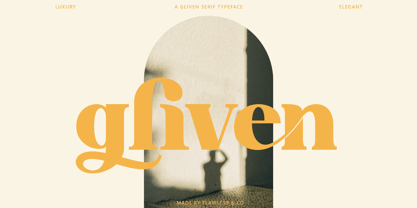 Gliven is a Modern Serif with various alternates and ligatures, an updated blend of bohemian style. An Original typeface that suitable for any graphic designs such as branding materials, t-shirt, print, business cards, logo, poster, t-shirt, photography, quotes .etc This font support for some multilingual. Handcrafted Script that contains uppercase A-Z and lowercase a-z, alternate character, numbers 0-9, and some punctuation. If you need help, just write me! Thanks so much for checking out my shop!
 - Beamont by Flawlessandco,
$9.00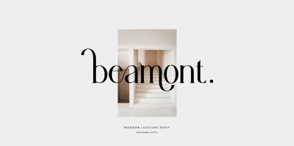 Beamont is a Serif Typeface with Elegant vibes in each character with some alternate. There's some connected letters and some alternates that suitable for any graphic designs such as branding materials, t-shirt, print, business cards, logo, poster, t-shirt, photography, quotes .etc This font support for some multilingual. Also contains uppercase A-Z and lowercase a-z, alternate character, numbers 0-9, and some punctuation. If you need help, just write me! Thanks so much for checking out my shop!
 - Broca by Flawlessandco,
$9.00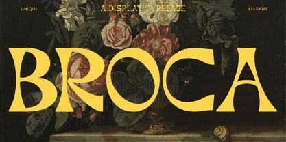 Broca is a Modern Retrotype with various connected letters, an updated blend of bohemian style. An Original typeface that suitable for any graphic designs such as branding materials, t-shirt, print, business cards, logo, poster, t-shirt, photography, quotes .etc This font support for some multilingual. Display Typeface that contains uppercase A-Z and lowercase a-z, alternate character, numbers 0-9, and some punctuation. If you need help, just write me! Thanks so much for checking out my shop!
 - Nirpa by Flawlessandco,
$9.00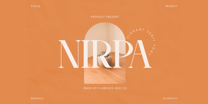 Nirpa is a Serif Typeface with Elegant vibes in each character with some alternate. There's some connected letters and some alternates that suitable for any graphic designs such as branding materials, t-shirt, print, business cards, logo, poster, t-shirt, photography, quotes .etc This font support for some multilingual. Also contains uppercase A-Z and lowercase a-z, alternate character, numbers 0-9, and some punctuation. If you need help, just write me! Thanks so much for checking out my shop!
 - Magea by Flawlessandco,
$9.00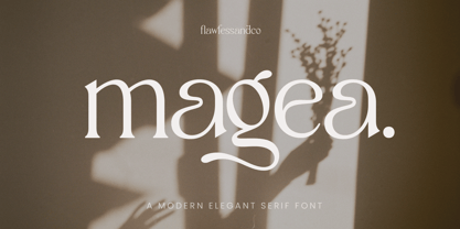 Magea is a Modern Serif Typeface with Elegant vibes in each character with some alternate. An Original typeface that suitable for any graphic designs such as branding materials, t-shirt, print, business cards, logo, poster, t-shirt, photography, quotes .etc This font support for some multilingual. Modern Sweet Retro that contains uppercase A-Z and lowercase a-z, alternate character, numbers 0-9, and some punctuation. If you need help, just write me! Thanks so much for checking out my shop!
 - Stormlight by Gassstype,
$23.00 Here comes a New Font ,Introducing STORMLIGHT is a Race Theme Display Font.This Handmade Display Font with a stylish touch inspired by the famous minimalist logo STORMLIGHT has is perfect for the purposes of designing templates, brochures, videos, advertising branding, logos and more. That is Sport Display with strong and Sport nuances.This font is great for your next creative project such as logos, printed quotes, invitations, cards, product packaging, headers, Logotype, Letterhead, Poster, Label, and etc.Crafted manually with love and passion.
 - Fasten by Gassstype,
$23.00 Here comes a New Font,Introducing FASTEN is a Race Theme Display Font .This Handmade Display Font with a stylish touch inspired by the famous minimalist logo FASTEN has is perfect for the purposes of designing templates, brochures, videos, advertising branding, logos and more. That is Sport Display with strong and Sport nuances.This font is great for your next creative project such as logos, printed quotes, invitations, cards, product packaging, headers, Logotype, Letterhead, Poster, Label, and etc.Crafted manually with love and passion.
 - Thorin by Flawlessandco,
$9.00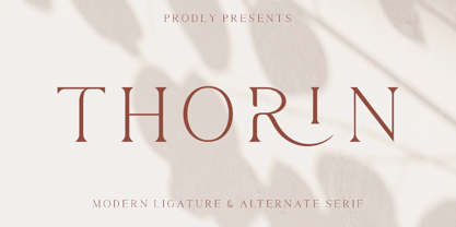 Thorin is a Serif Typeface with Elegant vibes in each character with some alternate. There's some connected letters and some alternates that suitable for any graphic designs such as branding materials, t-shirt, print, business cards, logo, poster, t-shirt, photography, quotes .etc This font support for some multilingual. Also contains uppercase A-Z and lowercase a-z, alternate character, numbers 0-9, and some punctuation. If you need help, just write me! Thanks so much for checking out my shop!