10,000 search results
(0.281 seconds)
- Gate Keeper AOE by Astigmatic,
$19.95 The GateKeeper typeface was inspired by old horror movies, and the various poster typography that went with some of them. A loose and pointy typestyle, GateKeeper embodies the dark side of typography and life, with a creepy and on edge feeling. With large and small capitals, it is easy to exchange cases in events of double characters, which can lend for a very interesting offbeat quality. Usable for any ocassion, but most suitable for dark matter. Learn about the GateKeeper, study his methods, and pass his test. Get the GateKeeper typeface today, and you are on your way!
 - Lipa Agate by TypeTogether,
$49.00 Lipa is the name of the Slovenian national tree 'Linden'. The typeface Lipa Agate by Croatian designer Ermin Međedović, is part of a bigger type collection, comprising various type groups into one coherent system which Ermin developed over the past 10 years. Lipa Agate is the first to be released; a sans serif designed and engineered to be used in the smallest text sizes, best under 10pt, and in very bad printing conditions. It is perfect for phone books, classified ads, directories or any other job requiring economy without jeopardising legibility. To achieve this, Lipa Agate employs a range of tools, such as deep ink-traps, narrow proportions and a tall x-height. Contemporary editorial design requires a high amount of flexibility to respond to various design situations in a consistent fashion. Lipa Agate — with its 3 levels of condensation, 4 weights and 2 sets of different x-heights, 'High' and 'Low', which share the same width — fulfils these requirements wonderfully. That's a total of 24 fonts! To make this clean and honest workhorse face complete, its large character set also includes small caps, arrows, info-numerals and much more.
 - Playful Garden by Yumna Type,
$25.00 Playful Garden is a display font inspired by garden plants, such as flowers, leaves, and other plants. The letters are round and organic portraying natural shapes of garden views. This font’s unique characteristic is that all of the letters are in capitals to show dramatic, prominent displays. Such big letter sizes help emphasize the messages delivered. Furthermore, such a garden-themed display font is able to create calm, quiet situations to apply for nature designs or organic and eco-friendly products. Overall, it is the right option for you to show unique, interesting displays. Moreover, Playful Garden provides a clipart in accordance with the font theme as a bonus and features you can enjoy. Features: Multilingual Supports PUA Encoded Numerals and Punctuations Playful Garden fits best for various design projects, such as brandings, headings, magazine covers, quotes, printed products, merchandise, social media, etc. Find out more ways to use this font by taking a look at the font preview. Thanks for purchasing our fonts. Hopefully, you have a great time using our font. Feel free to contact us anytime for further information or when you have trouble with the font. Thanks a lot and happy designing.
 - Nippon Note by Hanoded,
$15.00 I just returned from a short holiday in Japan. I stayed in hostels and small guesthouses and noticed a peculiar thing they all had in common: they love little notes, telling you where to go, what to do, how to use the microwave oven and when to check out. These notes were sometimes printed, but more often they were handwritten. I found that the Japanese way of writing roman characters is a little, well, unusual. The letters are correct, but they have that typical ‘Japanese look’ - most notably the a and A the b, d and g, the p and P and the t and T. I can’t really tell you what makes them look different, maybe it’s the proportions, but I do know that a Nippon Note is highly recognisable. So, here is Nippon Note, a highly recognisable, handmade font. You don’t really have to be in Japan to use it, but it will give your designs that extra cachet. And don’t forget Nippon Note Kawaii - the cute doodle font which is free if you download the Nippon Note family! Comes with extensive language support, but unfortunately not Japanese…
 - Raina by Nathatype,
$29.00 Want to have a more unique design? Raina is a new way to show uniqueness and freedom in your design. Raina is one of the sans serif font combinations with the display font. Unlike the other solid, firm displays of sans serif font, Raina expresses more artistic, unique displays as a result of the display font’s character combinations. Its differing letter shapes from ordinary alphabets create uniqueness for this font because each letter has no straight lines, but indentations or cavities instead, and no tiny lines or hooks as a sans serif font character. With the unique shape of this font, use this font on bigger screens for a legibility reason. This font has included outstanding features to take your creativity and ideas to the next level. Features: Ligatures Multilingual Supports PUA Encoded Numerals and Punctuations Raina fits for various design projects, such as posters, banners, logos, book covers, quotes. , headings, printed products, merchandise, social media, etc. Find out more ways to use this font by taking a look at the font preview. Feel free to contact us if you require more information when you are experiencing a problem. Thank you. Happy designing.
 - Sweetie Darling by Nathatype,
$29.00 Finding a perfect font for your designs may be tough work and time-consuming. Definitely, you never want to have a too plain, common font, but you have trouble finding the one to express your creativity and visions precisely. For that reason, Sweetie Darling is here to meet your needs. Sweetie Darling is a cursive-style handwriting script font. Like other cursive font designs, the letters are interconnected, but another character of this font is that the letters have high contrasts in curved edges to beautify the display. Due to the seemingly complex font style details to add the font’s legibility, it is suggested to apply this font for big text sizes. Additionally, you can enjoy the available features here. Features: Alternates Ligatures Multilingual Supports PUA Encoded Numerals and Punctuations Sweetie Darling fits best for various design projects, such as brandings, headings, magazine covers, quotes, invitations, greeting cards, printed products, merchandise, social media, etc. Find out more ways to use this font by taking a look at the font preview. Thanks for purchasing our fonts. Hopefully, you have a great time using our font. Feel free to contact us anytime for further information or when you have trouble with the font. Thanks a lot and happy designing.
 - Wanderlust Collection by Cultivated Mind,
$32.00 Wanderlust Letters has returned, but now offered in a beautiful collection of hand painted scripts. New versions include Wanderlust Letters Pro, Decorative, Boho, Chic, Shine, Gold, Caps, and Ornaments. Wanderlust Letters Pro is an extended version of the immensely popular Wanderlust Letters. This latest version includes three sets of basic alternates, one set of decorative alternates, and one set of ligatures. Wanderlust Decorative Pro offers a magnificent updated flow from the initial Wanderlust Letters release. Decorative Pro includes two sets of decorative alternates, two sets of basic alternates, and one set of ligatures. Decorative Regular comes with one set of decorative alternates. Boho, Chic, Shine and Gold are an updated spin off of Wanderlust Letters. These fonts offer new letter styles that blend seamlessly with all Wanderlust fonts. Pro versions of Chic, Shine and Gold comes with three sets of basic alternates and one set of decorative alternates. Boho Pro comes with with two sets of basic alternates and two sets of decorative alternates. Caps is a perfect choice for headline use since it’s an all uppercase font. But don't be afraid to mix it up with all the other Wanderlust fonts. The entire Wanderlust Collection works impeccably to enhance your magazine, packaging, advertising, branding, posters, websites, and films. Combine all Wanderlust fonts with Ornaments to create unique hand painted typography art.
 - Snowmany Snowmen by Comicraft,
$19.00Snow, Snow, Thick, Thick Snow! Sweetly and simply illustrated by the lovely 'Lilou', Our Snowmany Snowmen font features fifty (count 'em) hilarious Snowmen, perfect for creating Seasonal Greetings for homemade Christmas Cards, decorating your children's 'Thank You' letters -- or just print them out for your kids to color while Uncle Frank's shovelling snow out of the driveway! - Vanhille Quaver by Viswell,
$18.00 Venhille Quaver is inspired by classic typography and brings its own unique style to any design project. This fantastic handwritten font is best suited for headlines of all sizes, as well as for blocks of text that have both maximum and minimum variations. Whether it’s for web, print, moving images or anything else – Venhille Quaver will look spectacular.
 - Weiss by Linotype,
$29.99The German poet, painter, calligrapher and type designer Emil Rudolf Weiß originally created this eponymous typeface for the Bauer Foundry of Frankfurt. Long known and loved by metal type enthusiasts under the name "Weiss Antiqua," this design was inspired by typefaces from the Italian Renaissance while still distinctly reflecting the artistic and poetic personality of its twentieth-century designer. Weiss has tall ascenders, sharp apex points, and a low-slung midsection on the caps. The italic moves like a classical ballerina. Weiss is one of the earliest contemporary serif types to have italics based on the chancery style of writing. The Weiss family works well for warmly legible text typography; and it's also an original choice for refined headline and display graphics." - Quota by Ryan Williamson,
$- Quota is an investigation into the modularity of the Cyrillic alphabet. Unlike Latin and Greek, the Cyrillic alphabet owes much of its form to its development in early industrious printing and movable type. This lead the Cyrillic alphabet to be dominated by hard edge and straight lines, giving it a much more modular overall construction. The forms within the Cyrillic alphabet therefor allow for all the characters themselves to have somewhat unified side bearings without compromising ease of reading. Within Quota the default character set has only unified side bearing, giving a more relaxed mono-spaced appearance. While the first stylistic set unifies the entire character set with the same character width, creating a true mono-spaced typeface. Quota was initially designed in Cyrillic, catering to all languages using the alphabet. While the Latin was designed after, and is loosely based of the forms present within the Cyrillic alphabet.
 - Calaveras by Design is Culture,
$29.00 In August of 2009, I was commissioned by Zoo York, a New York City based skateboard company, to visit Buenos Aires to study and document street typography. As soon as my taxi driver took the bustling street Entre Ríos, it was clear that the city and I were going to be good friends. Many of the independently owned businesses on Entre Ríos are adorned with handmade signage. These signs are painted in a style called Fileteado which is a century-old Argentinian type of lettering and floral ornamentation. Nowadays, Fileteado is still a prominent part of the city’s landscape, coloring the façades of restaurants, bars and coffee shops. Calaveras and Diablitos are two new typefaces that were inspired by Fileteado. Stylistically, the fonts are a return to a rhythmic and playful sensibility reminiscent of Vitrina and Cuba, two fonts that I designed in 1996. Along with dynamism and dance, these new fonts incorporate a rigor and functionality essential to labelling any font a ‘workhorse.’ The names Calaveras and Diablitos, came from the name of a song by the infamous Buenos Aires rock band, Los Fabulosos Cadillacs. —Pablo A. Medina
 - Diablitos by Design is Culture,
$29.00 In August of 2009, I was commissioned by Zoo York, a New York City based skateboard company, to visit Buenos Aires to study and document street typography. As soon as my taxi driver took the bustling street Entre Ríos, it was clear that the city and I were going to be good friends. Many of the independently owned businesses on Entre Ríos are adorned with handmade signage. These signs are painted in a style called Fileteado which is a century-old Argentinian type of lettering and floral ornamentation. Nowadays, Fileteado is still a prominent part of the city’s landscape, coloring the façades of restaurants, bars and coffee shops. Calaveras and Diablitos are two new typefaces that were inspired by Fileteado. Stylistically, the fonts are a return to a rhythmic and playful sensibility reminiscent of Vitrina and Cuba, two fonts that I designed in 1996. Along with dynamism and dance, these new fonts incorporate a rigor and functionality essential to labelling any font a ‘workhorse.’ The names Calaveras and Diablitos, came from the name of a song by the infamous Buenos Aires rock band, Los Fabulosos Cadillacs. —Pablo A. Medina
 - Sedid Pro by Fontuma,
$24.00 Sedid, “solidity; It is an Arabic term meaning “righteousness”. In particular, the correctness and soundness of a word is indicated by this word. The fact that I gave this name to the writing family is to point out its accuracy and robustness. This typeface, which is sans serif, consists of three families: ▪ Sedid: Font family containing Latin letters ▪ Sedid Pro: Font family including Latin, Arabic and Hebrew alphabets ▪ Sedid World: A family of typefaces including Latin, Cyrillic, Greek, Arabic and Hebrew alphabets Those who have versatile works should meet the Sedid Pro writing family to meet a new face of writing and make a difference to their work. This font is serious, elegant and solidly built. The Sedid Pro font family can be used as text and header fonts in publishing, digital media and websites. Sedid Pro also has a nice-looking, flexible, geometric face with smooth lines and transitions. The inner and outer spaces of the font are proportioned so that the text can be read easily. Sedid Pro font family consists of 14 fonts, seven plain and seven italic. The font family includes open type features, as well as a large number of ligatures, small caps, modifiers, and currency symbols of many countries.
 - Raindec by Haniefart,
$17.00 Raindec is a handcrafted script typeface, a font inspired by sign paintings, branding, t-shirts, flyers, and more, with a variety of interesting characters. You can really make Raindec feel personalized for your client's projects. Raindec script fonts can be used for magazines, clothing designs, logos, titles, flyers and more.
 - theLUXX by Resistenza,
$39.00 The Luxx font was born in 2010 and in the 2013 has been redesigned. Luxx is based on a style of lettering often seen on Italian art deco posters and advertising of the 1930s. This font is very modern, and is inspired by the “velocitá-speed” of this artistic period. TheLuxx is perfect for when you want to use eye-catching big texts for anything from posters and retro-advertisements, and art, but it´s especially striking for printed projects.
 - Codeplay by Gie Studio,
$11.00 Are you looking for handwritten originals with fun characters? Yes, you will find it right here. Codeplay is a original handwritten font. It is suitable for svg designs, pottery, shirts, hats, tote bags, wall art, interior prints, and get creative with its childlike playfulness. Codeplay includes Multilingual Options to make your branding globally acceptable. Features: Funny Ligatures Swash collection Multilingual Support 83 country PUA Encoded Numerals and Punctuation Thank you for your visit and downloading premium fonts from Gie Studio Designers: Gie Studio
 - Art School by AVP,
$25.00 Faithfully reproduced from my father’s design drawings made at The Municipal School of Arts and Crafts, Wolverhampton in 1939. Strong nostalgic influences of Art Nouveau and Art Deco. What caught my eye was the consistency with which each particular character was formed: every ‘R’ like every other, every ‘S’ the same. Tight letter spacing and loose word spacing characterised his titling but he didn’t trust himself to print without first ruling guidelines, a hint of which remain in this font.
 - Social Networking Icons by Matt Grey Design,
$26.00The Social Networking Icons font family has been designed to simplify the process of routinely loading and pasting social icons around, for both print and on the web – reducing server load and saving time. They are great for embedding in webpages or for use on product packaging, posters, flyers and other marketing materials. Comes with a PDF guide and an interactive symbol sheet with labelled icons for reference. v4.0 Is out now with multiple improvements and updates on most icons. - PiS Wanderlust by PiS,
$36.00 PiS Wanderlust is inspired by specimens from the book „Die Schriften des Malers“ from 1950 and by vintage hand painted signposts and guides found on hikes in the outskirts of Vienna and rural Austria, hence the name Wanderlust! Although classic, constructed modernist it features some charmingly unfashionable quirks and is available in rounded for a smooth and warm feel. Lace up those hiking boots, don't forget to pack some Landjäger and cool drinks and enjoy the view from above the treeline!
 - SF Rasmi by Sultan Fonts,
$29.99 Rasmi font It is a font for print and the web. Especially for coordinating university and school books, scientific research, exams, government and corporate correspondence, and coordinating financial, judicial, and diplomatic documents. The Rasmi font family includes four weights: thick for headlines, bold for subheadings, medium for body text, and thin for footnotes and explanations. The font supports Arabic, Latin, Persian, Urdu, and Kurdish languages. The graphic designer can use Rasmi variable font to reach wider options in working with the text.
 - Siga Mono by Greentrik6789,
$21.00 Elevate your design game with Siga Mono, the ultimate font family for all your creative needs. Transform your digital and print projects into masterpieces with its remarkable monospace layout and distinctive style. The multiweight options of Siga Mono allow you to experiment with various typographic hierarchies, ensuring that your design stands out from the competition. Don't miss the opportunity to try Siga Mono's extraordinary capabilities – download our variable demo and witness its magic firsthand!
 - Troia by Ahmet Altun,
$10.00 Troia Font Family comes in three weights; normal and italic. In addition, with rounded corners, each weight has its own smoother version. Thanks to its large letters and added spaces between the letters, this font can be used to get perfect results and create great works such as web typography, banners, logos, texts, t-shirts and printings, and also presentations. Troia's eye-pleasing and nice-looking style makes writing much more pleasant.
 - Mono Rose by Yumna Type,
$25.00 Mono Rose is a visually prominent display font having unique, attractive letter designs along with rose ornaments to leave lovely, romantic impressions. All of the font letters are designed in special details and have peculiarly unique characteristics to reflect the beauty of a rose making it suitable to apply for any products expressing rose beauty and charm. Furthermore, the blunt and round font letter shapes leave soft and friendly impressions. In fact, Mono Rose is able to produce beautiful, elegant displays to its advantage and able to make your designs look more attractive, and elegant for increasing the product’s attractiveness. You can use this font for big text sizes due to its unique shapes to ease you to read it. Mono Rose provides a clipart in accordance with the font theme as a bonus and features you can enjoy. Features: Multilingual Supports PUA Encoded Numerals and Punctuations Mono Rose fits best for various design projects, such as brandings, headings, magazine covers, quotes, printed products, merchandise, social media, etc. Find out more ways to use this font by taking a look at the font preview. Thanks for purchasing our fonts. Hopefully, you have a great time using our font. Feel free to contact us anytime for further information or when you have trouble with the font. Thanks a lot and happy designing.
 - Monthir by Ditatype,
$29.00 It may be a hard challenge to find an attractive, prominent font in a unique way amid the abundant font options available. Due to the significant reason to find the right font to deliver appropriate messages and emotions, we would like to introduce you to the Monthir, the perfect choice to express any of your project designs. Monthir is a capitalized brush font in brush details to produce authentic looking handwriting displays. The font’s bold, firm displays which are the advantages of such a font can create more interesting, prominent designs. Besides, people can feel closer to the brands or designs created through its personal, natural nuances. The letters’ proportions are relatively consistent, yet its dramatic, bold styles are suitably applied for bigger text sizes rather than the text body. Features: Multilingual Supports PUA Encoded Numerals and Punctuations Monthir fits best for various design projects, such as brandings, posters, banners, headings, magazine covers, quotes, invitations, name cards, printed products, merchandise, social media, etc. Find out more ways to use this font by taking a look at the font preview. Thanks for purchasing our fonts. Hopefully, you have a great time using our font. Feel free to contact us anytime for further information or when you have trouble with the font. Thanks a lot and happy designing.
 - Mighty Party by Nathatype,
$29.00 Mighty Party is a display serif font in thick weights to express friendly, modern nuances. It has a high contrast in curvy final wipe details on some of the letters. Its heights and proportions are not the same, but its simple forms are legible in both small and big text sizes. You can also enjoy the lovely features available in this font. Features: Stylistic Sets Multilingual Supports PUA Encoded Numerals and Punctuations Mighty Party fits for various design projects, such as posters, banners, logos, magazine covers, quotes, headings, printed products, invitations, name cards, merchandise, social media, etc. Find out more ways to use this font by taking a look at the font preview. Thanks for purchasing our fonts. Hopefully, you have a great experience using our font. Feel free to contact us for further information when you have a problem using the font. Thank you. Happy designing.
 - Prince And Princess Charming by Harald Geisler,
$68.34 Prince and Princess Charming are very extravagant and extroverted about their feelings. Prince Charming puts a heart on everything. If you're convinced that you love you've got to go with Prince Charming. Compared to the Prince, Princess Charming puts more hearts on every letter. Convince that you have to be loved: follow Princess Charming. As you would expect from Aristocrats the family members are fluent in many languages and have a surprising extensive character set that even covers Cyrillic. Prince and Princess Charming are a part of the Light Hearted Font Collection that is inspired by a recording of Jean Baudrillard with the title, "Die Macht der Verführung" (The Power of Seduction) from 2006. Further inspiration came from the article, "The shape of the heart: I'm all yours". The heart represents sacred and secular love: a bloodless sacrifice. by British writer Louisa Young printed in EYE magazine (#43) London, 2002.
 - Agile Jewelry by Nathatype,
$29.00 Agile Jewelry a stylish, modern display serif font to give you informal, modern impressions. The characteristics of this font are the extra hooks on the letters’ edges and some of the letters have curvy ending wipes. The thick and thin lines on every letter are clearly visible. For a legibility reason, apply this font for big-sized texts instead of the body texts. Features: Stylistic Sets Ligatures Multilingual Supports PUA Encoded Numerals and Punctuations Agile Jewelry fits for various design projects, such as posters, banners, logos, magazine covers, quotes, headings, printed products, merchandise, social media, etc. Find out more ways to use this font by taking a look at the font preview. Thanks for purchasing our fonts. Hopefully, you have a great experience using our font. Feel free to contact us if you require more information when you are dealing with a problem. Thank you. Happy designing.
 - FS Maja by Fontsmith,
$50.00 Youthful Fontsmith received a brief to develop a font that would form part of the broadcast identity for the UK’s first digital Freeview channel – E4. It needed to work seamlessly in text and display, both in print and on-screen, and please the eye of the target audience, 18-34-year-olds. So, young, fresh and informal. No problem. Except for one thing: the timing. Daughter As he worked on FS Maja, Jason Smith was occupied by another imminent deadline: the birth of his third child. The pressure was mounting, but rather than let it get to him, Jason embraced the challenge and made light of the tension, fashioning a bright, bubbly, entertaining type with a personality made for memorable headlines. Beautifully random FS Maja’s soft, rounded shapes and assured, fluent lines encompass lots of notable features that contribute to its warm, fun-loving personality, including: a very large x-height; a short, rounded serif to allow for close spacing and give texture to body text; a slight convexity, or bulge, in the stroke terminals; a calligraphic fluidity in the entry to the down-stroke of most lowercase letters; open, generous curves, especially in the “B”, “P” and “R”; and a “w” made of two “u”s.
 - Preto Semi OT Std by DizajnDesign,
$- Preto Semi is an experiment. It is an attempt to create a readable type for text point sizes (other than sans-serif and serif). Preto Semi is not a Sans with added serifs or Serif with serifs removed. The use of the serifs is redefined and used for other purpose(s). The serifs became the extension of the stroke, they help to solve the spacing problem of sans-serif types and they use the primary function of serifs – keeping the eye on the baseline and emphasize the horizontal rhythm of the lines of text. Preto Semi is intended for magazines and editorial design, as other members of Preto family. Preto is an extensive type family, which explores the function of serifs on readability and legibility. Preto consist of three subfamilies: Sans, Semi and Serif. Preto is designed for multilingual typesetting. All of the subfamilies have equal gray value but different texture which can be use to differentiate languages. Preto sub-families have two text weights and two bold styles (Regular -> Bold, Medium -> Black). Every weight has a companion Italic style as well.
 - Preto Semi by DizajnDesign,
$24.00 Preto Semi is an experiment. It is an attempt to create a readable type for text point sizes (other than sans-serif and serif). Preto Semi is not a Sans with added serifs or Serif with serifs removed. The use of the serifs is redefined and used for other purpose(s). The serifs became the extension of the stroke, they help to solve the spacing problem of sans-serif types and they use the primary function of serifs – keeping the eye on the baseline and emphasize the horizontal rhythm of the lines of text. Preto Semi is intended for magazines and editorial design, as other members of Preto family. Preto is an extensive type family, which explores the function of serifs on readability and legibility. Preto consist of three subfamilies: Sans, Semi and Serif. Preto is designed for multilingual typesetting. All of the subfamilies have equal gray value but different texture which can be use to differentiate languages. Preto sub-families have two text weights and two bold styles (Regular -> Bold, Medium -> Black). Every weight has a companion Italic style as well.
 - Flanker Tanagra by Flanker,
$12.00 In order to give new imput to the art of typeface design in Italy, Nebiolo Company held, in March 1910, an artistic competition for a new alphabet conception, so the best-ranked design would be transformed into a real new typeface. 42 competitors participated and, although the first prize was not technically awarded, "Ancora" resulted as the best typeface, created by the designer-typographer Natale Varetti of Turin. Nonetheless, the new alphabet was transformed into a full-fledged metal typeface in 1924, renamed "Tanagra" in honor of the Greek city in the center of Boeotia. The new font, although not significantly detached from the classical Roman form, introduced decorative elements that allowed its use in both rational and artistic compositions. This font appears very clear and easy to read, with very high ascenders and some decorations that make it distinctly retrò. Finally, after almost 100 years, this peculiar character has been digitized taking it as a model the shapes of the 16 points size (other dimensions have significantly different contrasts and proportions). To adapt it to modern use, some glyphs have been modified, but all the originals are available as Stylistic Alternate OTF, as well as all the swashed variants while the missing ones were added.
 - Mirey by Nathatype,
$29.00 If you want your designs to be prominent, you will need a unique, prominent, yet professional, legible font. However, it may be hard and take some time to find the right one due to a lot of options available causing difficulty to figure out the suitable one you desire. With Mirey, you can easily create a unique identity for your design. Mirey is a display serif font in thick weights with small lines on the letters’ edges to look formal and classic. In addition, it expresses unique, artistic touches from its combinations with display font characters. This display font has thick lines and strong contrasts, so that it is perfect to attract attention and to show strong impressions. Due to its high legibility level, this font is applicable for a variety of text sizes. In addition, you can enjoy the available features here. Features: Multilingual Supports PUA Encoded Numerals and Punctuations Mirey fits best for various design projects, such as brandings, posters, banners, headings, magazine covers, quotes, invitations, name cards, printed products, merchandise, social media, etc. Find out more ways to use this font by taking a look at the font preview. Thanks for purchasing our fonts. Hopefully, you have a great time using our font. Feel free to contact us anytime for further information or when you have trouble with the font. Thanks a lot and happy designing.
 - Saphire by Yumna Type,
$16.00 Saphire is a elegant handwritten font with a natural and unique design will make your project more beautiful. The font is suitable for your branding project, printing, logos dan wedding. Included: Saphire (OTF) Features: Standard Ligatures Stylistic Sets Multilingual Support PUA encoded Numeral and Punctuation by Yumnatype
 - Posterizer KG Rough by Posterizer KG,
$30.00 Posterizer KG Rough is basically a hand-printed texture version of the Egyptian Slab Serif font Posterizer KG that already exists. Posterizer Kg Rough looks good on substrates with a rustic texture like wood, metal, textile, rough paper. It contains all the Latin and Cyrillic glyphs.
 - Wallnutt Corps by Here East Fonts,
$18.00 WALLNUTT CORPS is a cool, bold and powerful super modern unicase font, designed for maximum visual and emotional impact. It's great for social media, headlines, large-format print, editorial, branding, posters, fashion designs and websites — everything that strives for being confident and yolo. Definitely has a personality!
 - Bobgert by Oleg Gert,
$30.00 Bobgert – is a whimsical, optimistic and inspiring modern sans-serif font with a touch of monospace that is wonderful for headings and is perfect for posters, Instagram, magazines, print, branding, logos and anything else you can imagine. I hope my font will help you in your creativity.
 - Mallorist by Nurf Designs,
$16.00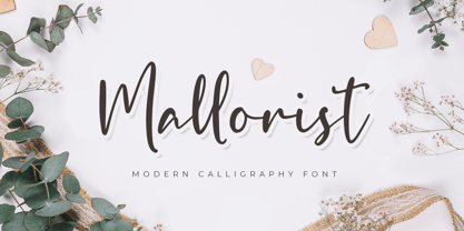 Mallorist is a handwritten font with a modern calligraphy style. This font is great for your next creative project such as logos, printed quotes, invitations, cards, product packaging, headers, logotypes, letters, posters, apparel designs, labels, and etc. Mallorist comes with uppercase, lowercase, numerals, punctuation & multilingual support characters.
 - Goodbye Kiss by Fat Hamster,
$25.00 Goodbye kiss is a stylish and elegant typeface. It comes with FREE logo design templates and illustrations. Goodbye kiss is a combination of femininity & brutality. This typefaces is perfect for tattoo projects, poster design, t-shirt design, printing, logo design, quotes, apparel design, album covers and etc.
 - Visual Fantasy by Kitchen Table Type Foundry,
$15.00 Visual Fantasy is a great, all caps display font. It was based on an old font of mine called Plakkaat, which was made using a flat brush and acrylic paint. Visual Fantasy is great for poster work, book covers and product packaging. Comes with extensive language support.