10,000 search results
(0.02 seconds)
- Revolter by Gassstype,
$25.00 Here comes a New font,Introducing Revolter It's Unique Rough Brush Font is a Authentic Style and classy style, this font is great for your creative projects such as watermark on photography, and perfect for logos & branding, invitation,advertisements,product designs, stationery, wedding designs,label ,product packaging, special events or anything that need handwritting taste.
 - Headbears by Almarkha Type,
$29.00 Hello Everyone, introduce our new product Headbears - Sport Display, inspired by the title of the sports poster and We make it very energetically. Headbears font with strong and challenging nuances. very suitable for the title, typography, Poster, magazines, brochures, packaging,Websites and much more for your design needs, making your designs more modern and professional.
 - Borned by Almarkha Type,
$29.00 Hello Everyone, Introduce our new collection, Borned - Futuristic Display, Inspired from famous logos of Futuristic Style and brands that have very strong characteristics, Borned font with strong and challenging nuances. very suitable for the title, typography, Poster, magazines, brochures, packaging,Websites and much more for your design needs, making your designs more modern and professional
 - Nutty Noisses by Gassstype,
$25.00 Here comes our new font Nutty Noisess Inspired from old skool graffiti tagging, street art, we created this Typeface, drawn in Procreate app, then vectorized and crafted carefully. Nutty Noisess Suitable for many design project, branding, packaging, logo, wall art, headline, template, banner, poster, and many more projects. These include all caps, punctuation, and numerals.
 - Amelia Harper by Letterhend,
$14.00 Amelia Harper , a new font duo where the elegance of a serif font intertwines flawlessly with the beauty of a handwritten script. This font duo is carefully crafted to bring together the classic charm of serifs with the contemporary edge of modern scripts. Features : Uppercase & lowercase Numbers and punctuation Alternates & Ligatures Multilingual PUA encoded
 - The Gloves by Aestherica Studio,
$12.00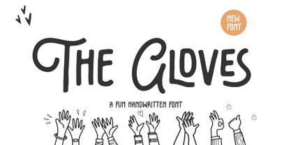 Introducing the new Fun Handwritten Font by Aestherica Studio. Proudly Present, The Gloves The Gloves is perfect for product packaging, branding project, megazine, social media, wedding, or just used to express words above the background. The Gloves also multilingual support. Enjoy the font, feel free to comment or feedback, send me PM or email.
 - Southeast by Haksen,
$13.00 Southeast The new fresh handmade brush script font. Very suitable for greeting cards, branding materials, business cards, quotes, posters, and more! This font are perfect for all brand :) Features : UpperCase & Lowercase Numerals & Punctuations Ligatures Multilingual characters (AÀÁÂÃÄÅCÇDÐEÈÉÊËIÌÍÎÏNÑOØÒÓÔÕÖUÙÜÚÛWYÝŸŸÆŒßÞàáâãäåæçèéêëìíîïðñòóôõöøùúûüýÿ) PUA ENCODEDZIP INCLUDED: - Southeast OTF - Southeast Swashes OTF Thanks for visited and reviewed. Happy Design, Haksen Letters
 - P22 Gothic Gothic by IHOF,
$24.95 The name says it all. Gothic from the old literary style and/or current subculture genre. And Gothic meaning a block or sans serif style of lettering. The concept was to take the classic German style lettering and create a contemporary extended block letter typeface. The result is a fusion of old and new.
 - Rockless by Fargun Studio,
$16.00 Rockless is handwritten stylish copperplate calligraphy fonts, combines from copperplate to contemporary typeface with a dancing baseline, classic and elegant touch. Can be used for various purposes. such as headings, signature, logos, wedding invitation, t-shirt, letterhead, signage, lable, news, posters, badges etc. Features All Uppercase and Lowercase Number & Symbol Supported Languages Ligatures PUA Encoded
 - Moxy Rush by Alit Design,
$21.00 Introducing "Moxy Rush" Font: Redefining Modern Blackletter Elegance Unleash the power of typography with "Moxy Rush," a remarkable font that seamlessly blends the timeless essence of blackletter style with a captivating contemporary twist. This font is a true masterpiece, meticulously designed to elevate your designs, projects, and artworks to new heights of sophistication and creativity.
 - Audrena by Putracetol,
$19.00 Audrena is a new elegant modern script font. A lovely, elegant and sweet script font. Audrena is perfect for styling logos, stationery, wedding event, invitation, quote, social media, websites and so much more! Come with Opentype feature with a lot of alternates, its help you to make great lettering.This font is also support multi language.
 - Masha by Vladislav Ivanov,
$15.00Masha is a new 3D font notable for its unique style and attractiveness. It is appropriate to use this font as addition to different pictures or pieces of art, it is a good final touch for something unusual and beautiful. The hand made letters provide individuality and an unusual appearance. It supports all European languages. - InkArt Labels by John Moore Type Foundry,
$24.95 Inkart is a font dingbats, shapes for new labels or frames that the user can supplement according to the requirements and purposes. It consists of a set uppercase containing the forms, and a set is lower case which has areas of the same shapes to be colored by layers. Contains retro and modern styles.
 - Caracas by John Moore Type Foundry,
$20.00 Caracas is a new family of sans serif fonts, looking friendly, sweet and comfortable to read. Where text flow between straight lines and round by becoming transparent in the interest of readability. Caracas is ideal for working in small letters and texts of a technical nature. Caracas is a humanistic approach to reading sans forms.
 - LA QATRIE by Hishand Studio,
$15.00 Experience refined design with La Qatrie, a display font that boasts an elegant look and a touch of luxury, setting a new standard for sophistication in typography. Perfect for those needing a touch of elegance, classy, stylish, beautiful bold type, and modernity for their design. Complete with ligatures alternates regular hollow icon kerning multilingual support
 - Unranked by Gassstype,
$23.00 Here comes our new font Unranked this is a sans handwritten that is written casually and quickly. this font are made with brushes on Procreate. Then crafted carefully drawn into vector format. That is why Unranked has Rough and strong characteristic more natural look to your text with a more modern look to your text.
 - Dupliciter by JAF 34,
$9.90 DUPLICITER is an experimental display sans serif font which has two typefaces for comfortable and experimental use. DUPLICITER is a (latest) part of new school in type design that could be called like mind-free and geometric direction in the world. Sans serif, condensed, sharp edges, geometric, experimental, these are the main attributes of DUPLICITER.
 - Drakoheart Revofit Sans by G3 Typefaces,
$- Drakoheart Revofit is an initiative to make sans fonts. It’s one of my personal favorites, in fact. In its first release, this font had a cool appearance but was improved with better kerning and a cool look in this new release. Perfect to write some digital texts as in web articles, blogs and branding.
 - Look by insigne,
$25.00 Look, folks! From what may just be the vernacular sign capital of the world, Chattanooga, Tennessee, it’s a brand new hyperfamily from insigne! Look includes three different related fonts, with three weights each. That’s over 70 fonts! Imagine: you turn onto a stretch of open country road. On the distressed, red background of an old barn wall, a large block of crisp white letters shout out: “See Rock City.” You soon realize this barn is not alone in competing for the passing eye. Far from it, ladies and gentlemen. This is just one of the many pieces of historic, hand-painted advertisements dotting the great Southern United States. Yes, these are the pieces of true Americana--the barns, the roadside signs, the machinery, the soda fountains, and more--that now inspire this splendid new set of three font families. This new, easily readable type from insigne digs deep to capture the very heart and passion of this splendid country’s lettering of the post-war era. Look’s compact frame quickly draws the audience to your headline, logo, subheading, or pull quote, working well in those compact spots of text without overpowering your content. You'll easily put the feeling of those days gone by into every piece with the natural beauty and simple usefulness of the Look hyperfamily. Each of the individual sub-families incorporates a variety of font weights with distressed attributes. Think Woodtype. Jeans. Antiques, folks. That deep, ingrained texture--that quality that will stand the test of time. And Look is flexible, too. Take, for example, Look Script. This powerhouse of a font offers thinner weights to give your work an easy-going, down-to-earth design. But bring in those heavier weights, and you'll have a muscular, assertive font that will go the whole nine rounds. Combine any of the Look families with Ornaments to really give your layouts a zing. Build an extraordinary design as well with Look’s swashes and alternates. To activate any of these alternates, just click on Swash, Stylistic or Titling Alternates in any OpenType-savvy application, or choose from the Glyph Palette. Explore hundreds of included extras to find that “cherry on top” for your one-of-a-kind project. There are over 70 fonts to choose from, including subfamily sans, serif, script and ornament fonts! You can't go wrong. To get the most bang for your buck, order the whole Look family now! Note on SHADOWS: Increase depth and make your designs pop! Add shadows to any of the Look fonts by duplicating the text content layer in place and switching it to its corresponding shadow. Color and offset to taste. Look shadows are offset automatically. In Illustrator, you may need to turn on Em Box Top for proper shadow alignment.
 - MARIAMNE by Type Innovations,
$39.00 MARIAMNE is an original design by Alex Kaczun. It is an elegant, modern and traditional interpretation based on and modeled after his successful "Contax Pro" and "New Age Gothic" typeface series. As such, it has generous proportions with clean, crisp lines—ideally suited for easy reading and long lines of copy. Alex felt that the skeleton for "Contax" was perfectly suited to transform the design into a modern version of 'old-style', somewhat reminiscent of German Black Letter. Numerous modifications where made to the body proportions, stems and shapes. True 'old-style' serifs and unusual 'cross-strokes' where added for a touch of distinction. The 'cross-strokes' where added at exactly visual mid-point on the overall heights. This gives the typeface a romantic, female-like quality to the overall design. Strong, yet delicate. Visually stimulating in appearance and function. The result is a truly unique transitional and modern design. Unlike other typefaces, MARIAMNE incorporates uniform stems throughout the capitals, lower case and figures. This gives the design a uniform appearance in overall color and strength. There is a perfect visual balance between inter-letter spacing, stem weights and proportions. The accents are equally large, bold and command attention. This font includes a large 'Pro' character set, which supports most Central European and many Eastern European languages. As a result, the design is ideally suited for display copy as well as text composition. In the near future, Alex plans to expand the typeface series to include a light and heavy weight, along with true italics.
 - Authemart by Great Studio,
$17.00 Introducing a new quality calligraphy font is Authemart Script. High-quality script fonts come with modern and vintage touches in them. Inspired by a mixture of copper calligraphy with handlettering style. OpenType feature with Stylistic Alternatives, Swash, Ligatures, Stylistic sets. It allows you to mix and match letter pairs to fit your design, and also comes with modern ornaments to make this font look elegant and perfect. Authemart is attractive like a smooth, clean, feminine, sensual, glamorous, simple and very easy to read. The classic style is perfect to be applied in various formal forms such as invitations, labels, menus, logos, fashion, make up, stationery, letterpress, romantic novels, books, greeting / wedding cards, packaging, labels, and more. Authemart also supports in pragram, Adobe Illustrator, Adobe Photoshop, Adobe InDesign, Corel Draw X version, Microsoft Word, Language Support : Albanian, Basque, Breton, Chamorro, Danish, Dutch, English, Faroese, Finnish, French, Frisian, Galician, German, Icelandic, Italian, Malagasy, Norwegian, Portuguese, Spanish, Swedish. How to access all alternative characters using Adobe Illustrator: • https://www.youtube.com/watch?v=XzwjMkbB-wQ How to use stylistic sets fonts in Microsoft Word 2010 or later versions: • https://www.youtube.com/watch?v=NVJlZQ3EZU0 There are additional ways to access alternates / swashes, using the Character Map (Windows), Nexus Font (Windows) Font Book (Mac) or a software program such as PopChar (for Windows and Mac). How to access all the alternative characters, using the Windows Character Map with Photoshop: • https://www.youtube.com/watch?v=Go9vacoYmBw Need help? If you need help or advice, please contact me by e-mail : "Greatstudio92@gmail.com" Thank you for your purchase!
 - Gallaecia, a font named evocatively to conjure images of historical depth and cultural richness, is one that manages to bridge the gap between the ancient and contemporary with its design. Named afte...
- Keep Calm by K-Type,
$20.00 Keep Calm is a family of fonts developed from the now famous World War 2 poster that was designed in 1939 but never issued, then rediscovered in 2000. As well as the original Keep Calm font, the medium weight of the poster, new weights are now available – Keep Calm Book (regular weight), Heavy and Light – and each weight comes with a complimentary italic. Version 2.0 (2017) is a comprehensive update which consists of numerous refinements and improvements across all weights. The family now contains a full complement of Latin Extended-A characters, Welsh diacritics and Irish dotted consonants. The four italics have been optically corrected with revised, ‘true italic’ forms of a and f. The crown motif from the top of the Keep Calm poster is located at the plus minus ± and section § keystrokes (Alt 0177 and Alt 0167 on Windows). The lowercase g follows the Gill/Johnston eyeglass model, but also included is an alternative, single-story g at the Alt G keystroke (Alt 0169 on a Windows keyboard), the normal location of the copyright symbol which has been relocated elsewhere in the fonts. An alternative lowercase t, without the curved wedge cutaway, is provided at the Alt T (dagger) keystroke (Alt 0134 on Windows). When I first saw the Keep Calm and Carry On poster, I wrongly assumed the letters to be Gill Sans. Recent research at the National Archive by Dr. Bex Lewis of Manchester Metropolitan University has revealed that the original poster was hand drawn by the illustrator and painter, Ernest Wallcousins. The Gill Sans influence is apparent, in the R particularly, the M’s perfectly pointed vertex is redolent of Johnston’s Underground, and the most anomalous character, the C, resembles the ‘basic lettering’ of engineers that provided the vernacular sources for the Gotham typeface. Developing the Keep Calm typeface has been an exercise in extrapolation; an intriguing challenge to build a whole, high quality font family based on the twelve available capitals of the Keep Calm poster, and on similar lettering from the other two posters in the original series. This has required the creation of new lowercase letters that are believably 1939; that maintain the influence of Gill and Johnston while also hinting at the functional imperative of a wartime drawing office. Wallcousins’s lettering balanced intuitive human qualities and the pure pleasure of drawing elegant contemporary characters, against an underlying geometry of ruled lines, perfect circles, 45° terminals, and a requirement for no-nonsense clarity.
 - Justus - Unknown license

- Arpona by Floodfonts,
$49.00 For anyone who prefers to stand out from the crowd, than to go with the flow! Arpona is a typeface with small wedge serifs and a strong character, ideal for corporate design and all projects characterized by a sense of individualism – for example art, fashion, food, beverage and lifestyle topics. Arpona is inspired by roman letters carved in stone but otherwise difficult to categorize. It is neither a pure serif nor a sans but rather a symbiosis of different design concepts. Because of its display qualities, Arpona is a good choice for packaging, advertising and editorial design and is well readable even in running text on screen. The family has nine weights, ranging from Thin to Black plus corresponding italics. Each style includes 590 glyphs supporting all western-, eastern- and central-european languages including four sets of figures and various currency symbols. For more information visit the microsite: http://floodfonts.com/arpona
 - Feisty by Fauzistudio,
$20.00 Feisty (2020) is a straight script bold using magic OpenType automatically at mimic real hand lettering. Use it for magazine, fashion, invitations, greeting cards, bussines card, logo, t-shirt, web banner, book cover, campaign and watermark photography. Feature Presents an advanced OpenType to automatically choose the appropriate letter shape as you type based on whether the letter appears at the beginning, middle or end of a word. The width of the bar in the lowercase "t" can be changed as desired. Has two different styles of caps: Normal caps, which are the same style as the lowercase; and a type of Comic font, plain caps for setting acronyms, roman numerals or any other case that calls for all caps. With extended language support for most Latin-based Western and Central European languages. Automatic all fractions. *Requires an application with support for OpenType advanced typography, such as Adobe Creative Suite and QuarkXPress.
 - Atherosser by Mokatype Studio,
$18.00 Atherosser is elegant classic serif font inspired from old formal roman, built with modern nuance, and still looks vintage, unique design with rounded on the tip of serif and lots of alternates and ligatures. This font is suitable for any purposes of design like headlines, typography, Poster, magazines, brochures, packaging, websites, and much more for your design needs, making your designs look like luxurious nuances. And still, this font can be used for long text design. What's you get : Standard glyphs Ligatures (Opentype features) Alternates (Opentype features) Web Font International Accent Works on PC & Mac Simple installations Accessible in Adobe Illustrator, Adobe Photoshop, Adobe InDesign, and even work on Microsoft Word. PUA Encoded Characters - Fully accessible without additional design software. Fonts include multilingual support Image used: All photographs/pictures/vectors used in the preview are not included, they are intended for illustration only. Thank You
 - Diverda Serif by Linotype,
$29.99Diverda Serif is a contemporary typeface that is free from ornament. Created by Swiss designer Daniel Lanz, Diverda Serif is optimized for maximum legibility. In contrast to many other modern typefaces, which try to squeeze the traditional rounder forms of the alphabet into square designs, and which often attempt to equalize the widths of the capital letters, Diverda Serif remains true to the proper proportions of the Roman alphabet. The x-heights of Diverda Serif's characters are low, and the differences between curved, square, and triangular elements are very clear. Like the more calligraphic typefaces of the past, Diverda Serif's strokes exhibit contrast that is inspired by movements of the pen on paper; down strokes are heavier than up strokes. Possible applications for the Diverda Serif include magazine design, as well as advertising for fashion, design, or architectural products. Diverda Serif is also a good fit for Corporate Identity solutions. - ITC Motter Corpus by ITC,
$40.99ITC Motter Corpus was designed by the Austrian type designer Othmar Motter in 1993 to combine the display advantages of a sans serif extra bold design with the legibility of a roman weight. The Motter Corpus is available in the weights regular and condensed regular. The capitals with their strong strokes display slight irregularities and natural looking outlines. When used in very large point sizes the tiny serifs become noticeable. Distinguishing characteristics of this typeface are the unusual design of the g with its upward reaching ear and that of the capital C, whose curve ends in an angular stroke in its upper third. Almost, but not quite, a sans serif, the typeface has diminutive serifs which, along with its modulated weight contrasts, make ITC Motter Corpus remarkable legible in display applications and will give text a nostalgic feel. A similar typeface is Linotype Bariton. - Lectio by Eurotypo,
$14.00 Lectio is a Roman font based on a Venetian Renaissance early typefaces, but with a modern and expressive design. His obvious calligraphic influence favors continuous text reading. The generous internal "eye" gives Lectio an appropriate legibility, its soft and organic modulation avoids fatigue, its robust character is attractive and stimulating in large bodies, especially for use in headlines. Lectio comes in two versions: Lectio and Lectio B. Lectio has seven weight and their corresponding slanted variables (true italics). Lectio B is composed only of Italics in six weight. The ascenders are slightly lower, the descending are more regular and the oblique trace of some letters have a more constant rhythm. Each of these faces has the optimum amount of contrast agains the background and clear and open internal letter shape. These fonts include diacritics for CE languages, Old Style figures, standard and discretional ligatures.
 - Chamberí by Extratype,
$40.00 Chamberí is designed to be Vogue España's bestpoke typeface. An ambitious typographic branding project made for one of the most iconic magazine headers of the world, it defines the Spanish edition’s personality through a blending of the functionality of XIX Century Modern Romans (also known as “Scotch" typefaces) and the gestural expressiveness of typographic Baroque. Chamberí is a peculiar combination of the rational and the delicate, the sturdy and the feminine. The family is organised in a broad spectrum of 56 variants in which the transition from the restrained text version to the flamboyant, elegant display is modulated by contrast. The family is organised in seven weights: from Extra Light to Black, plus four optical sizes : Text, Headline, Display and Superdisplay. All this with its own Italics, Small Caps and Old Style Figures, besides the due refinement to resolve any editorial and communicative requirement.
 - Cal Uncial Rough by Posterizer KG,
$19.00 Cal Uncial Rough is a calligraphic font based on sketches written with cane calligraphy pen and ink on coarse-textured paper. Because of the fact that the Uncial don't have lowercase letters, there are small capitals instead of the lowercase. As the Latin version of the Uncial was created from the Greek Uncial script (translating the Bible from Greek into Latin), in addition to the standard Latin graphemes, the font contains the Greek alphabet (and also the Cyrillic letters (Ustav), derived from the Greek Uncial too). Regardless of the stylistic connection, there is a difference between the morphology of related Greek, Latin and Cyrillic letters. Most of the graphemes are based on traditional roman and insular uncial calligraphy. Cal Uncial Rough is suitable for the preparation of calligraphic sketches as well as an application in typography that should bring us closer to historical topics (European literature, quotes, history, film ...).
 - Restora Neue by Nasir Udin,
$25.00 Restora Neue is an evolution of its precursor, Restora. While the Restora has an authentic imperfect letterforms, Restora Neue comes with a neater shape and higher contrast. It’s a mix of old-style roman serif styles. Its sharp and longer serif with a bit touch of medieval, makes Restora Neue a versatile type family that can be used in many different themes of design projects, from classic style to modern. It comes in nine weights from thin to black with matching italics. Its mixture of weights provide a wide range of styles that will help you find the best vibe for your projects, for headlines or a short paragraph. The set of special ligatures and stylistic alternates can be perfect mates for your brand. It is well suited for book covers, editorial, branding, advertising and more. To see the complete presentation please visit my Behance profile.
 - Ergonomique by Monotype,
$31.99 Ergonomique is a humanist sans serif typeface that has been designed to be efficient and comfortable to use across all applications. Ergonomique’s personality is defined by its spurless lowercase glyphs – the stems are truncated and blend into their adjoining arcs, as can be seen in the a/b/d/m/n/p/q/r/u characters. Ergonomique is ideal for branding and display purposes, but also performs well as body copy if you’re seeking a unique style for your text. With its nine weights and complementing italics, Ergonomique is highly versatile, especially when you consider that there are small caps and old style figures included, along with a Latin Extended character set. Key Features: • 18 font family – 9 weights in Roman and Italic • Small Caps, Ligatures, with Proportional, Old Style, and Small Cap figures, plus Fractions, Numerators, Denominators, Superiors, and Inferiors • Full European character set (Latin Extended) • 800+ glyphs per font.
 - Slow Tempo by Dharma Type,
$19.99 Slow Tempo is a relaxed, loose-fit font that you can easily enjoy. Slow Tempo has basic, natural and neutral letterforms and skeletons for a wide range of usage. Though, there are some distinctive features. As you can see, Slow Tempo has low curvature of the intersections between stem & shoulder or bowl and also has large and open apertures. This makes this font relaxed. The letterform has low contrast and geometric shape to be neutral design, large x-height and humanistic terminal to be legible and distinguishable. Slow Tempo consists of 8 weights and their matching Italics for a wide range of usages. Further, Slow Tempo is supporting international Latin languages and basic Cyrillic languages including Basic Latin, Western Europe, Central and South-Eastern Europe. Also CSS covers Mac Roman, Windows1252, Adobe1 to 3. This wide range of international characters expands the capability of your works.
 - 1785 GLC Baskerville by GLC,
$42.00 This family was created/inspired from the well-known Baskerville Roman and Italic typefaces created by John Baskerville, the English font designer. We were inspired by the original family sent by Baskerville’s wife after his death. The full Baskerville collection was bought by the French editor and author Pierre-Augustin Caron de Beaumarchais who used it to print - in Switzerland - for the first time the complete works of Voltaire (known as the “Kehl edition” from the "Imprimerie de la société littéraire typographique"). We have used this edition, with copies from 1785, to reconstruct these two genuine historical styles. The font faces, kerning, and spacing are scrupulously identical to the original. This Pro font includes characters for Western, Eastern and Central European languages (including Celtic) and Turkish, with a complete set of small caps, standard and “long s” ligatures in each of the two styles.
 - Garibaldi by Harbor Type,
$50.00 🏆 Selected for Tipos Latinos 6. 🏆 Selected for the 12th Biennial of Brazilian Graphic Design. 🏆 Typographica Favorite Typefaces of 2015. Garibaldi is a text typeface based on humanist calligraphy. It has an organic look and feel, while preserves the traditional construction of roman typography. It all started with a desire to learn more about the origin of the strokes on humanist typefaces. To accomplish that, Garibaldi features a 20° axis, medium contrast based on translation and expansion, asymmetric serifs, and terminals related to the broad nib stroke. Garibaldi Regular was nominated for Tipos Latinos 2014. Since then, the family was expanded with more weights and matching italics, making it a solid choice for setting books, magazines and documents. Among many OpenType features, each font contains small caps, ligatures and contextual alternates, totalling more than 750 glyphs and supporting at least 80 languages.
 - Cavolini by Monotype,
$50.99 The Cavolini™ typeface family, by Carl Crossgrove, is unique to handwriting fonts. It is a family of several designs, and it was developed for imaging on small screens. While drawn for a specific use, the family is also equally at home in many interactive and print applications. Cavolini has all the casual charm and immediacy of handwriting, while maintaining high levels of typographic clarity. Cavolini’s large x-height, open character spacing, clearly defined apertures, and easily differentiated forms enable high levels of legibility and readability at small sizes, while the family’s multiple designs of roman, bold and italic in regular and condensed proportions enable breadth of choice for creating emphasis, hierarchy, and typographic diversity a wide variety of environments. A large character set enables the setting of most Western European and many Eastern European languages, including Cyrillic and Greek – and adds to the family’s broad range of uses.
 - Quadrim by Artisticandunique,
$40.00 Quadrim - Serif Font Family - Multilingual -12 Style (2020) On the basis of Quadrim, it is a mix of the old-fashioned Roman serif family. The old style serif combination combines, modern aesthetics with fantasy and Art Nouveau serif fonts, making Quadrim a versatile family that can be used in many different design projects. This font offers a wide variety of styles to help you discover the best mood for your projects, from body text to large titles, from classic styles to modern and bold styles. It is very suitable for book and magazines, magazine covers, editorial, titles, websites, logos, invitations, branding, advertising and more. CHARACTER RANGES : Basic Latin, Latin-1 Supplement, Latin Extended-A, Latin Extended-B, General Punctuation, Currency Symbols, CJK Symbols And Punctuation, Private Use Area (plane 0), With this font you can create your unique designs. If you have a question, please contact me. Have a good time.
 - Medieval Leaves by Kaer,
$19.00 Once I found a pretty H letter initial on an ancient book. The letter was illuminated by beautiful engraved leaves. Based on it, I designed A-Z and 0-9 sets and assembled Medieval Leaves font. Medieval Leaves font family has Regular and Colored styles. It's all you need to precisely imitate medieval style text. Use this font as a decorative element at the beginning of a paragraph or section, other part of the paragraph should be in regular black letter font. You’ll get Drop Caps & Numbers set. --- *You can use color fonts in PS CC 2017+, AI CC 2018+, ID CC 2019+, macOS 10.14 Mojave+ * *Please note that the Canva & Corel doesn't support color fonts!* *Please download this test file with only A letter ( https://www.dropbox.com/s/03e7i78j4bz4mnm/MedievalLeaves-Test.otf?dl=0 ) to check your app & system.* --- Please feel free to request any help you need: kaer.pro@gmail.com Best, Roman.
