10,000 search results
(0.039 seconds)
- BD Micron Font by Typedifferent,
$10.00 The BD Micron Font is the first typedifferent variable font. It is a very technical looking typeface great for use in sci-fi, science and electronic music related projects. The BD Micron Font alphabet designed together with H1reber was initially created as the display typeface for the communication and visual identity of the TechnoCulture 2 festival in Fribourg, Switzerland summer 2019. The technologic yet playful looking font shall break boundaries between technology, science, fiction and art. Creating characters, hence little robots out of the shapes found in the BD Micron Font glyphs and the variable font technology helped breathing live into the BD Micron Robots which is also availabe here at MyFonts
 - Craftsman by Woodside Graphics,
$19.95The Craftsman font is a faithful reproduction of the logo, or Title typeface used for Gustav Stickley's "Craftsman" Magazine, the foremost journal of the American Arts & Crafts Movement during its publication years of 1901-1916. It is an All-Caps font, with condensed and closely-spaced characters, specifically designed for titles and headlines. The "Craftsman" font is available in two versions: "Craftsman Regular" and "Craftsman Outline." Each is two fonts in one, in the sense that the capital letters are contained in a hand-drawn box (as on the cover of "The Craftsman" Magazine). Lower-case characters are identical, but without the box. Thus, the two may be used separately, or in combination, to achieve a desired effect. - Sagarana by Eller Type,
$35.00 Sagarana is an elegant display typeface rooted in the style of romantic or didones letterforms; however, it is a sans serif with a cleaner appearance. The contrast and the vertical stress maintain the modern style, while the terminals, the finials, the proportions and the narrow look enhance its stylish personality. It could be suitable for editorial projects such as magazines, books or even for sophisticated environments, let’s say, fashion, department store, perfumes, cosmetics and so on. Sagarana was initially inspired by a Brazilian book cover from 50’s. The name itself combines the words “saga” (as in the English sense of “story”) and “rana,” a Tupi word (Indigenous language) that roughly means “showing similarities”.
 - Old Miami Beach JNL by Jeff Levine,
$29.00 The grandeur of what was Miami Beach had its golden years peak in the 1940s. One of the grande dame hotels that stood at Collins Avenue and 23rd Street was the Roney Plaza; built in the 1920s and demolished around 1969. An online auction offered a pair of gummed labels provided by the hotel to be used by their guests for shipping souvenir packages back home, thus also giving the hotel a promotional plug. Jeff Levine not only created two typefaces from this hand-lettered label - Old Miami Beach JNL and Old Miami Beach Nights JNL (a solid black version), but painstakingly recreated the look of the label for the promotional flag and banner for the fonts.
 - Kristall Now Pro by Elsner+Flake,
$49.00 The design of Kristall Grotesk Now is based on a cut by Wagner & Schmidt, Leipzig, from the 30s of the last century as well as the digital version Kristall Grotesk MdK, created for the Stiftung Werkstattmuseum für Druckkunst. The implementation of the Kristall Grotesk MdK, a headline font, was deliberately created as a replica to create a faithful reproduction of the original. The design of the complete family Kristall Grotesk Now is based on the one cut Kristall Grotesk Buchschrift by Johannes Wagner GmbH, 1937, with its function as a text family. Designer: in parts Johannes Wagner GmbH, Redesign Elsner+Flake, Hamburg Designdate: 1937, 2009 Publisher: Elsner+Flake Design Owner: Elsner+Flake Original Foundry: in parts Johannes Wagner GmbH
 - Bolívar by César Puertas,
$39.95 Bolívar is a contemporary display typeface inspired in the handwriting of one of the most prominent personalities of the Latin American 19th century: Simón Bolívar, “the liberator". The typeface intends to capture the passion of handwritten letterforms and to translate it into type. Among the characteristics that best contribute to its strong personality, are the impressive length of ascenders and descenders as well as the more than 45 degrees of slant. Bolívar mimics certain aspects of handwriting such as the slightly different baseline for each letter and ink clogs in the counters of some letters. Use Bolívar whenever you need to add passion to a piece of text, from logos or single words to sentences and captions.
 - Panorama KG by Posterizer KG,
$24.00 Panorama KG is a black display font. The starting idea was to design letters that stand on the horizon. For that reason, the descenders are extremely short, and the elements of the letters lying on the base line are cutten, the horizontal strokes are lowered ... These characteristics should reduce the spacing and emphasize the compactness of densely composed titles and shorter text forms. Panorama KG was designed specifically for headlines, logotypes, branding, and similar applications... Due to the characteristics that are in function only in the bold version, it did not make sense to make more styles or family, but Panorama KG can be combined with many other serif and sans serif typefaces.
 - China Dragon JNL by Jeff Levine,
$29.00 China Dragon JNL was inspired by a vintage letterpress logo cut on sale in an online auction. The logo for The China Dragon restaurant (presumably from the 1950s or 1960s) had a wonderfully eclectic hand-lettered look. Some of the original characters were modified slightly to conform with the ones created for the remainder of the typeface, but the original styling remains intact. The unique design of this font allows it to adapt well to Art Nouveau or Mideastern project styles. In January of 2006, Jeff Levine Fonts started with just ten designs. A little more than seven years later, in April, 2013 the release of China Dragon is the 700th font added to this ever-growing library.
 - Clearface Gothic by Linotype,
$29.99 Clearface Gothic first appeared in 1910, designed by Morris Fuller Benton, the world-famously prolific typeface artist. In addition to Clearface Gothic, Benton also designed classics like Franklin Gothic, Century Expanded, and many other types. Clearface Gothic is a sans serif face with light forms displaying the Zeitgeist of the turn of the 20th century. Distinguishing characteristics are the open forms of the a" and "c," the arched "k," and the upward-tilting horizontal stroke of the "e." The relatively narrow typeface, with its open inner white spaces, is extremely legible even in small point sizes. There is no accompanying italic. This digital version of Clearface Gothic was made in 1984 by the Linotype Design Studio."
 - Ctoxina by FSdesign-Salmina,
$39.00 The Ctoxina family is growing. Due to the success the author decided to add an outline version of the font. The typeface is now available in 6 different styles: light, light italic, regular, italic, bold and bold italic. The Atoxina family is designed especially for the burgeoning market of starships and other space cruisers. The fonts are ideal for internal and external use (including zero-g and occasional bursts of cosmic rays), and with their simplified forms are expected to survive well in non-linear galaxies. With their unusual diagonal half-pixels the fonts are striking as abstract designs at astronomical sizes, where small text may be placed within the black holes formed inside the letters.
 - Aquiline by GroupType,
$24.95 Handsome, adventurous, legible and elegant, this script has the feel of practical handwriting from past centuries. Aquiline is based on a cursive italic style influenced by the 16th century European writing masters. The Aquiline design team turned to Ludovico degli Arrighi, the great 16th century writing master, for period ideas on how to improve, strengthen and add grace to the font. Aquiline has strokes and gestures that seem very like the writing of Arrighi and Mercator, such as the flamboyant balloon of a flourish on the cap A; the graceful flourishes on the cap B, D, and L; and the compact lowercase with tall ascenders. Aquiline has a strong personality and is historically correct.
 - Big Clyde by Galapagos,
$39.00In designing an advertising poster to show off the unconventional Safefont typeface, Steve drew what appeared as relatively traditional letterforms for the expository text. When these characters were as well received as the typeface which was the subject of the poster, Steve decided to expand them into a full-fledged graffiti style typeface of their own. While exploring where this new design might lead, Steve worked to elaborate the poster segment which had inspired it. He soon found himself staring at a drawing of a weapons-wielding Bonnie and Clyde. The desperate duo resonated with the graphic elements of the drawn letters; thus leading to the effortless fleshing out of the design, and to its name, Big Clyde. - Wood Heinz No. 2 by astype,
$50.00 Wood Heinz No.2 - the close friend of Wood Heinz No.4 The Regular font style offers up to four »printed look« variations of all the Latin base letters and figures. An OpenType letter rotator is build into the font to emulate the randomness of wood type printing. You can switch manually to the alternate letters by using the Stylistic Sets 1–4. Stylistic Set 5 will activate the more common look of the capital letter R with a straight leg. The New font style has clean outlines and of course the alternate letter R. Wood Heinz No.2 and No.4 working seamlessly with each other. You can both mix them easily. PDF Specimen
 - Architype Renner by The Foundry,
$99.00 The geometry of Paul Renner’s sans letterforms was tempered by optical correction to follow earlier typeface proportions, with capitals close to old-style forms, yet still retaining the spirit of the New Typography. His early experimental characters were included as alternatives in the sans which was to become the Futura released by Bauer in 1927–30. Unusually, old style figures also appeared in his early versions but they too were soon discarded. Foundry Architype Renner as a new four weight family has been developed from the original Renner Regular and Bold, created by The Foundry for the first Architype Collections in the early 1990s. This new family features the old style figures and the experimental elements.
 - Monolith Pro by Gravitype,
$12.90 Monolith Pro is a futuristic heavy display that steals the show. This typeface is inspired by the popular Kubrick’s movie 2001: a space odyssey, from which the iconic monolith scene. The glyphs, in fact, have been designed to fill the rectangular shape, with the addition of minimal inlays to differentiate them consistently. While the uppercase is perfect for impactful headings and titles, the lowercase completes the main headline masterfully - but can also stand out alone due to its own distinguishable personality. The family includes 4 styles: regular, italic, outline and outline italic, to give more dynamism and sense of lightness when needed, in contrast with the heavy weight. Multilingual support is available.
 - Candida by Linotype,
$50.99Candida roman was designed by Jakob Erbar and appeared after his death with the typeface foundry Ludwig & Mayer in Frankfurt am Main in 1936. Due to the original designer’s death, the italic was designed by Walter Höhnisch shortly thereafter. In 1945 the roman was reworked, the breadth of the figures was reduced and the strokes made heavier. The bold weight followed in 1951. Later the typeface was expanded with further weights, which have for the most part fallen out of use. Three weights can still be found in catalogues, available as early as 1937 for the Linotype machine. Candida is a modest text font which retains its legibility even in smaller point sizes. - Goose Creek JNL by Jeff Levine,
$29.00 The hand lettered credits from the 1942 British film comedy “The Goose Steps Out” became the model for Goose Creek JNL, a simple sans serif design available in both regular and oblique versions. According to the Internet Movie Database (imdb), “A bumbling teacher turns out to be the double of a German general. He is flown into Germany to impersonate the general and cause chaos and hilarity in a Hitler Youth college.” The title is a parody of the “goosestep” style of marching by German soldiers during World War II. As a variant on the movie’s title, the font was named for Goose Creek, South Carolina – a charming community just northeast of historic Charleston.
 - Macro - Unknown license

- Bounties by Balpirick,
$15.00 BOUNTIES is a Fun & Rounded Handbrushed Font. Bounties is a fun, round, hand-brushed, and handwritten font that has an innocent and clean style. It is perfect for product packaging, branding project, magazine, social media, wedding invitations and so much more! BOUNTIES also multilingual support. Enjoy the font, feel free to comment or feedback, send me PM or email.
 - Bodynote by Balpirick,
$15.00 Proudly Present, BODYNOTE Font. BODYNOTE is a Fun Handbrushed Font. Bodynote is a fun and playful display font. This font is perfect for children themed designs, especially when combined with bright colors. This font includes TTF and OTF, BODYNOTE also multilingual support. Enjoy the font, feel free to comment or feedback, send me PM or email. Thank you!
 - Juki by Illushvara,
$14.00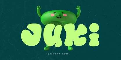 Juki is a handwritten font with bold display fun character. The groovy letters make this font great for logotype, headline, poster film, food packaging, magazine, labels or any type of advertising purpose. FEATURES : Uppercase, Lowercase, Number, Punctuation, Multilingual, PUA Encode, Opentype. If you have any question, don’t hesitate to contact me. Happy Designing !!! Thank You, Illushvara Design
 - Fallout by Balpirick,
$15.00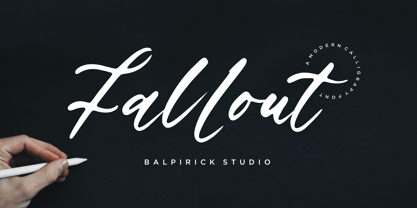 Fallout is a Modern Calligraphy Font. Fallout is a flowing handwritten font, described by an elegant touch, perfect for your favorite projects. Fall in love with its incredibly distinct and timeless style and use it to create spectacular designs! Fallout also multilingual support. Enjoy the font, feel free to comment or feedback, send me PM or email. Thank you!
 - Goldside by Balpirick,
$15.00 Goldside is a Bold Monoline Handbrushed Font. Goldside is a bold and elegant handwritten font. Its distinct and well rounded letters make this font a masterpiece. Fall in love with its incredibly versatile style and use it to create spectacular designs! Goldside also multilingual support. Enjoy the font, feel free to comment or feedback, send me PM or email.
 - Mostly Bonny by Haksen,
$12.00 Introduce my New Product "Bonny" The new fresh handmade script font. Very suitable for greeting cards, branding materials, business cards, quotes, posters, and more! These fonts are perfect for all brand :) Features : - UpperCase & Lowercase Numerals & Punctuations - Ligatures Multilingual characters (AÀÁÂÃÄÅCÇDÐEÈÉÊËIÌÍÎÏNÑOØÒÓÔÕÖUÙÜÚÛWYÝŸŸÆŒßÞàáâãäåæçèéêëìíîïðñòóôõöøùúûüýÿ) PUA ENCODEDZIP INCLUDED Thanks for visited and Please contact me if you have any questions. My Best, Haksen
 - Woliu Maners by madeDeduk,
$16.00 Woliu Maners is a Modern Sans, use this font for any branding, product packaging, invitation, fashion, label, poster, logo etc. Feature Uppercase & Lowercase Number & Symbol International Glyphs Multilingual support Alternative Ligature Feel free to drop us a message any time and follow my shop for upcoming updates Shoot me on email at: dedukvic@gmail.com Hope you enjoy it.
 - Cervo by Typoforge Studio,
$25.00 Font Cervo is the younger sister of Kapra. It is characterized by eight different varieties – lower and uppercase characters and in contrast to Kapra is “slimmed” version (from Medium to Thin). It is inspired by a You And Me Monthly published by National Magazines Publisher RSW „Prasa” that appeared from May 1960 till December 1973 in Poland.
 - Castlena by Balpirick,
$15.00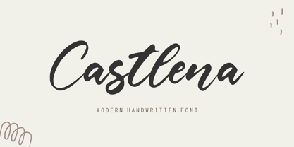 Castlena is a Modern Handwritten Font. Castlena is a flowing handwritten font, described by an elegant touch, perfect for your favorite projects. Fall in love with its incredibly distinct and timeless style and use it to create spectacular designs! Castlena also multilingual support. Enjoy the font, feel free to comment or feedback, send me PM or email. Thank you!
 - Luckangle by Balpirick,
$15.00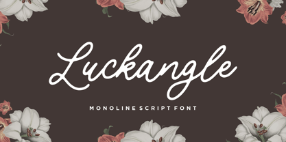 Luckangle is a Monoline Script Font. Luckangle is a lovely and delicate script font that exudes elegance and class. This font was particularly crafted for those who need a beautiful and refreshing look to their designs. Luckangle also multilingual support. Enjoy the font, feel free to comment or feedback, send me PM or email. Thank you!
 - Yourladies by Balpirick,
$15.00 Yourladies is a Modern Handwritten Font. Yourladies is a sweet and delicate handwritten font. Dainty and joyful, this font will be ideal for writing wedding invitations, cards or any other design that may need a romantic, personalized touch! Yourladies also multilingual support. Enjoy the font, feel free to comment or feedback, send me PM or email. Thank you!
 - Goldie Boxing by Balpirick,
$15.00 Goldie Boxing is a Bold Brushed Handdrawn Font. Goldie Boxing is a bold display font with an autumn theme. Add this chunky lettered font to your designs and notice how it makes them come alive! Goldie Boxing also multilingual support. Enjoy the font, feel free to comment or feedback, send me PM or email. Thank you!
 - Belanda by Subectype,
$13.00 Introducing the new "Belanda" font, a monoline script font. For those of you who are needing a touch of clean monoline handwritten Font, chic and modernity for your designs, this font was created for you! If there's anything else you are unsure of feel free to pop me a message :) That's it! Have fun using Belanda Fonts!
 - Magic Romance by Zeenesia Studio,
$19.00 Introducing Magic Romance Magic Romance is a modern and elegant serif font. Magic Romance is well-suited for advertising, branding, logotypes, packaging, titles, headlines and editorial design. We hope you enjoy the font, please feel free to comment if you have any thoughts or feedback. Or email me at zeenesia@gmail.com. Thanks for purchasing and have fun!
 - Violetail by Balpirick,
$15.00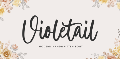 Violetail is a Modern Handwritten Font. Violetail Modern is an elegant and dainty handwritten font that features sweet and delicate swashes. This original look will appeal to a wide range of crafty ideas, from letterheads and titles, to stationery. Violetail also multilingual support. Enjoy the font, feel free to comment or feedback, send me PM or email. Thank you!
 - Blackbone by Balpirick,
$15.00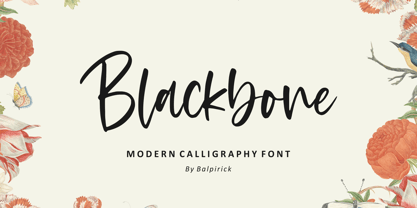 Blackbone is a Modern Calligraphy Font. Blackbone is a lovely and delicate script font that exudes elegance and class. This font was particularly crafted for those who need a beautiful and refreshing look to their designs. Blackbone also multilingual support. Enjoy the font, feel free to comment or feedback, send me PM or email. Thank you!
 - Guardian Circus by Balpirick,
$15.00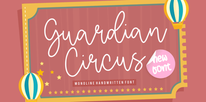 Guardian Circus Font. Guardian Circus is a Monoline Handwritten Font. Guardian Circus is a sweet, thin and natural handwritten font. It looks friendly and adaptable and it will certainly enhance each and every one of your designs. Guardian Circus also multilingual support. Enjoy the font, feel free to comment or feedback, send me PM or email.
 - Houstonfield by PeachCreme,
$19.00 Houstonfield is not another script font suitable for any project. Add a touch of luxe and elegance to your project. This font is perfect for signature logos, modern invitation, wine labels and many more. Swipe the preview to get some inspiration. If you have any other questions, feel free to drop me a message:) Happy designing, Gulya
 - ROBO - Personal use only

- FS Silas Sans by Fontsmith,
$80.00 The great enigma There are hidden depths to FS Silas Sans. First impressions are of a functional, multi-purpose typeface with a cool, edgy, angular character. Gaze into its eyes a little longer, though, and you'll detect a more nuanced, colourful personality, with full, open, satisfyingly squarish forms balancing the abruptness of the sharply-angled terminals and ascenders. Authoritative, official and stern on the outside; amiable and welcoming on the inside. You’re so Dane The designers, led by Phil Garnham, were trying to capture something straight-talking, authentic, and a little... Scandinavian. ‘We were thinking about some of the characters in Danish dramas that were on in the early stages of the font’s development, like The Killing and The Bridge,’ says Phil. ‘The police officers, that is, not the psychopathic killers. Smart and a bit cool, but with a warm heart.’ For a good Danish name, we settled on Silas. It was that or Hans-Christian. The finer points Silas Sans rewards close inspection. Study, if you will, its amply squarish forms, the roomy ‘o’ and ‘e’, in particular. Observe the angular ascenders and terminals of, for example, the ‘L’, ‘I’, ‘d’ and ‘i’, inferring the movement and lift of a pen. Consider the cuts to the ‘A’ and ‘v’ that create harmony with adjacent letters. And scrutinise the subtle ink traps set within the ‘A’ and ‘Y’ for reproduction at small sizes. A fine subject, we think you’ll agree, and available in a versatile range of weights to make (with FS Silas Slab) a typographic system with a comprehensive hierarchy.
 - Disruptor's Script by Piñata,
$15.00 Disruptor's Script is the alter ego of our previous project Gentlemen's Script. Unlike the Gentlemen's Script, the new font is an elegant rebel and defies traditions. The font is painted with a brush pen, which is especially noticeable in the characteristic shabbiness and different thicknesses of the strokes. While the Gentlemen's Script is an embodiment of a classic costume, dress shoes and an expensive watch, Disruptor's Script is a fashionable suit, sneakers, an iWatch and a tattoo that peeks from under the shirt. The font retained the incline, speed and overall sense of dynamics inherent in Gentlemen's Script, but got a bit more chaotic and unpredictable. This is especially noticeable in the newly added shabbiness, elongated extenders, a large number of contextual alternates and different ligatures. For some high-frequency letters (10 for the Latin alphabet and 10 for the Cyrillic alphabet), we painted alternative versions that are substituted in the word instead of the standard characters when following our preceding certain groups of letters. In addition, in the Disruptor's Script you can find functional ligatures, including some of the frequently occurring two- and three-letter combinations. All these solutions dilute the monotonous line of the set, add a bit of unpredictability to the font and a touch of chaos to inscriptions. To fully enjoy usage of the font, we recommend that you always keep the features contextual alternates (calt) and standard ligatures (liga) turned on. If you do not have access to applications that support OpenType features, it does not matter—even without these features you can use and enjoy our font!
 - Stubble by Aah Yes,
$12.00Stubble is a distressed grunge font with many useful variations that make things easy. It comes in both a Regular and Bold version, and a Smudged version as if the print block has slipped a little bit just at the vital moment. Also there’s 2 jumbled versions with the letters and numbers, and some punctuation, at odd angles and slightly off-whack; there’s 2 versions with little bits of overprint on most of the main characters (as if the corners of the block or stamp have just caught the paper); a couple of Caps Only versions; plus condensed and expanded versions of the main faces. The Bold version is not an exact expanded version of the Regular version, please note, the characters are different (i.e. the misprinting is different) in the two weights. Western and Central European accented characters are included, and there’s a set of replacements for double-letter combinations such as bb, dd and OO, TT, so that 2 different letters will appear - which avoids having exactly the same grunge letter appearing twice in succession (20 or more pairings for each case, all the pairings that reasonably exist) which work as ligature replacements. The whole family constitutes a comprehensive package that offers a great variety of ways of presenting a grunge typeface for display, headlines and posters, while maintaining the thread of the same sans-serif style. The zip package contains both the TTF and OTF versions of the font. Install only one version on the same machine, installing both versions may produce all sorts of erratic behavior.

