10,000 search results
(0.023 seconds)
- Pirate Bay by Vozzy,
$5.00 A vintage look label font named "Pirate Bay".Typeface includes five styles plus aged version, for sample look at 4th preview. This font will good viewed on any retro design like poster, t-shirt, label, logo etc. For using effects layers: - Type your text in Regular. - Copy that and paste at the same position. - Change the style to Effects, Shadow or Texture.
 - Churchward Isabella by BluHead Studio,
$25.00 Churchward Isabella is a five weight typeface family originally designed during the 1980's by the late type designer Joseph Churchward, from New Zealand. A straightforward, geometric sans serif, it is a no-nonsense, highly legible workhorse design, readable on screen as well as in print, for text, headline and display. The family includes Light, Regular, Medium, Bold and Extra Bold.
 - College Game JNL by Jeff Levine,
$29.00 The hand lettered credits for the 1940 horror film “The Invisible Woman” look more like they would show up in a movie about a college football game. A bold, condensed slab serif type design, it’s perfect for many sports-themed graphics projects. The digital version has been aptly named College Game JNL, and is available in both regular and oblique versions.
 - Oh Hex JNL by Jeff Levine,
$29.00 An Art Deco “thick and thin” novelty type design based on the hexagon shape was found within the pages of “La Lettre Dans le Decor & La Publicite Modernes” - a 1930s-era French alphabet collection. The title somewhat translates to “The Letter in Modern Decor and Advertising”). Named Oh Hex JNL, it is now available in both regular and oblique versions.
 - Spike by Quadrat,
$25.00 Spike was designed as a Latin type family, with the characteristic triangular serifs, but with more character and range of weights than the more common latin faces available. Designed as a display face, it could be used as a flavorful text face in special situations. The complete family consists of four fonts: light, regular, bold and an all-caps incised version.
 - Warm Thanksgiving by Mvmet,
$15.00 Warm Thanksgiving is a warm and fun font for your thanksgiving day, you can use it for everyday use too for its versatility. Create something with it from regular typing notes, to t-shirts, kids’ book designs, greeting cards, stickers, posters, or anything that needs a casual touch. Fall in love with its incredible style and use it to create lovely designs!
 - CHILD & MOMSKY by Rhd Studio,
$15.00 Style and Grace personified - say Child Momsky. This typeface has two main styles, Regular and Italic, that are designed to work elegantly in unison and apart. The serif has a boldy different ' f', which sets it apart from regular serifs.....as Child Momsky likes to stand out from the rest. A regular 'f' is included in its alternates, and a extra font style with a regular f is included for projects that require a more staid elegance. The Italic style is dreamy, sultry and light-footed - a perfect partner for the more serious serif. Use them together or apart for stylish, stand-out type designs and projects. For those of you who do not have access to Opentype Software, such as Canva Users, a separately available 'extra letters' font set will be available for purchase soon. Language Supported : Danish, English, French, German, German (Switzerland), Italian, Low German, Luxembourgish, Norwegian Bokmål, Norwegian Nynorsk, Portuguese, Swedish, Swiss German. Enjoy
 - HWT Geometric by Hamilton Wood Type Collection,
$24.94 This late 19th century design conjures up early 20th century Dutch DeStijl lettering with a mostly strict adherence to right angles and minimal stroke modulation. Geometric began its life as a metal typeface from the Central Type Foundry, circa 1884. Soon after, this design was officially licensed to Morgans & Wilcox and was shown in their 1890 catalog in Regular, Light and Condensed Light variations. After acquiring Morgans & Wilcox, Hamilton Manufacturing offered Geometric Light Face Condensed as their own No 3020 and the Geometric Light Face as No 3021. HWT Geometric has been expanded digitally to include a Regular Condensed version. A heavier wood type specimen was found from an unknown manufacturer and digitized as it was found, resulting in the HWT Geometric Shopworn and Shopworn Inked variations. These digital versions all include a full Western and Central European character set of over 380 glyphs.
 - Linotype Cerny by Linotype,
$29.99Linotype Cerny is part of the Take Type Library, selected from the contestants of Linotype’s International Digital Type Design Contests of 1994 and 1997. Dutch artist Mark van Wageningen designed an alphabet consisting exclusively of capital letters. The font’s most distinguishing characteristic is its irregular outer contour, almost as though they were ripped out of paper. Linotype Cerny is intended exclusively for headlines in larger point sizes. - HT Libreria by Dharma Type,
$19.99 This font consists of thin lines, we get very delicate impression.The straight lines are regularly arranged, at the same time, this font has very beautiful curved lines. So its overall atmosphere is intelligent and sophisticated. Holiday Type Project offers retro hand drawing scripts. Inspired by retro script on shopfront lettering, wall paint advertisements in Italy around 1950s. Check out the script fonts from Holiday Type!
 - Linotype Konflikt by Linotype,
$29.99Linotype Konflikt is part of the Take Type Library, which features winners of Linotype’s International Digital Type Design Contest from 1994 to 1997. Designer Stefan Pott was inspired by the conflict between the appearance of a typeface in print and on a computer screen. Out of this conflict came a font in which every character has aspects of both flowing handwriting and angular pixel-like strokes. - Ad Lib by Image Club,
$29.99Ad Lib designed by Freeman Craw for the American Type Founders (ATF) in 1961. A bold Grotesque with irregular rectangular counters in round characters. This type was designed by cutting the letter images out and thus has some wood-cut character. Some lower case characters have slight inclination. Initially numerous alternative characters were provided. Unusual shapes make this typeface useful for advertising and display work. - Cinematica by Underground,
$14.90 Cinematica was specially designed for film credits in communication pieces. Due to its space saving qualities, geometric elegance of its shapes, and eight wights; it allows a wide range of uses. Its geometry makes Cinematica able to harmonize and unify any text, incorporating the necessary signs for composition in English, Spanish, Italian, French, German and Portuguese. The Regular weight also incorporates statements that usually appear in film credits (such as "directed by", "produced by", etc.) that have been programmed as predetermined ligatures and can be accessed by typing a short sequence of signs to avoid typing the full phrase. To make the most of the alternatives proposed, use applications that support Open Type. Take a look at the User Guide.
 - Poppin by Kustomtype,
$20.00 Poppin is a playful font-type that you can comfortably use in all kinds of styles, from modern to old school. A combination of a few names on an old movie poster is what triggered the creation of this font type. Because it had such a strong rock and roll character, I decided to dedicate a font-type to it. The Poppin font is completely hand-drawn and then digitized. It results in being an extremely user-friendly, complete and modern font that you can use in all your graphic applications. Poppin is a font from the subculture that has been updated to a hip and classy font, ideal for eye-catching designs. Poppin comes in 4 styles, regular, bold , round & bold round. Poppin makes everyone smile!
 - Altissimo by Soneri Type,
$32.00 Altissimo is a display type family, derived from the Ample typeface, it has large x-height, optical mono linear and a bit squarish in nature. It has a smooth curve instead of sharp angles formed by the junction of two strokes, which is a prominent feature of its design. It is designed to be a little eye-catching yet legible. It has clear and distinguishable letterforms, which helps to elaborate and emphasise the message. It is graphically strong and commands viewer's attention. The overall appearance of this type is suitable in setting it as heading, title, headline, etc. The type family consists of seven weights viz. Thin, ExLight, Light, Regular, Medium, Bold and ExBold. Altissimo is designed by Aakash Soneri in a period between 2017 and 2018.
 - Geon by cretype,
$20.00 Geon Family is a modern sans-serif typeface that is clean, simple and highly readable. Letters in this type family are designed with geometric shapes without any decorative distractions. The spaces between individual letter forms are precisely adjusted to create the perfect typesetting. Geon is a versatile type family of 54 fonts. Geon family consists of 9 weights (Thin, ExtraLight, Light, Regular, Medium, Bold, ExtraBold, Heavy & Black) & 3 widths (Condensed, Normal & Expanded)with their corresponding italics. The Open Type fonts contain complete Latin 1252, Cyrillic, Central European 1250, Turkish 1254 character sets. Each font includes proportional figures, tabular figures, numerators, denominators, superscript, scientific inferiors, subscript, fractions and case features. We highly recommend it for use in books, web pages, screen displays, and so on.
 - Bodebeck by Linotype,
$29.99 The Swedish designer/typographer Anders Bodebeck designed the Bodebeck type family in 2002. The family, which includes five different styles, is primarily intended for use as a titling, or display face, and belongs to the neo-transitional style of typefaces. Transitional style type first appeared in England during the late 1750s, when John Baskerville released his first sets of type. Bodeck bears similarities to another, later transitional style typeface as well - Eric Gill's Perpetua (originally released by the British Monotype Corporation in 1928). Like these two previous English stonecutters turned masters of typography, Anders Bodebeck has given us a modern re-interpretation of classic letterforms. Bodebeck, which is fitted with old style figures, is available in the following styles: Regular, Italic, Bold, Bold Italic, and Extra Bold."
 - Jiho by cretype,
$20.00 Jiho Family is a modern sans-serif typeface that is clean, simple and highly readable. Letters in this type family are designed with minimal & modern shapes without any decorative distractions. The spaces between individual letter forms are precisely adjusted to create the perfect typesetting. Jiho is versatile type family of 18 fonts. Jiho family consists of 9 weights (Thin, ExtraLight, Light, Regular, Medium, Bold, ExtraBold, Heavy & Black) with their corresponding italics. The Open Type fonts contain complete Latin 1252, Cyrillic, Central European 1250, Turkish 1254 character sets. Each font includes proportional figures, tabular figures, numerators, denominators, superscript, scientific inferiors, subscript, fractions, old style-figures and case features. We highly recommend it for use in signage, books, web pages, screen displays, and so on.
 - Rexlia Free - Unknown license

- House of Montague by IKIIKOWRK,
$17.00 Introducing House of Montague - Classic Font Duo, created by ikiiko. House of Montague is a traditional font for the classic serif type with the addition of a script type. A simple font, with a thin size, adds an elegant and classy impression. This typeface is perfect for an elegant logo, branding, travel promotion, layout magazine, beauty product, packaging product, quotes, or simply as a stylish text overlay to any background image. What's included? Regular & Script Uppercase & Lowercase Number & Punctuation Multilingual Support Enjoy our font and if you have any questions, you can contact us by email : ikiikowrk@gmail.com
 - Karolinus Fraktur by Cercurius,
$19.95 A slightly regularized digital version of a late Baroque Fraktur type, probably from the beginning of the 18th century, issued by the Norstedts type foundry in Stockholm in 56 point size as "Sju petit fraktur nr 2". This digital font is designed for rather large sizes, at least 30 points. The font includes accented letters for all Western languages, as well as a long s and the usual Fraktur ligatures, e.g. ch, ck, st, tz. The font can be used for logos, packaging, posters, restaurant menus, beer and wine labels etc. associated with traditional German and Scandinavian culture.
 - Hostile Portia by Letterhend,
$19.00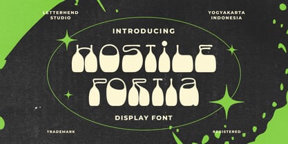 Hostile Portiais a reverse display font with fun and playful looks. This type of font perfectly made to be applied especially in storybook children or child theme which is need a standout font, and the other various formal forms such as invitations, labels, logos, magazines, books, greeting / wedding cards, packaging, fashion, make up, stationery, novels, labels or any type of advertising purpose. Features : regular & hand drawn numbers and punctuation multilingual PUA encoded We highly recommend using a program that supports OpenType features and Glyphs panels like many of Adobe apps and Corel Draw, so you can see and access all Glyph variations.
 - Newsprint JNL by Jeff Levine,
$29.00 Newsprint JNL has its origins in an online auction image of wood type. Only the lower case a-z were shown and the type design included an extra-wide 'g' and 's'. Expanding on this idea but narrowing the 's' a bit, Jeff Levine created a capitals set and all of the necessary additional characters - even adding a generous selection of accented characters not usually found in his display fonts. Regular, oblique, narrow, narrow oblique, wide and wide oblique versions are available. All styles offer crisp, clean lettering for headlines, window signage and other display text applications.
 - Pompano by Letterhend,
$17.00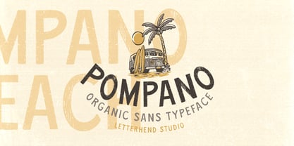 Pompano is an organic sans serif typeface which is purposely made for headline, display or logotype.This type of font perfectly made to be applied especially in logo, and the other various formal forms such as invitations, labels, logos, magazines, books, greeting / wedding cards, packaging, fashion, make up, stationery, novels, labels or any type of advertising purpose. Features : regular & stamp version uppercase & lowercase numbers and punctuation multilingual alternates & ligatures PUA encoded We highly recommend using a program that supports OpenType features and Glyphs panels like many of Adobe apps and Corel Draw, so you can see and access all Glyph variations.
 - Cottage Stone by Letterhend,
$17.00 Cottage Stone is a bold serif font with classic and vintage looks. This type of font perfectly made which is need a standout font, and the other various formal forms such as invitations, labels, logos, magazines, books, greeting / wedding cards, packaging, fashion, make up, stationery, novels, labels or any type of advertising purpose. Features : 3 Styles : Regular, Inline & Extrude Lowercase & upercase Numbers and punctuation multilingual ligatures PUA encoded We highly recommend using a program that supports OpenType features and Glyphs panels like many of Adobe apps and Corel Draw, so you can see and access all Glyph variations.
 - Glow Better by Ergibi Studio,
$22.00 Glow Better Modern Duo, these fonts are of two types serif and script. Display Serif inspired by famous logo, This typeface has been made carefully to make sure its premium quality and luxury feel. The ligatures on serif makes this typeface unique and stands out rather than the regular serif font, perfectly for headlines, wedding, social media, logos, posters, packaging, T-shirts, coffee shops, restaurants, magazine’s headers, signs or gift/post cards, cafe’s and weddings or any type of advertising purpose. What's Included : Standard glyphs Web Font Ligatures International Accent Works on PC & Mac Simple installations
 - Manufacturer JNL by Jeff Levine,
$29.00 Manufacturer JNL is a reinterpretation of the classic type face Venus Extra Bold Extended, and is available in both regular and oblique versions. According to Wikipedia: “Venus or Venus-Grotesk is a sans-serif typeface family released by the Bauer Type Foundry of Frankfurt am Main, Germany from1907 onwards. Released in a large range of styles, including condensed and extended weights, it was very popular in the early-to-mid twentieth century. It was exported to other countries, notably the United States, where it was distributed by Bauer Alphabets Inc, the U.S. branch of the firm.”
 - Cosmo Bones by Letterhend,
$16.00 Cosmo Bones is a reverse display font with fun and playful looks. This type of font perfectly made to be applied especially in storybook children or child theme which is need a standout font, and the other various formal forms such as invitations, labels, logos, magazines, books, greeting / wedding cards, packaging, fashion, make up, stationery, novels, labels or any type of advertising purpose. Features : regular & hand drawn numbers and punctuation multilingual PUA encoded We highly recommend using a program that supports OpenType features and Glyphs panels like many of Adobe apps and Corel Draw, so you can see and access all Glyph variations.
 - Mountain Warrior by Letterhend,
$17.00 Mountain Warrior is a monoline script with a touch of retro look and feel. This type of font perfectly made to be applied especially in logo, headline, signage and the other various formal forms such as invitations, labels, logos, magazines, books, greeting / wedding cards, packaging, fashion, make up, stationery, novels, labels or any type of advertising purpose. Features : uppercase & lowercase regular & rough numbers and punctuation multilingual alternates / swashes and ligatures PUA encoded We highly recommend using a program that supports OpenType features and Glyphs panels like many of Adobe apps and Corel Draw, so you can see and access all Glyph variations.
 - Craggy by Ingrimayne Type,
$7.95 Craggy has a narrow, spidery, irregular set of letters. Its creepy, Halloween spirit makes it ideal for scary stories and similar uses. The family has three base styles: condensed, regular, and bold. Each comes with an oblique and backslanted version yielding a complete family of nine members.
 - Basil by Karandash,
$- A mix between tradition and innovation, Basil is a unique humanist slab serif well suitable for broad range of design projects - editorial, logotype, poster, etc. With its tall x-height and generous internal spaces, the type family was especially designed with legibility in mind and is well suitable for body text at small sizes. In the same time Basil is equally able as titling and headline font due to numerous distinctive visual features that shape its attractive appearance. A true workhorse, packed with lots of OpenType features and full multilingual support, the type family consisting of six weights, with Regular available for free! Basil type family received Special Mention in Cyrillic text Typeface category at 7th International Type Design Competition for non-Latin typefaces - Granshan 2014. It also was exhibited at New Bulgarian Typography exhibition part of Sofia Design week 2013 and then took part in several travelling exhibitions.
 - Life Support - 100% free

- Spylord Bold Expanded - Unknown license

- Austral Slab by Antipixel,
$15.00 Austral Slab is a hand-drawn layered font designed by Antipixel, with unique textures & styles that combine giving your work a distinctive impression. This font comes in three weights, Regular, Light & Thin, with irregular outlines and uneven/crooked strokes, giving your work more personality and making it exclusive and powerful. For this same reason it can be used in a vast variety of projects, such as logos & branding, stationery, book covers, magazine design, clothing prints & tags, packaging, animated videos, and many more! Austral Slab has three sets of alphabets in uppercase and lowercase to avoid repeating the same character pattern, and giving the font a more natural handwritten feel. This is included in the Open-Type Contextual Alternates, which applies an automatic substitution of glyphs as long as the Open-Type features are activated. Also, Austral Slab offers other Open-Type features such as Stylistic Alternates, Ligatures, Discretionary Ligatures, Fractions, Superscript, Subscript, Denominator, Numerator, Scientific Inferiors & Kerning. This font has a very large glyph coverage and can be used in a wide range of languages, including English, Spanish, Italian, French, German, Polish, Czech, Vietnamese, Finnish, Icelandic, among many others. The style Maplines Thin is offered Free for commercial & personal use!
 - Argone LC by Graphite,
$22.00 Argone LC is a handmade organic typeface family. It is a variant of Argone typeface, but has lower case letters. It comes in four weights– light, regular, bold and black, which is a feature not seen much in handmade typefaces. This makes Argone LC a versatile and flexible type family. There is also a version of Argone LC which only has upper case letters – Argone
 - Rekord Antiqua by RMU,
$30.00 Rekord Antiqua, regular and semibold, released 1911 by Wagner & Schmidt, is a perfect body text partner for Art Nouveau display fonts. Both styles come with a long s, which can be reached by the OT feature of historical forms or by typing [alt] + b. In addition, you find two framing elements on [alt] + P and [alt] + p, and an oblique style was added too.
 - DF Staple TXT by Dutchfonts,
$33.00 StapleTXT is a transformation from the monospaced typewriter font Staple mono into a text type. The 'mono' skeleton was used as much as possible but some characters were slightly altered in order to obtain more regularity without losing its specific typewriter atmosphere: little variation in character widths. The font has lining figures and works very well as text system in combination with the Staple mono.
 - Pulp Magazine JNL by Jeff Levine,
$29.00 For a pulp magazine called Spicy Western Stories, it was unusual that the January 01, 1939 issue had its cover title hand lettered in an extra bold Art Deco style rather than Western influenced lettering. This did not stop the lettering from being used as the design model for a digital type revival. Pulp Magazine JNL, is available in both regular and oblique versions.
 - Sugar Free by PizzaDude.dk,
$17.00 Don't be afraid to taste something sugar free - most times you will be surprised how good it tastes! My Sugar Free font may not look as very much at first glance - but play around with the Regular and Italic versions (and notice the 4 different versions of each letter, that automatically cycles as you type!) and you will see how lively the font is!
 - Virtual by John Moore Type Foundry,
$25.00 Virtual is an experimental fantasy font based on a pseudo optical enclosure where a linear system that is not connected there. Virtual comes in three weights: regular. light, and thin also an virtual mix by mixing different thicknesses in a single font, with alternative variations through features of open type. Virtual is an experience based on play with the laws of the Gestalt of closing.


