10,000 search results
(0.046 seconds)
- Pixeloza 02 by Fontsphere,
$12.00 Pixeloza 02 is a pixel-style, grid-based, display typeface. This is another version of Pixeloza type. Compared to Pixeloza 01, it is characterized by a more slender form, the letters are taller and narrower, which makes the font lighter. The font is characterized by its simplicity, attention to detail, and original form. You can use it in a wide variety of projects. It gives many possibilities for creating graphics. Pixeloza 02 is available in two options: Pixeloza 01 Regular and Pizeloza 01 Skewo Regular.
 - Roseka by Andfonts,
$23.00 Meet "Roseka," the font that's here to infuse your designs with a burst of energy and creativity. This playful and funky typeface adds a dash of retro charm, making it the perfect choice for a wide array of projects. Whether you're working on posters, social media graphics, or even reimagining vintage aesthetics, Its whimsical letterforms give your text a unique personality, making it ideal for advertisements, branding, packaging, invitations, and more. Unleash your creativity without limits – Roseka is the creative spark your projects need.
 - Cagelon by Pista Mova,
$15.00 Cagelon is an adorable handwritten Monolin font with a cute and whimsical feel to it. Fall in love with its subtle and authentic charm and wide set of unique characters. The Open Type feature can be accessed using Open Type programs such as Adobe Illustrator, Adobe InDesign, Adobe Photoshop, versions of Corel Draw X, and Microsoft Word. And this Font has provided PUA unicode (custom coded font). so that all alternative characters can be easily accessed in full by a craftsman or designer. Regards Mova Pista
 - Gerard Display by Rafael Jordan,
$25.00 Clean, elegant & flexible… Gerard Display is a beautiful rational typeface, a Scotch Roman dressed up as a high-contrasted Didot for this optical size. Its 6 weights and 6 widths made it adaptable and versatile with 36 fonts, from a solid “Compressed Regular” to a broader “ExtraExpanded Heavy” without losing a bit of grace. Gerard Display counts on an extended character set that covers a wide range of Latin languages and a lot of features (as stylistic sets, local forms, or a complete set of figures).
 - Reflex by Sudtipos,
$29.00 Reflex update: Now in 18 styles and variable version. Reflex was designed as an alternative to many overused types found on the packaging of pop culture products. Taking its inspiration from Bauhaus design roots, even in its heavy weights it maintains a soft aesthetic that can transparently convey a message of newness and understanding, as well as clarity and evenness. The Reflex set comes with a wide range of linguistic support, at no extra charge, including characters for Central European, Cyrillic, Greek, Turkish and Baltic regions.
 - Canciller by Corradine Fonts,
$29.95 Canciller is an elegant typeface designed by Manuel Corradine and Sergio RamÌrez that will give your projects a very exclusive and fresh appearance. Its style is a mix between the grace of calligraphy and the legibility of typography so Canciller can be used in a wide range of purposes. It’s available in six weights that go from light and delicate to black and powerful to give the designer the possibility of creating hierarchies and great contrasts. Its character set supports Western and Central European languages.
 - Gemsbuck 01 by Studio Fat Cat,
$14.00 Gemsbuck 01 is a typeface that was designed by Atok Khoiruding in 2022. It is a sans-serif font known for its bold and geometric design. Gemsbuck 01 features clean lines and a modern, industrial aesthetic, making it popular for various applications, including posters, headlines, and logos. The font family includes several weights and styles, ranging from light to bold, allowing for versatile use in different design contexts. Gemsbuck 01 has been widely used in print, advertising, and digital media due to its distinctive and impactful appearance.
 - Bowdon by K-Type,
$20.00 Bowdon is a warm, Bodoni-inspired English Modern, influenced by the 1930s lettering of designer Barnett Freedman. Slightly rounded corners give characters a printed-look softness, and hairlines are thickened a little to increase legibility at smaller sizes, reducing the harshness and dazzle that can afflict Didone typefaces. Bowdon is supplied in three widths – Regular, Wide and Narrow – and each width is accompanied by a utilitarian oblique rather than a fancy italic. Each font includes a full Latin Extended-A character set and additional oldstyle numerals.
 - Shallot by Eko Bimantara,
$24.00 Shallot is a serif font family with sharp and exquisite characteristic. The initial letterforms are made not completely based on calligraphic strokes, which make it more likely close to transitional serif style. The letterforms have high contrast strokes and sharp serif with curved brackets. The upright styles have a fairly wide proportion. The italic styles have 12 degree angle and redrawn lowercase letters. Shallot consist of 4 styles from regular to extrabold with each matching italics. It contains 462 glyphs that support broad latin languages.
 - Biennale by Latinotype,
$29.00 Biennale is a geometric typeface with a strong character and a large x-height which make it an excellent choice for a wide range of applications, such as headlines or branding. Although common in style, Biennale distinctive details and color on the page allow users to create really unique designs. The font comes in 11 weights, from Hair to Heavy, and includes matching italics. As you would expect from Latinotype, this typeface comes with a standard set of 417 characters that support over 200 Latin-based languages.
 - Parteys by Craft Supply Co,
$20.00 Introducing Parteys – Brush Script Dynamic and Captivating: Parteys – Brush Script is a font that exudes dynamism with its varied stroke widths, making it perfect for creating eye-catching displays. Expressive Brush Strokes: This font boasts expressive brush strokes that give your text a lively and energetic appearance, making it ideal for projects that demand a touch of excitement. Versatile Design Possibilities: Parteys – Brush Script offers versatility in design, suitable for a wide range of creative applications, from posters and invitations to branding and social media graphics.
 - SK Mutka by Shriftovik,
$32.00 SK Mutka is a geometric sans serif made in the style of Art Deco. Its graceful forms are emphasized by the arched structure typical for the style and spirit of Art Deco. The typeface is suitable both for decorative work and for typing because it includes uppercase and lowercase. Moreover, it supports a wide language range. SK Mutka typeface supports extended Cyrillic, Latin, as well as an extensive character set. SK Mutka is perfect for bold and classic designs, for print and web works.
 - HandXpression by SullivanStudio,
$9.95 HandXpression was created with a stylus, imitating the experience of writing on a whiteboard with a marker. Its 646 glyphs cover from the Western to a wide part of Eastern European (Latin) alphabets. It also has all Greek letters for Math usage: yes, HandXpression makes formulas, and they look great, especially with LaTeX/XeTeX systems. The font has true italics, as well as some useful OpenType features: fractions, capital spacing, scientific superiors/inferiors, old style numbers, as well as standard ligatures and localized forms. Enjoy!
 - Qojarun by Twinletter,
$15.00 Introducing our newest font called Qojarun. With Arabic Style display fonts, you can easily give your designs a genuine Middle Eastern feel. This font features characters in an Arabic style, and goes well with a wide variety of design projects, from posters to logos and beyond. Elegant calligraphy Arabic letters are easy to read, just like writing in general. This download pack contains all the characters needed to translate your project into an Arabic theme, complete with the full character set, punctuation marks, and numbers.
 - Yapari by Power Type,
$15.00 YAPARI is a font inspired by a street typography located in a Makassar city 2005, this writing is poured into a font and then made several variations of width which are Wide, Extended, and Expanded kind of stretched font then have thickness ranging from Thin, Extra Light, Light, Regular, Medium, Semi Bold, Bold, Extra Bold, Ultra. This font is suitable for use for design projects that have a bold impression and can also be used for all lines of media as well as formal and informal
 - Bitsumishi Pro v2 by CheapProFonts,
$10.00 A squarish uppercase font perfect for logos and short eye-catching headings. The lowercase contains some alternate letterforms - more specifically: uppercase have closed forms (I made a new A D and R), and lowercase have some open alternatives (new B E F P and T in addition to the A D and R). I noticed the two width version of the H and made similar normal and wide versions of J and L. Then I added lots of missing glyphs and all the diacritic letters, of course - and finally the family has been expanded to 7 weights AND corresponding Italics! Enjoy! ALL fonts from CheapProFonts have very extensive language support: They contain some unusual diacritic letters (some of which are contained in the Latin Extended-B Unicode block) supporting: Cornish, Filipino (Tagalog), Guarani, Luxembourgian, Malagasy, Romanian, Ulithian and Welsh. They also contain all glyphs in the Latin Extended-A Unicode block (which among others cover the Central European and Baltic areas) supporting: Afrikaans, Belarusian (Lacinka), Bosnian, Catalan, Chichewa, Croatian, Czech, Dutch, Esperanto, Greenlandic, Hungarian, Kashubian, Kurdish (Kurmanji), Latvian, Lithuanian, Maltese, Maori, Polish, Saami (Inari), Saami (North), Serbian (latin), Slovak(ian), Slovene, Sorbian (Lower), Sorbian (Upper), Turkish and Turkmen. And they of course contain all the usual "western" glyphs supporting: Albanian, Basque, Breton, Chamorro, Danish, Estonian, Faroese, Finnish, French, Frisian, Galican, German, Icelandic, Indonesian, Irish (Gaelic), Italian, Northern Sotho, Norwegian, Occitan, Portuguese, Rhaeto-Romance, Sami (Lule), Sami (South), Scots (Gaelic), Spanish, Swedish, Tswana, Walloon and Yapese.
 - Hawkes by Kimmy Design,
$15.00 Hawkes is an extensive handmade typeface family that comes with a bundle of weights, widths and styles, all designed to work cohesively. Here is a breakdown of the Hawkes family. Hawkes Sans: The primary subfamily is a sans-serif typeface that includes nine fonts: three weights (light, medium and bold) and three widths (narrow, regular and wide). Within this set are an array of stylistic features; including small capitals, character style alternatives, discretionary ligatures and contextual alternatives. See details below for more information on OpenType Features. Hawkes Variable Width Sans: The secondary subfamily is the same base sans-serif fonts but combined in variating widths. Essentially, it takes all three widths of each weight and randomly mixes them together. This creates a funky and creative alternative to the more traditional sans-serif set. The variations are for the uppercase, lowercase, small capitals, ligatures and numbers. Hawkes Script: The last subfamily is the script typeface. It’s a quirky script with variations of its own, including ligatures, swashes and contextual alternatives (again, see below for further details.) The script font works great as a complimentary style to the sans-serif, or on it’s own. FEATURES Alright, let’s get into all the extra goodies this typeface has to offer. Small Capitals: Small caps are short capital letters designed to blend with lowercase text. These aren’t just capital letters just scaled down but designed to fit with the weight of both the lowercase and capitals. With Hawkes, small caps can either sit on the baseline (in line with the base of the capital and lowercase) or to be lifted to match the height of the capital letters by applying the discretionary ligature setting in the OpenType panel. These small capitals have a dot underlining them that sit along the baseline. The feature offers a unique display affect that is great for logos, titles and other headline needs. Discretionary Ligatures: A discretionary ligature is more decorative and unique combination than a standard ligature and can be applied at the users discretion (as the name indicates.) The specific styling for these ligatures varies for different fonts. With Hawkes, they are used as an all capital styling feature, or to lift the small capitals to align with the height of the capitals. In the former setting, both lowercase and uppercase letters are first changed to all capitals, then a specialized set of letter combinations are transitioned so small characters are positioned within a main capital letter. These combinations only happen with main characters that include an applicable stem, such as C F K L R T Y. Some of these combinations include two or three characters. When Small Caps is turned ‘on’, this feature will lift the small caps to the height of the capital letter. For more information, please check out the user guide! Stylistic Alternatives: Stylistic alternates are a secondary form of a character, often used to enhance the look or style of a font. For Hawkes, these alternatives provide a slightly more handmade feel. A - the capital and small capital A will lose its pointed apex and become rounded. Think of it more as an upside-down U than an up-side-down V ;-) Oo, G, Ss, Cc- these characters’ topmost terminal becomes a loop. The O is applied automatically, the G S and C need to be turn on individually. Titling Alternatives: This feature does sort of the opposite of what it intends. Instead of being used for titling purposes, this feature makes the text look better in paragraph text settings. Kk Rr h n m - curved terminals on the are straightened e - the counter stroke also gets straightened from a more looping motion y - the shape of y is changed from a rounded character to a sharper apex (think more like a ‘v’ than ‘u’) Contextual Alternatives: Contextual alternates are glyphs designed to work within context of other adjacent glyphs. With Hawkes Sans, there are three slightly different variations per character. The feature rotates the application of each variation. This helps with organic authenticity, so if you have two e’s next to each other, they won’t look identical (reflecting the natural variations in handwriting and lettering.) With Hawkes Variable width fonts, I have created a contextual pattern that randomizes the widths of each character. So, when the feature is turned ‘on’ in the OpenType panel, the widths would alternate in a pattern such as: Narrow, Wide, Regular, Narrow, Regular Wide, Narrow, etc. It happens automatically so the user doesn’t have to think or worry about getting a random seed. With Hawkes Script, contextual alternates allow strokes to connect properly from one character to the next while maintaining a believable, natural flow. Connecting strokes are present for two letters next to each other but are replaced by a shorter stroke when located at the end of a word or sentence. Some characters have in-strokes when located at the start of a word. When a character is preceded by a capital letter that doesn’t connect, it too needs an in-stroke or altered spacing. This feature is complicated and messy, but luckily you don’t really have to think about it! I’ve done all the coding so all you have to do is turn ‘on’ the feature in the OpenType panel and you are off to the races! I’m just letting you know what’s happening behind the scenes. Swashes: These are just for Hawkes Script and provide tail swashes to the start and ends of letters. There are three different options. You can pick the basic option by turning ‘on’ the swash feature in the OpenType panel, or you can pick using the Glyph panel. Stylistic Sets: This feature work in new versions of Illustrator CC and InDesign CC. You can pick specific styling sets instead of turning on an entire feature. For example, let’s say you want to have a loopy S, but not a loopy C or O, you can just turn on the S in the Style Set. It also helps create the little drop box that pops up when you hover over a character, showing you the alternates associated with that character. This makes it easy to pick and choose specific styles you want in a word or headline. ---------- And there it is folks! That’s all the basic info on Hawkes, I know it’s been a lot and I appreciate you hanging on. If you are like me and need more of a visual reference to accessing all these goodies, I’ve made a user guide to help navigate Hawkes and everything it has to offer. Altogether this extensive family boasts 14 total fonts in a wide array of styles, weights and widths, making it a great addition to any handmade type collection. Enjoy!
 - Electrone by Alit Design,
$21.00 💥Introducing "Electrone" – Unleash the Power of Typography with a Superhero Flair! Unleash the electrifying energy of "Electrone," a dynamic font that embodies the essence of superheroes with lightning speed, unmatched strength, and a dash of style. This font is not just a typeface; it's a superpower for your design projects! Key Features: Electrifying Glyphs: With 890 meticulously crafted glyphs, "Electrone" offers a vast array of characters that will add a powerful punch to your designs. Every glyph is a superhero in its own right. Sided Ligature: Seamlessly blend characters with our specially designed sided ligatures, creating a visual impact that resonates with strength and unity. Alternate Characters: Customize your text with alternate characters to give your designs a unique and personalized touch. The alternates are carefully curated to ensure versatility without compromising the superhero aesthetic. Lightning Swash: Add a bolt of energy to your typography with lightning swashes that strike through your text. Watch your words come to life with the electrifying force of "Electrone." Wings of Typography: Elevate your designs to new heights with the winged elements included in "Electrone." These wings symbolize the freedom and power associated with superheroes, making your text soar above the ordinary. Suit Up Your Designs: "Electrone" is not just a font; it's a complete superhero costume for your words. Whether you're working on comic book titles, posters, logos, or any design that demands a bold statement, "Electrone" is here to save the day. Perfect for: Comic Books and Graphic Novels Superhero Movie Posters Action-packed Logos Gaming Graphics Apparel Design and more! Embrace the electrifying power of "Electrone" and turn your designs into epic adventures. Download now and witness the transformation of ordinary into extraordinary!
 - Metropolica Shadow by Intellecta Design,
$20.00 Metropolica is a plakkat font, inspired in titglings from advertises from 1930's
 - TPG Tolle One by Tolstrup Pryds Graphics,
$15.00 TolleOne - a display font family of five weights, named after my wife, whose nickname is Tolle. The “One” indicates that she is number one, of course, but also that this is the first set of fonts I have published.
 - Jacaranda JNL by Jeff Levine,
$29.00Jacaranda JNL is a casual and fun font—resembling lettering made with the broad side of a chisel-tipped marker. Perfect for anything that is relaxed and not-too-serious, it is flexible and versatile for many ad projects. - Circuit by Holland Fonts,
$30.00A decorative tech typeface, designed for use in broadcast station identities and animations (Wired TV), with a slight reference to Rand's Westinghouse logo, of which a huge sign was used as a dinner table in the corporate guest quarters. - Wireline JNL by Jeff Levine,
$29.00 Inspired (in part) by a vintage photo of a storefront neon sign for Cushman’s Furs, Wireline JNL is a thin monoline font with the appearance of bent wire characters. The font is available in both regular and oblique versions.
 - Nasser by Eyad Al-Samman,
$3.00 “Nasser” is a Kufic modern Arabic typeface. It is suitable for books' covers, advertisement light boards, and titles in magazines and newspapers. It is very distinctive when used in black and white printout. It decorates colored pages and makes artworks more attractive. This font comes in three different weights. My father’s name is “Nasser”. Consequently, “Nasser” Typeface was designed for eternizing the memory of my late father. He was the person who taught me how to like arts, literature, and languages. Besides, my first cute child is named also “Nasser.” The main characteristic of “Nasser” Typeface is in its modern non-descender style for some of its Arabic characters such as “Sad”, “Seen”, “Sheen”, “Qaf” and others. The shape of the characters' “dot”, “dots”, and “point” is innovative; a triangle with a semi-circle shape. “Nasser” Typeface is suitable for books' covers, advertisement light boards, and titles in magazines and newspapers. Its characters' modern Kufic styles give the typeface more distinction when it is used also in posters, greeting cards, covers, exhibitions' signboards and external or internal walls of malls or metro’s exits and entrances. It can also be used in titles for Arabic news and advertisements appeared in different Arabic and foreign satellite channels.
 - Mrs Eaves XL Serif by Emigre,
$59.00 Originally designed in 1996, Mrs Eaves was Zuzana Licko’s first attempt at the design of a traditional typeface. It was styled after Baskerville, the famous transitional serif typeface designed in 1757 by John Baskerville in Birmingham, England. Mrs Eaves was named after Baskerville’s live in housekeeper, Sarah Eaves, whom he later married. One of Baskerville’s intents was to develop typefaces that pushed the contrast between thick and thin strokes, partially to show off the new printing and paper making techniques of his time. As a result his types were often criticized for being too perfect, stark, and difficult to read. Licko noticed that subsequent interpretations and revivals of Baskerville had continued along the same path of perfection, using as a model the qualities of the lead type itself, not the printed specimens. Upon studying books printed by Baskerville at the Bancroft Library in Berkeley, Licko decided to base her design on the printed samples which were heavier and had more character due to the imprint of lead type into paper and the resulting ink spread. She reduced the contrast while retaining the overall openness and lightness of Baskerville by giving the lower case characters a wider proportion. She then reduced the x-height relative to the cap height to avoid increasing the set width. There is something unique about Mrs Eaves and it’s difficult to define. Its individual characters are at times awkward looking—the W being narrow, the L uncommonly wide, the flare of the strokes leading into the serifs unusually pronounced. Taken individually, at first sight some of the characters don’t seem to fit together. The spacing is generally too loose for large bodies of text, it sort of rambles along. Yet when used in the right circumstance it imparts a very particular feel that sets it clearly apart from many likeminded types. It has an undefined quality that resonates with people. This paradox (imperfect yet pleasing) is perhaps best illustrated by design critic and historian Robin Kinross who has pointed out the limitation of the “loose” spacing that Licko employed, among other things, yet simultaneously designated the Mrs Eaves type specimen with an honorable mention in the 1999 American Center for Design competition. Proof, perhaps, that type is best judged in the context of its usage. Even with all its shortcomings, Mrs Eaves has outsold all Emigre fonts by twofold. On MyFonts, one of the largest on-line type sellers, Mrs Eaves has been among the 20 best selling types for years, listed among such classics as Helvetica, Univers, Bodoni and Franklin Gothic. Due to its commercial and popular success it has come to define the Emigre type foundry. While Licko initially set out to design a traditional text face, we never specified how Mrs Eaves could be best used. Typefaces will find their own way. But if there’s one particular common usage that stands out, it must be literary—Mrs Eaves loves to adorn book covers and relishes short blurbs on the flaps and backs of dust covers. Trips to bookstores are always a treat for us as we find our Mrs Eaves staring out at us from dozens of book covers in the most elegant compositions, each time surprising us with her many talents. And Mrs Eaves feels just as comfortable in a wide variety of other locales such as CD covers (Radiohead’s Hail to the Thief being our favorite), restaurant menus, logos, and poetry books, where it gives elegant presence to short texts. One area where Mrs Eaves seems less comfortable is in the setting of long texts, particularly in environments such as the interiors of books, magazines, and newspapers. It seems to handle long texts well only if there is ample space. A good example is the book /CD/DVD release The Band: A Musical History published by Capitol Records. Here, Mrs Eaves was given appropriate set width and generous line spacing. In such cases its wide proportions provide a luxurious feel which invites reading. Economy of space was not one of the goals behind the original Mrs Eaves design. With the introduction of Mrs Eaves XL, Licko addresses this issue. Since Mrs Eaves is one of our most popular typefaces, it’s not surprising that over the years we've received many suggestions for additions to the family. The predominant top three wishes are: greater space economy; the addition of a bold italic style; and the desire to pair it with a sans design. The XL series answers these requests with a comprehensive set of new fonts including a narrow, and a companion series of Mrs Eaves Sans styles to be released soon. The main distinguishing features of Mrs Eaves XL are its larger x-height with shorter ascenders and descenders and overall tighter spacing. These additional fonts expand the Mrs Eaves family for a larger variety of uses, specifically those requiring space economy. The larger x-height also allows a smaller point size to be used while maintaining readability. Mrs Eaves XL also has a narrow counterpart to the regular, with a set width of about 92 percent which fulfills even more compact uses. At first, this may not seem particularly narrow, but the goal was to provide an alternative to the regular that would work well as a compact text face while maintaining the full characteristics of the regular, rather than an extreme narrow which would be more suitable for headline use. Four years in the making, we're excited to finally let Mrs Eaves XL find its way into the world and see where and how it will pop up next.
 - Ah, the font "Carrois" by 04 | Yuji Oshimoto, you mean? Before we dive into the sea of glyphs and curves, let's get our facts aligned like a perfectly justified paragraph: it seems like a little mix-...
- Barberry by FontaZY,
$35.00 Barberry is a hand-made brush script typeface equipped with some decorative OTF features, made by Zakhar Yaschin (FontaZY). Barberry font contains stylistic alternates, initial and final alternates (which is duplicated by contextual alternates in the case when ini & fina are not supported), ligatures, titling alternates, small caps and large collection of swashes (additional variants - in Stylistic Set). The Barberry font is essential for hand-made lettering and design. The Barberry family also includes Barberry Vigniette font with over 200 icons and vigniettes in it. Barberry Letters supports most of Western languages (including Central Europian, Baltic and Eastern European languages) and also Cyrillic. Each lowercase letter has three positional versions of the design – basic (if the letter is in the middle of a word), initial (if the word starts with it) and the final (in the end of the word) that makes the set look more alive and expressive. Working with Barberry Letters you can enable and disable if needed such typographic tools as swashes, ligatures, small caps, titling alternates, stylistic alternates, additional swashes and the already mentioned initial and final alternates. If your design software does not support the use of the initial and final alternatives, they can be duplicated by contextual substitutions. There are more than 20 Latin and Cyrillic ligatures in the Barberry Letters. It works by default as the standard ligatures, but you can switch it off for design reasons or to select the more appropriate typographic solution in any particular case. Ornamental font Barberry Vigniette has more than 200 pictograms and vignettes that can decorate your typographic layout. All icons are drawn with a brush in the same style as the Barberry Letters. You can use them inside the text lines, or make the ornamental decoration for text, or use separately, without any letters. OpenType extensions of the Barberry Letters significantly expand the choice of typographical tools to design a better, more expressive layout. Choosing the optimal variant of certain letters in each case, you can receive a unique composition. Whether it is lettering for packaging or magazine headline, logotype or the name in the invitation – just one Barberry font-family gives you the very wide typographic possibilities.
 - KG Party On The Rooftop by Kimberly Geswein,
$5.00 In both chunky and tilted/3D versions, this font gives a dose of fun!
 - Slurp - 100% free

- Swish - 100% free

- Thoroughfare JNL by Jeff Levine,
$29.00 The Art Deco style of the 1930s offers many variants of the popular "streamline" look in hand lettering found on old sheet music titles. Thoroughfare JNL is one such example of a monoline design with the interesting curves and angles that was considered so modern and up to the minute for its time.
 - Beast Sketch by 38-lineart,
$19.00 "Beast Sketch" is an extraordinary handwritten font created with bold, untamed strokes using ink and a bamboo pen. It boasts a masculine aesthetic, an organic, natural feel, and extensive Latin character support. Perfect for book titles, magazine covers, logos, and more, it adds a raw, authentic, and compelling vibe to your projects.
 - Qairen by Letterena Studios,
$10.00 Qairen is a classic typeface with a unique style and modern look. It is perfect for elegant and luxury logos, book or movie title design, fashion brands, magazines, clothes, lettering, quotes, and so much more. This font is PUA encoded, which means you can access all of the glyphs and swashes with ease!
 - Stonefloral by Allouse Studio,
$16.00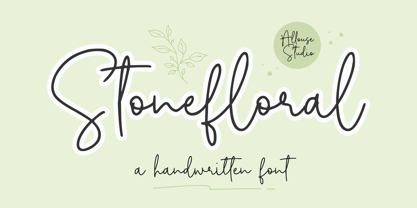 Proudly Presenting, Stonefloral A Handwritten Font. Stonefloral is perfect for any titles, logo, product packaging, branding project, megazine, social media, wedding, or just used to express words above the background. Stonefloral also come with Multi-Lingual Support. Enjoy the font, feel free to comment or feedback, send me PM or email. Thank You!
 - Steel Leg by Gatype,
$9.00 Steel leg is a font that was scratched with a brush pen, to get a natural texture, this font will show the characteristics of the hand.This font is perfect for various places such as clothing, posters, title books, stationery designs, quotes, branding, logos, invitations, greeting cards, t-shirts, packaging designs and more.
 - Rodista Brush by Stripes Studio,
$20.00 Rodista Brush is a super casual hand brushed script with detailed brush stroke texture, and a quirky, Can be used for various purposes. such as the title, signature, letterhead, signage, labels, newsletters, posters, logos, correspondence, wedding invitations, badges, etc. Rodista Brush Font international Support for a review of most Western languages included.
 - Anzura by Mightyfire,
$10.00 Anzura is a decorative font that can be used for book title, logo brand, poster and many more. The looks is vintage classic yet clean, with a little decoration on each letter. We have two styles, Anzura Regular and Anzura Shadow. Both are beautiful! Enjoy in cooking something creative with Anzura font! :)
 - Wonderbear PB by Pink Broccoli,
$14.00 From the title screens and comic books of the Hair Bear Bunch comes the fun and funky Wonderbear typeface. All that 70’s flavor packed into a Caps/Alt Caps typestyle reminiscent of a lovable limited run cartoon show. The Hair Bears miss you as much as you miss them. Relive the laughter.
 - The Hungry by Zeenesia Studio,
$14.00 The Hungry font. It has a bold and smooth style and is perfect for making any design stand out. Best suitable for branding, packaging, print titles, tshirt design, food design, and similar projects. more than 50 stylistic alternates and some natural ligatures to make this font very classy and look so beauty.
 - Meizda by Patria Ari,
$15.00 Introducing Meizda, a fun handwritten font with unique alternate and ligatures. Meizda can be played off easily to use for your project to make design more beautiful. Meizda suitable for book cover, tshirt, tote bags, merchandise, books, poster, title, quotes, and many more! Fonts featured : Uppercase Lowercase Numbers Punctuation & symbols Accented characters

