10,000 search results
(0.032 seconds)
- Ozana Pro by Mostardesign,
$99.00 Ozana Pro is a bracketed serif font family adapted to the professional requirements of graphic designers, web designers and mobile app developers. Comprised of 24 styles including 12 styles designed especially for headlines and 12 styles for text and long paragraph design, Ozana Pro is a very versatile family of fonts that can be used in many projects such as editorial design, branding or corporate identity creation, design of posters or logos, the creation of websites or the development of mobile applications. This serif font family, with a resolutely modern aspect, also hides a unique typographic design since it has 2 distinct styles (Roman and Display) which have 2 different optical sizes in order to graphically differentiate the appearance of titles, subtitles and long paragraphs. With this design of glyphs differentiated by the optical size according to the styles, the titles have a very graphic aspect while the long texts have a more classic design in order to keep an optimal readability in all cases. Ozana Pro is also equipped with powerful OpenType features such as case sensitivity, true small caps, ligatures, tabular figures, old styles figures, numbers circled. Ozana Pro is also available as a variable font family.
 - Qillsey Einstein by Asd Studio,
$15.00 Introducing the new font Qillsey Einstein, a type of script that has a natural scratch texture. I made Qillsey Einstein by using a Japanese calligraphy pen that makes the impression seem natural. My font is complete with 3 Stylistic Sets which will make the writing more beautiful and charming. This typeface is suitable for use in a variety of design fields, such as event advertisements, product promotions, book titles, activity titles, logos, adventure, and others. This font can when paired with serif font types will make your design project more beautiful and perfect. I highly recommend using a program that supports OpenType features and Glyphs panels such as Adobe Illustrator, Adobe Photoshop CC, Adobe InDesign, or CorelDraw, so you can see and access all Glyph variations. This font is encoded with Unicode PUA, which allows full access to all additional characters without having special design software. Mac users can use Font Book, and Windows users can use Character Map to view and copy one of the extra characters to paste into your favorite text editor / application. Thank you if you are interested in purchase and using my font. I hope you enjoy the font, thank you.
 - Chalfont by Alan Meeks,
$45.00 The typeface was designed after seeing a photocopy of some News Gothic text where the ink had faded on the bottom of each character. As character recognition is generally based on the top half of a character, readability was never compromised. Rather like Antique Olive the characters have a top heavy look when viewed straight on, however, as most type is read at an angle with the top further away than the bottom this top heavy look is diminished.
 - Grover by Sudtipos,
$35.00 The object of Grover was to join two distinctive typeface designs: the basic European gothic of the late nineteenth century and the ‘rounded’ style found in 1960s America. The result is a clear, friendly face with subtle yet unforgettable features. Named after Grover Washington, Jr., the jazz saxophone player, Grover is geometrically constructed and yet very human in appearance. Sans and slab serif variations, true italic weights, as well as small caps afford Grover versatility and unique display characteristics.
 - Rockport BF by Bomparte's Fonts,
$39.00 The roots of Rockport BF run deep. 19th century woodtypes, display gothics of the 40s and 50s, are inspiration for this distinctive font style. Its OpenType programming features automatic fractions, stylistic sets and alternates for a, b, q, r, t, u, y, M, N, U, Y, and dollar symbol. Tempered by somewhat humanistic elements, these condensed, geometrically-structured letterforms bring a strong but friendly presence to posters, logos, bookjackets, signage headlines, and many other typographic environments.
 - Oun by Ezzazebra,
$15.00 Inspired from Cambodia’s alphabet, Khmer. I tried to explore the visual of the original character in Latin characters. Inspired by 2 gothic fonts, Old London (for the modern/straight feel) and Berliner (for the dynamic between thin and bold line). The letters are made with pencil in a millimeter block book, then scanned into clean vector format. And the result can be use for Display or a Headline with traditional or ethnic theme, including film, game, event, etc.
 - Carisma by CastleType,
$59.00 If you're in need of a sophisticated sans serif font, look no further than type designer Jason Castle’s Carisma (Paul Shaw in HOW magazine). Carisma, a CastleType Original, combines the elegance of classic capitals, the simplicity of clean-cut, geometric lowercase letters and the warmth of sensuous curves, subtle contrasts and sensitively tapered terminals, making it the perfect typeface for an understated, modern, sophisticated look. Available in two styles: Carisma Classic (the original), and Carisma Gothic, plus Carisma Inline.
 - HU Storyserif by Heummdesign,
$15.00 HU Storyserif is a textual font in the form of a slab serif and contains a concise and neat feeling through the round conclusion of straight lines and lines. It is a typeface designed to contain a distinctive feeling by adding a round topknot, not a typical square topknot of slab serif, and a gothic solidity through a straight straight line. There is 1 weight of HU Storyserif : Regular Features : Uppercase & Lowercase Numbers & Puncuatuion Multilanguage 882 Glyphs
 - Bulldog Slab by Club Type,
$36.99 Figgins and Caslon may be names familiar to many as Type Founders. Indeed they are, but they are perhaps less well known for the emergence of Sans Serif type styles which have become part of our lives since 1889. The first hundred years of this style is celebrated with this design by Adrian Williams, completed in 1989. It echoes many features of the Gothic, Grotesque and Sans Serif models of the period, based particularly on the 1870 Figgins.
 - Cruz Quaste by Mans Greback,
$59.00 Cruz Quaste is a calligraphic medieval type, drawn by Måns Grebäck between 2018-2020. While traditional in character it is yet original, and could be described as a reinvented Gothic style. Its blackletter style it works great in historical contexts, or to give projects a tough feeling. Cruz Quaste contains OpenType features such as alternates and ligatures. The font is multilingual and supports all Latin-based European languages. It contains numbers, punctuation and all symbols you'll ever need.
 - Wittingau by Storm Type Foundry,
$39.00 Wittingau is the original German expression for “Třeboň”, which is a beautiful town near my studio in South Bohemia. I love it for its calm and inspiring atmosphere and rich cultural past dating from the 12th century. The present typeface family is released as homage to Třeboň in the style of its greatest glory – Gothic Revival with classicistic decorativeness. Wittingau is excellent for music covers, book and catalogue jackets, invitations and posters. Contains many ornaments for creating decorative wallpapers.
 - The Chaffy by XdCreative,
$25.00 About The Chaffy The creation of the chaffy is inspired by classic and vintage fonts, with a touch of Slightly calligraphic, with variable stress angle and high contrast. The Chaffy is a display font type, so it is perfectly suited for graphic design and any display use ( for the logos, t-shirts, the web as well as for print, and also great for headings), The Chaffy is perfect pairing for Giane Gothic sans or Giane Serif Thank You _xdCreative
 - Devil Kalligraphy by Lián Types,
$17.00Devil Kalligraphy was performed by Argentina Lián Types in 2007. The shapes of each caracter have a strong personality. It was based on antique writings. Devil Kalligraphy was inspirated in calligraphy styles. Gothic and Uncial themselves. A mix with lots of personal qualities. Devil Kalligraphy has ligatures which look evil. Ascendents and descendents were designed to look that way too. Kerning was designed taking into account the way calligraphers used (and still use) to write: Pattern looking. - Vasari NF by Nick's Fonts,
$10.00The pattern for this font was found in the 1906 specimen book for the Keystone Type Foundry under the name Ancient Gothic, which is a pretty accurate description of the particular appeal of this typeface. Use it liberally anytime you want to add an air of mystery or menace...or simply some quaint charm. Both versions of the font include complete Latin 1252, Central European 1250 and Turkish 1524 character sets, with localization for Moldovan, Romanian and Turkish. - Bulldog by Club Type,
$36.99Figgins and Caslon may be names familiar to many as Type Founders. Indeed they are, but they are perhaps less well known for the emergence of Sans Serif type styles which have become part of our lives since 1889. The first hundred years of this style is celebrated with this design by Adrian Williams, completed in 1989. It echoes many features of the Gothic, Grotesque and Sans Serif models of the period, based particularly on the 1870 Figgins. - Wagnesday by Arterfak Project,
$19.00 don't think you're alone, watch your behind "Wagnesday" is a thriller-horror styled font, inspired by thriller movies and designed with an elegant touch of horror, and thrilling. This all-caps font adds a dark vibe to your designs, making them more attention-grabbing. With its bold and sharp font style, Wagnesday can be applied to various themes, including underground, gothic, sports, and even vintage designs. Wagnesday becomes even more versatile with the addition of stylistic alternates.
 - Grover Slab by Sudtipos,
$35.00 The object of Grover was to join two distinctive typeface designs: the basic European gothic of the late nineteenth century and the ‘rounded’ style found in 1960s America. The result is a clear, friendly face with subtle yet unforgettable features. Named after Grover Washington, Jr., the jazz saxophone player, Grover is geometrically constructed and yet very human in appearance. Sans and slab serif variations, true italic weights, as well as small caps afford Grover versatility and unique display characteristics.
 - Collibryums by Maulana Creative,
$11.00 Collibryums is a modern signature font inspired by social media advertising and product titles. It has Opentype features Ligatures. Collibryums support multilingual more than 100+ language. This font is good for logo design, Social media, Movie Titles, Books Titles, a short text even a long text letter and good for your secondary text font with sans or serif. Make a stunning work with Collibryums signature font. Cheers, MaulanaCreative
 - Black Mortal by Yoga Letter,
$30.00 "Black Mortal" is an elegant and unique block font. This font is perfect for logos, movie titles, business branding, stickers, book titles, banners, posters, Halloween, Black Friday, and more. Equipped with uppercase, lowercase, numerals, punctuation, and multilingual support
 - Zombie Predator by Yoga Letter,
$18.00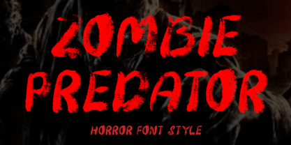 "Zombie Predator" is a scary horror display font. This font is very suitable for horror movie titles, Halloween, banners, posters, stickers, branding, book titles, and more. This font is equipped with uppercase, lowercase, numerals, punctuation, and multilingual support.
 - Cooper Black by URW Type Foundry,
$89.99Cooper Black The Cooper Black font should be used in display sizes only. Cooper Blacks serifs are rounded and the counters are small. Cooper Black was designed by Oswald B. Cooper for Barnhart Brothers & Spindler in 1921 for advertising and posters. The capital O and Q of the Cooper Black font are tilted back; in the lowercase, the dot on the I and j become elliptical. The extra bold Cooper Black font has a remarkable personality and reproduces well in sizes over 18 point in titles, subheadings and generally short sentences. - Dance Number JNL by Jeff Levine,
$29.00 Vintage sheet music for the song "Just Once for All Time" (from the United Artists release "Congress Dances") provided the bold sans that served as the model for Dance Number JNL. This 1932 film was the English language version of the German comedy "Der Kongrefl tanzt" The movie's plot is based around the Congress of Vienna. There, an Austrian commoner is mistakenly thought to be the Tsar of Russia.
 - PF Mellon by Parachute,
$35.00 PF Mellon is a modernist variable grotesque with mixed roots. Its unconventional aesthetic is the product of an exploration into the art of emphasizing titles, headlines and text in captivating and unpredictable ways. Contrary to conventional practices of highlighting text with heavier weights, PF Mellon proposes an intriguing new scheme based on striking and attention-grabbing compositions of narrow and extended letterforms- even when set in lowercase. Part geometric and part grotesque, PF Mellon’s expressionist alphabet and extravagant style challenge conventions of visual culture in an Art Deco-like manner. PF Mellon’s rebellious idiosyncrasy takes its cues from the eccentric personality of our popular PF Venue, an earlier geometric sans serif characterized by its daring combinations of non-uniform structures. PF Mellon’s basic design skeleton was influenced by nineteenth and early twentieth century condensed sans serif typefaces such as Stephenson Blake's Grotesque No.77 and ATF’s Alternate Gothic, adding an extra contrast to the thickness of strokes. PF Mellon is also available as a variable font format which you may request it free of charge from Parachute® once you purchase the whole type family.
 - Rahere Esoteric by ULGA Type,
$25.00 Rahere Esoteric is a gothic-flavoured, quasi-Roman display font with an eccentric persona and more quirks than a Tim Burton film. A member of the extended Rahere typeface family, it’s the enigmatic cousin of Rahere Roman Display & Rahere Sans. This is a niche display font that doesn’t try to please everyone. Rahere Esoteric revels in its mystical aura, using a bewildering array of ligatures to magically transmute itself as characters loop, curl, jerk and strut, randomly connecting and disconnecting into words like a retro-futuristic steam train clattering along a disused railway track, challenging and delighting the reader at the same time. To add more sparkle, there are alternatives, inferior and superior caps plus a [Wicca] basketful of symbols, ornaments, weird faces and even a snake-infused ampersand. Whilst Rahere Esoteric has been designed primarily as an all-caps font, the lowercase slots contain small caps with corresponding numerals. However, because this is an arcane, unpredictable font, order and regularity are frowned upon, which means there are no tabular numerals – so company reports or accounts are a solid no! Unless they’re for the Golden Circle of Alchemists PLC or Gothic Blackstar Corporation. It is ideal for all things pagan, esoteric, alchemy, other-worldly or magic-related projects and particularly useful for music genres across the Gothic / Darkwave / Ethereal spectrum. What about legibility? Hey, look into my eyes: Esoteric is all about the mystique. If a secondary font is needed for the important stuff, I recommend its cousin, Rahere Sans, which pairs beautifully with this display font and is perfect for long passages or small text. The initial idea for Rahere Esoteric came about during a visit to Whitby, a small coastal town in Yorkshire, UK and famous for its inclusion in Bram Stoker’s novel, Dracula. A Steampunk festival was in full swing and the narrow streets of the town centre were teeming with people adorned in a glorious fusion of clothing and accessories influenced by a love of 19th-century life, science fiction, horror, fashion and art. I was fascinated by the juxtapositions of colour, patterns, material and style – archaic mechanical Sci-fi, gothic, the American Wild West and romantic Victorian. But what intrigued me the most, somehow, all the disparate elements worked as a whole. Thus, like Frankenstein, this font jolted into existence. Supported languages include Western Europe, Vietnamese, Central/Eastern Europe, Baltic, Turkish and Romanian.
 - BK Bird by Konst.ru,
$10.00 Font for names, logotypes, titles, headers, topics etc.
 - Kermel by La Boîte Graphique,
$25.00 Handwriting font. Usage recommendations: Title, short text, logo.
 - Ninja Hirosi by Yoga Letter,
$16.00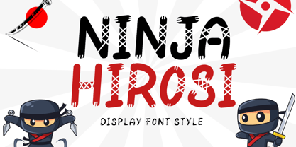 "Ninja Hirosi" is a very unique and cute display font. This font is equipped with uppercase, lowercase, numerals, punctuation, and multilingual support. Very suitable for comics, book titles, promotions, business branding, stickers, banners, branding, logos, film titles, and others.
 - Anabela Christmas by Yoga Letter,
$20.00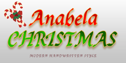 "Anabela Christmas" is an elegant handwritten font. This font is equipped with uppercase, lowercase, numerals, punctuation, and multilingual support. Very suitable for business branding, Christmas, Christmas invitations, weddings, Halloween, logos, film titles, book titles, posters, banners, stickers, and others.
 - Santa Display by Yoga Letter,
$18.00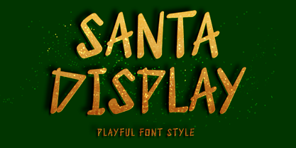 "Santa Display" is a unique and cute display font. This font is equipped with uppercase, lowercase, numerals, punctuation, and multilingual support. Very suitable for Christmas, weddings, birthdays, engagements, posters, branding, stickers, logos, tattoos, book titles, film titles, and others.
 - Sparose by Dhan Studio,
$21.00 Sparose fonts is handwritten specifically designed to get texture, also have ligature and beautiful Swash. Suitable for use in design titles such as invitations, signboards, book titles, stationery designs, quotes, branding, logos, greeting cards, packaging designs, posters, and more.
 - Death Demon by Yoga Letter,
$15.00 "Death Demon" is a horror font that is very scary and full of mystery. This font is perfect for Halloween moments, movie titles, book titles, Halloween party invitations, and more. Equipped with uppercase, lowercase, numerals, punctuation, and multilingual support.
 - Antique Tuscan No 9 by HiH,
$8.00 Antique Tuscan No.9 was one of the earlier wood-type designs by William Hamilton Page. It was first shown among the specimens produced in 1859, shortly after Page entered into a new partnership with Samuel Mowry, owner of the Mowry Axle Company. The new company was named Page and Company and was located at the Mowry facility in the Greenville section of Norwich, Connecticut. Antique Tuscan No.9 is an extra-condensed version of the tuscan style that had been released in moveable type by Vincent Figgins of London in 1817 and had become so popular for advertising in the intervening years. Because of the extreme compression in the design, we might be tempted to describe it as "Triple-X," but that might be misleading. The analogy would, of course, be to clothing sizes, not movie ratings. Because of the compression, this typeface reads best when set extra-extra-extra large. For printing, we recommend 36 points or larger. For the screen, we suggest at least 72 points. An unusual and distinctive design, it is best used with discretion. If I were doing a term paper for school or submitting an article to a magazine for publication, I might use it for the title page, to grab someone’s attention. I would certainly not use it for the main body of text - not if I expected anyone to read what I wrote. If you wonder why we make this recommendation, take the Ten-Point challenge. Print this paragraph using Antique Tuscan No.9 and set the font size at 10 points. If you are young and blessed with good eyesight, you will probably be able to read it - with effort. So, here is the challenge: hand it to your Grandmother and ask HER to read it.
 - Commander by Red Rooster Collection,
$45.00 Commander is a compressed serif font family and is an original creation of Steve Jackaman (ITF). It was designed in 1994 exclusively for the Red Rooster Collection. The family excels at display sizes and in headlines, and its masculine nature lends itself well to projects about sports, science fiction, and academia. Wherever Commander ends up in your project, it is guaranteed to draw attention!
 - Cute Dog by Yoga Letter,
$15.00 "Cute Dog" is a display font with decorative bones, dog heads, and dog paws. This font is equipped with lowercase, uppercase, numerals, punctuation, and multilingual support. Suitable for posters, business branding, logos, banners, stickers, magazine titles, film titles, and more.
 - Kigelio by Ivan Rosenberg,
$15.00 KIGELIA is a stylish display serif font inspired by fashion magazines and romance. It is great for short headlines and titles, but it looks great in advertising, vintage mood board, branding, logotypes, packaging, titles, editorial design and modern and vintage design.
 - Geogrotesque Condensed Series by Emtype Foundry,
$69.00 The popular Geogrotesque family becomes an extended system with the inclusion of three new members to the family; Geogrotesque Condensed, Geogrotesque Compressed and Geogrotesque Extra Compressed. The condensed series keep the spirit of the original one, and give way to a superfamily up to 56 styles. This new system fluidly varies between widths, ranging from the original width to a 55% of it in the narrower one. As their original partner, the new fonts are great headline families for publications, but will also work in text of intermediate length and point size. The Geogrotesque superfamily offers now one font for each design need. It is available in Open Type format and includes Ligatures, Tabular Figures, Fractions, Numerators, Denominators, Superiors and Inferiors. All of them with support for Central and Eastern European languages. This type family consists of 42 styles, 7 weights plus italics in 3 widths. For more details see the PDF.
 - Sweet Square by Sweet,
$39.00The Engraver’s Square Gothic—like its rounder cousin, the engraver’s sans serif, Sweet® Sans,has been one of the more widely used stationer’s lettering styles since about 1900. Its minimal forms, made without curves, were popularized long ago by bankers and others seeking a serious, established feel to their stationery. One might argue that the design is a possible precursor to Morris Fuller Benton’s Bank Gothic® typeface. Sweet® Square is based on antique engraver’s lettering templates called “masterplates.” Professional stationers use a pantograph to manually transfer letters from these masterplates to a piece of copper or steel that is then etched to serve as a plate or die. This demanding technique is rare today given that most engravers now use a photographic process to make plates, where just about any font will do. But the lettering styles engravers popularized during the first half of the twentieth century remain both familiar and appealing. Referencing various masterplates, Mark van Bronkhorst has drawn Sweet Square in nine weights. The sources offered just uppercase, small caps, and figures, yet similar, condensed examples had a lowercase, making it possible to interpret a full character set for Sweet Square. Italics were also added to give the family greater versatility. The fonts are available as basic, “Standard” character sets, and as “Pro” character sets offering special characters, a variety of typographic features, and full support for Western and Central European languages. Sweet Square gives new life to an uncommon class of typeface: an early twentieth-century commercial invention that brings a singular verve to modern design. Its unique style is as useful as it is novel. Bank Gothic is a registered trademark of Grosse Pointe Group LLC. - Sweet Square Pro by Sweet,
$59.00 The Engraver’s Square Gothic—like its rounder cousin, the engraver’s sans serif, Sweet® Sans,has been one of the more widely used stationer’s lettering styles since about 1900. Its minimal forms, made without curves, were popularized long ago by bankers and others seeking a serious, established feel to their stationery. One might argue that the design is a possible precursor to Morris Fuller Benton’s Bank Gothic® typeface. Sweet® Square is based on antique engraver’s lettering templates called “masterplates.” Professional stationers use a pantograph to manually transfer letters from these masterplates to a piece of copper or steel that is then etched to serve as a plate or die. This demanding technique is rare today given that most engravers now use a photographic process to make plates, where just about any font will do. But the lettering styles engravers popularized during the first half of the twentieth century remain both familiar and appealing. Referencing various masterplates, Mark van Bronkhorst has drawn Sweet Square in nine weights. The sources offered just uppercase, small caps, and figures, yet similar, condensed examples had a lowercase, making it possible to interpret a full character set for Sweet Square. Italics were also added to give the family greater versatility. The fonts are available as basic, “/fonts/sweet/square/” character sets, and as “Pro” character sets offering special characters, a variety of typographic features, and full support for Western and Central European languages. Sweet Square gives new life to an uncommon class of typeface: an early twentieth-century commercial invention that brings a singular verve to modern design. Its unique style is as useful as it is novel. Bank Gothic is a registered trademark of Grosse Pointe Group LLC.
 - Morque by Craft Supply Co,
$20.00 Morque – Sans Serif Font: Bold and Expressive Boldness in Every Letter: Morque – Sans Serif Font stands out with its all caps design. It’s perfect for impactful titles and displays. This font commands attention in any visual space. Ideal for Titles and Displays: Morque’s bold structure makes it ideal for titles and visual displays. It enhances the readability of headlines. This font is a go-to for designers aiming for a strong statement.
 - Joyosa by Autographis,
$39.50 Joyosa is an elaborate script written with a broad pen; it gives the impression of a flowing ribbon.