10,000 search results
(0.028 seconds)
- Movie Drama JNL by Jeff Levine,
$29.00 The Nov. 26, 1921 issue of “The Moving Picture World” carried an ad for the dramatic film “For Your Daughter’s Sake” (originally tilted “The Common Sin” and produced in 1920). Hand lettered in an Art Nouveau sans serif style, the ad copy inspired Movie Drama JNL, which is available in both regular and oblique versions.
 - Bellerin by Mevstory Studio,
$15.00 Bellerin is one of my fonts based on a hand lettering project in 2020. I was very inspired by the famous retro typography designs form the late 60's till the 70's. So you won't need extra efforts for create an extrude effect for this font. This mean it will saves your time.
 - Henny by driemeyerdesign,
$19.95 Henny is a simple but elegant handwriting font which is legible even in very small sizes and longer texts. There is an extended character set with some extra ligatures for a natural look. Henny was used in “Coffeeshop” for titel and headlines: http://www.amazon.de/Aus-dem-Coffeeshop-Dr-Oetker/dp/376700688X Have fun using it!
 - Sunny Bunny by Allouse Studio,
$16.00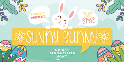 Sunny Bunny a Quirky Handwritten Font. Sunny Bunny is perfect for any tittles, logo, product packaging, branding project, megazine, social media, wedding, or just used to express words above the background. Sunny Bunny also come with Multi-Lingual Support. Enjoy the font, feel free to comment or feedback, send me PM or email. Thank You!
 - Gikit by bb-bureau,
$65.00 Gikit is a very raw and quirky typeface structured according to a strict grid. The design is massive, with very little curve (just the dots and a few punctuation marks). A really stand out characteristic is Gikit’s accents that crush the forms. The type is drawn with 2 styles, for 2 uses: Tittle or Text.
 - Wiramatra by Beewest Studio,
$25.00 Wiramatra is a modern Wire-Metric style font. This neat display font with unique wire cable on each character. Dainty and joyful, this font will be ideal for Sci fi Novel Tittle book, or writing techno modern wedding style invitations, cards or any other design that may need a techno futuristic romantic, personalized touch!
 - Alesantria Mane by Allouse Studio,
$16.00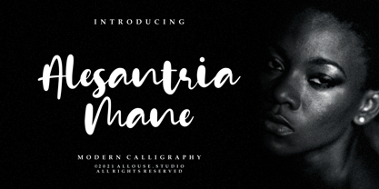 Alesantria Mane a Modern Calligraphy Font. Alesantria Mane is perfect for any tittles, logo, product packaging, branding project, megazine, social media, wedding, or just used to express words above the background. Alesantria Mane also come with Multi-Lingual Support. Enjoy the font, feel free to comment or feedback, send me PM or email. Thank You!
 - Kremlin Chairman, crafted by the innovative minds at Bolt Cutter Design, is an evocative typeface that plunges deep into the heart of Soviet-era typography yet carries a modern twist that makes it re...
- Effexor - Unknown license

- Certificate by Scholtz Fonts,
$18.20 Elegant, fluid and romantic are but a few of the words that describe this beautiful font. Certificate is a perfect choice for awards, wedding invitations, greeting cards - in fact any products for which a sophisticated, contemporary yet formal look is sought. Certificate was designed for situations that require: - a classical, “award” like font (for certificates, invitations, formal notices etc); - a very legible font (particularly important for invitations to events such as weddings and formal occasions where details of the occasion are very important and should not be mis-read); Certificate is fully professional, carefully letterspaced and kerned. All upper and lower case characters, punctuation, numerals and accented characters are present.
 - Bricbrac by Nootype,
$25.00 Bricbrac is a layered family that allows different combinations. The typeface is full-cap, with a squared style, the font doesn’t contains any curve. The different styles gives 3D effect to the letters and the typeface user can play with the Lines and Pattern effect. Bricabrac consists in a 9 styles family. This is a monoline typeface and the variety of combinations and style make it perfect for magazine and poster design. The fonts have an extended characters set to support Central, Eastern and Western European languages. Notice: The spacing is optimized for the version with volume, therefore the fonts should always be used with the 3d volume effect.
 - Breton by Latinotype,
$29.00 Breton is a geometric slab serif typeface inspired by Boston. Breton has a strong personality and it is an ideal face for headings and branding design. Its most noticeable characteristic is a great difference of proportions between rounded characters (like "o", "c" or "e") and non-rounded ones (like "n", "m" or "z"). By combining them, you will be able to give your compositions a very unique rhythm. Each font style comprises 417 characters, which support more than 200 Latin-based languages, as you would expect from Latinotype fonts. Breton comes in 10 styles, from Hair to Black, and includes matching italics. Breton was designed by Daniel Hernández and Rodrigo Fuenzalida.
 - Lucas Brandis by Proportional Lime,
$9.99 In the early days of printing everything had to be worked out from scratch. This set of lettering is based on section headings used by the Printer Lucas Brandis (no known relation), the first printer to operate in the city of Lübeck around 1473. They remind me of a medieval version of the spray paint graffiti so often seen on the sides of trains. A bit on the crude side, but also and importantly extremely noticeable. So whether you use it for creating old styled printing or some wild modern eye grabbing text item, its robust and sturdy shapes will be certain to grab the eye.
 - LD Cherries by Dikas Studio,
$15.00 Hello... this is Cherries, a cute and bounch hand drawn font family. Cherries have 5 weight: light, regular, medium, semibold and bold with 2 styles: regular and slanted also included with pairing font Cherries Display. Cherries included with some alternate character and ligature to make your design awesome. Cherries is fun and very suitable for cute or girly design needs such as cover design, typography, sticker, greetings card, logo, merchandise and many more. Cherries also easy for read and you can use it for quote or caption. Add this beautiful handwritten font to each of your creative ideas and notice how it makes them stand out!
 - Venis by Chank,
$99.00 On first impression, Venis is a traditional text typeface: clean, simple and elegant with nice contrast. On closer inspection, you'll notice nuances that add charm and wonder, much like its name (rhymes with "tennis"). Is this font a serif or sans serif? Hmmmm, it never really commits. Further design liberties were taken to create unique qualities in its characters, which are best exemplified by the signature lowercase y. This font family is optimized for print, and has worked beautifully for letterpress projects including wedding invitations and birth announcements. Venis will also work well in newsletters, brochures, proposals, magazines, books, and other text-heavy paper products, bringing creative elegance to your designs.
 - Minspire by Mehras Types,
$25.00 Minspire, inspired by my own handwriting. Originally started as part of my "Inspire" project during the pandemic. what was originally a personal challenge to keep my creativity level in difficult times, became a passion to learn making Typefaces professionally. (I don't think there is any school in the world that teaches you that properly). The name is a combination of my initials Mehras Irani, combined with the word inspire. Unicodes included in this family: Basic Latin Latin-1 Supplement Latin Extended-A *This is my first font/typeface design. If there are any mistakes you notice. please contact me and I will make an update to the family.
 - Bad Marker by Haiku Monkey,
$10.00 The marker has been sitting in your pen drawer for years. You can't bring yourself to throw it out, because it's the best marker in the world; but it has become worn and frayed, and you can't bring yourself to use it, either. But today you have just the project for the best bad marker in the world, and you take it from the drawer, remove the cap, and notice with glee that time has accumulated a perfect supply of ink in the frayed tip. You bring it down on the pristine white paper in front of you, and magic begins to trace itself on the page...
 - Flyoika by Ingrimayne Type,
$9.00 Flyoika is a slab serif family with a fairly low x-height, long ascenders, and considerable contrast. The family has five weights, each with an italics and it can be used for either display or text. Flyoika was not designed to meet a particular need but rather out of curiosity. Years ago I had designed two slab serif families, FlyHigh and Euroika, that I recently noticed had a lot of similarities and I wondered what a blend of the two would look like. Several corresponding characters in the two families are considerably different and in cleaning up the results, I usually opted for simplicity. The name "Flyoika" reflects these origins.
 - Overseas by Hanoded,
$15.00 I traveled a lot: in the beginning on my own, later as a tour guide. I always used the English word ‘abroad’ to describe a trip to a foreign country, but I noticed that the English, Australians and New Zealanders preferred the word ‘overseas’. I then realised that they all lived on an island, so most of the foreign countries for them were across the sea. I had to think of that when I made this font! Overseas is a brush font with a certain rough elegance to it. I made it using poster paint and a brush. Use if for posters, product packaging and book covers.
 - Linotype Rough by Linotype,
$29.99French designer Christophe Badani developed the Linotype Rough family in 1999. The family contains nine different typeface styles, each with a slightly different voice. The forms appear to have found a unique middle ground between hand-drawn letters and pure geometry, especially Linotype Rough Outline. Make sure to pay special notice to the true-italic forms in the three italic weights! Badani's attention to typographic detail is not to be missed. Linotype Rough is perfect for headlines and display work. The medium and bold weights can also function splendidly in text. The entire family is included in the TakeType 4 collection, available through Linotype." - Wildrace by Din Studio,
$29.00 Get ready to be bold and elegant at the same time. It’s time to see Wildrace, a display font created in capital letters with the racing theme. The font’s character is the thick letters formed similar to rectangles to give strong impressions. Therefore, it will be more noticeable and match the large-sized texts. Wildrace also provides interesting features to enjoy. Features: Multilingual Supports PUA Encoded Numerals and Punctuation Use Wildrace for any design projects such as posters, banners, logos, book covers, headings, printed products, merchandise, social media, etc. Find out more ways to use this font by taking a look at the font preview. Purchase now. Happy designing.
 - Cambria Math by Microsoft Corporation,
$49.00OpenType Layout features: smallcaps, stylistic alternates, localized forms, standard ligatures, uppercase-sensitive forms and spacing, oldstyle figures, lining figures, smallcap figures, arbitrary fractions, superscript, subscript. Cambria has been designed for on-screen reading and to look good when printed at small sizes. It has very even spacing and proportions. Diagonal and vertical hairlines and serifs are relatively strong, while horizontal serifs are small and intended to emphasize stroke endings rather than stand out themselves. This principle is most noticeable in the italics, where the lowercase characters are subdued in style, to be at their best as elements of word-images. This font is suitable for business documents, email, web design. - Unisketch by Letters&Numbers,
$22.00 Unisketch is an homage to my favorite font Univers when I was at design college. Univers is a neo grotesk font by famous Swiss typeface designer Adrian Frutiger. Unisketch, with its worn, misaligned and slightly tilted characters, still retains some of the qualities that workhorse body copy requires: It is legible at small sizes and produces a compact ‘Schriftbild’.
 - Mealky Winter by Allouse Studio,
$16.00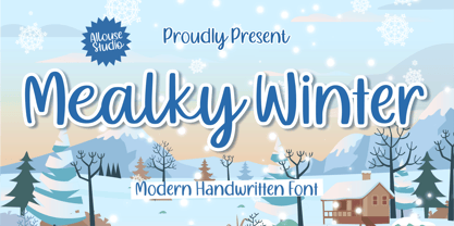 Proudly Presenting, Mealky Winter a Modern Handwritten Font Mealky Winter is perfect for any tittles, logo, product packaging, branding project, megazine, social media, wedding, or just used to express words above the background. Mealky Winter also come with Multi-Lingual Support. Enjoy the font, feel free to comment or feedback, send me PM or email. Thank You!
 - Roundlane by Zealab Fonts Division,
$10.00 Roundlane is a font inspired by retro badges antique labels, and includes all-caps, multilingual support, alternates signs, numbers & punctuation. It works well for album covers, video tittles, stickers, clothing brand names, t-shirt designs, badges designs, banner, flyer and more. I can’t wait to see what you guys will come up with with using this font!
 - Goldenlife by Putracetol,
$22.00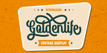 Goldenlife is a vintage display typeface. This font was inspired by classic vintage signs. It come with uppercase, lowercase, various alternates, numbers, punctuation and multi-lingual support. Goldenlife is great for any kind of display purpose from logos, t shirts, apparel, handwritten quotes, product packaging, tittle headers, posters, merchandise, social media, labels, branding and greeting cards.
 - Lupo by Typoforge Studio,
$19.00 Font Lupo is the younger brother of Kapra. However, unlike Kapra it is characterized by the sharpness of the finish. It is inspired by a You And Me Monthly published by National Magazines Publisher RSW „Prasa” that appeared from Mai 1960 till December 1973 in Poland. Font Lupo is designed in one version – lower and uppercase characters.
 - Natube by Dhan Studio,
$14.99 Natube is a font that is scratched with a brush pen, to get a natural texture, so this font will display the characteristics of the hand. This font is very suitable for a variety of places such as clothing, poster, tittle books, stationery designs, quotes, branding, logos, invitations, greeting cards, t-shirts, packaging designs and more.
 - Cervo by Typoforge Studio,
$25.00 Font Cervo is the younger sister of Kapra. It is characterized by eight different varieties – lower and uppercase characters and in contrast to Kapra is “slimmed” version (from Medium to Thin). It is inspired by a You And Me Monthly published by National Magazines Publisher RSW „Prasa” that appeared from May 1960 till December 1973 in Poland.
 - Fenggasta by Gatype,
$9.00 Fenggasta is a font that is scratched with a brush pen, to get a natural texture, so this font will display the characteristics of the hand. This font is very suitable for a variety of places such as clothing, poster, tittle books, stationery designs, quotes, branding, logos, invitations, greeting cards, t-shirts, packaging designs and more.
 - Burnfolk by Allouse Studio,
$14.00 Burnfolk a Brush Font that bring an a natural brush impression. Come with separate alternate and Multi-Lingual Support. Burnfolk is perfect for any tittles, logo, product packaging, branding project, megazine, social media, wedding, or just used to express words above the background. Enjoy the font, feel free to comment or feedback, send me PM or email. Thank You!
 - Flaminia by Andinistas,
$39.95 Flaminia is a typeface family of 4 members designed by Carlos Fabián Camargo G. The central idea started as Dingbats and titles labeled with fine-tipped brushes and flat tip for graphic design related restaurant menus, instructions, packaging, food containers and labels. Thus began the process of drawings and letters integrated by shapes and counterblocks that seem inaccurate yet but at the same time clean and attractive. For this reason each variable suggests fresh brushstrokes that combine ideas from Roman and italic calligraphy. Flaminia members work separately or together by solving needs in different scenarios. This will enhance its properties in order to control and diagram titles, subtitles and short paragraphs with an effusive and manuscript character. Flaminia is useful for generating a flavor of "hand lettered by skilled artists lettering." In conclusion, Flaminia Regular and Italic are used to write short paragraphs. His ascending and downs are lower that the X height. Its width is imperceptibly condensed to save horizontal space. Its smooth lines and finishes simulating a crescent moon have been made with fine-tipped brush. The contrast between thick and thin has medium intensity. Its complement is an ideal italic to emphasize words and phrases. Its conceptual characteristics are similar with foundation's handwriting, except for his companion who takes ideas from the ornamental italic calligraphy. Flaminia Black is compact and ideal for ranking information such as words and titles. Its personality is based on ornamental penmanship italics mixed with humanistic ideas outlined with contrast-type, flat-tipped brush thickness. Its overall width is slightly condensed, rising and falling are short compared to an exaggerated X height. Its smooth lines and terminations as in a crescent moon simulate the path of a broad brush. Its amount of contrast between strokes have average intensity. In brief, push to the limit parameters such as the type and amount of contrast, size, backward, forward, overall width, etc. And finally, Flaminia Dingbats offers three sets of different illustrations, a total of almost 90 drawings useful in communications related to: Food, Clothes and Sketchy. Each carefully wrought through research, testing, analytical design, visual strategy and high-definition of Bezier paths, optimizing time and work to their users. And in conclusion, I have plans to continue expanding the family with more complete versions in the future.
 - Barokah by Alifinart Studio,
$14.00 Do you want to create a design with a luxurious and casual style? Barokah Serif Font is the best choice. This is a modern display font has a lot of ligature for uppercase and lowercase. This serif font are perfect for luxury projects and will keep your creativity flowing. Typeface Story In 2021, we released Barokah Script and at that time a lot of people loved it. However, we feel that Barokah Script should be combined with a serif font with a luxurious and casual style, so that it will become a popular for everyone. That's why, today—after 1 year—we are releasing Barokah Serif, as the best match for Barokah Script. Why Barokah Serif Font? Barokah Serif is a font with a myriad of ligatures, both uppercase and lowercase. In this font, there are Stylistic Alternates for each capital letter with an authentic and elegant design. In the lowercase letters you will find an amazing variety of ligatures and in a luxurious style. This will make each of your designs look elegant and classy. For ease of use, we divide it into two; Standard and Discretionary Ligatures. Features: - Uppercase and lowercase letters - Numbers and punctuation - Lots of ligatures for uppercase and lowercase - Stylistic Alternates for each capital letter - True type hinting - Multilingual Standard and Discretionary Ligatures Standard and Discretionary Ligatures are available for the following letter combinations: LA LI LU LE LO LL RA RI RU RE RO KA KI KU KE KO XA XI XU XE XO ZA ZI ZU ZE ZO RS AS MS KS HS EV EW DO OC OG DG OO OQ TT NN WWW SS Th fi ff ffi fj ffj ft fl ffl fb ffb fh ffh fk ffk ſi ſſ ſſi ſl ſſl ſt ct st tt an ah am ap ar ab en eh em ep er eb cn ch cm cp cr cb un uh um up u rub gi gj ti tti tj ss ri rj www Language Supports Afrikaans, Albanian, Asu, Basque, Bemba, Bena, Breton, Catalan, Chiga, Colognian, Cornish, Croatian, Czech, Danish, Dutch, Embu, English, Esperanto, Estonian, Faroese, Filipino, Finnish, French, Friulian, Galician, German, Gusii, Hungarian, Indonesian, Irish, Italian, Kabuverdianu, Kalaallisut, Kalenjin, Kamba, Kikuyu, Kinyarwanda, Latvian, Lithuanian, Lower Sorbian, Luo, Luxembourgish, Luyia, Machame, Makhuwa-Meetto, Makonde, Malagasy, Maltese, Manx, Meru, Morisyen, North Ndebele, Norwegian Bokmål, Norwegian Nynorsk, Nyankole, Oromo, Polish, Portuguese, Quechua, Romanian, Romansh, Rombo, Rundi, Rwa, Samburu, Sango, Sangu, Scottish Gaelic, Sena, Serbian, Shambala, Shona, Slovak, Soga, Somali, Spanish, Swahili, Swedish, Swiss German, Taita, Teso, Turkish, Upper Sorbian, Uzbek (Latin), Volapük, Vunjo, Walser, Zulu Suggested Uses Perfect for branding projects, logo or logotype, promotion, book cover, invitation, letterhead, website, and more. Conclusion Barokah Serif is a luxurious authentic font and a must-have in your font collection. Get the Barokah Serif Font now… ----------------------------------- Alifinart Studio alifinart@gmail.com Instagram | Behance
 - Bradley Gratis - Unknown license

- MARIAMNE by Type Innovations,
$39.00 MARIAMNE is an original design by Alex Kaczun. It is an elegant, modern and traditional interpretation based on and modeled after his successful "Contax Pro" and "New Age Gothic" typeface series. As such, it has generous proportions with clean, crisp lines—ideally suited for easy reading and long lines of copy. Alex felt that the skeleton for "Contax" was perfectly suited to transform the design into a modern version of 'old-style', somewhat reminiscent of German Black Letter. Numerous modifications where made to the body proportions, stems and shapes. True 'old-style' serifs and unusual 'cross-strokes' where added for a touch of distinction. The 'cross-strokes' where added at exactly visual mid-point on the overall heights. This gives the typeface a romantic, female-like quality to the overall design. Strong, yet delicate. Visually stimulating in appearance and function. The result is a truly unique transitional and modern design. Unlike other typefaces, MARIAMNE incorporates uniform stems throughout the capitals, lower case and figures. This gives the design a uniform appearance in overall color and strength. There is a perfect visual balance between inter-letter spacing, stem weights and proportions. The accents are equally large, bold and command attention. This font includes a large 'Pro' character set, which supports most Central European and many Eastern European languages. As a result, the design is ideally suited for display copy as well as text composition. In the near future, Alex plans to expand the typeface series to include a light and heavy weight, along with true italics.
 - Averta by Intelligent Design,
$15.00 Bringing together features from early European grotesques and American gothics, Kostas Bartokas’ Averta (Greek: ‘αβέρτα’ – to act or speak openly, bluntly or without moderation, without hiding) is a new geometric sans serif family with a simple, yet appealing, personality. The purely geometric rounds, open apertures, and its low contrast strokes manage to express an unmoderated, straightforward tone resulting in a modernist, neutral and friendly typeface. Averta is intended for use in a variety of media. The central styles (Light through Bold) are drawn to perform at text sizes, while the extremes are spaced tighter to form more coherent headlines. The dynamism of the true italics adds a complementary touch to the whole family and provides extra versatility, making Averta an EXCELLENT tool for a range of uses, from signage to branding and editorial design. Take advantage of Averta’s extended OpenType features including alternate glyphs, small caps, fractions, case sensitive forms, contextual alternates, oldstyle and lining (proportional and tabular) numerals, small cap numerals, numerators/denominators, superiors/inferiors, and a variety of symbols. Averta comes in eight weights with matching italics and supports over two hundred languages with an extended Latin, Cyrillic (Russian, Bulgarian, and Serbian/Macedonian alternates), Greek and Vietnamese character set. It ships in three different packages offering different script coverage according to your needs: Averta PE (Pan-European: Latin, Cyrillic, Greek), Averta CY (Latin and Cyrillic), and Averta (Latin and Greek). Averta's Cyrillic have received the 3rd Prize in the 2017 Granshan Awards in the Cyrillic Category.
 - Keratine by Zetafonts,
$39.00 The letterforms that we now accept as the historical standard for printing latin alphabets were developed in Italy around the end of 1400. Deriving from Roman capitals and from italic handwriting, they soon replaced the blackletter letterforms that were used a few years before by Gutenberg for his first moveable types. Between these two typographical traditions there's an interesting and obscure middle ground of historical oddballs, like the Pannartz-Sweynheym Subiaco types, cut in Italy in 1462. Keratine is the result of Cosimo Lorenzo Pancini's exploration of that territory. Like our Kitsch by Francesco Canovaro it explores the impossible territory between antiqua and blackletter, not as a mere historical research, but rather as a way to re-discover and empower an unexpected and contemporary dynamism. Using contemporary digital aesthetics to combine the proportions of humanistic type with the gestural energy of Fraktur letterforms, Keratine develops a "digitally carved", quasi-pixelated appearance (clearly stressed in Keratine's italics) that allows an unexpected balance between small-size readability and display-size personality. Keratine also relies heavily on a variable identity as the letterforms change dynamically with weight, developing from a contrasted, text-oriented light range to more expressive and darker display range, for a total of 8 weights with italics. Open type features and glyph alternates further enrich the usage possibility of this typeface that embodies our contemporary swap culture by embracing the contradictory complexity at the crossroads between Gothic and Humanist styles, while playfully empathising with a digital, brutalist spirit.
 - Kingthings Spike Pro by CheapProFonts,
$10.00 You gotta love this extreme take on the "gothic" blackletter traditions! Roger Nelsson edited a few letters, drastically improved the spacing - and then gave it the usual large CheapProFonts character set. Fun! Kevin King says: "Kingthings Spike was made because Buffy has one, I made Willow... Xander is yet to come. Oh and because I hate Engravers Old English! Pugin, eat my shorts! Sorry!" Kingthings Spikeless is a toned down version of Kingthings Spike. Kevin King says: "Kingthings Spikeless was requested by those who actually want to read text... well I call that tedious, but if you must, here it is no flourishes, just my small homage to black-letter." ALL fonts from CheapProFonts have very extensive language support: They contain some unusual diacritic letters (some of which are contained in the Latin Extended-B Unicode block) supporting: Cornish, Filipino (Tagalog), Guarani, Luxembourgian, Malagasy, Romanian, Ulithian and Welsh. They also contain all glyphs in the Latin Extended-A Unicode block (which among others cover the Central European and Baltic areas) supporting: Afrikaans, Belarusian (Lacinka), Bosnian, Catalan, Chichewa, Croatian, Czech, Dutch, Esperanto, Greenlandic, Hungarian, Kashubian, Kurdish (Kurmanji), Latvian, Lithuanian, Maltese, Maori, Polish, Saami (Inari), Saami (North), Serbian (latin), Slovak(ian), Slovene, Sorbian (Lower), Sorbian (Upper), Turkish and Turkmen. And they of course contain all the usual "western" glyphs supporting: Albanian, Basque, Breton, Chamorro, Danish, Estonian, Faroese, Finnish, French, Frisian, Galican, German, Icelandic, Indonesian, Irish (Gaelic), Italian, Northern Sotho, Norwegian, Occitan, Portuguese, Rhaeto-Romance, Sami (Lule), Sami (South), Scots (Gaelic), Spanish, Swedish, Tswana, Walloon and Yapese.
 - Neuzeit Office by Linotype,
$50.99 The Neuzeit Office family is designed after the model of the original sans serif family Neuzeit S™ , which was produced by D. Stempel AG and the Linotype Design Studio in 1966. Neuzeit S itself was a redesign of D. Stempel AG’s DIN Neuzeit, created by Wilhelm Pischner between 1928 and 1939. Intended to represent its own time, DIN Neuzeit must have struck a harmonious chord. DIN Neuzeit is a constructed, geometric sans serif. It was born during the 1920s, a time of design experimentation and standardization, whose ethos has been made famous by the Bauhaus and De Stijl movements in art, architecture, and design. Upon its redesign as Neuzeit S in the 1960s, other developments in sans serif letter design were taken into account. Neuzeit S looks less geometric, and more gothic, or industrial. Separating it from typefaces like Futura, it has a double-storey a, instead of a less legible, single-storey variant. Unlike more popular grotesque sans serifs like Helvetica, Neuzeit S and especially the redesigned Neuzeit Office contain more open, legible letterforms. Neuzeit Office preserves the characteristic number forms that have been associated with its design for years. After four decades, Neuzeit has been retooled once again, and it is more a child of its age than ever before. Akira Kobayashi, Linotype’s Type Director, created the revised and updated Neuzeit Office in 2006. His greatest change was to retool the design to make its performance in text far more optimal. Additionally, he created companion oblique to help emphasize text.
 - Caslon Antique by GroupType,
$19.00 Caslon Antique is a decorative American typeface that was designed in 1894 by Berne Nadall. It was originally called "Fifteenth Century", but was renamed "Caslon Antique" by Nadall's foundry, Barnhart Bros. & Spindler, in the mid-1920s. The design of the typeface is meant to evoke the Colonial era. Early printers would reuse metal type over and over again, and the faces would become chipped and damaged from use. Caslon Antique emulates this look. Despite the name, it is not a member of the Caslon family of typefaces. The renaming is believed to have been a marketing maneuver to boost the popularity of a previously unpopular typeface by associating it with the highly popular Caslon types. Caslon Antique is popular today when a "old-fashioned" or "gothic" look is desired. It is used by the musical group The Sisters of Mercy on their albums, for the logo of the musical Les Misérables, and for the covers of the books in A Series of Unfortunate Events. It is also frequently used on historical displays. It was used for the previous edition of the Warhammer Fantasy Role-Play. Most recently, it has been used on promotional material for the smash musical Monty Python's Spamalot on Broadway, the West End, and its tour of the United States. British 80's band The The also used the font in several of their music videos, usually displaying several lyrics from the song in the opening scenes. It used on the cover of Regina Spektor's album, Begin to Hope. This description was sourced (in part) from Wikipedia, the free encyclopedia.

