10,000 search results
(0.075 seconds)
- Solid Stencil JNL by Jeff Levine,
$29.00 In 1962, the late Robert Libauer of the Stenso Lettering Company (of Baltimore, MD) revised two of his popular stencil lettering guides to offers users two choices: “traditional” stencil letters and numbers and "solid" letters for tracing and coloring. Solid Stencil JNL was modeled from one of those lettering guides, and contains all of the character anomalies found within that vintage stencil.
 - Wyoming Pastad by Ingrimayne Type,
$14.95 Wyoming Pastad is the simplest of the Wyoming series. The round letter shapes of Wyoming Spaghetti have moved toward squareness. The overall effect is that Wyoming Pastad no longer looks much like an “Old West” face. There are two shadowed versions of WyomingPastad. Using the ShadowedInside style in layers with the shadowed styles is an easy way to get two-colored letters.
 - Wyoming Macroni by Ingrimayne Type,
$14.95 Wyoming Macroni is the split-serif (or Tuscan) version of the Wyoming series. The Pegged version adds a horizontal spike through the middle of the stems, which has been a popular variation of this style. Included in the family are two shadowed versions. The ShadowedInside styles can be used in layers with the Shadowed styles to easily create two-colored letters.
 - Symcaps Vario X1 by Deniart Systems,
$20.00 The Symcaps Vario X1 typeface is a monospaced design created to give optically symmetrical message forms. This all-caps alphabet provides two styles of capital letters plus numbers 1-0.
 - Wilko by Device,
$39.00 Wilko is the carnival barker of typefaces. Bold, impactful yet friendly, with two decorative variants. No frills, no corners, no messing. When you want to say it loud and clear.
 - XChessNut by Ingrimayne Type,
$5.00 XChessNut contains two chess fonts that resemble actual chess pieces. The key layout is a bit complicated; see the key guide for detailed information on how to position pieces correctly.
 - Aanaar by Letterjuice,
$66.00 This typeface comes from a self initiated project called Sápmi, which aims to contribute to keep a group of minority languages alive through solving issues in the education environment. This re-thought edition takes the name of Aanaar and joins our library with a bigger character set and two new weights which complete the typeface providing a big typographic palette as well as adding stylistic two-story a and g for more advanced readers as well as to enable the typeface to be used in other environments. The typeface was originally designed for children’s text books. Analysing kid’s typeface design, we identified some important problems and solved them within the boundaries we had. The main concern in a typeface which will be used by children is letter recognition, as they have not yet fully develop their reading skills. For example, letters like “a” and “g” share a very similar structure in this particular kind of typefaces, where the only distinctive part is the descender of the “g”. It is known that the lower part of the letter is the less important feature when reading, therefore we decided to make a clear distinction between them by having an “a” with a spur on the top right. This also helped distinguishing “a” and “o”. Children typefaces usually have one story “a”, making “a” usually too close to “o”. Additionally we moved the joint in “a” upwards and narrowed very slightly the “a” to make sure they cannot be mistaken. More generally, the x-height is fairly tall and the typeface has a bit of movement which give it a good rhythm helping moving along nicely when reading. Aanaar consists of 5 weights (Light, Regular, Medium, Bold and Black) plus two Italics (Light Italic and Italic).
 - Chuck Noon Script by Fontdation,
$20.00 After long time no script, finally we released our new Chuck Noon Script. A clean and bold script fonts that offers you a natural hand-lettering experience. Handcrafted and digitally checked with high attention to the details, we're a sucker for clean lines and crispy edges too, just like you. Available in two styles; Script and Brush, their dynamic letterforms work like magic, whether you go all caps or using it normally as a script. Suits best for logotype, poster/t-shirt designs, food/beverage labels, hipster quotes, greeting cards, wedding invitations, and many more.
 - Hipster Script Pro by Sudtipos,
$79.00 Hipster Script is another of my habitual attempts at trying to reduce the divide between manual and digital. In this case, I try to articulate brush lettering, try to get the computer to emulate continuous painting. The process wasn't that different from my work with Feel Script's shot at computerized commercial lettering, though here we have a more casual contrast, rather than the high seriousness of the Copperplate script. Swashes, alternates, ligatures — too many of them, all trying to make the interplay between the tool’s two extreme widths remain faithful to hand movement subtleties. I also toyed with ligatures containing apostrophes, something I've never seen before. With this typeface I think I've become more balanced in uniting the spontaneity of post-war ad lettering with the current trends in illustration and design. Hipster Script received a Judge’s choice Certificate of Excellence at the Type Directors of New York and was selected to be part of the Bienal Tipos Latinos 2012.
 - Zaftig Pro by Typeco,
$49.00Many current poster artists like to reference the graphic type styles that were popular in the ’60s and ’70s. Zaftig is a contemporary font that takes the geometric and blocky inspiration from that era but then steps off in a modern direction. At first glance, it may appear that the capitals of Zaftig all take up the same amount of space, but certain letters have been designed proportionally for a better flow. However, if the designer would prefer to stack the capital letters in even columns, like blocks, then one can use the Titling Alternates feature. In this feature the metrics of all the capital letters are the same, and certain letters have been designed narrower, allowing for seamless stacking. The space, bullet, asterisk have also been given the same monospaced metrics in this feature to make stacking easy. The Small Caps feature in Zaftig is designed so that the small cap glyphs are the same height as the lowercase. This allows the graphic designer not only the option of small caps, but also the ability to mix and match both kinds of letters to create a distinctive style. There are also alternate numerals in the Small Caps feature that match the height of the small caps. In Stylistic Alternates 1 you will find alternate designs for the Q, A, I, J, L, n, and u glyphs. Or you can find alternates in the Glyph Pallet of your favorite OpenType savvy application. Zaftig is more than it appears on the surface. This OpenType font contains over 1200 glyphs and language support. That makes it an international font which contains letters for most languages that use Latin, Central European, Cyrillic, and Greek scripts. - Port by Onrepeat,
$25.00 Detailed guided tour available here. Port is an experimental Didone typeface with a modern twist, inspired in the well known forms of typography masters such as Bodoni and Didot and the exuberance and elegance of calligraphy typefaces. Port melds the straight lines and strong contrasts of the Didone typefaces with the elegant lines of calligraphy in a geometric way, resulting in exuberant characters with geometric swashes that can be combined in countless ways. The result of this experiment is Port, an unique and rich display typeface meant to be used on big sizes and it’s main perk is the amount of alternative characters it features. Port is Open-Type programmed and includes hundreds of alternates, from swashes to titling alternates, ligatures and stylistic sets with each character having a thin version of itself, giving complete freedom to all your creative needs. Port is available in several flavours: Port Regular, being the base version and featuring the whole base character set; Port Regular Decorated, featuring richer forms and containing more ornamentated and more extravagant characters; Port Medium and Port Medium Regular, designed for the occasions you need a bit more thickness and the decoration variants: Port Ornaments, containing a wide set of elements meant for the creation of fillets, vignettes and fleurons, resulting in an almost infinite number of possible combinations to embellish your designs and Port Words, a set of some of the most common words used in English, Spanish, French, German, Italian and Portuguese. It’s strongly recommended that you use it on big sizes, for better performance you can also set the Photoshop text anti aliasing settings to Strong when you type, for a better understanding of all the uses of Port and the full character list I recommend the reading of the manual.
 - Erotique by Zetafonts,
$39.00 Designed by Cosimo Lorenzo Pancini and Mariachiara Fantini with the help of Solenn Bordeau, Erotique is an evolution of the original design by Zetafonts for Lovelace, that challenges its romantic curves with the glitchy and fluid aesthetic of trans-modern neo-brutalist typography. The seductive "evil serif" look of the Pheimester-like Oldstyle letter shapes is made edgier by the quirky connections and unexpected calligraphic twirls that marry digital distortions to traditional penmanship. Sensuous but sharp, Erotique speaks the language of teasing, and unrequited love, over-the-top and restrained like a show of Japanese Kinbaku, and beautifully heartbreaking like a friendzone valentine. Designed for display use, this high-contrast serif typeface is ready to take center stage in projects where a subtle elegance and an edgy, aggressive touch are required. For branding use it is paired by a Erotique Ornaments, a set of interlocking patterns based on the font letter-shapes, allowing for striking packaging, digital and ambient design. For editorial use it can add a sharp sensuality to logos and titles thanks to an impressive array of alternate glyphs, subtle ligatures and a set of whiplike fleurons, collected in the Erotique Flourishes pack. The typeface has been developed in the regular, medium and bold weight plus a monoline version, all of which have been paired with an Alternate version to give immediate access the more exotic alternate letterforms. With a character set of over five hundred glyphs, all the the weights of Erotique cover almost 200 languages using extended latin, and include advanced Open Type features as Stylistic Alternates, Standard and Discretionary Ligatures, Positional Numerals, Swash and Case Sensitive Forms. If you are a typeface lover, be warned: Erotique could be your fatal attraction!
 - Aviano Gothic by insigne,
$22.00 The Aviano collection returns, refined into a new, mid-contrast sans-serif inspired by the design and style of early 1900ís American engravers. Engravers would meticulously carve lettering into copper plates for printing, and often these letters, for more impact, would be extended and only utilize capitals. While taking inspiration from the past, Aviano Gothic is distinctly one-of-a-kind, and is not a revival, but instead is based on the structure of pre-existing Aviano type families for interchangeability and interoperability. Aviano Gothic has been diligently honed to be sinuous and seductive, making it great for high-end work such as including jewelry, beauty, and other luxury products. The full Aviano Gothic family presents you with six distinct weights and is full of OpenType options. Available with the face are deco alternates for replicating inscriptions and signage of the í20s and í30s. Style sets are offered, together with four full sets of art deco-inspired alternates, swashes, and titling, in addition to an expansive range of other alternates to help ìunique-ifyî your layouts. Aviano Gothic also features forty discretionary ligatures for inventive typographic compositions. Begin planning your work with Aviano Gothic by looking at these options in the instructive .pdf brochure. OpenType-able applications, including Quark or the Adobe suite, allow for the comprehensive benefit of the ligatures and alternates. This typeface also features the glyphs to aid a broad number of languages. Several variants have been made to extend the usefulness of the typeface, and it makes for a fine substitute for Copperplate, ITC Blair or Engravers Gothic. Aviano Gothic also pairs perfectly with the other members of the Aviano collection, including the original Aviano, Aviano Serif, Aviano Sans, Aviano Didone, Aviano Flare, Aviano Future, Aviano Wedge, Aviano Contrast and Aviano Slab.
 - Aktifo by Degarism Studio,
$45.00 Aktifo is designed with two Flavour which carries a modern and contemporary style, based on elementary geometric shapes and constructed of monolinear lines, it was invented to be functional, leaving behind anything that can be regarded as superfluous. Aktifo comes in 28 styles: there are two types of families Actifo A and Aktifo B from Light to Black, which both have differences in characters and spaces. Developed with powerful opentype features, equipped with extended language support: Cyrillic, Greek (BETA) and fractions, tabular figures, arrows, ligatures and more.
 - Fiesole by Eurotypo,
$22.00 Fiesole was inspired by calligraphic models; it is a bookface font family to be used for text, display and caption. Fiesole has three different lengths of items (ascenders-descenders). Old style figures have been included in the fonts. Spacing of Small Caps has been adjusted to obtain good legibility and integrity with Capitals and lower cases. Fiesole Text: Two weights. Fiesole Display: Two weights. Fiesole Caption: Five weights. They include also CE languages, swashes, small caps, ligatures, discretionary ligatures, alternates, old style figures and case sensitive forms.
 - Grenale by insigne,
$24.00 The elegant Grenale brings a new look to the classic didone. This shimmering sans-serif family with its mild deco shades alters the typical serifs and terminals of the classic style to form a gracefully eye-catching, high-contrast font. While high-contrast, sans serif forms tend to disappear in the copy, Grenale's meticulously designed features exhibit proper balance in the spacing and in the thorough improvements of its contours. The rigorous consideration given these details leaves a delicate typeface that doesn't get washed out in certain applications. Its pure, polished, geometric structure has a glamorous sensitivity, drawing heavily from the inspiration of the haute couture influence. Grenale's thin weights are simple but vibrant--elegant forms that naturally lend themselves to high fashion journals, high-end branding, and other five star applications. With added energy and power, the thicker weights with their ink traps and optical compensation intensify the gravitas for a statelier look to the graceful forms. Grenale's upright versions are also matched by optically adjusted italics, intentionally tailored to maintain their counterparts' sharp edge, causing the font's fierce characteristics to shine through the refined face. The typeface also includes a wide variety of alternates that can be accessed in any OpenType-enabled application. The stylish features include a large group of alternates, swashes, and meticulously precise details with teardrop terminals and alternate titling caps to accessorize the font. Also included are capital swash alternates, old style figures, and small caps. Take a look at the informative PDF brochure to see these features in action. OpenType enabled applications such as the Adobe suite or Quark can take full advantage of the automatic replacing ligatures and alternates. This family also offers the glyphs to support a wide range of languages. It's time to think high-class. Graceful and confident, Grenale's carefully crafted features transfer pleasantly to each page with elegant charm. With its variety of alternate glyphs and its high, classy contrast, this five star font is a great option for bringing a more refined look to your work. Production assistance for Grenale provided from Lucas Azevedo and iKern.
 - LHF Welo Thin by Letterhead Fonts,
$42.00 A classic Art Deco period style inspired by Samuel Welo, circa 1930. Letters are widely spaced to allow the subtle beauty of the letters to shine. Includes over 30 bonus alternates and two sets of small caps which are designed to be used at the cap height rather than sit on the baseline.
 - Quetzal by Scriptorium,
$12.00Quetzal is a decorative font designed to look like letters formed by mosaic tiles in a Mayan or Aztec style. The font features two different character sets and customizable over-and-under decorative tails which can be added to any character to make hundreds of possible combination forms which nest together attractively. - Sun by LucasFonts,
$49.00 Sun is a family of compact typefaces closer to old industrial-style American newspaper headlines than to Luc(as)’s other designs. The fonts also work in text, and have been used for corporate identity and editorial projects for more than two decades now.
 - Qalisha Signature Script by Letterena Studios,
$10.00 Qalisha Signature consists of two fonts designed to complement each other perfectly. Together or apart, these fonts are ideal for adding a chic and cheery touch to your crafts. This font is PUA encoded which means you can access all glyphs and swashes with ease!
 - Elicit Script Variable by Monotype,
$156.99Elicit Script Variable Set is a single font file that features two axes: Weight and Contrast. Each axis has preset instances The Weight axis has instances from Extra Light to Bold. The Contrast axis has instances from Casual (low contrast) to Formal (high contrast). - Christmas Combine Script by AEN Creative Studio,
$15.00 Christmas Combine consists of two fonts designed to complement each other perfectly. Together or apart, these fonts are ideal for adding a chic and cheery touch to your crafts. This font is PUA encoded which means you can access all glyphs and swashes with ease!
 - Cosmic Dream Sans by Carpiola Studio,
$10.00 Cosmic Dream consists of two fonts designed to complement each other perfectly. Together or apart, these fonts are ideal for adding a chic and cheery touch to your crafts. This font is PUA encoded which means you can access all glyphs and swashes with ease!
 - XTextures by Ingrimayne Type,
$9.95 The XTextures package contains two typefaces that can be used to create borders or backgrounds. The elements are simple stripes, spots, and cracks. Some of them are flipped and rotated so that they can be combined to create endless patterns that connect and repeat.
 - Bodoniez by Huy!Fonts,
$19.00 Nice typographic experiment consisting of the progressive "bodonization" I have summarized in two steps, by a letter drawn with the same concentration and intensity with which Paris Hilton reading a book, to get something like the sketches that Mr. Gianbattista used to Wrap the sandwich.
 - Albrecht Pfister by Proportional Lime,
$14.99 Herr Pfister was a printer in the city of Bamberg Bavaria. He is known to have published nine works. And it has been contentiously argued that he printed the “36 line Bible.” He was responsible for two innovations. The first was printing in his native German language and the second was the use of woodblock prints to add illustrations to the text. These were both first with the use of movable type. He was heavily influenced by Gutenberg’s typefaces but there are a range of notable and also subtle differences between the two men’s output. He was known to be active in the industry from about 1460 to his death in 1466. This font was specifically based on his "Biblia Paperum."
 - Decorate The Tree by Ingrimayne Type,
$9.00 DecorateTheTree is a festive novelty font family containing two styles designed to be used in layers. Each style has letters on Christmas-tree lights. The regular style has clear bulbs and the bold style has filled bulbs. Some characters are on standing bulbs and others on hanging bulbs and these two sets are made to alternate with the OpenType contextual alternatives (calt) feature. To use only one set of bulbs, this feature must be turned off and character spacing adjusted, though why anyone would want to use only one set is a mystery. These fonts are monospaced. They are useful to display a holiday message not just in words but in the lettering itself. (The characters on the bulbs are derived from the font SansduskiMono.)
 - Antypica by Anfound Type,
$33.00 Antypica is a soft and friendly slab-serif font that draws inspiration from typewriter styles. This font is designed to be easily legible in both small and large sizes, making it a great option for various applications. Its simple yet timeless design with a modern twist makes it perfect for use in a wide range of design projects. This includes package design, ad campaigns, brand identities, movie titles, poster art, booklets, and even classified documents. With an impressive 790 glyph count, Antypica supports Basic Latin and Latin Extended-A. OpenType features further enhance typography by providing Small Caps and Small Numbers, Lining Figures, Oldstyle Figures, Superscripts, and Subscripts, Fractions, Tabular Lining Figures, Tabular Oldstyle Figures, Ligatures, and Contextual Alternates to prevent some unwanted letter pair collisions. Additionally, Stylistic Sets offer Stylistic Alternate Lowercase a, Alternate Cap T, Alternate Dollar Sign, and Slanted Hyphen to add calligraphic quality to text blocks, while the Special Set offers unique glyphs like Bitcoin and Interrobang. Antypica is highly versatile and can be used in many design applications. Small Caps and Small Numbers can be used creatively to create more visually engaging typography, and the optimized underline effect can be used to enhance the design. To access the Special Set in OpenType features, select it from the OpenType menu. To add special additional marks, type following in your text field. • For the Exclam-Comma mark, type ” ,! ” (comma+exclam) • For the Question-Comma mark, type ” ,? ” (comma+question) • For the Bitcoin mark, simply type " bitcoin " (not case sensitive). • For the alternate (Cap Height) Registered mark, type " registered " (not case sensitive). • For the Published mark, type " published " (not case sensitive). The font also has a small caps version of the Published Mark. • For the Numero mark, type " N° " (N + degree) (case sensitive). • For the Interrobang, type " bang " (not case sensitive). • For Price marking, type ” ,– ” (comma + one of these: hyphen, en dash, em dash). • For Dot(s) Pattern glyph, type " dots " (not case sensitive). • For Line(s) Pattern glyph, type " lines " (not case sensitive).
 - This Notes by Afkari Studio,
$13.00 Introducing This Notes - Handwritten Marker Note Font is a delightful testament to the artistry of handwriting, meticulously crafted to infuse your designs with an authentic, hand-drawn aesthetic. With a distinctive yet versatile style, This Note is poised to enhance a diverse array of design projects, serving as a conduit for creativity and expression. At its core, This Note embodies the charm of handwritten notes, capturing the nuances and imperfections that make each stroke unique. It's a natural flow and effortless elegance make it an ideal choice for a multitude of graphic endeavors, ensuring its relevance across various platforms and applications. Highlighted Features: - Complete set of uppercase and lowercase letters, numerals, and punctuation marks - Unique alternates and ligatures for added character variation - Compatible with both PC and Mac platforms - Hassle-free installation process - Seamless integration with Adobe Illustrator, Adobe Photoshop, Adobe InDesign, and Microsoft Word - No additional design software is required for full accessibility - Multilingual support encompassing characters such as ä, ö, ü, Ä, Ö, Ü, ß, ¿, and ¡ This Note transcends mere functionality; it becomes a catalyst for innovation and inspiration. Its versatility knows no bounds, seamlessly integrating into digital notes, quote designs, book covers, logos, posters, menu layouts, apparel designs, scrapbooks, comic illustrations, magazine headers, and numerous other creative avenues. The font’s adaptability is matched only by its ability to breathe life into every project it graces. Whether adorning a playful children's illustration or adding a touch of personality to a sophisticated magazine title, This Note lends an air of authenticity that captivates audiences. In conclusion, This Note Handwritten Marker Note Font isn’t merely a font; it's a conduit for creativity, a bridge between imagination and realization, poised to elevate your projects to new heights. Embrace its charm, leverage its versatility, and allow it to become the catalyst for your creative journey. Unlock the boundless potential of This Note, where each stroke tells a story and every design bears the mark of authenticity.
 - Coegit by insigne,
$32.00 In the world of webfonts, Condensed proportions are key to maximizing your page's premium real estate while keeping your copy clean and catchy as you cut down to the essentials. Soon after the introduction of webfonts, I began to see Insigne's Le Havre used frequently for web headlines, not so much for its Art Deco look as for its more compact proportions. There seemed to be a need for a font that was designed to be used solely for the web's unique constraints. Enter Coegit Sans. Coegit is built specifically for web applications. Its highly Condensed forms range from thin--offering the greatest number of uses--to the attractive, accenting black. With three widths--Compressed, Compact, and the widest, Condensed --the family holds a total of sixteen fonts. The typefamily has also been hinted for excellent, onscreen display quality, even at small sizes. Overall, its lighter, humanist features provide the reader a more congenial welcome than its square, sans-serif counterparts can offer. Coegit is equipped for complex professional typography with stems, small caps and plenty of alts, including titling capitals. The face includes a number of numeral sets, including fractions, old-style and lining figures with superiors and inferiors. OpenType-capable applications such as Quark or the Adobe suite can take full advantage of automatically replacing ligatures and alternates. You can find these features demonstrated in the .pdf brochure. The family also includes glyphs to support a wide range of languages, including Central, Eastern and Western European languages. In all, Coegit supports over 40 languages that use the Latin script, making the new addition a great choice for multi-lingual publications and packaging. While the advanced OpenType features of webfonts are not currently supported in many browsers, the near future promises wide support. As acceptance of these features grow, Coegit Sans will prove to be a versatile element for your wide range of web projects.
 - Abrect by Hackberry Font Foundry,
$24.95 My first font for the summer of 2009, Abrect is a new sans serif font where I try to maximize the x-height and keep the design fresh and personal. It fits in with my continuing objective of designing book fonts that I can really use. Abrect is a tangent for me just taking an idea out to its end. In particular, it is a radical modification of my first font in 1993, Nuevo Litho. The hand-drawn shapes vary a lot, many pushing the boundaries of the normal character. With many of the new releases I see, the digital perfection is getting pretty extreme. It’s looking like a Rococo stage of development for many with decoration taking over from function. I'm consciously trying to head a different direction. This is not a normal font for me in that it has caps, lowercase, with the appropriate figures for each case, no small caps. This is the first time I have skipped small caps in over a decade. This font has all the OpenType features in the display set for 2009 except for the small caps. There are several ligatures for your fun and enjoyment: bb gg ff fi fl ffi ffl ffy fj ft tt ty Wh Th and more and many of them are experimental in form. Enjoy!
 - Valley of Winter by Colllab Studio,
$15.00 Presenting Valley of Winter! A Calligraphy Font. This font made with the perfect combination of each character. You can combine with Extra to get a unique combination. It looks original and can be used for all your project needs. Each glyph has its own uniqueness and when meeting with others will provide dynamic and pleasing proximity. This font can be used at any time and in any project. You can see in the presentation picture above, Valley of Winter looks versatile on design projects. So, Valley of Winter can't wait to give its touch to all your design projects such as quotes, poster design, personal branding, promotional materials, website, logotype, product packaging, etc. Besides that, Valley of Winter also has some ligature that gives a surprise when you type certain characters combining. The ligatures are tt, ll, rr, ss, ee, and cc. WHAT'S INCLUDED? 1. Valley of Winter • It comes with uppercase, lowercase, ligatures, numeral, punctuation, symbols, and Standard Latin Multilingual Support (Afrikaans, Albanian, Catalan, Danish, Dutch, English, French, German, Icelandic, Indonesian, Italian, Malay, Norwegian, Portuguese, Spanisch, Swedish, Zulu, and More). Also included some alternates for ending glyphs; a, e, d, g, h, i, j, k, l, m, n, q, r, t, and u. 2. Extra Swash • You can feature all with typing c_1 until c_4 A Million Thanks Colllab Studio
 - Wurst Hassen by Ingrimayne Type,
$9.95 WurstHassen is an ugly, violent typeface, full of anger and rage. The two overlay styles can be used alone or layered with the base font to produce bi- or tricolored lettering.
 - Dina Stencil by TipografiaRamis,
$29.00 Dina Stencil is geometric sans serif stencil typeface, an addition to Dina family. Dina Stencil consists of two styles (weights)—regular and bold. The typeface recommended for use in display sizes.
 - Planet Adventure by Putracetol,
$28.00 Introducing PLANET ADVENTURE - SCIFI FONT. This font is inspired by techno circuit boards, combined with the scifi font type. PLANET ADVENTURE is great for any kind of display purpose from logos, Tshirt, apparel, product packaging, tittle header, poster, merchandise, social media, labels, branding. The alternative characters were divided into several Open Type features such as Swash, Stylistic Sets, Stylistic Alternates, Contextual Alternates, and Ligature. The Open Type features can be accessed by using Open Type savvy programs such as Adobe Illustrator, Adobe InDesign, Adobe Photoshop Corel Draw X version, And Microsoft Word. This font is also support multi language.
 - Ruthen Back by Java Pep,
$13.00 Ruthen Back - a Stylish Font, offering a different feel than my other fonts. A script font with a taste like signature fonts because all characters are based on the stylish signature, always catchy and elegant if you use it for personal name branding or logotype in your business. This font also looks outstanding in other projects such as greeting cards, tittle book/magazine, poster, neon light logo and etc. What's featured? - Uppercase and lowercase - numeral and punctuations - Multilingual support - PUA encoded Thanks for using this font. For other questions about this font please contact me at java.indonesian@yahoo.com. Have a nice day!
 - The Riskeys by Letterhend,
$19.00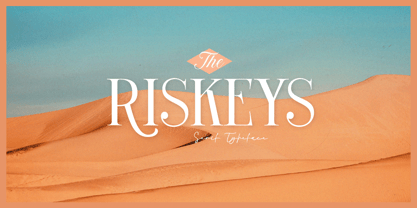 The Riskeys is a stylish and sophisticated modern serif font. This typeface has can be used for modern theme or vintage looks with ligatures & alternates. Very suitable for logo, headline, tittle, and the other various formal forms such as invitations, labels, logos, magazines, books, greeting / wedding cards, packaging, fashion, make up, stationery, novels, labels or any type of advertising purpose. Features : uppercase and lowercase numbers and punctuation multilingual ligatures alternates PUA encoded We highly recommend using a program that supports OpenType features and Glyphs panels like many of Adobe apps and Corel Draw, so you can see and access all Glyph variations.
 - Garten House by Letterhend,
$19.00 Garten House is a sophisticated high contrast display serif typeface. The ligature character makes this typeface unique and stands out rather than the regular serif font. Very suitable for logo, headline, tittle, and the other various formal forms such as invitations, labels, logos, magazines, books, greeting / wedding cards, packaging, fashion, make up, stationery, novels, labels or any type of advertising purpose. Features : Numbers and punctuation Multilingual Ligatures Alternates PUA encoded We highly recommend using a program that supports OpenType features and Glyphs panels like many of Adobe apps and Corel Draw, so you can see and access all Glyph variations.
 - Freehand Brush by Zetafonts,
$39.00 Freehand is a type system designed by Debora Manetti and Francesco Canovaro to emulate the natural appearance of handmade brush writing. Open type ligature substitutions are used to randomly alternate between different versions of each character to give the final output a realistic, uneven look. The main typeface of the system is a wide freestyle brush cursive, featuring over four hundreds of alternate version for characters and double letter ligatures. A "brush easy" version is included without the substitutions if you need more consistent look in your design and better control over letter variation through the glyph panel. The two freehand brush weights are complemented by two sets of icons of matching style, one for ui design with navigation icons and one with food icons. The system also includes a blockletter family in two weights, to be used together with the other fonts to create variation and contrast in your design. Freehand covers over 40 languages that use the Latin alphabet, with a full range of accents and diacritics.
 - Kudos Kaps NF by Nick's Fonts,
$10.00Introducing a series of decorative initials with a twist: each font contains two complete alphabets, A-Z, and numerous border elements in the numeral and shift-numeral positions. Classic, ornate, quaint and exotic, these fonts are essential tools for adding style and charm to your next project. Kudos Kaps Five features Jakob Erbar’s eponymous Initials in the uppercase slots, and Aldo Novarese’s Fontasi in the lowercase AND numeral slots. The font also includes three complete eight-piece borders, a two-piece accent set, two single border elements and an elegant penman dingbat.