10,000 search results
(0.038 seconds)
- Arkham77 by Jvne77 Studio,
$20.00 Inspired by the works of Howard Philips Lovecraft (1890-1936), and the city of Arkham lying abroad the Miskatonic River... witth all those witchcrafts secrecy and the infamous Necronomicon. The Elder Ones and the mighty Cthulhu, who lies and not dies within the dephts of the ocean in R'lyeh he's awaiting... arf, anyway this font will well set for posters, detective stories or horror books, pulps and others... *Full western latin language with most diacritics and numbers* Included in this set: - ARKHAM77 Black (More formal display) 560 glyphes - ARKHAM77 Elegante (for a creepiest rendition) 590 glyphes - ARKHAM77 Titles (as its name do not tells, for credits, or simple text) 560 glyphes - ARKHAM77 Extras (Embellish your work with this cool collection of frames and ornaments) +100 glyphes
 - 19-PRA by ILOTT-TYPE,
$29.00 Inspired by the elegance of Herman Zapf’s designs crossed with the readability of early 20th century Gothic fonts by Morris Fuller Benton, 19-PRA is a sans-serif with a visible stroke contrast and a humanist tone of voice. The large x-height seen in fonts like News Gothic and Palatino increases legibility and condensed proportions give excellent readability making it perfect for newspaper and magazine publishing. A typeface that can serve for both body text and titling the uppercase excels for headlines and renders beautiful brand names when tracked out. It sets well with both a serif or sans serif and has various open type features including: 12 standard ligatures, 3 discretionary ligatures, tabular figures, old stye figures as well as European accents.
 - Fontwax by Kustomtype,
$25.00 The Fontwax font is inspired by sign painters in sixties advertisings with a touch of Arts & Crafts. This style of type is instantly associated with advertising and design for high-end products. Fontwax is meticulously drawn for quality and readability. Fontwax is great for display, logos, branding, packaging, advertising, food, sports, titles, film, tv, and much more. Fontwax comes in 4 styles which perfectly match together. Fontwax is a great display family with roots in the advertising and sign painting industry of the 20th century. It is smoothly polished with all the features a good designer needs. For the best price, I recommend you grab the whole pack! Fontwax is designed by Coert De Decker in 2018 and published by Kustomtype Font Foundry.
 - SF Cross by Fonts66,
$16.00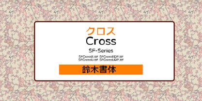 Expressive style for logos and eye catches, titles. 表現力の強い書体。ロゴやアイキャッチ、タイトルに最適。 縦画と横画の太さがほぼ同じのゴシック体の基本を崩して、太さをアトランダムに組み合わせデザインしたのがクロスです。 おやっと思わせるスタイルがアッピール度を高めてアイキャッチを生かしたロゴタイプやヘッドラインなどに適しています。 DPは仮名を大きくし多セットでより強い印象になります。
 - Hennigar by Sharkshock,
$115.00 Hennigar is a Neo Grotesque sans serif especially useful for display text and headlines. Many of the rounded letters are based on the appearance of the letter O with very little variation in width. Because of it's condensed nature the apertures are narrow with extenders that dip well below the base line. Similarly many of the lowercase characters are based on the lowercase o. Terminals and tails always point east/west giving the entire alphabet a very uniform appearance. Basic Latin, extended Latin, diacritics, punctuation, math symbols, symbols,Greek, Cyrillic, ligatures, fractions, alternates, and kerning are included. Kerning support for Macedonian and Serbian is included via alternate substitutions along with proper italics for Russian. Use Hennigar for a poster, web graphics, or book title.
 - Wooden Bridge by Putracetol,
$22.00 Wooden Bridge - Vintage Display Font. The line of Wooden Bridge is also very unique, so it makes seem irregular, What makes Wooden Bridges unique is vintage touch in the character. Wooden Bridge is inspired by display of the 1970s posters but made flexible enough for everyday use. Wooden Bridge best uses for title, invitation, heading, cover, poster, logos, quotes, product packaging, merchandise, social media & greeting cards and many more The alternative characters were divided into several Open Type features such as Swash, Stylistic Sets, Stylistic Alternates, Contextual Alternates, and Ligature. The Open Type features can be accessed by using Open Type savvy programs such as Adobe Illustrator, Adobe InDesign, Adobe Photoshop Corel Draw X version, And Microsoft Word. Wooden Bridge is also support multi language.
 - Mangueira by Latinotype,
$29.00 Mangueira is a sans-serif geometric typeface that is made up of 2 sub-families: one standard more contemporary family perfectly suited for display use and one alternative version for short blocks of text and more neutral titles. Each subfamily comes in 9 weights and includes swashes, which can be easily accessed from the OpenType menu. One of its main features is the combination of geometric shapes and vertical terminals that resemble Humanist sans typefaces. A generous number of swashes along with unique details in some glyphs such as "g" and "k" make Mangueira a versatile font well-suited for editorial design, branding, packaging, web and broadcast use, etc. Mangueira contains a set of 502 characters, supporting over 200 Latin-based languages.
 - Aveneur by Mokatype Studio,
$19.00 Hello Everyone, Introduce our new collection, Avaneur - Unique Display, Inspired by Modern logos of brands that have very strong characteristics, very suitable for posters, packaging, branding, logotype, and more. Avaneur font with strong and challenging nuances. very suitable for the title, typography, Poster, magazines, brochures, packaging, Websites and much more for your design needs, making your designs more modern and professional What's Included : + Standard glyphs + Multilingual Support + Web Font + Works on PC & Mac + Simple installations Accessible in Adobe Illustrator, Adobe Photoshop, Adobe InDesign, even work on Microsoft Word. PUA Encoded Characters - Fully accessible without additional design software. Fonts include multilingual support + Image used: All photographs/pictures/vectors used in the preview are not included, they are intended for illustration purposes only. Cheers! Thank You
 - Emperatriz by Latinotype,
$19.00 Emperatriz—with deep roots in the Roman tradition—is an elegant font and, above all, firmly situated in the present, featuring monumental forms and a classical design yet with a contemporary twist. It is a refreshing, clean, modern display font, perfect for the editorial design of magazines and catalogs, for the creation of titles and short texts, on book covers and large format publications, or as part of a corporate identity, logos, packaging and labels. Every variant in the family has generous counter forms, with ligatures and alternative capitals (Q, R, P, O), as well as oldstyle and Roman numerals, manicules, and monetary and mathematical symbols, providing a complete set with language support for more than 200 Latin script languages.
 - Shell Mera by Putracetol,
$24.00 Shell Mera is a slab serif inspired by 1970s cowboy and sheriff posters but made flexible enough for everyday use. What makes this font unique is the difference in the height of each character. The baseline is also not the same, so it makes this font seem irregular Shell Mera best uses for title, invitation, heading, cover, poster, logos, quotes, product packaging, merchandise, social media & greeting cards and many more The alternative characters were divided into several Open Type features such as Swash, Stylistic Sets, Stylistic Alternates, Contextual Alternates, and Ligature. The Open Type features can be accessed by using Open Type savvy programs such as Adobe Illustrator, Adobe InDesign, Adobe Photoshop Corel Draw X version, And Microsoft Word. This font is also support multi language.
 - Isle Headline by Mans Greback,
$19.00 Isle Headline is a high-quality serif typeface family, drawn by Måns Grebäck during 2018 and 2019. It is a sharp font with a clear and attentive look, adapted for headlines, titles and large type settings. It comes in four weights, each one as italic, totaling in eight styles: Light and Light Italic, Medium and Medium Italic, Bold and Bold Italic, Black and Black Italic. The font family can be used in a combination with a font of a different style, or together with its sister font Isle Body, also a serif font, which has the same basic structure but with a softer look and adapted for body text and smaller type. Each style contains ligatures and support for a wide range of languages.
 - Tambau by Tipogra Fio,
$30.00 Tambau is a display typeface crafted by Matheus “Fio” Gonçalves, a Brazilian design student, still in college, inspired by Brazilian concert urban posters and wood type that I saw at the Oficina Tipográfica São Paulo. The font was first made for a magazine project in design school, making it beautiful on giant pages headlines, billboards, signs, etc. There’s no lowercase, the character set is dramatic and objective. The uppercase is actually expanded letterforms causing some eyes and breathing paths to the very condensed and very modular glyphs, which creates a quite interesting striped texture between form, counterform and spacing. The lots of ligatures come to give it more closure between the letters, when they try to form blank spaces. So do the diacritics, fitting in the space given to them by the dynamic letterforms, making dense rectangular blocks. You may use Tambau as big as you can or do a high tracking to it and still it will be pretty. The titles can be dynamic, just condensed or just large. It’s on your own. Don’t be afraid to play with Tambau, it’s an alive typography. Curiosity: For the magazine in design school, the pilot project of Tambau was cut in a MDF board, to print it with texture and paint. Later was added more characters, languages and special glyphs to it. Set: Tambau is a singular font typeface, with extended and condensed characters, numbers, ligatures, punctuation and symbols for Basic, Western, Central and South Eastern Latin languages.
 - Patihan Variable by Jehoo Creative,
$119.00 Introducing Patihan Variable, a variant that makes it easy for you to access fonts with sharp, strong, bold characters. Patihan Variable is a combination of three different styles – Sans, Slab, and Serif – which are united into 2 Axes weight axes and serif axes, where weight axes have instances: Thin, Extra Light, Light, Regular, Medium, Semibold, Bold , Extrabold, and Black. This font has beautiful Ligature and Stylistic Alternate settings, Patihan font is also equipped with the Smallcaps feature which gives more control over typography, allowing you to create elegant and unique typography. The sans version of this typeface is versatile and easy to read, with a minimalist but impactful aesthetic. The Slab version is characterized by its solid and powerful strokes, while the Serif style has that extra classic flair with elegant curves and a stark contrast to the look. Patihan Variable is optimized to make it easier to access each variation, all you have to do is slide the slide in the software, and then you can access the style you want. Without sacrificing easy readability, this makes it a great choice for headlines, titles, and any long-form content. Ligature settings and discretionary styling add an extra layer of sophistication, making this font a great choice for magazines, branding and advertising. Overall, this font is a great choice for those looking to make a lasting impression. Its versatility, readability and unique features make it an excellent choice for any project.
 - XSeeder Chess by Ingrimayne Type,
$5.00 The two XSeederChess fonts are two modernistic chess fonts. The key layout is a bit complicated; see the key guide for detailed information on how to position pieces correctly.
 - Romans Story by Letterhend,
$19.00 Romans Story is a sophisticated ligature serif from us. This typeface has been made carefully to make sure its premium quality and luxury feel. The ligatures makes this typeface unique and stands out rather than the regular serif font. Very suitable for logo, headline, tittle, and the other various formal forms such as invitations, labels, logos, magazines, books, greeting / wedding cards, packaging, fashion, make up, stationery, novels, labels or any type of advertising purpose. Features : numbers and punctuation multilingual ligatures alternates PUA encoded We highly recommend using a program that supports OpenType features and Glyphs panels like many of Adobe apps and Corel Draw, so you can see and access all Glyph variations. How to access opentype feature : letterhend.com/tutorials/using-opentype-feature-in-any-software/
 - Hello Crimsons by Gilar Studio,
$16.00 HELLO CRIMSONS was inspired by a recent trip to London, England where I happened upon a bustling pub with beautiful typographic signage. HELLO CRIMSONS delivers a multitude of Opentype features, For a number of capital and lowercase letters, large swashes expand above and below the characters. Contextual swashes are also applied to some characters when placed at the beginning or end of a word. This font is made in a modern style with a very beautiful beginning and ending.elegantly,very casual and suitable for your various design needs I'ts.Perfect for logo,branding, tittle, social media posts, advertisements, product packaging, product designs, label, photography, watermark, special event,magazine,web design. Included: multilingual support beginning and ending swash Check my other Font here https://gilarstudio.com/
 - Morning Glow by Allouse Studio,
$16.00 Proudly Preseneting Morning Glow, handwritten stylish script font. This will give you an stylish impression. Morning Glow come along with many Ligatures, underline styles and Multilingual-Support which will add more cool impression. We highly recommend using a program that supports OpenType features and Glyphs panels like many of Adobe apps and Corel Draw, so you can see and access all Glyph variations. Morning Glow is perfect for any tittle, logo or even shope name sign. This also very suitable on product packaging, branding project, magazine, social media, wedding, or just used to express words above the background. Enjoy the font, feel free to comment or feedback, send me PM or email if there are issues or queries. Thank you!
 - The Royal Chambers by Letterhend,
$19.00 The Royal Chambers is a sophisticated display serif typeface. This typeface has been made carefully to make sure its premium quality and luxury feel. The unique letterforms makes this typeface unique and stands out rather than the regular serif font. Very suitable for logo, headline, tittle, and the other various formal forms such as invitations, labels, logos, magazines, books, greeting / wedding cards, packaging, fashion, make up, stationery, novels, labels or any type of advertising purpose. Features : numbers and punctuation multilingual ligatures alternates PUA encoded We highly recommend using a program that supports OpenType features and Glyphs panels like many of Adobe apps and Corel Draw, so you can see and access all Glyph variations. How to access opentype feature : letterhend.com/tutorials/using-opentype-feature-in-any-software/
 - Laterlocks by Letterhend,
$22.00 Introducing, Laterlocks, A sophisticated ligature serif from us. This typeface has been made carefully to make sure its premium quality and luxury feel. The ligatures makes this typeface unique and stands out rather than the regular serif font, very suitable for logo, headline, tittle, and the other various formal forms such as invitations, labels, logos, magazines, books, greeting / wedding cards, packaging, fashion, make up, stationery, novels, labels or any type of advertising purpose. Features : numbers and punctuation multilingual ligatures alternates swashes PUA encoded We highly recommend using a program that supports OpenType features and Glyphs panels like many of Adobe apps and Corel Draw, so you can see and access all Glyph variations. Email us to letterhend@gmail.com if you need something! Happy Designing!
 - Emporia Roman by Bean & Morris,
$35.00 SPQR Senatus Populusque Romanus or The Senate and People of Rome as quoted by the likes of Marcus Tullius Cicero or Tully to his friends and Titus Livius otherwise known as Livy. SPQR appeared on battle standards carried by Roman troops and no doubt can still be seen chiseled into stone facades across the old empire of the ancient Romans. This evokes visions of stonemasons delicately inscribing messages that were meant to endure, one which can still be seen on the Trajan column circa 114AD. Emporia Roman is a modern display font that was inspired by the craft of those ancient artisans, with an added lowercase set, some flourished alternates, an oldstyle set of figures and now with a matching Italic.
 - Merlo Neue by Typoforge Studio,
$29.00 Merlo Neue is the younger brother of Merlo. New family received refreshed, more square proportions and a new shape of many glyphs. However, what is the most important in new Merlo, is the wide range of instances – nine new weights, from Hairline to super dark Black – which allows to use the family in a complex way, depending on the user’s needs. Italic version has narrower and lighter proportions. Font has a glyph set for latin script and old-style figures. Merlo Neue would be a great choice for display use as well as for the longer texts. Font Merlo Neue is inspired by a “You And Me Monthly” published by National Magazines Publisher RSW "Prasa” from May 1960 till December 1973 in Poland.
 - Cristola Display by Masa Type,
$15.00 Cristola Display is a sophisticated ligature serif from us. This typeface has been made carefully to make sure its premium quality and luxury feel. The ligatures makes this typeface unique and stands out rather than the regular serif font. Very suitable for logo, headline, tittle, and the other various formal forms such as invitations, labels, logos, magazines, books, greeting / wedding cards, packaging, fashion, make up, stationery, novels, labels or any type of advertising purpose. Features : numbers and punctuation multilingual ligatures alternates PUA encoded We highly recommend using a program that supports OpenType features and Glyphs panels like many of Adobe apps and Corel Draw, so you can see and access all Glyph variations. Email us to masatype195@gmail.com if you need something! Happy Designing!
 - Crainzel by Letterhend,
$19.00 Crainzel is a sophisticated high contrast display serif typeface. The ligature character makes this typeface unique and stands out rather than the regular serif font. Very suitable for logo, headline, tittle, and the other various formal forms such as invitations, labels, logos, magazines, books, greeting / wedding cards, packaging, fashion, make up, stationery, novels, labels or any type of advertising purpose. Features : numbers and punctuation multilingual ligatures alternates PUA encoded We highly recommend using a program that supports OpenType features and Glyphs panels like many of Adobe apps and Corel Draw, so you can see and access all Glyph variations. How to access opentype feature : letterhend.com/tutorials/using-opentype-feature-in-any-software/ Email us to letterhend@gmail.com if you need something! Happy Designing!
 - Merlo Neue Round by Typoforge Studio,
$29.00 Merlo Neue Round is the younger brother of Merlo Round and cousin of Merlo Neue. This new family received a refreshed, rounded style and a new shape of many glyphs. New Merlo consist of a wide range of instances' seven new weights with italics, from Hairline to Bold allows to use the family in a complex way, depending on the users' needs. The font has a glyph set for latin and cyrylic script, small caps and old-style figures. Merlo Neue Round would be a great choice for display use as well as for the longer texts. This family is inspired by a "You And Me Monthly" published by National Magazines Publisher RSW "Prasa" from May 1960 till December 1973 in Poland.
 - Semiotic by Letterhend,
$19.00 Semiotic is a stylish condensed font. The uniqueness of this font is have the same size of uppercase and lowercase, so you can playaround to create a nice wording with this font. Very suitable for logo, headline, tittle, and the other various formal forms such as invitations, labels, logos, magazines, books, greeting / wedding cards, packaging, fashion, make up, stationery, novels, labels or any type of advertising purpose. Features : uppercase and lowercase numbers and punctuation multilingual ligatures alternates PUA encoded We highly recommend using a program that supports OpenType features and Glyphs panels like many of Adobe apps and Corel Draw, so you can see and access all Glyph variations. How to access opentype feature : letterhend.com/tutorials/using-opentype-feature-in-any-software/
 - Jazz Gothic by Canada Type,
$24.95Jazz Gothic is a digitization and expansion of an early 1970s film type from Franklin Photolettering called Pinto Flare. This type became an instant titling classic with jazz and soul album designers; then it caught on wildly with film and television designers. Blue Note and Motown would not have been the same without this face. Jazz Gothic is a simple geometric idea, quite likely originally inspired by the heavier display weights of Futura. The resulting product is a versatile message-driver that stands quite strong and cherishes the limelight, yet shows a playful and artistic side within its curvy thick swashes and rebellious unicase forms. In the hands of a good designer, Jazz Gothic eliminates any doubt about the delivery of the message or the attractive purposeful way it is delivered. It is the kind of typeface that loves a design program's bells and whistles. Knock it out of dark or light backgrounds, shade it, mask-alize it, roughen it, stretch it, squeeze it, and the message will still stand larger than life. Jazz Gothic comes in two fonts, a main one with a full character set to accommodate the majority of Latin-based languages, and a second one that contains about 50 alternates and swashed forms. The OpenType version is a single font that has all the alternates and swashes at the disposal of the buttons of OT-savvy program palettes. - Basilio by Canada Type,
$29.95 In the late 1930s, old Egyptiennes (or Italiennes) returned to the collective consciousness of European printers and type houses — perhaps because political news were front a centre, especially in France where Le Figaro newspaper was seeing record circulation numbers. In 1939 both Monotype and Lettergieterij Amsterdam thought of the same idea: Make a new typeface similar to the reverse stress slab shapes that make up the titles of newspapers like Le Figaro and Le Frondeur. Both foundries intended to call their new type Figaro. Monotype finished theirs first, so they ended up with the name, and their type was already published when Stefan Schlesinger finished his take for the Amsterdam foundry. Schlesinger’s type was renamed Hidalgo (Spanish for a lower nobleman, ‘son of something’) and published in 1940 as ‘a very happy variation on an old motif’. Although it wasn’t a commercial success at the time, it was well received and considered subtler and more refined than the similar types available, Figaro and Playbill. In the Second World War, the Germans banned the use of the type, and Hidalgo never really recovered. Upon closer inspection, Schlesinger’s work on Hidalgo was much more Euro-sophisticated and ahead of its time than the too-wooden cut of Figaro and the thick tightness of Playbill. It has a modern high contrast, a squarer skeleton, contour cuts that work similarly outside and inside, and airy and minimal solutions to the more complicated shapes like G, K, M, N, Q and W. It is also much more aware of, and more accommodating to, the picket-fence effect the thick top slabs create in setting. Basilio (named after the signing teacher in Mozart’s Figaro) is the digital revival and major expansion of Hidalgo. With nearly 600 glyphs, it boasts Pan-European language support (most Latin languages, as well as Cyrillic and Greek), and a few OpenType tricks that gel it all together to make a very useful design tool. Stefan Schlesigner was born in Vienna in 1896. He moved to the Netherlands in 1925, where he worked for Van Houten’s chocolate, Metz department store, printing firm Trio and many other clients. He died in the gas chambers of Auschwitz in 1944. Digital revivals and expansions of two of his other designs, Minuet and Serena, have also been published by Canada Type.
 - Gineso by insigne,
$- Michaelangelo. da Vinci. Bellini. Rafael. Masters of Italian art whose names have dwarfed those of many other great Italian artists. Yet relics from these other artists remain, though often unnoticed because of their practical nature. These unknowns are the Italian Masters of vernacular sign painting, and insigne now gives a nod to their work with its new sans serif, Gineso. Based on its inspiration, Gineso was created for posters, headlines and logotypes. (It does well in apps, too, though the sign painters probably weren’t thinking about that at the time.) Aesthetically remedied, yet still with an uncut charm, Gineso’s condensed qualities make it especially nice for signs and titling where horizontal space is at a premium. The tight, narrow forms of its geometric design leave you with a robust flavor that will remind you of mamma’s spaghetti. But don’t worry; the font’s ample counters ensure your audience won’t be reading through a bowl of pasta. These condensed forms look great on their own or when their seven different weights and matching italics are utilized together. With the included OpenType features, fractions and superior/inferior positions are also available to broaden your palette. Even more, this font is ready for complex, professional typography with OpenType features like alternate letters and a large character set including Central and Eastern European Languages. So when you find yourself (or your project) in a tight space, stir in Gineso to get the right taste for your copy. It may just make all the difference.
 - Clear Sans by Positype,
$29.00 Clear Sans™ is a… wait for it… rational geometric sans serif. It is intended to fill a niche… to provide an alternative to the somewhat based-on-vernacular signage, somewhat geometric sans. I hear the word vernacular thrown around too much and too loosely. If a typeface is based in the vernacular, based on hand-painted or hand-crafted signage, then it should be based on the movements of the hand, retain that warmth and not on a pretty geometric model. For me, clean, geometric and precise doesn't have to be cold and expressionless. The original skeleton was hand-painted in 2008 to help determine and inform my decisions going forward. The typeface was completed shortly afterwards at the behest of an old friend for their identity. As usual, I expanded it, but considered retiring it since there were so many things similar out there. Years later, I had a chance to rediscover it and came to the conclusion that it could be improved, expanded in a logical and useful way, and introduced. I would be lying if I didn't admit that the rise of webfonts and embedded type in applications influenced many of the decisions I made about reworking Clear Sans™. Completely new Text and Screen fonts were developed that utitlize larger x-heights, space-saving widths, logical (and simplified) weight offerings… to name a few alterations. Even the pricing of each variant was considered to produce a more reasonable and simple solution for the developer, designer, professional and novice. Clear Sans™ is a departure from my previous sans serifs, but the influences of Aaux Next, Akagi Pro and Halogen are evident. Enjoy a light-hearted mini-site devoted to Clear Sans™
 - Clear Sans Text by Positype,
$25.00 Clear Sans™ is a… wait for it… rational geometric sans serif. It is intended to fill a niche… to provide an alternative to the somewhat based-on-vernacular signage, somewhat geometric sans. I hear the word vernacular thrown around too much and too loosely. If a typeface is based in the vernacular, based on hand-painted or hand-crafted signage, then it should be based on the movements of the hand, retain that warmth and not on a pretty geometric model. For me, clean, geometric and precise doesn't have to be cold and expressionless. The original skeleton was hand-painted in 2008 to help determine and inform my decisions going forward. The typeface was completed shortly afterwards at the behest of an old friend for their identity. As usual, I expanded it, but considered retiring it since there were so many things similar out there. Years later, I had a chance to rediscover it and came to the conclusion that it could be improved, expanded in a logical and useful way, and introduced. I would be lying if I didn't admit that the rise of webfonts and embedded type in applications influenced many of the decisions I made about reworking Clear Sans™. Completely new Text and Screen fonts were developed that utitlize larger x-heights, space-saving widths, logical (and simplified) weight offerings… to name a few alterations. Even the pricing of each variant was considered to produce a more reasonable and simple solution for the developer, designer, professional and novice. Clear Sans™ is a departure from my previous sans serifs, but the influences of Aaux Next, Akagi Pro and Halogen are evident. Enjoy a light-hearted mini-site devoted to Clear Sans™
 - Clear Sans Screen by Positype,
$21.00 Clear Sans™ is a… wait for it… rational geometric sans serif. It is intended to fill a niche… to provide an alternative to the somewhat based-on-vernacular signage, somewhat geometric sans. I hear the word vernacular thrown around too much and too loosely. If a typeface is based in the vernacular, based on hand-painted or hand-crafted signage, then it should be based on the movements of the hand, retain that warmth and not on a pretty geometric model. For me, clean, geometric and precise doesn't have to be cold and expressionless. The original skeleton was hand-painted in 2008 to help determine and inform my decisions going forward. The typeface was completed shortly afterwards at the behest of an old friend for their identity. As usual, I expanded it, but considered retiring it since there were so many things similar out there. Years later, I had a chance to rediscover it and came to the conclusion that it could be improved, expanded in a logical and useful way, and introduced. I would be lying if I didn't admit that the rise of webfonts and embedded type in applications influenced many of the decisions I made about reworking Clear Sans™. Completely new Text and Screen fonts were developed that utitlize larger x-heights, space-saving widths, logical (and simplified) weight offerings… to name a few alterations. Even the pricing of each variant was considered to produce a more reasonable and simple solution for the developer, designer, professional and novice. Clear Sans™ is a departure from my previous sans serifs, but the influences of Aaux Next, Akagi Pro and Halogen are evident. Enjoy a light-hearted mini-site devoted to Clear Sans™
 - Redwinger by Ditatype,
$29.00 Redwinger is a captivating display font designed with a games theme, featuring different proportions of letters and sharp, uneven borders. This font showcases different proportions in its letterforms, adding a sense of variety and excitement to the font. Each uppercase letter has its own distinct width and height, creating a visually engaging composition. This design choice adds a playful and dynamic element to the font, reflecting the diversity and unpredictability of the gaming world. The sharp and uneven borders of Redwinger enhance its edgy and adventurous aesthetic. The jagged edges and irregular shapes give the font a distinctive and daring look, evoking a sense of action and intensity. This unique feature adds a touch of excitement and captures the spirit of gaming. For the best legibility you can use it in the bigger text. Enjoy the available features here. Features: Stylistic Sets Multilingual Supports PUA Encoded Numerals and Punctuations Redwinger fits in headlines, logos, posters, titles, branding materials, print media, editorial layouts, website headers, and any other projects that aim to transport players into thrilling virtual worlds. Find out more ways to use this font by taking a look at the font preview. Thanks for purchasing our fonts. Hopefully, you have a great time using our font. Feel free to contact us anytime for further information or when you have trouble with the font. Thanks a lot and happy designing.
 - Leftfield by Fenotype,
$35.00 Leftfield - stylish vintage font collection. Leftfield collection includes following: •Leftfield Brush -a bold baseball style script with Clean and Rough version •Leftfield Swoosh -a set of swooshes designed to go with Leftfield Brush. Clean and Rough version. •Leftfield Sans -a sturdy all caps sans serif with Regular and Bold weight and Clean and Rough version of both •Leftfield Serif -a sturdy all caps serif with Regular and Bold weight and Clean and Rough version of both Leftfield Brush is a bold and strong sports team style vintage connected script. It’s great for any kind of display use from impressive logos to packaging and headlines. Brush is equipped with automatic Contextual Alternates that keep the connections smooth. In addition there is Swash, Titling and Stylistic alternates for standard characters. Try combining Leftfield Swoosh to make stunning compositions. Leftfield Sans and Serif work great as themselves, they make striking word blocks and they are designed to go with the Brush. Try Leftfield Serif in large sizes to make the best out of the subtle serif’s. Leftfield Rough versions simulate a printed version of the font for authentic vintage look. They’re otherwise the same font but with a rugged outline and print texture inside the characters. Leftfield has a wide language support including West European, Central European, Baltic, Turkish and Romanian character sets.
 - Cabrito Flare by insigne,
$35.00 Cabrito Flare joins the Cabrito font family, a family designed to help younglings with the recognition of letter shapes. The original fonts are part of the development of a children's book, The Clothes Letters Wear. Cabrito Flare combines the simplicity and readability of the original Cabrito with an elegant flare serif. Now, this latest addition brings a new flavor to the table. Cabrito Flare brings fluid, carefree, medium contrast fun. It takes a more calligraphic direction than most. Cabrito combines structure and handwriting. There's a fluid balance of both characteristics, and Flare is no exception. It’s a unique combination of functional elegance with a little spice and a dollop of friendly. Fifty-four well-designed fonts give you many readable options to work with while developing your design. Cabrito Flare includes a suite of OpenType features. Alternative forms, ligatures, figures, and titling caps are all here. Preview these functions in the interactive PDF manual. There are glyphs for 72 languages; more than 600 glyphs await you. Cabrito Flare is an excellent choice for websites, as well as for brochures and packaging. Like Cabrito, used by several visible brands, Cabrito Flare is also an excellent option to define your logo. Try the taste of Cabrito Flare and be sure to dip in and sample some of the other Cabrito members: Original flavor, Didone, Sans, Serif, Semi, Contrast, and Inverto.
 - Redfighter by Ditatype,
$29.00 Redfighter is an attention-grabbing display font with a games theme, featuring large letters and a rectangular shape with sharp corners. This font shows large letters that demand attention and make a statement. The generous size of each character ensures maximum visibility and impactful design elements. This design choice allows this font to stand out and grab the viewer's attention with its imposing presence. The rectangular shape with sharp corners in Redfighter adds a sense of structure and strength to the font. The clean lines and defined angles create a visually bold and striking appearance. This unique feature evokes a sense of power and precision, reflecting the intensity and competitiveness found in the gaming world. For the best legibility you can use it in the bigger text. Enjoy the available features here. Features: Stylistic Sets Multilingual Supports PUA Encoded Numerals and Punctuations Redfighter fits in headlines, logos, posters, titles, branding materials, print media, editorial layouts, website headers, and any other projects that aim to create a strong visual impact. Find out more ways to use this font by taking a look at the font preview. Thanks for purchasing our fonts. Hopefully, you have a great time using our font. Feel free to contact us anytime for further information or when you have trouble with the font. Thanks a lot and happy designing.
 - Servegin by Letterhend,
$17.00 Servegin is a sophisticated modern serif font from. This typeface has can be used for modern theme or vintage looks. Very suitable for logo, headline, tittle, and the other various formal forms such as invitations, labels, logos, magazines, books, greeting / wedding cards, packaging, fashion, make up, stationery, novels, labels or any type of advertising purpose. Features : uppercase and lowercase numbers and punctuation multilingual ligatures alternates PUA encoded We highly recommend using a program that supports OpenType features and Glyphs panels like many of Adobe apps and Corel Draw, so you can see and access all Glyph variations. How to access opentype feature : letterhend.com/tutorials/using-opentype-feature-in-any-software/
 - Rogshire by Letterhend,
$14.00 Introducing, Roghsire.A stylish displa font with chic & classic looks. This typeface has been made carefully to make sure its premium quality and luxury feel. It comes with Slant Version. Very suitable for logo, headline, tittle, and the other various formal forms such as invitations, labels, logos, magazines, books, greeting / wedding cards, packaging, fashion, make up, stationery, novels, labels or any type of advertising purpose. Features : Uppercase & lowercase Numbers and punctuation Alternates & Ligatures Multilingual PUA encoded We highly recommend using a program that supports OpenType features and Glyphs panels like many of Adobe apps and Corel Draw, so you can see and access all Glyph variations.
 - Yuki by Thinkdust,
$10.00 Yuki is a full and rounded font that also manages to be compact, so when you need to make a big impact in a small space and still maintain a friendly feel, Yuki is here to do the job. In two different styles, each with bold alternatives, Yuki’s best function is to grab attention without taking up too much space. The lined form allows it to look even more streamlined in this performance, cutting shapes into more easily digestible pieces, while the bold forms create even more smoothness. Use Yuki for quick, impactful statements without being aggressive.
 - Pop by Alias Collection,
$60.00 A decorative, maze-like multi-line typeface in two weights. Lower case is narrow, upper case is wide, the two can be mixed to give a variety of bold, dynamic effects.
 - First March by Nathatype,
$29.00 First March is a captivating display serif font designed with elegance and a touch of modernity. This typeface combines classic serif elements with a contemporary twist, offering a unique and refined look to your creative projects. The elegant letterforms with clean lines and balanced proportions adding a sense of sophistication and grace to your typography. The serif details provide a timeless appeal, while the modern twist brings a fresh and current vibe to the font. This combination creates a harmonious balance between tradition and innovation. What sets First March apart are its swinging endings in select letters. These graceful and subtle flourishes add a touch of dynamism and playfulness to the font, creating an engaging visual experience. The swinging endings bring a sense of movement and fluidity to the letterforms, enhancing the overall elegance of the typeface. Because of its legibility you can use this font in a variation of text sizes. Enjoy the available features here. Features: Ligatures Stylistic Sets Multilingual Supports PUA Encoded Numerals and Punctuations First March fits in headlines, logos, posters, titles, invitations, branding materials, print media, editorial layouts, website headers, and many more. Find out more ways to use this font by taking a look at the font preview. Thanks for purchasing our fonts. Hopefully, you have a great time using our font. Feel free to contact us anytime for further information or when you have trouble with the font. Thanks a lot and happy designing.