10,000 search results
(0.03 seconds)
- The Riskeys by Letterhend,
$19.00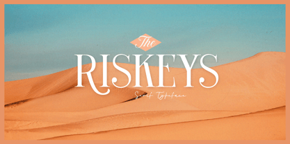 The Riskeys is a stylish and sophisticated modern serif font. This typeface has can be used for modern theme or vintage looks with ligatures & alternates. Very suitable for logo, headline, tittle, and the other various formal forms such as invitations, labels, logos, magazines, books, greeting / wedding cards, packaging, fashion, make up, stationery, novels, labels or any type of advertising purpose. Features : uppercase and lowercase numbers and punctuation multilingual ligatures alternates PUA encoded We highly recommend using a program that supports OpenType features and Glyphs panels like many of Adobe apps and Corel Draw, so you can see and access all Glyph variations.
 - Greater Delight by Allouse Studio,
$16.00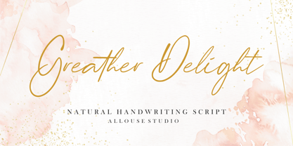 Greater Delight a Natural Handwritting Script. Feel the natural and beautiful handwriting impression! Greater Delight is perfect for any tittles, logo, product packaging, branding project, megazine, social media, wedding, or just used to express words above the background. Greater Delight come with Beginning and Ending swash, also come with multilingual support to fulfill your need! We highly recommend using a program that supports OpenType features and Glyphs panels like many of Adobe apps and Corel Draw, so you can see and access all Glyph variations. Enjoy the font, feel free to comment or feedback, send me PM or email. Thank You!
 - Kapra Neue Pro by Typoforge Studio,
$39.00 Kapra Neue Pro is a younger sister of Kapra Neue – he was the #1 bestselling Grotesque Sans released in 2017 on MyFonts and grandson of Kapra. Now you really have a lot of options to choose! New family is full of everything – 96 weights contain a wide range of instances, from Condensed to Expanded, everything with rounded corners or with sharp ones. Now, font has also: small caps, cyrillic script, and old-style figures. Kapra Neue Pro is inspired by a “You And Me Monthly” magazine, published by National Magazines Publisher RSW "Prasa” in Poland, from May 1960 till December 1973.
 - North Mountain by Letterhend,
$19.00 Introducing, North Mountain - A nostalgic display typeface. The sharp edges make this font looks great and standout for tittle, headline, logo, etc. There are three styles, regular, edge, stamp. Perfectly to be applied to the other various formal forms such as invitations, labels, logos, magazines, books, greeting / wedding cards, packaging, fashion, make up, stationery, novels, labels or any type of advertising purpose. Features : uppercase & lowercase numbers and punctuation multilingual alternates & ligatures PUA encoded We highly recommend using a program that supports OpenType features and Glyphs panels like many of Adobe apps and Corel Draw, so you can see and access all Glyph variations.
 - Millgrove by Letterhend,
$17.00 Introducing, Millgrove - A condensed display typeface. The condensed style make this font looks great and standout for tittle, headline, logo, etc. There are three styles, regular, edge, stamp. Perfectly to be applied to the other various formal forms such as invitations, labels, logos, magazines, books, greeting / wedding cards, packaging, fashion, make up, stationery, novels, labels or any type of advertising purpose. Features : - uppercase & lowercase - numbers and punctuation - multilingual - alternates & ligatures - PUA encoded We highly recommend using a program that supports OpenType features and Glyphs panels like many of Adobe apps and Corel Draw, so you can see and access all Glyph variations.
 - Garten House by Letterhend,
$19.00 Garten House is a sophisticated high contrast display serif typeface. The ligature character makes this typeface unique and stands out rather than the regular serif font. Very suitable for logo, headline, tittle, and the other various formal forms such as invitations, labels, logos, magazines, books, greeting / wedding cards, packaging, fashion, make up, stationery, novels, labels or any type of advertising purpose. Features : Numbers and punctuation Multilingual Ligatures Alternates PUA encoded We highly recommend using a program that supports OpenType features and Glyphs panels like many of Adobe apps and Corel Draw, so you can see and access all Glyph variations.
 - Vtg Stencil Germany No1 by astype,
$45.00 The Vtg Stencil series of fonts from astype are based on real world stencils. The Germany No.1 design was derived from authentic antique German stencil-plates. » pdf specimen « Surprisingly these stencil-plates offer a high contrast Didot design very similar to the French stencils produced and sold till today. The production time of these stencils is in the range of the German imperial period (1871‒1918). Of course the usage period was even longer. The font styles PAINT and SKETCH include 4 additional variations of base glyphs and figures. An extensive random function will mix the glyphs as you type - on proper OpenType-savvy apps like Adobe InDesign only. All styles offer an extended Latin character set.
 - Nurani by Allouse Studio,
$16.00 Nurani is a bold marker font that will bring an marker feel to your designs in need. Nurani come along with Stylistic Alternates, Underline Styles and Multi-Lingual support which will add cool impression. We highly recommend using a program that supports OpenType features and Glyphs panels like many of Adobe apps and Corel Draw, so you can see and access all Glyph variations. Nurani is perfect for any tittle, shope name or logo, this also very suitable on product packaging, branding project, magazine, social media, wedding, or just used to express words above the background. Enjoy the font, feel free to comment or feedback, send me PM or email if there are issues or queries. Thank you!
 - Goodbye Anjing by Allouse Studio,
$16.00 Goodbye Anjing is a Tall Handwritten Font that will give you an young and fun feeling. Goodbye Anjing come along with Multi-Lingual support which will add cool impression for your need. We highly recommend using a program that supports OpenType features and Glyphs panels like many of Adobe apps and Corel Draw, so you can see and access all Glyph variations. Goodbye Anjing is perfect for any tittle, shope name, lyric video or logo, this also very suitable on product packaging, branding project, magazine, social media, wedding, or just used to express words above the background. Enjoy the font, feel free to comment or feedback, send me PM or email if there are issues or queries. Thank you!
 - Sedid by Fontuma,
$20.00 Sedid, “solidity; It is an Arabic term meaning “righteousness”. In particular, the correctness and soundness of a word is indicated by this word. The fact that I gave this name to the writing family is to point out its accuracy and robustness. This typeface, which is sans serif, consists of three families: ▪ Sedid: Font family containing Latin letters ▪ Sedid Pro: Font family including Latin, Arabic and Hebrew alphabets ▪ Sedid World: A family of typefaces including Latin, Cyrillic, Greek, Arabic and Hebrew alphabets Those who want to meet a new face of writing for their works and projects and make a difference in their work should meet the Sedid writing family. This typeface is as serious as it is affectionate, and solid as well as elegant. The Sedid font family can be used as a text and title font in all publishing and printing areas, magazines, newspapers, books, banner and poster designs, and websites. Sedid also has a pleasant-looking, flexible face with smooth lines and transitions. The inner and outer spaces of the font are proportioned so that the text can be read easily. Sedid font family consists of 14 fonts, seven plain and seven italic. The font family includes open type features, as well as a large number of ligatures, small caps, modifiers, and currency symbols of many countries.
 - Neuarc by CozyFonts,
$25.00 Neuarc Font Family This is the 20th font family of CozyFonts Foundry, established 10 years ago in 2012 with the release of Aladdin Bold. Neuarc is based loosely on arcs and curves, hence it’s naming. As shown in one of the font posters that serves to showcase this font, a collage of rough sketches is displayed as the poster’s background. These hand drawn pencil drawings were worked and reworked and The final drawings were scanned and built in Adobe Illustrator and transferred to glyph windows, glyph by glyph, in Fontlab 8. The 5 styles, so far, are reminisscent of The Art Deco Era of Design between the 1030s and 1950s. Neuarc also has it’s own footprint with several characters that stand out, eg. A, 8, &, B, ?, $, 5, w, x, a, c, e, etc. giving the reason for the ’Neu’ in the naming. These letterforms & Numbers work extremely well in monograms. Each styles has it’s own personality. From the ultra chic Light style to the dominant cool Bold style, this family maintains a uniform legibility at small to large sizes. Meant primarily for display uses, Neuarc works well for posters, logos, headlines, packaging, branding, signage for a myriad of applications. The Neuarc Deco style font will work well in titles and numbers of any application.
 - PF Beau Sans Pro by Parachute,
$79.00 The design of Beau Sans was inspired by Bernhard Gothic which is considered one of the first contemporary American sans serifs and was designed by Lucian Bernhard in the late 1920s. Panos Vassiliou came across this font while attempting to reduce the design elements of a text typeface, by introducing Bauhaus-like minimal forms to the characters. The first version was completed back in 2002 and introduced one year later in Parachute’s 3rd catalog, under the name PF Traffic. Some time later it was decided to make a few improvements but the project was so carried away that the new typeface which emerged needed urgently a new name. Beau Sans Pro is a modern sans-serif family of 16 fonts which includes true-italics. Just like all other Parachute fonts, it covers a broad range of languages by incorporating 3 major scripts i.e. Latin, Greek and Cyrillic in one font. Furthermore, every font in this family has been completed with 270 copyright-free symbols, some of which have been proposed by several international organizations for packaging, public areas, environment, transportation, computers, fabric care and urban life. This typeface is totally recommended for titles and/or body text when you want to give a distinct and contemporary identity to a product or service.
 - Artisan Paris by Jolicia Type,
$25.00 Artisan Paris, a true embodiment of Parisian finesse and grace, is a mesmerizing display font crafted with a delicate and aesthetic feminine style. Characteristics: Aesthetic Feminine Style: Artisan Paris showcases a refined, feminine aesthetic that speaks of sophistication and beauty. Its design embraces the elegance synonymous with Parisian artistry. Intricate Craftsmanship: The font is meticulously designed, with every character bearing intricate details reminiscent of the craftsmanship seen in the heart of Paris. Delicate curls and ornate elements define this font, showcasing the skilled artistry of Parisian artisans. Two Weights: Artisan Paris provides versatility with two distinct weights – Regular and Italic. The Regular weight exudes a balanced and poised demeanor, while the Italic weight adds a playful and dynamic touch, enhancing your creative expressions. Usage: Artisan Paris is the font of choice when you want to infuse your designs with the grace and allure associated with Parisian artistry. Ideal for headlines, titles, branding, invitations, and any design project seeking an elegant and feminine touch. Designer: Artisan Paris was meticulously designed by a team of dedicated artists and designers, drawing inspiration from the chic and timeless femininity of Paris. Every element in this font reflects their passion for capturing the essence of Parisian artisans.
 - Snacko by Eko Bimantara,
$22.00 Snacko is one dope display font. It’s got that casual vibe mixed with some 70s soft serif styles, and a playful italic angle that’ll make your designs move and groove! This font is perfect for titling, branding, logos, and all kinds of digital or printed materials. It’s fun and playful, so it’s perfect for designs that are targeted at a younger crowd or need a fresh and modern feel. Snacko’s funky, soft, and cool design makes it the bomb for all kinds of design fields, from advertising to packaging to social media graphics. It’s got a style that’s all its own and can make your designs pop and stand out from the crowd. This font only comes in one style, but don’t trip, it’s versatile and can be used in all kinds of ways. It’s approachable and friendly with a softness that’s off the hook, but also funky and expressive with a unique personality that can take your designs to the next level. Bottom line, Snacko is one creative and versatile font that’ll bring a playful and fun energy to all your designs. It’s got a unique style that’s perfect for any designer’s font collection, so don’t sleep on this one!
 - Phiz by Shinntype,
$29.00 Phiz is a diverse suite of 28 decorative fonts based on Figgins Sans Extra Bold. Classic (10 fonts), Rounded (7 fonts), Rough (4 fonts) and Particles (7 fonts). The Rough and Particles styles emerge as a unique niche—neither imitating distressed printing (e.g. the “rusty” look), nor casual, hand-drawn styles. These type designs are conceived and executed as complex algorithmically-generated graphic procedures, in which repetitive elements have been artfully applied to the Sans capitals, and manually nuanced. As such they also differ substantially from textured glyph shapes that have been cut out from larger pattern fields, for the constituent particles are disposed in relation to the specific shape of each character they define. The caps-with-small-caps format was chosen for two reasons. Firstly, titling display usage is predominantly capitals, and secondly, rather like optical scaling, having the same resolution of texture available in two different “sizes” (upper and lower case) should prove useful in the hierarchy of page layout—not primarily for setting upper and lower case text as caps-with-small-capitals, although this is of course an option. All figures and major symbols (punctuation and currency) are provided in both cap and small cap height.
 - Ahmed by Linotype,
$187.99Ahmed is a modern Arabic headline face, first produced by Linotype-Hell Ltd. in the early 1980s. Originally developed as a simplified face, its design recalls the inscriptional and decorative tile work lettering of the medieval period. The strong treatment of the tails of certain characters departs from the more traditional style of tapering these finials, introducing a modern feel to the design. The contrasting proportions of the tall vertical strokes and the rather elongated counters lend a monumental look to Ahmed, allowing its effective use in titling. During the later 1980s Ahmed was developed into a traditional typeface, with the introduction of medial forms to improve character spacing and balance. Recently, Ahmed has been converted into the OpenType font format, ensuring its continued popularity as a heading face for newspaper typesetting. The Ahmed typeface contains two weights, Ahmed and Ahmed Outline. Both of the OpenType fonts include Latin glyphs from Clearface Gothic Roman inside the font files, allowing a single font to set text in both most Western European and Arabic languages. The two Ahmed fonts include the Basic Latin character set and the Arabic character set, which supports Arabic, Persian, and Urdu. They include tabular and proportional Arabic, Persian, and Urdu numerals, as well as a set of tabular European (Latin) numerals. - 1510 Nancy by GLC,
$20.00 This set of decorated initial letters was inspired by those used in 1510 in Nancy (France, Lorraine) for printing of "Recueil ou croniques des hystoires des royaulmes d'Austrasie ou France orientale[...]" Author Symphorien Champion, unknown printer. There were three sorts of initials family, but only one complete and clear, except a very few characters. The printer used some letters to represent others, as V, turned over to make a A, D to make a Q, M for E, So, the reconstruction was a little less difficult. Thorn, Eth, L slash and O slash were also added. The original font's letters was only drawn in white on a black background only, but it was tempting to propose a negative version in black on white. A few letters have multiple appearance, but only the A was clear enough to be reproduced. It can be used as variously as web-site titles, posters and flyer design, publishing texts looking like ancient ones, or greeting cards, all various sorts of presentations, as a very decorative, elegant and luxurious additional font... This font supports strong enlargements revealing its fine details and remaining very smart. Its original medieval height is about one inch equivalent to about three to four lines of characters. This font may be used with all our blackletter fonts, but as well with "1543 Humane Jenson", "1557 Italic" and "1742 Civilite", without any fear about anachronism.
 - Native Txt by XdCreative,
$25.00About Native-Txt It is combine of transitional and contemporary type style, with variable stress angle and more stroke contrast. Native-txt has vary styles and most have a large x-height with bracketed serif and square terminal also a litle open aperture. Native-Txt comes up with a true italic with calligraphic latin style, this is a very contrasting and perfectly elegant. Thank you _xdCreative - ASM by Extratype,
$40.00 The initials ASM represent the acronym of the Santa Monica Arts cultural center located in Barcelona, Spain, where this typeface, with the same name, has served as the custom corporate typeface since 2008 till today (2013). ASM is an energetic monospaced with extreme legibility consisting of two original weights, with an underlined version – used on some of corporate applications – all with their corresponding italics.
 - Balmecia by IbraCreative,
$17.00 Balmecia – A Tall Display Serif Typeface Balmecia is a distinguished tall display serif typeface that exudes a timeless elegance and sophistication. With its tall and slender letterforms, Balmecia commands attention and lends a touch of grace to any design it graces. The carefully crafted serifs add a classic flair, while the generous letter spacing ensures optimal legibility even in larger sizes. Balmecia’s vertical proportions create a sense of stateliness, making it an ideal choice for headings, titles, and other display applications where a touch of refinement is desired. This typeface seamlessly blends tradition with a modern aesthetic, offering a unique personality that captures the essence of both vintage and contemporary design sensibilities. Balmecia is perfect for branding projects, logo, wedding designs, social media posts, advertisements, product packaging, product designs, label, photography, watermark, invitation, stationery, game, fashion and any projects. Fonts include multilingual support for; Afrikaans, Albanian, Czech, Danish, Dutch, English, Estonian, Finnish, French, German, Hungarian, Italian, Latvian, Lithuanian, Norwegian, Polish, Portuguese, Slovak, Slovenian, Spanish, Swedish. **Uppercase
 - Civane Serif by insigne,
$35.00 Civane Serif maintains the epic grandeur of Civane with a text-friendly typeface. Inspired by the great tales of old, the grandeur of Civane is refined into a serif font with sharp serifs. Civane Serif is a contemporary sans-serif typeface with a robust character set. The Civane Serif family of typefaces supports 48 Latin-based Western, Central, and Eastern European languages, as well as the Baltic States and Turkey. Ligatures, small caps, embellishments, and a wide range of numerals are all accessible in OpenType, including proportional and tabular-width numbers, old style figures, fractions, inferiors, and superiors. Civane Serif is one of the finest choices for serif text setting. The italic or bold weights, as well as the roman set in titling caps, will impart a feeling of serene dignity on posters and webpages. Civane Serif's craftsmanship shines through with its higher contrast modern design, perfect for high-end premium goods and services.
 - Gojali by Sabrcreative,
$15.00 Gojali is a sleek and modern geometric sans serif font family. It offers a range of 5 weights, from Thin to Thick, combining contemporary style with its distinct softness. The design of Gojali is characterized by its minimalistic, elegant, and versatile nature, providing a unique feel and ensuring ease of reading. Gojali was specifically created to deliver an easy-to-read text display. It is suitable for both text and display purposes, making it a perfect choice for headers, titles, posters, websites, branding, apps, and a wide range of other creative designs or projects. Gojali features various OpenType functionalities, including standard ligatures and number variations such as old-style numerals, fractions, numerators, and denominators. It also offers extensive support for the Latin language. With Gojali, you can effortlessly create captivating text displays with a special touch. Its soft yet strong design makes it an ideal option for crafting extraordinary and charming designs.
 - Chez Moustache by PintassilgoPrints,
$29.00 Based on Irma La Douce film opening titles, Chez Moustache is a very eye-catching display font loaded with cool special effects. It is a unicase typeface with 2 versions for each letter, each easily accessible through upper and lower case keys. To prevent double letters from displaying the same glyph, just type the alternate glyph, or use the neat OpenType feature to make things even easier: just turn on the contextual alternates in any OpenType aware program and it's all done before you can say Jack Robinson. Did you push the stylistic alternates button instead of the contextual one? Voilà, so you've got a pocketful of flowers! There's a complete set of sweet stylistic alternates to instantly flourish your way. And it's not over yet: check out the cool initial and terminal forms for that extra twist. Pick your choices with a glyphs palette or just turn on the OpenType swash feature. Now go ahead, there's a lot to do Chez Moustache. But that's another story...
 - Mayes by Sabrcreative,
$15.00 Mayes is a soft, geometric sans serif font family. It consists of 6 weights ranging from Thin to Black, combining elements of Bauhaus and modern styles with its distinctive softness. Its design is minimalist, elegant, and warm, offering a unique yet versatile and easily readable impression. Mayes was created with the purpose of providing text displays that are easy to read, strong, and make a standout impression. It is compatible with both text and display purposes, making it perfect for headers, titles, posters, websites, branding, apps, and various other creative designs or projects. Mayes features several OpenType functionalities, including standard ligatures and number variations such as old-style figures, fractions, numerators, and denominators. It also offers extensive support for the Latin language. With Mayes, you can effortlessly create text displays that stand out with a touch of specialty. Its soft yet strong design makes it an ideal choice for creating remarkable and captivating designs.
 - Epillox by Formatype Foundry,
$20.00 PDF Epillox is a modern, contemporary, geometric typeface, with a strong personality and more unique with maximum emotional. It is inspired by modern contemporary display sans typefaces. We spent a lot of time, especially in the italic, to draw with high-quality compensation for all circles and strokes to become fresher and cleaner from the geometric point of view. As an OpenType family it includes 51 alternate characters and ligatures, plus extra characters. The most interesting is about Stylistic set (ss02) have a more powerful characters the combination of original and wide characters. Epillox also supports other OpenType such as: Ligatures, Discretionary Ligatures, ordinal numbers, case sensitive, fraction, supscript, superscript, ss01, ss02, ss03, ss04, ss05, ss08 Epillox contains 695 characters supports over — 200 Latin-based languages. Other Essential sets are composed of alternative glyphs. its great in headline, titles and short paragraphs (Poster, Signage, Logo, Branding, cover and etc) A Variable Font is also included in the family.
 - Audrey by Fenotype,
$30.00 Audrey is an elegant monolinear Script and Sans font family. Audrey is great for designing headlines, packaging or as a logotype online or offline. Audrey has three weights of Script and Sans and a set of Ornaments. The weights go following: Regular is twice and Bold is three times as wide as Thin so if you want to have an Ornament example with same stroke width as Script you can set the Script in 36pt Regular and Ornament 72pt Thin -and they’ll have exactly the same width. Audrey Script is packed with OpenTtype features: Keep Standard Ligatures on for smooth connections and try Swash, Stylistic or Titling Alternas for more showier letters or seek for even more alternates from the Glyph Palette. Script also has Lining numerals as default and Old Style numerals as an OpenType alternates. Audrey is a close relative to widely popular Cosmopolitan released earlier by Fenotype. Compared to Cosmopolitan Audrey has more geometric forms and bigger lowercase characters with larger x-height.
 - Dollygirl Script by Zane Studio,
$12.00 Dollygirl Script is a beautiful calligraphy design, including Regular and italics. This font is enough with a sweep. Can be used for various purposes. such as logos, product packaging, wedding invitations, branding, titles, signs, labels, signatures, book covers, posters, quotes, and more. Dollygirl Script displays alternative OpenType, Binder and Various International styles for most Western languages. To activate the OpenType Stylistic alternative, you support programs that support OpenType features such as Adobe Illustrator CS, Adobe Indesign & CorelDraw X6-X7, Microsoft Word 2010 or newer. Dollygirl Script is coded with Unicode PUA, which allows access to all features without special design software. Mac users can use the Letter Book, and Windows users can use Character Maps to view and copy additional characters to paste into your favorite text editor / application. If you need help or have questions, let me know or send an email "zanestudio55@gmail.com" I'm happy to help :) Thank you & Happy Design!
 - Indipia by Aah Yes,
$11.95 Indipia is a caps-only misprinted font, ideal for display, titles, and headlines. It has alternative characters for all double-letter combinations aa-zz and AA-ZZ to avoid having two identical degraded letters together (You can see this by typing/copying words like mirror BASSOONS into the text box above, with Ligatures on); different characters for upper/lower case letters; and of course all the expected accented characters for European languages. There’s also Stylistic Alternates for some common letters and punctuation which will give a third version of the letter and/or add some random ink-misprints if selected. There are 2 styles -- Regular has small areas misprinted within the letter itself like little bits that haven't been inked, the Solid version doesn't, and the Solid one is on the grey gallery poster image. The zips contain both OTF and TTF versions - install either OTF or TTF, not both (to avoid incompatibility issues).
 - Hadriano by Monotype,
$29.99When traveling in Paris, American designer Frederic W. Goudy did a rubbing of a second century marble inscription he found in the Louvre. After ruminating on these letterforms for several years, he drew a titling typeface in 1918, all around the letters P, R, and E. He called the new face Hadriano" as that name was in the original inscription. Robert Wiebking cut the matrices, and the Continental Typefounders Association released the font. Goudy designed a lowercase at the request of Monotype in 1930, though he didn't really like the idea of adding lowercase to an inscriptional letterform. The lowercase looks much like some of Goudy's other Roman faces. Compugraphic added more weights in the late 1970s, and made the shapes more cohesive. Hadriano has nicely cupped serifs and sturdy, generous body shapes. Distinctive individual letters include the cap A and Q, and the lowercase e, g, and z. Hadriano™ is an excellent choice for impressive headings and vigorous display lines." - Emilio by Narrow Type,
$35.00 Emilio is a modern serif family available in 14 styles. It's an elegant typeface with friendly and warm personality which seeks a balance between traditional and modern. Emilio is inspired by the visuality of the 1980s and the typefaces that were widely used in advertising at the time, such as Times and Garamond. However, Emilio offers a contemporary take on the serif font family, adding new elements such as reductive, calligraphy-inspired details or the "K" and "R" legs shape. If you want a more traditional look, you can achieve it with the stylistic alternatives available. Of course, the typeface also provides standard and discretionary ligatures and many other Open Type features. In addition, it offers support for most Latin languages. The big headlines and titles are where Emilio shines the most, but due to large x-height and decent contrast will work for smaller text as well. Emilio is the ideal typeface for editorial design, posters, covers, branding and much more.
 - Fits by DearType,
$40.00 Fits is a modern version of the versatile vintage style script. It's clean, legible and easy to use. Fits was meant to be used as an everyday workhorse font, thus its uses are endless - from websites and signage to merchandise and editorial designs. It looks great on product packaging and menus, being easily readable from afar. It has some initial forms and ligatures, as well as fancier alternates for the capital letters (in case you want to spice things up a bit). Unlike its predecessor, BeachBar, Fits has more basic letter shapes which makes it the perfect script for most day-to-day design applications - think apps, websites, merchandise, posters and cards, blog titles, t-shirts, branding and animation projects, etc. As promised, Fits comes in seven weights for a different impact and with a neat set of Cyrillic letters. All in all, Fits is a simple and workable script that will fit most design tasks perfectly.
 - Hejira by Sudtipos,
$49.00 Hejira means “rupture” and this concept was the primary principle that guided the creation of this typeface: to escape conventions and take up the challenge of designing letters with an unusual and fresh approach. Unlike traditional typefaces, each member of this somewhat atypical family has its own distinct personality and formal features. A thin, spiky font that looks like its sharp serifs could pierce through. A more experimental sibling, based on the same skeleton but taken to the extreme, that is best suited to setting big titles. An odd-one-out, sans-serif style whose shapes mimic those generated by the movement of a calligraphic pen. And a quirky fat-face with a flair for combining round curves with pointy elements. Regardless of how different they may be, all four styles feel part of the same system and can be used alongside each other seamlessly. The Hejira set includes multiple ligatures and supports a wide variety of Latin alphabet-based languages.
 - Deus by Renegade Fonts,
$22.00 Deus is when type design is brought to extreme. It tries to answer the question whether you can design all glyphs in one axis of stress. It does not try to be all purpose, useful at all sizes, legible or readable and most of all it does not try to be neutral. It has its own style you either accept or not. But if you do so, it has many great stuff inside. Every glyph has the same width across four masters, so you can change the style in one title or even make an animation out of that. It also has some cool animated emojis, so make sure you take all four styles! Deus has two sets of styles. "Deus" that has an expanded glyph set, and "Deus Basic" that comes with a limited glyph set. You can play around with "Deus Basic" since you get it for free, then fall in love with this font family and go for the full version.
 - Gelica by Eclectotype,
$30.00 When work started on the design of Gelica, there wasn't the same glut of retro-ish soft serifs there is today, and if I'd managed to complete it quicker, it might have been more trendsetter than bandwagon jumper, but that's the way it goes sometimes! I still think it's useful and unique enough to be a worthwhile addition to your typographic arsenal. Although obviously influenced by Cooper, it actually owes more to the lesser known Goudy Heavyface and Ludlow Black, particularly in the concave serifs. I wanted the family to be friendly and approachable, but not overly cutesy, and usability was always the prime concern. A nice weight range with matching italics was a must, along with useful OpenType features, and various figure styles. This is a display family first and foremost, but is also comfortable at smaller sizes for longer copy, and so works well in a supporting role to a more exuberant titling font.
 - Brake by Black Studio,
$19.00 New from Black Studio, presenting Brākė is a typeface that is feminine, adaptable, contemporary aesthetic and creates endless variations for your creative needs. Its striking contrasts and subtle details, together with its sumptuous strokes and voluptuous curves, create a beautiful and powerful statement for any typographic composition, blending glamor with a contemporary aesthetic. Brākė really helps you create unlimited variations for your creative needs in making your project titles: such as Books, fashion, magazines, logos, branding, photography, invitations, wedding invitations, quotes, blog headers, posters, advertisements, postcards, books, websites, etc. WHAT IS INCLUDED • Brākė – Regular • Brākė – Oblique • Brākė – Outline This type of family has become the work of true love, making it as easy and fun as possible. I can't wait to see what you do with Brākė! Feel free to use the #Black Studio tag and the #Brākė font to show what you've been up to, I really hope you enjoy it! Thank You!
 - Wave by Jennifer Delaney Designs,
$23.00 WAVE is characterized by curved lines and intricate details. Each character was individually made in Illustrator and Type Tool using my original illustrations. Wave is a decorative font best used for titles or short bursts of texts in large point settings. The typeface is based on the uppercase letterforms, but I have also created lowercase letters, numbers, and glyphs. The motion lines used in the making of Wave mirror an art deco-style. Inspired by an illustration of a large wave, I was fascinated that by using only lines and solid colors we as artists can depict the translucency and ever-changing movement of waves. I began by delicately sketching out all of the letters using graph paper and micron pens. My work always begins with traditional media. I'm an illustrator, freelance artist, and graphic designer from Chicago, IL. I studied at Texas Christian University, and received my Bachelors of Arts in Graphic Design from Columbia College Chicago. Visit www.jennyddesigns.com for more! :)
 - Desire Lite by Borges Lettering,
$30.00 With over five years of design and development, Desire is a pursuit of epic proportions and ready to make a statement by adding elegance and unique flair to your next design project. Desire offers an expansive set of options to create logos, headlines and titling. It is well suited for books, editorial, packaging, advertising, branding and more. From period style and Victorian to modern and elegant, Desire is strong and stately yet elegant and decorous. A wide selection of alternate upper and lowercase forms feature delicate line flourishes creating a subtle background for additional letters to rest ? The result is an intertwining and beautifully flourished design. Unique ligatures go beyond function and add eye catching flair and style. Desire is truly a designer's dream come true! Desire Lite is PUA encoded! PLEASE NOTE: Image samples show Desire Lite A, B and C. Please check Character map above to see which letters are included in each font.
 - Cozy Sweater by Larry Nickname,
$9.00 It was originally inspired by my winter scarf knitting exploits. I discovered that making wool scarves was generating beautiful patterns and I wanted them to become a source of inspiration for a style. I made a few collages, and they became letters. Other characters came up with ease. It is readable, but long essays are not its main purpose. It is decorative and will look casual and very attractive on any ad as a title or a short phrase. It also demonstrates very good performance in automatic 3D generators, like Xara 3D maker, used in making examples of how this font can be utilised. It was designed to be thin, soft, with the capacity to cover empty space and to create a vibrant environment. Small characters are different from capital letters, they are stylistic alternates. Some letters are slightly ominous or dynamic, others create a soothing feeling. Using several colors make it shine, but it is complex, it looks good in monochromatic compositions as well.
 - Peachi by My Creative Land,
$25.00 Peachi is a serif typeface loosely based on Morris Fuller Benton’s Souvenir forms and some other serif fonts designed in the early 1900s. It has a soft look - round corners, slightly curved legs of capital K, R, V and W; and lowercase k, v, w and y. Rather heavy ball terminals and a very large x-heigh make Peachi a perfect choice for designing titles, book covers, for branding, quotes design - basically any design that needs to make an impact and to be remembered. Peachi is released in 6 weights from Thin to Black and has stylistic alternates that make it even more versatile. While the default style follows Souvenir’s trend, the alternative style looks more modern. It’s totally up to you which style to choose for your design. To access all alternates and ligatures you’ll an OpenType aware application such as Adobe Suite or MSWord. March 2021 Update: more alternates and ligatures have been added!
 - Bentoga by Black Studio,
$25.00 New from Black Studio, presenting bentoga is a typeface that is feminine, adaptable, contemporary aesthetic and creates endless variations for your creative needs. Its striking contrasts and subtle details, together with its sumptuous strokes and voluptuous curves, create a beautiful and powerful statement for any typographic composition, blending glamor with a contemporary aesthetic. Bentoga really helps you create unlimited variations for your creative needs in making your project titles: such as Books, fashion, magazines, logos, branding, photography, invitations, wedding invitations, quotes, blog headers, posters, advertisements, postcards, books, websites, etc. WHAT IS INCLUDED • Bentoga – Regular • Bentoga – Italic This type of family has become the work of true love, making it as easy and fun as possible. I can't wait to see what you do with Bentoga! Feel free to use the #Black Studio tag and the #Bentoga font to show what you've been up to, I really hope you enjoy it! Thank You!