10,000 search results
(0.026 seconds)
- DIN Next Shapes by Monotype,
$29.99 Sabina Chipară's DIN Next Shapes typeface is a twist on the original German industrial classic, taking its skeleton and re-clothing it in dots, hearts, snowflakes and stars. The design offers a more approachable and whimsical tone of voice than the original, while maintaining all the legibility and clarity of form that makes DIN Next such a reliable and versatile design. It works in harmony with DIN Next, and is particularly suited for designers looking to be a little more expressive. DIN Next Shapes includes four fonts: Dots, Flakes, Hearts and Stars, and has pan European language support including Greek and Cyrillic. It also has OpenType features including stylistic alternatives, ligatures and fractions.
 - Linotype Didot eText by Linotype,
$50.99 A clear and enjoyable reading experience hinges on the legibility of text copy, especially when reading on screen. This is why Monotype has developed the eText collection of fonts specifically tailored for the text-heavy display environments of e-readers, tablets, mobile devices, and the Web.
 - DIN Next Devanagari by Monotype,
$103.99DIN Next is a typeface family inspired by the classic industrial German engineering designs, DIN 1451 Engschrift and Mittelschrift. Akira Kobayashi began by revising these two faces-who names just mean ""condensed"" and ""regular"" before expanding them into a new family with seven weights (Light to Black). Each weight ships in three varieties: Regular, Italic, and Condensed, bringing the total number of fonts in the DIN Next family to 21. DIN Next is part of Linotype's Platinum Collection. Linotype has been supplying its customers with the two DIN 1451 fonts since 1980. Recently, they have become more popular than ever, with designers regularly asking for additional weights. The abbreviation ""DIN"" stands for ""Deutsches Institut für Normung e.V."", which is the German Institute for Industrial Standardization. In 1936 the German Standard Committee settled upon DIN 1451 as the standard font for the areas of technology, traffic, administration and business. The design was to be used on German street signs and house numbers. The committee wanted a sans serif, thinking it would be more legible, straightforward, and easy to reproduce. They did not intend for the design to be used for advertisements and other artistically oriented purposes. Nevertheless, because DIN 1451 was seen all over Germany on signs for town names and traffic directions, it became familiar enough to make its way onto the palettes of graphic designers and advertising art directors. The digital version of DIN 1451 would go on to be adopted and used by designers in other countries as well, solidifying its worldwide design reputation. There are many subtle differences in DIN Next's letters when compared with DIN 1451 original. These were added by Kobayashi to make the new family even more versatile in 21st-century media. For instance, although DIN 1451's corners are all pointed angles, DIN Next has rounded them all slightly. Even this softening is a nod to part of DIN 1451's past, however. Many of the signs that use DIN 1451 are cut with routers, which cannot make perfect corners; their rounded heads cut rounded corners best. Linotype's DIN 1451 Engschrift and Mittelschrift are certified by the German DIN Institute for use on official signage projects. Since DIN Next is a new design, these applications within Germany are not possible with it. However, DIN Next may be used for any other project, and it may be used for industrial signage in any other country! DIN Next has been tailored especially for graphic designers, but its industrial heritage makes it surprisingly functional in just about any application. The DIN Next family has been extended with seven Arabic weights and five Devanagari weights. The display of the Devanagari fonts on the website does not show all features of the font and therefore not all language features may be displayed correctly. - DIN Next Cyrillic by Monotype,
$65.00DIN Next is a typeface family inspired by the classic industrial German engineering designs, DIN 1451 Engschrift and Mittelschrift. Akira Kobayashi began by revising these two faces-who names just mean ""condensed"" and ""regular"" before expanding them into a new family with seven weights (Light to Black). Each weight ships in three varieties: Regular, Italic, and Condensed, bringing the total number of fonts in the DIN Next family to 21. DIN Next is part of Linotype's Platinum Collection. Linotype has been supplying its customers with the two DIN 1451 fonts since 1980. Recently, they have become more popular than ever, with designers regularly asking for additional weights. The abbreviation ""DIN"" stands for ""Deutsches Institut für Normung e.V."", which is the German Institute for Industrial Standardization. In 1936 the German Standard Committee settled upon DIN 1451 as the standard font for the areas of technology, traffic, administration and business. The design was to be used on German street signs and house numbers. The committee wanted a sans serif, thinking it would be more legible, straightforward, and easy to reproduce. They did not intend for the design to be used for advertisements and other artistically oriented purposes. Nevertheless, because DIN 1451 was seen all over Germany on signs for town names and traffic directions, it became familiar enough to make its way onto the palettes of graphic designers and advertising art directors. The digital version of DIN 1451 would go on to be adopted and used by designers in other countries as well, solidifying its worldwide design reputation. There are many subtle differences in DIN Next's letters when compared with DIN 1451 original. These were added by Kobayashi to make the new family even more versatile in 21st-century media. For instance, although DIN 1451's corners are all pointed angles, DIN Next has rounded them all slightly. Even this softening is a nod to part of DIN 1451's past, however. Many of the signs that use DIN 1451 are cut with routers, which cannot make perfect corners; their rounded heads cut rounded corners best. Linotype's DIN 1451 Engschrift and Mittelschrift are certified by the German DIN Institute for use on official signage projects. Since DIN Next is a new design, these applications within Germany are not possible with it. However, DIN Next may be used for any other project, and it may be used for industrial signage in any other country! DIN Next has been tailored especially for graphic designers, but its industrial heritage makes it surprisingly functional in just about any application. The DIN Next family has been extended with seven Arabic weights and five Devanagari weights. The display of the Devanagari fonts on the website does not show all features of the font and therefore not all language features may be displayed correctly. - DIN Next Paneuropean by Monotype,
$92.99DIN Next is a typeface family inspired by the classic industrial German engineering designs, DIN 1451 Engschrift and Mittelschrift. Akira Kobayashi began by revising these two faces-who names just mean ""condensed"" and ""regular"" before expanding them into a new family with seven weights (Light to Black). Each weight ships in three varieties: Regular, Italic, and Condensed, bringing the total number of fonts in the DIN Next family to 21. DIN Next is part of Linotype's Platinum Collection. Linotype has been supplying its customers with the two DIN 1451 fonts since 1980. Recently, they have become more popular than ever, with designers regularly asking for additional weights. The abbreviation ""DIN"" stands for ""Deutsches Institut für Normung e.V."", which is the German Institute for Industrial Standardization. In 1936 the German Standard Committee settled upon DIN 1451 as the standard font for the areas of technology, traffic, administration and business. The design was to be used on German street signs and house numbers. The committee wanted a sans serif, thinking it would be more legible, straightforward, and easy to reproduce. They did not intend for the design to be used for advertisements and other artistically oriented purposes. Nevertheless, because DIN 1451 was seen all over Germany on signs for town names and traffic directions, it became familiar enough to make its way onto the palettes of graphic designers and advertising art directors. The digital version of DIN 1451 would go on to be adopted and used by designers in other countries as well, solidifying its worldwide design reputation. There are many subtle differences in DIN Next's letters when compared with DIN 1451 original. These were added by Kobayashi to make the new family even more versatile in 21st-century media. For instance, although DIN 1451's corners are all pointed angles, DIN Next has rounded them all slightly. Even this softening is a nod to part of DIN 1451's past, however. Many of the signs that use DIN 1451 are cut with routers, which cannot make perfect corners; their rounded heads cut rounded corners best. Linotype's DIN 1451 Engschrift and Mittelschrift are certified by the German DIN Institute for use on official signage projects. Since DIN Next is a new design, these applications within Germany are not possible with it. However, DIN Next may be used for any other project, and it may be used for industrial signage in any other country! DIN Next has been tailored especially for graphic designers, but its industrial heritage makes it surprisingly functional in just about any application. The DIN Next family has been extended with seven Arabic weights and five Devanagari weights. The display of the Devanagari fonts on the website does not show all features of the font and therefore not all language features may be displayed correctly. - Old Hero - Unknown license

- OLD SYDNEY_DEMO - Personal use only

- Old Copperfield - Personal use only

- Old Town - Personal use only

- Old Typewriter - Unknown license

- Old Script - Unknown license

- Old Republic - Unknown license

- Old Republic - Unknown license

- Old Virus - Unknown license

- Old Republic - Unknown license

- Old Oak - Unknown license

- Old Republic - Unknown license

- Old Bikers by Fractal Font Factory,
$8.00 Introducing a new font - an old biker. It is a multilayer vintage typeface with 5 styles. The font contains stylistic alternatives for uppercase and lowercase letters. Numbers, punctuation and multilingual characters for each style. The font design is inspired by gothic, biker and rock culture.
 - Old Glory by Fonthead Design,
$12.00 - Old Buddy by Awanstudio,
$19.00 Old Buddy is an elegant handwritten script font. Get inspired by its unique shape and character! Great and It will turn any design project stand-out!
 - Old Stamp by Kaer,
$14.00 Introducing my new fingerprint typeface OldStamp. In addition to the Regular style, I added two more color styles. Typeface for casino labels, nightlife headlines, bright posters, detective cards, biometric access etc. What's included? * Regular, Violet and Green styles * Only uppercase * Numbers * Symbols * Punctuation I hope you enjoy this font. Follow my shop to receive updates of products and the very hottest news! If you have any question or issue, please contact me: kaer.pro@gmail.com Please request to add additional characters and glyphs if you need! Thank you!
 - Olde Crilt by Graffiti Fonts,
$19.99With 2 full alphabets & a full array of symbols & decorations this style can look elegant or insane. New English is easy to customize for infinite unique looks. - Old Letterhand by JOEBOB graphics,
$24.00 'Old letterHand' is a very legible handwritten script font, created with a fine brush pen. The font was made with old style lettered ads in mind but it is has a modern look. It features a couple of ligatures, alternate characters and a few swashes for you to play around with. Related fonts are fourHand and blackHand.
 - Old Kharkiv by Bohdan Hdal,
$24.00 Old Kharkiv was inspired by the first half of the 20th century photo with a signage on the building of the Ivan Kotlyarevsky Kharkiv National University of Arts. During the development, the font has acquired unique features not from the original signage, for example, drops in uppercase were replaced with sharp serifs. This font contains the letters of all the main European languages, Cyrillic and basic special characters. Some uppercase letters (where allowed their form) have decorative elements (swashes) to use them as drop caps or initials. There are stylistic alternatives for some Ukrainian letters. Also, as a bonus, this font contains up to a dozen graphic elements that you can use in your layout.
 - Old Craftsman by Sebastian Cabaj,
$12.00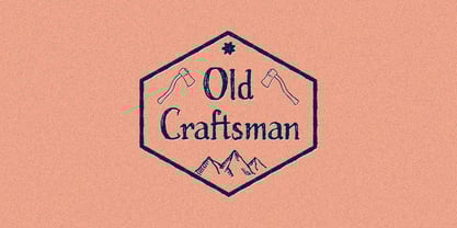
- Old Skull by Gleb Guralnyk,
$14.00 Hi, presenting a blackletter font named Old Skull. This vintage gothic look typeface was originally made using a flat calligraphic pen what makes it more organic and natural. Old Skull typeface suits the best for original t-shirt prints and tattoo designs. This font supports most of the European languages, please check out the screenshot with all available characters.
 - Old Landmark by HRDR,
$17.00 Old Landmark is a monoline script typeface, that inspired by the old advertising posters. Old Landmark comes with uppercase, lowercase, numerals, punctuation and many variations on each character, including OpenType alternates to let you customize your designs.
 - Old galaxy by Turto Studio,
$10.00 Old Galaxy is an old fashioned interstellar sci-fi with a twist of good humor geometric display font. It is perfectly suited for traditional media and the web. Great for logos, banners, posters, and graphic artists.
 - Old Note by Fenotype,
$29.95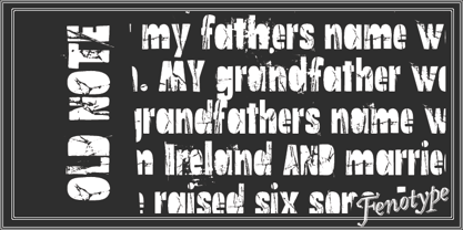
- Old Millerstown by Greater Albion Typefounders,
$16.00 Millerstown is full of that solid, 19th Century, transatlantic spirit of enterprise. It is an all capitals face, decorative but clear and legible, ideal for signage, posters and banners. "Old Millerstown" has been treated to capture the look of heavily used, weathered type, adding another vintage element to the typeface. Bring a touch of American inspired flair to your next design project!
 - Old Russian by Grummedia,
$20.00Old Russian is a fake Cyrillic alphabet, based on old Slavic characters universally adopted in the old days of the Russian empire. Offering an opportunity to create a unique historical look. - Old Linoleum by Gassstype,
$23.00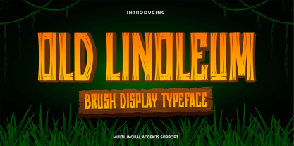 Hello Everyone, introduce our new product Old Linoleum is Brush Display Typeface with a natural feel. This handmade font will make your design has a beautiful natural touch for each details. It is perfect for any design project as Invitation,logo, book cover, craft or any design purposes. Old Linoleum is Inspired by Logo style and combination with Unique Craft style. that will fulfill your design needs for quotes,sporty theme, logotype, wordmark, etc. This has many opentype features and support multi language. This font is PUA encoded which means you can access all of the magical glyphs with ease!
 - Old Spokes by Putracetol,
$25.00 Old Spokes - Vintage Display Font. Old Spokes is a super unique vintage display typeface. Old Spokes font inspired by display of the posters with vintage themes. Old Spokes have classic, retro and trendy impression is very visible. But in Old Spokes font I combine several variations such as the ligature. It makes this font even more unique and different. Old Spokes is also great for any kind of display purpose from album, cover,poster, label, tshirt, apparel, signage, quote, logo, greeting card,logotype and many more. Old Spokes is also support multi language. The alternative characters were divided into several Open Type features such as Swash, Stylistic Sets, Stylistic Alternates, Contextual Alternates, and Ligature. The Open Type features can be accessed by using Open Type savvy programs such as Adobe Illustrator, Adobe InDesign, Adobe Photoshop Corel Draw X version, And Microsoft Word. This font is also support multi language.
 - Old Depot by 2D Typo,
$24.00 Old Depot is a newly reworked idea for the Depot Trapharet 2D font. It supports more languages and is available in more lettering. Old Depot stands out with its industrial nature of archaic spirit. It is a wonderful choice for solid uncompromising inscriptions or slogans. Don't be afraid to be brutal!
 - Old Union by Mysterylab,
$18.00 Old Union is a unique and creative modern font that is eye-catching and versatile. Elements of the design strongly reference Cyrillic typefaces of the early Soviet era, but with a distinctly modern look. Excellent for many uses including posters, banners, and logos. This design straddles the line between Didone-style elegance and vintage agit-prop. There are two variations in this package: Regular and Oblique.
 - Old Jersey by Alphabet Agency,
$15.00 Old Jersey is a cool, vintage styled and rough textured display font. This adaptable font will look great on a variety of design ideas. It will add a distinct touch to each of your projects
 - Old Story by Gleb Guralnyk,
$12.00 Hello! Introducing "Old story" typeface with funny doodles. All the graphics you can access from the "glyphs" palette. Have fun!
 - Old Vic by Solotype,
$19.95This is Solotype's version of a popular mid-nineteenth century style explored by several early foundries. It reads surprisingly well in paragraphs, and is a handy font for work with a Victorian theme. - Old Beck by Putracetol,
$24.00 Old Beck - Display Vintage Retro Serif Font. This bold typeface effortlessly combines the charm of vintage and retro aesthetics, creating a groovy yet classic vibe. With two distinct versions - clean and rough - Old Beck offers versatile options for your designs. The font's unique feature lies in its captivating groovy-shaped letter ends, adding an extra layer of character and style.
 - Old Earthy by Gustav & Brun,
$16.00 Old Earthy is a hand drawn font inspired by the mid 19th-century art movement with William Morris and the Pre-Raphaelite Brotherhood in the front line. The art and the patterns from that time is reflected in Old Earthy. It comes with a set of basic English/Latin letters and some west European diacritics.


