10,000 search results
(0.033 seconds)
- Linotype Pide Nashi by Linotype,
$29.99Linotype Pide Nashi is part of the Take Type Library, chosen from the entries of the Linotype-sponsored International Digital Type Design Contests of 1994 and 1997. German artist Verena Gerlach created a typeface which looks almost like Arabic at the first glance, only with the second do the familiar forms become clear. Rounded lower case letters, generous, sweeping capitals and diamond-shaped ornaments give the font its Arabic feel. The exotic Linotype Pide Nashi is best suited for short and middle length texts and headlines and especially for ornamental texts. - Steed by Device,
$29.00 A condensed and bold obround sans inspired by 60s condensed inserat faces, with a more pronounced thick/thin stress as seen on the titles of the Avengers TV show.
 - Fifty Famous Fairy Tales by Funk King,
$20.00 Fifty Famous Fairy Tales was inspired by lettering on the cover of a children’s book of the same name published by Whitman Publishers back in the 50s or 60s.
 - Retro Cool by Nirmana Visual,
$22.00 Retro Cool , Inspired by 60s - 70s Design Era. Retro Cool offers beautiful typographic harmony for a diversity of design projects, including logos & branding, social media posts, advertisements & product designs.
 - PreussischeIV44Ausgabe3 - 100% free

- 2 Lines - Personal use only

- Iova Nova by profonts,
$41.99 Iova Nova is based on Jowa Script, designed by J. Wagner in 1967. The typeface has been redesigned, digitized, completed and expanded as OpenType Pro in the profonts studio. The resdesign includes the modification of the numerals which originally had capheight size. Besides, we complete the character set to cover Western and Eastern Europe including Turkey and Romania. The font contains more than 300 characters. Iova Nova is a young, fresh and casual design.
 - Aaron Script by Seniors Studio,
$23.00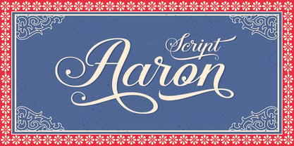 Aaron Script is highly legible Script typeface, a simply beautiful, classic, elegant and fun script font. With almost 400 glyphs and contain with opentype features. Stylistic alternates, Ornament, swash and more. Can be used for various purposes.such as logos, wedding invitation, t-shirt, letterhead, signage, news, posters, badges etc. To enable the OpenType Stylistic alternates, you need a program that supports OpenType features such as Adobe Illustrator CS, Adobe Indesign & CorelDraw X6-X7.
 - Rasbern by Nasir Udin,
$29.00 Rasbern is a display serif typeface with high contrast and refreshing looks. Ranging from thin to black with italics, Rasbern offers many possibilities to be applied in many graphic or editorial projects. The lighter weights are suitable for short paragraph, and the heavier weights are perfect for headlines, perfectly suitable for display purpose such as branding, book covers, and web heading. Rasbern has extended latin character set that supports 200+ latin-based languages.
 - Nexus Serif Pro by Martin Majoor,
$49.00 Nexus (2004) consists of 3 matching variants – a serif, a sans and a slab – which makes it a highly versatile typeface. There is also a monospaced version called Nexus Typewriter. The Nexus family is a workhorse typeface with extensive OpenType features. Free bonus: there are more than 100 elegant Swash italics and dozens of arrows and other icons. Nexus was awarded the First Prize at the Creative Review Type Design Awards 2006.
 - P22 Bangersfield by IHOF,
$29.95 Bangersfield is a four-member font family from Robby Woodard. With line treatments clearly inspired by cased meat products, these fonts function as a healtier alternative to Comic Sans. The casual hand lettering works well for light-hearted design and comic lettering. These fonts are stuffed with opentype features, extra ornaments, and a full Central European character set—over 400 characters per serving. Satisfy your hunger for a fresh take on a stale genre!
 - WTF Strange Crispy by Wasabib Type Foundry,
$15.00 WTF Strange Crispy - is a playful bounced display font that inspired by retro typeface, I make it with 100% hand drawn to get the artistic look. Perfectly suited for quotes, branding, logos, and social media posts, “WTF Strange Crispy” has a unique touch to every design, ensuring it stands out and makes a lasting impact. Illuminate your content with the enchanting allure of “WTF Strange Crispy” font, and let your creativity shine in every project.
 - Signatra by Fontdation,
$18.00 Introducing Signatra; a clean and playful yet trendy script typeface. Mouse-crafted with high attention to the details; Signatra offers you a natural hand-lettering/signpainting experience. Suits best for logotype, poster/t-shirt designs, food/beverage labels, greeting cards, wedding invitations, etc. Consists of +400 glyphs (includes some OpenType Features like ligatures, special-alternate characters, swashes, initial-terminal forms, multingual characters, etc), Signatra is a great addition for your designing arsenal.
 - Verilet by Azzam Ridhamalik,
$10.00 Verilet is elegant and vintage display typeface that looks stunning in just about every context. Very suitable as to make a design choice such as logos, branding, magazines, headlines, websites, packaging, wedding cards and more creative project! All-caps characters, with over 400 glyphs VERILET’s also has a lot of alternative characters. It looks really cool when elegant meet vintage to any piece. FEATURES : Uppercase Lowercase Number Punctuation Multilingual PUA Encode Opentype
 - Fleurious by Proportional Lime,
$9.95 This font was inspired by the many changes in printing habits over the last half millennium. Every book has a story and sometimes the printing itself can be its own story. Every era has its own tendencies in decorative elements and these practices were observed and included such that the font contains over 200 hundred glyphs with which to add variety to your documents. It is provided with a complete character map.
 - Andale Teletext by Monotype,
$41.99Teletext fonts have a defined character set comprising alphanumeric and graphics characters. The Andale Teletext fonts also include G3 Smooth Mosaics and Line Drawing Set support as defined in ETSI EN 300 706, for Teletext 2. Andale Teletext includes the following character sets: Latin G0 and G2 sets, Latin National Option Sub-Sets, Cyrillic set, Greek set. Andale Teletext family includes 3 fonts: Andale Telext regular, Andale Telext 43 and Andale Teletext 83. - Elita by Wiescher Design,
$14.00 »Elita« is a 100% geometric font designed on a 3 by 16 grid that makes it very slim. There are no optical tricks employed, it is purely geometric. The extreme narrow font design gives it high black and white contrast. The font is not made to write long copy, but it is perfect if you want to employ that magic between pure geometric and almost impossible to read. Just look at the samples and enjoy!
 - Grand by North Type,
$- Inspired by old school sign painting techniques, Grand is a display condensed sans serif that isn't shy to put its foot down. Its verticality and bulky curves combined with its sharp angular connections between the bowls and stems give Grand a distinctive look and feel. It comes in 12 styles (6 weights and accompanying italics), and supports over 200 languages. Grand Regular and Grand Italic are both available for free (personal and commercial use).
 - Oyko by The Northern Block,
$39.00 A geometric typeface that follows the grid but understands the rule to go off-grid. The design is sharp, square and engineered yet has plenty of craftsmanship in each character to give it a more human and friendly touch. Oyko is best suited to immersive interfaces, including mobile apps, video games, virtual reality and the web. Details include five purposeful weights with italics, over 500 characters, five variations of numerals, stylistic zeros, and OpenType features.
 - Hoeflers by Maulana Creative,
$12.00 Hoeflers is a Hand-lettered font inspired by the vintage 70's sign board, music, shop and movies, it has a rough stroke outline and then we fill it. Hoeflers includes opentype features Ligatures. It support multilingual more than 100+ language. This font is good for logo design, Movie Titles, Books Titles and any awesome project you create. Make a stunning work with Hoeflers Rough sans font. Its a caps only fonts. Cheers, MaulanaCreative
 - Funkboy by PizzaDude.dk,
$20.00 Funkboy looks like something that was made 20 years ago. You know, when Grandmaster Flash was scratching to the beat and graffiti was totally underground. Funkboy was made to look 100% oldschool, and now you can make your own bad-boy oldschool graffiti, using your computer! Comes with two hard knock alternate letters: the peace 'o' + the heart dotted 'i' You will need to use OpenType supporting applications to use the autoligatures.
 - Drina by Posterizer KG,
$19.00 Drina is a script handwritten font with a casual and modern look. Because of the spontaneity there are plenty of Standard and Discretionary Ligatures to avoid frequent repetition of letters. If you find a single repeating glyphs, you can change that by toggling between Stylistic Alternates. There are ligatures created for Cyrillic too, more then 100 symbols, ornaments and artworks with inky texture. Drina is the perfect choice for all natural and authentically beautiful things.
 - Amarela Stencil by Latinotype,
$29.00 Amarela Stencil is a contemporary typeface, specially designed for titles, packaging and branding. Sharp serifs and an extreme stroke contrast give the font a classy look and a strong personality. Amarela Stencil comes in 5 weights, ranging from Ultralight to Black, plus two decorative styles- One and Two. As you would expect from Latinotype, this font comes with a standard character set that supports over 200 languages. Alternates and OpenType features are also included.
 - Gloria Beauty by Lettersams,
$18.00 Gloria Beauty is a script with a new idea that has letter characters connected to each other, so it looks unique and romantic with others. This font has beautiful, well-balanced characters, making it suitable for a variety of purposes. such as posters, wedding invitations, logos, branding, titles, signs, labels, mugs, quotes, and others. Gloria Beauty features 620+ glyphs covering characters, alternatives, and binders, including start and end letters, alternates, binders, and multiple language support.
 - Moderna Sans by Latinotype,
$29.00 Moderna Sans, a modern sans-serif inspired by the American culture, is a clean and contemporary interpretation of American Gothic typefaces like "Alternate Gothic". Moderna Sans comes in 5 weights, with matching italics, and 3 widths—condensed, standard and extended. The font's character set supports over 200 Latin-based languages. Moderna Sans is an excellent choice for branding and corporate design and a versatile 3-width workhorse suitable for newspaper or magazine headlines and subheadings.
 - GR Milesons by Garisman Studio,
$23.00 GR Milesons | Artdeco Typeface Milesons is a very interesting font, which has been inspired by Art Deco art. It is formed from very careful lines with stylistic set and ligature features. Milesons has 300+ glyphs consisting of three styles: Milesons One, Milesons Two and Milesons Three. Suitable for any graphic design projects, prints, logos, posters, t-shirts, packaging and applicable for some types of graphic design. Milesons is compatible with any software without any pain.
 - Clab by Eko Bimantara,
$19.00 Clab is meant for branding. The initial characters were build in bold and chunky personality, yet the thin strokes and flowy italics gives it a versatile and unique set of family. The glyphs crafted in low contrast strokes, short ascenders and descenders and low caps. Clab consist of 9 weight from Hairline to Black with each matching italics. Contain more than 400 glyphs with some OpenType features e.g, standard and discretionary ligature, fraction, e.t.c.
 - Tanger Serif by Typolar,
$72.00 Inspired by New Transitional and Egyptian fonts, Tanger Serif has elements of a sturdy work-horse text face and finely detailed headline font. A wide variety of widths and weights support many text sizes. Typically Narrow is used in headlines, Medium in body and Wide in smaller print. Nothing is predefined, though. By combining the right widths with the right weights this traditional approach can easily be challenged. Let’s take an oversized (over 10 pt) body copy for instance. In conjunction with using a bigger size to enhance readability, a narrow and slightly lighter weight will save space and brighten text color. Tanger Serif Narrow is a slim normal rather than a condensed face. As an Open Type “Pro” font each weight includes an expanded character set, small caps, old style figures, tabular figures, ligatures, fractions etc. All these are easily accessible through OpenType features.
 - Synerga Pro by Mint Type,
$- Synerga Pro is a contemporary slab-serif typeface with humanist features. In smaller text sizes it exposes the characteristics of its slab built, but as the size grows, lots of fine features become visible: rounded terminals, dynamic horizontal serifs, non-vertical endings of vertical serifs. Such details make Synerga Pro suitable for setting paragraph texts as well as large captions. Synerga Pro is equipped with many OpenType features including 4 sets of digits, small caps and ordinals. The extensive language coverage includes most of the Latin-based languages, as well as major languages that use Cyrillic script. Also be sure to try Synerga Pro as webfont to appreciate its accurate and rhythmic appearance at virtually any text size! Some of the styles of Synerga Pro can be found in Mint Type Editorial Bundle together with other fonts which make some great pairs. Check it out!
 - Delicato Pro by MAC Rhino Fonts,
$59.00 In many aspects, built in a traditional way. Still, some modern details have been implemented which classic designs sometimes lack. The prime goal was to make a strong text font for books and longer texts in general. This fact does not exclude the possibilites for use elsewhere. Throughout history existing designs have often been the source of inspiration for newer ones. Delicato is no exception and looking closely, similarities can be found in the lowercase of Jeremy Tankard’s Enigma and the stems of Petr van Blokland’s Proforma. The goal is to respect these sources and turn the the typeface into something new with a unique and personal touch. Most text faces carry a basic set of weights like Regular, Italic, Bold and Small Caps. MRF wanted to expand that a little bit further and added a Medium, Alternates and a set of Ornaments to make the family complete and versatile.
 - Calluna by exljbris,
$- Calluna was born more or less by accident. When I needed a little break from designing Museo I was just fiddling around a bit to see if maybe a full slab serif would be something to have a look at. The first thing I did, of course, was to put slab serifs on the stems of Museo. When I did, something nice happened. Slab-serifs with a direction! I ended up using the idea for something I always wanted to do: making a rather serious text face. The goal was to make a text font, but one with enough interesting details. In the end it all came down to finding the balance in a typeface between the robustness needed to function as a text face and enough refinement to look good as a display font. Check out Calluna Sans™ which is a great pair for Calluna™.
 - Humanex by Sébastien Truchet,
$40.00 Humanex is the first text typeface of Sébastien Truchet. He created it during the year of postgraduation ‘Systèmes graphiques, typographique & language' in Amiens. The beginning stages of the font development involved calligraphic research based on humanistic ductus. Sébastien’s goal was to introduce modules in a lineal structure. Downstrokes and upstrokes are homogeneous. Links between stem and curve are straight. It gives solidity and thickness to the typographical composition. The first version was a Semi Bold version and its italic. This typeface gave a blackest text. You can see the first display typeface, Humanex Ultralight. Sébastien kept the Semibold structure in order to make a thin typeface. Its goal is to give support to the Semibold version. It is a good typeface in big sizes. In order to add a better legibility, Sébastien built a Book version to have a brightest grey of text. The reading is more comfortable.
 - Keiss Title by DSType,
$50.00 The Keiss type family is our interpretation of the popular nineteen century Scotch Roman typefaces. We intended to keep a very classic approach while introducing a couple of new elements that differentiate this type family from it’s ancestors. This design, with short descenders and ascenders, along with three very distinct optical sizes makes this type family well suited for contemporary newspapers. The Title and Big versions range from Thin to Heavy, with matching italics, in order to be used in big sizes and stand out in the design. The Text ranges from Thin to ExtraBold and is a standalone type family for text usage, with narrow proportions and wider and open italics for improved text setting. The Condensed versions, ranging from Thin to Bold, don’t have italics, although they can be matched with the italics of the Title and Big versions, due to the fact they are very condensed.
 - Keiss Big by DSType,
$50.00 The Keiss type family is our interpretation of the popular nineteen century Scotch Roman typefaces. We intended to keep a very classic approach while introducing a couple of new elements that differentiate this type family from it’s ancestors. This design, with short descenders and ascenders, along with three very distinct optical sizes makes this type family well suited for contemporary newspapers. The Title and Big versions range from Thin to Heavy, with matching italics, in order to be used in big sizes and stand out in the design. The Text ranges from Thin to ExtraBold and is a standalone type family for text usage, with narrow proportions and wider and open italics for improved text setting. The Condensed versions, ranging from Thin to Bold, don’t have italics, although they can be matched with the italics of the Title and Big versions, due to the fact they are very condensed.
 - Virgin by John Moore Type Foundry,
$95.00 Virgin is a hybrid typeface with a Victorian spirit, based on script forms of Romanesque ornamentation. With his rich variety of stylistic forms, ornaments and catchwords, Virgin is a chance to create completely new texts, varied and elegant. About 1100 Glyphs allow users to create words out standard, thanks to its Opentype programming in countless combination of alternates. The variety of styles makes it easy to create texts according to your taste and use because Virgin offer an unlimited combinations of stylistics alternates. Virgin is ideal for humanistic texts, tourist ads, liquor and wine labels, fashion and even for cosmetic purposes. Virgin is presented in solid and inline version, and a basic version for web in lighter weight, also providing a refined collection or ornaments and catch Words. Virgin has been specially designed for logotype, packaging & publishing design project. Virgin evokes the richness of nature in its biodiversity.
 - Ondine by Linotype,
$29.99 Ondine is one of the early typefaces of Adrian Frutiger. It looks as though it were written with a broad tipped pen, however, Frutiger actually cut the forms out of a piece of paper with scissors. The forms of Ondine are reminiscent of the humanist period, the high point of the Italian Renaissance text typefaces of the 15th century. This movement was centered in Florence, the base of the Humanist movement overall, and the home of a famous type school of the time. The main goal of the educated writers was to faithfully recreate the writing of the admired literary works, whose aesthetic was as important as their content. Ondine displays a regular and open character. Texts set in this typeface give the impression of being hundreds of years old. Ondine should be used in point sizes of 12 and larger and is best for short texts and headlines.
 - Qualion Round by ROHH,
$39.00 Qualion Round™ is a soft geometric sans serif with lots of swashes and ligatures, a sibling of successful Qualion™ and Qualion Text™ families. The rounded family is designed by carefully adjusting letter shapes, tapering and ink traps to in order to achieve optimal legibility as well as strong personality. The family is intended to serve in display situations like branding and advertising as well as in paragraph text and user interfaces. Its versatility can be even strengthened by pairing it with Qualion™ or Qualion Text™ families. Qualion Round™ family consists of 10 weights with corresponding oblique styles. It has extended language support, as well as broad number of OpenType features, such as case sensitive forms, standard and discretionary ligatures, swashes, terminal forms, stylistic sets, contextual alternates, lining, oldstyle, tabular figures, slashed zero, fractions, superscript and subscript, ordinals, currencies and symbols.
 - Keiss Condensed by DSType,
$50.00 The Keiss type family is our interpretation of the popular nineteen century Scotch Roman typefaces. We intended to keep a very classic approach while introducing a couple of new elements that differentiate this type family from it’s ancestors. This design, with short descenders and ascenders, along with three very distinct optical sizes makes this type family well suited for contemporary newspapers. The Title and Big versions range from Thin to Heavy, with matching italics, in order to be used in big sizes and stand out in the design. The Text ranges from Thin to ExtraBold and is a standalone type family for text usage, with narrow proportions and wider and open italics for improved text setting. The Condensed versions, ranging from Thin to Bold, don’t have italics, although they can be matched with the italics of the Title and Big versions, due to the fact they are very condensed.
 - Keiss Condensed Big by DSType,
$50.00 The Keiss type family is our interpretation of the popular nineteen century Scotch Roman typefaces. We intended to keep a very classic approach while introducing a couple of new elements that differentiate this type family from it’s ancestors. This design, with short descenders and ascenders, along with three very distinct optical sizes makes this type family well suited for contemporary newspapers. The Title and Big versions range from Thin to Heavy, with matching italics, in order to be used in big sizes and stand out in the design. The Text ranges from Thin to ExtraBold and is a standalone type family for text usage, with narrow proportions and wider and open italics for improved text setting. The Condensed versions, ranging from Thin to Bold, don’t have italics, although they can be matched with the italics of the Title and Big versions, due to the fact they are very condensed.
 - Psychofun by Alit Design,
$15.00 Introducing Psychofun Typeface Psychofun Typeface is designed with a retro style concept that has a unique and cool shape. It is suitable for header text fonts, book covers and designs that have a retro and groovy concept, besides that Psychofun Typeface is also very good when used for body text. Psychofun Typeface has 5 families from Regular to Heavy. Display Serif typefaces such as “Psychofun Typeface” are very easy to apply to any design, especially those with an retro, groovy and classic concept, besides that this font is very easy to use both in design and non-design programs because everything changes and glyphs are supported by Unicode (PUA). The Psychofun Typeface contains 530 glyphs with many unique and interesting alternative options. Plus, there's a cool display serif font family for header and description text from regular to heavy. In the poster preview all the letters are in the Psychofun Typeface.

