10,000 search results
(0.029 seconds)
- Mister Slasher Halloween by Sipanji21,
$15.00 Hello, this is Mister Slasher, a Unique display font which is prepared to welcome Halloween. Mister Slasher comes with an awesome horror style, make it very perfect to use for quotes, logotypes, badges, labels, packaging, t-shirts, or simply use it in your next design project. Especially in Halloween celebrations.
 - Picaro NF by Nick's Fonts,
$10.00A rather quaint but charming typeface, originally named Harlequin, provide the inspiration for this typeface. Its mild eccentricities will add an inviting warmth to your next project. Both versions of this font contain the Unicode 1252 (Latin) and Unicode 1250 (Central European) character sets, with localization for Romanian and Moldovan. - Silkstone by Zeenesia Studio,
$15.00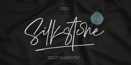 Presenting! Silkstone - Handwritten ScriptFont Silkstone is a handwritten script font with a simple and classy style, this font is great for your next creative projects such as watermark on photography, logo design, wedding, invitation, quotes, book cover, business card, and many other design project. From business cards to photo watermarks.
 - Nicko by Zealab Fonts Division,
$14.00 Nicko is a bold and friendly typeface. Nicko has a unique style with stylistic, alternates, ligatures and supports multilingual languages. Create unique & beautiful logotype, use it as an elegant solution for your next magazine layout, or choose Nicko for any graphics that require a sleek look with a elegant flair.
 - Naroid Initials JNL by Jeff Levine,
$29.00Naroid Initials JNL is one of the most ultra-compressed sets of initials available in digital type. These twenty-six initials are so narrow that a test print with all of the letters at 2-1/2 inches in height took up no more than about 5 inches in width! - Monschone by Zealab Fonts Division,
$18.00 Monshcone is a minimalist luxury and gorgeous font that is both classically elegant and inherently modern. Create unique word mark logo, beautiful wedding invitations, use it as an elegant solution for your next magazine layout, or choose this font for any graphics that require a sleek look with an elegant flair.
 - Burba by Gassstype,
$23.00 Hello Everyone, introduce our new product Font BURBA This Is All Caps Display Font.This is a Textured Natural Style and classy style with a clear style and dramatic movement. This font BURBA is great for your next creative project such as logos, printed quotes, invitations, cards, product packaging, headers, Logotype.
 - Farench by Muksal Creatives,
$15.00 Farech is modern Display Vintage font, and Farech features unique and modern Display Vintage look and feel.is a fancy and Display Vintage font will elevate a wide variety of projects, from logos and stationery to magazine covers and social media posts. This typeface will take your designs to the next level!
 - Night Franklin by Sipanji21,
$18.00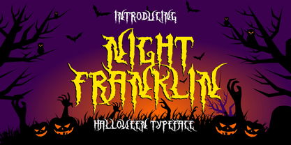 Hello, this is Night Franklin, a Unique display font which is prepared to welcome Halloween. Night Franklin comes with an awesome horror style, make it very perfect to use for quotes, logotypes, badges, labels, packaging, t-shirts, or simply use it in your next design project. Especially in Halloween celebrations
 - Wilderness Doodles by Outside the Line,
$19.00 Wilderness Doodles is full of water and trees and mountains. Silhouettes of fish, moose, beaver, bears, elk, wolf, deer and sheep. Camping and hunting boots, float plane, coffee pot, cabin, tent, ax, hatchets, snowshoes, canoe and more. Create ads, invitations, store signage, cards, placemats. All with a outdoorsy Northwoods feel.
 - Yippie Yeah by Almarkha Type,
$25.00 Yippie Yeah Sans & Slab is a Cute & Playful Font full of charm . It will take any DIY-project to the next level! Yippie Yeah Sans & Slab is perfect for Crafts, Poster, product packaging, product designs, label, branding projects, logo, wedding designs, social media posts, advertisements, watermark, invitation, stationery and any projects
 - Moon Earth by Orenari,
$17.00 Please welcome, Moon Earth. A simple cozy handwritting and it's perfect for quotes. Moon Earth also fit for any range of your design projects. This font is naturally written by my self, so the flow of each characters became unique. Take your design project to the next level with Moon Earth.
 - Thin Fox by Gassstype,
$22.00 Hello Everyone, introduce our new product Font THIN FOX This Is Display Font.This is a Textured Natural Style and classy style with a clear style and dramatic movement. This font THIN FOX is great for your next creative project such as logos, printed quotes, invitations, cards, product packaging, headers, Logotype.
 - Sugar Crakers by Atom,
$19.00 Sugar Crakers is a bold signature font with pointed corners and supported with over 45 ligatures. Use your imagination to make company logos, product labels, headlines, and other designs that will make your designs come alive and become more selling points. Use Sugar Crackers for the success of your next project.
 - Coffee Matcha by Awan Senja,
$14.00 Coffee Matcha is a Lovely script font. It features a modern and elegant style that will take your designs to the next level. Whether you�re looking for fonts for Instagram or calligraphy scripts for DIY projects, Coffee Matcha will turn any creative idea into a true piece of art!
 - Bondjlo by Muksal Creatives,
$13.00 Bondjlo is font a vintange serif, and Bondjlo features unique and modern serif look and feel.is a fancy and modern serif font will elevate a wide variety of projects, from logos and stationery to magazine covers and social media posts. This typeface will take your designs to the next level!
 - Classy Melody by Lemonthe,
$14.00 Classy Melody is a lovely duo mix of a monoline script and slab serif font. Combining these two fonts on your next design will give a modern feel. It is perfect for many different projects such as logos & branding, invitation, stationery, wedding designs, signature, product designs, labels, photography, and much more!
 - Neima by Zealab Fonts Division,
$12.00 Neima is high contrast serif font features a mixed modern-classic design. Neima support multilingual languages, numbers, punctuation and alternative-ligatures. Create unique & beautiful logotype, use it as an elegant solution for your next magazine layout, or choose Neima for any graphics that require a sleek look with a elegant flair.
 - Faceless by Gassstype,
$29.00 Hello Everyone, introduce our new product Font Faceless it is lack metal Typeface, Rooted, but still readable.This is a Textured Natural Style and classy style with a clear style and dramatic movement. This font Faceless is great for your next creative project such as logos, printed quotes, invitations, cards, product .
 - Meave Multipurpose Display Typeface by Eotype,
$12.00 Meave is high contrast serif font features a mixed modern-classic design. Meave support multilingual languages, numbers, punctuation and alternative-ligatures. Create unique & beautiful logotype, use it as an elegant solution for your next magazine layout, or choose Meave for any graphics that require a sleek look with a elegant flair.
 - Moline Quotes Sans by Ayska,
$20.00 Introducing Moline Quotes Sans Typeface. it looks natural like a handmade which has a fast dry brush style. That is ideally suited for advertising and packaging, logo, branding and creative industries. The Moline Quotes Sans Typeface is designed to make your next great project look more natural and stand out.
 - Mrs Eaves XL Serif by Emigre,
$59.00 Originally designed in 1996, Mrs Eaves was Zuzana Licko’s first attempt at the design of a traditional typeface. It was styled after Baskerville, the famous transitional serif typeface designed in 1757 by John Baskerville in Birmingham, England. Mrs Eaves was named after Baskerville’s live in housekeeper, Sarah Eaves, whom he later married. One of Baskerville’s intents was to develop typefaces that pushed the contrast between thick and thin strokes, partially to show off the new printing and paper making techniques of his time. As a result his types were often criticized for being too perfect, stark, and difficult to read. Licko noticed that subsequent interpretations and revivals of Baskerville had continued along the same path of perfection, using as a model the qualities of the lead type itself, not the printed specimens. Upon studying books printed by Baskerville at the Bancroft Library in Berkeley, Licko decided to base her design on the printed samples which were heavier and had more character due to the imprint of lead type into paper and the resulting ink spread. She reduced the contrast while retaining the overall openness and lightness of Baskerville by giving the lower case characters a wider proportion. She then reduced the x-height relative to the cap height to avoid increasing the set width. There is something unique about Mrs Eaves and it’s difficult to define. Its individual characters are at times awkward looking—the W being narrow, the L uncommonly wide, the flare of the strokes leading into the serifs unusually pronounced. Taken individually, at first sight some of the characters don’t seem to fit together. The spacing is generally too loose for large bodies of text, it sort of rambles along. Yet when used in the right circumstance it imparts a very particular feel that sets it clearly apart from many likeminded types. It has an undefined quality that resonates with people. This paradox (imperfect yet pleasing) is perhaps best illustrated by design critic and historian Robin Kinross who has pointed out the limitation of the “loose” spacing that Licko employed, among other things, yet simultaneously designated the Mrs Eaves type specimen with an honorable mention in the 1999 American Center for Design competition. Proof, perhaps, that type is best judged in the context of its usage. Even with all its shortcomings, Mrs Eaves has outsold all Emigre fonts by twofold. On MyFonts, one of the largest on-line type sellers, Mrs Eaves has been among the 20 best selling types for years, listed among such classics as Helvetica, Univers, Bodoni and Franklin Gothic. Due to its commercial and popular success it has come to define the Emigre type foundry. While Licko initially set out to design a traditional text face, we never specified how Mrs Eaves could be best used. Typefaces will find their own way. But if there’s one particular common usage that stands out, it must be literary—Mrs Eaves loves to adorn book covers and relishes short blurbs on the flaps and backs of dust covers. Trips to bookstores are always a treat for us as we find our Mrs Eaves staring out at us from dozens of book covers in the most elegant compositions, each time surprising us with her many talents. And Mrs Eaves feels just as comfortable in a wide variety of other locales such as CD covers (Radiohead’s Hail to the Thief being our favorite), restaurant menus, logos, and poetry books, where it gives elegant presence to short texts. One area where Mrs Eaves seems less comfortable is in the setting of long texts, particularly in environments such as the interiors of books, magazines, and newspapers. It seems to handle long texts well only if there is ample space. A good example is the book /CD/DVD release The Band: A Musical History published by Capitol Records. Here, Mrs Eaves was given appropriate set width and generous line spacing. In such cases its wide proportions provide a luxurious feel which invites reading. Economy of space was not one of the goals behind the original Mrs Eaves design. With the introduction of Mrs Eaves XL, Licko addresses this issue. Since Mrs Eaves is one of our most popular typefaces, it’s not surprising that over the years we've received many suggestions for additions to the family. The predominant top three wishes are: greater space economy; the addition of a bold italic style; and the desire to pair it with a sans design. The XL series answers these requests with a comprehensive set of new fonts including a narrow, and a companion series of Mrs Eaves Sans styles to be released soon. The main distinguishing features of Mrs Eaves XL are its larger x-height with shorter ascenders and descenders and overall tighter spacing. These additional fonts expand the Mrs Eaves family for a larger variety of uses, specifically those requiring space economy. The larger x-height also allows a smaller point size to be used while maintaining readability. Mrs Eaves XL also has a narrow counterpart to the regular, with a set width of about 92 percent which fulfills even more compact uses. At first, this may not seem particularly narrow, but the goal was to provide an alternative to the regular that would work well as a compact text face while maintaining the full characteristics of the regular, rather than an extreme narrow which would be more suitable for headline use. Four years in the making, we're excited to finally let Mrs Eaves XL find its way into the world and see where and how it will pop up next.
 - Amor Serif by Storm Type Foundry,
$55.00Antique monumental incriptional majuscule, originally carved in stone, and sometimes called “Roman Capital”, is the origin of the upper-case part of our latin alphabet. Its narrowed form, derived from handwritten originals used between the first to third century A. D., served as the inspiration for the Mramor typeface, which I drew with ink on paper in 1988 under Jan Solpera’s leadership. After composing negative letters on a strip of film it was possible to use Mramor with the early phototypesetting devices. In 1994 with the help of Macintosh IIvi I added the lowercase letters and bolds, and issued this typeface as 14-font family. After some years of using Mramor for various purposes, I realized a need of modernization and humanizing its very fragile appearance, as well as removing numerous decorative and useless parts. Besides that, type design made a huge technical progress in past few years, so I was able to finish the remaining approximately 9600 glyphs contained in the present font system named Amor. It is already usual to combine sans and serif fonts within one family in order to distinguish (e. g. in a book) historical part from contemporary, a plain chapter from a special one, or, in quotations, to divide speaking persons. Sans-serif typefaces don't arise by simple removal of serifs; they have to be drawn completely separately, when occasionally many declined forms may be made, considered to the serifed original. Nevertheless, both parts of this type system appear consistent as for proportional, aesthetic and emotional atmosphere. Usage of type is often closely linked to its original inspiration, in this particular case with architecture and figurative sculpture. An inner “order” was also text setting in smaller sizes. A smooth scale of weights enriches the possibilities in designing of magazines, brochures, exposition catalogues and corporate identity. Economizing, but opened shape of characters is well legible and antique hint comes into play after longer reading. - Shape Variable Script by Roland Hüse Design,
$32.00 A shape-shaky script font that reacts to audio! Thanks to the variable font technology, fonts today can be variable be it weight, width or any other parameters that are defined by values such as shape! Even better: in html, with a bit of css (and in this case, javascript as well) it is possible to animate them between these values. This gave me the idea to create something really fun which is a quirky, informal handwritten font that can react to sound. The html file along with css and javascript is taken from codepen.io and I was using and tweaking it to this specific project. Please read more details in this pdf where you can also find link to a demo and download the txt files: https://drive.google.com/file/d/15J_6g3NgmZKJYO6SrnOHj4Rk7qltkfwE/view?usp=sharing The character set of this font contains Western, Eastern and South-Eastern Latin accented characters, special characters, basic symbols, punctuation and signs. Best use is with large size and a few words rather than large sentences. I hope you guys like it and it will add up to your next creative project! Have fun and happy creating!
 - Warhol by Andinistas,
$34.00 Warhol is a font family designed by Carlos Fabian Camargo. Its 3 fonts work in groups or independent. His carefree soul lies in the sensibility, creativity and abstract motivations listening to the album: The Velvet Underground & Nico released in 1967. Preparations for his typographic design were illustrated by imagining extravagant, fascinating and hard-to-resist ideas, That is why his brushstrokes of the alphabet were born of irregularity, with naive character and expressive drawing, notable with the discordance and instability of drawing by Andy Warhol, infiltrated with pop folk art and artisan harmony. Warhol is a font family offers uppercase, lowercase and numbers that work at the beginning, middle or end of words, achieving calligraphic expressiveness. In that order of ideas Warhol font family offers the following vantages: • Warhol Script (694 glyphs): handwritten letters drawn with a thin-thickness tool, simulating interesting imperfections in their contours and connections. * Warhol Script Bold (694 glyphs): Thick letters that appear to be drawn with a brush of inflated and irregular thickness • Warhol Extras (140 glyphs): Words with letters written with pen, highlighting meaningful criteria that function as perfect companions between words designed in Warhol Script and Bold.
 - Wayfinding Sans Pro by FDI,
$49.00 Ralf Herrmann, the designer of Wayfinding Sans, started this project with extensive field studies, driving tens of thousands of miles to explore the legibility of road signage typefaces in dozens of countries around the world. After building his own theoretical framework of relevant legibility parameters, the design process used a unique custom real-time simulation software, which could simulate difficult reading conditions (distance, fog, halation, positive/negative contrast) while the letters were actually being designed. This process made it possible to optimize even the tiniest details of each letter for maximum legibility. Being made specifically for wayfinding purposes, this type family does not compromise on any aspect of legibility — and yet, the typeface is a beautiful, clean and modern sans serif. With its broad language support and the large number of available styles it is perfectly suitable for any possible signage project anywhere in the world. In an independent empirical study at the University of Applied Sciences “htw” in Berlin different typefaces were recently tested when used on signs and Wayfinding Sans Pro was the winner in all conducted tests, being significantly more legible and therefore superior to all other styles of the tested typefaces. Check out the PDF specimen for more information: wayfinding-sans-pro.pdf
 - Hawkes by Kimmy Design,
$15.00 Hawkes is an extensive handmade typeface family that comes with a bundle of weights, widths and styles, all designed to work cohesively. Here is a breakdown of the Hawkes family. Hawkes Sans: The primary subfamily is a sans-serif typeface that includes nine fonts: three weights (light, medium and bold) and three widths (narrow, regular and wide). Within this set are an array of stylistic features; including small capitals, character style alternatives, discretionary ligatures and contextual alternatives. See details below for more information on OpenType Features. Hawkes Variable Width Sans: The secondary subfamily is the same base sans-serif fonts but combined in variating widths. Essentially, it takes all three widths of each weight and randomly mixes them together. This creates a funky and creative alternative to the more traditional sans-serif set. The variations are for the uppercase, lowercase, small capitals, ligatures and numbers. Hawkes Script: The last subfamily is the script typeface. It’s a quirky script with variations of its own, including ligatures, swashes and contextual alternatives (again, see below for further details.) The script font works great as a complimentary style to the sans-serif, or on it’s own. FEATURES Alright, let’s get into all the extra goodies this typeface has to offer. Small Capitals: Small caps are short capital letters designed to blend with lowercase text. These aren’t just capital letters just scaled down but designed to fit with the weight of both the lowercase and capitals. With Hawkes, small caps can either sit on the baseline (in line with the base of the capital and lowercase) or to be lifted to match the height of the capital letters by applying the discretionary ligature setting in the OpenType panel. These small capitals have a dot underlining them that sit along the baseline. The feature offers a unique display affect that is great for logos, titles and other headline needs. Discretionary Ligatures: A discretionary ligature is more decorative and unique combination than a standard ligature and can be applied at the users discretion (as the name indicates.) The specific styling for these ligatures varies for different fonts. With Hawkes, they are used as an all capital styling feature, or to lift the small capitals to align with the height of the capitals. In the former setting, both lowercase and uppercase letters are first changed to all capitals, then a specialized set of letter combinations are transitioned so small characters are positioned within a main capital letter. These combinations only happen with main characters that include an applicable stem, such as C F K L R T Y. Some of these combinations include two or three characters. When Small Caps is turned ‘on’, this feature will lift the small caps to the height of the capital letter. For more information, please check out the user guide! Stylistic Alternatives: Stylistic alternates are a secondary form of a character, often used to enhance the look or style of a font. For Hawkes, these alternatives provide a slightly more handmade feel. A - the capital and small capital A will lose its pointed apex and become rounded. Think of it more as an upside-down U than an up-side-down V ;-) Oo, G, Ss, Cc- these characters’ topmost terminal becomes a loop. The O is applied automatically, the G S and C need to be turn on individually. Titling Alternatives: This feature does sort of the opposite of what it intends. Instead of being used for titling purposes, this feature makes the text look better in paragraph text settings. Kk Rr h n m - curved terminals on the are straightened e - the counter stroke also gets straightened from a more looping motion y - the shape of y is changed from a rounded character to a sharper apex (think more like a ‘v’ than ‘u’) Contextual Alternatives: Contextual alternates are glyphs designed to work within context of other adjacent glyphs. With Hawkes Sans, there are three slightly different variations per character. The feature rotates the application of each variation. This helps with organic authenticity, so if you have two e’s next to each other, they won’t look identical (reflecting the natural variations in handwriting and lettering.) With Hawkes Variable width fonts, I have created a contextual pattern that randomizes the widths of each character. So, when the feature is turned ‘on’ in the OpenType panel, the widths would alternate in a pattern such as: Narrow, Wide, Regular, Narrow, Regular Wide, Narrow, etc. It happens automatically so the user doesn’t have to think or worry about getting a random seed. With Hawkes Script, contextual alternates allow strokes to connect properly from one character to the next while maintaining a believable, natural flow. Connecting strokes are present for two letters next to each other but are replaced by a shorter stroke when located at the end of a word or sentence. Some characters have in-strokes when located at the start of a word. When a character is preceded by a capital letter that doesn’t connect, it too needs an in-stroke or altered spacing. This feature is complicated and messy, but luckily you don’t really have to think about it! I’ve done all the coding so all you have to do is turn ‘on’ the feature in the OpenType panel and you are off to the races! I’m just letting you know what’s happening behind the scenes. Swashes: These are just for Hawkes Script and provide tail swashes to the start and ends of letters. There are three different options. You can pick the basic option by turning ‘on’ the swash feature in the OpenType panel, or you can pick using the Glyph panel. Stylistic Sets: This feature work in new versions of Illustrator CC and InDesign CC. You can pick specific styling sets instead of turning on an entire feature. For example, let’s say you want to have a loopy S, but not a loopy C or O, you can just turn on the S in the Style Set. It also helps create the little drop box that pops up when you hover over a character, showing you the alternates associated with that character. This makes it easy to pick and choose specific styles you want in a word or headline. ---------- And there it is folks! That’s all the basic info on Hawkes, I know it’s been a lot and I appreciate you hanging on. If you are like me and need more of a visual reference to accessing all these goodies, I’ve made a user guide to help navigate Hawkes and everything it has to offer. Altogether this extensive family boasts 14 total fonts in a wide array of styles, weights and widths, making it a great addition to any handmade type collection. Enjoy!
 - Quarter Braille by Echopraxium,
$20.00 Presentation QuarterBraille (Abbreviated as "QB" thereafter) is a decorative, steganographic and lattice font. Its core design concept is that Braille dots are represented as "quarters of a square"[1]. This is illustrated by posters 1 and 2 (NB: these glyph parts will be called "QB dots" thereafter). The other glyph parts (see poster 3) are purely decorative and meaningless in terms of Braille dots encoding[2]. All glyph parts are meant to generate a wide variety of patterns from horizontal and vertical combinations of glyphs. There is also a graphic convention to differentiate uppercase from lowercase letters with the presence or absence of shape subparts (in the "endings", "quarter of a circle with a ring" and "quarter of a diamond with a small square in the middle") like shown by poster 4. This font is suitable for very short texts (e.g. logos, acronyms, quotes, ambigrams, pangrams, palindromes, etc...) but on the other hand it may be used for steganographic purpose like geocaching as well as fictive alphabets (e.g. Alien/SciFi/Fantasy/Antique civilizations). Posters 1. Font Logo: the displayed text is " Quarter " followed by " Braille". There's a rainbow layer above the text to highlight the "QB dots", this is achieved by A..Z glyphs with "only QB dots" (codes 230..255) 2. Anatomy of a Glyph (L) and "QB Dots" (quarters of a square) 3. Glyphs Parts: Square and Cross (Inverted square), Circle and Inverted Circle (with or without the small circle in the middle), Diamond (with or without the small square in the middle), Inverted Square and Circle, Shape combos, Ending 4. Uppercase vs Lowercase (tiny shape subparts are shown in red) 5. Sample 1: Bathroom sink with QB tiles on the credence 6. Sample 2: Hands knuckle tatoos: "LOVE/HATE"[4] 7. Sample 3: Poker Hand: pocket Aces. It's an Ace of Hearts (Ah) on the left and an Ace of Spades (As) on the right. Like in regular cards, the card value (e.g. Ah) is displayed twice: at the top and rotated by 180 degrees at the bottom. This poster also illustrates that QB could be used to print embossed playing cards with tactile and visual display of card values. 8. Sample 4: Pangram: "Adept quick jog over frozen blue whisky mix" 9. Sample 5: Latin Magic Square: "SATOR AREPO TENET OPERA ROTAS" (NB: for compensation of the 2/3 glyph ratio, letters on each line are separated by a space: "S A T O R", ...). 10. Sample 6: Quote of Mahatma Gandhi: "Learn as if you will live forever, live like you will die tomorrow.". This is also a demonstration of border glyphs combinations. 11. Sample 7: Steganography use case: the text is a sequence of 64 aminoacids (1 Letter notation), this protein was described in a research paper "The complete Aminoacid sequence of an amyloid fibril protein AA of unusual size (64 residues) 1975". 12. Sample 8: Border Glyphs with the provided styles and mixed styles. The words are the same than in poster 9 ("SATOR AREPO TENET OPERA ROTAS"). Despite the 2/3 glyph ratio, the "TENET cross" was achieved by both inserting spaces in horizontally ("T ENE T") and by using the "thin borders glyphs". Notes a. Border glyphs[3] are meant to enhance the esthetics of text samples displayed with QB b. Special characters (e.g. *$()[].,;:&@# ...) are provided and follow the NABCC (North American Braille Computer Code) convention. c. A..Z Glyphs with only the "QB dots" are provided as demonstrated by posters 1 and 2 (A/N: this was very useful to create them). d. Glyph Map: 32..64: Special characters - 161..187: "Thin variant" of Border glyphs, 192..229: Border glyphs, 230..255: A..Z with only the "QB dots" - Codes 176 an 181 are "regular SPACE" (empty glyph). Footnotes 1. There is indeed two shapes which represent the braille dot: the "quarter of a square" and the "quarter of a cross". It's because a cross may be considered as an "inverted square" because the square corners are merged in the center. 2. That's why the SPACE glyph is only made of decorative/meaningless glyph parts (i.e. no "QB dots"). 3. For other fonts with border glyphs, please take a look at my other "decorative Braille fonts" (GoBraille, HexBraille, KernigBraille, StackBraille, MaBraille, DiamondBraille, LorraineBraille). 4. LOVE/HATE knuckle tatoos are inspired by the anthology scene from "The Night of the Hunter" movie (Charles Laughton 1955), it also appearead in "Do The Right Thing" movie (Spike Lee 1989). Disclaimer This font is not appropriate and not meant to print text documents in Braille for the blind readers audience.
 - Aiolos by Nantia.co,
$16.00 This font is a hand-made typeface with Greek Character support. With cute doodles icons in PUA encoding, this typeface can be a mighty companion to your next graphic design project. From “hand-written” quotes to product packaging, merchandise, and branding projects, this font is so versatile that it can cover them all.
 - Pacifista by Suitcase Type Foundry,
$39.00 Pacifista takes advantage of the well-tested structure of our constructed typefaces, the directness and simplicity of which are by far the best suited to stencils. Straight lines, regular arcs and purity of drawing facilitate maintaining the maximum possible legibility even in a typeface that is practically devoid of any joining of strokes.
 - The Bafger by Muksal Creatives,
$12.00 The Bafger is modern vintage serif font, and The Bafger features unique and modern serif look and feel.is a fancy and modern serif font will elevate a wide variety of projects, from logos and stationery to magazine covers and social media posts. This typeface will take your designs to the next level!
 - Murisa Rania by Murisa Studio,
$10.00 Murisa Rania is our next very attractive font. Have you ever imagined a font that is formed from brush strokes whose ink is almost dry? That's what this font is made of. Murisa Rania combines elements of art and high technique in its creation to create a unique, attractive and beautiful font.
 - Endymion by Greater Albion Typefounders,
$10.00 Endymion is a Tuscan display face that speaks of traditional fairgrounds and circuses, or 19th century poster design and even of the wild west. Its name derives from its ogee curves, which have been likened to the bluebell (Endymion) flower. Bring a sense of lively fun to your next design with Endymion.
 - Csorna by Edcreative,
$15.00 Csorna is a script typeface with a monoline style. Perfect for your next creative project like Logo Type, printed quotes, invitations, cards, product packaging, headers, letterheads, posters, clothing designs, labels and more. The name Costa itself is taken from the name of a city in Hungary and this name already has special permission
 - Racnegut by SimpleType Studios,
$15.00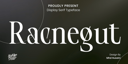 Racnegut is high contrast serif font features a mixed modern-classic design. Racnegut support multilingual languages, numbers, punctuation and alternative-ligatures. Create unique & amp; beautiful logotype, use it as an elegant solution for your next magazine layout, or choose Racnegut for any graphics that require a sleek look with a elegant flair.
 - Rahella by Balevgraph Studio,
$12.00 Rahella is an enchanting handwritten font. This versatile script font has a wide spectrum of applications ranging from greeting cards to headlines and is guaranteed to add a romantic feel to your next project. What's Included : - Uppercase, Lowercase, Numerals & Punctuations - Ligature & Alternate - Works on PC & Mac - Simple installations - Multilingual support - PUA Encoded
 - Wylgate by Greater Albion Typefounders,
$18.50 Wylgate us a classic sign writer’s lettering style, designed on an oblique line to capture and a sense of motion and speed. It’s a timeless design which can be used to draw attention to a headline or a sign, while maintaining perfect legibility. Bring a ‘middle 20th century’ feel to your next project.
 - Drillepind by Bogstav,
$17.00 Drillepind is a kidder in danish. You know, someone who teases, without being rude. Once you start typing with Drillepind, you will notice that the font does the same, in a playful way. You never know what happens next, when using the font - but you do know that it'll be loads of fun!
 - Spikle by Valentino Vergan,
$14.00 Spikle is a unique mixed display typeface that is very eye catching. Spikle contains a mix-up of different uppercase letters from different typestyles, these distinct letter combinations will make your next project really standout. Spikle is perfect for creative project such as: branding, logos, quotes, titles, product packaging and much more.
 - Vintage Rough by Nirmana Visual,
$22.00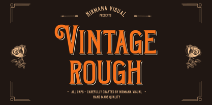 Introducing Vintage Rough. A Vintage display font that has a classy, clean, and has dramatic movement. This font is great for your next creative project such as logos, quotes, invitations, product packaging, posters, and social. It is also great for watermarks on photography and product merchandise, or anything that needs a vintage taste.