10,000 search results
(0.024 seconds)
- Haboro Serif by insigne,
$- The polls are in. Now here by customer request--Haboro Serif, the newest edition of the Haboro Hyperfamily. The Haboro fonts are an outstanding upstart success from the first part of 2016. Following the release of the popular Haboro, Haboro Sans and Haboro Slab have both been welcomed additions to the family, too. Now, Haboro Serif continues to build on the base of these related designs. Serif maintains the unique, script-like terminals of the original. These terminals, along with the optimized stroke weight of this face, make it useful for text settings. Prefer standard serifs? These are also available as OpenType alternates within the font, giving you a wider variety of options without compromising its effectiveness in the same text settings.. Haboro Serif works with many other members of the Haboro family as well. Try the original Haboro for your headlines, and pair your Serif text with Haboro Sans for a balanced design that appeals to the reader. Add Serif to your box today, and try this all-around “Renaissance man” of a typeface for a touch of practical elegance on your next job.
 - Ardentia by Asritype,
$19.00 Ardentia is a serif typeface, supporting a wide range of Latin based languages and Greek (see TechSpecs). Ardentia was created inspired by most serif text font used in book printing. Smooth curves help the flow for long text reading. Ardentia is designed with medium contrast in order to have all parts of the letter’s shape well printable in book size printing, for high or low resolution printers, high or low paper quality. Other than book printing, the medium contrast also gives good visibility in display thanks to its clearness. Thus, Ardentia will work well for both printing and display, webpage or electronic/digital display. Ardentia consist of 4 weights: Light, Regular, Semi-bold and Bold, plus matching italics. The thickness of the lowercases (vertical stem) of the regular font is drawn at about the middle of the thickness of similar kind (serif) and similar size fonts. So Ardentia is the right choice for both textbook and display altogether. Being a normal serif typeface, Ardentia is applicable to a wide range of usage. From book typing, news, magazines notes, cards, sticker texts, banners, to logos and the others design mean. Enjoy using Ardentia for your projects.
 - PS Fournier Std by Typofonderie,
$59.00 Style and elegance in 14 styles PS Fournier, created by Stéphane Elbaz, is designed in tribute to Pierre Simon Fournier. Fournier was the prolific Parisian type designer whose work is best known for its iconic representation of French transitional style. PS Fournier elegantly represents the transition to the modern era of typography. Featuring three optical sizes, PS Fournier is designed to perform in any context. The Pierre Simon Fournier heritage Pierre Simon Fournier (1712—1768) was a leading innovative type designer of the mid-18th century. Early in his career, the young Pierre Simon developed a strong aesthetic that he cultivated throughout his life. His art is representative of the pre-revolutionary “Age of Enlightenment” (Siècle des Lumières). Precursor of the Modern style, Fournier’s body of work deeply influenced his times, and created the fertile ground from which the Didot family and Giambattista Bodoni developed their own styles. During the historical period of the 18th century, Fournier exemplified the intellectual pursuits of the times with his own research on type, documenting in detail the typefounding process. He also offered a unique vision: he is the first to clearly comprehend the concept of “type family,” sorting a set of similarly styled alphabets by sizes, width, and by x-heights. In addition, Fournier is one of the earliest advocates of the point system to organize the practice of typography, the point system that contemporary typographers continue to use to this day. The refined and discreet elegance of PS Fournier With a close look at the family, one finds you’ll find that the difference between the optical sizes (Petit, standard and Grand) is more than a contrast variation between the thin and the thick; the eye can also denote a palette of distinct tones: More streamlined and robust in the smaller sizes (Petit), more refined and detailed in the larger sizes (Grand). The PS Fournier standard family is designed to adapt to any situation with its intermediate optical size, from body copy to headlines. With a bit of tracking, PS Fournier Petit will make the smallest captions perfectly readable. However, Petit family is not limited to body and captions — its “slabby robustness” will make a relevant headline choice as well. PS Fournier Grand presents a higher contrast adapted to large text sizes, displays or banners. Its refined elegance makes it a perfect choice for Design, Fashion or Luxury publications. As a “modern” type PS Fournier Grand features a larger x-height than the preexistent old style typefaces such as Garamond or Jenson. These proportions provide any basic text set in PS Fournier Grand a strong typographic texture. As a result, the PS Fournier global family is a versatile alternative to the Modern typefaces commonly used in the publishing industry. The optical sizes, the large range of weights, and the design variations make this family adaptable to captions, paragraphs, and pages, as well as to large texts and displays. A leading-edge typography in the 18th century In the spirit of modernity, Pierre Simon Fournier did not find any use for the conventional swashes still produced by peers such as Caslon or Baskerville. Nevertheless the French designer created many inventive elements to decorate the page and set delightful variations in the text itself. To this regard PS Fournier includes a large set of glyphs variations, ligatures and more than one hundred glyphs for borders, rules and ornaments or — as called in French — “vignettes.” PS Fournier: A tribute to the French modern typography era by Stéphane Elbaz
 - FF Info Pict by FontFont,
$62.99 Erik Spiekermann, working in collaboration with Ole Schäfer, originally designed FF Info® Display for use in the context of wayfinding systems. The variants FF Info™ Text and FF Info™ Correspondence were developed later for text setting and office communication. FF Info Display The sober and clear forms of the sans serif FF Info Display have been deliberately molded to make them perfect for use on wayfinding systems. The font by Ole Schäfer and Erik Spiekermann not only takes the problem of lack of space into account - it is some 15% narrower than comparable typefaces - the characters have also been designed to ensure they remain legible even in adverse conditions for reading. As text on signs often contains words with which readers are unfamiliar and which are thus deciphered letter for letter rather than perceived as whole words, it is essential to provide for a clear differentiation between glyphs. Additional serifs on the lowercase "i" and uppercase "I" and a small arch on the terminal of the lowercase "l" ensure that it is possible to readily discriminate between these particularly problematic letters. Moreover, sharp corners on glyphs can also make it difficult to read signs with backlighting or when driving past. The rounded corners of FF Info Display counteract this effect and make sure that the character forms remain well defined.FF Info Display is available in five carefully coordinated weights, from Regular to Bold. In the corresponding italic variants, the letters appear overall more rounded while the lowercase "a" has a closed form and the "f" has a descender. Also included among the glyphs of FF Info Display are several ligatures and arrow symbols. Pictograms with different themes that complement the typeface are also available in four weights. FF Info Text Thanks to his know-how gained through designing other typefaces, Erik Spiekermann became aware that fonts created for use in problematic environments can be used in many different situations. In smaller point sizes, FF Info Display cuts a fine figure when used to set longer texts. So Spiekermann carefully reworked FF Info Display to produce FF Info Text, a font perfected for use in this context. Not only can the characters be more generously proportioned, certain features, such as additional serifs to aid with the differentiation of problematic letters, are also no longer necessary in textual surroundings. The upright styles have a double-story "g" while Spiekermann has added oldstyle figures and small caps. FF Info Correspondence FF Info Correspondence has also been designed for setting block text although it recalls the style of old typewriter characters and is specifically intended for use in office communication. The characters of this third member of the family are thus more formal, without rounded terminals but with rectangular punctuation marks. The narrower letters are provided with large serifs to give them more space although, at the same time, this reduces the differences in terms of letter width among the alphabet. In contrast with its two siblings, FF Info Correspondence has only three weights, each with corresponding italic.The three styles of the FF Info super family cover an extensive range of potential applications. If the different kerning is adjusted manually, the three styles harmonize happily with each other and can be readily used in combination to set, for example, headlines and texts and also creative display options.
 - Heft by Device,
$39.00 Heft is a heavy slab serif that packs a powerful punch. Available in square-cornered and rounded versions, each with italics, plus two distressed variants — an inky version that evokes the urgency of cheap hot-metal printing, and a worn, distressed version that suggests vintage woodtype or photocopied text.
 - HU Milksherbet KR by Heummdesign,
$25.00 This typeface was inspired by milk sherbet, which is enjoyed cold on a hot summer day. Rounded shapes and soft stroke endings make the typeface look cute. Heavy works great for headlines with its extra-heavy stroke weight and size, while Regular and Light are best for body text.
 - Alquitran Stencil by RodrigoTypo,
$45.00 Alquitran Stencil is a variant of Alquitran Pro. Alquitran stencil is specially designed for titles, with stencil effect.,Iin addition to Regular and Bold Alquitran Stencil also contains Rough and Rounded with additionally traces Extras (1-2) that are dingbats that support the text to look much more realistic.
 - ID Gotira by Izouuss Design,
$15.00 Inspired by many Blackletter styles, ID Gotira Blackletter is a contemporary take of the historic Blackletter, also sometimes referred to as Old English. Modern, versatile, while not losing it's classic touch, it's also equipped with multi-language support and works best for headlines, body text, branding, packaging and posters.
 - Digitalis by G-Type,
$46.00 Digitalis was created from a desire to make an original, æsthetically pleasing rounded typeface using the minimum of strokes. Each character has been reduced to only the most essential elements. Due to the contrast between the thick and thin strokes Digitalis is surprisingly legible when set as text.
 - HU Milksherbet by Heummdesign,
$15.00 This typeface was inspired by milk sherbet, which is enjoyed cold on a hot summer day. Rounded shapes and soft stroke endings make the typeface look cute. Heavy works great for headlines with its extra-heavy stroke weight and size, while Regular and Light are best for body text.
 - Mandarin Duck by Yasemin Varlik,
$10.00 Mandarin Duck is a very playful typeface where its design was inspired by the rare duck seen in New York once every year. The delicate tail of this duck creates the edges of the characters. It is bold and fun, a perfect typeface for children books and larger texts.
 - Rosacfild by Brithos Type,
$11.00 Rosacfild is a bold script font. This fantastic typeface is best suited for headlines of all sizes, as well as for blocks of text that have both maximum and minimum variations. Use it to create standout headings, promote your online sales, Instagram quotes, business cards, t-shirts, and invitations.
 - Murderous Desire by PizzaDude.dk,
$20.00 Murderous desire for grunge! Grunge is timeless, and Murderous Desire is worn and torn, yet very legible. Great for massive text or headlines! Comes with different lower- and uppercase plus alternate letters and on top of that, ligatures for double letter! Go crazy, go grunge - and use Murderous Desire!
 - EB Bellissimo Display by Erik Bertell,
$15.95 Bellissimo Display boasts an impressive range of handsome all caps ligatures that would make even Herb Lubalin jealous. Despite its iconic features, Bellissimo works surprisingly well as a text face as well. Small capitals, alternate glyphs and both lower and upper case figures are intrinsic in the design.
 - Parity by Shinntype,
$39.00 There is no bicameral Parity. It has been designed from scratch to be an exceptional unicase typeface, uncompromised by the priorities of mixed case or all-cap setting. Each glyph is shaped, proportioned and detailed for one purpose only: to optimize text set in the lining unicase format.
 - Sellebou by Creativemedialab,
$20.00 Sellebou is a modern display font. It consists of three weights, display, regular and text. Straight lines combined with a slight curve make Sellebou look modern and unique. Try uppercase for a simple look. Sellebou is perfect for website headers, logos, Instagram stories, magazines, or fashion-related branding.
 - Gusset by Pesotsky Victor,
$10.00 Gusset is a simple modular font. It was created for headlines and posters. It creates a dense and interesting texture in the text set. Simple rounded curves contrast with "wedges". Gusset supportsBasic Latin, Cyrillic and more than 100 languages all together. The font was designed by Viktor Pesotsky.
 - Drab by Pesotsky Victor,
$12.00 Drab is a neutral grotesque, but with decorative elements. Suitable for texts and titles. When you do not need a strong accidental but a boring set, Drab is also not suitable. Drab supportsBasic Latin, Cyrillic and more than 100 languages all together. The font was designed by Viktor Pesotsky.
 - Softrobo by Koval TF,
$10.00 Fine-built, straight but not official, with soft corners is suitable for short texts, placards and advertising. It was inspired by 1970s when people were mad about robots, space and so on. I decided to create a font as if it was a progressive font of the 1970s.
 - Almarose by S&C Type,
$22.00 Almarose is a geometric sans serif OpenType font designed by Fanny Coulez and published by S&C Type. Functional with a little distinctive touch, Almarose comes with 9 weights with italics, from Thin to ExtraBlack, and was designed for all uses like texts, web or headlines. Merci beaucoup.
 - Lanz by Nine Font,
$29.00 Lanz Family is a clean & warm sans serif family with 7 weights - 7 uprights and matching italics. Its open apertures and large x-heights make text more legible and readable at small sizes. Recommended for editorial design, a header for an article and a various range of typography.
 - Nadsat by Typogama,
$19.00 Nadsat is a unicase display typefaces with a condensed, art deco styling. Best suited for short texts or display settings, the lowercase and capital letters can be combined to offer more layout possibilities. The typeface also includes a series of ligatures and alternate characters for even more layout options.
 - MD Pen by Margarita Dyakovich,
$12.00 MD pen is a unique handwritten sans serif font family ( based on MD Grotesque) with a feel of elegance and with high readability. It’s versatile and can be used for a big variety of design projects. Perfect for any simple text. Each style includes Latin and Cyrillic character set.
 - Churchward Montezuma by BluHead Studio,
$25.00 Churchward Montezuma is the latest OpenType font family released by BluHead Studio, LLC. from the exciting and unique typeface library of Joseph Churchward. The cut-in motif gives this four weight serif family a unique look suitable for display work, and the lighter weights hold up well in text.
 - Adonis by ParaType,
$30.00PT Adonis™ was designed by Natalia Vasilyeva and licensed by ParaType in 2002. An original typeface, its characters have slightly oblong proportions, with rounded serifs and generally soft letterforms. The face is both space-saving and quite legible in small sizes. For use in text and display typography. - Mogaloa Script by Bosstypestudio,
$15.00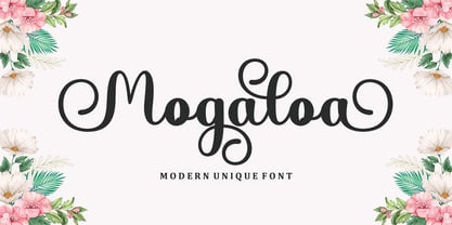 Mogaloa Script in a beautiful handwritten style. Equipped with 300 glyphs. Mogaloa Script is perfect for branding projects, home appliance design, product packaging, use in business cards, invitation cards, etc. Simply as a stylish text overlay onto a background image or anything that requires a touch of elegance.
 - Quickline by Jonahfonts,
$35.00 Quickline OpenType font family in four weights supporting Central-European languages, containing ligatures, fractions and an abundance of alternates for upper and lower case glyphs. Quickline also comes in a matching Quickline-SLAB version containing four weights as well. Quickline works well as a text and display font.
 - Starslang Phat by MyAnvil,
$20.00 This is the "Starslang Phat" font, which is similar to the original "Starslang" font featuring starring vowels. The evolved font design has a heavier weighted text body and rounded contours. The result is a font that has a warm, natural, and curvy feel; with a fun urban impression.
 - Booked by Gassstype,
$27.00 Hello Everyone, introduce our new product Font Booked This Is Rough Display Font.This is a Textured Natural Style and classy style with a clear style and dramatic movement. That is has charming, authentic and relaxed characteristic more natural look to your text. You can activate 4 Ligatures OpenType panel.
 - Londoner by Motokiwo,
$10.00 Londoner is a handwritten font with a dry brush texture. It was created directly with my marker vector brush, the whole process is digitalized. Londoner is suitable for logo, product branding, or for text overlay to any background image. Londoner comes with ligatures, swashes, multilingual support, and PUA Encoded.
 - Marbella Script by Bosstypestudio,
$14.00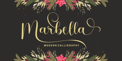 Marbella Script with a smooth handwriting style and very pretty and lovely. Marbella Script is perfect for branding projects, home appliance design, product packaging, use in business cards, invitation cards, etc. Just like a stylish text overlay to a wallpaper or anything that needs a touch of love.
 - Snoofer by Cool Fonts,
$19.95 Snoofer is a modern font that works for both display and text. It comes in 4 weights(Regular, Italic, Bold, Bold Italic). Snoofer was inspired by a character in stories my dad told me as a kid. Somehow they always ended with "... and they never left home again." Enjoy!
 - Leon by Hafontia,
$99.00 Leon is a modern wide sans serif type family in Hebrew and Latin. It comes in four styles to match any design need - Headers in Black or Thin to long text in regular and Bold. Includes full Hebrew support including punctuation. Designed in Tel Aviv by Ben Nathan, 2021.
 - Quantico by MADType,
$21.00 Quantico is an angular typeface family that was inspired by old beer packaging and military lettering. It utilizes 30 degree angles and completely straight lines to form unique character shapes. Equally at home in text or display settings, Quantico includes 3 alternate characters as well as several ligatures.
 - Altum Sans by Erik Seitz,
$9.99 Altum Sans is a new clean and contemporary typeface. The geometric and condensed letterforms are designed for use in larger texts and display applications. With over 500 glyphs Altum Sans supports many languages as well as two different figure styles, interpolation breakpoints, subscript, superscript, contextual alternatives, ordinal indicators, fractions,...
 - WTF Alimento by Wasabib Type Foundry,
$15.00 Alimento Font is Mesmerizing Rhythm, harmonious style & Graceful appearance, simplicity and the sophistication magnificent. Alimento is perfect for editorial projects, Logo design, Music Album, Clothing Branding, product packaging, magazine headers, or simply as a stylish text overlay to any background image. What's you get : - Numeral & Punctuation - LIGATURE - Multilingual Accents
 - Vanquish by Aboutype,
$24.99A traditional Sans serif with a modern flair and uniform consistent weight to the vertical and horizontal stokes. Vanquish was designed for all media and can be used in a wide range of point sizes. Vanquish was kerned for text point sizes but requires subjective display kerning and compensation. - Hailgen by Akufadhl,
$29.00 Hailgen is a Serif typeface that explores the flexibility in contrast, with a thicker horizontal and thinner vertical contrast. Designed specially for short texts or quotes. Hailgen comes with 5 weights ranging from Thin to Black and is armed with several opentype features and Latin and Cyrillic language support.
 - Gasstock by Gassstype,
$27.00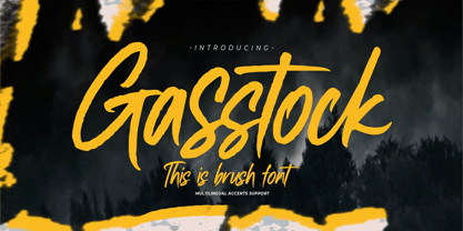 Hello Everyone, introduce our new product Font Gasstock This Is Brush Font.This is a Textured Natural Style and classy style with a clear style and dramatic movement. That is has charming, authentic and relaxed characteristic more natural look to your text. You can activate 32 Ligatures glyphs OpenType panel.
 - P22 Mai Pro by IHOF,
$39.95 Mai Pro is a new transitional antiqua that features ligatures, smallcaps and full Central European support. Mai's classic design is understated enough to be used for long running text applications yet includes unique characters suitable for design purposes. It is the Norwegian name for the month of May.