10,000 search results
(0.045 seconds)
- Heystone Typeface by Joelmaker,
$18.00 ITRODUCING Heystone Typeface & Heystone Exstrude Heystone Typeface is a combination of brush script with an Extrude effect from artistic touch elegant modern the as well as a unique blend of ligatures a letter, so that the authors compose it with a and little swirly embedding, so that a modern font is formed and ready to make a statement by adding elegant and unique flair to your next design project. Heystone Typeface & Extrude can be used for various purposes such as Magazine Title, Poster, Logo, T-Shirt, Sub Title, Business cards, Trademark, Label, Book Covers, Wedding Invitations,Templates Instagram Story Post, Greeting Cards, Quotes, etc. These letters are embedded into the font file and easily accessible in programs such as photoshop and illustrator. You can access these in more basic design programs but you will need to use your character map or font book Come on..let's style and pamper your next design with Heystone Typeface & Extrude. File Included Thanks You for Visit
 - Arachnology by Ortho,
$19.99 If you're looking for a sci-fi inspired, retro-futuristic display font with limitless applications, look no further than Arachnology. Arachnology is a stylish, confident, and versatile display font inspired by the neo-futuristic graphic design movements of the late 90's & early 2000's; and takes cues from the extremely prevalent Japanese and European design influence of that time period. All while refreshing it for a new generation of creatives. Featuring an extensive set of Western alphabetical characters, numbers, special characters, and punctuation; Arachnology includes everything creatives (professional and hobbyist alike) demand from a modern, creative display font. "Arachnology Standard" provides highly-stylized glyphs, apt spacing, weight, and contrast for high legibility in any use-case! "Arachnology Heavy Titling" provides all those benefits, with an additional feature! All its characters (both upper and lowercase) share a single height. Experiment with mixing upper and lowercase glyphs to find the combination that best suits your titles, and especially your personal taste!
 - Probeta by deFharo,
$11.00 Probeta is an exclusive Sans Serif typeface family, condensed in proportion into three styles: Regular, Italic & Small Caps. Each family consists of 7 weights (Extra Light, Light, Regular, Medium, Semi Bold, Bold and Extra Bold). Plus three bonus fonts: Circle, Cube & arrows • Includes a bonnus font with the purchase of each style! After defining all the proportions of the new typeface, and starting from the drawing of the lowercase letter «o», in an exercise of minimalist construction, I have built all the characters, contributing with this technique, morphological coherence and a balanced reading. I have put special interest in defining the width of each character, depending on the relationship with others, then the configuration of the metrics and the exhaustive definition of Kerning, provide maximum readability in paragraph texts and titles. The use in graphic design, editorial or advertising guarantees originality and difference. Very versatile fonts for billboards, video games, movie titles, logos, publications, etc. They include the symbol of Bitcoin and other Cryptocurrencies.
 - Genera Grotesk by Wahyu and Sani Co.,
$25.00 Genera Grotesk is a strong & clean modern sans serif font family. It is total rework of Genera typeface which was released in late 2019. This totally new version of its predecessor has closer aperture, some new letterforms, new italic style and new weight distribution ranging from Thin to Extra Black. Genera Grotesk also available in variable fonts for more flexibility in choosing the right weight. This typeface also equipped with useful OpenType features such as Ordinal, Superior, Stylistic Alternates, Proportional Figure, Fraction, Numerator & Denominator. Each font file covers Western & Eastern Europe Latin language, as well as other Latin based languages – over 200 languages supported! This is a new real multi-purpose typeface that will be perfect for logo, packaging, greeting cards, presentations, headlines, lettering, posters, branding, quotes, titles, magazines, headings, web layouts, mobile applications, art quote, typography, advertising, invitations, packaging design, books, book title, & nearly any other type of creative design you’re working on.
 - TT Bluescreens by TypeType,
$35.00 TT Bluescreens useful links: Specimen PDF | Customization options Please note! If you need OTF versions of the fonts, just email us at commercial@typetype.org Meet the upgraded TT Bluescreens! TT Bluescreens is a geometric sans serif with narrow proportions. The font has a memorable character, while remaining neutral, so it can be used in various design projects. The range of possibilities of the updated TT Bluescreens has become much wider! Condensed styles with narrowed proportions have been added. The classic styles of TT Bluescreens are universal and suitable for setting both in headings and in text arrays. Condensed styles are intended for non-standard design solutions. In small sizes, they are perceived as if having a texture, thanks to which they can become part of packaging or poster design. In large size they look extraordinary, but they are highly readable and convey information well. Variable font now changes along 3 axes: weight, width and slant. Even more options for those who love variety. The character set of TT Bluescreens was expanded, and additional extended Cyrillic and Latin characters were added. Expanded character set. Each style has 874 characters. This is 253 characters more than it there were in the previous version. New currency signs, arrows, punctuation and fractions were added. Number of OpenType features increased from 18 to 31! The font has become even more functional and convenient thanks to a large number of ligatures, stylistic alternatives and localizations. The quality of the contours has become even higher, diacritics were improved. The updated TT Bluescreens is suitable for the design of covers and posters, it will look aesthetically pleasing in packaging design. It can be used in the design of titles and disclaimers. Condensed styles are preferably used in large size. The TT Bluescreens font has 37 styles: 9 upright and 9 italics of standard width, 9 upright and 9 italics in Condensed, 1 variable style. Each style contains 874 characters. The font has 31 OpenType features, including ligatures, stylistic sets, and localizations.
 - Viktorie by Three Islands Press,
$39.00 Viktorie might easily be mistaken for the handwriting of a note-taker in a hurry: it looks swiftly jotted down. These energetic characters pay little heed to such arbitrary contraints as baseline or x-height -- taken together, they give the effect of casual penmanship that's both curiously legible and inspiringly unleashed. Viktorie has a single, medium-light weight and comes, of course, with a full character set.
 - Cover Charge JNL by Jeff Levine,
$29.00 Although less prevalent today, a cover charge was added to better class night clubs of the 1930s and 1940s to discourage patronage by people of questionable social graces. The general idea was that the lower strata of society (meaning the "average Joe" or "hoi polloi") would balk at paying an extra fee just for entrance to a place of good entertainment and fine dining.
 - Olivia01 - Personal use only

- SteelTown - Unknown license

- Steletto by Jonahfonts,
$42.00 Condensed Gothic. Great for tight-fitting headlines and other condensed titling situations such as headlines, ads, invitations, captions, packaging, bulletins, posters, and greeting cards.
 - Galpon Pro by RodrigoTypo,
$25.00 Galpon Pro, is an improved version of Galpon, this time it contains Lowercase, Signs and also is in different weights, ideal for entertaining titles!
 - Heraldic Devices Premium by Intellecta Design,
$16.90 A collection of shields, crowns and heraldry designs. Represents heraldry devices, Spanish city seals, world nations seals, coats of arms, helms, crowns, crests etc.
 - Poltrone by TeGeType,
$29.00 The Poltrone typefaces family was inspired by the public inscriptions of the 19th century and was designed to be used for titling, headlines, etc.
 - JH Tania 2x by JH Fonts,
$50.00 JH Tania 2x is geometric typeface, including a double stripe & a black weights. It has a modern design ideal for logos / branding and titles..
 - KG LET HER GO by Kimberly Geswein,
$5.00 Tall, chunky title-friendly sans serif capitals in 3 styles. Use all caps for even lettering or alternate caps and lowercase for bouncy lettering.
 - Ding Pro by RodrigoTypo,
$25.00 Ding pro! is a typographic family that contains many alternatives from ligatures to styles like Rough, Hand, UltraLight-Heavy, special for children-Youth titles.
 - Gallegos by profonts,
$51.99 Gallego Pro is a classical, pen-drawn upright script useful for many applications, e.g. book titles, ads, magazines or any kind of display work.
 - Port Of Call JNL by Jeff Levine,
$29.00 The hand lettered titling on a vintage piece of sheet music for the song "Sweet Siamese" is the basis for Port of Call JNL.
 - Steletto Neue by Jonahfonts,
$42.00 Condensed Gothic. Great for tight-fitting headlines and other condensed titling situations such as headlines, ads, invitations, captions, packaging, bulletins, posters, and greeting cards.
 - Hollyday by Sea Types,
$10.00 Hollyday is designed to be practical and use of texts and titles. Ideal for application in graphics and editorial projects and mobile interface design.
 - Stahlhelme Und Kronen by Intellecta Design,
$22.90 A collection of shields, crowns and heraldry designs. Represents heraldry devices, Spanish city seals, world nations seals, coats of arms, helms, crowns, crests, etc.
 - Manbokun by ahweproject,
$10.00 Introducing Manbokun – a typeface that has a unique letterform inspired by Japanese kanji typography. Suitable for headlines, titles, logos, logotypes, posters, brochures, and more!
 - Cornerstone Flair by Jonahfonts,
$35.00 Condensed Gothic, great for tight-fitting headlines and other condensed titling situations. Applications include Headlines, ads, invitations, captions, packaging, bulletins, posters, and greeting cards.
 - Steletto Oldstyle by Jonahfonts,
$42.00 Condensed Gothic. Great for tight-fitting headlines and other condensed titling situations such as headlines, ads, invitations, captions, packaging, bulletins, posters, and greeting cards.
 - Life Of Apple by Typefactory,
$14.00 Life of Apples is a Fun Handwriting typeface, perfectly suitable for creating quotes, kids book, lifestyle design such as logos, title, magazine, and more.
 - Cornerstone by Jonahfonts,
$35.00 Condensed Gothic, great for tight-fitting headlines and other condensed titling situations. Applications include Headlines, ads, invitations, captions, packaging, bulletins, posters, and greeting cards.
 - FS Pimlico by Fontsmith,
$80.00 Born in the 70s Personal influences are unavoidable in type design and usually find their way through into finished fonts. At Fontsmith, one period in particular provides inspiration, according to FS Pimlico designer, Fernando Mello. “Jason and Phil have always known that I’m very into the visual language of the 70s. I know that Jason shares my love of the 70s and Phil will sometimes admit to being a fan, too. I think that’s the reason they were both so supportive in the development of this font. “And, of course, we all share an interest in good-humoured and intelligent design. We like to think it’s a Fontsmith characteristic.” Back from black FS Pimlico started in an unusual place: with a tubby, penguin-like lowercase “a” that Fernando Mello had been sketching. From “a” grew the rest of the alphabet – a bubbly, fat, friendly family with a brush-written quality that became FS Pimlico Black. The black weight certainly isn’t the normal starting point for creating a regular and bold weight, but Fernando pressed on, driven by a glut of influences: brush-writing; Letraset and early digital systems catalogues; the type of Herb Lubalin and Tony di Spigna; 70s clothes and vinyl; and 70s revival disco nights in London’s Pimlico and Vauxhall. Natural or flourished Not often do fonts come along that seem to span the ages. FS Pimlico is at home in an office environment providing a fresh clear identity in communications or providing text that’s clear and easy to read. But it likes to party, too, 70s style. With the OpenType features switched on, a designer can totally change the look of their work, and create point-of-sale, headlines and titles that stand out and get noticed.
 - FS Pimlico Variable by Fontsmith,
$249.99Born in the 70s Personal influences are unavoidable in type design and usually find their way through into finished fonts. At Fontsmith, one period in particular provides inspiration, according to FS Pimlico designer, Fernando Mello. “Jason and Phil have always known that I’m very into the visual language of the 70s. I know that Jason shares my love of the 70s and Phil will sometimes admit to being a fan, too. I think that’s the reason they were both so supportive in the development of this font. “And, of course, we all share an interest in good-humoured and intelligent design. We like to think it’s a Fontsmith characteristic.” Back from black FS Pimlico started in an unusual place: with a tubby, penguin-like lowercase “a” that Fernando Mello had been sketching. From “a” grew the rest of the alphabet – a bubbly, fat, friendly family with a brush-written quality that became FS Pimlico Black. The black weight certainly isn’t the normal starting point for creating a regular and bold weight, but Fernando pressed on, driven by a glut of influences: brush-writing; Letraset and early digital systems catalogues; the type of Herb Lubalin and Tony di Spigna; 70s clothes and vinyl; and 70s revival disco nights in London’s Pimlico and Vauxhall. Natural or flourished Not often do fonts come along that seem to span the ages. FS Pimlico is at home in an office environment providing a fresh clear identity in communications or providing text that’s clear and easy to read. But it likes to party, too, 70s style. With the OpenType features switched on, a designer can totally change the look of their work, and create point-of-sale, headlines and titles that stand out and get noticed. - Brownstone Sans by Sudtipos,
$59.00 One design sparks another. As Alejandro Paul experimented with the strokes and curves of the monoline script Business Penmanship, he discovered interesting new forms and shapes that didn't fit the Spencerian theme of that typeface. These forms simmered in Ale’s subconscious over the next three years, during which time he visited New York City, pored over rare type specimen books in the New York Public Library, and explored Brooklyn’s neighborhoods. Brownstone, the face born from these explorations, is an original 21st-century design, yet one subtly infused with historical and cultural references -- keen observers might spot influences from decorative typefaces of 19th-century foundries. And just as faces from that era were influenced by contemporary architecture, the frames included with Brownstone echo the ornate iron railings of Park Slope’s row houses. (There’s also a slight 1960s vibe to Brownstone, of novelty swash-sans photocompositing faces, that can be played up at your discretion.) Influences aside, Brownstone has broad appeal to modern audiences. A soft, monoline sans-serif, with elements of Swiss geometry (see the ‘k’ and ‘x’), its marriage of highly legible, draftsman-like letterforms with decorative swashes and ornaments reflects the old-meets-new aesthetic of the DIY craft culture seen in Brooklyn and other urban centers. It’s ornamental but unfussy, romantic but understated. Brownstone includes character sets for Latin-based languages, including Western and Eastern European, Baltic, Turkish, Maltese, Celtic and Welsh. Over 1500 glyphs, including small capitals, swash characters, alternates, and ligatures, in both Light and Thin weights. Ornamental frames are also included in both weights. The Brownstone Frames fonts are available as separate fonts in the new Brownstone Slab family.
 - ITC Medea by ITC,
$40.99The designer of ITC Medea , Silvio Napoleone said: “I've always had an interest in early letter shapes, particularly how they influenced modern typographic designs. While I was on vacation in Greece, I had a chance to see, first-hand, examples of early letterforms and typography. They really made an impression on me.” The idea of combining the ancient and the modern to create something new was the primary inspiration behind ITC Medea. ITC Medea is essentially a careful blending of the modern sans serif with the elegant forms of the uncial. At first glance, Medea appears to be constructed of geometric shapes. However, closer inspection reveals many calligraphic subtleties. Stroke terminals are flared slightly in characters like the 'e' and 'c.' The top curve of the 'd' is more pronounced than the bottom, and characters like the 'o' are elliptical rather than round. “I gravitated towards the simplicity and legibility of the uncial and half-uncial,” Napoleone recalls. “I thought it would make a great titling font, and I was surprised at how attractive ITC Medea looked in a body text.” - Schools Out by Comicraft,
$39.00 Originally created for Sound Effects in Marvel's GHOST RIDER 2099, our spraycan stylish HOOKY font has just the right Scrawl of the Wild for graph-iti enthusiasts everywhere -- and they wash right off with just a little splash of 'delete'. Spray it, don't Say it!
 - Hooky by Comicraft,
$29.00 Originally created for Sound Effects in Marvel's GHOST RIDER 2099, our spraycan stylish HOOKY font has just the right Scrawl of the Wild for graph-iti enthusiasts everywhere -- and they wash right off with just a little splash of 'delete'. Spray it, don't Say it!
 - Rhomer by Fargun Studio,
$14.00 Introducing Rhomer Serif Font This beautiful font will engage your audience and make your promotions and projects stand out. This font is designed with a bada curve in the middle so it looks really cool and brings your brand to life and add a touch of modernity and style with the Rhomer Serif Font. Use it for titles, logos, business cards, printed quotes, all kinds of invitations, cards, packaging and branding of your website or social media. Our font always includes Multilingual option to make your branding globally recognized.
 - Nadimo by Twinletter,
$12.00 Nadimo is an elegant, charming, and sensual sans serif font. Designed with subtle curves and flexible shapes to create a beautiful typeface that fits all your projects. Whether you’re looking for a typeface for a logo, t-shirt, poster, or even a large typography installation, Nadimo is here to help. Of course, your various design projects will be perfect and extraordinary if you use this font because this font comes with a font family, both for titles and subtitles and sentence text, start using our fonts for your extraordinary projects.
 - Raguel by Sensatype Studio,
$15.00 Raguel is Classy Elegant Luxury Font with Sharp shape make your design look classy and elegant A new Serif Font that we created special for Headline, Title and more stand out typography needs, we crafted for unique style and modern feels so enjoy to create any project that will show your main idea out. Raguel is Classy Elegant Luxury Font ready with: Any options to get creative variations Preview as a inspirations that you can do with Raguel font Ready with All characters Wish you enjoy our font. :)
 - Gutheng by Letterlite Studio,
$10.00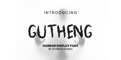 Gutheng - is a horror-themed font that is very mysterious and spooky. This font is very suitable to be used for book covers, titles, quotes, and others that require a font with a horror theme. What's Included : - Standard & Multilingual glyphs - Works on PC & Mac - Simple installations - Accessible in the Adobe Illustrator, Adobe Photoshop, Adobe InDesign, even work on Microsoft Word. - PUA Encoded Characters - Fully accessible without additional design software. - Fonts include multilingual support for; Afrikaans, Danish, Dutch, French, German, Indonesian, Irish, Italian, Norwegian, Portuguese, Scottish, Spanish, Swedish, Swiss. Hope you enjoy with our font!
 - Baroty by Twinletter,
$17.00 Baroty is a modern sans serif font that we made with great care to make your project beautiful and perfect, to make your project look unique and different from the rest. By using this typeface, you may anesthetize the entire audience, allowing them to remember your project easily and firmly. of course, your various design projects will be perfect and extraordinary if you use this font because this font is equipped with a font family, both for titles and subtitles and sentence text, start using our fonts for your extraordinary projects.
 - Efrida by Twinletter,
$12.00 Efrida is a sanserif font family with a sporty and maco feel. Naturally, this typeface will make your diverse projects look attractive, distinct, and flawless. because we created it with great care so that you can use it for a variety of purposes in your amazing project of course, your various design projects will be perfect and extraordinary if you use this font because this font is equipped with a font family, both for titles and subtitles and sentence text, start using our fonts for your extraordinary projects.
 - Bertram by ITC,
$29.00Bertram Plain is the perfect font for setting titles in comic strips and similar designs. UK designer Martin Wait created this font 1991, after he was inspired by the casual style of circus graphics. In fact, this jolly and lighthearted font was even named after one circus in particular: the Bertram Mills Circus. Bertram Plain is an all-caps font, with capital letters placed on both the upper and lowercase keyboard strokes. Additionally, Bertram Plain letters sport a 3D-like drop shadow, a distinctive feature when comparing this to many other display fonts. - Dark North by HansCo,
$15.00 Dark North Font is a modern and casual display font with an incredibly friendly feel. This font comes with a blackletter feel but has a clean and modern style. Comes with a full uppercase, lowercase, numbers, punctuation and with extensive language support, it’s going to be a very usable addition to your project. Whether you’re looking for fonts for various projects like logos, blog titles, branding, packaging, barber shop, fashion, invitations, greeting cards, posters, business cards, clothing, letters, stationery, and more Dark North Font will turn any creative idea into a true piece of art!

