6,694 search results
(0.047 seconds)
- BR Nouveau Ramblings - Unknown license

- MicroTech - Unknown license

- Stencil Set JNL by Jeff Levine,
$29.00 Stencil Set JNL takes the 2011 release of Stencil Mark JNL (a spur-serif letter based on a vintage set of brass stencils) and transitions it to the design of a clean, bold sans typeface.
 - Black Beer by Fractal Font Factory,
$10.00 Black beer, strong Gothic. It is designed for logos, prints, headlines and more. The font has 4 styles, base, blurred, outlined, and aged. Contains basic characters and punctuation marks as well as extended multilingual characters.
 - Hookshot by Callout,
$19.00 Hookshot is a quirky serif font font with a retro touch, inspired by an old Canon Word-mark. Hookshot works great for headlines, callouts, and illustrations. It is perfect for short words and even sentences!
 - Monstroula Shadow TT - Unknown license

- Gummi by Anastasia Kuznetsova,
$22.00 I present to you a fascinating contrasting font system, Gummi! Modern development of 3 fonts, each of which is designed to complement each other in a natural way. This is an extremely versatile font collection, ideal for experimenting with vibrant and modern typographic designs in any modern design. This product includes 3 font files containing uppercase and lowercase characters, numbers and a large set of punctuation marks. Font Features * A-Z; a-z character set; * 1 language (English); * numbers and punctuation marks, symbols A font containing uppercase and lowercase letters, numbers, and a wide range of punctuation marks. Fonts can be opened and used in any software that can read standard fonts, even in MS Word. No special software is required, and to get started. It is recommended to use it in Adobe Illustrator or Adobe Photoshop Made with love ♡ Thanks for checking it out, and feel free to drop me a message if you had any queries! ~ Anastasia
 - Kalender Serif by Gurup Stüdyo,
$10.00 ∙Kalender is designed as a high-contrast modern serif for display use. Kalender is provides you an elegant and luxurious typographic colour. ∙When Kalender's lines invisible at small sizes you can use Kalender No 2 which have thicker lines and serifs to assist readability. ∙Kalender Blok is arranged for situations which are diacritical marks overflow to leadings of the headline and headline typographical color is affected negatively from this situation. For this purpose, majiscule diacritical letters are resolved within the letter height. However, when this is done, new forms are obtained by integrated diacritical marks with letters instead of directly merging them. The idea behind this approach is to preserve the typographic value of diacritical marks and emphasize the semantic value of diacritical letters. 68 letters have been redesigned in this way. And also Kalender have different meanings in Turkish: large, humble etc. I considered this name appropriate because it described the structure of this font well.
 - Ministry Script by Sudtipos,
$99.00 Ministry Script was designed to be “A time capsule that marks both the American ad art of the 1920s, and the current new-millennium acrobatics of digital type.” First letters of Ministry comes from a how-to lettering book but immediately turned on a complex and modern new digital typeface design with thousand glyphs. Ministry’s OpenType features include contextual and stylistic alternates, swash characters, and a galaxy of ligatures. A single face with over 1,000 characters to explore. The OpenType palette provides access to four different variants of each letter. For more info about the use of Ministry, its background, ligatures, alternates, please read The Ministry Script Guide in the Gallery section.
 - Titla by ParaType,
$25.00 The name of the font Titla emphasizes it heading and display functionality. At the same time low contrast, narrow proportions, wide variety of weights and clear glyph constructions make it possible to use it for long texts as well. Combination of modern serifs with flexing stems (see n, p,…) brings to the font fresh, informal and noticeable appearance. The character set includes alternative variations and specific 'vertical ligatures' for paired letters that are built with the help of diacritical forms of letters placed above basic ones. This feature also was reflected in the name of the font as Greek 'titlos' means diacritical mark. The font was designed by Oleg Karpinsky and released by ParaType in 2009.
 - Hebrew Sevilha Tanach by Samtype,
$149.00 This is Classic Hebrew Sefardi Font. This is a beautiful typeface to invitations, posters, cover books and small texts. All diacritic marks for vocalization are present (Nikud), including shevana, kamats katan, cholam chaser and dagesh hazak.
 - Kally Dreams by Hishand Studio,
$14.00 Kally dreams is a beautiful monoline font with signature style that really good for water mark, logotype, advertisement, social media posts, product packaging, clothing design and more. complete with uppercase lowercase ligatures swashes alternates multilingual support
 - Hebrew Sevilha Std by Samtype,
$49.00 This is Classic Hebrew Sefardi Font. This is a beautiful typeface to invitations, posters, cover books and small texts. All diacritic marks for vocalization are present (Nikud), including shevana, kamats katan, cholam chaser and dagesh hazak.
 - Elastik by bb-bureau,
$65.00 Grotesk typeface with elastic punctuation & diacritical mark. in 4 weights: Light, regular, Medium and Bold by 4 styles: A (small diacritical), B (normal diacritical), C (hight diacritical) and D (very hight diacritical) language: all latin glyphs
 - Industrial Stencil JNL by Jeff Levine,
$29.00 Samples of vintage machine-punched stencils used for marking crates and cartons were spotted in an online auction. These served as the basis for Industrial Stencil JNL, which is available in both regular and oblique versions.
 - Deskmark Pro Slab by Alexey Makarov,
$14.00 Hi! Introducing Deskmark Slab Pro Typefamily. Original and soft version. 3 weight for each version, bold, regular and light. Language support: Contains full set of Latin alphabet, including diacritical marks for European languages and Cyrillic alphabets.
 - Stencil Plate JNL by Jeff Levine,
$29.00 A brass stencil hand cut to mark the tops of oil drums yielded the lettering for Stencil Plate JNL. The font emulates the retro feel of the unique letter forms found in the original antique design.
 - Monster DD by Doffdog,
$14.00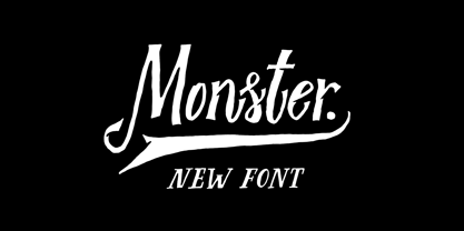 Monster DD is a decorative vintage font in modern performance. It is perfect for: Logos Posters Labels Headlines Apparel Tattoo & more Monster DD comes with upper and lowercase characters, numbers, marks and punctuation. Multilingual support Enjoy!
 - Qatana by Ixipcalli,
$20.00 La tipografía Qátana es una tipografía inspirada en el estilo románico serif y sans serif. Su estilo elegante y de fácil lectura ha logrado ser una tipografía esencial para redacciones de documentos, textos o libros. Cuenta con tres pesos bien marcados que dan un juego visual de resaltados y tenues. Además de las formas itálicas. The Qátana typeface is a typeface inspired by the Romanesque serif and sans serif style. Its elegant and easy-to-read style has become an essential typeface for writing documents, texts, or books. It features three well-marked weights that give a visual play of highlights and lows. In addition to the italic forms.
 - Aure Jane by Aure Font Design,
$23.00 Aure Jane defines grace under fire. These clean, sans-serif forms engage the reader with a subtext of trust. Jane’s excellent legibility will stand up under almost any typographic challenge, bringing confidence to text and titles, and clarity to astrological expressions and chartwheels. Jane is an original design developed by Aurora Isaac. After more than a decade in development, 2018 marks the first release of the CJ and KB glyphsets in regular, italic, bold, and bold-italic. The CJ glyphset is a full text font supporting a variety of European languages. A matching set of small-caps complements the extended lowercase and uppercase glyphsets. Supporting glyphs include standard ligatures, four variations of the ampersand, and check-mark and happy-face with their companions x-mark and grumpy-face. Numbers are available in lining, oldstyle, and small versions, with numerators and denominators for forming fractions. Companion glyphs include Roman numerals, specialized glyphs for indicating ordinals, and a variety of mathematical symbols and operators. The CJ glyphset also includes an extended set of glyphs for typesetting Western Astrology. These glyphs are also available separately in the KB glyphset: a symbol font re-coded to allow easy keyboard access for the most commonly used glyphs. In addition to Aure Jane’s versatility as a text font, Jane can enhance the message of other designs. Aure Jane pairs well as an innocuous foil to any decorative font; Aure Sable, for example, will shine all the more beside Jane’s sensible utility. The witty highlights of Aure Brash will sparkle against Jane’s practicality. Give Aure Jane a trial run! You may discover a permanent place for this font family in your typographic palette. AureFontDesign.com
 - Banknote 1948 by Ingo,
$39.00 A very expanded sans serif font in capital letters inspired by the inscription on a bank note Old bank notes tend to have a very typical typography. Usually they carry decorative and elaborately designed markings. For one thing, they must be practically impossible to forge and for another, they should make a respectable and legitimate impression. And in the days of copper and steel engravings, that meant nothing less than creating ornate, shaded or otherwise complicated scripts. Designing the appropriate script was literally in the hands of the engraver. That’s why I noticed this bank note from 1948. It is the first 20 mark bill in the then newly created currency ”Deutsche Mark.“ All other bank notes of the 1948 series show daintier forms of typography with an obvious tendency toward modern face. The 1949 series which followed shortly thereafter reveals the more complicated script as well. For whatever reason, only this 20 mark bill displays this extremely expanded sans serif variation of the otherwise Roman form applied. This peculiarity led me in the year 2010 to create a complete font from the single word ”Banknote.“ Back to those days in the 40’s, the initial edition of DM bank notes was carried out by a special US-American printer who was under pressure of completing on time and whose engravers not only engraved but also designed. So that’s why the bank notes resemble dollars and don’t even look like European currency. That also explains some of the uniquely designed characters when looked at in detail. Especially the almost serif type form on the letters C, G, S and Z, but also L and T owe their look to the ”American touch.“ The ingoFont Banknote 1948 comprises all characters of the Latin typeface according to ISO 8859 for all European languages including Turkish and Baltic languages. In order to maintain the character of the original, the ”creation“ of lower case letters was waived. This factor doesn’t contribute to legibility, but this kind of type is not intended for long texts anyway; rather, it unfolds its entire attraction when used as a display font, for example on posters. Banknote 1948 is also very suitable for distortion and other alien techniques, without too much harm being done to the characteristic forms. With Banknote 1948 ingoFonts discloses a font like scripts which were used in advertising of the 1940’s and 50’s and were popular around the world. But even today the use of this kind of font can be expedient, especially considering how Banknote 1948, for its time of origin, impresses with amazingly modern detail.
 - Whatzis JNL by Jeff Levine,
$29.00Whatzis JNL is a collection of over 85 decorative question marks gathered from the Jeff Levine font collection and assembled into one convenient file for use in specialty projects where ad copy is based on questions or curiosity. No need to search through dozens of fonts for your background images, as they're all here. Ads such as "Have a question about your insurance?," "What's New at Harper, Jones and Harper?" or "Ask Us! - We are the Experts!"... or signs saying "May We Help You?" benefit from some well placed display question marks - especially when printed in contrasting colors or screened-back in halftones. - Suboel by Subtitude,
$- This bitmap font is made of 97 icons to use to express this time of the year... You will find christmas tree, Santa, cake, stars, gobelin, and a lot more. They work well for background tiling, just as symbols, or for anything else. We hope you like them ! Best size in bitmap is 20pt.
 - Cross Stitch Cursive by Gerald Gallo,
$20.00 Cross Stitch Cursive is based on upper case characters 16 stitches tall and contains the upper case characters A-Z, lower case characters a-z, small numbers 0-9, ampersand, exclamation and question marks, comma, and period.
 - Metalmark Stencil JNL by Jeff Levine,
$29.00 A lot of interesting variations in lettering style can be found in sets of antique tin or brass marking stencils. One such set was the model for Metalmark Stencil JNL, a bold sans with a chamfered look.
 - Katigert by Oleg Gert,
$20.00 Katigert – is a rather friendly italic with a touch of measured severity, combines very sharp angles and bold shapes. The font works best for display. The font includes extended Cyrillic and Latin alphabets, punctuation marks and currencies.
 - Ongunkan Byzantine Empires by Runic World Tamgacı,
$100.00 For this Byzantine Empire calligraphy font, I had to work for 2 weeks and 3-4 hours a day and search the internet. It made me very tired, but I finally finished it, and it was good. This font can use both latin keyboard and greek keyboard. I also added Greek unicode characters. I will adapt this font to the latin alphabet, I will make the full character set font, this will take less time. I wish you good work.
 - ASF Diana by Edik Ghabuzyan,
$30.00 ASF Diana is a Serif family font. It has 5 upright weights and their Italics and supports Latin, Armenian and Cyrillic alphabet systems. The weights from Regular to Bold and their Italics can be used as text fonts. ASF Diana can be used as Display fonts too. It is an easily readable two side serif font and the eyes don't get tired while reading. ASF Diana has a contrast style and at the same time is quite bright and clear.
 - GHEA Samo by Edik Ghabuzyan,
$30.00 GHEA News is a super family font. It has 8 upright weights and their Italics and supports Latin, Armenian and Cyrillic alphabet systems. The weights from Regular to Bold and their Italics can be used as text fonts. The weights thicker than Bold can be used as Display fonts. It is an easily readable two side serif font and the eyes don't get tired while reading. GHEA News has a contrast style and at the same time is quite bright and clear.
 - GHEA News by Edik Ghabuzyan,
$40.00 GHEA News is a super family font. It has 8 upright weights and their Italics and supports Latin, Armenian and Cyrillic alphabet systems. The weights from Regular to Bold and their Italics can be used as text fonts. The weights thicker than Bold can be used as Display fonts. It is an easily readable two side serif font and the eyes don't get tired while reading. GHEA News has a contrast style and at the same time is quite bright and clear.
 - Eldridge by Greater Albion Typefounders,
$10.95 Eldridge is reminiscent of the sort of clear functional slab serif that was often to be seen in the 19th century. It is the plainer cousin of our Bamberforth family and the two partner together very well—Bamberforth for the eye-catching headines and Eldridge for the essential support. It is another new face, which harks straight back to Victorian times and, as such, is ideal for giving anything a 19th century feel-especially posters, book headings, dust jackets and invitations.
 - Spiraling Down by Hanoded,
$15.00 I was listening to an Opeth album called Blackwater Park. By the time I had decided that this font needed some swirls, the band was playing a song called The Drapery Falls - which has the word ‘spiraling’ in it (see poster 2) - and the name was born. Spiraling down is a surprisingly elegant font (given its roughness). I probably wouldn’t set a whole text in it, but it will really stand out as a titling font for packaging or book covers.
 - Sinister Plot - Unknown license

- Memory Square by Beware of the moose,
$16.99Mono Square is a monospaced font, each glyph has the same width. It is based on 25 rectangles so the are some glyphs that needs some effort to read.The font set contains most punctuation marks for normal use. - Shipping Carton JNL by Jeff Levine,
$29.00 Shipping Carton JNL was modeled from vintage bands of rubber type used on a special rotary marking stamp (similar to an office date stamp); generally used for identifying cartons and boxes of merchandise for shipment or product identification.
 - Cross Stitch Discreet by Gerald Gallo,
$20.00 Cross Stitch Discreet is based on upper case characters 16 stitches tall and contains upper case characters A-Z, ampersand, exclamation and question marks, comma, period, colon, and semi-colon. The Gallo foundry now offers 174 font styles.
 - Cross Stitch Simple by Gerald Gallo,
$20.00 Cross Stitch Simple is based on upper case characters 8 stitches tall and contains upper case characters A-Z, lower case characters a-z, numbers 0-9, ampersand, exclamation and question marks, comma, period, colon, and semi-colon.
 - Ampersorts JNL by Jeff Levine,
$29.00 Ampersorts JNL is a collection of many wood type ampersands along with a smattering of question marks, exclamation points, dollar signs and cent signs. A vintage wood type embellishment is also included on the keystroke for the number 6.
 - Magules by HansCo,
$15.00 Magules is a serif typeface with vintage and retro look!. Equipped with all complete characters ranging from uppercase letters, lowercase letters, numbers, punctuation marks and multi-lingual support, this font is ready to be used in any project. Enjoy!
 - Cross Stitch Basic by Gerald Gallo,
$20.00 Cross Stitch Basic is based on upper case characters 7 stitches tall and contains the upper case characters A-Z, lower case characters a-z, numbers 0-9, ampersand, exclamation and question marks, comma, period, colon, and semi-colon.


