5,785 search results
(0.012 seconds)
- Selfie Neue Sharp by Lián Types,
$29.00 INTRODUCTION When I started the first Selfie back in 2014 I was aware that I was designing something innovative at some point, because at that time there were not too many, (if any) fonts which rescued so many calligraphy features being at the same time a monolinear sans. I took inspiration from the galerías’ neon signs of my home city, Buenos Aires, and incorporated the logic and ductus of the spencerian style. The result was a very versatile font with many ligatures, swashes and a friendly look. But… I wasn’t cognizant of how successful the font would become! Selfie is maybe the font of my library that I see the most when I finally go out, (type-designers tend to be their entire lives glued to a screen), when I travel, and also the font that I mostly get emails about, asking for little tweaks, new capitals, new swashes. Selfie was used by several renowned clients, became part of many ‘top fonts of the year’ lists and was published in many magazines and books about type-design. These recognitions were, at the same time, cuddles for me and my Selfie and functioned as a driving force in 2020 to start this project which I called Selfie Neue. THE FONT "Selfie for everything" Selfie Neue, because it’s totally new: All its glyphs were re-drawn, all the proportions changed for better, and the old and somehow naive forms of the first Selfie were redesigned. Selfie Neue is now a family of many members (you can choose between a Rounded or a Sharp look), from Thin to Black, and from Short to Tall (because I noticed the feel of the font changed notoriously when altering its proportions). It also includes swashy Caps, which will serve as a perfect match for the lowercase and some incredibly cute icons/dingbats (designed by the talented Melissa Cronenbold, see also Selfie Neue Rounded for more!) which, as you see in the posters, make the font even more attractive and easy to use. You'll find tons of alternates per glyph. It's impossible to get tired with Selfie! Like it happened with the old Selfie, Selfie Neue Sharp was thought for a really wide range of uses. Magazines, Book-covers, digital media, restaurants, logos, clothing, etc. Hey! The font is also a VF (Variable Font)! So you can have fun with its two axes: x-height and weight, in applications that support them. Let me take a New Sharp Selfie! TECHNICAL If you plan to print Selfie Neue VF (Rounded or Sharp), please remember to convert it to outlines first. The majority of the posters above have the "contextual" alternates activated, and this makes the capitals a little smaller. I'd recommend deactivating it if you plan to use Selfie for just one word. Use the font always with the "fi" feature activated so everything ligatures properly. The slant of the font is 24,7 degrees, so if you plan to have its stems vertical, you may use Selfie with that rotation in mind. THANKS FOR READING
 - Cholla by Emigre,
$49.00 The Cholla typeface family was designed by Sibylle Hagmann in 1998-99 and named after a species of cactus she encountered in the Mojave Desert. Cholla was originally developed for the Art Center College of Design in Pasadena, California. There, art director Denise Gonzales Crisp and associate designer, Carla Figueroa, collaborated with Hagmann to create a series of fonts that would offer a great deal of variation. The variety was needed to echo the school's nine different departments, yet together the fonts had to exude a unified feel. It was first used in the radically designed 1999/2000 Art Center catalog which won a honorable mention in I.D. magazine and was featured in Eye No. 31. Originally Hagmann set out to design a typeface that, as she recalls, "I could feel comfortable making, first of all, and one that would serve a purpose and had a clear idea behind it, and something that I would want to use myself." Stylistically Hagmann set out to create "12 cuts with slightly different personalities, with different ideas applied. For example the bold weight isn't simply the Regular with weight gain, but has bold letterforms with their own peculiar details. What all weights share and what is the necessary unifying detail is the tapered curve - marked out, for example, in the lowercase b's left top and bottom of the bowl." Gonzales adds: "The forms seemed classical as well. This combination could have a long life, and be timely. I also saw - at least in the beginnings of Cholla - forms that connoted hybrid, of inter-connection, of human and machine growing together. These notions seem appropriate for a school that teaches design and art." Greek version by Panos Haratzopoulos.
 - Hymers JNL by Jeff Levine,
$29.00 Born on May 8, 1892 in Reno Nevada, Lewis Franklin (“Lew” ) Hymers left an indelible mark as a caricaturist, cartoonist and graphic artist. At the age of twenty [in 1912] he worked for the San Francisco Chronicle. During World War I he worked for the Washington Post. He even was employed for a time by Walt Disney as an animator - but most of his life was spent in either Tujunga, California or his birthplace of Reno, Nevada as a self-employed illustrator. Hymers inked a feature for the Nevada State Journal called “Seen About Town”, which was published during the 1930s and 1940s. In this panel, he caricaturized many of the familiar faces around Reno. He also designed signs, logos, post cards and numerous other commercial illustrations for clients, but what has endeared him to a number of fans was his vast library of stock cuts (the predecessor to paper and electronic clip art) which feature his humorous characters in various professions and life situations. So popular is his work amongst those “in the know” that a clip art book collection of over seven hundred of his drawings that was issued by Dover Publications [but long out of print] commands asking prices ranging from just under $15 to well over $100 for a single copy. Lew Hymers passed away on February 5, 1953 just a few months shy of his 61st birthday. Although his artwork depicts the 1930s and 1940s lifestyles, equipment and conveniences, more than sixty years after his death they stand up amazingly well as cheerful pieces of nostalgia. The twenty-seven images (and some variants) in Hymers JNL were painstakingly re-drawn from scans of one of his catalogs and is but just a tiny fraction of the hundreds upon hundreds of illustrations from the pen of this prolific artist.
 - Just The Way You Are - Personal use only

- KG Like A Skyscraper - Personal use only

- Two Reeler JNL by Jeff Levine,
$29.00While watching a 1920s Charlie Chaplin short film, Jeff Levine was taken with the unusually modern looking lettering of the title cards in that silent movie. The lettering was not only right for its time, but could also be adapted to both Art Deco and Techno applications. From this classic film comes the font Two Reeler JNL, a bit of yesterday with an eye toward the future. - Picturama Founder by Mans Greback,
$59.00 Picturama Founder is a beautiful script font that elegantly bridges the gap between time-honored formality and contemporary innovation. Every curve and connection in this formal calligraphy type speaks of finesse, flowing with an unmatched grace reminiscent of vintage labels or classic vinyl covers. Yet, there's a modern twist that sets it apart: its bold stance and innovative touches redefine what we expect from formal script.
 - Futurette by Jvne77 Studio,
$11.00 Futurette is a large weight family, covering all your needs for futuristic or sport projects, logos and others. Each style comes with 409 glyphes and can be used for Display titling, but in text also well. It was inspired by a bunch of 70's and 80's types like Handel Gothic or the ITC Bolt, and more recent faces like Typodermic's Conthrax and Good Times...
 - WBP Red Tape by Studio Jasper Nijssen,
$20.00 A wise orange cat said once: There are three things certain in life. Death, taxes and teddy bears. The closest thing to a fourth is red tape. Restricting you, bounding you to the rules of a bureaucratic organisation. My advise, carry a scissor with you all the time to cut through it. WBP Red Tape is a great monospace font specifically designed for headings and logo design.
 - LP Cervo by URW Type Foundry,
$35.99 LP Cervo is a typeface designed by German type designer Peter Langpeter. LP has been running his own design studio since 1995, working as a typeface and logo designer, as a calligrapher, cartographer and illustrator. During this time LP created a large number of excellent new typeface designs. With its styles Grotesk, Lapidar, Semiserif and Serif the LP Cervo is well suited for various design possibilities
 - Rumo Script by Bean & Morris,
$35.00 Rumo Script is a bright, breezy, free-flowing contemporary script to lighten the load when a change of pace is required to communicate freshness, fun, lifestyle and a general 'good feeling'. Designed so that some letters connect while others don't giving a spontaneous feel at the same time keeping it a 'considered' style. Rumo (pronounced Roo-mo) will enhance your graphics and give them that 'wow' look!
 - LTC Halloween Ornaments by Lanston Type Co.,
$24.95 Halloween is a time when perfectly reasonable people choose to reenact some lost pagan rituals. No one seems to know why exactly, but Halloween has been celebrated in its present form for a little over one hundred years. This set of ornaments dates back to the early 20th century and depicts a “classic” Halloween collection of black cats, pumpkins, witches, and other indispensable Halloween ornaments.
 - VVDS The Bimbo by Vintage Voyage Design Supply,
$10.00 If you need a simple way to get hand written / drawing style graphics – VVDS The BIMBO Collection is for you. Absolutely hand drawn lettering style collection gives you many styles for your graphic projects. Easy way to give your poster, or gift cards, or gift paper or something else a hand touch for really short time. 25 typefaces, 248 hand drawn graphics and 124 catchwords.
 - Caballero Script by T4 Foundry,
$21.00 Caballero Script is a calligraphic font from from Swedish type designer Bo Berndal and the T4 font foundry. Caballero is inspired by Spanish handwriting from 15th and 16th century, minus the extremely long ascenders. If it would be music or a dance, it would be a Flamenco – there is fire as well as discipline. It is an OpenType creation, for both PC and Mac.
 - Mothra by madeDeduk,
$15.00 Introducing MOTHRA use this font for any branding, product packaging, invitation, quotes, t-shirt, label, poster, logo etc. Feature Uppercase & Lowercase Number & Symbol International Glyphs Multilingual support Feel free to drop us a message any time and follow my shop for upcoming updates Shoot me on email at: dedukvic@gmail.com and find more previews on my Instagram here : https://www.instagram.com/acekelgondolayu/?hl=en Hope you enjoy it.
 - Syom by Luxfont,
$38.00 Take a trip back in time with our unique color font family Syom! The rounded and inflated shapes of the letters embody the atmosphere of decades of the last century, while remaining relevant in modern design. Features: - Real 3D effect - Extras - Multilingual - Ability to adapt 3D letters to other languages - Kerning IMPORTANT: - Check the glyphs in the font before buying! - SVG fonts contain raster letters.
 - Lamiran by RagamKata,
$14.00 Lamiran is a Distorted Wavy Font . You're not going to write a novel with this font, I will tell you that but... if you want something seriously psychedelic thats part art and part font, then this is the font for you. Using it sparingly to mix and match with a clean sans serif or go all out for a good time. Thanks, Have a wonderful Day. Ragamkata
 - Justine Handwriting by SoftMaker,
$15.99 Digitized handwriting fonts are a perfect way to give documents the “very special touch”. Invitations look simply better when handwritten than when printed in bland Arial or Times New Roman. Short handwritten notes look authentic and appealing. There are numerous occasions where handwritten text makes a better impression. “Justine Handwriting” is a beautiful typeface that mimics true handwriting closely. UseJustine Handwriting to create stunningly beautiful designs easily.
 - Poster Casual JNL by Jeff Levine,
$29.00 Poster Casual JNL is based on the hand lettered title on the cover of the 1929 sheet music for the song "Give Yourself a Pat on the Back"; touted at the time as being "the cheer-up song of England". Available in both regular and oblique versions, the font is perfect for applications where a less-formal look is desired in headlines or brief text.
 - Fette Gotisch by Linotype,
$29.99Fette Gotisch font is an interpretation of Gothic scripts in the style of the 19th century. During this time, the individualistics handwritings of the past were used to create and define new broken letter forms. This style has heavily influenced the designs of the majority of today's broken letter fonts. The strong appearance of Fette Gotisch made it popular as a typeface for emphasizing text. - Dine And Dance JNL by Jeff Levine,
$29.00 Sheet music featuring a song from the 1933 film "Torch Singer" starring Claudette Colbert was the basis for Dine and Dance JNL. A multi-line Art Deco design, it epitomizes both the typographic style and the night life of the time, when supper clubs featuring big bands were at their peak. Torch Singers were female vocalists who typically sang melancholy love songs of lost love and heartbreak.
 - BiIuend Vibes by Ridtype,
$50.00 This font is inspired by summer nuances that convey the long-awaited vacation of enjoying the summer atmosphere outdoors and spending time with friends, girlfriends, and family. This font was created to give the impression of a summer atmosphere as a digital form that can be implemented both for printing t-shirts, stickers, and supporting tools for graphic design needs that can represent a summer atmosphere.
 - Blue (Not) Mono by Volcano Type,
$35.00 As a binary system, at the junction to two antagonist drawings, the Blue (Not) Mono typeface is a hybrid between the monospace and the humanistic sans-serif families. Declined to several variants and weights: a true monospace and a proportional one, a roman and italic style, bold and the main purpose is obviously to maintain in the same time a calligraphic identity, and a computing legacy.
 - Neoreby by Graphicfresh,
$25.00 Starting the new year with a new font. We present something different. The font this time has a straight-line theme. This font is inspired by the lamp style of the past few years. Elongated incandescent lamp. We combine aesthetic and elegant styles in the preview. Actually suitable also for styles in neon form. But we're taking a little dive into the style of today's design trends.
 - Sugar Free by PizzaDude.dk,
$17.00 Don't be afraid to taste something sugar free - most times you will be surprised how good it tastes! My Sugar Free font may not look as very much at first glance - but play around with the Regular and Italic versions (and notice the 4 different versions of each letter, that automatically cycles as you type!) and you will see how lively the font is!
 - Motte by TypeClassHeroes,
$14.00 Introducing Motte is a tall and wide sans comes with classic casual family to get more stunning. Use this font family for any branding, product packaging, invitation, quotes, t-shirt, label, poster, logo etc. Character Set Uppercase & Lowercase Number & Symbol International Glyphs Ligatures Multilingual support Feel free to drop us a message or shoot me on message any time and follow my shop for upcoming updates
 - Gush Kettel AT by madeDeduk,
$12.00 Gush Kettle is a distinct note font made manually with a pen contains 50+ ligatures with two alternative. Gush Kettle is great for branding, posters, logos, invitation, writing and headings. Feature Uppercase & Lowercase Number & Symbol International Glyphs Multilingual support Alternative Ligature Thanks so much for checking out my shop and feel free to drop us a message any time and follow my shop for upcoming updates
 - Hackbot by Typefactory,
$14.00 Hackbot is a font which is both retro-inspired and amusing to the eye. The gaps between the letterings allows you to feel vintage and travel back to the old times. It’s a font which uses a sans serif style of writing, but uses a retro design to make an overall unique font. It’s flawlessly suitable for promoting games, creating quotes, retro designs and much more.
 - Svolta by Stefano Giliberti,
$15.00 SVOLTA is a font family designed by Stefano Giliberti — each character handwritten on paper to form something truly unreplicable, a reinterpretation and celebration of blackletter Germanic typefaces. But its uniqueness goes beyond form: SVOLTA integrates in its styles PARTITA 1990, a pixel typeface aiming in the opposite direction of time, the present and future, resulting in a duo that adds personality and depth to your designs.
 - Brightfate by Zealab Fonts Division,
$10.00 Brightfate is font designed by Reza Rasenda & Riska Candra Dewi, with design choices and a combination between the medieval times and urban street wear themes. Brightfate comes with stylistic, alternates, ligatures and supports multilingual languages. Create unique & beautiful logotype, use it as an elegant solution for your next magazine layout, or choose Brightfate for any graphics that require a sleek look with a elegant flair.
 - Hallie by Gleb Guralnyk,
$14.00 Introducing a classic bold font Hallie. It's an elegant typeface with very high contrast shapes. Thin curly elements combined with bold base shapes brings vintage and modern impression at the same time. Hallie also has a lot of ligatures and swash symbols that helps to create an original lettering composition. It's perfect for labels and postcard design. Thank you and have a nice day!
 - Alma by Sudtipos,
$69.00 From the technical hand of Alejandro Paul and the creative jungle in the mind of Angel Koziupa, comes a wild-natured script. Alma may appear slightly weathered, but still maintains a sharp and determined face. The casual strokes are at times pointed, yet ultimately playful. Released in OpenType format to expand possibilities of use with lots of alternates when used with OpenType-aware applications such as AdobeCS.
 - Sudsier AT by madeDeduk,
$12.00 Sudsier is a note hand drawn font contains 50+ ligatures and comes with two alternative font. Sudsier is great for branding, posters, logos, invitation, writing and headings. Feature Uppercase & Lowercase Number & Symbol International Glyphs Multilingual support Alternative Ligature Thanks so much for checking out my shop and feel free to drop us a message any time and follow my shop for upcoming updates Hope you enjoy it.
 - Bling by Hackberry Font Foundry,
$24.95 My second font for 2009, Bling is a hoot. This vaguely Deco, sparkly sans is for those heads that need bling. This is the first font released in a long time without my complete feature set. It has lining and oldstyle figures, many wild ligatures, the x-height is too high to make a small caps set worth the effort. It's just for fun. Enjoy!
 - Renard Moderne NF by Nick's Fonts,
$10.00Twentieth Century Poster, designed by Sol Hess for Lanston Monotype in the 1940s, provided the inspiration for this family of faces. Although, historically, the design falls outside the time period normally considered the Art Deco era, its sensibilities are pure Art Moderne. Both versions of this font contain the Unicode 1252 (Latin) and Unicode 1250 (Central European) character sets, with localization for Romanian and Moldovan. - HT Libreria by Dharma Type,
$19.99 This font consists of thin lines, we get very delicate impression.The straight lines are regularly arranged, at the same time, this font has very beautiful curved lines. So its overall atmosphere is intelligent and sophisticated. Holiday Type Project offers retro hand drawing scripts. Inspired by retro script on shopfront lettering, wall paint advertisements in Italy around 1950s. Check out the script fonts from Holiday Type!
 - Bim Runger by madeDeduk,
$14.00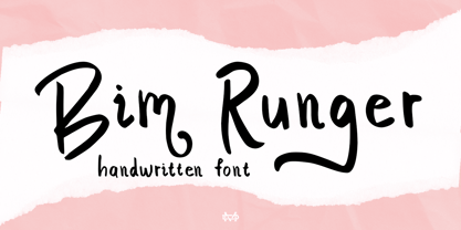 Introducing Bim Runger is a realistic handwritten font come with alternative and ligature and will be perfect for book, title branding, product packaging, invitation, quotes, label, poster, logo etc. Feature Uppercase & Lowercase Number & Symbol International Glyphs Multilingual support Alternative Ligature Thanks so much for checking out my shop and feel free to drop us a message any time and follow my shop for upcoming updates
 - Musical Score JNL by Jeff Levine,
$29.00 A number of pieces of antique sheet music utilizing the same Roman typeface were the inspirational basis for Musical Score JNL. This antique design closely resembles pen lettering and its hand-made charm due to the rounded stroke ends and varying character widths. Informal, yet attractive - the character design evokes the feeling of the turn of the previous century and simplicity of life at that time.
 - AT Borsnery by Amera Type,
$15.00 Borsnery is a decorative font that can be a great choice for your visual needs. With a modern vintage style, it can be more ideally used for posters, signage, and other visual branding needs And now we provide a different work than before, the first time for our fonts combined with well and carefully crafted illustrations. If you like and want this, please visit ameratype.com
 - NS Gibswing by Novi Souldado,
$35.00 Gibswing born based on the reference of old fancy lettering, vintage illustration, and victorian calligraphy. The Gibswing decorative style make it as an instant time machine to the era from 1800-1900 victorian visual style of the products, printed advertising, and signs back in the day. It will be a perfect companion of your classic visual direction for decorative sign, labels, branding, logotype, you name it.

