10,000 search results
(0.038 seconds)
- Geiger by WyldType,
$14.99 Geiger is a geometric typeface inspired by type found in the intros of Commodore 64 games, its attention to the grid and its limited set of building blocks. The design of Geiger respects these criteria to create a sturdy alphabet without diagonals, and loosen its grip on the classic limitations to produce a complete character set worthy of today`s high-resolution displays with a retro touch. The properties of classic computing platforms, like their limited memory and low-resolution displays, required that the designers and programmers of the time devise and use certain techniques to produce interesting visual results. These platforms offered limited sets of default building blocks from which to build more complex graphics and type, and some skilled coders would work around these limitations to produce the unexpected. One of the areas that saw experimental digital type flourish is the Commodore 64 intro scene. The Geiger family includes four styles (regular, oblique, bold and bold oblique), all include common ligatures (fi, ff, ffi, fj, fl, jj, tt, Th, TT) and a few stylistic alternates (K, L). A particular attention was paid to the pattern created by the vertical stem and negative spaces of tightly set text, especially for Geiger Bold. Geiger produces good results at a size of 30pt or more, but we suggest using it at higher display sizes.
 - Cubio Mono by R9 Type+Design,
$38.00 Cubio™ Mono is a new monospaced geometric sans serif inspired by the hexagonal silhouette of isometric cubes. We applied this angular form through all aspects of Cubio™ type design from the overall look of letters and icons down to the small details such as the end of each letter stem and hexagonal dotted lines. This font family comes in 3 weights/styles: 300 (Regular), 500 (Medium), and 700 (Bold). With over 1,500 glyphs, Cubio™ Mono not only supports most Latin-based languages, but also features an extensive set of UX/UI icons, and patterns. Cubio™ Mono is a versatile typeface for both digital and traditional designs. Perfect for packaging design, logo design, print design, store signages, UX/UI web & apps designs. Cubio™ Mono packed with features such as case-sensitive marks, punctuations and math symbols. It also comes with an extensive set of box/compartment drawing glyphs to help you create a unique modern design without even using the line tools. We designed the Cubio™ Mono font system with your convenience in mind. It comes with two sets of hexagonal dotted line and icon positions (Mid Cap Height and Mid X-Height ), so you don’t have to use the baseline shift command to set them to the perfect spots. To find out more about Cubio™ Mono Opentype features and type specimen, please visit www.r9typedesign.com
 - Woodford Bourne PRO by Monotype,
$25.99 Woodford Bourne PRO is the evolution of my original Woodford Bourne typeface that was inspired by the iconic stone cast letters on the façades of the 19th century Woodford, Bourne & Co. buildings in Cork City, Ireland. Woodford Bourne PRO has matured with numerous improvements to make it an even more versatile font family. The fonts have been completely redrawn and spaced, there are now an additional 500 glyphs for you to use across 9 stylistic sets. The additions include underlined caps, small caps, petite caps, catchwords, discretionary ligatures and more. Please view the specification sheet before you purchase to see all the glyphs and features. Key features: • Woodford Bourne PRO is a vintage geometric sans, optically adjusted for improved aesthetics and legibility 2 FONTS IN 1 – Use the default contemporary character set, or switch to vintage style with stylistic sets 9 Weights in Roman and Italic Thin | ExtraLight | Light | Regular | Medium | SemiBold | Bold | Black | Ultra Underlined Caps, Small Caps, Petite Caps, Catchwords, Discretionary Ligatures Full European character set 1000+ glyphs per font UPDATED JULY 2021 (v.3) Woodford Bourne PRO v.3 update includes numerous improvements including rebalanced /S/s/ glyphs to make them less ‘top heavy’. Italics have been redrawn to smoothe out irregularities. Improvements have been made to diacritics and glyph coverage now supports all Latin European languages.
 - Hierophant by Monotype,
$40.00 Hierophant is a humanist serif type family that has the heritage of classic Old Style and Transitional type while having the crisp lines and functionality of contemporary fonts. Its defining features include a high-contrast combined with diagonal stress, along with pinched stems and horizontals. This gives Hierophant a distinctive hand-drawn feel which also reflects the strong influence of the work of 16th century calligrapher Giovanni Francesco Cresci upon this family. OpenType features include stylistic sets of alternate glyphs – the first of which contains ornate teardrop serifs and ball terminals (ss01). This style dramatically changes the look of your typography and is ideally suited for short runs of text, headlines and branding purposes. Swash alternates for certain glyphs are available via Stylistic Sets 2 and 3. Other useful features include Small Caps at the click of a button, and Old Style Figures are an option to the default proportional figure style. There are 14 fonts altogether over 7 weights in roman and italic, you can also avail of two variable fonts which allow you to fine tune the weight to your exact liking. Hierophant has an extensive character set (1000+ glyphs) that covers every Latin European language. Key features: 7 weights in both roman and italic 112 Alternates Small Caps Variable fonts included with full family Full European character set (Latin only) 1000+ glyphs per font.
 - Jackalope LP by LetterPerfect,
$39.00 Jackalope is a new original script font from LetterPerfect Fonts. The design is a hybrid of pressure-pen calligraphy infused with whimsy and curlicue terminals. Letterforms are free-spirited and edges are rough, simulating spontaneous writing on rough paper. In addition to the full ANSI western character set, Jackalope includes a full set of small capitals, both lining and old-style numbers, and swash lowercase alternate characters that can be used as terminal letters at the ends of words for additional flourish. The genesis and realization of Jackalope was also a hybrid process. In 1996, LetterPerfect commissioned type designer Kathy Schinhofen to provide pen-written source material based on her commercial handwriting style and specifically on a logo she had designed for its "Viva la Fonts" line of script fonts. This work was digitized by LetterPerfect’s Garrett Boge and later fonticized by former Hallmark Cards type maven Myron McVay who unified the design and contributed additional characters. The design sat unfinished for over 12 years until Garrett Boge revived the project in 2010 filling out the extended character set. Jackalope is released in two versions: Jackalope LP Regular, which is the base font for continuous text setting; and Jackalope LP Expert, which includes swash variants, small capitals, and old-style numerals which can be swapped into text for extra flourish and effect.
 - Kadigan by Missy Meyer,
$12.00 Kadigan: (noun) A placeholder word. A kadigan can be used to substitute for any other noun: persons (John Doe, Acme Company), places (Anytown, 123 Main Street) or things (whatchamacallit, thingamajig). Just like kadigans can be used in nearly any situation, the members of the Kadigan font family can be used in nearly any design! These sans-serif beauties are clear and easy to use, but they also have a little bit of wiggle in their strokes and weights, for a fun hand-lettered look! The three members of the family: - Kadigan Light: An all-purpose lightweight stroke, with sharp corners. - Kadigan: A nice mid-weight stroke, with slightly rounded corners. - Kadigan Heavy: A thick, chonky stroke with pillowy rounded corners. And each member of the family is packed with features, including: - All of the basic stuff you expect from every font; - 340+ extended Latin characters; - Cyrillic character set; - Greek character set; - Those character sets? Support over 110 languages! - 52 double-letter ligatures for variety (That's right, EVERY letter. I'm looking at you, savvy revved trekkers!); - A full set of small caps (including Cyrillic & Greek); - And more! (Seriously, it was hard to stop.) So whether your work is in English, Español, български, ελληνικά, Türkçe, or over a hundred other languages, this cute and fun sans-serif may be just what you've been looking for!
 - Double Porter by Fenotype,
$30.00 Double Porter - an elegant font collection. Double Porter includes following: • 6 fonts - a clean and textured version of each. • Ornaments • Catchwords • Ending swash ornaments for the script Double Porter is a clean cut script font with five strong sans fonts. All the fonts are designed to work nice together. Here’s a short introduction to the fonts: • Double Porter 1 -Clean connected script with Swash Alternates for caps and lowercase letters with ascender or descender. The Script also has Contextual Alternates that add variation & make the flow smooth. Contextual Alternates are automatically on. • Double Porter 2 -Wide Sans Serif font. • Double Porter 3 -Bold version of Double Porter 2 • Double Porter 4 -Semi condensed Sans Serif • Double Porter 5 -Condensed Bold Sans Serif • Double Porter 6 -Serif version of Double Porter 5 • Double Porter 7 -Set of 60 icons and ornaments • Double Porter 8 -Set of 68 Catchwords • Double Porter 9 -Set of 62 Ending Swashes and Strokes designed to go with Double Porter 1 - the script. In addition there is a “Printed” version of every Double Porter font. Printed versions are named Double Porter P x. Printed versions are exactly the same but the shapes have rugged outlines and a worn-out texture. Double Porter has wide language support including West European, Central European, Baltic, Turkish and Romanian character sets.
 - Geminian by Sudtipos,
$49.00 Geminian is a set of fonts that started as a simple idea based on a theoretical level and developed during a long time, to be able to take shape under a creative impulse inspired by the need to communicate, today more than ever. From an astrological point of view, it celebrates and contributes to this practice, the study of stars position and movement and their influence on people's destiny. As a good Gemini, this set revives the main features of the opposite twins sign. Gemini is associated with thoughts, creativity, and communication. Its ruler Mercury (Hermes for the ancient Greeks), messenger of the Gods, and spokesman of the divine word, gives the natives of this sign intelligence, wit, eloquence and poetry. Geminian aims to be a medium to carry different messages from one end to the other. And this is because when using words, Geminis always surprise. Thanks to this gitf (and language and communication), they are able to bring up the most ingenious ideas, to solve any problem and to contribute new perspectives. These qualities may be the secret of its magnetism. The Geminian set comes in 5 styles including a script with multiple ligatures and alternates, 3 sets of caps and dingbats. In addition the complete font family supports a wide variety of Latin alphabet-based languages.
 - Kubrick by Quadrat,
$25.00 Kubrick is an experiment in extremes. The Light font is very tall and slender, the Black font is very massive, and Kubrick's slender counters push some of its glyphs to the edge of recognition. The thin counters and negative spaces also give text set in Kubrick a definite visual sparkle, especially in all-uppercase settings. Because of its extreme letterforms, Kubrick is recommended only for large display use. The default letterspacing is set fairly wide to keep text legible. Kubrick was a double-experiment. One part of it was to see how heavy and massive a typeface I could make while still keeping it legible. The other part was to develop a Multiple Master font. Multiple Master fonts were a format developed by Adobe that allowed the user to change things like the weight and width of a typeface. Monollith started as just such a Multiple Master typeface, but when Adobe discontinued the Multiple Master format, I stopped work on the typeface. Later I decided to continue work on it, but as five separate font weights: Light, Medium, Bold, ExtraBold and Black. Very rectilinear letterforms with extremely narrow counters and negative spaces. The five fonts go from very thin and condensed to very heavy and extended. Use in large display settings where unornamented high visual impact is desired.
 - Letterpress Studio by Fenotype,
$15.00 Letterpress Studio -Crafted Vintage Goods Letterpress Studio includes following • 7 fonts - a textured and clean version of each • Ornaments • Catchwords • 25 Logo Templates Letterpress Studios core is seven fonts - textured and clean version of each. Fonts are designed in same proportions and work great together. Here’s a short introduction to the fonts: • Letterpress Script -A connected script with lot’s of OpenType features • Letterpress Script Bold -Bold version of Letterpress Script • Letterpress Condensed -A condensed sans-serif typeface with swash uppercase characters on • Letterpress Gothic -A sans-serif typeface with swash uppercase characters • Letterpress Sans -An extended sans-serif typeface with swash uppercase characters • Letterpress Wood -A woodcut style serif typeface with swash uppercase characters • Letterpress Black -A black woodcut style serif typeface with swash uppercase characters • Letterpress Ornaments -A set of pictograms, ornaments, borders and badges (OTF, AI & PDF) • Letterpress Catchwords -A set of over 100 woodcut-style catchwords (OTF, AI & PDF) All fonts have West European, Central European, Baltic, Turkish and Romanian character sets. Fonts come in OTF format. TTF are also available but OpenType features won’t work with them. Letterpress Templates -25 templates (AI) Letterpress Templates is a set of 25 ready made compositions with font pairings, shapes, ornaments and ready made 2-4 color schemes for each. Templates can be used as such or as a starting point for your own project. Download Letterpress Templates here.
 - Hard Block - Unknown license

- Ash - Unknown license

- CHEESE - Unknown license

- Zothique Demo - Unknown license

- TMBFont - Unknown license

- Tortillon Tryout - Unknown license

- Boulons Tryout - Unknown license

- Tyrfing Demo - Unknown license

- Daresiel Demo - Unknown license

- Aeterna by Dawnland,
$13.00 Hand drawn, sketchy antiqua that come in two font variants: Regular, Small caps with old style figures. Æterna was revised 2012 and now hold a full character set of basic english/latin letters and west european diacritics!
 - Litfass by RMU,
$30.00 Litfass is a revival which follows a turn-of-the-century German Art Nouveau font, once released by the Flinsch Foundry. To get access to all ligatures, it is recommended to activate both Standard and Discretionary Ligatures.
 - Emotional Expression by Seemly Fonts,
$14.00 Emotional Expression is a cute and simple lettered handwritten font. It can easily be matched to an incredibly large set of projects, so add it to your creative ideas and notice how it makes them stand out!
 - Dizzy Boy by Mchcrafter,
$14.00 Dizzy Boy is a cool and thin lettered display font. It can easily be matched to an incredibly large set of projects, so add it to your creative ideas and notice how it makes them stand out!
 - Missale Lunea by astype,
$36.00 Missale Lunea is a calligraphic uncial typeface with a female note. The font offers lots of stylistic alternates, signs, zodiacs & symbols. OpenType features: stylistic alternates signs, zodiac & symbols, proportional, medieval numerals, Roman numerals numerators, denominators and fractions
 - Animal Paws by Beary,
$14.00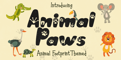 Animal Paws embodies fun, quirkiness and authenticity. This enchanting handwritten font features gorgeous animal-themed characters that will turn any creative idea into a true standout. Get inspired by its unique look and create gorgeous crafting projects!
 - Coconut Milk by Susan Brand Design,
$10.00 Coconut Milk Script is a fun new handwritten font with lots of personality. It contains multi-lingual support with accented characters for international Western European users, as well as a special double "tt" ligature and stylistic alternative.
 - Clear Prairie Ornaments by Quadrat,
$25.00Clear Prairie Ornaments were designed as a set of ornaments and border elements to complement Clear Prairie Dawn. Many of the glyphs are based on rural and urban prairie motifs, including stars, wheat and even stylized outhouses. - Asterism by Great Lakes Lettering,
$30.00 Asterism is a calligraphy style font with a moving baseline and lots of shining personality. This hand written style font is based on one of Molly’s signature calligraphy styles and pairs beautifully with Frosted, Icing, Saint Agnes.
 - Mortised Vignettes by Intellecta Design,
$23.00 Mortised Vignettes is a set of classic decorative elements researched in the victorian heritage typography. A collection of 136 beautiful ornaments to make everything you need : frames, borders, headpieces, tailpieces, fleurons, tags, with a classic vintage feeling.
 - Vauxhall NF by Nick's Fonts,
$10.00 Get your groove on with this trippy little gem, based on a Fotostar face called Angelica. Not for the faint of heart. Both versions support the Latin 1252, Central European 1250, Turkish 1254 and Baltic 1257 codepages
 - Z-Rex by Cool Fonts,
$24.00 Z-Rex looks like the copies I was getting from a lousy copier before I threw it out. You might think it has been eaten by a T-Rex, or maybe it looks like swiss cheese blech.
 - Copenhagen Grotesk Nova by David Engelby Foundry,
$15.00 Copenhagen Grotesk Nova is based on its 2015 predecessor (Copenhagen Grotesk). The Nova edition is carefully designed with new details, a simpler set of glyphs and with moderate descenders and ascenders in relation to less accentuated capitals.
 - Cross Stitch Medieval by Gerald Gallo,
$20.00 Cross Stitch Medieval is not intended for text use. It was designed specifically for use as fancy monograms or initials. Cross Stitch Medieval has an uppercase alphabet, 9 stitches tall, located under the shift+character set keys.
 - Montreuil by Viswell,
$16.00 Montreuil is an elegant signature font, created with the natural effect of handwriting, stylish. This font can be used for business cards, quotes, branding and more. Montreuil has multi-lingual support and contains a lot of ligatures.
 - Venus by Linotype,
$29.00The Venus type family is a historic hot metal face with left slanted weights that is used for the german cartographic map production. There are also special typefaces required like the Roemisch and Topografische Zahlentafel type family." - FT Digital Kauno by Fenotype,
$19.95 Digital Kauno is a soft geometric script type. It is recommended for headlines and display use. Digital Kauno was originally designed in 2002 and it has now been redesigned with full character set and more distinctive letters.
 - Kairengu by insigne,
$15.95Kairengu is a casual and lively rounded sans serif. The characters are "gloopy" as if ink was poured onto page surface. Kairengu is a great choice whenever you need an amusing face with a lot of character. - Nonantza Sans by Ixipcalli,
$26.00 Nonantza Sans is a sans serif style. It comes in four weights and features an extended character set with open type support for European languages. Use Nonantza Sans for your graphic design projects, advertising, banners and signs.
 - Watershed by Epiclinez,
$18.00 Watershed is a stylish script font. It has Open Type features such as Stylistic Sets, Ligatures, and Swashes. This font is also multilingual and PUA encoded. Use it for any design projects that require a charming appearance!
 - Gerson Rand by Device,
$39.00 A sharp, corporate font with a clean, modern machine-aesthetic. Suitable for forward-looking company brochure headlines, contemporary and futuristic movie posters, logos and more. Incorporates a full international character set and alternate designs for many letters.


