10,000 search results
(0.039 seconds)
- Fregata Sans by Estudio Calderon,
$14.99 A modern and funny pack with 4 handmade script and sans fonts that started in the sketchbook and finished in the computer. Fregata has a unique and beatiful look to be used in many design projects as: cover books, labels, logos & branding, advertisements & product design. When you get this pack you will receive 4 font files, designed to work as perfect companions or simply as strong standalone typefaces. Fregata Script Inline: A unique style with a different look thanks to the line that connects the whole typographic system. Fregata Sans: Includes 3 handmade fonts variables (Fregata Sans 1, Fregata Sans 2, Fregata Sans 3) with small rounded serifs making it a modern and fun typography. Fregata is equipped with ligatures and all stylistic alternates, extended character set to support Central and Eastern European as well as Western European Languages. That's it! I really hope you enjoy it, and please don't hesitate to send us a message if you have any comments or questions. Enjoy Fregata!
 - Cobbler by Juri Zaech,
$30.00 Cobbler is a friendly type family in six weights. With proportions of geometric type, Cobbler is a contemporary sans on the inside and an ultra soft display typeface on the outside. Not a single sharp corner and only a hand full of straights make Cobbler extra warm and huggable. In fact, the few straight horizontal lines give the typeface the stability of a workhorse while keeping the gooey playfulness that characterizes Cobbler so much. And to make all this even more fun, there is a pile OpenType features built in. For example loads of Discretionary Ligatures that make capital letters interlock left and right – just fun! Or automatic fractions, case sensitive punctuation and contextual alternates – for serious typesetting. Cobbler works great for branding, packaging, editorial or any display application – and it comes with an expansive character set that covers Underware’s Latin Plus and with it over 200 languages. Furthermore Cobbler is manually kerned and auto-hinted for crisp display on screen also in small sizes.
 - The Duck by Shakira Studio,
$19.00 Say hello to new serif font, The Duck! The Duck is a Groovy Retro Font. Create bold, gorgeous headlines and elegant designs with a vintage flair. George's contrasting lines and curved terminals give a sleek, elegant look to logos, holiday cards, wedding invitations, quotes, advertisements, and more. The Duck has full set of modern uppercase and lowercase letters, numerals, punctuation, also multilingual symbols. It included opentype features like ligature, alternate and many others. Here's what you get: Regular and Outline All Multilingual symbol Opentype features ( ligature, alternate ) Accessible in the Adobe Illustrator, Adobe Photoshop, Adobe InDesign, even work on Microsoft Word. PUA Encoded Characters - Fully accessible without additional design software. Multilingual character supports : (Afrikaans, Albanian, Catalan, Croatian, Czech, Danish, Dutch, English, Estonian, Finnish, French, German, Hungarian, Icelandic, Italian, Lithuanian, Maltese, Norwegian, Polish, Portuguese, Slovenian, Spanish, Swedish, Turkish, Zulu) Follow my shop for upcoming updates, and for more of my work, Thank you!
 - BUNK by AdultHumanMale,
$20.00 BUNK is an 11 font system that can be layered in different ways to create various classic titling effects, think Old Timey signage 'COME IN WE'RE OPEN'. It's a display font that produces the different results by mixing and matching the various fonts together. Bunk's layer combos give you the control to create brilliant bevel, convex and 3-D styles. Each font contains the same metrics, so when your title is set, copy and paste-in-place to create layers of different weights/styles to build out your desired effect. Unlike other Layered Fonts out there, BUNK has upper case and lower case as well as currency symbols and lots of foreign characters too. Over 180 glyphs!. Five of the fonts (Shades 1,2,3,4,5) are clearly dependent on each other to create a complete font, so theses are only available in the Full family pack (11 fonts) or in the Layer Kit Family pack (7 fonts).
 - Moving Headlines JNL by Jeff Levine,
$29.00 For decades, visitors to Times Square could look up and read the up-to-the-minute news flashes that moved across a giant electric sign on the face of the old New York Times Building (now known simply as One Times Square). According to Wikipedia's article on OneTimes Square: "On November 6, 1928, an electronic news ticker known as the Motograph News Bulletin (colloquially known as the "zipper") was introduced near the base of the building. The zipper originally consisted of 14,800 light bulbs and a chain conveyor system; individual letter elements (a form of movable type) were loaded into frames to spell out news headlines. As the frames moved along the conveyor, the letters themselves triggered electrical contacts which lit the external bulbs (the zipper has since been upgraded to use modern LED technology)." An example of this was seen in the 1933 Warner Bothers film "Picture Snatcher" starring James Cagney. This example inspired Moving Headlines JNL.
 - Bitlamero Script by ijemrockart,
$15.00 Bitlamero Script is a handwritten signature typeface that comes with more than 389 stylistic ligatures. Its classy energetic look makes it the perfect fit for feminine logos, printed quotes, invitation cards, social media headers, product packaging and a lot more! Files Included: - Bitlamero Script.otf - Bitlamero Slant.otf - Bitlamero Bold.otf - Bitlamero Bold Slant.otf Characters included: - Basic Latin A-Z and a-z - Numbers - Symbols - Stylistic Set - Ligature - PUA Encode - Multilanguage Support To enable the OpenType Stylistic alternates, you need a program that supports OpenType features such as Adobe Illustrator CS, Adobe Indesign & CorelDraw X6-X7. There are additional ways to access alternates, using Character Map (Windows), Nexus Font (Windows), Font Book (Mac) or a software program such as PopChar (for Windows and Mac). For use in office word, you all can read the following article. http://www.magpiepaperworks.com/blog/using-opentype-fonts-in-microsoft-word/If You have any question, don't hesitate to contact me by email: ijemrealmad54@gmail.com
 - Flatline Sans by Up Up Creative,
$15.00Introducing Flatline, an elegant, modern sans serif font family. Meticulously drawn with high contrast between thick and thin strokes with the goal of making even the simplest sans serif letters look sensual, elegant, and warm. It’s perfect for headlines, editorial uses, and advertising projects. Makes beautiful luxe logos and wedding invitations, too. Flatline includes six styles (three weights each in both roman and italic), each of which includes nearly 500 glyphs. OpenType features include 20 standard and discretionary ligatures, a small number of character variants, three figure sets, four ampersand styles, and multilingual support (including multiple currency symbols). The OpenType features can be very easily accessed by using OpenType-savvy programs such as Adobe Illustrator and Adobe InDesign. (You can also access most of these features in Microsoft Word and other similar programs, but you'll need to get comfortable with the advanced tab of Word's font menu.) Find inspiration (and sneak peeks at my next font-in-progress) on: Instagram: http://instagram.com/julieatupupcreative My website: http://upupcreative.com - ITC Kendo by ITC,
$29.99 ITC Kendo is the work of British designer Phill Grimshaw, suggesting the dash and verve of quick, sketchy calligraphy, complete with splatters of ink. Grimshaw says he worked deliberately against his own habits to create the forms, drawing the letters with slow deliberation" and a pointed pen. He overloaded the pen with ink and drew on rough paper, "applying a lot of pressure at the beginning of a stroke and easing off towards the terminals. Accidental splashes occurred frequently owing to the nib catching the 'tooth' of the paper." Those splashes were refined into features which enhance but do not overwhelm the characters and carefully worked so as not to leave an obvious white strip of unsplattered space between lines and letters. The initial capitals can be used alone or combined with the lowercase alphabet, and the font includes a full set of f-ligatures and some extra ligatures as well as decorative elements."
 - Shopping Script by Roland Hüse Design,
$15.00 Shopping Script is designed after and inspired by my handwritten shopping list that was originally a lot less stylish, I have written each words multiple times to achieve the organic and natural flow with a bit spaced out style. This font is an existing work of mine that came in only one weight. Now I added multiple weights I as well as expanded and condensed instances, along with a weight and width variable font file that can be set to anything in between Thin Condensed to Heavy expanded. There are standard ligatures for it, jt, ll and tt, stylistic alternates for uppercase "A" and lowercase "e". For lowercase r and s there are contextual/initial variants when they are first letter of a word. A guide of open type features and how to activate them is available at https://drive.google.com/file/d/1q4j4X8ZntqgEUB8gUmflUNtmlX4IVQBq/view?usp=sharing Most latin based languages are covered from Western European to Eastern.
 - Due Giorni by Eurotypo,
$80.00 “Due Giorni”, two days in italian language, express a measurement of time, it can be little or a lot, depending on who or what it is used for. “Due Giorni” is a script font very expressive, fresh, agile and dynamic, hand-drawn with connected forms on slanted angle of 23º This font contain 542 glyphs with plenty OpenType features: Standard and discretionary ligatures, stylistic alternates, swashes, Old style figures, small caps, case sensitives and ornaments. It come also, with three kind of capitals: Roman Capitals, Small Caps (different proportions) and Swashes. Roman Capitals are inspired on the beautiful inscription found in the Augustorium’s house in Ercolano, Naples.those letters have been carefully drawn and sculpted. Swashed Cursive Capitals are similar to 18th century penmanship. “Due Giorni” is a versatile font that may give you the chance to create original logos and headlines, specially by many stylistic sets, ligatures and alternates that can be combined with them.
 - VVDS My Spellbound by Vintage Voyage Design Supply,
$10.00 My Spellbound an authentic groovy typeface. So, The Stranger Things series is already watched and you'll waiting the last one season for another two years. Well, if you miss for late 70s or early 80s in your design – this one is for you. Smooth, groovy and playful – exactly for your vintage projects. This typeface will suit for the display block texts like package labels or will be perfect for an any display header. Create a vintage t-shirt print or make groovy stickers - Spellbound will suits perfectly. A lot of alternates will give you a really wide range of results. You may combine it with Italics and get a really playful pair. Two characters for any caps and up to 6 alternates for lowercases. Regular and true Italic Open Type Features Multilingual I would really love to see what you create with my products, so please feel free to tag me @vintagevoyagedesign on Instagram. Happy creating! Thank you.
 - Mandelia by Type Innovations,
$39.00 Mandelia was created by Alex Kaczun, an American type designer, in 2010. The typeface was named in honor of Nelson Mandela, former president of South Africa, for his “shining example of the incredible strength of the human spirit to persevere in the face of adversity for the pursuit of freedom”. Mandelia is a strong, bold and wide-bodied serif typeface design, reminiscent of the great African landscape with its diverse animal life. It’s easy to see the influence of the 'Rhino' sharp serifs and ‘Elephant’ size stems and proportions. The font commands attention and respect. Great for headlines that pack a punch, logos, posters, and signage. And because it was well designed, it can even be used in body copy at various point sizes. Mandelia is available in Opentype format for both Mac and PC, and comes complete with true drawn small caps, old style figures and Unicode Latin 1252 and Central European 1250 character sets. It has everything you need to get the job done.
 - Armature Neue by fontBoy,
$15.00 Armature Neue is an extension and clarification of the original Armature family released in 1997. We made the distribution of weights more even, and added italics extra light and black weights. Originally consisting of four fonts, Armature Neue has twelve: six weights with accompanying italics. Although conceived as a display face, a number of alternate characters are included that can be used to regularize the type for text setting. Armature is one result of my interest in typefaces that are constructed, rather than drawn. Although it is basically a monoline design, there are subtle details throughout that compensate for a monoline’s evenness. As with all fontBoy fonts, there are dingbats hidden away in the dark recesses of the keyboard. When I first started designing this face in 1992, I called it Dino-I thought I would name all my fonts after famous pets-so the dingbats for Armature are dinosaurs. Designed by Bob Aufuldish with editing and production by Psy/Ops.
 - Front Desk by Aah Yes,
$12.00Front Desk is designed to be easily readable, its increased legibility coming from the slightly enlarged lower case letters (a greater x-height) which make it easy on the eye. Also it is slightly slanted (but a lot less than a normal italic angle) to give it a more informal and modern look than a perfectly upright font would be, which is also intended to contribute extra dynamism while reading. Five available weights give adequate variation, and there are some Condensed and Expanded varieties in the complete set. A primary feature of this font is that the serif bases and tops are not indented or concave, which gives clear straight edges to the serifs, and the removal of this complexity adds to the clean lines and crispness of the font. The package contains both OTF and TTF versions - install either OTF or TTF, not both versions of a font on the same machine. - Proper by Scholtz Fonts,
$17.00Proper was based on handwritten characters (of my own) that I scanned and then digitally touched up. I kept the digital editing to a minimum so as to preserve the freshness of the original. I did, however, want to convey a sense of propriety and regularity and so my original handwriting was done with quite a lot of control. I kept the size of the lower case characters quite large and this makes the font very readable, even at quite small point sizes. Proper may be used when you need clean, legible text, with a natural look, e.g.: -- magazines aimed at the natural health market -- "natural look" fashion pages -- "natural look" decor pages -- natural food products -- natural beauty products -- children's books -- packaging for children's toys, games etc. -- educational material -- comics Proper contains a full character set with all upper and lower case characters, numerals, symbols, accented characters and it has been carefully spaced and kerned. - Melya by Stripes Studio,
$12.00 Melya Script, a modern hand writing, I hope you are interested in this font. It can be used easily and simply because there are a lot of features in it and contains a complete set of letters in lower and uppercase, assorted punctuation, numbers, and multilingual support. It also contains several ligatures and alternate style stylistic characters. To enable the OpenType Stylistic alternates, you need a program that supports OpenType features such as Adobe Illustrator CS, Adobe Indesign & CorelDraw X6-X7, Microsoft Word 2010 or later versions. And there are additional ways to access alternates/swashes, using Character Map (Windows), Nexus Font (Windows), Font Book (Mac) or a software program such as PopChar (for Windows and Mac). How to access all alternative characters using Adobe Illustrator: https://www.youtube.com/watch?v=XzwjMkbB-wQ How to access all alternative characters, using Windows Character Map with Photoshop: https://www.youtube.com/watch?v=Go9vacoYmBw Melya Script has given PUA unicode. Thank you for your purchase!
 - Data Error AOE Pro by Astigmatic,
$24.00 The Data Error AOE Family was one of my earliest typefaces, at a time when I had become obsessed with all forms of "digital/techology" typestyles. It's been awhile since the early 2000's, but I've had a hankering for awhile now to revisit this typeface, giving it a more expansive language character set and fill it out with some Opentype features. Inspired by some old printouts of BASIC programs and an Atari 1050 Disk Drive manual with pin printer examples, comes the familiar yet oddly restricted style with this Data Error family. This family comes complete with Regular and Bold versions with their respective Oblique versions. Odd pin printer restrictions inherent in this typeface are: no characters extend below baseline or above ascender line, (except international accents). A nostalgic typeface for computer programmers everywhere, strong and legible at any size, Data Error is perfect for so many purposes, get it today!
 - Aragon ST by Canada Type,
$39.95 Aragon ST is a special version of Hans van Maanen’s Aragon family. It was developed for science writing, and it serves as the very first introduction of SciType, an innovative new way of building fonts specifically for typesetting science text. For more information about SciType, please consult the SciType FAQ PDF in the Gallery section. The Aragon design is a remodelling of the classic mid-1500s Garamond forms through a modern lens. It is a text workhorse that performs very well in a variety of sizes, from footnotes and legal copy to lengthy, immersive-reading body sets. Its efficient and legibility-asserting traits are wedge serifs and uniquely tapered stems that slightly shift the weight stress to the top half of the forms while maintaining the clarity and synergy of the counterspace’s sequence. Aragon ST takes all that a step further for science writers. For details about the functionality of Aragon ST, please consult the Aragon ST Access Chart PDF in the Gallery section.
 - MVB Greymantle by MVB,
$39.00Kanna Aoki had fairy tales in mind when she designed MVB Greymantle. She drew dots with a felt pen to build up the forms, giving them their particular rough character. The “Extras” font contains a set of whimsical illustrations, including a portrait of Greymantle—her 18-pound cat, a set of curly initial caps, and border parts. MVB Greymantle has been spotted on numerous children's books, in magazines, in salad dressing advertisements, and on food packaging. - Moire by Microsoft Corporation,
$39.00Moire™ Regular is a block-style sans serif font designed by Jim Ford in the spirit of typefaces popular during the 1950's. The Moire Regular font is slightly more streamlined for a more contemporary voice than its predecessors. Moire Regular is useful for all modern display settings in signs, publications, reports and presentations. The Moire Regular font will also reproduce well in on-screen uses from User Interfaces to web graphics. Character set: Latin 1. - Empire Display by Bean & Morris,
$27.50 Empire Display is a sans serif italic display face which references the styling of the 30s through to the 50s. It has a large x height and with its condensed proportions makes it ideal for headlines, posters or where large size settings are required. It has the unique feature of having the stems and cross bars slightly angled top and bottom. This also helps to create the art deco/modern feel that sets it apart from standard condensed typefaces.
 - Sonora by profonts,
$51.99 Sonora is a brandnew profonts script typeface family supplied in the new OpenType Pro font format. Sonora contains six styles as light, medium, bold and the corresponding italics. The character set covers about 1.500 glyphs for the complete Latin character set (West, East, Baltic, Turkish, Romanian), and a huge number of handmade ligatures and alternates to make it a perfect OpenType Pro connecting script. Sonora is a very distinguished, elegant and versatile, intentionally non-slanted script font.
 - Last Midnight by The Ampersand Forest,
$45.00 Suggested by J.M.Bergling’s 1917 “New Romeo Initials, Last Midnight is a display face created in a distinctive pseudocalligraphic Belle Époque style that we’ve come to associate with beloved fairy tales. Rich in typographic goodies, with two additional stylistic sets and a host of standard ligatures, Last Midnight now even has a Roman small caps set in both smooth and rough varieties — great for all of your tale-telling, folkloric, swashbuckling, & spellcasting needs! Part of The Ampersand Forest's Sondheim Series.
 - Folkloric by Inumocca,
$20.00 FOLKLORIC is A Retro Sans-Serif Style They were particularly common in the 70s, this is a great choice for expressing a summer. The Typeface comes with Stylistic Set and Ligature Combinations Exellent typeface to use for covering your Project, like Branding, Movie Title, Headline Letter, Bookcover or Book Content, Magazine cover, Poster, Quotes Lettering, Logos, and more your project design. - Unique glyphs - Multilingual Characters Support - UPPERCASE - Lowercase - Numeric - Symbol - Punctuation Character - Ligature - Stylistic Set inumocca type
 - Ruling Script by Linotype,
$29.99Prof. G. Pott’s Ruling Script first appeared in 1992 with Linotype-Hell. The font is a part of the package Calligraphie for Print, which also contains Sho and Wiesbaden Swing. Calligraphie for Print 2 completes the set. These packages offer modern calligraphy fonts particularly well-suited to use in posters, magazines and advertisements. Ruling Script looks like the zestful handwriting of a calligrapher but its legibility even in longer sentences set it apart from others of its type. - Aquari by Dominik Kowalik,
$50.00 A geometric typeface. Smooth corners are mixed with straight angles to form a strong. These make Aquari ideal for almost any type of graphic design. Its unique look is well suited for corporate identity, its precise drawing for branding and poster design. The character set includes various OpenType features and a broad language support with German and Polish special signs. Details include 3 weights, with European character set, manually edited kerning, stylistic alternatives and Opentype features.
 - Sanelma by Melvastype,
$35.00 Sanelma is a brush script inspired by Hot Rod lettering and sign painting. Sanelma is a very versatile script: It includes two different styles of end swashes, swash caps, small caps, lots of alternate characters and underline option. All in all it has over 1,200 glyphs. Sanelma is bouncy and smooth and has a very organic feel. You have a lot of options to customize it and that makes it perfect for logos, packages and titles.
 - Ouachita Way NF by Nick's Fonts,
$10.00One in the series of fonts called Whiz-Bang Wood Type, intended to be set large and tight. Ouachita Way is an ultrabold and boxy caps and small caps font, especially well-suited for commadning headlines. Based on nineteenth-century “Grecian” fonts, the name comes from a forest and a river in Arkansas. Both versions of this font contain the Unicode 1252 Latin and Unicode 1250 Central European character sets, with localization for Romanian and Moldovan. - Portland Grotesk by QUADRAAT,
$35.00 Portland Grotesk is a grotesque sans serif typeface with chubby proportions in 5 weights Light - Regular - Medium - SemiBold - Bold and supports all latin languages. Easy to use and easy to read. The character set contains 1109 glyphs with a wide range of alternates characters and includes: - Small Capitals - Fractions - Superiors, denominators - Open type features such as case sensitive, standard ligatures and several stylistics sets Portland Grotesk fits perfectly for all types of communication (Books, magazines, posters)
 - SK Lisovik by Shriftovik,
$32.00 SK Leshiy is an authentic monumental font inspired by ancient Slavic legends and fairy tales. This font combines geometric and natural forms, each of its symbols creates a unique image of a fabulous creature that hides in the forest thicket. The SK Leshiy font has a basic and alternative character sets that allow you to expand the font's capabilities and its decorative functions. The font supports a multilingual set and an extended table of Cyrillic and Latin characters.
 - Bright Sunshine by Mindtype Co.,
$15.00 Introducing the "Bright Sunshine" script font. New fashionable handwriting font and super cool with sexy style. And also the Capital letters set with contemporary and sophisticated accents. Bright Sunshine offers beautiful typographic harmony for a diversity of design projects, including logos & branding, wedding designs, social media posts, advertisements & product designs. "Bright Sunshine" includes Italics, full set of lovely uppercase and lowercase letters, multilingual symbols, numerals, and punctuation. And this Font has given PUA unicode (specially coded fonts).
 - Nouveau Crayon by Hanoded,
$15.00 Nouveau Crayon is based on Crayon Crumble, a font I made a long time ago. I changed a lot of glyphs and added a whole bunch of new ones. It has become quite a good looking font to be honest: oodles of crayon goodness, heaps of crumbling bits and a lot of expression. Use it for cafe websites, restaurant menus, children’s books, art fair posters and whatever else you fancy. Nouveau Crayon comes with abundant language support.
 - Bravado NF by Nick's Fonts,
$10.00 This growing family of friendly faces is based on the typeface Bravour, designed in 1913 by Martin Jacoby-Boy for the D. Stempel AG foundry in Frankfurt am Main. The wide stance and very large x-height shared by the family members makes them warm and inviting, and equally suitable for use in headlines or text blocks. All versions of this font include the Unicode 1250 Central European character set in addition to the standard Unicode 1252 Latin set.
 - Santa Fe by profonts,
$51.99 Santa Fe is a profonts script typeface family supplied in the new OpenType Pro font format. Santa Fe contains six styles as light, medium, bold and the corresponding italics. The character set covers about 500 glyphs for the complete Latin character set (West, East, Baltic, Turkish, Romanian), and a large number of handmade ligatures and alternates to make it a perfect OpenType Pro connecting script. Santa Fe is a very distinguished, elegant and versatile, intentionally non-slanted script font.
 - Bogart by Zetafonts,
$39.00 All the nine weights of Bogart, as well the matching true italics forms, feature an extended charset of over 1600 glyphs, covering 219 languages using latin, cyrillic and greek alphabets, and sporting a complete set of Open type features. To add flexibility for editorial usage, a text-oriented Bogart Alternate set of nine weights was added to the family keeping the design more similar to its modern old style model and allowing for a heavy readable mid-weight range.
 - Siarog by Linecreative,
$16.00 Looks simple and powerful. This is the reason why we want to offer you the Siarog font. This font gives off a clean, powerful and very elegant feel. This font is perfect for use in headlines, posters, branding, titles, and other graphic designs. What you get dear, you will get : Siarog- A clean San serif font including Upper & Lowercase characters(ALL CAPS), Stylistic alternates Character (11 Character) Supports Multi linguage (Latin Western Europe), Numbers and Punctuation
 - Beautiful Heart by Garisman Studio,
$20.00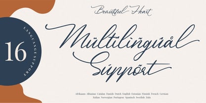 Beautiful Heart is a calligraphy script font and is perfect for logos, invitations, stationery, wedding designs, social media posts, advertisements, product packaging, product designs, labels, photography, watermark, special events or anything. Beautiful Heart comes with full set of uppercase and lowercase letters, multilingual symbols, numerals, punctuation. - Ligature - Stylistic Alternates, Stylistic Sets, and Swashes - Natural brush touch - PUA Encoded open - Support for MAC or PC - Simple installation for Adobe Illustrator, Corel Draw, Photoshop, or Procreate (New Updated)
 - Brushstrike by Zetafonts,
$39.00 The Brush Strike Family is an exercise in dynamic, gestural brush type design by Francesco Canovaro. The typeface contains no lowercase set, but it doubles the uppercase with a strikethrough alternate set to be used for dynamic logo design and unusual word highlighting. Two weights are available with consistent design: the light weight (Brushstrike Light aka Lightstrike) can work together with the heavier regular weight but can also be used in white on dark background for light effects.
 - Hareer by Attractype,
$14.00 Hareer is an attractive and simple script font, it is carefully crafted to make your text look beautiful. This font is suitable for various projects, for example: posters, invitations, weddings, greeting cards, business cards, logos, quotes, fashion, blog headers, branding, letters, stationery, etc. Hareer has the main features Stylistic set of capital letters and several ligatures. You can access it by activating Stylistic Alternates, Stylistic Set or accessing directly on PUA Encoded “Private Use Area” (custom coded fonts) glyphs.
 - Frizzy by Gleb Guralnyk,
$15.00 Frizzy is a classic look vintage style font with a big set of additional characters. Lowercase letters have 4 stylistic sets with different shapes. Uppercase letter has two additional glyphs with upper and lower swashes. All those features can be found in the OpenType panel. Five extra swashes are available in the glyphs panel. When combining all of this features, you can create an interesting and unique lettering compositions. Thank you and have a nice day!