10,000 search results
(0.036 seconds)
- Viking Initials by Wiescher Design,
$19.50 Viking Initials are pure brute-force blackletter initials of the time just before the Nazis started to rule, somehow these initials are typical for that period. I made one alphabeth-set with rough edges on the uppercase keys and a second set with sharp edges on the lowercase keys. For you to choose. Your historical designer Gert Wiescher
 - San Marcos NF by Nick's Fonts,
$10.00In his book Victorian Display Alphabets, Dan X. Solo called this specimen "Marquette". This unicase version features a complete character set, and is named after a favorite watering hole in Texas on the Guadeloupe River. Both versions of this font contain the Unicode 1252 (Latin) and Unicode 1250 (Central European) character sets, with localization for Romanian and Moldovan. - Society Page NF by Nick's Fonts,
$10.00This elegant face with a few semi-script flourishes is based on Morris Fuller Benton’s Announcement Roman, designed for American Type Founders in 1917. It’s perfect for invitations, programs and all kinds of formal ballyhoo. All versions of this font include the Unicode 1250 Central European character set in addition to the standard Unicode 1252 Latin set. - P22 Pop Art by P22 Type Foundry,
$24.95 This font set was developed for the Albright-Knox Art Gallery and is inspired by their collection of Pop Art. Artists such as Warhol, Lichtenstein, and Rauchenberg sought to blur the lines between high and low art as well as the boundaries between art and everyday life. The alphabets and extras in this set reflect that spirit.
 - Contraban by Arendxstudio,
$16.00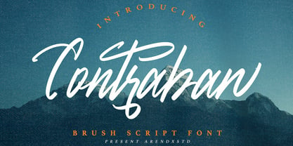 Introducing a Contraban Brush script fonts with sharp and beautiful letters that create fonts that are modern, tendy and elegant. Contraban came with opentype features such stylistic alternates, stylistic sets & ligatures good for logotype, poster, badge, book cover, tshirt design, packaging and any more. Features : • Character Set A-Z • Numerals & Punctuations (OpenType Standard) • Accents (Multilingual characters) • Ligature • Alternate
 - Buchfraktur by RMU,
$25.00 The late-19th and early-20th century standard blackletter family in Germany, in three weights. To get access to all ligatures, it is recommended to activate both Standard and Discretionary Ligatures. You find the round s on the # key, and by typing the combination N-o-period and activating the OT feature Ordinals you get the numero sign.
 - IngyArrows by Ingrimayne Type,
$10.00 IngyArrows is a set of three fonts with three sets of arrows, with one of them a blend of the other two, where normally there are standard numbers, letters, and punctuation marks. The revision of 2011 added many of the arrows that exist in several places in the unicode codings and that cannot be accessed by normal keystrokes.
 - Geomee by Font-o-Rama,
$9.00Geomee is a modern and square type family which works for headlines as well as for copies. It is influenced by modern pixel typography but the typeface still relies on the basic rules. Very special are three basic cuts which are set up on the same upper case character set but differ in the x-height. - Oregon Street by Arendxstudio,
$15.00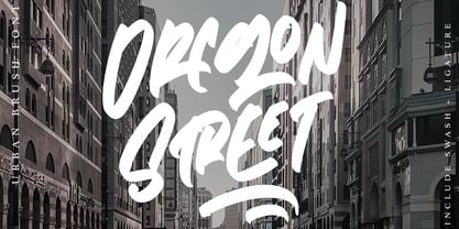 Oregon Street - Urban Brush Font with its distinctive character that can be easily implemented in your various design projects . Oregon Street came with opentype features such stylistic alternates, stylistic sets & ligatures good for logotype, poster, badge, book cover, tshirt design, packaging and any more. Features : • Character Set A-Z • Numerals & Punctuations (OpenType Standard) • Accents (Multilingual characters) • Ligature
 - Argentina NF by Nick's Fonts,
$10.00This elegant titling face is based on an American Type Founders release from the 1920s named Sterling. Hairline serifs and graceful curves give this typeface a certain grace and charm that will brighten up any project. All versions of this font include the Unicode 1250 Central European character set in addition to the standard Unicode 1252 Latin set. - Keepon Truckin NF by Nick's Fonts,
$10.00Baby Fat, designed by Milton Glaser in 1964, saw a lot of action during the psychedelic poster phase. This little dumpling is based on that workhorse, and takes its name from a phrase that also got around a lot in the 60s. Both versions of the font include 1252 Latin, 1250 CE (with localization for Romanian and Moldovan). - Gumok by Linecreative,
$14.00 Gumok - Ultra Condensend font and Minimalis Character, It's Perfect for logo, name card, magazin layout,headers, or oven large scale artwork What you get dear, you will get : 1. Gumok- A clean San serif font including Upper & Lowercase characters(ALL CAPS), 2. Stylistic alternates Character (9 Character) 3. Supports Multi linguage (Latin Western Europe), Numbers and Punctuation
 - Winder by Sarid Ezra,
$15.00 Introducing, Winder, a modern font Winder is a modern and stylish sans based font. You can find the uniques from the forms in lowercase. You can combine the lowercase and uppercase to get more stunning and approachable design. You can use this font for poster, logotype, branding and get stunning and unusual looks. This font also support multilingual!
 - Subjective by Arendxstudio,
$15.00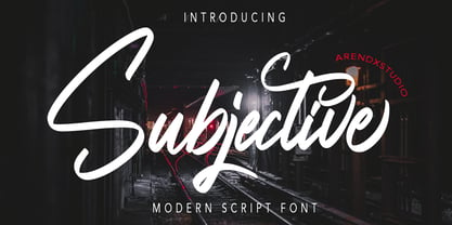 Introducing a Subjective Modern script fonts with sharp and beautiful letters that create fonts that are modern, tendy and elegant. Subjective came with opentype features such stylistic alternates, stylistic sets & ligatures good for logotype, poster, badge, book cover, tshirt design, packaging and any more. Features : • Character Set A-Z • Numerals & Punctuations (OpenType Standard) • Accents (Multilingual characters) • Ligature • Alternate
 - Display Haphazard by Gerald Gallo,
$20.00 Display Haphazard is a display font not intended for text use. It was designed specifically for display, headline, logotype, branding, and similar applications. Display Haphazard has an uppercase alphabet located under the character set keys and a full set of alternate uppercase characters located under the character + shift keys. It also has numbers with alternates, and punctuation.
 - Keith by Talbot Type,
$19.50 Keith is a striking and playful display font. Mix and match the different shadow styles, to create a variety of different looks and effects. There are four different shadow effects, along with a fill and an outline variation. Keith features a full upper and lower case character set and an extended set of accented characters for Central European languages.
 - Rahaely by Putracetol,
$19.00 Introducing Rahaely, a elegant script font with a lot of alternates character. This font is perfect for logotype creation, lettering compositions, wedding invitations, fashion projects, book design cover, magazines typography, cards, packagings, posters, branding and more. Come with Opentype feature with a lot of alternates, its help you to make great lettering. This font is also support multi language.
 - HWT Antique Tuscan 9 by Hamilton Wood Type Collection,
$24.95 A very condensed 19th century Tuscan style wood type design with a full character set with ligatures. This design was first shown by Wm H Page Co in 1859 and this is the first digital version of this font to include a lowercase and extended European character set. This is a font best used at large sizes.
 - Jackart by Arendxstudio,
$15.00 Introducing a Jackart Brush script fonts with sharp and beautiful letters that create fonts that are modern, tendy and elegant. Jackart came with opentype features such stylistic alternates, stylistic sets & ligatures good for logotype, poster, badge, book cover, tshirt design, packaging and any more. Features : • Character Set A-Z • Numerals & Punctuations (OpenType Standard) • Accents (Multilingual characters) • Ligature • Alternate
 - ATC Timberline by Avondale Type Co.,
$20.00 ATC Timberline, is an ultra wide-set sans-serif typeface. With its sharp points and extended curves, ATC Timberline feels just at home in mid-century modern as it does in forward-looking modern settings. Contains 370+ glyphs, full alphabet, ligatures, numberals, accents and punctuation. File type included in download is .otf. ATC Timberline was released in 2016.
 - ITC Farmhaus by ITC,
$29.99ITC Farmhaus is the work of British designer Tim Donaldson and is, in his own words, Neil Young meets Paul Renner." Donaldson borrowed the perfect circles and clean lines of Renner's drawings for Futura and gave them jagged edges and uneven, thick strokes. Farmhaus contains one set of capitals and two sets of lower case letters." - Ignorance by Typogama,
$29.00 Ignorance is a script typeface that mimics traditional handwriting found in America in the 19th century. Full of vitality and personality, this typeface includes a wide range of Opentype ligatures, alternates and swash characters that allow multiple choices for each setting. This design is principally aimed for use in display and titling setting that will reveal it's finer details.
 - Turn Destiny by Deeezy,
$14.00 Trendy, bold & modern style sans font for your fancy projects. Elegant, funny and classic style on Amarillo font will be great for any branding project. Lot of alternates and ligatures will help you to create unique and original logo design or website header! Enjoy :) -Multilingual support -Lot of alternate characters & ligatures -Great for modern branding projects!
 - Quietism Variable by Michael Rafailyk,
$150.00 A smooth contemplative Antiqua with aspiring to the sky ascenders, inspired by the Quietism philosophy. Clarity of the mind is achieved by bringing the body into a state of calm and contemplation, and this is reflected in the design – the quiet horizontal serifs (body) are opposed to the peaky soaring ascenders (mind). The design also features four optical size subfamilies with different x-height and contrast, oldstyle diagonal stress, oldstyle figures by default, smooth details and slightly dark texture. Variable axes: Weight, Contrast, X-Height. Scripts: Latin, Greek, Cyrillic. Languages: 480+. The complete list of supported languages: michaelrafailyk.com/quietism Kerning: 4553 class-to-class pairs. Hinting: Not applied. Format: TTF – OpenType with TrueType outlines. Variable Font: Quietism Variable provides more options than static versions, and has three axes: Weight (Thin–Black), Contrast (Low-High), and X-Height (Low-High). Variable fonts includes thousands of styles that you can access using a sliders on graphic editor or via CSS on web browser. Mixing different axes gives you extra styles not represented by static fonts. Optical Size: The typeface is represented by four subfamilies: Text (low contrast, high x-height – for paragraph 10-20 pt), Deck (medium contrast, medium x-height – for subheading 20+ pt), Display (high contrast, medium x-height – for heading 72+ pt), Poster (high contrast, low x-height – for big size 120+ pt). Small Caps: Lowercase letters and Oldstyle Figures are replaced with Small Capitals forms. Capitals to Small Caps: Uppercase letters, all figures, and some punctuation are replaced with Small Capitals forms. Case Sensitive Forms: ()[]{}‹›«»-–—•·#%‰@ and Arrows are centered on capitals. Oldstyle figures are replaced with Lining figures. Oldstyle Figures: 0123456789 #%‰. Designed to work with lowercase letters. Used by default. Lining Figures: 0123456789 #%‰. Figures are the same height as uppercase letters (cap height). Proportional Figures: Lining, Oldstyle, Small Caps, Capitals to Small Caps. Tabular Figures: Lining, Oldstyle, Small Caps, Capitals to Small Caps. Ordinals: adehnorst. Superscript, Subscript, Numerator, Denominator: 0123456789. Fractions: ¼½¾⅐⅑⅒⅓⅔⅕⅖⅗⅘⅙⅚⅛⅜⅝⅞⅟ (precomposed). Any other fractions (even those typed through a slash) will also be displayed correctly, with the automatic replacement to Numerator + fraction + Denominator. Slashed Zero: All 0 figures. Contextual Alternates: Number sign character (#) before uppercase letters is replaced by its version centered on capitals. Hyphen character (-) between two uppercase letters is replaced by its version centered on capitals. First of two TT letters is replaced by its alternate form. Letters vwy before the letters fijmnprtuvwxy are replaced with an alternate shorter versions that fits better in the context. Contextual Alternates (Greek): ΆΈΉΊΌΎΏ. Greek uppercase accented characters lose their tonos accent and retain only dieresis in All Caps and Small Caps modes. Turned on by default. If you need tonos accents in All Caps then turn off Contextual Alternates (calt) feature. Stylistic Alternates: FTГТИЦЩцщ and their versions with diacritical marks. Stylistic Set 01 “Arrows”: Left <- Right -> Up Left Right <-> Up Down North West South East \> South West Stylistic Set 02 “Round-Square Cyrillic”: ДИЙЍЛФвгджзийѝклнптцчшщьъю characters are replaced with its Bulgarian or Russian forms. Stylistic Set 03 “Cyrillic Tse Shcha short tails”: ЦЩцщ characters are replaced with its alternate form with short tail. Stylistic Set 04 “Cyrillic I full serifs”: ИЙЍӢ characters are replaced with its alternate form with inner serifs. Stylistic Set 05 “FT bent inward serif”: FTГ characters and their versions with diacritical marks are replaced with its alternate form with right head serif that bent inside. Stylistic Set 06 “Small Caps centered on Capitals”: Small Caps are vertically centered on uppercase letters. Standard Ligatures: fi fl fb ff fh fj fk ffb ffh ffi ffj ffk ffl. Discretionary Ligatures: Th ct st. Localized Forms: 52 character substitutions for Azeri, Bulgarian, Catalan, Dutch, German, Kazakh, Macedonian, Moldavian, Polish, Romanian, Serbian, Tatar, Turkish. Glyph Composition/Decomposition (Diacritics): Full Latin and based Vietnamese set of diacritics (571 characters). Precomposed.
 - Alistair Signature by Aktab Studio,
$17.00 Alistair Signature Font is a modern font with more featured and made with hand lettering. Alistair Signature Font have a complete glyphs, this font suitable for wedding invitation, greeting cards, T-Shirt, Logo or any design that you create. comes with a complete set of standard characters, Alternates, Punctuation & have extra ornament for your design and many more. The Features of this fonts is: - UPPERCASE and lowercase - Numeral and punctuation - Stylistic Sets - Stylistic Alternates and Contextual Alternates - International Glyphs support to All Stylistic Sets - Support PUA unicode (specially coded fonts) - Standart Ligatures and Discretionary Ligature - Fractions - Initial and Terminal Forms - Swash - Smallcaps Numeral
 - Pennyroyal by Stiggy & Sands,
$29.00 A Historic Revival with a Sophisticated Rustic Edge Pennyroyal began as a Barnhart Brothers & Spindler typeface called Plymouth Bold, first cut in 1900. What began as a straightforward rustic typestyle has been revived to include a more extensive character set. But this font wasn’t just revived, it has come alive with character and personality. Pennyroyal includes 564 characters. The expanded SmallCaps option for gives the typestyle a more sophisticated look, expanding on the original typeface inspiration. Opentype features include: A collection of ligatures. Smallcaps. Full set of Inferiors and Superiors. Proportional figures and Oldstyle figure sets
 - Diversa by DSType,
$40.00 Diversa is a typeface that takes a very different path from the most fonts, both in terms of appearance and usability. Diversa is a single typeface with 9 fonts within, containing 2760 glyphs*, divide in 9 stylistic sets, but the main difference is that all the glyphs are kerned with each other, which means you can swap glyphs between stylistic sets and keep them properly kerned - unbracketed serifs, bracketed serifs, engraved, stencil, sans, slab, baroque, stencil sans, stencil slab and a stylistic set that mixes them all in a rotative feature. Diversa: Because uniformity sucks! *requires applications which have Open Type access/features.
 - Gart Sans by Vitaliy Gotsanyuk,
$25.00 Gart Sans is a grotesque font that preserves the characteristics of early 20th-century grotesques, primarily used in advertising. The main features of this font include a pronounced contrast, narrow proportions, and light, smooth forms combined with modern design solutions. Compared to geometric or neo-grotesque fonts, Gart Sans distinguishes itself with its attention to detail. As the font weight increases, it acquires a more pronounced character, expanding its usability from headlines to extensive text settings. Gart Sans consists of 5 styles, 630 glyphs, encompassing an extended Latin character set, basic Cyrillic characters, ligatures, numeral sets, and much more.
 - Revolage by FallenGraphic,
$15.00 Revolage. Revolage is a vintage sans serif and script including Rough, & Clean versions as well as Oblique versions . Revolage is a versatile sans serif and script typeface that gives a vintage aesthetic. With it’s unique & distinct characteristics it sets itself apart, while also maintaining a strong timeless appeal overall. Textured versions allow Revolage to be a complete set without the need for 3rd party effects to create a printed look, eliminating a step in the process of finalizing your piece FEATURES : Character Set A-Z Numberal Accents (Multilingual characters) PUA encode Alternates Ligature MULTiLINGUAL ACCENT žŠŒšŸÀÁÂÃÄÅÆÇÈÉÊËÌÍÎÏÐÑÒÓÔÕÖØÙÚÛÜÝßàáâãäåæçèéêëìíîïðñòóôõöøùúûüýÿ
 - Mouse Memoirs Pro by Stiggy & Sands,
$29.00 Our Mouse Memoirs Pro was inspired by vintage Mickey Mouse, Beagle Boys, and Uncle Scrooge comic books put out by Walt Disney in the 50's and 60's. It nods to the Disney aesthetic with an all-around fun personality and truly animated look. The chipper letterforms engage the audience, while the SmallCaps and extensive figure sets expand the scope of use. Opentype features include: - SmallCaps. - Full set of Inferiors and Superiors for limitless fractions. - Tabular, Proportional, and Oldstyle figure sets (along with SmallCaps versions of the figures). - Stylistic Alternates for Caps to SmallCaps conversion.
 - Motgan by FallenGraphic,
$14.00 Introducing Motgan – Vintage Fonts Motgan is a vintage sans serif family including Textured, & Clean versions as well as Oblique versions of each. Motgan is a versatile sans serif typeface that gives a vintage aesthetic. With it’s unique & distinct characteristics it sets itself apart, while also maintaining a strong timeless appeal overall. Textured versions allow Motgan to be a complete set without the need for 3rd party effects to create a printed look, eliminating a step in the process of finalizing your piece FEATURES : Character Set A-Z Numberal Accents (Multilingual characters) PUA encode Alternates Ligature MULTiLINGUAL ACCENT žŠŒšŸÀÁÂÃÄÅÆÇÈÉÊËÌÍÎÏÐÑÒÓÔÕÖØÙÚÛÜÝßàáâãäåæçèéêëìíîïðñòóôõöøùúûüýÿ
 - Anlinear by Linotype,
$29.99Anlinear is part of a series of constructed typographic experiments from the young Swiss designer Michael Parson. In the Anlinear family, which contains three separate weights, Parson has successfully created a fabulous display of alphabets out of the sole arrangement of lines at right angles to each other. The letters in this face virtually groove with the beat as you set them in text. Like a musical score, they provide a fantastic look just right for your next flyer. This family of fonts looks best when set in larger point sizes, in headlines or other display settings. - Human Sans by Ian Farnam,
$20.00 Human Sans is a humanist sans serif font created as an experiment. The goal, how much a simple substitution of a small set of characters could change a font's nature. In its base form, Human Sans is a humanist sans serif geared toward text. However, through stylistic sets, it can adopt a myriad of different visual styles. This includes geometric alternates, uncials alternates, contextual swash caps, and the high and low midlines, typically seen in Art Deco lettering. These features are combinable for whatever look you may need. Human Sans comes with a full set of diacritics, in 9 weights and corresponding Italics.
 - Country Western Script by FontMesa,
$30.00 Country Western Script is a new font based on the classic William Page font known as Clarendon Ornamented originally designed in 1859 and again in 1877 by Vanderburgh & Wells. This version includes Greek, Cyrillic, Central and Eastern European characters sets. Keeping with the original theme from 1859, Fill fonts are available for the Ornamented and Open faced versions of this font. Greek, Cyrillic, Central and Eastern European characters sets are supported in the Windows TrueType and OpenType formats. The Windows and Mac Type1 versions of this font do not support Greek, Cryillic, Central and Eastern European characters sets.
 - Zapatista by MADType,
$29.00 Zapatista is derived from a typeface that I designed in 1998 but never released. It is a playful slab serif with a texture that is sometimes subtle and reminiscent of the irregularities of letterpress printing. Like a fine wine, this face has been aged to perfection and is now ready for public consumption. It includes a full character set with accented characters as well as a second full set of alternate uppercase, lowercase, and numbers. OpenType makes it easy to mix and match the two sets of letters to create custom designs. It's like having 2 fonts in one!
 - Special Elite Pro by Stiggy & Sands,
$29.00 Our Special Elite Pro brings the unique individuality of the Special Elite Type No. NR6 vintage typewriter keyset to the digital age. Antique typewriters would type with a warmth and appeal to them, primarily because of their unpredictable “grunge” results from force of keystrokes to ribbon and paper. The SmallCaps and extensive figure sets add a more serious note to the nature of the typeface. OpenType features include: - SmallCaps. - Full set of Inferiors and Superiors for limitless fractions. - Tabular, Proportional, and Oldstyle figure sets (along with SmallCaps versions of the figures). - Stylistic Alternates for Caps to SmallCaps conversion.
 - Dambera by Tour De Force,
$25.00 Dambera is a made up word I used as planet name in my first comic published in a kids magazine when I was 6 years old. Dambera font has pretty similar reference - it's a simple script font I initially designed for wedding invitations and restaurant menus, but it can have wide appliance in every design field, from posters, book covers, outdoor signes to labels and packages. It contains a set of stylistic ligatures and swash alternates, as well as a small set of floral dingbats. Also contains a set of characters with specific endings (in OpenType terminology, better known under FINA term).
 - Risque Pro by Stiggy & Sands,
$29.00 Our Risque Pro draws inspiration from the title screen of the 1962 Looney Toons cartoon, "Martian through Georgia". Originally an all Capitals reference, Risque includes Capitals, lowercase, and SmallCaps sets as festive and irregular in its bounce as the cartoon reference. This frolicking fun typeface has retro roots, but also an all around offbeat personality that opens it up to a wide gamut of uses. Opentype features include: - SmallCaps. - Full set of Inferiors and Superiors for limitless fractions. - Tabular, Proportional, and Oldstyle figure sets (along with SmallCaps versions of the figures). - Stylistic Alternates for Caps to SmallCaps conversion.
 - Morning Magpie by Ana's Fonts,
$15.00 Morning Magpie is a cute handmade brush font with matching illustrations and decorative elements. With an alternates character set, it is perfect for any design that needs a quirky handwritten feel, such as logotypes, postcards and tags, social media quotes. The illustrations will also look great in patterns, in wrapping paper and backgrounds. Morning Magpie includes: Morning Magpie, a brush font with ligatures for a more natural handwritten look Morning Magpie Alternate, a set of alternative characters for A-Z, a-z and 0-9 Morning Magpie Ornaments, a set of 52 drawings, swashed and underlines
 - Metronic Slab Pro by Mostardesign,
$26.00 Metronic Slab Pro is a slab serif typeface with a technological and minimalist look for text and headlines. It has six versatile weights from Air to Black with an alternative glyph set to improve its use in different graphic contexts. Metronic Pro has a wide range of OpenType features such as: old style and proportional figures, ligatures, case sensitive forms, fractions, stylistic alternates, arrows and an icons/ornaments set. This set of 60 icons, directly inspired from the typeface improves the OpenType features and can be quickly and easily use in your web design, GUI design, graphic design or any other graphic work.