10,000 search results
(0.036 seconds)
- White Wolf by Match & Kerosene,
$25.00 Set it large... I dare you! 100pt+ is definitely encouraged with this face. White Wolf was created to fill the void for condensed sharp wedge serif fonts. Taking inspiration from other hybrid fonts such as FF Dog, FF Vortex and HI Halfway House, I wanted to create a font that would offer something different for artists looking for a condensed font that has a lot of character. Use it for titles, subtitles, logos, posters, signs and pair it with some heavy wood types or slab serifs and you will be pleased with the attitude White Wolf will bring to your project!
 - Roadie PB by Pink Broccoli,
$16.00 Roadie was inspired by a 1981 Hallmark card with lettering that was full of frolicking fun. Filled with a childish persona and a playful bounce, this Roadie has a lot to offer. As with some of my previous type designs, it is a typographic dance, wonderfully skipping across designs, surprising with each letter typed. With an extensive character set, and clean sharpie marker-like look, Roadie is a joy to typeset with, and it comes with a stylistic alternates feature that shuffles the Capitals and lowercase that share similar unicase forms that add to the quirky playfulness.
 - Battle Road by Fachranheit,
$15.00 The Battle Road is an old, vintage display typeface. It has regular characters and a ventage style. It can be used for logos, t-shirts, quotes, badge, branding, headers, labels, packaging and much more! This is what you'll be get : Battle Road Regular.ttf Battle Road Italic.ttf Battle Road Ventage.ttf Battle Road Ventage Italic.ttf Features : Character Set A-Z Numerals & Punctuations (TrueType Standard) Accents (Multilingual characters) Above the description of this font, I hope you're satisfied with what I have created. if there's anyone who purchase and find some problem, don`t hesitate to using product support Thanks and enjoy designing.
 - Garinstae Script by Pista Mova,
$19.00 Garinstae Script Pro, is modern and classic handwritten calligraphy, so soft, perfect for your next designs, such as logos, printed quotes, invitations, cards, product packaging, headers and anything else from your imagination. Garinstae Script Pro allows you to create custom dynamic text. You can access by turning on; Alternative Styles, Swashes and binders in Photoshop, Adobe Illustrator, Adobe InDesign or via the glyph panel like Adobe Illustrator, Photoshop CC, Let's go from regular characters to alternate characters to get the text with the layout of your dreams. Garinstae Script Pro also includes glyphs, punctuation, numbers and multilingual. Thank you for your visit
 - Holistic Haircut by Kitchen Table Type Foundry,
$16.00 My son Sam turned 12 and all of a sudden he cares for his hairdo. It needs to be just so, not too long, not too short, with a lot of gel to hold it in place. ;-) He just had a haircut when I was creating this font, so now you know where the Haircut part comes from. The Holistic part is something that sort of sounded ok. Holistic Haircut is a nice, handmade display font. It comes with wider and narrower glyphs for the upper and lower case AND a set of alternates that likes to party with the rest.
 - Editors Note by Jen Wagner Co.,
$17.00 Say hello to the Editor's Note Family, an editorial serif display that includes 16 fonts, regular and italic, from Hairline weight to Bold, and still has all the clean lines, tight curves, and trendy minimalist vibes! I've been loving the clean, editorial type trend happening in design right now (let's be real, there's always a place for timeless editorial type). Editor's Note is a stunningly crisp upper and lowercase typeface that looks incredible in both large settings as a display text (think big headers, pretty quotes, calls to action, etc.). I've been loving combining the regular and italic, especially in big, bold quotes.
 - Fluffapalooza by takoliko,
$12.00 Fluffapalooza a fluffy handwritten font. It has a fun, warm, raw, cute, happy atmosphere, and gives a little bit quirky dorky vibes. Inspired by a personal touch of cuteness, cheerfulness, and passion. Fluffapalooza has a bouncy style if you acces the alternate. you can have a lot of variation by combining the glyph whatever you want. Fluffapalooza can easily be matched to an incredibly large set of projects and is good for communicating your brands, especially if you want to make a raw, artsy, handmade, and add a personal touch. So spice up your design and enjoy the font.
 - Coltinly Script by Gian Studio,
$16.00 Coltinly is a script typeface with beautiful calligraphy and is modern with an irregular baseline. This font is suitable for a wide range of products for each project, such as wedding invitations, greeting cards, correspondence, and various other purposes and many more. This language support some international fonts, you can get unique ligatures, and font, there are 859 glyphs, so many options that you can use for your projects, Features : Initial Alternates Contextual Alternates - Standard ligatures - Unique ligatures - Stylistic Alternates - Stylistic sets Basic Latin A-Z and a-z - Numbers - International Symbols include Thank You for your purchase!
 - Progressiva by Outras Fontes,
$24.00 Progressiva is a sans serif type family for text and display usage. With some unique playful forms and a little bit condensed structure, the family is ideal for texts that require some personality and titles with great visual presence. Progressiva family is composed by 11 roman styles, from Thin to UltraBlack, giving a lot of space for visual variance. Each font includes some standard and discretionary ligatures as well as some alternative letterforms included in stylistic alternates and stylistic sets OpenType features. It’s suitable for magazines, posters, packaging, advertising, signage systems, corporate material and so on.
 - PF Lindemann Sans by Parachute,
$49.00 Lindemann Sans is an immediately-inviting typeface with a pleasing distinct visual voice grounded by geometry and golden proportions. This modern geometric san serif typeface serves the interpretive needs of modern design through its legibility. This legibility is achieved through proportional balance of each letter based on the golden ratio, open counters, high x-height and wider individual shapes. In addition, a high level of legibility is arrived through distinctive glyphs like a, e, @, and f, which are engaging and add to Lindemann Sans visual voice. Being a modern, spirited, tech-savvy typeface, Lindemann Sans has many of the features demanded by today's designers. These features include 800 characters within each font, many ligatures, full numbers sets, small caps, alternative characters and other niceties found in opentype fonts. Due to Lindemann Sans high legibility, geometric sans tradition, and a large feature set list, it is a very versatile typeface and can be used in replacement of the more commonly used sans. Specifically, Lindemann Sans can be used by technology corporations, architectural firms in their supporting materials, in magazines as headers and key-points, as the typeface for professional keynotes, for the package design industry as a whole, in automotive concept projects, and for cosmetic branding for high class hair products. With its inviting nature it may also be used for liberal arts promotional materials. In addition, this typeface can be used by green industries because of its nature derived proportions. Each style and weight of Lindemann Sans adheres to the same geometric and golden proportions, however, each weight is innately noteworthy. For example, there is a charm that is found in the ultralight weight's elegant geometry and lights impressive use as oversized headlines. It shines with true clarity of vision with the book weight and the versatility of the medium. One cannot overlook the power and pacing of the bold and extra bold weights with its clear counters and restrained letter forms. Within Lindemann Sans family each weight has a distinctive role to play but stays true to its purpose.
 - Kindah by Eyad Al-Samman,
$30.00 “Kindah” is a Yemeni ancient tribe with evidence of its existence going back to the second century B.C.E. The kings of Kindah exercised an influence over a number of associated tribes more by personal prestige than by coercive settled authority. The Kindites were polytheistic until the 6th century CE, with evidence of rituals dedicated to the gods Athtar and Kahil found in their ancient capital in south-central Arabia. It is not clear whether they converted to Judaism or remained pagan, but there is a strong archaeological evidence that they were among the tribes in Dhu Nuwas' forces during the Jewish king’s attempt to suppress Christianity in Yemen. They converted to Islam in the mid-7th century CE and played a crucial role during the Muslims' conquests of their surroundings. Among the most famous figures from Kindah known as Kindites are Imru' al-Qays (526-565?), al-Ash'ath ibn Qays (599-661), Hujr ibn 'Adi al-Kindi (?-660), al-Miqdad Ibn Aswad al-Kindi (589-653), and Abu Yusuf Yaíqub ibn Ishaq as-Sabbah al-Kindi (805-873) known as the Philosopher of the Arabs. "Kindah" font is a modern Kufic font comes in three weights (i.e., bold, regular, and thin) which is mainly designed to be used as a display Arabic font. The main feature of this typeface is the mixture of curves and rectangular shapes used in the designed Arabic characters. Kindah font was inspired by the design of the Yemeni modern windows of houses in which only top part of the arc is used for building such windows which reflects the originality of the architecture preserved in this part of the world. "Kindah" font is extremely outstanding when used in printed materials with big sizes especially for headline, titles, signs, and names of brands. Hence, it is suitable for books' covers, advertisement light boards, and titles in magazines and newspapers. It has also a Latin character set and it also supports several Arabic character sets which makes it proper for composing alphabetical and numerical words in Arabic, Urdu, and Persian.
 - P22 Zaner Pro by IHOF,
$39.95P22 Zaner is based on ornamental penmanship from the turn of the 20th century. The Zaner font set includes four unique fonts that complement the other fonts in the set. Each font is available in PostScript and TrueType formats as well as OpenType which offers even more characters, options and overall functionality. Set options include PostScript and TrueType with a bonus set of extras and a “super” pro set containing over 3,000 characters. Zaner is perfect for wedding invitations and documents that require a touch of elegance. - P22 Zaner Basic by IHOF,
$24.95 P22 Zaner is based on ornamental penmanship from the turn of the 20th century. The Zaner font set includes four unique fonts that complement the other fonts in the set. Each font is available in PostScript and TrueType formats as well as OpenType which offers even more characters, options and overall functionality. Set options include PostScript and TrueType with a bonus set of extras and a “super” pro set containing over 3,000 characters. Zaner is perfect for wedding invitations and documents that require a touch of elegance.
 - Delirian by Andrey Sharonov,
$35.00 Delirian Script & Ornaments Delirian is elegant script with contemporary mood and perfect forms, inspired by immortal classic calligraphy. Not too thin and not too thick, good balanced and variable, born for luxury and beauty. In my examples I show how this script can be used. It's great for logotypes, branding, wedding invitations, romantic cards, alcohol labels, packaging, spelling of names and others. Delirian Script comes with beautiful Uppercase and Lowercase letters, numbers and punctuation. In addition to the main character set, there are 158 alternates characters, 36 ligatures and 10 lengths of end-swashes. You also get Ornament set of 26 elements which harmoniously complements original script. Multilingual Support Script support Western European characters and works with following languages: English, Croatian, Danish, Dutch, Estonian, Faroese, Filipino, Finnish, French, German, Hungarian, Icelandic, Irish, Italian, Norwegian, Polish, Portuguese, Slovenian, Spanish, Swedish, Turkish. OpenType Stylistic Alternates works on the principle of simple combinations with activated Standard Ligatures option in OpenType panel (Adobe Photoshop, Adobe Illustrator). To get alternate just add for example number 2 (two) after any letter. Every Uppercase has 1-2 variations and Lowercase about 3-4 alternate characters. For example: A2 A3 - Uppercase; a2 a3 a4 - Lowercase; a.1 a.2 - Lowercase with underline. _1 _2 _3 - End-swashes Ligatures works with activated Discretionary Ligatures option in OpenType panel. This special features don't work in Microsoft Word.
 - Cosma by Wiescher Design,
$35.00 »COSMA« is an old greek word that stands for »beauty« and »order«, I thought it a very befitting name for my new font-family. My »Cosma« has that special high-contrast Renaissance beauty but is very orderly in appearance. »Cosma« is a classical beauty with modern touches that make it unique. You will love this font. It is a great everyday workhorse with seven weights from UltraLight to Bold and all the necessary weights in between. Great for body copy and headlines! With 964 Glyphs it is a truly European font designed for all Central European and Latin using countries. »Cosma« has a set of Cyrillic that is also good for Serbia, Macedonia and Ukraine. Sorry, no Greek! But it has oldstyle- and lining-, tabular- and tabular-oldstyle-figures, many alternative letters and ligatures. On top I designed two sets of alternative, decorated caps each in normal and oblique. »Cosma« comes in Normal, Italic and Oblique, sometimes you just don’t want to use Oblique instead of Italic that would be too playful for the occasion. »Cosma« doesn’t come cheap, but I start off with an 80 % reduction, so that is a good chance to get all 49 cuts for a phantastic price. Oh, I almost forgot, If you buy the whole family, you get the variable fonts to go with it for free, that’s a good investment into the future. Enjoy!
 - Latitude Sans by Stiggy & Sands,
$24.00 An Uber-Black Sans Serif with a Warm Personality Latitude Sans began as a digitization of a film typeface from LetterGraphics known simply as "Free". The original specimen included standard Capitals and Lowercase, Numerals and minimal Punctuation, a bare bones character set. We've fleshed out the Latitude Sans typeface to include a full standard character set, an extended international set, and more so it can be a strong heavyweight sans typestyle. See the last graphic for a comprehensive character map preview. Opentype features include: - Full set of Inferiors and Superiors for limitless fractions. - Tabular, Proportional and Oldstyle figure sets. - Ligatures for a collection of "f" paired sets: fi, fl, ft, ffi, ffl, etc. Approx. 652 Character Glyph Set: Latitude Sans comes with a glyphset that includes standard & punctuation, international language support, and additional features.
 - Skullbats by Canada Type,
$24.95Patrick Griffin's sister is a really annoying individual sometimes. Not only is she into theater, but she thinks everyone else in the universe is into it as well. So once in a while tickets to local or provincial Shakespearean plays get delivered to the mailbox or dropped off on the living room's table. And once in a while the tickets just cannot be "lost" or ignored. Three or four times a year, Patrick must be subjected to Olde Englishe Speake, umbrella dresses and squeezetops, featherhats and men in leggings, rhyme and treason, mortality and immorality, drama inflicted by some mama, and it never ends. Last June it was Hamlet. Again. Someone's (wink wink) idea of a good time. There he goes, the Prince of Denmark, holding that skull with the tips of his fingers like it's an alien egg. Alas, poor Yorick! Yadda yadda boop-bop-a-loo-bop. And so the idea of a font made of skulls was born. And what can we possibly be but conduits for such abhorring ideas? Where be our gibes, our songs, our flashes of merriment? Skullbats has more skulls than you'll ever see in your lifetime. At least we hope so. Scary skulls, funny skulls, evil skulls, strange skulls, pixel skulls, fiery skulls, surprised skulls, happy skulls, sad skulls, cow skulls, sketched skulls, profiled skulls, light bulb skulls, cartoon skulls, techno skulls, alien skulls, expressionist skulls, pirate skulls, horned skulls, and skulls with whacky headgear. You name it, it's there. There's even a disco skull there for you. We lost count at 90 skulls, but there's a few more in there. For a complete showing of the skulls in the font, consult the image in the MyFonts gallery. Patrick's sister didn't turn out to be so bad after all. After making this font, he couldn't help but notice that her skull was a bit small compared to his. So now he takes every opportunity to remind her that the size of the cranium is relative to what it houses. Her upcoming halloween present will be a shirt with guess-what on it. Shirts, now there's putting Skullbats to good use! - Touch Me by Latinotype,
$69.00 Touch Me is a Script hand-drawn style typeface—designed by Coto Mendoza—resulting from polyrhythmic exploration, sign deconstruction and altered calligraphic contrast plays with watercolour brush. Coto has been using these experimental calligraphy techniques when creating the catchwords for Macarons, the Boho Family, Bikini Season Script and Matcha Script and so forth. Touch Me was inspired by a character in a story written by Coto while attending a literary workshop with Ina Groovie in Santiago de Chile. The character is a tribal girl who lives on an island in the Caribbean. She is heir of ancestral knowledge and possesses wild beauty, very passionate and sensual: intense, strong and free. These features are reflected in the polyrhythm of the typeface's curves: an irregular baseline, variable x-height, different lengths of initial and terminal strokes (that sometimes expand and sometimes shrink) and amount of brush pressure that generates changes in contrast within the characters. This way, when composing, signs with stroke contrast randomly alternate with monolinear ones and with signs of altered contrast, thanks to the typeface's OpenType programming. The family, with more than 3,000 glyphs, provides a number of alternative characters, swashes, ligatures, initial and terminal forms, in short, a vast ocean of choices! Touch Me is a spontaneous typeface with a fresh and unique personality. It is the perfect choice for short text in both print and digital formats. The family comes with a Script Regular version and a seductive Script Drop that you will enjoy a lot! The Extras set includes some catchwords, dingbats and ornaments that allows for endless composition options. The family also comes with a Caps version —designed by Luciano Vergara—in 2 styles: a funny and big-headed condensed Sans Grotesk display of inverted vertical proportion plus a Grotesk, neutral and slightly expressive Petite. Both versions, available in 6 weights, have been especially designed to create hierarchies when composing. This allows for balance between strokes of different weight when it comes to the Sans and Script fonts. Come and dare yourself! Touch Me! Thanks Alisa for sharing your amazing and beautiful picture with us.
 - Calinda by Eurotypo,
$32.00 Calinda font is a sans serif typeface, condensed, and characterised by widening strokes. Calinda has 630 glyphs with a full set of OpenType features, stylistics alternates, stylistics sets, swashes, ligatures and a set of ornaments well designed to combine with the glyphs.
 - Jungle Fever NF by Nick's Fonts,
$10.00An adaptation of the font Neuland, designed by Rudolph Koch in 1923. The freeware (TrueType) version has a limited character set. The Pro Set (Postscript) version has a complete character set (Adobe Standard for PC; Macintosh Standard for Mac), and extensive kerning. - Wanderlust Collection by Cultivated Mind,
$32.00 Wanderlust Letters has returned, but now offered in a beautiful collection of hand painted scripts. New versions include Wanderlust Letters Pro, Decorative, Boho, Chic, Shine, Gold, Caps, and Ornaments. Wanderlust Letters Pro is an extended version of the immensely popular Wanderlust Letters. This latest version includes three sets of basic alternates, one set of decorative alternates, and one set of ligatures. Wanderlust Decorative Pro offers a magnificent updated flow from the initial Wanderlust Letters release. Decorative Pro includes two sets of decorative alternates, two sets of basic alternates, and one set of ligatures. Decorative Regular comes with one set of decorative alternates. Boho, Chic, Shine and Gold are an updated spin off of Wanderlust Letters. These fonts offer new letter styles that blend seamlessly with all Wanderlust fonts. Pro versions of Chic, Shine and Gold comes with three sets of basic alternates and one set of decorative alternates. Boho Pro comes with with two sets of basic alternates and two sets of decorative alternates. Caps is a perfect choice for headline use since it’s an all uppercase font. But don't be afraid to mix it up with all the other Wanderlust fonts. The entire Wanderlust Collection works impeccably to enhance your magazine, packaging, advertising, branding, posters, websites, and films. Combine all Wanderlust fonts with Ornaments to create unique hand painted typography art.
 - FS Joey Paneuropean by Fontsmith,
$90.00Kangaroo FS Joey was the offspring of a project with Rudd Studio to develop a logotype for an online streaming TV service, in 2008. While under wraps, the secret project was code-named Kangaroo. The logotype led to a second project, to design a corporate typeface for the service. It was the first big project Fernando Mello had worked on with Jason Smith. “Like any designer who just joined a team, I was very excited about it, drawing and sketching lots of ideas. I remember Jason and I experimenting with lots of possibilities, for both the logo and the typeface.” Online As the font for a Spotify-style, internet-based service, FS Joey needed to be highly legible on-screen, including at very small sizes. There had to be a range of weights, and they’d have to work well in print, too. It was also important that it felt corporate, not too quirky, while still having a strong character of its own. Quirkiest “We designed three weights specifically for use on the Web,” says Jason Smith. “There was the usual fight between me and my team. I wanted at least one identifiable letter that was a quirk. As always I went straight for the lowercase ‘g’, and it was drawn numerous times with lots of variation. I got the quirkiest one accepted by the client.” But, later in 2009, the Competition Commission blocked Project Kangaroo, and Fontsmith were left with a couple of weights of an as yet unused font. From Kangaroo, Joey was born. A favourite “Straight away, people started to notice the typeface,” says Jason. “I can take the credit for pushing the art direction and standing up for the quirks. But it was Fernando who was the key to pulling it all together and adding his own distinct flavour. Now it’s one of my favourite designs in our library.” Fresh and friendly, geometric and energetic, Joey is available in five weights, all with italics, all finely-tuned for both screen and print. - FS Joey by Fontsmith,
$80.00 Kangaroo FS Joey was the offspring of a project with Rudd Studio to develop a logotype for an online streaming TV service, in 2008. While under wraps, the secret project was code-named Kangaroo. The logotype led to a second project, to design a corporate typeface for the service. It was the first big project Fernando Mello had worked on with Jason Smith. “Like any designer who just joined a team, I was very excited about it, drawing and sketching lots of ideas. I remember Jason and I experimenting with lots of possibilities, for both the logo and the typeface.” Online As the font for a Spotify-style, internet-based service, FS Joey needed to be highly legible on-screen, including at very small sizes. There had to be a range of weights, and they’d have to work well in print, too. It was also important that it felt corporate, not too quirky, while still having a strong character of its own. Quirkiest “We designed three weights specifically for use on the Web,” says Jason Smith. “There was the usual fight between me and my team. I wanted at least one identifiable letter that was a quirk. As always I went straight for the lowercase ‘g’, and it was drawn numerous times with lots of variation. I got the quirkiest one accepted by the client.” But, later in 2009, the Competition Commission blocked Project Kangaroo, and Fontsmith were left with a couple of weights of an as yet unused font. From Kangaroo, Joey was born. A favourite “Straight away, people started to notice the typeface,” says Jason. “I can take the credit for pushing the art direction and standing up for the quirks. But it was Fernando who was the key to pulling it all together and adding his own distinct flavour. Now it’s one of my favourite designs in our library.” Fresh and friendly, geometric and energetic, Joey is available in five weights, all with italics, all finely-tuned for both screen and print.
 - Divert by Little Fonts,
$15.00 Based on the outline of each character, Divert works by re-directing each outline as a single meandering stroke that moves back and forth to create a quirky yet clean typeface. The typeface contains an uppercase character set plus two lowercase character sets (one standard and one alternate) and two sets of numerals. Plus all punctuation and basic latin European accents. See glyphs for full character set.
 - Brushed by d[esign],
$4.62 Let this free-flowing brush script add a little hand painted goodness to your works. Cheaper than a bucket of paint, use Brushed to add brush painted letters to your works or manipulate the many glyphs in this font using image editing software to create art as shown above.
 - Christmas Energy by Rashatype,
$10.00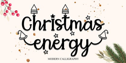 Christmas Energy is a whimsical script font with a relaxed theme, featuring a lovely style. This font is PUA encoded which means you can access all of the glyphs and swashes with ease! Add it confidently to your favorite creations and let yourself be amazed by the outcome generated.
 - Kargert by Oleg Gert,
$30.00 Kargert is a typeface that carries powerful messages in a modern graphic style with ease. It uniquely combines simplicity and sophistication. With the display typeface Kargert, you can create stunning headlines that will grab attention. Let Kargert impress your viewers and help deliver your message with strong impact.
 - Midnight Story by Orenari,
$17.00 Midnight Story font is specially designed for spooky yet horror occasion. This font has rough texture, so it will bring the creepy atmosphere in every glyphs. It's really horror when your project didn't meet the perfect font. So let Midnight Story be friends with your design and craft projects.
 - Seaglass by Atlantic Fonts,
$26.00 Seaglass is decorative, feminine, and strong. Its whimsical curls and handmade form make a crafty statement in all-caps, and its expressive lower case invites in young and old alike - not unlike the gems found on secluded beaches. Let Seaglass transform your next packaging, poster, or book project.
 - Kegger by Chank,
$59.00Show you school spirit with this sporty, collegiate font. These big chunky serifs let the world know you speak with authority, and they'll read your message clear as a bell. It's like a traditional college font, but it's got a chanky flair. Good for hockey jerseys and house parties. - Geistig by Michael Browers,
$15.00 Geistig is a set of 26 individual letter monogram designs. Geistig works great for monograms, drop caps, and unique display settings.
 - "Child's Play" isn't just a font; it's a joyride back to the days of yore, when the toughest decision of the day was choosing between crayons or markers. This font mimics the erratic yet sincere hand...
- Golden Clouds by Anastasia Kuznetsova,
$22.00 Say hello to Golden Clouds :) A charming and cute font duo with handwritten letters and doodles!! Bring some irresistible fun to your design with Golden Clouds Font Duo! This playful font duo consists of a fast-flowing signature font and a charming font with small capital letters as the perfect companion. But that's not all - the set also includes a bonus Doodle font containing hand-drawn drawings designed to give your "Golden Clouds" fonts the appeal of handmade. Golden Clouds Script • A clean, smooth handwritten signature font containing uppercase and lowercase characters, numbers and a wide range of punctuation marks. Golden Clouds SmallCaps • Clean, charming handwritten font with capital letters. Golden Clouds Doodles • A set of hand-drawn drawings designed in combination with Script and Small Caps fonts. Just set it as your own font and enter any character to create each drawing. "Golden Clouds" is ideal for everyday use in greeting cards, illustrations, quotes, original branding, book covers, children's books, packaging and much more :) Font Features: A-Z; a-z character set; 1 language (English); numbers and punctuation marks, symbols. Fonts can be opened and used in any software that can read standard fonts, even in MS Word. No special software is required to get started. It is recommended to use it in Adobe Illustrator or Adobe Photoshop. Made with love and magic ♡ Thank you for reading it, and do not hesitate to send me a message if you have any questions! ~ Anastasia
 - SG Noxvile by Studio Gulden,
$24.00 Unleash the power of typography with Noxvile, a revolutionary font that demands attention and exudes confidence. Crafted with precision and designed to make a statement, Noxvile brings a whole new level of intensity to your words. Ignite your creativity and let your message roar with Noxvile's super bold style and captivating all-caps specimen. Whether you're designing eye-catching headlines, striking logos, or empowering social media posts, this font will make your words leap off the page and leave a lasting impression. Stand tall among the rest with Noxvile's commanding presence. Embrace its sharp edges, powerful curves, and unparalleled strength to create a visual experience that is truly unforgettable. Let your message shine brighter than ever before, cutting through the noise and leaving your audience captivated.
 - Display Explicit by Gerald Gallo,
$20.00 Display Explicit is a display font not intended for text use. It was designed specifically for display, headline, logotype, branding, and similar applications. Display Explicit has an uppercase alphabet located under the shift+character set keys with alternate characters for A, B, C, D, E, F, G, J, K, M, N, P, Q, R, and W located under the option+character and shift+option+character set keys. Under the character set keys are condensed uppercase characters. There are sets of numbers matching each of the uppercase sets, and punctuation.
 - Satimela by Scoothtype,
$5.00 Meet Satimela Script, a modern wedding calligraphy font that lends a modern edge to wedding stationery, elegant logos and branding, websites, calligraphy quotes, and more! Included are a full set of beginning and ending lowercase swashes, for a custom handwritten look. Satimela Script Features - Full Set of standard - Alphabet and punctuation - Extra set of Beginning - Ornament - Extra set of beginning swashed lowercase - Three full sets of ending lowercase alternates - Extra stylistic alternates and ligatures PUA Encoded - no special software needed to access extra swashed characters Multilingual Characters (ÁÂÄÀÅÃÆÇÐÉÊËÈÍÎÏÌÑÓÔÖÒØÕŒÞÚÛÜÙẂŴẄẀÝŶŸỲ áâäàåãæçðéêëèíîïìñóôöòøõœþßúûüùẃŵẅẁýŷÿỳŠšŽž€£¥ªº)
 - Neutraface Condensed by House Industries,
$33.00 Richard J. Neutra became an icon of Modern architecture as an artistic visionary, social commentator and outspoken defender of the environment. He refined his unique approach to design, for which he coined the term biorealism, over half a century ago. Regarding humankind and its surroundings as two inseparable halves to a greater whole, Neutra created habitats with the welfare of man and nature as his utmost concern. His ideas of evolutionary growth and adaptability compelled House Industries to develop Neutraface Condensed, built upon the original typeface and driven by the enduring spirit of the revolutionary who inspired it. “I have tried to be a feeling observer of life in all its manifestations, not a cold rationalist.” House Industries adopted this precept of Neutra as the guiding principle when the foundry commissioned Christian Schwartz to draw Neutraface Condensed. Instead of being exactingly compressed, the new companion fonts were composed around a complementary structural framework in order to better reflect the sensibilities of their predecessor. The result is an individualistic design with a restrained exuberance that shuns stylistically ersatz imitation. This compact yet lively presence allows Neutraface Condensed to lend flexibility and economy to headlines without sacrificing the simplicity and charm of the original. Like all good subversives, House Industries hides in plain sight while amplifying the look, feel and style of the world’s most interesting brands, products and people. Based in Delaware, visually influencing the world.
 - Brimborion, designed by Pleine Page in collaboration with Luc Mahler, is a captivating typeface that combines whimsical creativity with artistic finesse. Introduced to the world of typography, Brimbo...
- MARIAMNE by Type Innovations,
$39.00 MARIAMNE is an original design by Alex Kaczun. It is an elegant, modern and traditional interpretation based on and modeled after his successful "Contax Pro" and "New Age Gothic" typeface series. As such, it has generous proportions with clean, crisp lines—ideally suited for easy reading and long lines of copy. Alex felt that the skeleton for "Contax" was perfectly suited to transform the design into a modern version of 'old-style', somewhat reminiscent of German Black Letter. Numerous modifications where made to the body proportions, stems and shapes. True 'old-style' serifs and unusual 'cross-strokes' where added for a touch of distinction. The 'cross-strokes' where added at exactly visual mid-point on the overall heights. This gives the typeface a romantic, female-like quality to the overall design. Strong, yet delicate. Visually stimulating in appearance and function. The result is a truly unique transitional and modern design. Unlike other typefaces, MARIAMNE incorporates uniform stems throughout the capitals, lower case and figures. This gives the design a uniform appearance in overall color and strength. There is a perfect visual balance between inter-letter spacing, stem weights and proportions. The accents are equally large, bold and command attention. This font includes a large 'Pro' character set, which supports most Central European and many Eastern European languages. As a result, the design is ideally suited for display copy as well as text composition. In the near future, Alex plans to expand the typeface series to include a light and heavy weight, along with true italics.
 - Banished GRP by Grype,
$16.00 Banished was inspired by posters for the 1968 Cult Cinema Classic, “Astro Zombies”, but it exudes the rough and tumble, chewed up and spit out Old West era. Banished dives head first into all of the nostalgic clichés of the old west, as well as the cult classic that inspired it. Here's what's included with Banished: 388 glyphs - including Capitals, Lowercase (Alt. Capitals), Numerals, Alt. Numerals, Punctuation and an extensive character set that covers multilingual support of latin based languages. (see the 6th graphic for a preview of the characters included) Contextual Alternates that auto-switches between Capitals & Lowercase (Alt Capitals) glyphs, as well as Numerals and Alt Numerals for visual randomness. To access the Contextual Alternates feature, you will need to be using software with Opentype compatibility otherwise you can access the alternate glyphs via a Glyphs panel. Stylistic Alternates feature that swaps all default Numerals with their Alternates Numerals Font is provided in TTF & OTF formats. The TTF format is the standard go to for most users, although the OTF and TTF function exactly the same. Here's why Banished is for you: You're in need of a good rustic slab serif typestyle with a narrow width and gritty feel You're planning a Western themed party and need a unique western typeface You're a fan of the 1968 Cult Classic "Astro Zombies" as just have to have the font to match You've got one of those Old West photography studios and need a great Wanted poster font You just like to collect quality fonts to add to your design arsenal