10,000 search results
(0.028 seconds)
- Rage Italic by ITC,
$40.99 Rage Italic is the work of American designer Ron Zwingelberg. It was one of the first casual brush style scripts with a rough, textured edge. The initial-like capitals complement a lowercase alphabet which links together to create the look of true handwriting. Rage Italic font is ideal for work that should have the spontaneous look of pen writing on parchment.
 - Allograph JNL by Jeff Levine,
$29.00According to the dictionary, the way a letter is formed or shaped within a writing system is an allograph... and Allograph JNL from Jeff Levine takes on unusual shapes. Using characters from Jeff's Printing Set JNL font, they were printed out white-on-black, and the paper was torn into abstract pieces and then scanned in order to create this edgy looking font. - Dear Diary by Comicraft,
$19.00 Dear diary, what a day it's been. Dear diary, it's been just like a dream. Woke up late. Wasn't where I should have been. For goodness sake what's happening to me? Write lightly, yours truly, dear diary. At last, a font to help you overcome those moody blues… Features: Four fonts (Regular, Underline, Strikethrough & Small caps) with upper and lower case alphabets.
 - White Sign by Ergibi Studio,
$20.00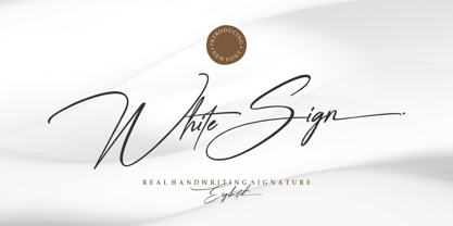 White Sign is Real Handwritting font presentation from Ergibi Studio. Inspired by beautiful writing that has a luxurious feel with additional swash lines perfect for branding, photography, invitations, quotes, watermarks, advertisements, product designs, social media posts, stationery, labels, and more! I hope you enjoy this font. If you have any questions please don't hesitate to drop me a message :) Big Thanks ~ Ergibi Studio
 - Bestina by Cocodesign,
$10.00 INTRODUCING Bestina Modern Calligraphy. This font was designed by handwriting, and it has a modern and unique forms of calligraphy, the writing style is very natural. Bestina has a very unique style of calligraphy, it is very suitable for use in the work of modern design. The Features of this fonts is: * Standart ligatures * Stylistic Alternates * PUA Unicode (Private Use Areas)
 - Bouncer by Fenotype,
$9.95 Bouncer is an all-caps font family with automatic interlocks. With soft and rounded look and over 150 automatic ligatures and three weights Bouncer is a flexible and easy to use font. It's very suitable for anything from a Jazz poster to a restaurant menu. To access the ligatures you only need to write in CAPS in any OpenType-supporting application.
 - Luxury Home by Fo Da,
$5.00 Luxury Home is a slab serif typeface of 9 weights from Extra Light to Extra Black and can be used as both a headline and text face. "Luxury Home" is recommended for using in long-form writing and articles, since a serif is far more readable for longer passages of text. The typeface has a carefully crafted weight range, with ligatures .
 - Metro Beardy by Figuree Studio,
$16.00 Hello, This is Metro Beardy! Metro Beardy is a retro bold font that comes from hand scratches to get natural writing. With the main style of the hand-lettering display font. Metro Beardy is very suitable for use in various media such as; packaging, logos, labels, posters, shirt designs, wisdom quotes, bulletins, typography, and many other media, especially with retro or vintage looks.
 - La Brilliante by Lucky Type,
$20.00 La Brilliante is the newest signature font perfect for wedding invitations, website headers, logos and more. La Brilliante is designed with natural handwriting which will make your design look unique and very beautiful. La Brilliante has front and back swashes in lowercase letters and has more than 50 ligatures that will beautify your writing. Thank you very much for viewing.
 - Grinc Heart by Mvmet,
$25.00 Grinc Heart is a playful and perfect Christmas font. The font is awesome for creating cool designs that scream for attention. It’s ideal for anything ranging from t-shirts, book designs, poster, blog writing, greeting cards to stickers, or anything that needs a casual touch. Fall in love with its incredibly cool style, and use it to create lovely designs!
 - Thimberly by Febri Creative,
$15.00 Thimberly is a modern and awesome handwriting font with extraordinary charm. This will change any design idea to be beautiful and perfect! Thimberly can be used for a logo, branding, or just writing which you can combine into great designs. It has multi-lingual support. Accessible in the Adobe Illustrator, Adobe Photoshop, Adobe InDesign, CorelDraw, even work on Microsoft Word.
 - Linotype Markin by Linotype,
$29.99 Markin is named after the writing utensil with which it looks like it was drawn, the marker. Its even strokes display characteristics similar to those of a sans serif typeface, but the stroke endings with their typical handwritten look give Markin a personal touch. Extremely versatile, it is the perfect choice for any work where individuality and spontaneity are the emphasis.
 - Merry Old Soul NF by Nick's Fonts,
$10.00This jaunty display face was discovered in one of the many books on sign writing produced by Eric Matthews. The work was signed “King Cole", hence the font’s name. This typeface’s large x-height and tight spacing make it highly suitable for attention-grabbing headlines. Both versions of this font include the complete Unicode Latin 1252 and Central European 1250 character sets. - Murisa Betzmann by Murisa Studio,
$10.00 Murisa Betzmann is a very special font. We make it with enthusiasm and joy. Betzmann is an innovation and style in typography. We provide 4 alternates for each uppercase, and 4 swashes for each lowercase. You are also given various ligatures for variations of your writing. Multiple alternates, multiple swashes, multiple ligatures, a brilliant work of art. Get it right now.
 - Al Mahdis by Mightyfire,
$15.00 We're proudly introduce Al Mahdis, the arabic-style font. Starting from the idea of making an Arabic font that remains clean and easy to read, Al Mahdis was born. This font is very suitable for writing calligraphy, book titles, or even your business logo. We're honored and hope the Al Mahdis font can be part of your special work. Thank You :)
 - Wanwan by Jipatype,
$30.00 ฟอนต์วันวาน อักษรแบบตัวเขียนอ้างอิงจากสไตล์การเขียนแบบพู่กันให้ความรู้สึกพริ้วไหว มีสไตล์ให้เลือกใช้ 9 สไตล์ตเป็นตัวเอียงทั้งหมด และเพิ่มความน่าสนใจด้วยการไฮไลท์ตัวอักษรที่ต้องการจากนั้นเปิดใช้งาน Stylistic Set 01-09 (ss01-09) หรือ Access All Alternates (aalt) จะมีป็อปอัพเด่งขึ้นมาให้เลือกอักษรทางเลือกอื่นๆ ฟอนต์วันวาน เหมาะสำหรับการผาดหัว ข้อความสั่นๆ หรือจัดวางเป็นกลุ่มคำสั่นๆ - Wanwan, a calligraphy font based on a brush writing style. There are 9 styles with italic. Comes with Stylistic Set 01-09 (ss01-09) or Access All Alternates (aalt). Wanwan suitable for headline wedding cards and other graphic work.
 - Ongunkan Tolkien English Runic by Runic World Tamgacı,
$50.00 Cirth was invented by J.R.R. Tolkien for use in his novels. It is modelled on the Anglo-Saxon Runic alphabet, and is used to write the language of the Dwarves (Khuzdul) in The Hobbit and The Lord of the Rings in inscriptions in wood and stone. It is also used as a alternative alphabet for English. This font is english version.
 - Dempsey by Just My Type,
$25.00 Creative people tend to mix printing and cursive, i.e. some letters connected, some not. Why? Who knows? Handwriting analysts have a field day with this sort of thing. Have a field day of your own with Dempsey, based on the writing of Tucson film teacher, media artist and programmer, Vikki Dempsey. It’s fun, assertive and will make you look even more creative.
 - Snowy Days by Mvmet,
$10.00 Snowy Days is a cool and playful snow-themed display font. The font is awesome for creating cool designs that scream for attention. It’s ideal for anything ranging from t-shirts, book designs, restaurant menu, blog writing, greeting cards to stickers, or anything that needs a casual touch. Fall in love with its incredibly cool style, and use it to create lovely designs!
 - Detori by Joe Hewitt Design,
$12.99 Detori makes its appearance offering you a clean and unpretentious typeface. It embraces a dreamy quality owing to its slightly wider apertures, creating a more informal look for your writing. Available in 9 weights (all with matching obliques), Detori has you covered for all uses, including modern-looking discrete thin and light weights to Bold and Black where extra emphasis is required.
 - Hand Real by Alit Design,
$15.00 Hand Real This font is inspired by the signature that makes writing cool and unique. The limp and natural monoline script style is perfect for a young, bold and cool design. Hand Real font is perfect for designs with a girly, love and relaxed concept. Very well applied to wedding invitation card designs, logotypes, business card designs and so on.
 - Magnitudo by ZetDesign,
$16.00 Magnitudo is a very amazing handwritten font. This font is equipped with many choices of styles (alternative A-z forms), making it easier for design workers to determine the form of writing according to their desired tastes. This font also features an international accent to be used in several countries at once.I hope you are interested in my work. Thank you...
 - Goat by Oliveira 37,
$30.00 Goat is a font display with extremely fine and sharp serifs, inspired by Gothic architecture, which brings a vertical elongation in extent and an allusion to the typical ogival vaults of the style. A font that not only carries a texture of writing with magnitude and elegance, but also causes some kind of strangeness for the subversion of some typographic laws.
 - Arum Sans by Australian Type Foundry,
$40.00 A humanist sans-serif family which displays subtle influences of the edged writing tool. Inspired by modern faces such as Chaparral and Enigma, Arum Sans is versatile enough to be used for high-end text setting as well as display purposes. A full international glyph set, extended for European use, allows Arum Sans to play on the field with the big boys.
 - Galleds Stars by Yukita Creative,
$14.00 Galleds Stars Display Typeface is a single font with a minimalistic but standout style for any work from movie titles, music album covers, magazines, beauty ads, and even wedding invitations. --- Minimalist type design has been a success for professional designers worldwide. - Galleds Stars Display Typeface is legible from much larger distances than typical fonts - Elegant letterforms give the feeling of luxury - Smooth curves for elegant typography This font has several alternative characters as in ( A,N,O,R,S,a,c,e,o,t,y ) Tips for using fonts in projects. Use this font with a simple background, not too busy so that you can highlight your branding This font file OTF
 - Blackoak by Adobe,
$29.00Joy Redick designed Blackoak, a big and heavy Egyptienne-sytle titling slab serif face, in 1990. The extremely robust style of the characters in this typeface was consciously distorted; creating letterforms that appear flattened and stretched, like a rubber band. Blackoak is drawn in the style of old wood tpes, just like those that one envisions when one thinks of the large, decorative posters that once filled Wild West America. The wood type collection of the Smithsonian Institute in Washington, DC acted as a primary source of inspiration for this design. True to its rooks, Blackoak is meant for use exclusively in headlines in very large point sizes, or for logos and other corporate advertising purposes. - Landry Gothic by E-phemera,
$12.00Landry Gothic is inspired by a wood type alphabet by an unknown designer. It was digitized in order to make prop signage for movies and television. Its imperfect lines and rounded corners are meant to capture the feeling of real wood or metal type that's worn from use. - MPI Gothic by mpressInteractive,
$5.00 Gothic is a basic sans serif with thick strokes and minimal contrast. Designs of this nature first appeared in wood type catalogs around the 1840s, and proved extremely popular in advertising and broadside printing. This version is based on a wood type design manufactured by Hamilton Manufacturing Company.
 - Stargild by Sinfa,
$14.00 Stargild is the perfect typeface for any type of your project with alternative fonts in both lowercase and uppercase and several types of underlines, such as advertisements, branding, quotes, wedding designs, graphic design, logos for online or offline businesses, photography, and more. -other. Make your business more beautiful!
 - RMU Pittoreske by RMU,
$35.00 This great Victorian display font of the late 19th century was revived for today’s use. You also find two frame elements. To start setting a frame, type [shift] + [alt] + p for the corner, and continue with typing [alt] + p. Duplicate and mirror the lines to get a fantastic frame.
 - Valjean by Solotype,
$19.95Here is a wood type from Tubbs & Co., about 1900. Its lack of decoration reflects the changes that were rapidly occurring in the design of printed pieces at the beginning of the 1900s. There were several similar types in metal in the first decade of the 20th century. - Grist Mill JNL by Jeff Levine,
$29.00Grist Mill JNL was modeled from an old wood type design and has all of the wonderful quirks that made wood type so appealing for many projects. There is minimal kerning because of the unique letter shapes, so you may wish to adjust your layout to fit your needs. - Bachenas by ParaType,
$30.00 The typeface was designed for Polygraphmash type design bureau in 1963 by Lithuanian book and type designer Vitoldas Bachenas. There is a low-contrast Serif with some unusual elements. For use in text and display matter. The digital version was developed for ParaType in 2003 by Lyubov Kuznetsova.
 - Halvan by driemeyerdesign,
$35.00 HALVAN –a striking type with half-serifs The Halvan font family comes in 5 styles from Roman to Bold, Italic and a Small Caps Version. Each version includes old style figures and lining figures. It is a versatile type and can be used in a wide range of circumstances.
 - Ohio by Wiescher Design,
$39.50 OHIO is a rough headline type in the tradition of Louis Oppenheimer. It is closely related to Lo-Type from Berthold, redesigned in the 1980s by Erik Spiekermann. Matter of fact, I discovered Ohio while visiting Erik in Berlin, searching his endless archive. Your typeface-looter Gert Wiescher
 - Typemonger JNL by Jeff Levine,
$29.00 Typemonger JNL is based on Two Line Sans Serif from the British type specimen book of Vincent Figgins (circa 1860), and is available in both regular and oblique versions. The word ‘monger’ is an old term for a merchant specializing in a certain commodity (such as printing type).
 - Anselm Sans by Storm Type Foundry,
$63.00One of the good practices of today’s type foundries is that they release their type families as systems including both serif and sans serif type. Usually, the sources of inspiration need to be well tried with time and practice, since production of a type family is such a laborious and complex process. From the beginning, it needs to be clear that the result will be suited for universal use. Such systems, complete with the broad, multi-lingual variations permitted by the OpenType format, have become the elementary, default instrument of visual communication. Non-Latin scripts are useful for a wide scope of academic publications, for packaging and corporate systems alike. And what about outdoor advertisement designated for markets in developing countries? Cyrillics and Greek have become an integral part of our OpenType font systems. Maybe you noticed that the sans serif cuts have richer variety of the light – black scale. This is due to the fact that sans serif families tend to be less susceptible to deformities in form, and thus they are able to retain their original character throughout the full range of weights. On the other hand, the nature of serifed, contrasted cuts does not permit such extremes without sacrificing their characteristic features. Both weights were drawn by hand, only the Medium cut has been interpolated. Anselm Ten is a unique family of four cuts, slightly strengthened and adjusted for the setting in sizes around 10 pt and smaller, as its name indicates. The ancestry of Anselm goes back to Jannon, a slightly modified Old Style Roman. I drew Serapion back in 1997, so its spirit is youthful, a bit frisky, and it is charmed by romantic, playful details. Anselm succeeds it after ten years of evolution, it is a sober, reliable laborer, immune to all eccentricities. The most significant difference between Sebastian/Serapion and Anselm is the raised x-height of lowercase, which makes it ideal for applications in extensive texts. Our goal was to create an all-round type family, equally suitable for poetry, magazines, books, posters, and information systems. - Anselm Serif by Storm Type Foundry,
$63.00 One of the good practices of today’s type foundries is that they release their type families as systems including both serif and sans serif type. Usually, the sources of inspiration need to be well tried with time and practice, since production of a type family is such a laborious and complex process. From the beginning, it needs to be clear that the result will be suited for universal use. Such systems, complete with the broad, multi-lingual variations permitted by the OpenType format, have become the elementary, default instrument of visual communication. Non-Latin scripts are useful for a wide scope of academic publications, for packaging and corporate systems alike. And what about outdoor advertisement designated for markets in developing countries? Cyrillics and Greek have become an integral part of our OpenType font systems. Maybe you noticed that the sans serif cuts have richer variety of the light – black scale. This is due to the fact that sans serif families tend to be less susceptible to deformities in form, and thus they are able to retain their original character throughout the full range of weights. On the other hand, the nature of serifed, contrasted cuts does not permit such extremes without sacrificing their characteristic features. Both weights were drawn by hand, only the Medium cut has been interpolated. Anselm Ten is a unique family of four cuts, slightly strengthened and adjusted for the setting in sizes around 10 pt and smaller, as its name indicates. The ancestry of Anselm goes back to Jannon , a slightly modified Old Style Roman. I drew Serapion back in 1997, so its spirit is youthful, a bit frisky, and it is charmed by romantic, playful details. Anselm succeeds it after ten years of evolution, it is a sober, reliable laborer, immune to all eccentricities. The most significant difference between Sebastian/Serapion and Anselm is the raised x-height of lowercase, which makes it ideal for applications in extensive texts. Our goal was to create an all-round type family, equally suitable for poetry, magazines, books, posters, and information systems.
 - Univers by Linotype,
$42.99 The font family Univers? is one of the greatest typographic achievements of the second half of the 20th century. The family has the advantage of having a variety of weights and styles, which, even when combined, give an impression of steadiness and homogeneity. The clear, objective forms of Univers make this a legible font suitable for almost any typographic need. In 1954 the French type foundry Deberny & Peignot wanted to add a linear sans serif type in several weights to the range of the Lumitype fonts. Adrian Frutiger, the foundry's art director, suggested refraining from adapting an existing alphabet. He wanted to instead make a new font that would, above all, be suitable for the typesetting of longer texts - quite an exciting challenge for a sans-serif font at that time. Starting with his old sketches from his student days at the School for the Applied Arts in Zurich, he created the Univers type family. In 1957, the family was released by Deberny & Piegnot, and afterwards, it was produced by Linotype. The Deberny & Peignot type library was acquired in 1972 by Haas, and the Haas'sche Schriftgiesserei (Haas Type Foundry) was folded into the D. Stempel AG/Linotype collection in 1985/1989. Adrian Frutiger continues to do design work with Linotype right up to the present day. In 1997, Frutiger and the design staff at Linotype completed a large joint project of completely re-designing and updating the Univers family. The result: Univers Next - available with 59 weights and 4 Linotype Univers Typewriter weights. With its sturdy, clean forms Univers can facilitate an expression of cool elegance and rational competence. Univers has the uncanny ability to combine well with fonts of many different styles and origins: Old style fonts such as: Janson Text, Meridien, Sabon, Wilke. Modern-stressed fonts such as: Linotype Centennial, Walbaum. Slab serif fonts such as Egyptienne F, Serifa. Script and brush fonts such as: Brush Script, Mistral, Ruling Script. Blackletter fonts such as: Duc De Berry, Grace, San Marco. Even fun fonts such as F2F OCRAlexczyk, Linotype Red Babe, Linotype Seven."
 - Reina Neue by Lián Types,
$29.00 Hey! See Reina Neue in action here! INTRODUCTION When I designed the first Reina¹ circa 2010, I was at the dawn of my career as a type designer. The S{o}TA, short for the Society of Typographic Aficionados, described it as complex display typeface incorporating hairline flourishes to a nicely heavy romantic letterform². And it was like that; that’s what I was pursuing at that time since I was very passionate about ornaments and accolades of Calligraphy. Why? I felt that Typography, in general, needed more of them. These subtle flourishes could breathe life into letters. Maybe, I thought it was the only way I could propose something new into the field of type. However, after some years, I came across a very interesting quote: –Beautiful things don’t ask for attention– Wow! What did this mean? How could something be attractive if it’s not actually showing it. Could this be applied to my work? Sure. I think every type-designer goes through this process (aka crisis) regarding his or her career. At the beginning we love everything. We are kind of blind, we only see the big picture of a project. And that’s not because we are lazy. We actually can’t see the small mistakes nor the subtleties that make something simpler beautiful. We are not able. But, the small subtleties… They are actually everything: With experience, one puts more attention into the details and learns that every single decision in type has to be first meticulously planned. Here I am now, introducing a new Reina, because I felt there was a lot of it that could be improved, also the novelty of Variable Fonts caught my attention and I had to take that to my type library. THE FONT A thing of beauty is a joy forever Now, a decade later, I’m presenting Reina Neue. This font is not just an update of its predecessor: –A thing of beauty is a joy forever– is the first line of the poem ‘Endymion’ by John Keats, and despite the meaning of “beauty” may vary from person to person, and even from time to time (as read in the last paragraph), with Reina I always wanted to bring joy to the eye. In 2010, and now, in 2020. I believe the font is today much better in every aspect. It was entirely re-designed: Its shapes and morphology in general are much more clean and pure. The range of uses for it is now wider: While the old Reina consisted in just one weight, Reina Neue was converted into a big family of many weights, even with italics, smallcaps and layered styles. The idea behind the font, this kind of enveloping atmosphere made out of flourishes, is still here in the new Reina. This time easier to get amazing results due to the big amount of available alternates per glyph and also more loyal from a systemic point of view. However, and as read in the introduction -Beautiful things don’t ask for attention-, if none of the flourishes are activated the font will look very attractive anyway. Reina Neue is ready to be used in book covers, magazines, wedding cards, dazzling posters, storefronts, clothing, perfumes, wine labels and logos of all kind. Like it happened with the previous Reina, I hope this new font satisfies every design project around the world if used, and can be a joy forever. SOME INSTRUCTIONS Before choosing the right style for your project, hear my advice: -Reina Neue Display was meant to be used at big sizes. If you plan to print the font smaller than 72pt, I suggest using Reina Neue, not Display. Otherwise, if the font will be BIG or used on a digital platform, Reina Neue Display should be your choice. For even smaller sizes, use Reina Neue Small. This style was tested and printed in 12pt with nice results. (Note for variable fonts: Print them in outlines) -Reina Italic is not a slanted version of the roman, and this means some flourishes are different between each other. The Italic version has other kind of swirls. More conservative, in general. -All the styles of Reina Capitals have Small Capitals inside. -Reina Capitals Shine should be used/paired ONLY with Reina Capitals Black. The engraved feeling can be achieved if Reina Capitals Black and Reina Capitals Shine are used as layers, with the same word. Variable fonts instructions: -For more playful versions, choose Reina Neue VF, Reina Neue Italic VF or Reina Neue Capitals VF: With them you can adjust between 3 axes: Weight (will change the weight of the font) – Optic Size (will thicken/lighten the thin strokes and open/close the tracking) – Accolades (will modify the weight of the active flourishes). SOME VIDEOS OF REINA NEUE VF https://youtu.be/8cImmT5bpQM https://youtu.be/1icWfPmKAkg https://youtu.be/YC9GkJDL1a8 NOTES 1. The original Reina, from a decade ago: https://www.myfonts.com/fonts/argentina-lian-types/reina/ 2. In 2011, Reina received an honourable mention by S{o}TA. “Great skill is shown in the detailing, and an excellent feel for the correct flow of curves and displacement of stroke weight.” https://www.typesociety.org/catalyst/2011/ Reina was featured in the “Most Popular Fonts of the year” in MyFonts in 2011 https://www.myfonts.com/newsletters/sp/201201.html In 2012, the font was also selected in Tipos Latinos, the most prestigious competition of type in Latinoamerica. https://www.tiposlatinos.com/bienales/quinta-bienal-tl2012/resultados Also, chose as a “Favorite font of the year” in Typographica. https://typographica.org/typeface-reviews/reina/