10,000 search results
(0.058 seconds)
- UppenArmsNF - 100% free

- UA Squared - Unknown license

- DTCBrodyM37 - Unknown license

- DTCBrodyM33 - Unknown license

- UA Serifed - Unknown license

- Cachuelin Letter - Personal use only

- Helveticrap - 100% free

- AnjaliOldLipi is a font that gracefully bridges the gap between tradition and digital expression, particularly in the context of Malayalam script. It is a typeface that has been carefully designed to...
- Homework by DAAZ,
$9.00 Homework font was specially conceived/designed for teaching cursive writing. This resource allows tutors and parents to create worksheets for individual or class teaching. Associated with the dashed version of the font, students can learn and exercise their handwriting abilities. All capital letters, excluding I, F, T and P, link to any following small letter: the sequence of the previous letter stroke always follows the angle of the initial stroke of the subsequent letter. This, in the real world, means that words built with the font can be handwritten without having to lift the pen from the paper (except to cross t and f and dot i and j) or interrupt the writing flow. All the letters are base aligned and all small letters have the same ‘x’ height in order to fit a ruled worksheet. Homework font letter stroke widths are uniform in order to emulate regular pens. Homework font also mimics genuine handwriting, making it useful for online stores gift cards, thank you cards and all applications where a real world feel is desired. The Homework font also performs well on long texts.
 - Cíclope by Andinistas,
$19.95 Cíclope is a typeface family designed by Carlos Fabián Camargo in 2012 and used to write the headlines. Its idea is based on an army of stone soldiers that with their size and strength cause earthquakes. Under this concept he obtained stencil and sans serif letters with monstrous shapes and torn counterforms. Its usefulness as well as readability consists in imitate rocks with scars and cracks. For that reason, Cíclope family has three sizes, each with their respective italics distributed at different levels of corrosion. In addition, each file contains 260 glyphs useful for designing words and phrases with systematically eroded treatments for advertisement material. Thus Cíclope works as a raw material in the exploration of new graphic design. Finally, Cíclope concept has grotesque, geometric and humanistics letters roots that seem disastrous but each and every detail has been planned with high definition drawing. Most importantly, it expresses a big amount of grunge style with cracked edges and medium contrast between thin and thick strokes. In that sense, the writing seems impaired and special for design of logos, posters, flyers, brochures and worn, crusty or demolished graphic design.
 - Veronika by Linotype,
$29.99Veronika is a semi-serif text face, available in three styles: Regular, Italic, and Bold. All three faces are available in OpenType format, with both lining and old-style figures. Grüger, a German artist and designer, first began the design of her typeface by writing out its letterforms with a wooden stylus. She wanted to create a new semi serif face that had uniform stroke widths, but still maintained some aspects of calligraphy. Veronika achieves this; the terminals that begin the first strokes of most letters are round and bulbous, as if the writing instrument added extra emphasis on that spot. This adds a dynamic, movement-like quality to texts designed with Veronika. Aside from some sans serif-ness, Veronika appears similar to old style typefaces from the renaissance: classical inscriptions inspired the proportions of the capital letters, and the lower case letters stem from Carolinian minuscule. These proportions allow Veronika to function very well in text and at small sizes. However, only when you design larger headlines, logos, or other elements with Veronika, will you notice all of its special qualities, like its weight distribution and stroke characteristics. - Ongunkan Ogham by Runic World Tamgacı,
$50.00 This font is a latin based version of the ogham alphabet used in the writing of the old irish language. It can be used on Latin keyboards. I will make a unicode font version of this font in the future. Ogham (/ˈɒɡəm/ OG-əm, Modern Irish: [ˈoː(ə)mˠ]; Middle Irish: ogum, ogom, later ogam [ˈɔɣəmˠ] is an Early Medieval alphabet used primarily to write the early Irish language (in the "orthodox" inscriptions, 4th to 6th centuries CE), and later the Old Irish language (scholastic ogham, 6th to 9th centuries). There are roughly 400 surviving orthodox inscriptions on stone monuments throughout Ireland and western Britain, the bulk of which are in southern Munster. The largest number outside Ireland are in Pembrokeshire, Wales. The vast majority of the inscriptions consist of personal names. According to the High Medieval Bríatharogam, the names of various trees can be ascribed to individual letters. For this reason, ogam is sometimes known as the Celtic tree alphabet. The etymology of the word ogam or ogham remains unclear. One possible origin is from the Irish og-úaim 'point-seam', referring to the seam made by the point of a sharp weapon.
 - Ah, Bebas Neue by Dharma Type, the slender, tall glass of water of the typeface world. Picture this - if fonts were people, Bebas Neue would be that incredibly cool, unfailingly stylish friend who kn...
- J.Kasperville - 100% free

- EDB Indians - Unknown license

- Anyway - Unknown license

- Wesley - Unknown license

- Exploding Sheep - Unknown license

- ATF Headline Gothic by ATF Collection,
$59.00 ATF Headline Gothic cries out to be used in headlines, and that is exactly how it was used after it was first created by American Type Founders in 1936 with newspapers in mind. It would be hard to imagine a better typeface for a shocking, front-page headline in a scene from an old black-and-white movie. With its all-caps character set, and its big, bold, condensed design, ATF Headline Gothic is the epitome of its name. “Extra! Extra!” The style of ATF Headline Gothic recalls the bold, condensed gothic display faces of the 19th century, but with more refinement in its details than many large types of the time (typically wood type). Its most recognizable trait is the restrained, high-waisted M, with short diagonal strokes that end with their point well above the baseline; this avoids the sometimes cramped look of a bold condensed M with a deep “V” in the middle, common in many similar headline faces. The digital ATF Headline Gothic comes in a single weight, all caps, like its predecessor, but offers two styles: one crisply drawn, and a “Round” version with softer corners, to suggest a more “printed” feel, reminiscent of wood type. Of course, in either style it includes a full modern character set, including symbols such as the Euro, Ruble, and Rupee, that didn’t exist in 1936.
 - Normandia by Canada Type,
$30.00 Designed over three years after the second World War, and published in 1949 by the Nebiolo foundry, Normandia was Alessandro Butti’s take on the fat face. As it usually was with Butti’s designs, this face effectively injected a catchy yet expertly calculated calligraphic spin into its source of inspiration — which was the essentially geometric/deco, thicker model of Bodoni’s very popular aesthetic. The metal Normandia saw some widespread use for a handful of years after its publication, not least because of the multitude of sizes in which it was available. It stepped out of the limelight by the mid-1950s, due to a combination of the popularity of cold type and Nebiolo’s refusal to retool its faces for new technologies. It was copied by a few small film typesetting outfits on both sides of the Atlantic, but never really found its way back to the mainstream. By the time computer type became the norm, Normandia was pretty much relegated to a type historian’s collection of anecdotes. This digital update of the classic series revives and refines the three original metal designs (Tonda/Regular, Corsiva/Italic, and Contornata/Outline) and expands the character set to more than 600 glyphs per font, including small caps, six types of figures, fractions and nut fractions, a full set of f-ligatures, some stylistic alternates, and other fine typography niceties.
 - FM Bolyar Pro by The Fontmaker,
$29.00 Bolyar Pro type family is the ancestor of our successful font Bolyar . We decided to develop it to a new higher level - making it more sophisticated, detailed and useful at the same time. The new improved Bolyar is able to satisfy every typographic taste and meet the ever growing design requirements for high quality typefaces. If you are addicted to classic vintage style, then you could easily use Bolyar Pro for almost anything - from letterhead, logos and catchy headlines to elegant packaging, book covers and wine labels. Alternates, Swashes and Ligatures will help you customize almost every single letter and fit perfectly to your artwork. Bolyar Pro type family is showing an abundance of many new useful features and options like: - Five weights each sold as separate font - Over 1200 glyphs per weight - Full multilingual support of all European languages as well Greek and Cyrillic - Brand new Alternates and Swashes fully supported in all languages (even with accented characters) - Many useful ligatures - Full Open Type and True Type support for Mac and Win Platforms - New Bolyar Ornaments - a new complimentary font exclusively designed to fit the new Bolyar Pro, containig decorative shields, frames, ornaments and borders. Bolyar Pro font family is great for any kind of labels - in this link you could see some amazing examples how to use it alone or in combination with our Bolyar Ornate Pro font family.
 - TX Signal Signifier by Typebox,
$39.00Eight designers present a set of icons that indicate the fun and fantastic world of signage. Each collaborator's solution represents a completely different interpretations on signage vernacular. Akira Kobayashi's "Subsumption", obscured by foliage, offers a perspective that signs on Japanese roads can be vague and beautiful. M.A.D.'s "People Signs" is a graphical association of people signage with a variety of well known situation symbols. Cynthia Jacquette's "Honest Arrows" are a series of arrows that attempts to honestly tell you how to get from point A to Point B in a big, confusing city. Mike Kohnke's "Road Kill" and the "Bump & Bruise" highlight how signs make for perfect targets when unloading a round of buckshot, and the licking a contruction barrier often endures. Joachim Muller-Lance's "Traffic Blends" places faces on things! Hey, didn't you give your first car a nickname? Cars are alive, you know - they guzzle and smoke all day. Jean-Benoît Lévy's "Inner-State" was inspired while reading the California driver handbook to pass a driver's test. Kevin Roberson's "Tail Lighting" reminds us to drive carefully and not to forget to signal. Diana Stoen's "Drivers Out There" shows us "driver personality archetypes", including the lil'ol lady that everyone tries to avoid. - SF Chaerilidae - Unknown license

- SF Buttacup Lettering - Unknown license

- News Gothic SB Vietnam by Scangraphic Digital Type Collection,
$26.00 This version of News Gothic contains the Vietnamese character set. Since the release of these fonts most typefaces in the Scangraphic Type Collection appear in two versions. One is designed specifically for headline typesetting (SH: Scangraphic Headline Types) and one specifically for text typesetting (SB Scangraphic Body Types). The most obvious differentiation can be found in the spacing. That of the Body Types is adjusted for readability. That of the Headline Types is decidedly more narrow in order to do justice to the requirements of headline typesetting. The kerning tables, as well, have been individualized for each of these type varieties. In addition to the adjustment of spacing, there are also adjustments in the design. For the Body Types, fine spaces were created which prevented the smear effect on acute angles in small type sizes. For a number of Body Types, hairlines and serifs were thickened or the whole typeface was adjusted to meet the optical requirements for setting type in small sizes. For the German lower-case diacritical marks, all Headline Types complements contain alternative integrated accents which allow the compact setting of lower-case headlines.
 - SnowDream is not just a font; it's an enchanting journey into the heart of winter's magic. Picture the serene beauty of a world covered in a blanket of snow, where each snowflake carries its own uniq...
- Fundamental Rush - Unknown license

- Wires and Cowboys - Unknown license

- Cal Roman Capitals by Posterizer KG,
$16.00 Calligrapher Roman Capitals Font, is one of the calligraphic group of fonts called “21 alphabets for Calligraphers“. All graphemes are taken from calligraphic pages written on traditional Imperial (Roman) calligraphic stile. This font is ideal for calligraphic sketches or for imitation of ancient manuscripts. Font contains Small Caps and all the Latin glyphs.
 - Canyonlands by The Styled Script,
$27.00 Say hello to chic with the beautiful, modern Canyonlands Script font! This casual, hand-lettered script font is perfect for styling logos, stationery, social media, websites and so much more! Canyonlands was created with multilingual support and over 45 ligatures, allowing you to create a real hand-written look to your projects.
 - Aiolos by Nantia.co,
$16.00 This font is a hand-made typeface with Greek Character support. With cute doodles icons in PUA encoding, this typeface can be a mighty companion to your next graphic design project. From “hand-written” quotes to product packaging, merchandise, and branding projects, this font is so versatile that it can cover them all.
 - Elegeion Script by Patricia Lillie,
$29.00Built of all straight lines, Elegeion Script -- inspired by retro printers' scripts with a dash of calligraphy and handwriting thrown in -- mimics the imperfections and irregularities of old letterpress printing. Even better, it comes with lots and lots of swashy alternate characters and ligatures, including a full set of "long s" ligatures. - Mengelt Basel Antiqua by Linotype,
$29.99 Inspired by the excellent serif fonts of the Basel printer of the 15th and 16 Century, Christian Mengelt designed the Mengelt Basel Antiqua. The typeface is a Renaissance Antiqua with stylistic reference to the historical model, but with the technical and typographic qualities of a modern text typeface with excellent reading quality.
 - Mengelt Basel Antiqua Paneuropean by Linotype,
$103.99Inspired by the excellent serif fonts of the Basel printer of the 15th and 16 Century, Christian Mengelt designed the Mengelt Basel Antiqua. The typeface is a Renaissance Antiqua with stylistic reference to the historical model, but with the technical and typographic qualities of a modern text typeface with excellent reading quality. - Fidelio ND by Neufville Digital,
$45.25 Fidelio is a chancery italic typeface with swashes, designed by José Mendoza y Almeida in 1980. Written with a broad nibbed pen, it has Caps with swash versions, Lower Case and a wide number of ligatures. It is one of the most complete and appealing calligraphies. Fidelio is a Trademark of BauerTypes SL
 - Cal Expressive by Posterizer KG,
$16.00 Calligrapher Expressive is one of the calligraphic group of fonts called “21 alphabets for Calligraphers“. All graphemes are taken from calligraphic pages written in Expressive calligraphic style with nibs made of cans. This font is ideal for calligraphic sketches or for imitation of ancient manuscripts. The font contains all the Latin glyphs.
 - Irrational by Gassstype,
$25.00 Irrational - Strong Brush Font is an Authentic brush Font that is written casually and quickly. Letters are made with Procreate. Then trace down into vector format, and carefully crafted into a typeface. That is why Irrational has a rough, authentic, and strong characteristic more natural look. You can activate Ligature OpenType panel.
 - Treves Sans by AdultHumanMale,
$15.00 Treves Sans is a scratchy, messy, hand written display font. It has the look of charcoal or a brass rubbing, reversed in lighter tones it looks like chalk. It reminds me of Edward Gorey's or Eddie Campbell's styles of sketching. It has about 200 glyphs including all those extra pesky foreign features.
 - Cal Cursive Modern by Posterizer KG,
$16.00 Calligrapher Cursive Modern, is one of the calligraphic group of fonts called “21 alphabets for Calligraphers“. All graphemes are taken from calligraphic pages written on Cursive Modern calligraphic style. This font is ideal for calligraphic sketches or for imitation of ancient manuscripts. Cal Cursive Modern contains all the Latin and Cyrillic glyphs.
 - Woodyland by Illushvara,
$16.00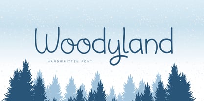 Hello, Woodyland is a cute and friendly handwriting font that is perfect for winter design or crafty projects. Use it for branding, crafts for decor, invitations, and more! Features : Uppercase and lowercase Numbers Symbols Ligature Multilingual Accent If you have any question, don’t hesitate to contact me. Happy Designing !!! Thank You, Bayu Suwirya


