10,000 search results
(0.029 seconds)
- Mentah 1 by Sulthan Studio,
$10.00 This sketch font Sans serif was born from the lines in the font that we created for the (Rajin) font and we redeveloped it into a different style with a more minimalist and more powerful setting and looks stunning for any smooth and bold writing that can be used anywhere in your work This font has complete uppercase and lowercase letters with 4 thicknesses, numbers, punctuation, and also language support
 - Alzaina by Zamjump,
$17.00 Introducing Al Zaina, a font with Arabic style, inspired by classical Latin handwriting and Arabic calligraphy art. Fonts designed with a touch of arabic style are very suitable for use in your various projects, product packaging, magazine covers, book covers, flayer backgrounds, beauty products, boutiques, and are used for writing at Islamic annual events. Equipped with alternate, and swash makes it easy for you to explore your design.
 - Furqan by Putracetol,
$28.00 Furqan - Arabic Font beautifully encapsulates the essence of Arabic calligraphy, with its distinctive style that closely resembles traditional Arabic letters. Each character is adorned with intricate dots, paying homage to the intricate detailing found in classical Arabic writing. This font carries an air of authenticity and cultural richness, making it an excellent choice for a wide array of design purposes. From logos and branding materials to posters, product packaging.
 - Wamelo by Groen Studio,
$16.00 Wamelo, a work that is purely a result of handwriting and writing by using a liquid ink pen, has a natural characteristic. This is perfect for invitations, signatures, blogs, social media, business cards, product brands. OpenType features can be accessed by using OpenType smart programs such as Adobe Photo Shop, Adobe Illustrator, Adobe Indesign, Corel Draw and Microsoft Office. They can also be accessed through the character map.
 - Majestic Wisteria by Letterhanna Studio,
$19.00 Majestic Wisteria is a a sweet handwritten font that is made with great care in order to produce the expected outcomes. This font can be used for writing various kinds of products according to their respective needs. It will add a luxury spark to any design project that you wish to create! This font is PUA encoded which means you can access all of the amazing glyphs and ligatures with ease!
 - Abdo Text by Abdo Fonts,
$99.00 Abdo Text is an Arabic Naskh font for books and magazines discriminate accurately design and clarity of reading, it comes in one weight. Will later add mor weights and a copy of it to write the Koran Ottoman drawing. This is an OpenType Font supporting Arabic,and compatible with the various operation systems and modern software. This font also contains many of Stylistic Sets, Ligatures and Justification Alternatives - 775 glyphs.
 - Odell by The Organic Type,
$29.99 Odell is a fun, whimsical, yet elegant handwritten font that was created in a light-hearted manner for use in things like menus, invitations, bed and breakfast collateral and whatever else you can dream up. Odell features extra thin letters and it is designed to be creative, a little fancy, and very legible. There are tons of foreign characters to choose from so you can write in other languages as well.
 - !CRASS ROOTS OFL - Unknown license

- Neuzeit Office Soft Rounded by Linotype,
$29.99 Every year, more and more text is read directly on a computer screen in office applications, or from freshly printed sheets from a copier or laser printer. Clear, legible text faces are more imperative to office communication than ever before. Yet every worker desires a small bit of personality in the corporate world. Most office environments are only equipped with a few basic fonts that are truly optimized for use in text, with laser printers, and on screen. The Linotype Office Alliance fonts guarantee data clarity. All of the font weights within the individual family have the same character measurements; individual letters or words may have their styles changed without line wrap being affected! All numbers, mathematical signs, and currency symbols are tabular; they share the same set character width, ensuring that nothing stands in the way of clear graph, chart, and table design. In addition to being extremely open and legible, the characters in this collection's fonts also share the same capital letter height and the same x-height. The production and reading of financial reports is duly streamlined with the Linotype Office Alliance fonts. The Neuzeit Office family is designed after the model of the original sans serif family Neuzeit S, which was produced by D. Stempel AG and the Linotype Design Studio in 1966. Neuzeit S itself was a redesign of D. Stempel AG's DIN Neuzeit, created by Wilhelm Pischner between 1928 and 1939. Intended to represent its own time, DIN Neuzeit must have struck a harmonious chord. DIN Neuzeit is a constructed, geometric sans serif. It was born during the 1920s, a time of design experimentation and standardization, whose ethos has been made famous by the Bauhaus and De Stijl movements in art, architecture, and design. Upon its redesign as Neuzeit S in the 1960s, other developments in sans serif letter design were taken into account. Neuzeit S looks less geometric, and more gothic, or industrial. Separating it from typefaces like Futura, it has a double-storey a, instead of a less legible, single-storey variant. Unlike more popular grotesque sans serifs like Helvetica, Neuzeit S and especially the redesigned Neuzeit Office contain more open, legible letterforms. Neuzeit Office preserves the characteristic number forms that have been associated with its design for years. After four decades, Neuzeit has been retooled once again, and it is more a child of its age than ever before. Akira Kobayashi, Linotype's Type Director, created the revised and updated Neuzeit Office in 2006. His greatest change was to retool the design to make its performance in text far more optimal. Additionally, he created companion oblique to help emphasize text. The other three families in the Office Alliance system include Metro Office, Times Europa Office and Trump Mediaeval Office.Some weights of the Neuzeit Office are availabla as soft rounded versions. "
 - Hellschreiber by Jörg Schmitt,
$35.00 The birth of the monospaced types dates back to the past. There was a need for the creation of typesets for typewriters. The difficulty was to align the different glyphs in the same width. This led to particular problems with letters like “M” and “l”; the former seemed to be squeezed into the same width of all letters and the second one appeared way too streched. Despite – or perhaps because of – the impression of the typewriter is still popular with Graphic Designers. Nowadays there are even monospaced versions of primarily proportional types; for example the the Sans Mono designed by Lucas de Groot or the DIN Mono. Then again, why not the other way round?! In the first half of the Nineties, Erik Spiekermann developed a proportional type named ITC Officina based on the Letter Gothic. According to a survey on the 100 best fonts of all time conducted by FontShop, ITC Officina is in an eighth place, far ahead of its forerunner. This was the reason for me to create a wider design with a Serif and a Sans Serif based on the queen of all monospaced types – the Courier.
 - Lucas Brandis by Proportional Lime,
$9.99 In the early days of printing everything had to be worked out from scratch. This set of lettering is based on section headings used by the Printer Lucas Brandis (no known relation), the first printer to operate in the city of Lübeck around 1473. They remind me of a medieval version of the spray paint graffiti so often seen on the sides of trains. A bit on the crude side, but also and importantly extremely noticeable. So whether you use it for creating old styled printing or some wild modern eye grabbing text item, its robust and sturdy shapes will be certain to grab the eye.
 - Okeanos by Nantia.co,
$12.00 Okeanos Handwritten Greek Cyrillic Font is a handwritten display font. 100% handcrafted with a marker, digitized, and turned into a font. Of course, the font supports a full set of Greek characters, Cyrillics, and an extended Latin character set with diacritics. With 10 nautical icons, this typeface can be your next typeface for your graphic design needs. From “hand-written” quotes to product packaging, merchandise, and branding projects, this font is so easy to use that it can cover them all. Also, it can be used on social media content, for branding, poster design, for “hand-written” quotes and any other kind of product packaging.
 - Durazno de Chile by Ocha Puyaber,
$10.00 Durazno de Chile are cursive fonts based on Chilean school script. It can be written in Aymara, Mapuche and Rapa Nui from Chile. It can also be written in Dutch, Maltese, and other languages. This font family is cute. The style is wide and rounded. It has wide and open loops. The strokes are drawn with a round cap tool, with no contrast. It is cursive and connected. The form is upright because upright is the Chilean script standard. It is easy to read in Chile. Parts A have capitals with high starts. Parts B have capitals with low starts. Parts F are Final forms.
 - Lualaba Snake by Scholtz Fonts,
$19.00Lualaba Snake is a bold display font, characterized by the snake-like decoration used in each letter. The design of the font was inspired by the legend of the Lualaba River in Central Africa. Snakes enjoy a special status in Africa, as they are reputed to be messengers of the ancestors, and are therefore good. Near the Lualaba river is a pool in which a big snake called Kabwe lives. Our ancestors are thought to communicate through this snake. - Sheepman by Dharma Type,
$19.99 Sheepman inspired by and based on retro William Page’s No.506 typeface which is popular wooden type fonts of the 19th century. To make soft and natural impressions, the original polygonal design was changed to rounded design. All glyphs had been designed carefully to be retro-looking of the old time and to fill all with nostalgia. This modern wood type includes 3 weights and their matching slanted style and all style have sprayed ends(beginning) alternates for F, H, L, M, N, P, U, f, h, j, m, n, p, q, and u which can be accessed by using OpenType Stylistic alternates or swash alts. Sheepman will be the best solution for posters, titles and anywhere you need vintage lettering.
 - Circus Didot by ParaType,
$25.00 Circus Didot typeface presents a rework of a typical neoclassical serif type in a constructivist style. Analyzing the shapes of characters author placed basic geometric figures — triangles, rectangles, circles… above the contours of letters. Resulting constructions staying recognizable letters at the same time bore a resemblance to pictures of Russian avant-garde artists from 20th century. This discovery has brought an idea to design a typeface where the tendency of a modern serif type to rationalism and geometry is realized in maximum possible extent. The prototypes for the project were taken from the works of Didot, lettering experiments of Russian constructivists and art deco artworks. The technique of juggling with shapes and overall grotesque approach to the design explains the selection of the name for the font.
 - VTC Elmwood by Vintage Type Company,
$12.00 VTC Elmwood is a modernized blackletter font family from Vintage Type Company. What's old is new again. Elmwood comes in 4 styles, including regular, 8-bit, outline, and spurred. Drawing inspiration from calligraphic techniques of the past, Elmwood strips away any flourishes that would typically be found in a similar textura typeface, and offers a more modern, stylized old english font. The styles that come included save you a bit of time from having to stylize the regular version yourself, and allow you to tailor the font to more niche and customized projects. Saving time is good, and you're sure to love these options. VTC Elmwood makes the perfect font for branding & logo projects, package design, title design, print & e-publications, and the list goes on.
 - House Of Cards by Dharma Type,
$19.99 House of Cards is inspired by and based on retro Hamilton’s Teniers typeface which is popular wooden type fonts of the 19th century. To make natural and contemporary impressions, the original lowercase design was slightly changed from the original but all glyphs had been designed carefully to be retro-looking of the old time and to fill all with nostalgia. This modern wood type includes 2 weights and their matching italic style and all style have sprayed ends(beginning) alternates for F, H, P, U, f, h, m, n, t, u, and w which can be accessed by using OpenType Stylistic alternates or swash alts. House of Cards will be the best solution for posters, titles and anywhere you need vintage lettering.
 - Catastrophique by Comicraft,
$19.00 It’s a Towering Inferno of a Font! It’s a Poseidon Adventure, an Earthquake and a Sharknado of Devastating Proportions! Don’t Look Up -- these cracked and chunky letterforms are signifiers of a Magnificent Disaster! A Perfect Storm of Tip Top Type by Comicraft's Starkings & Roshell with artist Lisa Davighi. Dante’s Peak has exploded and the Deluge has begun. Don’t save this font for the Day After, when worlds collide — Armageddon is Now!
 - Sketchnote by Delve Fonts,
$29.00 The Sketchnote typeface was born of necessity: designer Mike Rhode needed a series of hand-drawn fonts to illustrate and produce his book, “The Sketchnote Handbook.” Because of its origin, this typeface was designed to be practical and convey the human character and quirks of his normal handwriting and hand-drawn lettering. The family is comprised of five fonts: Sketchnote Text in Regular, Bold, and Italic, the somewhat compressed and bold Sketchnote Square for headlines, and the playful Sketchnote Dingbats. Sketchnote Text is a casual script with a slightly bouncy baseline. In order to mimic the differences present in natural handwriting, OpenType features are built-in that automatically switch between multiple versions of each letter or number. In total, over 240 alternates in each of the text fonts are employed, making for a more authentic appearance. The warm texture of Sketchnote is the result of actual ink-spread on paper captured in the scans of written letterforms and was intentionally left intact during the digitization process to preserve that feeling. Rhode created Sketchnote Square as a display type to complement Sketchnote Text. Drawn instead of written, the letters often have neat little happenstance voids within the strokes. Sketchnote Dingbats features a selection of icons, rules, and arrows to provide some functional and fun tidbits, handy for bringing additional life to any design.
 - Mike Wieringo by Comicraft,
$29.00 SPIDER-MAN! THE HULK! THE FANTASTIC FOUR! BATMAN! SUPERMAN! Superstar artist Mike Wieringo has worked with the most well-known characters in comic books, and just a few short years ago Comicraft teamed up with Mike and writer Todd DeZago in the pages of their creator-owned comic book fantasy adventure series, TELLOS! At Mike's request, we created a special Wieringo font which incorporated Mike's distinctive, slick-and-easy, backward-sloping letters, as well as a slightly heavier font -- carrying just a little more ink -- for the Shadow Jumper characters featured in the first TELLOS story arc. Now the Mike Wieringo font can be yours as it joins our ever growing library of Masters of Comic Book Art fonts.
 - Art Project JNL by Jeff Levine,
$29.00 A 1930s WPA (Works Projects Administration) poster advertising a play entitled “Abraham Lincoln, The Great Commoner” had the play’s name done in a hand-lettered Art Deco sans. This is the basis for Art Project JNL. According to Wikipedia, “the Works Progress Administration (renamed in 1939 as the Work Projects Administration; WPA) was the largest and most ambitious American New Deal agency, employing millions of unemployed people (mostly unskilled men) to carry out public works projects, including the construction of public buildings and roads. In a much smaller but more famous project, Federal Project Number One, the WPA employed musicians, artists, writers, actors and directors in large arts, drama, media, and literacy projects.”
 - Fontocide - Unknown license

- Scripty by Turtle Arts,
$20.00Scripty is a hand drawn, calligraphy longhand handwritten font. With careful spacing, the letters can be used together to create words that look like theyπve been written with an old≠fashioned fountain pen, or used alone as embellishment to more plebean text. - Cotton Hill by Gassstype,
$27.00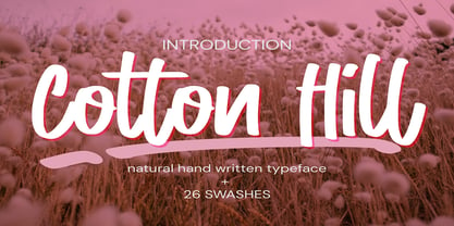 Cotton Hill - Natural Hand Written Typeface Font that will make your designs look modern, unique and fun. It’s perfect for labels, quotes, posters, DIY projects, branding, packaging, greeting cards, websites, photos, photography overlays, signs, window art, scrapbooking, tags and so much more!
 - Matricia by Type-Ø-Tones,
$40.00 Matricia by Pera Ribalta, José Manuel Urós / OpenType, 3 styles Nostalgically, the three weights of Matricia try not to recreate the modern pixel fonts but the noisy needle printers. The Uno and UnoXt are made of squares and the Dos version of dots.
 - Okay Marker by Okaycat,
$19.50 Okay Marker is a natural hand-printed font, designed to appear as if it was written by wide marker. A clean legible style yet friendly & fun. Okay Marker features extended characters, containing West European diacritics & ligatures, making it suitable for international environments & publications.
 - Barila by Irina Vascovet,
$16.00 Barila is a fun hand written font that is perfect for projects like games, apps, books, holiday cards, and nursery art projects. It is very readable while keeping it's fun and whimsical personality. Multilingual characters are included for international customers as well.
 - Prestly Signature by Letterhend,
$14.00 Signature Script, Monoline Script, Monoline Signature, Wedding Font, Ballpoint Font, Wedding Font, Wedding Invitation, Romantic Font, Feminine Font, Signature Font, Beautiful Font, Pretty Font, Stylish Font, Modern Font, Chic Font, Feminine Font, Wedding Font, Romantic Font, Romance Font, Handwriting Font, Hand Written Font,
 - Valentine Style by Yoga Letter,
$14.00 "Valentine Style" is a display font decorated with heart-shaped letters and is very easy to use. This font is equipped with uppercase, lowercase, ligatures, numerals, punctuations and multilingual support. Very suitable for valentines, weddings, stickers, romantic moments, spring, winter and others.
 - Homebreaks by HRDR,
$13.00 Homebreaks is a handwritten new font duo, with different style making beautifully looking font combinations to bring more fun to your projects! Homebreaks Perfect for creating inspirational quotes, posters, blog headers,logos, or just adding a hand-written touch to any project!
 - Post Box by Great Scott,
$16.00 Written in a ballpoint pen style POST BOX is a neighborly sans serif is slightly condensed and slanted. Scribbled quickly but readable. Exact but still human. Perfect for print, package and display use. You can also use it in shorter paragraph text.
 - Christmas Laurent by Yoga Letter,
$18.00 "Christmas Laurent" is a beautiful and unique handwritten font with Christmas decorations on the letters. Equipped with uppercase letters, lowercase letters, numerals, punctuation, swash, titling, alternates, and multilingual support Very suitable for Christmas, Christmas gifts, Christmas decorations, Christmas ornaments, winter, and others.
 - Folio by Bitstream,
$29.99Designed by Konrad Bauer and Walter Baum in 1956, Folio was the first popular Swiss Sanserif; the positive black shapes of the letters appear to be locked inevitably into the correct position by the firm and positive white shapes that surround them. - Eklekt by Yinon Ezra,
$9.00 The Magical look of Eklekt is not made by chance, it is created with the combination of graphic-sharp shapes and a flow curves that looks a bit like it is written by hand. Can be used for logos, headlines and short text.
 - Harmonica by Calligraphics,
$30.00This family of fonts was created to resemble a hand written style. It is loosely based on several sources, including that of the designer. There are unique ligatures, readily found in Keystrokes on the Macintosh platform: fr, ff, ffl, ss, tr, Th. - Vermilion by Hanoded,
$15.00 Vermilion is one of those colors that are neither/nor. It's an ancient hue, in between red and orange and I kind of like the name. Vermilion font is a hand written, narrow and tall typeface which comes with extensive language support.
 - Night Train by FontMesa,
$19.95 Night Train is a new font built from the ground up; while Night Train may resemble an old classic wood type there are a few lines that make this font a little more modern setting it apart from other wood type revivals. If you're a railroad enthusiast you're sure to enjoy the steam locomotive graphic located on the less than and greater than keys on all versions of this font, due to the fine detail of this train illustration the best printing results will be at 600dpi or higher on a laser printer. An alternate K and R are within the Night Train fonts, for Win Type1 these alternates are on the left and right bracket keys, for Truetype and OpenType you may access the alternates by using the Character Map in Windows or Adobe Illustrator, for OpenType you may also find them on the stylistic alternates page of the glyph map in Illustrator. There's something new with Night Train that the sign making people will love, for the first time FontMesa is pleased to offer a block shadowed version in four directions. One fill font is all that is needed for all four open faced fonts, you'll need an application that works in layers in order to use the fill font with the open faced fonts, simply place the fill font in its own layer then move it behind one of the open faced fonts of Night Train. The Night Train name has been on my list to use as a font name for a few years, a friend from years ago used to sail his boat in the Mackinac race from Chicago to Mackinac Island, the name of that boat was the Night Train. Watching the 2010 Olympic four man U.S. bobsled team win gold with their sled also called Night Train has inspired me to complete this font.
 - DNP Shueitai by DNP,
$225.00 Shueitai is a typeface that has been undergoing development for more than a century, starting from the days when Dai Nippon Printing Co., Ltd. (DNP) was still known as Shueisha. As Japan underwent rapid modernization during the early years of the Meiji era, Shueisha, believing that printing was a business befitting a modern civilized society, began operations with a focus on letterpress. Before long the company expanded into developing its own typefaces. In 1912 it completed a full range of Mincho type, in sizes from Sho-go (#0 size, 42pt) through Hachi-go (#8, 4pt), which it called "Shueitai" a new style that came to form one of the two mainstreams of Japanese typefaces and continues to have a significant influence on font design even today. The Shueitai typeface is distinguished by abundant variations matching the size of type and the changing demands of the times. Whether it is the spirited and powerful Sho-go, the delicate and flowing San-go (#3, 16pt), or the bright and solidly reassuring Shuei-Mincho L, all Shueitai typefaces share a vibrant brushwork that adds an expression of eloquence and a burst of brilliance to every printed word. Currently, Shueitai is composed of 17 kinds of fonts useful for various purposes. The world has witnessed vast changes in the environment surrounding the printed world, with the tran-sition first from letterpress to Desktop Publishing, and most recently to e-books. But no matter how this environment might evolve, the written word remains the basis of communication, and the importance of beautiful and readable typefaces stays unchanged. In preparation for the changes that will inevitably come during the future, DNP will continue to evolve the Shueitai designs from now on. Through its continual reinvention, Shueitai, a typeface consistently adopted at the vanguard of the industry, perhaps represents Japanese innovation at its very best.
 - PackardClipperNF - 100% free


