10,000 search results
(0.037 seconds)
- Peppermill JNL by Jeff Levine,
$29.00 A bold sans serif with occasional rule-breaking vertical serifs on some characters was found within page examples from the book "100 Alphabets Publicitaires" ("100 Advertising Alphabets"). Although a few of those vertical serifs extended above the cap height in the hand lettering, they were made more uniform to keep a consistency in the digital version known as Peppermill JNL. Available in both regular and oblique versions.
 - Bronto Burger by Comicraft,
$19.00 Eight tons of Meat-eating TYRANNOSAURUS REX vs. one Vegetarian BRONTOSAUR? CRUNCHTIME!
 - Hispania Script by HiH,
$10.00 Hispania Script is a distinctive and distinctly nineteenth century script. It was released by Schelter & Giesecke of Leipzig, Germany around 1890. Particularly noteworthy are the sharply-pointed legs of the upper case ‘K’ & ‘R’ that seem to be characteristic of the period. Similar strokes, often with a slight curve, may be seen in typefaces like Alt-Romanish and Tinteretto by Schelter & Giesecke, Artistic and Lateinsch by Bauer and Berthold and the poster lettering of Edward Penfield. The angle of this script (approximately 24 degrees) and the sharp delicate points must have made the manufacture of this face in metal type a challenge. The resulting type was probably quite fragile and subject to accidental damage. Additionally, the sharp points would be subject to wear. With digital type, these concerns are eliminated. As far as I know, no one has ever dropped a digital letter on the floor. Nonetheless, creating a digital outline for a typeface like Hispania Script, with many crossing strokes, can be quite time-consuming. Even with an accurate scan of a good quality original, it is usually necessary to construct each crossing stroke separately and then remove the overlap in order to obtain a sharp and convincing intersection. Steep internal angles are often defined with two points, rather than one, to minimize ink or toner fill that can muddy the rendering in smaller sizes. Like all formal scripts, Hispania Script is always useful for announcements and invitations. However, the distinctiveness of of this design strongly suggests that there are other applications that may benefit from its use. Step outside the box and try it in some unexpected places. It is the unexpected that often draws a person’s eye.
 - Geometria by Brownfox,
$44.99 Although geometric Sans Serifs have been in vogue for nearly a century, they have never been as ubiquitous. It is not improbable that the old adage would be phrased: “When in doubt, set it in geometric sans”, had it been composed today. Have we not had enough? We think, not. Postmodern times demand a variety of expressions. The vision behind Geometria was to revisit the perennial favorite to lend subtle individuality to its tried and true forms. Geometria stands out in the crowd of similar fonts thanks to its complicated nature. It combines dynamic elements with a certain degree of stability. A slightly higher waistline of the capitals contributes to their distinctive appearance. If the upper case refers to the American grotesques of the 19th century, the lower case tends toward the forms of the Renaissance in its proportions. Geometria is a typeface of clean shapes that is well-suited for continuous reading, and it sets remarkably well. At the same time, it can be friendly, even flirtatious. Its distinct personality combines seeming opposites. At times it may appear serious, at times playful. On occasion, it may be deliberate, other times dynamic. It could seem rigid, then elegant. It is a typeface that could be perceived either as cutting-edge, or as nostalgic. A careful and discerning typographer will bring out and emphasize those aspects of its multifaceted personality that are needed to solve the problem at hand. Geometria consists of 24 fonts — eight weights with matching italics and narrow styles. The font includes multiple sets of figures and currency signs, alternate glyphs, a variety of experimental ligatures, and punctuation marks for the two cases. The 835 glyphs support 72 languages. Granshan 2013 award.
 - Promenades - Personal use only

- Illyrian by Solotype,
$19.95Our font of the original was only ten point, so we had to use our imagination to a great extent. As specialists in Victorian typography, we have found that many people do not like the "center alignment" idea, used on several old time faces, but we have been faithful to the original. So there! - Candy Script by Sudtipos,
$79.00 Inspired by Argentina and its culture, Alejandro Paul’s Candy Script captures the country’s spirit. It comes from the tradition of window sign painting, but its thick hand-brushed characters, with alternates for almost every upper and lowercase letter, have a personality all their own. Tons of OpenType alternates included, over 1150 characters in all.
 - Hamptons BF by Bomparte's Fonts,
$40.00 Hamptons BF is a beautiful, elegant sans serif with dramatic individuality. A font that steps out in Art Deco style. As a design movement Art Deco came into prominence during the 1920s and 30s when forms were typically sleek, symmetrical, geometric or highly stylized. Today the influence of this enduring style can be clearly seen in architecture, industrial design, fashion, art, graphic design, and yes, even type design. Art Deco style exemplifies luxury, glamour and modernity. I believe Hamptons BF captures something of that retro look in a nod to the past without ever looking dated, all the while retaining a contemporary flair. Named after the well-known New York resorts synonymous with style and elegance, this gothic or sans serif type is based upon University Roman, an early 1970s serif design which in turn was influenced by yet another serif design called Forum Flair (late 1960s); and that in turn owes its pedigree to the late 1930s’ Stunt Roman, which is the original source of inspiration for all of these. Quite a family tree! There’s dynamic interplay between certain wide, full-round letters such as C, D, G, O, P, Q, R, S and narrow ones like A, E, F, H, K, L, M, N, U, etc. This contrast repeats throughout certain lower case letters and serves to create a unique look of distinction. Light and Regular weights communicate a romantic, feminine appeal while the Bold offers a complementary emphasis. The font is somewhat versatile as in addition to its primary purpose for display, Hamptons BF also succeeds in settings containing short blocks of large text. It’s right at home in a variety of typographic environments: branding, packaging, signage logos, magazine headlines, invitations, menus, trendy cafes and more. Among the included OpenType features are Stylistic Alternates, Automatic Ligatures and Fractions. There is extended language support for Western, Central and Eastern Europe and Turkish.
 - Apricot by Canada Type,
$24.95 A. R. Bosco made Romany for ATF in 1934, when there was much demand for script types in advertising and publishing. It was the high times of Speedball lettering, and a casual script in that fashion was naturally very welcome. It became an instant hit and was used widely for a good part of the 1930s and 1940s. Apricot is not only a revival of Bosco's work, but also a major expansion of it. It contains very effective solutions to the many problems presented by the original metal type, which had to always be tracked too wide because of the forms of some of its letters. Solving these problems was not an easy task. A comprehensive set of alternates was designed to give the user the ability to replace some forms in certain uses, and a large set of two-, three-, and even four-letter ligatures was added to solve the awkwardness of some of the more common letter pairings. The resulting work is quite delightful, especially for those who like to take advantage of OpenType technology. Apricot is the rarest kind of script in digital type these days, the kind that is upright, round, bold, feminine, and distinctly young in appearance. A birthday cake for a teenage girl can certainly benefit from these letters. So can greeting cards, family show posters, diary covers, party invitations, women's shirts, toy packaging, celebration literature, and almost anything that needs that special touch of shiny happy youth. Apricot is available in all common font formats. The Postscript and True Type versions come in 4 fonts, which include one for alternates and two for ligatures alongside the main font. The OpenType version is one font that contains more than 380 glyphs and all the necessary programming for the palettes of OpenType-supporting applications. If you liked Canada Type's hugely popular font Dominique, you will love Apricot.
 - Hollywood X - Unknown license

- Radiogram by Device,
$29.00 Radiogram, pure digital bakelite, can be layered - the solid variant can be placed under the striped version to create two-tone effects.
 - Samaritan by Comicraft,
$49.00 It's another beautiful day in scenic Astro City, home of post modern gods and ordinary mortals alike. Look into the sky and perhaps you'll get a glimpse of everyone's favorite man of the hour, if not the man of tomorrow... SAMARITAN! Relocated to Vertigo Comics in 2013, the ASTRO CITY series continues to tell the stories of people like you and me living in a world of super heroes like Winged Victory, Jack in the Box, the Honor Guard and Samaritan. In honor of the relaunch, Comicraft's JG Roshell has taken the original fifties style Astro City font apart, remastered it, expanded the international character set and given it a whole new secret identity – Samaritan. Everything old is new again. Pax Purists -- the SAMARITAN fonts come with our First Family of ASTRO CITY fonts, as published alongside the Image ASTRO CITY title in 1995. See the families related to Samaritan: Samaritan Tall & Samaritan Lower .
 - ArTarumianBehrensInitialen by Tarumian,
$100.00 Behrens Initialen is based on the type graphics of the German architect and type designer Peter Behrens (1868-1940). The drawing of the original typeface is in tune with the Art Nouveau (Jugendstil) style in which Behrens worked. This is a light, delicate, somewhat theatrical typeface, the forms of which bear at the same time a certain shade of Gothic and modernity, and can be used, in particular, when there is a need to make a reference to medieval graphics while maintaining the modern style of composition. In the proposed version, the original initial graphics are used not only for uppercase letters, but also for Arabic figures, while for lowercase letters and for the base of other characters are used the letters themselves - without decorative framing. This feature can be useful for obtaining various effects when using both lower and upper cases in parallel, including when they are overlaid. The font includes the Latin, Cyrillic and Armenian ranges. Created by Ruben Tarumian in 2020.
 - Bizarries by Typephases,
$25.00 This series, with 104 illustrations in three files, collects original ink drawings with absurdities, bizarre people, whimsical personalities and risky behaviors! There is a very peculiar sense of narrative in the sucession of characters, even if they came out rather spontaneously and their order is random.With a vintage look and feel, these people seem to come out of a time capsule from Victorian times. Almost everything in the Bizarries (and also in their close relatives, our Illustries, Whimsies, Ombres, Absurdies and Genteta dingbats) is invented and drawn with no references —just a handful of images were sketched from historical photography. These illustrations can be very useful for a variety of projects, either in black and white, or colored in a paint or drawing application. You can use them at any size, from a small spot illustration to a huge poster, depending on your needs. The outlines remain crisp and clear no matter how much you enlarge, reduce, distort or tweak their shapes.
 - Turntable Stencil JNL by Jeff Levine,
$29.00 A disc jockey-only promotional sleeve for a 1964 [45 rpm] release of “Close to Me” and “Let Them Talk” by Dan Penn featured the song titles printed in a stencil typeface on the record sleeve. Closely resembling a stencil version of Franklin Gothic but with its own unique characteristics, this design has been reinterpreted as Turntable Stencil JNL and is available in both regular and oblique versions. For trivia buffs, Dan Penn is a singer-songwriter-record producer, often collaborating with Dewey Lindon “Spooner” Oldham; both closely associated with the late Rick Hall’s Fame recording studios in Muscle Shoals, Alabama. In 1964, Hall started the Fame record label, and for a time it was distributed by Vee-Jay Records of Chicago, the first major Black-owned record label in the United States. Penn’s release was only the second for the new label; Fame 6402.
 - Cutoff Pro by URW Type Foundry,
$49.99 The first plain weight of Cutoff was designed in 2005 to be used in Miele, an independent Italian free magazine. The need was for an elegant, unusual and legible semi-serif with contemporary flavour. I was fascinated by the deconstructivist work of Jeff Keedy (Hard Times Thick), Phil Baines (Can You, You Can) and Otl Aicher (Rotis), so my aim was to get the feeling of a cut transitional typeface; at the same time felt the exigence to work on the whole shape of the glyphs, in order to soften the “90s deconstructivist” effect and obtain a more balanced and readable design. In the last years I further worked on the typeface adding the other styles, extending the character set and refining the letterforms. Finally the precious collaboration with URW++ brought in 2010 to a complete OpenType Pro font family, with multilingual and advanced typographic features. Fulvio Bisca, July 2010
 - Gratitude Script by Sudtipos,
$59.00 The quality or feeling of being grateful or thankful. An appreciation for the world around us. Gratitude for being a part of it all. No matter what’s happening in our lives, there’s always something to be grateful for. When we have an appreciation for all we have, life gives us more to feel grateful for. It’s a naturally occurring cycle. Some of the most profoundly grateful times in our lives can be felt when we find ourselves surrounded by beauty: in art, nature, music, special places, the seasons, family, loving relationships, a cozy home, meaningful work; in doing what brings us joy, comfort, and feelings of deep love and satisfaction. There is beauty everywhere, and creating beauty is an artist’s mission. We all have the ability to create and experience beauty. In this high-tech, fast paced world of strict, unbending rules, we give you Gratitude Script: A celebratory font that’s deeply rooted in tradition letterforms but with a modern, updated twist; a casual, whimsical, fun look that is also elegant and versatile! Partnering with Ale Paul is seasoned wedding calligrapher Kathy Milici, who is well known for her passionate writing style and highly ornamental pen flourishing. With its signature hand-written look, flowing lines, graceful curves and flourishes, Gratitude Script’s space saving, vertical style is perfect for small printing areas as well as large format presentations. An extended variety of alternates makes it a perfect and versatile addition to your font repertoire.. These are tender times. Long hours and work pressures add to our stress. Time spent with family and friends is more valuable than ever before, as we try to balance it all. It’s important to mark time with special, happy events in our lives that we can all appreciate and enjoy. Let’s be grateful for it all! Hooray for Gratitude, and Gratitude Script! About the font: Gratitude Script is an OpenType font that contains more than 1400 glyphs icluding ligatures, alternates, endings , a wide range of latin languages and a set of ornaments and words specially designed to use in stationery for weddings, birthdays, etc. There is a smooth version of Gratitude Script too. To access to all the extra characters you will need to use software that actually supports OpenType like Adobe CS apps or later where we recommend the use of the Glyph palette. About the presentation: Every time we publish a new typeface we love to invite an artist to collaborate. Vero Scherini, an argentinian and very talented designer and illustrator, fits perfectly with Gratitude.
 - Chordette for Guitar by Ukefarm,
$10.00 Description Chordette for Guitar Chord Fonts are tuned EADGBE. Create a guitar chord chart or chord sheets quickly and easily. Guitar Chord Fonts Chordette contains high quality guitar chord fonts. Each guitar chord is mapped to a specific key on the keyboard, so you can type out chords. It’s a lot easier than dealing with images to create a guitar chord chart or song sheet. It’s a favorite tool for teachers, music therapists, and musicians. What instruments are supported? Chordette for Guitar is tuned EADGBE and supports Guitar. Chordette is available in multiple tunings for most stringed instruments. Most versions of Chordette support multiple instruments. App / Instruments Supported / Tuning Chordette for Guitalele / Guitalele, Baritone Guitar / ADGCEA Chordette for Ukulele / Concert Ukulele, Banjolele / GCEA Chordette for Soprano Uke Soprano Ukulele ADF#B Chordette for Baritone Uke / Baritone Ukulele / DGBE Chordette for Mandolin / Mandolin, Irish Tenor Banjo, Irish Bouzouki / GDAE Chordette for Banjo / Banjo /gDGBD Chordette for Tenor Banjo / Tenor Banjo, Tenor Guitar, Mandola / CGDA Chordette for Guitar / Guitar / EADGBE Each version of the Chordette font uses the same chord sets and keyboard mappings. If you play multiple instruments, you can create a chord sheet for one, then use another Chordette font to transpose the song to another. For example, you can create a song for Mandolin, then instantly transpose it for Guitar and Ukulele - just by changing fonts! Chordette for Guitar is priced at $10, which includes the guitar chord font sets for both Mac and Windows. For help and support, please visit http://ukefarm.com/chordette/help.html
 - Chocoball by Yumna Type,
$16.00 It is significant to have a unique font to create impressive, impactful designs because people often forget common things which may cause your work to be forgotten as well. You may have lost your candidate customers even before they know your brand and product. Let us introduce you to Chocoball, a font with firm impressions to protrude your designs. Chocoball is an uppercased display font designed in playful, modern concepts. It has firm, attractive impressions because of the inclined square letter shapes making it more unique than the others. Furthermore, it can show off your desired messages on your designs easily with the use of the uppercases. Besides, this font is able to build up a strong, recognizable brand identity. A playful display font is flexible and suitable for various design types as its advantage because it is applicable for either formal or informal designs producing interesting, consistent results. You can apply Chocoball, which gives you a clipart as a bonus, for big text sizes to be legible. You can enjoy the available features here as well. Features: Ligatures Multilingual Supports PUA Encoded Numerals and Punctuations Chocoball fits best for various design projects, such as brandings, posters, banners, headings, magazine covers, quotes, printed products, merchandise, social media, etc. Find out more ways to use this font by taking a look at the font preview. Thanks for purchasing our fonts. Hopefully, you have a great time using our font. Feel free to contact us anytime for further information or when you have trouble with the font. Thanks a lot and happy designing.
 - Chiripa by Huy!Fonts,
$25.00 Chiripa is a casual, handcrafted, display font that gets a semi-random effect rotating between three different sets of characters (with Contextual Alternates on). Chiripa means luck in Spanish, but if you do not trust in your Chiripa you can turn Contextual Alternates off and change the glyphs switching between sets in the OpenType menu of your application or in the Glyphs list. Chiripa is perfect for children's books, fresh advertising, food packaging and any use in large sizes.
 - SK Yok Deve by Salih Kizilkaya,
$9.00 SK Yok Deve is a handwritten font. It is designed for use in cartoons, comics or illustrations. Special kerning settings have been made for easy reading in small areas such as speech bubbles. It offers full support for the Latin alphabet and contains many typographic elements. In this way, you can easily use it in your designs. This font family includes 8 fonts and 2656 glyphs. In this way, it contains many typographic materials you will need.
 - SF Mabsut by Sultan Fonts,
$19.99 Sultan-Mabsut, designed by Sultan Maqtari in 2018, is an Arabic typeface in the style of Maghribi (Moroccan Mabsut). This style, which originated in western North Africa, is characterized by a strong baseline and long, fluid, and curvaceous curves. It can be used in headlines or in text and gives a very fresh and calligraphic look. The font combines two methods of writing at one time (writing oriental and writing Moroccan). It also includes lots of Stylistic Alternates.
 - Venice Revolution by RM&WD,
$30.00 This font take inspiration by the Venetian famous typographers in 1500s. Is a font designed to perform better when used in high dimension like Headline in Ad, Titles in Magazines or Blogs, Logos, Naming, Packaging... Is easy to have great result using contextual & stilistic alternatives, ligatures and other SS alternatives, as show in the posters. Is highly raccomended graphic applications with OpenType tab, such Adobe Illustrator or Photoshop or Quark Xpress InDesign, for the use of OpenType Features.
 - Mellnik by ParaType,
$25.00Mellnik is a sans serif of humanist style (in a way) that was developed by Oleg Karpinsky for ParaType in 2006. The type family contains nine styles with a number of alternate characters in each ones. For use as a text font in long text passages of advertising booklets, catalogues or magazines, as well as for accident setting. Mellnik may be also applied as a corporate typeface. Five condensed styles were added in 2007 by the same designer. - Alfarooq by Eyad Al-Samman,
$20.00 Alfarooq is the most widely known epithet for the Islamic figure Umar ibn al-Khattab (c. 586 - 644) who was a leading companion and an adviser to the Islamic prophet Muhammad (peace be upon him) who later became the second Muslim Caliph after Muhammad’s death (pbuh) in 632. Muslims widely know Umar ibn Al-Khattab (may Allah be pleased with him) as Alfarooq (i.e., he who knows and distinguishes between truth and falsehood). Alfarooq is a unique, wide, and headline Arabic display typeface. The main trait of this typeface is the novel design of its letters' tails and its dots which renders it as one of the modern stylish typefaces used for headlines and titles. This can be noticed in different letters such as Ain, Ghain, Jeem, Khah, Seen, Sheen, and others. In addition, Alfarooq font has an Arabic character set which supports Arabic, Persian, Kurdish, and Urdu letters and numerals with a limited range of specific Arabic ligatures. This typeface comes in two ultra-bold styles (i.e., Alfarooq and Alfarooq-Pro) and more than 430 distinctive glyphs with a single weight for each style. Alfarooq typeface effectively offers diverse typographic and digital usages including mainly the very large and wide poster-size works. Due to its strong baseline-stroke, Alfarooq typeface is appropriate for heading and titling works in Arabic, Persian, Kurdish, and Urdu newspapers, magazines, and other printed materials. It is also elegantly suitable for signs, book covers, advertisement light boards, street and city names, products- and services names, and titles of flyers, pamphlets, and posters. The wide style of Alfarooq font’s characters gives it more distinction when it is used in greeting cards, covers, exhibitions' signboards, external or internal walls of malls, and also the exits and entrances of airports and halls.
 - Dearest Outline - Unknown license

- Dearest Open - Unknown license

- We Love Nature Leaves by kapitza,
$79.00 We Love Nature Leaves is an extensive and versatile collection of foliage illustrations. This font consists of 52 highly detailed drawings of twigs and leaves which can be used on their own or in combination with the other illustrations in the ‘We Love Nature’ font collection. All illustrations are drawn by hand and of the highest quality.
 - Kinera by Zamjump,
$17.00 Kinera is a display elegant serif . It seduces your eyes with its curves yet still looks serene and classy. Perfect for any kind of creativity you are about to start :). with a binder in it will add a very memorable impression to the writing you want. Note : Ligature can be active in CAPSLOCK File Included : - All Caps - Ligature
 - Rhapsody by profonts,
$39.99Rhapsody is clearly showing Unger's love with Blackletters and Gothics. Other than many of the existing Blackletters, Rhapsody is really easy to read. The calligraphic forms of the upper case in connexion with its lower case appear very special, very unique. Rhapsody, having its origins in the 50ies, was redesigned, completed and expanded by Unger for the URW++ FontForum. - Falfurrias NF by Nick's Fonts,
$10.00Another in the Whiz-Bang Woodtype series, based on authentic xylographic designs from the late nineteenth century. Named after (surprise!) a small town in Texas. The net effect is a typeface which can add style and warmth to any project. Both versions of this font include the complete Unicode 1252 Latin and Unicode 1250 Central European character sets. - Schoolyard Blues JNL by Jeff Levine,
$29.00 Schoolyard Blues JNL is based on the hand lettered title found on the sheet music for the 1938 song "I Was Late for School". A condensed sans serif with chamfered corners, it reflects the Art Deco influences of the day in some of the letter forms. This type design is available in both regular and oblique versions.
 - Pismo Clambake NF by Nick's Fonts,
$10.00This stylish stout script was originally issued in the 1930s under the name “Fulgor” by the spanish foundry Fundición Gans. Cursory research suggests that Saks-Fifth Avenue found it suitably snooty to use extensively in its newspaper ads of that period. Perhaps somewhat ironically, this version takes its name from one of comedian W. C. Fields' many odd aliases. - Allerton by Jeff Levine,
$29.00 Presenting a condensed Art Deco sans serif font with rounded corners and squared inner lines, based on the hand lettered title on the cover of the sheet music for 1944’s “Just A Little Fond Affection”. Allerton JNL is available in both regular and oblique versions, and was named after a neighborhood in the Bronx, New York.
 - Horsefeathers by Patricia Lillie,
$29.00Play a while with Horsefeathers, and you'll find yourself feeling kind of a combination of giddy and up. a lively, animated font that draws attention in short bursts yet has remarkable balance in longer text blocks, even at smallish point sizes. And that can be said for all three styles: Regular, Bold, and the aptly-named Horsefeathers Buzzsaw. - Violets by Tanincreate,
$12.00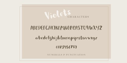 Violets is a cute handwritten brush font designed initially for using in a packaging design. Quirky and casual it is actually very versatile, and can be used in a variety of project styles - children book design, invitations, quotes, headings, blogs, logos and more, where a hand written type is needed. Features numbers, signs, punctuation, multilingual glyphs.
 - Vanage by Katatrad,
$29.00 Vanage is is an elegant high contrast contemporary sans-serif stencil typeface provides advanced typographical support with features such as ligatures and alternate characters. It is rooted in the style of a classic high contest typeface, excluding the typical serifs and ball terminals. Vanage is made for display use, Available in 5 weights and their Italics.
 - Columnist JNL by Jeff Levine,
$29.00 “News Gothic” has been a reliable workhorse of a font since it was created by Morris Fuller Benton and first offered for sale in 1908 by American Type Founders. A clean, legible design used for text copy, it can also double as a light headline face. This reinterpretation (named Columnist JNL) is available in both regular and oblique versions.
 - HU Malrang by Heummdesign,
$30.00 'HU Malrang' is a font that gives a round and soft feel to its tightly packed modules. This font has a variable function, allowing users to fine-tune the thickness they want. (Available only in Adobe programs.) Six basic weights are provided so that they can be used even in programs that do not apply the variable function.
 - Blicalon by Tanincreate,
$24.00 Blicalon is a geometric sans serif font with modern look and good legibility. Blicalon aims to be a universal, it works great in headlines, short and long texts, high-end branding, logo designs, magazines, product packaging & invitations. It comes in 2 different styles - regular and italic and is equipped with an extended character set, supporting most European languages.


