10,000 search results
(0.134 seconds)
- Dime Store by Breauhare,
$35.00 Dime Store is a font inspired by childhood memories of dime stores in downtowns and shopping malls in the 1970s. The font was tweaked and digitized by Bob Alonso, who also digitized Breauhare’s Cooper Goodtime font. Dime Store is a cool, hip, nostalgic way of creating a decorative display, and at times it seems to have a slightly futuristic look, too.
 - Literal by Kosinsky,
$25.00 Literal is a classic sans serif typeface with closed shapes. Simple and elegant at the same time, it is perfect for a wide range of uses, where you need both large and small text, be it a print product, website design, logo design and much more. The font supports Extended Latin and Extended Cyrillic. Created in 2019. Type designer Igor Kosinsky.
 - Quelia by Piotr Łapa,
$30.00 Quelia is an experimental, display, all-caps typeface inspired by nature and organic shapes. It has a very expressive character. The letterforms are extraordinary but also elegant at the same time. Quelia is a great choice for fashion projects, branding, headlines, titles, posters, packaging, covers, and logotypes but it can also add a distinct character to your website or app.
 - Stymie by Linotype,
$40.99In 1931, Morris Fuller Benton created the Stymie typeface for the American Type Founders (ATF). Stymie is a reworking of a slab serif type that was popular in Europe at that time, Memphis. For the past one hundred fifty years, slab serif types (sometimes called Egyptian or Egyptienne-style faces) have been a popular choice for headline text in newspapers, magazines, and advertising. - Nikoovers by madeDeduk,
$15.00 Nikoovers Font is a modern rounded sans that exudes simplicity and versatility. Its clean and geometric letterforms make it ideal for various design applications, from corporate branding to editorial layouts. Feature Uppercase & Lowercase Number & Symbol International Glyphs Multilingual support Alternative Ligature Feel free to drop us a message any time and follow my shop for upcoming updates Hope you enjoy it.
 - Walrus Gumbo NF by Nick's Fonts,
$10.00An unnamed alphabet from wacko lettering artist Otto Heim’s 1925 opus, Farbige Alphabete, provided the pattern for this delightful, if slightly deranged, typeface. Use it any time you want to add mirth and merriment to a project. Both versions include the complete Unicode Latin 1252, Central European 1250 and Turkish 1254 character sets, as well as localization for Lithuanian, Moldovan and Romanian. - Becker Monoline Modern NF by Nick's Fonts,
$10.00The first in a series of typefaces based on the work of legendary lettering artist Alf Becker, whose works appeared in Signs of the Times magazine for almost thirty years. Originally titled "Extreme Thin Gothic", this was Becker’s 185th design for the magazine. Both versions of the font include the 1252 Latin and 1250 CE character sets (with localization for Romanian and Moldovan). - Marticus by TypeClassHeroes,
$14.00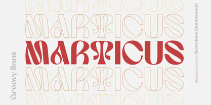 Introducing Marticus is a Groovy Sans, Comes with unique style and access your OpenType features to access the large selection of alternate letters and ligatures. Use this font for any branding, product packaging, invitation, quotes, t-shirt, label, poster, logo etc. Feature Uppercase & Lowercase Number & Symbol International Glyphs Multilingual support Alternative Ligature Feel free to drop us a message any time Cheers!!
 - Fancy Show Card JNL by Jeff Levine,
$29.00 A playful, casual take on round nib pen lettering was spotted amongst some online scans from an old lettering book. The free-form and stylized shapes of the letters and numbers are reminiscent of old-time show cards, movie titles and signage in vogue around the early 1900s through the 1920s. Fancy Show Card JNL is available in both regular and oblique versions.
 - Penman by Page Studio Graphics,
$25.00The Penman fonts are partially based on the 19th century penmanship of one of the designer’s ancestors, and originally created for a personal mailing with an “old-times tradition” flavor. The fonts are lightly pair-kerned, in order to control punctuation and numeral spacing. Auto-kerning should be turned on, and tracking should be checked to make sure all characters join well. - Hellrose by madeDeduk,
$12.00 Hellrose is a scratches hand drawn font contains 50+ ligatures with three alternative. Hellrose is great for branding, posters, logos, invitation, writing and headings. Feature Uppercase & Lowercase Number & Symbol International Glyphs Multilingual support Ligature Thanks so much for checking out my shop and feel free to drop us a message any time and follow my shop for upcoming updates. Hope you enjoy it.
 - Soulfinger PB by Pink Broccoli,
$16.00 Soulfinger PB is a another frisky offbeat typeface from Pink Broccoli, this time inspired by a vintage paperback cover of Patricia Highsmith's "A Pleno Sol". Soulfinger is a flare serif with just enough visual dance to it without going off the rails. It's simply a celebration of the original vintage paperback titling, letting it's freak flag fly, so to speak.
 - Mighty Dust by madeDeduk,
$12.00 mighty dust is a blackletter. There's come with 3 style font with much alternative inside. Suitable to create any branding, product packaging, invitation, quotes, t-shirt, label, poster, logo etc. Feature otf. and ttf. file woff and woff2. file Uppercase & Lowercase Number & Symbol International Glyphs Multilingual support Alternative Ligature Feel free to drop us a message any time Hope you enjoy it.
 - Penman B by Page Studio Graphics,
$25.00The Penman fonts are partially based on the 19th century penmanship of one of the designer’s ancestors, and originally created for a personal mailing with an “old-times tradition” flavor. The fonts are lightly pair-kerned, in order to control punctuation and numeral spacing. Auto-kerning should be turned on, and tracking should be checked to make sure all characters join well. - Grumpy by Suomi,
$40.00 An extreme headline font with six optical variants. Black 24 is loosely based on ITC Grouch (1970) by Tom Carnase. It has some 2000 hand-adjusted kerning pairs for TNT (that’s Tight, Not Touching), a very popular type treatment from the seventies and eighties. Take your pick, or get them all, so you don’t have to buy another one later on.
 - Mooners by Burntilldead,
$14.00 Make your design as a time machine with "Mooners" typeface. Inspired by the decorative victorian advertising poster, Mooners came to make make your document, poster, logo, etc... perfectly have a vintage victorian vibes. It's a solid combination that can bring your design, logo, document, website, etc. back to 1800 decade. Multilingual fonts-family and playful one with 165 alternate characters.
 - Candice by ITC,
$29.99Alan Meeks designed the Candice typeface in 1976. A groovy swirl of a font, Candice looks like an ice cream sundae topped with whipped cream. Candace is often seen on album covers, and has come to be associated with innumerable party hits from the 1970s. One thing is for sure: Candice is a child of it's times - flashy, lively, and fun! - Telecomm NF by Nick's Fonts,
$10.00 This font is actually two different fonts. The uppercase mimics the typeface used once upon a time in Teletypes, and the lowercase is patterned after the face used during the first half of the twentieth century by Western Union for their telegrams. Both flavors of this font feature the 1252 Latin, 1250 Central European, 1254 Turkish and 1257 Baltic character sets.
 - Kangmas by Azzam Ridhamalik,
$12.00 Introducing Kangmas, a nostalgic retro serif font with regular and true italic style. This font has rounded serif inspired by all the retro aesthetics making a comeback and the awesome classic "Cooper Black" typeface, but includes more modern letter shapes in it. The combination make it has a nostalgic retro vibes and also gives modern looks at the same time.
 - Emirah by madeDeduk,
$11.00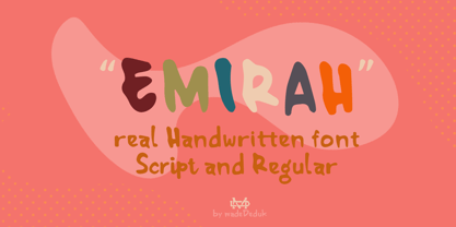 Introducing Emirah is a cute handwritten font with a matching script and regular will be perfect for book, title branding, product packaging, invitation, quotes, t-shirt, label, poster, logo etc. Feature Uppercase & Lowercase Number & Symbol International Glyphs Multilingual support Ligature Feel free to drop us a message any time and follow my shop for upcoming updates Hope you enjoy it.
 - Farmhouse Haystack by Hipfonts,
$17.00 Welcome to the cosmic dance of typography with Groove Galaxy, a captivating and thrilling rounded vintage typeface that swirls you into a time warp of retro charm reminiscent of the beloved 1970s. Just like stars twinkling in the night sky, each letter of Groove Galaxy emanates a mesmerizing aura, pulling you into a captivating journey through the groovy days of the past.
 - Xtencil lc by John Moore Type Foundry,
$25.00 Xtencil is a typeface inspired by the shapes of the drawing templates letters, based on the letter forms from my teacher Milton Glaser who at the same time was influenced by the modernism of Paul Renner. Xtencil is a round letter to create funny signs, ideal for posters and headlines. Xtencil not come as a drawing template, but as OpenType typography.
 - Sauerkrauto Pro by Martin Lexelius Core,
$33.00 In the late 90’s, there were many German cars coming into Malmö (where I lived at the time). I was blown away by the font on the license plates. So strange, so strong, peculiar – but still macho. I built the uppercase from my own photos. After this I completed the font with my own lowercase, small caps and punctuation.
 - SUSHI by Fontsphere,
$5.00 SUSHI is an unusual font family (2 styles), created by Bartosz Panek. The idea was created while working on the design of a certain logo. With time, a whole font was created from modular elements, which in its form brings associations with food, fish and sushi. The font contains uppercase characters, numerals and a large range of punctuation (over 220 glyphs).
 - Ongunkan Elder Futhark Viking by Runic World Tamgacı,
$50.00 Vikings or Norses are Scandinavian pirate and merchant tribes. Actually, "Viking" or "Nors" is not a nation name; It is the name given to Dans, Norwegians, Swedes and other Scandinavians regardless of who they are. The Elder Futhark here is a runic script - a version of the Viking script. I will upload other versions over time. Write nice things with pleasure.
 - Taurus by Fenotype,
$30.00 Save time and effort – choose your type wisely. Use Taurus and you’ll achieve impact without having to resort to cheap tricks. We have done the work for you: just type out words using Taurus and you’ll have a logo for a Wall Street law firm – or for that precious vintage Barolo. Refinement. Sophistication. Seriousness. Sex appeal. Taurus has it all.
 - Becka Script by ITC,
$29.00Becka Script was designed by David Harris in 1985 and is a wide running typeface with varying stroke contrasts. This font looks as though written with a broad tipped pen and its slight slant to the right makes clear its similarity to callipgraphy fonts. Becka Script is reminiscent of the 1950s and its strong strokes make it best for headlines or shorter texts. - Nightspot JNL by Jeff Levine,
$29.00 Nightspot JNL was modeled from one of many display alphabets created by the late sign painter and lettering expert Alf Becker. His work has graced the pages of Signs of the Times® magazine for decades. Special thanks to Tod Swormstedt of the American Sign Museum and ST Publications, Inc. in Cincinnati, Ohio for providing the source material for this typeface.
 - Olde Megrat NF by Nick's Fonts,
$10.00This rough-hewn offering is patterned after Antikva Margaret, designed by Zoltán Nagy for VGC in the mid-60s. Its energetic and, at times, eccentric letterforms make this face a perfect choice for headlines and subheads that will be noticed. Both versions include the complete Latin 1252, Central European 1250 and Turkish 1254 character sets, as well as localization for Moldovan and Romanian. - Une Nuit Parisienne by Megami Studios,
$10.00 This font is based on a lot of the downtempo culture in Paris. Smoky bars, jazz clubs, that sort of thing. How a font can be influenced by intangibles is a question that I can't quite answer, but I can say that when I created it, it strongly reminded me of a couple of times spent in Paris back in the mid-90s.
 - Bodoni Classic Bold Ornate by Wiescher Design,
$39.50 Bodoni Classic Bold Ornate is another puzzlestone in my ever growing Bodoni Classic family. This time the letters are ornated within the limits of the letter, this keeps the classic form of the typeface intact and still gives it ample decoration. Please use this font only sparingly to decorate text or use it as initials only. Your Bodonimaniac, Gert Wiescher
 - MPI Arcadian by mpressInteractive,
$5.00 Arcadian was first produced in wood type around 1870 by William H. Page & Company. It is a semi-ornamented face based on a French Clarendon, with dots added to the median and the tops and bottoms of the letters. It has a distinctly “Old West” feel, and was likely used to add a little pizzazz to advertising and broadsides of the time.
 - Nimous Daven by madeDeduk,
$12.00 Nimous Daven is a distinct hand drawn font contains 50+ ligatures with two alternative. Nimous Daven is great for branding, posters, logos, invitation, writing and headings. Feature Uppercase & Lowercase Number & Symbol International Glyphs Multilingual support Alternative Ligature Thanks so much for checking out my shop and feel free to drop us a message any time and follow my shop for upcoming updates
 - Masserini by Studio Sun,
$16.00 Masserini is inspired by the 20's art deco era of colorful posters, fonts, and typography with a vintage flair. With its strong geometric shapes and letters, like a style of sans serif that was used in signs and posters during that time period. This collection consists of a variety of widths, weights, and variants to suit your creative needs.
 - Allrounder Antiqua by Identity Letters,
$40.00 Timeless Renaissance looks, gently updated. For novels and billboards alike. Allrounder Antiqua is an old-style serif member of the Allrounder superfamily. A timeless typeface based on classical proportions, Allrounder Antiqua is perfectly suitable for advanced book and editorial design well as packaging and branding. True: its main purpose is to set flawless body copy and to generate an evenly textured page—but its refined shapes work fantastically in display applications, too. Some details, such as the small and sharp bowl of the lowercase a, are fully appreciated in large sizes only. If you need a sophisticated serif typeface for packaging, food, fashion, consumer goods, or lifestyle branding, Allrounder Antiqua is up for it. It's also apt as an outstanding corporate typeface, be it for a more conservative venture or the latest hipster start-up. This classy serif typeface comes in four weights with corresponding true italics. Just like its sans-serif counterpart, Allrounder Grotesk, Allrounder Antiqua is equipped with plenty of Opentype Features like small caps, six sets of figures, case-sensitive forms, superiors, fractions and many ligatures. You will find alternate letters with swashes within this extended character set, as well as all the accented glyphs necessary to support more than 200 Latin-based languages. Historical Background The (French) Renaissance-influenced typeface started as Moritz Kleinsorge's graduation project within the "Expert Class Type design" course of the Plantin Institute for Typography, located in the famous Museum Plantin-Moretus in Antwerp, Belgium. There, Moritz Kleinsorge decided to create a revival of Robert Granjon's "Ascendonica Romain", described as "a beautiful face; typical of Granjon's mature style" in the inventory list of available material. "To touch punches and matrices cut by Robert Granjon back in 1567 was an invaluable inspiration", Moritz explains. Over time, the typeface moved away from being a true revival. Rather, it evolved into a Granjon-inspired typeface. That typeface is now available as Allrounder Antiqua. Perfect Pairing: Allrounder Antiqua + Allrounder Grotesk Allrounder Grotesk is the ideal complement to Allrounder Antiqua. They both share common vertical metrics and a common color. This allows you to pair both typefaces within the same layout—even within the same paragraph—without creating visual disruption. Head over to the Family Page of Allrounder Grotesk to get more information about this typeface. Design Trick: Bilingual Design With the Allrounder Superfamily Combining Allrounder Grotesk with Allrounder Antiqua is an ideal approach for bilingual designs, wherein both languages get the same emphasis yet are distinguished with two different typefaces. It's also best practice to set headlines in a different typeface than the body text if they harmonize with each other. Allrounder Grotesk and Allrounder Antiqua provide you with the perfect pair for this purpose.
 - Groovy 3D Caps JNL by Jeff Levine,
$29.00 It all started with a simple idea back in 1998: do a digital version of a "lost" 70's typeface, and make up the missing letters that were not present in the only available example Jeff Levine had to work with. Jeff wasn't yet doing his own digital font creation, so he hooked up with Brad Nelson who owns a small foundry called Brain Eaters Fonts. Together, they collaborated on "Action Is"- a freeware font named after the source of the type example. This was a title page for a commemorative photo album of images from the 60's TV music show "Where the Action Is", formerly hosted by Jeff's employer at the time, singer-writer-producer Steve Alaimo. The free font took off like a rocket, being released just at the peak of the 60’s/70’s retro craze in the late 1990’s, and it was EVERYWHERE! It showed up on TV shows, packaging and web design -- and was even spotted on signage used on the side of a major amusement resort’s retro-themed hotel. From that point on, Jeff kept getting requests for a version with a lower case. Although they shared the copyright in the freeware version, Brad Nelson gave Jeff his blessing to re-work and take Action Is into the realm of commercial type. Newly improved and re-released as Groovy Happening JNL, it became one of Jeff's better selling type designs. A simplified, yet similar font was issued called Groovy Summer JNL. Now, after about a decade, Jeff had decided to clean up the 3-D (drop shadow) version that was originally freeware with many minute design flaws and re-release it commercially. Groovy 3D Caps JNL is an all-caps, limited character set font which ties in well with the previous releases, yet retains itís 1960s-1970s era charm. The font flag art is courtesy of Barbara D. Berney and is used by permission.
 - Caroni by Franzi draws,
$- Caroni is a cute handmade typeface, which was originally created in 2018 as a free font. It has a simple and clean look, and works great for longer texts. Caroni has already been used in numerous children's books, so now it was time to extend Caroni's look, and add more styles. The Caroni Family at a glance If you like Caroni, you will love the Caroni font family! Caroni now comes in bold and italic, and it has nine awesome siblings: Avenue (all dressed up with stylish serif strokes) Lime (the skinny version of Caroni) Avenue Lime (the skinny version of Caroni Avenue) Tabanca (dark and heavy, this is Caroni's brush version) Doubles (enhanced with fine lines) Fete (with fun little dots) Coconut (Caroni's outline style) Soursop (Outline with dots, a great display font) Carnival (a quirky and fun all-caps version) Caroni was created while staying with a friend in Trinidad, hence the names :) Languages supported: Afrikaans, Albanian, Asu, Basque, Bemba, Bena, Bosnian, Catalan, Cebuano, Chiga, Colognian, Cornish, Corsican, Croatian, Czech, Danish, Dutch, English, Estonian, Faroese, Filipino, Finnish, French, Friulian, Galician, Ganda, German, Gusii, Hungarian, Icelandic, Ido, Inari Sami, Indonesian, Interlingua, Irish, Italian, Javanese, Jju, Jola-Fonyi, Kabuverdianu, Kalenjin, Kinyarwanda, Kurdish, Latvian, Lithuanian, Lojban, Low German, Lower Sorbian, Luo, Luxembourgish, Luyia, Machame, Makhuwa-Meetto, Makonde, Malagasy, Malay, Maltese, Manx, Maori, Morisyen, North Ndebele, Northern Sami, Northern Sotho, Norwegian Bokmål, Norwegian Nynorsk, Nyanja, Nyankole, Occitan, Oromo, Polish, Portuguese, Romanian, Romansh, Rombo, Rundi, Rwa, Samburu, Sango, Sangu, Sardinian, Scottish Gaelic, Sena, Shambala, Shona, Slovak, Slovenian, Soga, Somali, South Ndebele, Southern Sotho, Spanish, Swahili, Swati, Swedish, Swiss German, Taita, Taroko, Teso, Tsonga, Tswana, Turkish, Turkmen, Upper Sorbian, Vunjo, Walloon, Welsh, Western Frisian, Wolof, Xhosa, Zulu
 - Atrium by Alex Jacque,
$20.00 Atrium, designed by Alex Jacque, is a strong, linear, geometric sans-serif display typeface based off century-old pen art by W.E. Dennis. Atrium's stubbornly geometric letterforms are set off with a few softening flourishes on a few glyphs. It's sharp corners, straight verticals and horizontals make Atrium pack some punch when used in headlines, pull quotes, and logotypes. Atrium was released in 2012 in OpenType format and comes in three different weights: light, regular, and bold, with a regular and oblique version of each for a total of 6 styles in the family.
 - CA Edwald by Cape Arcona Type Foundry,
$40.00 CA Edwald, the superbly crafted alphabet design now available in 5 weights, combining the familiar, the unusual, the practical and the aesthetic. Plan ahead and make use of the assorted logo letters that add distinction to your headline. CA Edwald is a welcome addition to our ever-growing collection of alphabet designs. It is prepared to meet your graphic requirements. Now there is one trusty Musketeer for today’s advertising. The illegitimate child of Oswald Bruce Cooper and Ed Benguiat, a mixture or even the “best of”: CA EDWALD.
 - Solidus by Brown Type,
$40.00 Inspired by the heuristic typography of the Concrete Poetry movement, Solidus is a hardworking and unobtrusive sans in the Neo-grotesque style. Its simplified features, generous spacing and squarish curves imbue a sense of sobriety and allow the textual information to take centre stage, whether in body copy or at display sizes. Solidus is available in nine distinctive weights from wafer-thin Hairline to a hefty Black, each with accompanying italics. Typical of the Neo-grotesque style the italics are slanted in construction and have the same advance width as the uprights.