10,000 search results
(0.035 seconds)
- Besty Mahgelin by Kartiny Type,
$12.00 Besty Mahgelin is a beautiful script perfect for branding, wedding invitations, and other romantic projects. This style look makes it perfect to use in all your design projects be it logos, labels, packaging designs, blog titles, posters, wedding designs, social media posts, Instagram designs, etc. Font Features: Lowercase letters start and end swash swipe up and down Contains full set: -Uppercase -Lowercase -Alternative -Ligatures -Punctuation -Number -Multilingual support. I hope you enjoy this font. If you have any questions, feel free to message me :) Thank you for your purchase!
 - Bittergrace Script by Letterhend,
$15.00 Introducing Bittergrace, a romantic modern script with a twist of fun! The natural hand writing script is suitable for you who needs a typeface for headline, logotype, apparel, invitation, branding, packaging, advertising and others. This typeface comes with uppercase, lowercase, punctuations, symbols and numerals, stylistic alternate set, ligatures, and mor and also has multilingual support. It also already PUA Encoded. We hope you enjoy the font, please feel free to comment if you have any thoughts or feedback. Or simply send me a PM or email at letterhend@gmail.com Thanks for purchasing and have fun!
 - Monotype Engravers Old English by Monotype,
$29.99 The rather wide, caps-only Monotype Engravers family imitates scripts that evolved from copperplate and steel plate engravers hands of the nineteenth century, which were a quite expressive medium! Monotype Engravers' letters show a strong contrast between thick and thin strokes and have sharply cut serifs. In 1899, Robert Wiebking (who worked for a number of foundries in his time) designed an all-caps typeface named Engravers Roman."" Shortly thereafter, American Type Founders, Inc. (ATF) released another successful ancestor of this design in 1902, ""Engravers Bold,"" designed by Morris Fuller Benton. Engravers Bold was also released by the Barnhart Brothes & Spinder foundry. Also made available by Lanston Monotype at the beginning of the twentieth century, the Engravers faces soon became a popular choice for letter heads, advertising and stationery.
 - Favarotta by Eurotypo,
$24.00 Favarotta was a small settlement on the medieval times. in the Gulf of Castellammare near Palermo, Sicily. Favarotta font is inspired on the style of writing based on Carolingian models, which continued to be used for handwritten liturgical works in Italy. The style show close affinities with the Italian printed books of the period. It combines Roman cursive writing ideas with some of the Celtic innovations in insular writing, including four guide lines, with strokes that flow smoothly from the ascending and descending. Favarotta font family contain five weigh and its corresponding italics. The Italic style are clearly legible and attractively set out, without obvious idiosyncratic tendencies. These fonts can be read and display with pleasure. Each font of the family contain standard ligatures, small caps, old style numerals and support CE languages.
 - Monotype Engravers by Monotype,
$40.99 The rather wide, caps-only Monotype Engravers family imitates scripts that evolved from copperplate and steel plate engravers hands of the nineteenth century, which were a quite expressive medium! Monotype Engravers' letters show a strong contrast between thick and thin strokes and have sharply cut serifs. In 1899, Robert Wiebking (who worked for a number of foundries in his time) designed an all-caps typeface named Engravers Roman."" Shortly thereafter, American Type Founders, Inc. (ATF) released another successful ancestor of this design in 1902, ""Engravers Bold,"" designed by Morris Fuller Benton. Engravers Bold was also released by the Barnhart Brothes & Spinder foundry. Also made available by Lanston Monotype at the beginning of the twentieth century, the Engravers faces soon became a popular choice for letter heads, advertising and stationery.
 - Fortezza by Eurotypo,
$22.00 Fortezza is a family of fonts inspired by the great masters who have created the Modern Roman style: Firmin Didot (1764 -1836) and Giambattista Bodoni (1740 -1813) Both typefaces can be similar, but a trained and close vision, show clear differences in the final result, like its weight and the degree of transition of the strokes. The type of Didot suggests greater warmth and elegance, they are characterized by extreme contrast in thick strokes and thin strokes, by the use of serifs very thin and by the vertical stress of the letters. while the Bodoni type conveys a greater robustness and hardness. Fortezza brings together the elegance and spirit of both types, but proposes a contemporary vision, establishing a distance with certain features typical of the baroque that was manifested at that time.
 - Therhoernen by Proportional Lime,
$9.99 Arnold Therhoernen. (Arnoldus ther Hornen, Drucker des Dictys , Arnold ter Hoernen, Arnold ther Hoernen, Arnoldus TherHornen.) Who was this guy? He was a printer active in the city of Cologne, having graduating from the university there. He learned his craft under Ulrich Zell. He printed books from 1470 to 1482 when the plague carried him off. Was he just another printer of the era? No, he brought out the first edition of the "Fasciculus temporum'' (The most popular work by a living author at that time.) And he was the first to use both a title page and page numbers. His page numbers, an idea probably suggested to him by Werner Rolevinck, were interesting in that they were centered half way down the page on the outer margin and were set in Roman Numerals.
 - Sheridan Gothic SG by Spiece Graphics,
$39.00 Sheridan Gothic, also known as Grant Antique, is a quaint design produced in the late nineteenth century. Its proportions are in keeping with extra condensed faces of the times. Its uppercase letters are quite narrow. Its lowercase letters are equally narrow and tall. This pleasant and enduring design contains a touch of novelty, too. Swelled terminal flourishes on such characters as C, J, S, c, e, r, and s help add interest and warmth to what is basically a friendly old soul. Sheridan Gothic is now available in the OpenType Std format. Some new stylistic alternates have been added to this OpenType version. Advanced features work in current versions of Adobe Creative Suite InDesign, Creative Suite Illustrator, and Quark XPress. Check for OpenType advanced feature support in other applications as it gradually becomes available with upgrades.
 - Selfie Neue Sharp by Lián Types,
$29.00 INTRODUCTION When I started the first Selfie back in 2014 I was aware that I was designing something innovative at some point, because at that time there were not too many, (if any) fonts which rescued so many calligraphy features being at the same time a monolinear sans. I took inspiration from the galerías’ neon signs of my home city, Buenos Aires, and incorporated the logic and ductus of the spencerian style. The result was a very versatile font with many ligatures, swashes and a friendly look. But… I wasn’t cognizant of how successful the font would become! Selfie is maybe the font of my library that I see the most when I finally go out, (type-designers tend to be their entire lives glued to a screen), when I travel, and also the font that I mostly get emails about, asking for little tweaks, new capitals, new swashes. Selfie was used by several renowned clients, became part of many ‘top fonts of the year’ lists and was published in many magazines and books about type-design. These recognitions were, at the same time, cuddles for me and my Selfie and functioned as a driving force in 2020 to start this project which I called Selfie Neue. THE FONT "Selfie for everything" Selfie Neue, because it’s totally new: All its glyphs were re-drawn, all the proportions changed for better, and the old and somehow naive forms of the first Selfie were redesigned. Selfie Neue is now a family of many members (you can choose between a Rounded or a Sharp look), from Thin to Black, and from Short to Tall (because I noticed the feel of the font changed notoriously when altering its proportions). It also includes swashy Caps, which will serve as a perfect match for the lowercase and some incredibly cute icons/dingbats (designed by the talented Melissa Cronenbold, see also Selfie Neue Rounded for more!) which, as you see in the posters, make the font even more attractive and easy to use. You'll find tons of alternates per glyph. It's impossible to get tired with Selfie! Like it happened with the old Selfie, Selfie Neue Sharp was thought for a really wide range of uses. Magazines, Book-covers, digital media, restaurants, logos, clothing, etc. Hey! The font is also a VF (Variable Font)! So you can have fun with its two axes: x-height and weight, in applications that support them. Let me take a New Sharp Selfie! TECHNICAL If you plan to print Selfie Neue VF (Rounded or Sharp), please remember to convert it to outlines first. The majority of the posters above have the "contextual" alternates activated, and this makes the capitals a little smaller. I'd recommend deactivating it if you plan to use Selfie for just one word. Use the font always with the "fi" feature activated so everything ligatures properly. The slant of the font is 24,7 degrees, so if you plan to have its stems vertical, you may use Selfie with that rotation in mind. THANKS FOR READING
 - Carrig Pro by Monotype,
$31.99 Carrig Pro is a refined and elegant serif. Classed as an Antiqua, Carrig Pro is born from [or borne by] a hybrid of influences that range from early Roman inscriptions to type of the Pre-Modern era, giving Carrig Pro a distinctive character all of its own. Carrig Pro will appear instantly familiar and friendly and could well be the perfect typeface for designers seeking to convey a message with a distinctive and prestigious air. Now a 12-font family, Carrig Pro (2017) is an extended version of Carrig (2015), it has been completely redrawn, revised and improved. Carrig Pro has many useful features for typographers to exploit, such as easily accessible small caps, discretionary ligatures, gadzooks and stylistic alternates, as well as a number of ornamental glyphs. See more here. Key features: 6 weights in roman and italic Small Caps, Ornaments, Alternates, Historic Characters, Ligatures and Gadzooks Full Latin character set 750 glyphs per font.
 - Modica Pro by Monotype,
$30.00 Modica Pro is here to expand upon the success and versatility of the original Modica typeface (2019). Modica has been compressed, condensed, narrowed, widened, and extended to a mega-family of 108 fonts that now includes small caps as well as additional language coverage. Modica Pro is a nimble typeface that can handle a multitude of applications – everything from body copy to retail fashion to corporate identities... why not put Modica Pro to task today? There are 108 fonts in this family, ranging from Hairline to Ultra weights across six widths in both roman and italic. A single variable font (included with the full family) covers all weights, widths, and italic angle with every increment in between to suit whatever style you prefer. Modica Pro has a character set that covers all Latin European languages. Key features: 1 Variable Font 9 Weights in Roman and Italic 6 Widths Small Caps Full European character set (Latin only) 650+ glyphs per font.
 - Tool by Suomi,
$30.00 A classic, narrow and clean sans serif family with seven weights, Roman and Italic, all with Old Style Numerals and Small Caps, for both headlines and body text use.
 - Koch Antiqua LT by Linotype,
$29.99Koch Antiqua is based on forms of old Roman writings, chiseled in marble thousands of years ago. This contemporary version is more playful and reminiscent of the Roaring 20s. - ITC Serif Gothic by ITC,
$29.99 ITC Serif Gothic font is the joint effort of Herb Lubalin and Antonio DiSpigna. Its distinguishing feature is its uniquely designed serifs, combining gothic simplicity with traditional roman elegance.
 - Hearst Italic by Solotype,
$19.95Carl Schraubstadter of the Inland Type Foundry probably had more to do with the design of this italic than he did with the roman. Great for Craftsman Era projects. - Hand Cut Stencil JNL by Jeff Levine,
$29.00 Hand Cut Stencil JNL is a condensed Roman typeface modeled from an antique tin stencil hand cut for shipping merchandise. The design is available in regular and oblique versions.
 - Amalfi by Irina Vascovet,
$26.00 Amalfi a hand written pointed pen font that is filled with personality. The font comes with upper and lowercase characters in both Roman and Cyrillic, numbers, marks and punctuation.
 - Conflict by Typomancer,
$20.00 ‘Conflict’ is one of Typomancer’s early typefaces; it was released when the foundry started. After a few years, we decide to give it some major changes, including more weights, more glyphs, brand new outline, and revamped kerning.
 - Boomshell by Dhan Studio,
$15.00 Boomshell is a very eye-catching font with natural-looking textural strokes, plus a few ligatures and swash additions. Perfect for project branding, logos, product packaging, posters, invitations, greeting cards, news, blogs, everything including personal charm, etc.
 - Charm by Typomancer,
$20.00 ‘Charm’ is one of Typomancer’s early typefaces; it was released when the foundry started. After a few years, we decide to give it some major changes, including more weights, more glyphs, brand new outline, and revamped kerning.
 - Antique Packaging JNL by Jeff Levine,
$29.00 The box cover of “Drawing Stencils No. 3 for Use on Slate or Paper” [a children’s drawing set produced by Montgomery, Ward & Company of Chicago circa the 1890s] had its title in an elegant spurred Roman type face. Working from the few letters available, a complete character set was created that resulted in Antique Packaging JNL, which is available in both regular and oblique versions. To note, this is the 1500th font release from Jeff Levine Fonts since its inception in January of 2006.
 - Amazónica - Personal use only

- Blue Goblet Christmas Ornaments by insigne,
$32.00 insigne is pleased to present new Christmas ornaments as the latest in the Blue Goblet series, a series of fonts and ornaments by artist Cory Godbey. This best-selling series has now been extended to include a new Christmas-themed member. Hand drawn by the artist, the Blue Goblet additions are a fun and lively take on Christmas ornaments. Expressive and spontaneous, these ornaments seem to dance their way across the page. They can be used in conjunction with the original Blue Goblet Ornaments and the Blue Goblet fonts, which include both a sans serif and serif member. Combine them to form interesting compositions, or insert them directly into your layout as chapter headings or illustrations. There are over 60 of the Christmas-themed ornaments, including Christmas trees, bows, ivy and more. Check out the .pdf or the promotional graphics to see all of these great options.
 - Gold by FontMesa,
$29.00 Gold is all new for 2021, the complete family has been rebuilt using the multiple masters technique. In this new version we've removed any alternatives that could not be shared across all weights in the family and we've trimmed a few others that just were not practical in keeping a consistent look to the whole font. All the alternates now have matching accented glyphs across all weights. Case sensitive forms have also been added to all weights. With 14 weights the difference between weights are closer together which may give you the effect of a variable font where variable fonts are not supported. For technical reasons the original Gold family has now been split into two families with Gold having ten weights and the four heavier weights under the Gold Magnum family. The Gold and Gold Magnum font families support accented characters for western, central and eastern European countries. Gold comes with OpenType features to access the alternate glyphs however you will need an application such as Adobe Creative Suite to take advantage of alternate glyphs.
 - Big Cat by FontMesa,
$25.00 Released in 2006 under the name Flatrock this new 2020 version takes back the original name of Big Cat. Also new for 2020 are two solid black weights and Big Cat now has additional accented glyphs for eastern European countries. If you're looking to make an authentic 1800's broadside poster then Big Cat is perfect for the job, combine it with other woodtype fonts from our collection.
 - Bebas Neue Semi Rounded by Dharma Type,
$4.99 Bebas Neue SemiRounded is the Bebas Neue with rounded corners. As you know, Bebas Neue is the most widely used free font recently. This semi-rounded version is the new style for more widely use. The basic theory and proportion are same as Bebas Neue but rounded shape gives a warm, soft and natural impression. A bit more rigid than Bebas Neue Rounded. Available at an affordable price.
 - Slack 01 by Fateh.Lab,
$10.00 Hello, Introducing our newest font Slack 01, Slack 01 has a character with a fun, happy, colorful, and very modern style, this is good news for those of you who are thinking of ideas and making something great, and Slack 01 is the answer for that all, with vector illustration support that you will get for free, so what are you waiting for, get Slack 01 right away
 - Ralline by Pen Culture,
$10.00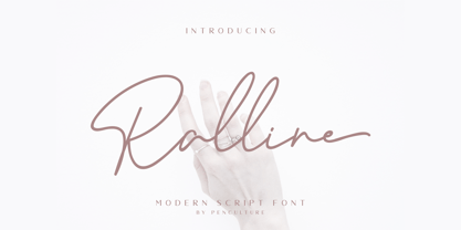 Introducing the new "Ralline - Modern Signature Font" a natural and fashionable script font with complete features that will be very pleasant. This font easy to use and perfect for logo design / branding, watermark photos, product packaging, and much more. Feature and what inside: uppercase and lowercase number and punctuation ligature Swashes Multilingual support Please fell free to contact me on Hipenculture@gmail.com if you have any question Thank you
 - Buddy Slender by Hackberry Font Foundry,
$24.95 Buddy Slender is the narrower version of the companion sans for Contenu, the book font family designed for a book on book family design called Practical Font Design. It's a loose, free, easy to read sans, so when my wife suggested Buddy, it clicked. This is the 2-font Buddy Slender family of Regular & Bold. I made a new more limited feature set for these fonts due to their designed usage.
 - Marcus Traianus by Eurotypo,
$48.00 The famous lettering “Capital Trajana” (inscription at the bottom of the column that bears its name erected in the year114 A.D.) is usually identified as the classic example that defines Imperial Capital forms. However, much earlier, there were already countless examples of Greco-Roman epigraphy of excellent execution, as evidenced by the monumental inscriptions from year 2 b.C. sculpted in the Portico di Gaio e Lucio Cesari in front of the facade of the Basilica Emilia, in the Roman Forum, erected by Augustus, dedicated to his two grandchildren for propaganda and dynastic needs. It has been more than two thousand years and the forms of these letters are still part of our daily life, product of their qualities of readability and beauty. It is probably the added semantic value that have made them an icon full of symbolism that expresses majesty, monumentality, order and universal power. Numerous authors, calligraphers and designers have studied this legacy such as Giovanni Francesco Cresci, Edward Catich, L.C. Evetts, Armando Petrucci, Carol Twombly, John Stevens, Claude Mediavilla, just to name a few. Marcus Traianus font is a fitted version of the two models mentioned, which is accompanied by Small Caps, lowercase (carolingas) and a set of numbers (Indo-Arabics) in addition to the Romans figures and diacritics for Central European languages Marcus Traianus is presented in two weight: Regular, Italic, Bold and ExtraBold.
 - Boho by Latinotype,
$39.00 Boho is inspired by a bohemian girl who is a free soul and creative spirit. She is a city girl, but she loves spending a lot of time outdoors and being close to nature. She loves art and going to the antiques and organic food markets. She is a wild and free spirit who knows no bounds. Boho is Coto Mendoza’s first Script font family, which is based on gestual calligraphy with Cola pen. A first exposure to gestual strokes applied to font design can be seen in her previous work, Macarons. Boho consists of 4 subfamilies: Script, Line, Sans and Serif. Each subfamily comes in 4 weights: Regular, Bold, Italic and Bold Italic. Script and Line versions include a teardrop terminal variant. Dingbats and ornaments are also included. Boho. Love and creative spirit!
 - Hafidz by Redy Studio,
$19.00 Hafidz – Luxury Signature Font If you are looking for high-quality, cool, and luxury signature fonts, Hafidz is one of your best choices. Start your digital signature with this brand-new font, Hafidz. Hafidz will help you create stunning signature logos for you, your company, and your projects. With sharp diagonal lines and ink splatters in the background. Alternate letters appear in the beginning, middle, and ending positions of a word – optimal for signature typography. The added swash will give you an even more personal touch to your greeting cards or lettering. Hafidz will bring a sense of sophistication and elegance to your digital signatures. Made with love from us to you. Create wonderful signature typography with Hafidz today! Hafidz features: A full set of upper & lowercase characters Numbers & punctuation 48 Gorgeous ligatures Lowercase alternates characters Lowercase beginning swashes Lowercase ending swashes Multilingual symbols PUA Encoded Characters – Fully accessible without additional design software. Feel free to give me a message if you have a problem or question. Thank you so much for taking the time to look at one of our products.
 - Black Storm by Nathatype,
$29.00 Black Storm, a captivating serif display font, commands attention with its bold presence and refined aesthetics. It's a versatile tool that empowers your projects with a sense of authority and intricate detailing. The characters in Black Storm are boldly large, ensuring a striking visual impact suitable for attention-grabbing designs. The stable letter size contributes to a balanced and authoritative aesthetic. What elevates Black Storm to new heights is the thoughtful incorporation of additional lines and ornaments, meticulously placed to create a harmonious blend of structure and embellishment. In addition, enjoy the features here. Features: Alternates Multilingual Supports PUA Encoded Numerals and Punctuations Black Storm fits in headlines, logos, posters, flyers, branding materials, greeting cards, print media, editorial layouts, and many more designs. Find out more ways to use this font by taking a look at the font preview. Thanks for purchasing our fonts. Hopefully, you have a great time using our font. Feel free to contact us anytime for further information or when you have trouble with the font. Thanks a lot and happy designing.
 - Turquoise by Resistenza,
$59.00 Many calligraphers agree that Roman Capitals is one of the most beautiful yet difficult hands to master. Its beauty lies in its simplicity of form and structure, yet understanding and applying these skillfully can take years of mindful practice. My goal was to design Roman Capitals that were smoothly designed with a brush, not carved. The main concept was based on the fundamental strokes that are commonly studied when you practice Roman letters. That’s why many Serifs have these unfinished terminal serifs. I created the Turquoise typeface based on my Capitalis Romana practice with a flexible broad edged brush and gouache. During the lowercase process I was still following Foundational calligraphy with a flat brush. My Turquoise Capitals were then adjusted and redesigned at the Tipobrda calligraphy workshop in Slovenia. Turquoise contains small caps, many discretionary ligatures, ornaments, swashes as well as several brushy nature-inspired ornaments, accessible via OpenType. Ideally suited for headlines or body text in advertising, packaging and visual identities, its delicate shapes, curves and endings give projects a harmonious elegance and stylistic feel in unique Turquoise style. My inspiration for this font showcase is one of the richest islands in the Mediterranean, the place where my parents are from, Sicily. This southern Italian region has so many unique spots: Stromboli, part of the Aeolian Islands, and the Pelagie Islands is one of my favorite places in Sicily. The pictures I used were taken there this year. So enjoy the sun, the serifs, the water and its Turquoise colors. The brush is mightier than the sword. Opentype Features: https://www.rsztype.com/article/how-to-use-opentype-features-adobe-microsoft-pages Turquoise works very well with Nautica Check also Turquoise Inline
 - TXT Tough Love by Illustration Ink,
$3.00Add character to your paper crafts and publications. Download this cool Tough Love font to create lettering with a scratched or brush-stroke look. Design titles, captions, journaling and more, or simply give your publication an off-beat, handwritten appeal. - TXT Monique by Illustration Ink,
$3.00Customize your lettering project with this cool and clever font. Download it for fanciful journaling on scrapbook pages and greeting cards. Try it on Halloween party invitations or wherever you might want to add a whimsical touch to a unique publication. - Castrade by Din Studio,
$29.00 Castrade is modern display sans font. Made for any professional project branding. Every letter has a unique and beautiful touch. Includes: - Castrade (OTF) Features: - PUA Encoded - Multilingual Support - Numerals and Punctuation Thank you for downloading premium fonts from Din Studio
 - TXT Scribbletti by Illustration Ink,
$3.00Add character to your paper crafts. Download this unique "Scribbletti" font to create lettering with a scratchy, handwritten look. Design titles, captions, and journaling for scrapbook pages and greeting cards, or simply give your publication an off-beat, handwritten appeal. - Frutiger Next Paneuropean by Linotype,
$99.00Frutiger Next is Adrian Frutiger's and Linotype's completely new interpretation of the well known typeface Frutiger released in 2000. For these revised forms, the areas of application are almost limitless. Frutiger Next can be used for anything from office communications to multimedia to complex printed materials. The Frutiger Next family contains small caps, oldstyle figures, and other figure options in every font. Adrian Frutiger's eponymous typeface has been used for decades, everywhere from airport signage to book text to corporate logos to the smallest web graphics. The Italics in the original version of Frutiger were based very closely on the Roman forms; in Frutiger Next, they have been re-designed to be true Italics. - Berling by Linotype,
$29.99The productivity of the Berlingska Stilgjuteriet was made possible by the development of modern typeface art in Sweden in the 1950s. The typeface Berling was designed by Karl-Erik Forsberg for the Berlingska Stilgjuteriet in Lund. It belongs to the modern text typefaces and like most of these markedly shows the influece of the Neorenaissance. Berling Antiqua appeared in 1951 with a matching italic and by 1959, it was expanded to include five weights. Linotype offers Berling in four of them, roman and bold with their respective italics. In 2004 the Swedish publisher Verbum commissioned a complete redesign of Berling for the 21st century. Linotype assisted the designers of this new typeface, which came to be called Berling Nova.
