10,000 search results
(0.067 seconds)
- Graystera by Letterhend,
$19.00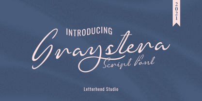 Introducing, Graystera Script. A Beautiful and classy script. This font perfectly made to be applied especially in logo, and the other various formal forms such as invitations, labels, logos, magazines, books, greeting / wedding cards, packaging, fashion, make up, stationery, novels, labels or any type of advertising purpose. Features : uppercase & lowercase numbers and punctuation multilingual ligatures alternates swashes PUA encoded We highly recommend using a program that supports OpenType features and Glyphs panels like many of Adobe apps and Corel Draw, so you can see and access all Glyph variations.
 - Mellodate by Letterhend,
$19.00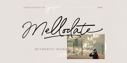 Introducing, Mellodate Script - an authentic hand writing with natural signature style. This type of font perfectly made to be applied especially in logo, and the other various formal forms such as invitations, labels, logos, magazines, books, greeting / wedding cards, packaging, fashion, make up, stationery, novels, labels or any type of advertising purpose. Features : uppercase & lowercase numbers and punctuation multilingual alternates and ligatures swashes PUA encoded We highly recommend using a program that supports OpenType features and Glyphs panels like many of Adobe apps and Corel Draw, so you can see and access all Glyph variations.
 - Gatlik Saphir by Alcode,
$16.00 Gatlik Saphir is a classic font, I built it with my relaxed hands, designing a classic font but having a modern element in it, which makes it particularly suitable for wedding media, book covers, greeting cards, logos, branding, business cards and certificates, in fact for any design work that requires a clasik, formal or luxury. Try Gatlik Saphir, enjoy the richness of OpenType features and let her fun and elegant excitement make you happy and enhance your creativity! You can use this font very easily. Thank you for purchase!
 - Blonde Fraktur by ParaType,
$30.00 Blonde Fraktur is a free interpretation of the Gothic theme in Cyrillic. The font is neither Fraktur nor any other Gothic script from the formal point of view, but it makes text look like Gothic script, no matter which language is used. Blonde Fraktur was written with a quill by Alexandra Korolkova and prepared in digital form by Alexandra Pushkova. The font contains a set of alternatives and swashed variations. It suits well for advertising of beer, sausages, pubs and other places where Gothic scripts are commonly used.
 - Timberland by Letterhend,
$16.00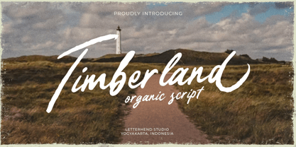 Timberland is a casual script with organic style. This type of font perfectly made to be applied especially in logo, and the other various formal forms such as invitations, labels, logos, magazines, books, greeting / wedding cards, packaging, fashion, make up, stationery, novels, labels or any type of advertising purpose. Features : Uppercase & lowercase Numbers and punctuation Alternates & Ligatures Multilingual PUA encoded We highly recommend using a program that supports OpenType features and Glyphs panels like many of Adobe apps and Corel Draw, so you can see and access all Glyph variations.
 - Rolih by Khoir,
$15.00 Introducing, Rolih. Serif typeface with a modern and classic look and feel, this font is made with a variety of unique font alternatives so that it is easy to apply, especially in logos, posters, quotes, invitations, labels, greeting / wedding cards, magazines, books, business cards, fashion, packaging and formal forms or other types of advertising. What's included? Uppercase Characters Lowercase Characters Support 75+ Language FEATURES Rolih (OTF) So what are you waiting for? immediately purchase this font, feel free to comment, or send me my PM or email at khoirtypework@gmail.com Thank you for seeing
 - Ansylia by Letterhend,
$19.00 Introducing, Ansylia Script - an authentic hand writing with natural signature style. This type of font perfectly made to be applied especially in logo, and the other various formal forms such as invitations, labels, logos, magazines, books, greeting / wedding cards, packaging, fashion, make up, stationery, novels, labels or any type of advertising purpose. Features : uppercase & lowercase numbers and punctuation multilingual alternates and ligatures swashes PUA encoded We highly recommend using a program that supports OpenType features and Glyphs panels like many of Adobe apps and Corel Draw, so you can see and access all Glyph variations.
 - Miguna by Twinletter,
$10.00 Miguna is a san serif family with relaxed, clean, and charming characteristics. its use is also very flexible, can be used for various design projects, both formal and informal, this font is really amazing. Miguna comes with alternatives from the thinnest to the thickest, helping you in creating titles and text. This font is perfect for packaging, special moment events, branding, banners, posters, movie titles, food and beverages, quotes, clothing, logotypes, and more. Of course, your various design projects will be perfect and amazing, start using our fonts for your amazing projects.
 - Lord Story by Letterhend,
$19.00 Lord Story is a great display font with medieval middle age theme. This font is also suitable to be applied especially in logo, and the other various formal forms such as invitations, labels, logos, magazines, books, greeting / wedding cards, packaging, fashion, make up, stationery, novels, labels or any type of advertising purpose. Features : uppercase & lowercase numbers and punctuation multilingual alternates & ligatures PUA encoded We highly recommend using a program that supports OpenType features and Glyphs panels like many of Adobe apps and Corel Draw, so you can see and access all Glyph variations.
 - Smorgasbord by TypeSETit,
$25.00 It’s an all occasion Smorgasbord in this collection of 17 fonts originally designed for the social expression industry— all ranging from juvenile/cute to masculine, to formal. Whether you want to send a nice note of thanks, or create a poster for a Renaissance Festival, you can find the right look in Smorgasbord. SAVE over 85%' when you purchase the entire Smorgasbord collection! The Smorgasbord collection is composed of fonts that have not been available for several years at MyFonts, but have been updated and improved to Professional standards.
 - Fulline by Letterhend,
$19.00 Fulline is a display typeface. This type of font perfectly made to be applied especially in headlines which is need a standout font, and the other various formal forms such as invitations, labels, logos, magazines, books, greeting / wedding cards, packaging, fashion, make up, stationery, novels, labels or any type of advertising purpose. Features : Solid version numbers and punctuation multilingual PUA encoded We highly recommend using a program that supports OpenType features and Glyphs panels like many of Adobe apps and Corel Draw, so you can see and access all Glyph variations.
 - Riverside Forest by Letterhend,
$14.00 Introducing, Riverside Forest is a hand drawn display font with organic looks. This font perfectly made to be applied especially in logo, and the other various formal forms such as invitations, labels, logos, magazines, books, greeting / wedding cards, packaging, fashion, make up, stationery, novels, labels or any type of advertising purpose. Features : Uppercase & lowercase Numbers and punctuation Alternates & Ligatures Multilingual PUA encoded We highly recommend using a program that supports OpenType features and Glyphs panels like many of Adobe apps and Corel Draw, so you can see and access all Glyph variations.
 - Raksana by Letterhend,
$19.00 Introducing, Raksana. A retro bold script which will bring you back to 60s feel. This font perfectly made to be applied especially in logo, and the other various formal forms such as invitations, labels, logos, magazines, books, greeting / wedding cards, packaging, fashion, make up, stationery, novels, labels or any type of advertising purpose. Features : uppercase & lowercase numbers and punctuation multilingual ligatures alternates swashes PUA encoded We highly recommend using a program that supports OpenType features and Glyphs panels like many of Adobe apps and Corel Draw, so you can see and access all Glyph variations.
 - Buckwheat TC by Tom Chalky,
$12.00 Introducing the Buckwheat Font Collection; Each and every font within the Buckwheat Collection was carefully created to be timeless, super versatile, and effortlessly cohesive. An essential kit to come back to time and time again for any number of design projects; from clean and modern, to rough and organic. What's Inside? - Buckwheat TC Regular: A condensed heading/titling font boasting real small caps (along with numerals, currency glyphs and more to match the small caps). - Buckwheat TC Sans: A rounded sans-serif font with several stylistic alternatives for various capitals (A, B, G, H, J, K, P, and R). - Buckwheat TC Script: Tying everything together, a simple yet effective monoline script font designed to look great big or small. - Rough and Smooth Styles: All of the aforementioned fonts are available in both smooth and textured styles. The textures are consistent throughout the collection, improving the cohesion of the fonts and eliminating the need to texture them yourself. - All of the typefaces within this collection include multilingual support and a full western character glyph range.
 - Music Sheets by Aah Yes,
$3.50 Music Sheets is a font that will produce blank music manuscript sheets, giving the main Clefs, Time Signatures, Stafflines, Guitar Tab, plus other useful symbols - in fact all you need to make simple manuscript of your own design, so you can put in the notation yourself. You can use it with ordinary Word Processors or top-end graphics programs equally easily. Using it is extremely simple - for instance into the text-box below type TBA for Treble Bass Alto Clefs, or 234567 for the basic Time Signatures from 2/4 up to 7/4, or L for the Lines. Essentially it’s a cut-down and slightly modified version of our Blank Manuscript font, (which is fairly comprehensive for more advanced scoresheets but obviously a bit more complex) and uses a similar intuitive method for inputting characters. There’s plenty of examples provided, plus a short guide explaining the character layout, which is extremely easy. Download the zip to get the guide and examples, and only install one version - either OTF or TTF, but not both.
 - Sophistic by Redy Studio,
$19.00 Sophistic – Luxurious Script Font Fashion and luxury are the first things that come to mind when you see or hear this font. Sophistic is an authentic and luxurious font that is dynamic with a hand-drawn stroke. It is full of life and movement which will add a modern sensibility to your graphic designs. Think runway shows, model and designer photography, fashion mags, beauty, cosmetics, and jewelry marketing campaigns. See how good it looks in tandem with other script font styles? Watch out because consumer appetite for luxe products is at an all-time high! This curly font can also be used for wedding invitations or to define your blog header. Sophistic features: A full set of upper & lowercase characters Numbers & punctuation 23 Gorgeous ligatures Uppercase beginning swashes Lowercase beginning swashes Lowercase ending swashes Lowercase alternates characters Multilingual symbols PUA Encoded Characters – Fully accessible without additional design software. Feel free to give me a message if you have a problem or question. Thank you so much for taking the time to look at one of our products.
 - Mina by Resistenza,
$39.00 Go back to a time when the Mediterranean coastline was truly glamorous, when stylish women and men in wire-framed glasses listened to Domenico Modugno songs on the radio while sipping wine in sidewalk cafes. A relaxing summer’s day, a gentle sea breeze, taking the time to write a postcard to your loved ones in your best handwriting. The 1950’s may have come and gone, but the elegance and simplicity of that classic style has not, Mina keeps the feel of calligraphy, the long connections between letters is elastic, the clean, thin lines, it is a relaxed cursive ideal for logotypes, titles, and lettering. There are eleven Mina font styles and many loops to choose from to customize any letter. Bring the seaside glamour of a bygone era to your projects of today with Mina. Ranging from light to heavy, Mina Calligraphic, and Mina Shadow, this family of fonts work perfectly separately but you can also achieve beautiful results when combining them. Check out also Mina Chic We recommend to combine Mina with: PestoFresco Turquoise
 - Escuela by Cuchi, qué tipo,
$9.95 Escuela typeface is born in an attempt to reflect so many current influences of modern grotesque fonts that are trying to better reflect the values of today's world. Its compact proportions and high x-height, but at the same time with sort kind of modulation and open inktraps, propose a visual game that is worth enough to use it many places; Escuela can be striking and ideal for headlines in large text and heavy weights, but at the same time serious and readable in smaller bodies or regular and fine weights. Its wide range of characters, which includes a set of emoticons ideal for signage, work and evaluation documents, as well as inclusive, is ideal for educational centers, whether they are more playful (schools) or more pragmatic (universities). In fact, "Escuela" means “School” in English. For this reason, Escuela is your best ally when it comes to preparing texts that transcend students through a contemporary and different, but functional, character. Designed by Carlos Campos www.cuchiquetipo.com Dummy text from wikisource.org (1911 Encyclopædia Britannica/Universities).
 - Schneidler Latein by Spirit & Bones,
$33.00 The Schneidler Latein is a sharp and elegant Antiqua based on the ductus of the broad edged pen with a strong character. Running perfectly in paragraph text giving it something quite special and being effortlessly legible at the same time, Schneidler Latein works great in headings as well. Each glyph is a piece of art ready to be used in branding and blowup combining beauty and personality in a kick-ass blend. It is absolutely new to the digital world as it never has been digitized before. This new version digitized, further developed and extended by artist and graphic designer Lena Schmidt comes in nine styles from which there are four application-related ones like Subtext and Display and five weight-related ones like Bold and Heavy. Each style contains 948 glyphs, variations of numbers, three stylistic sets one preserving the historic forms of changed characters, small caps, open type features and superior and inferior characters. Designed by F. H. Ernst Schneidler the Schneidler Latein was released in 1916, the bold version in 1920 and the italics in 1921. Schneidler was born in 1882 in Berlin. He studied at the school for applied arts in Düsseldorf with professor F. H. Ehmcke and P. Behrens. He was as a painter, graphic designer and illustrator. In 1920 he was appointed as teacher in the school for applied arts Stuttgart. His students were Albert Kapr, Imre Reiner and Lilo Rasch-Naegele among others. Further well-known fonts from his hands are for example Legende, Amalthea, Schneidler Mediävel and Schneidler Antiqua. Lena Schmidt was born 1981 in Bremen. She is a german painter, graphic designer and illustrator mostly known for her huge wood carving paintings. From 2003 to 2011 she studied Fine Arts in Hamburg with professor Matt Mullican. From 2015 to 2019 she studied graphic design with a focus on type design at HAW Hamburg Department Design with professor Jovica Veljović. She lives and works in Hamburg, Germany.
 - Bauer Bodoni by Linotype,
$45.99 Giambattista Bodoni (1740-1813) was called the King of Printers; he was a prolific type designer, a masterful engraver of punches and the most widely admired printer of his time. His books and typefaces were created during the 45 years he was the director of the fine press and publishing house of the Duke of Parma in Italy. He produced the best of what are known as "modern" style types, basing them on the finest writing of his time. Modern types represented the ultimate typographic development of the late eighteenth and early nineteenth centuries. They have characteristics quite different from the types that preceded them; such as extreme vertical stress, fine hairlines contrasted by bold main strokes, and very subtle, almost non-existent bracketing of sharply defined hairline serifs. Bodoni saw this style as beautiful and harmonious-the natural result of writing done with a well-cut pen, and the look was fashionable and admired. Other punchcutters, such as the Didot family (1689-1853) in France, and J. E. Walbaum (1768-1839) in Germany made their own versions of the modern faces. Even though some nineteenth century critics turned up their noses and called such types shattering and chilly, today the Bodoni moderns are seen in much the same light as they were in his own time. When used with care, the Bodoni types are both romantic and elegant, with a presence that adds tasteful sparkle to headlines and advertising. The Bauer Bodoni was done by Heinrich Jost for Bauer Typefoundry in 1927. This version has finer details of the original Bodoni types. It works well for headlines, logos, advertising.
 - Roloi by Mayfield Type Foundry,
$15.00 Originally inspired by the numerals on a vintage clock face, Roloi is a layered numbers font in the deco lettering style, and includes a full set of automatic clock symbols. Its geometric forms are typical of the deco style, but stop well-short of pure geometry. The irregular stroke and character widths work together to give the forms a warm and energetic, yet cohesive, feel. Roloi offers two layering styles—the personable Fill and the more dynamic Inline. Designed to be layered over the background Regular style, they both lend the forms an added level of interest. Roloi also includes a clock symbol for any and every time of day, rounded to the nearest five-minutes. The regular weight provides the circular clock background, while the Fill and Inline styles produce the clock hands. If ligatures are activated in your text-editing program, type out any time—such as 9:32, 12:05, etc.—and the proper clock symbol will be automatically substituted. Go ahead, type any time out below! To stop the automatic clock symbol substitution, simply deactivate ligatures. Because the clock symbols are standard ligatures, every major modern browser will support their use on the web. With some programing they could even be used to make a lightweight, text-only clock. In addition to the clock symbols and basic numerals, Roloi’s glyph range covers numeric superiors and inferiors, standard and arbitrary fractions, currency symbols, all of the punctuation and symbols commonly associated with currency, unicode clock Face symbols, the A M P / a m p letters, and alternates of the 1, 2, and 4, accessible by selecting Stylistic Set 1.
 - Fan Script by Sudtipos,
$99.00 A friend of mine says that sports are the ultimate popular drug. One of his favorite things to say is, “The sun’s always shining on a game somewhere.” It’s hard to argue with that. But that perspective is now the privilege of a society where technology is so high and mighty that it all but shapes such perspectives. These days I can, if I so choose, subscribe to nothing but sports on over a hundred TV channels and a thousand browser bookmarks. But it wasn't always like that. When I was growing up, long before the super-commercialization of the sport, I and other kids spent more than every spare minute of our time memorizing the names and positions of players, collecting team shirts and paraphernalia, making up game scenarios, and just being our generation’s entirely devoted fans. Argentina is one of the nations most obsessed with sports, especially "fútbol" (or soccer to North Americans). The running American joke was that we're all born with a football. When the national team is playing a game, stores actually close their doors, and Buenos Aires looks like a ghost town. Even on the local level, River Plate, my favorite team where I grew up, didn't normally have to worry about empty seats in its home stadium, even though attendance is charged at a high premium. There are things our senses absorb when we are children, yet we don't notice them until much later on in life. A sport’s collage of aesthetics is one of those things. When I was a kid I loved the teams and players that I loved, but I never really stopped to think what solidified them in my memory and made them instantly recognizable to me. Now, thirty-some years later, and after having had the fortune to experience many cultures other than my own, I can safely deduce that a sport’s aesthetic depends on the local or national culture as much as it depends on the sport itself. And the way all that gets molded in a single team’s identity becomes so intricate it is difficult to see where each part comes from to shape the whole. Although “futbol” is still in my blood as an Argentinean, I'm old enough to afford a little cynicism about how extremely corporate most popular sports are. Of course, nothing can now take away the joy I got from football in my childhood and early teens. But over the past few years I've been trying to perceive the sport itself in a global context, even alongside other popular sports in different areas of the world. Being a type designer, I naturally focus in my comparisons on the alphabets used in designing different sports experiences. And from that I've come to a few conclusions about my own taste in sports aesthetic, some of which surprised me. I think I like the baseball and basketball aesthetic better than football, hockey, volleyball, tennis, golf, cricket, rugby, and other sports. This of course is a biased opinion. I'm a lettering guy, and hand lettering is seen much more in baseball and basketball. But there’s a bit more to it than that. Even though all sports can be reduced to a bare-bones series of purposes and goals to reach, the rules and arrangements of baseball and basketball, in spite of their obvious tempo differences, are more suited for overall artistic motion than other sports. So when an application of swashed handlettering is used as part of a team’s identity in baseball or basketball, it becomes a natural fit. The swashes can almost be visual representation of a basketball curving in the air on its way to the hoop, or a baseball on its way out of the park. This expression is invariably backed by and connected to bold, sleak lettering, representing the driving force and precision (arms, bat) behind the artistic motion. It’s a simple and natural connective analysis to a designer, but the normal naked eye still marvels inexplicably at the beauty of such logos and wordmarks. That analytical simplicity was the divining rod behind Fan Script. My own ambitious brief was to build a readable yet very artistic sports script that can be a perfect fit for baseball or basketball identities, but which can also be implemented for other sports. The result turned out to be quite beautiful to my eyes, and I hope you find it satisfactory in your own work. Sports scripts like this one are rooted in showcard lettering models from the late 19th and early 20th century, like Detroit’s lettering teacher C. Strong’s — the same models that continue to influence book designers and sign painters for more than a century now. So as you can see, American turn-of-the-century calligraphy and its long-term influences still remain a subject of fascination to me. This fascination has been the engine of most of my work, and it shows clearly in Fan Script. Fan Script is a lively heavy brush face suitable for sports identities. It includes a variety of swashes of different shapes, both connective and non-connective, and contains a whole range of letter alternates. Users of this font will find a lot of casual freedom in playing with different combinations - a freedom backed by a solid technological undercurrent, where OpenType features provide immediate and logical solutions to problems common to this kind of script. One final thing bears mentioning: After the font design and production were completed, it was surprisingly delightful for me to notice, in the testing stage, that my background as a packaging designer seems to have left a mark on the way the font works overall. The modern improvements I applied to the letter forms have managed to induce a somewhat retro packaging appearance to the totality of the typeface. So I expect Fan Script will be just as useful in packaging as it would be in sports identity, logotype and merchandizing. Ale Paul
 - Trakya Sans by Bülent Yüksel,
$19.00 Thrace (/θreɪs/; Greek: Θράκη, Thráki; Bulgarian: Тракия, Trakiya; Turkish: Trakya) is a geographical and historical region in Southeast Europe, now split among Bulgaria, Greece, and Turkey, which is bounded by the Balkan Mountains to the north, the Aegean Sea to the south, and the Black Sea to the east. It comprises southeastern Bulgaria (Northern Thrace), northeastern Greece (Western Thrace), and the European part of Turkey (East Thrace). Trakya Sans is a modern sans serif with a geometric touch. Futura, Avant Garde and the like. It has a modern streak which is the result of a harmonization of width and height especially in the lowercase letters to support legibility. Ideally suited for advertising and packaging, editorial and publishing, logos, branding and creative industries, posters and billboards, small text, way-finding and signage as well as web and screen design. Trakya Sans provides advanced typographical support for Latin-based languages. An extended character set, supporting Central, Western and Eastern European languages, rounds up the family. The designation “Trakya Sans 500 Regular” forms the central point. The first figure of the number describes the stroke thickness: 100 Thin to 900 Bold. "Trakya Sans" comes in 5 weights with matching italics plus "Trakya Sans Alt", also 5 weights and italics so a total of 20 styles. The family contains a set of 630+ characters. Case-Sensitive Forms, Classes and Features, Small Caps from Letter Cases, Fractions, Superior, Inferior, Denominator, Numerator, Old Style Figures just with one easy touch in all graphic programs. Trakya Sans is the perfect font for web use. You can enjoy using it.
 - Trakya Slab by Bülent Yüksel,
$19.00 Thrace (/θreɪs/; Greek: Θράκη, Thráki; Bulgarian: Тракия, Trakiya; Turkish: Trakya) is a geographical and historical region in Southeast Europe, now split among Bulgaria, Greece, and Turkey, which is bounded by the Balkan Mountains to the north, the Aegean Sea to the south, and the Black Sea to the east. It comprises southeastern Bulgaria (Northern Thrace), northeastern Greece (Western Thrace), and the European part of Turkey (East Thrace). Trakya Slab is a modern slab serif with a geometric touch. It has a modern streak which is the result of a harmonization of width and height especially in the lowercase letters to support legibility. Ideally suited for advertising and packaging, editorial and publishing, logos, branding and creative industries, posters and billboards, small text, way-finding and signage as well as web and screen design. Trakya Slab provides advanced typographical support for Latin-based languages. An extended character set, supporting Central, Western and Eastern European languages, rounds up the family. The designation “Trakya Slab 500 Regular” forms the central point. The first figure of the number describes the stroke thickness: 100 Thin to 900 Bold. "Trakya Slab" comes with 5 weights and italics; "Trakya Slab Alt" also comes with 5 weights and matching italics, giving a total of 20 styles. The family contains a set of 630+ characters. Case-Sensitive Forms, Classes and Features, Small Caps from Letter Cases, Fractions, Superior, Inferior, Denominator, Numerator, Old Style Figures just with one touch, easy to access in all graphic programs. Trakya Slab is the perfect font for web use. Enjoy using it.
 - Scripps College Old Style by Monotype,
$49.00The story of Scripps College Old Style is a heart-warming and inspiring chronicle about a young librarian, a handful of students, a wealthy grandmother, a dedicated educator -- and two eminent American type designers. The story begins in 1938, when Dorothy Drake, the newly hired librarian at Scripps College, a small women's college in southern California, became an impromptu dinner companion of the American type designer Fred Goudy. By the 1990s, the original fonts that Goudy had created for Scripps College in the 1940s had become prized -- but they were seldom-used antiques. Scripps needed digital versions of the metal fonts. This goal posed two immediate challenges: finding a designer familiar with letterpress printing who was skilled at creating digital fonts, and locating the money to commission the designer's services. The first challenge was the easiest to conquer. Sumner Stone was my first and only choice," recalls Kitty Maryatt, the current curator of the Scripps College Press. "I knew he had letterpress experience, was an accomplished calligrapher, and that his typeface designs were simply exquisite. The choice was easy."The second challenge was more difficult. It took the dedication, hard work and tenacity of Maryatt to bring the beautiful Goudy designs into the twenty-first century. While Stone was eager to begin work on the project, the college had no more money for new typeface designs in the 1990s than it did in the1930s. Years of lobbying, cajoling and letter writing were necessary to obtain the college's approval for the design project. Once she had the necessary funding, the design brief posed yet a third challenge. Goudy had provided two sizes of type to the Press: 14 point and 16 point. Which would serve as the foundation for Stone's work? In addition, the Goudy fonts were quite worn. Should Stone use printed samples as his design master, or base his work on the original Goudy renderings? The 14-point master drawings were the ultimate choice, with the stipulation that the finished fonts would provide both a seamless transition from the worn metal versions and a faithful representation of the original Goudy designs. Once the budget and design brief were established, the process of converting the original Goudy drawings into digital fonts took just a little over two months. Stone delivered finished products to Scripps in the fall of 1997. The first official use of the fonts was to set an announcement for a lecture by Stone at Scripps in February of 1998. But the story is not quite finished. Maryatt was so pleased with the new digital fonts, she wanted to share them with the graphic design community. At Stone's suggestion, she contacted Monotype Imaging with the hope that the company would add the new designs to its library. An easy decision! Now Monotype Imaging is part of the story. We are proud to announce the release of Scripps College Old Style as a Monotype Classic font. The once exclusive font of metal type is now available in digital form for designers around the world. " - Settikef by Twinletter,
$14.00 Settikef is a handwritten script font with cute and cute nuances but still beautiful and elegant. This font is great for you to use as a title in your designs as well as great for writing names and words. and to be sure this font is not only limited to that purpose but also very special for every need of your project, be it a formal or non-formal project, this font is still beautiful and elegant. start creating awesome designs with this font! This charming font also offers the beauty of abstract typography harmony for a wide variety of design projects, including digital natural handwriting for designs, quote designs, for social media business designs, advertisements, trademarks, food and beverage promotion banners, text, posters, a signature, and all designs require handwriting or whatever design you want. This font is equipped with uppercase, lowercase, numbers, punctuation marks, swhases and several variations on each character including multi-language. ================================================== This font is best suited for open type friendly applications. How to get alternative glyphs from open type fonts: http://adobe.ly/1m1fn4Y PUA Character Code - Fully accessible without additional design software. do not hesitate anymore start using this font. and Feel free to send any message you want to convey.
 - Antoge by Twinletter,
$12.00 Antoge is a handwritten script font with a pretty and cute feel but is still beautiful and elegant to use. This font has its own charm for you to use as a title, write names, words and sentences which of course look good and charming, and certainly this font is not only limited to that purpose but is also very special for every need of your project, be it a project. formal and non-formal, this font is still beautiful and elegant. Start creating incredible designs with this font! This captivating font also offers harmoniously beautiful abstract typography for a wide variety of design projects, including digital natural handwriting for designs, design quotes, for social media business designs, advertisements, trademarks, food and beverage promotion banners, text, posters, a signature. , and all designs require handwriting or whatever design you want. What's Included: Font file Standard glyph Binder Works on PC & Mac Simple installation It can be accessed in Adobe Illustrator, Adobe Photoshop, Adobe InDesign, and even works in Microsoft Word. PUA Encoded Characters - Fully accessible without additional design software. Fonts include multilingual support for; Afrikaans, Albanian, Croatian, Czech, Danish, Dutch, English, Estonian, Finnish, French, German, Hungarian, Italian, Norwegian, Polish, Portuguese, Slovak, Slovenian, Spanish, Swedish
 - Plate Gothic by Monotype,
$29.00Around the turn of the twentieth-century, Steel and copper plate engraving was the most sophisticated and expensive method for producing business cards, stationery, and formal announcements. In engraved printing, the image is incised, or engraved into a hard, flat plate. Ink is applied to the plate, and then wiped off; leaving only the ink that is trapped below the surface in the incised areas. When the paper is pressed against the flat plate, the ink is drawn out of these areas and transferred to the paper. The results are twofold: printing which sits above the surface of the paper, and the reproduction very delicate lines and shapes. For business and formal printing, engraved printing was, and is, considered the best. The problem is that not everybody can afford the best. Type foundries, in the early 1900s, figured that if they could produce a typeface for traditional printing, which had appearance of engraving, they would be able to satisfy the needs of those forced to live with modest printing budgets. Engravers faces were born. Fredric Goudy’s Copperplate Gothic was one of the most popular. Plate Gothic is a version of this style updated for digital technology. It has all the charm and charisma as the metal type and yet is perfect for today's needs. - Le Monde Courrier Std by Typofonderie,
$59.00 A rounded slab in 4 styles In our age, since the arrival of microcomputing, the majority of professional letters have been composed in quality typefaces. Typewriters & the typestyles they used have become antiques. A letter set in Times or Helvetica & printed with a laser printer at 600 dpi or more are of such quality that one can no longer distinguish it with a document produced by offset printing. But letters composed in this way appear overly institutional when a bit of informality is needed. Le Monde Courrier, designed by Jean François Porchez, attempts to re-establish a style halfway between writing and printing. Informal neo-tech style This rounded slab serif returns the informal character of “typewritten” fonts to letters and suit well all bad conditions, from inkjet printed memos to webfonts use. With a unique typographic colour, it integrate itself with the rest of the Le Monde family with effective contrast. The verticals metrics and proportions of Le Monde Courrier are calibrated to match perfectly others Typofonderie families. Bukva:raz 2001 Type Directors Club .44 1998 European Design Awards 1998
 - Storefront Pro by Sudtipos,
$79.00 Storefront is what the prolific and talented American sign painters of the 1920s and 1930s would have created if they had access to the advanced lettering and type technologies we have today. Rooted in an incomplete Alf Becker alphabet sample, Storefront is my usual overdose on alternates and swashes, my eternal attempt at giving typesetting that ever-elusive handmade impression. Though the main shapes, especially the majuscules, are almost a standard recitation of the natural evolution of nineteenth century scripts, the additional variants available within the font provide a leap in time to what sign makers and packagers are doing today. I can honestly say that Storefront’s influences are probably less historic and more in line with my recent travels and frequent supermarket visits. It’s difficult to avoid current visual culture when you're constantly bombarded with it. Not that I try. I certainly welcome the overflow. I'm probably addicted to it by now. With a very cool aesthetic, plenty of alternates and swashes, extended Latin language support, Storefront is over a thousand glyphs for your branding, packaging, and sign making pleasure.
 - Greek by Scholtz Fonts,
$8.95The Greek font started from an experiment with designing fonts based on a geometric grid. I joined the points on the grid with straight lines to form the various characters and found that this resulted in a font that closely resembled Greek writing (derived from inscriptions carved in stone) of ancient times. I continued to develop this theme but I now accentuated the look and feel of Greek writing. The three styles shown are the results of this development. I did not kern or letterspace the individual letters since this would have been out of character with the orignal Greek writing. This means that the font is mono-spaced. At a later stage I may produce more refined and "modern" versions of these fonts. Surprisingly, the Greek SCF styles are very readable. The font is fully professional in terms of its character set. It contains over 235 characters - (upper and lower case characters, punctuation, numerals, symbols and accented characters are present). In fact, it has all the accented characters used in the major European languages. - Dynamic Duo by Comicraft,
$19.00 Batman & Robin! Thelma & Louise! Butch Cassidy & The Sundance Kid! Hip Flask & Farrell! Frodo & Sam! Sonny & Cher! Calvin & Hobbes! Bert & Ernie! Dynamic Duos exist in all forms of literature & entertainment, and now Comicraft is proud to introduce its latest alliterative offering, DYNAMIC DUO! A buddy movie in font form, Dynamic Duo is a team-up of Solid and Open weights who can’t decide who is the lead and who is the sidekick! In the fine tradition of all two-in-ones and company-wide comic crossovers, first they fight and then they team up — to take your design on the biggest, loudest, most intense adventure of All Time. Dynamic Duo features comic-book style hook caps and alternate uppercase letters which automatically cycle for a more natural, hand-drawn appearance. Solid and Open weights can be layered to create chromatic effects, and matching variable fonts allow near-infinite control of weight and slant. Each weight contains 478 glyphs and supports 220 languages. Comicraft fonts are created BY comic book letterers FOR lettering comic books. Accept no substitutes! Artwork by Axel Medellin from Elephantmen #73
 - Soin Sans Neue by Stawix,
$40.00 10 hours a day for almost as long as one anniversary of the Olympics to harvest the experience of designing many typefaces, thinking process and refining the craftmanship throughout these years. From Soin Sans that has been designed and released in 2011 until now, it has come to the right time to push a typeface like Soin Sans itself beyond the boundary, in terms of both usage and equipped features to serve many context of design as perfect as us, Stawix Foundry can offer to you. Soins Sans Neue is the evidence of how Stawix Foundry grows. If one seeks for a type that portrays a simple look, modern but still have a touch of humanist and a little pinch oldstyle, this little one of ours, Soins Sans Neue is the answer we have prepare for you. Technically, we are fully armed with c2sc, cpsp, frac, onum, salt and many more to minimize the chance of choosing other fonts in the project that requires diversities. Without further ado, please welcome Soins Sans Neue!
 - Kindly by Up Up Creative,
$16.00 Introducing Kindly, a friendly, hand-drawn, all-caps font with tons of symbols, wingdings, and word art. I’ve been developing this style of lettering for years in my custom design and lettering work, and now I’ve taken the time to turn it into something anyone can use to design with authentic, hand-drawn typography. Kindly is perfect for invitations, design for children, branding, and editorial design and comes with more than 100 extra elements to bring some fun to your layouts. Kindly comes with 504 glyphs and a smattering of OpenType features, including stylistic sets, character variants, and multilingual support (including multiple currency symbols). The OpenType features can be very easily accessed by using OpenType-savvy programs such as Adobe Illustrator and Adobe InDesign. (To access these awesome features in Microsoft Word, you'll need to get comfortable with the advanced tab of Word's font menu. If you need help with this, ask me!) The wingdings, word art, and other fun elements are all PUA-encoded so you can easily use them in OpenType-savvy software or with a character map.
 - BenderHead AEF by Altered Ego,
$45.00Now, more than ever, the world needs BenderHead. Why? – Because... it just does. Don't ask why, just take our word for it. BenderHead has its thicks and thins all mixed up. For you typographic aficionados, stroke weights and hairline weights aren't consistent, and many rules of typographic design were broken to make this font. We're sure there's a use for it... we've used it on CD covers and posters - and have seen it on a poster for the Zelda video game at Babbages. It's offered here for the first time through Altered Ego Fonts. I don't think we need to explain its history, its inspiration, or its historical reference to you... (we're not certain there is any.) Just accept it as it is, and use it profusely. Benderhead AEF features a full character set, including the Euro. It supports the following codepages: -Latin 1 -Latin 2 (Eastern Europe) -Western Baltic -Turkish AEF highly recommends the OpenType version for compatibility with future Macintosh and Windows operating systems. Not to mention they work better in Adobe InDesign. - Labyrindo by URW Type Foundry,
$39.99 Labyrindo is inspired on the classic Labyrinth. The oldest known labyrinth is 3200 years old and is to be found in Greece. The mythological king Minos held the monstrous son of his wife ‘Minotaurus’ prison in a labyrinth. Much later the labyrinth made his appearance in the medieval churches, this time as a pattern on the church floor. During the Italian renaissance the multiple gate labyrinth came in fashion. Paths led trough green hedges in beautiful palace gardens. These hedges where perfectly cut in rectangular shapes. Mainly meant as an aesthetic statement. Besides the origin of the physic labyrinth, it has always been a great source of story-telling and myths. I mention a few personal favourites (film) like, Pan’s Labyrinth (a journey to the underworld), Labyrinth (with David Bowie) and the Shining with Jack Nicholson (where a horrific scene takes place in a labyrinth). Not the most cheerful stories but fascinating and intriguing. A Labyrinth is mind boggling and mysterious but wonderful. I made graphic translation in this typeface.
 - Haeock by Pedro Teixeira,
$16.00 Haeock is very readable, an beautiful slab serif designed by Pedro Alexandre Teixeira. This font family works very well on packagings, branding and editorial design, tiles, books, magazines, corporate design.
 - Bella Donna by Canada Type,
$24.95The famous Italian type designer and Nebiolo director Alessandro Butti designed Rondine in 1948. Not so surprisingly - given its beauty - it quickly became quite a commonly copied metal type. But for some reason Rondine was spared during the massive “phototyping” that happened with the introduction of film type. Perhaps this is why no digital version of it ever existed until now. Bella Donna is an upright round script that can be used both formally and informally, in almost any design where an elegant script completes the equation. The almost dramatic grandeur of the majuscules is very nicely complemented by pouty low-x-height minuscules that sprout graceful and very visible ascender and descender loops. Titles, sentences and paragraphs set in Bella Donna are meant to delightfully tease the reader and make hearts skip a beat. Bella Donna can deliver a subtle promise of joyful playfulness, inviting elegance, memorable romance, sensuality, or sincere understanding. Bella Donna was redrawn and digitized from original specimen by Rebecca Alaccari, who also extended the character set with plenty of alternates and some add-on swashes built within the font. - Trasandina by TipoType,
$24.00 Trasandina is a very unique font-family: a modern, versatile, workhorse typeface with a special personality, given by the mix of humanist and geometric models, remaining far from both extremes. This typeface has 9 styles plus their matching italics, it has an incredible wide range of weights, from very thin to an ultra thick stem. This was made following the Luc(as) de Groot’s Interpolation Theory. Trasandina’s versatility also resides in the +800 characters that each weight includes, having several open type features and language support for more than 200 languages. This font has been specially designed for web (using hinting instructions), making it work in small and large sizes on different types of screen resolutions. Trasandina’s most interesting feature is its flexibility: On one hand, is easy to read thanks to its humanistic letterforms which allow this typeface to be legible in small sizes while remaining neutral (specially around its middle weights). And, at the same time, it’s perfect for logos and posters that need a lot more personality, this is mainly due to its more geometric nature in light and bold weights. Thank you for your support! It’s people like you that allow our team to keep enjoying creating new fonts. That’s why we’d like to hear from you! Send us your work using our fonts: info@tipotype.com, and you'll have a special 50% OFF on Tipotype at Myfonts
 - Seddon Penmans Paradise Capitals by Intellecta Design,
$29.50 John Seddon (1644-1700), was a famous English writing master, the leading calligrapher of his time, and master of Sir John Johnson’s Free Writing School in Priest’s Court, Foster Lane. His portrait was drawn by William Faithorne and was engraved by John Sturt as the frontispiece for his copy-books, such as ‘The Ingenious youth’s companion’ of c.1690 and 'The pen-man’s paradise' of c.1695. These were engraved after his work by others. Your extra-rare book - "The Pen-mans Paradise Both pleasent & Profitable OR Examples of all ye usuall hands of this Kingdome. Adorn'd with variety of ffigures an Flourishes done by Command of hand. Each ffigure being one continued & entire Track of the pen most where of may be struck as well Reverse (or to answer bothwayes) as Forward", London (1965). - (YES, that is the title of the book!) was the starting point to these new extra accurated works of Iza W, a series of revivals of the penmanship Seddon’s artworks, like this highly ornamented animal kingdom inspired capitals and alphabets: the Seddon Penmans Paradise Capitals typeface. And, on the other hand, you can get the animal and human kingdon inspired penmanship forms in the Bestiario font. The “SeddonsFleurons” will complete the collection. Fantastic choice to elaborated barocque/renaissance inspired and historical accurated layouts.